CSS Subgrid: What Is It and Why You Need It
Harish Rajora
Posted On: December 31, 2020
![]() 127433 Views
127433 Views
![]() 10 Min Read
10 Min Read
Wondering why CSS Subgrid is a big deal and why we need it? The CSS Grid features we presently use in browsers are those from Level 1 of the CSS Grid specification. If you have just started with the layout designs and CSS Grids, the chances are high that you must be wondering what was missing in the Level 1 of the module, which made the need to incorporate more features like subgrids in Level 2 of CSS Grid?
Keep reading to know the answer as in this blog; I will take you to the detailed analysis of CSS subgrids and what was the need to launch them in the first place? Also, I will cover a few examples to make it easy for you to understand this fairly new but interesting CSS Grid property.
New to CSS Selectors? Check out this Ultimate CSS Selector cheat sheet to boost your web designing career.
TABLE OF CONTENT
What Are CSS Grids & Subgrids?
With the advancements in website designs and the need to have a grid-based structure, CSS introduced Flexbox and CSS Grids into its library. CSS Grids and CSS Flexbox both have been immensely popular website design techniques, and since I have started to develop the websites, I have almost always made use of both of them in my work.
CSS Grids and CSS Flexbox are used for laying out a grid-like structure in the UI of the website. With CSS Grids, it becomes quite easy to position your elements and eventually elements under elements, if that is what your design demands. There is a minute difference between the flexbox and grids, though. CSS Grids is a two-dimensional layout spanning over both the axes (or one depends on the developer). Still, CSS Flexbox lacks this ability and is just flexible enough to move in any one direction in the layout. In short, both have their advantages and disadvantages.
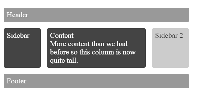
This is how a typical CSS Grid looks like:
To understand what CSS Grids are and how to implement Grids and Flexbox, you can read our Guide to Better Web Design with CSS Grids and Flexbox.
As discussed above, the development of a little complex web design led to the introduction of CSS Grids. But in the coming years after its launch, CSS Grids shared the same fate as well. In the last ten years and so, tremendous growth and changes have been seen in website designs, redesigns, and development. With the increasing complexities around the user interface layout, a new problem pops up: CSS Grids embedded into other CSS Grids, also called nested grids.
Although the demonstration of this concept is shown throughout this post, the basic idea is that applying Grids inside another Grid has become a popular concept and was not possible without turnarounds. Due to the popularity of nested grids, CSS has enrolled a new feature called subgrids, which helps developers develop nested grids that are predictable and easier to manage. The subgrid is applied with the keyword “subgrid” in the cascading style sheet.
Why Do We Need Subgrids?
A good question to ponder is that if we could do some makeshifts and create our subgrids through “grid” property, why do we need to have a separate property for subgrids?
Well, with grid property, the problem is that any changes we do or any element we construct inside the grid container do not reference the parent container for itself. Constructing a grid within a grid creates issues as the element starts acting independently, and therefore we have to manage two separate grids now unnecessarily.
Another issue with the nested grid used conventionally before Level 2 Grid was that it was not as flexible to the responsive web design as it should be. Since the market is flooded with different screens on mobile devices today, responsiveness is crucial. Creating a nested grid would sometimes overflow the inside element outside the boundaries of the grid container element. Hence, a new property was needed to cater to all these web developers’ needs, giving birth to the subgrids.
After making your CSS grid responsive, you can leverage LT Browser to test the responsiveness of your CSS grid to make sure it is responsive across various viewports. With LT Browser you can test the responsiveness of the CSS grid across 50+ pre-installed devices like mobiles, tablets, desktops, and laptops.
Here is an example for Subgrids, see the following card image taken from Mozilla Hacks :

Can you guess the glitch in this layout design built with nested grids (using multiple grid properties)?
Notice the third grid; it has a caption longer than the rest. Therefore, the row for that particular heading is adjusted independently. And space has become unequal due to the row on the above cards.
Had we used the subgrid property instead, we could have got the following type of design:
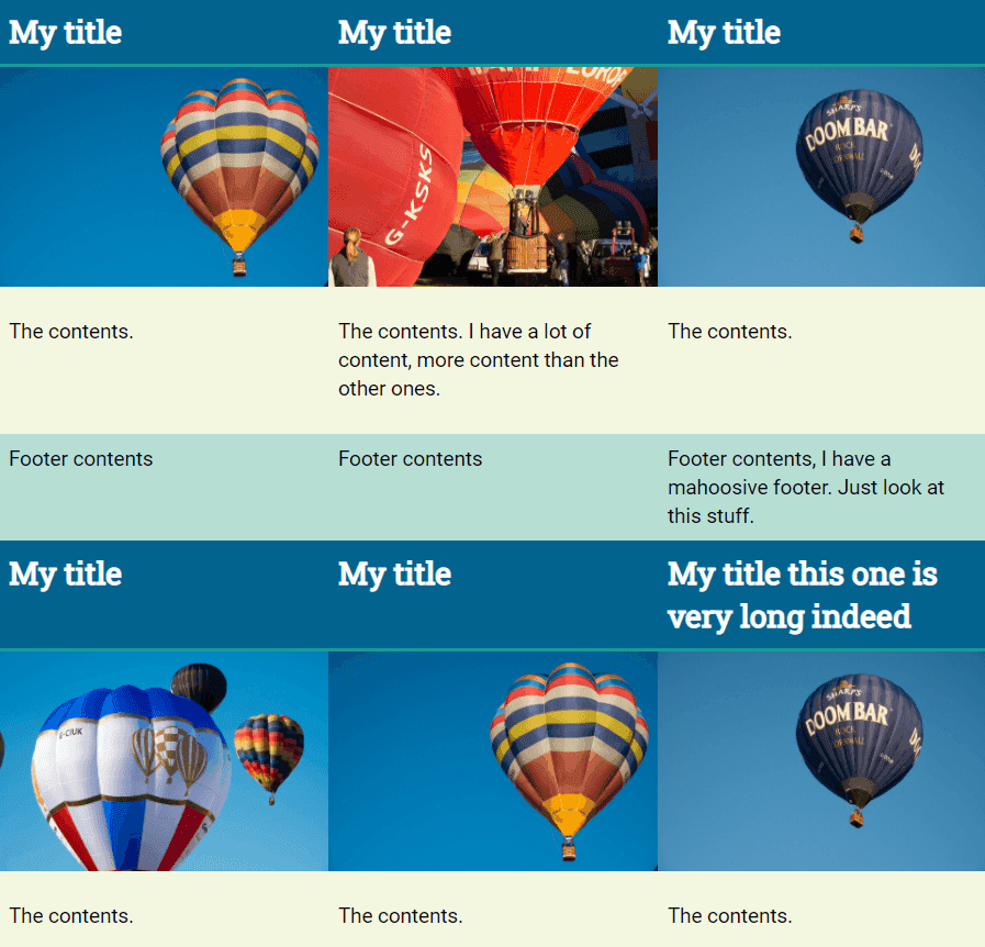
As visible, space has adjusted accordingly, and now it does look nice and clean. The important point to note is that this space will automatically adjust itself, taking the parent’s reference, and there is no need to write extra JS code or makeshift things in CSS.
I hope we are now on the same page in understanding the importance of subgrids and the need that led to their invention. In the further section, I will show you how you can position the subgrid differently on different axes.
Subgrid Acceptance In Browsers
Subgrid is used very poorly in web development to this date. Browsers are still in progress in adding subgrids to their long list of features except for Mozilla Firefox, which is no surprise as they are usually the ones to roll out a new property before anyone else.
The below stats show that the Global Usage for subgrid is just over 3%:

It is weird, though, that I could not even find this property in the Google Chrome Experimental Flags section. They usually put these properties there for the developers to experiment with. Therefore, it is highly doubtful that the subgrid will be seen in the next two or three updates (I am using Chrome 86 stable).
Related Read: Detailed Guide To CSS Supports In Browsers
Implementing Subgrids
In this section, I will demonstrate the construction and implementation of the subgrids along the x-axis, y-axis, and then in both directions simultaneously.
Subgrid on Row Axis
In this section, we will apply the subgrid property to an element to span it along the parent grid container’s rows.
For a normal nested grid, we can define two different classes as follows:
These are self-explanatory classes. If you would like to have a subgrid along the rows, we need to change the grid-template-rows option of the following snippet:
In the following webpage, as visible, the subgrid spans over 2 rows out of 4.
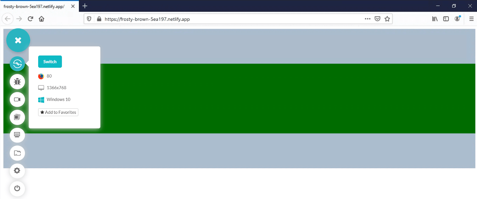
Subgrid on Column Axis
Just like we spanned the subgrid on multiple rows inside an outer grid, we can also span the subgrid across the column axis. For this, we need to set the grid-template-column property as subgrid as follows:
In the following webpage, as visible, the subgrid spans over 2 rows out of 4.
Keep the body code the same as above.

This time the subgrid spans along with the columns independently.
Subgrid in Both Dimensions
Subgrids can also be spanned in both dimensions, i.e., row-wise and column-wise. For this, you need to combine the above two codes into one without redundancy. So the code would contain both grid-template-row and grid-template-columns property set to subgrid as shown:
On the following page, you can see that a grid is constructed with reference to the rows as well as columns with the specified size inside the grid container:
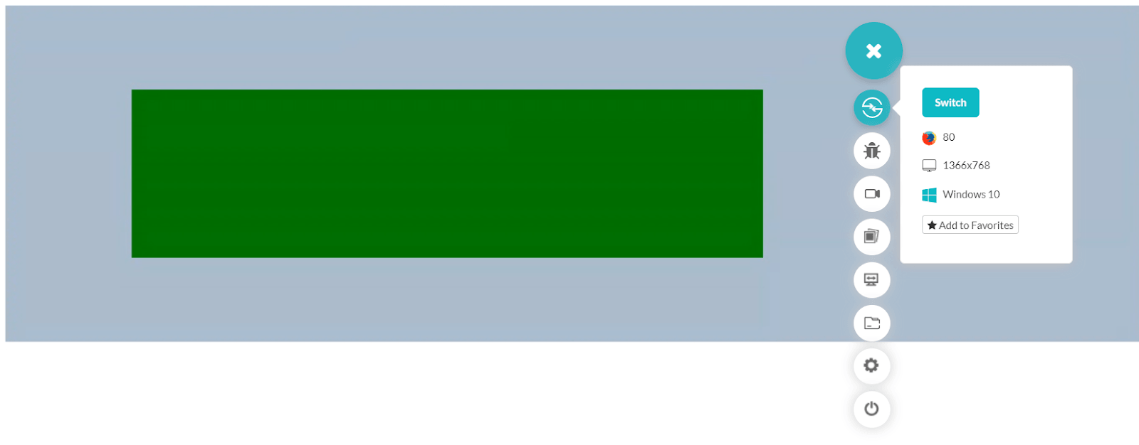
You can also try to construct multiple subgrids and comment with your links to the website.
Implicit Tracks In Subgrid
In the above sections, we have shown how you can place a subgrid expanding either row-wise or column-wise, or both. Another effect of using the subgrid over any dimension is that it will remove its ability to contain any implicit grids that are not mentioned but created when the grids expand to a larger level.
In such a case, the element’s last line will be aligned to the subgrid’s defined last line.
Gap Properties With Subgrid
Although the subgrid’s construction and implementation are discussed in the above section, there is a simple exception or notable point while using subgrids. Subgrids inherit the gap properties from their parent container. So if you have specified a certain gap in the parent container, the subgrids will also be constructed with the same gap. The gap properties include gap, column-gap, and row-gap.
The following webpage shows how the parent grid container is equipped with the row-gap, but the column gap is maintained at 0px.
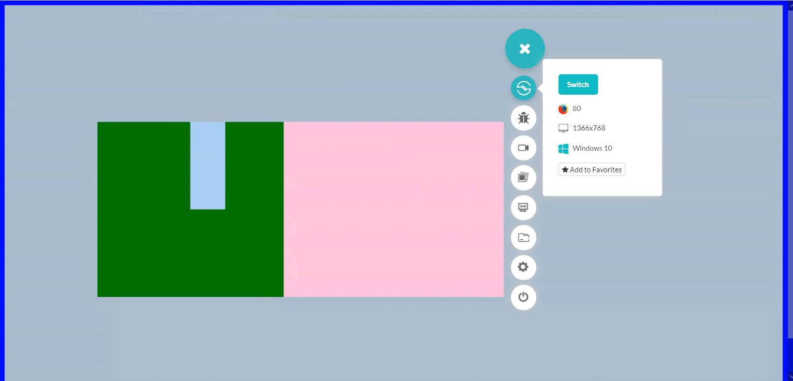
To notice the row-gap introduced in the parent grid, inspect the box, and the grid will be visible as follows:
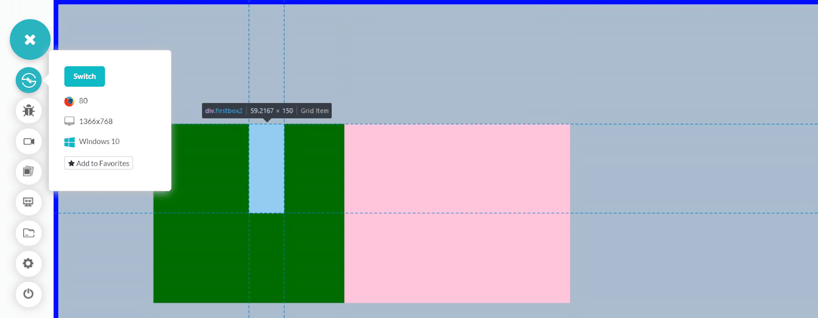
Note: You can use gap-* property if you want to have the subgrids’ independent tracks. You can also override the gap value by mentioning the gap value of its own in subgrids. In the above screenshots, we are using Firefox 80 on LambdaTest.
This might help explain how subgrids are independent, and all the hard work that the developer needed to do in nested grids is diminished here.
Conclusion
Since the introduction of Grids into the CSS, developers have been quite happy. CSS Grids made the arrangement-and-adjustment problem very easy, responsive, and faster than ever. With CSS Grids, I know my content will be organized automatically with just a few lines of CSS code. But with so many benefits, CSS Grids had a small disadvantage. The use of nested grids had the independence of its own. The result? Disorganized and dislocated elements inside the grid container. Even if some makeshift gave way to smooth structure, responsiveness would kill it in a single shot. A need for a better property was required, and hence subgrids were introduced.
Subgrids are an official substitute for nested grids to apply one grid inside another. The best thing is, it is scalable, responsive, and you don’t need to adjust anything through extra code or Javascript. Subgrid is sufficient within itself. Being dependent on the parent container keeps it stuck to its assigned ratio and position. Although web browsers are still in the phase of accepting subgrids in their systems, subgrids do bring out some beautiful web designs in themselves. We would love to see your designs and artistic approach in comments towards UI, ultimately helping us and the whole world learn.
Frequently Asked Questions
What is a nested grid?
When a grid item becomes a grid, it is called a nested grid. You need to apply display: grid (or display: inline-grid ) to the grid item to create a nested grid.
How do I use the grid template area?
We use grid-template-areas property to specify the areas within the grid layout.
Using this property you can name grid items and then refer to the name in the grid-template-areas property.
Syntax: grid-template-areas: none|itemnames;
Got Questions? Drop them on LambdaTest Community. Visit now


