11 Principles of Good Website Visual Design
Zikra Mohammadi
Posted On: November 18, 2024
![]() 105300 Views
105300 Views
![]() 23 Min Read
23 Min Read
Good website design is essential for businesses and organizations aiming to make a strong online impression. It’s about crafting a friendly, intuitive, and visually engaging experience. Modern web design combines appearance and functionality to ensure a positive user experience across devices.
To create effective websites, designers should follow the core principles of website visual design, from establishing a clear visual hierarchy to focusing on user-centered design, resulting in highly functional and user-friendly sites.
Table of Contents:
TABLE OF CONTENTS
What Is Website Visual Design?
Website visual design is the composition of a website’s look and feel. It arranges and represents texts, images, and other elements to enhance user experience. Good visual design guides users through the site, making it easy to navigate and understand the message.
It creates a coherent, attractive, and functional interface that engages visitors, encouraging interaction with the content. In essence, it’s the brand’s visual storytelling on the web. Website visual design is important because it influences how users interact with and view a website.
Here’s why it matters:
- First Impression: An effectively designed website creates a positive first impression, encouraging users to spend more time exploring it.
- Usability: Good visual design enhances usability by making navigation intuitive and information easy to locate, often with a single click. This improves the overall user experience.
- Brand Identity: Consistent visual components, such as colors, typefaces, and logos, reinforce brand identity, making the website distinctive and building trust.
- Engagement: An appealing design draws user engagement, directs attention, and promotes interaction. Visual cues can guide users to important content or call to action.
Test website visual designs across 3000+ browsers and OS combinations. Try LambdaTest Now!
11 Principles of Good Website Design
Website designers must adhere to several fundamental principles in creating a website that attracts users’ attention, engages them, and allows them to easily navigate the content.
The following are the principles that the designers must follow to create a good website visual design:
Focus on User-Centered Design
User-centered design focuses on developing websites with the end user in mind at all stages of the design process. This approach ensures the site is easy to navigate and aligns with user needs and expectations, making for a more engaging experience. Understanding your target audience’s preferences helps create a website visual design that resonates effectively.
User-centered design emphasizes usability, accessibility, and interaction, aiming to create interfaces that are visually appealing yet functional and easy to use. This process includes user research, prototype testing, and iterating design based on user feedback.
Tips to Focus on User-Centered Design:
- Understand Your Audience: Research to grasp audience needs, pain points, and preferences.
- Accessibility in Design: Make your website accessible to all users by following WCAG standards, including adequate color contrast and alt text for images.
- User Flows: Design with user flows in mind, ensuring major tasks (e.g., signing up or purchasing) are easy to complete.
- Get Feedback: Continuously test your website with real users to identify areas for improvement.
Good user-centered design reduces frustration and provides a seamless browsing experience. Every decision, from navigation to color selection, should consider the user’s perspective, enhancing the overall website visual design.
Establish a Clear Visual Hierarchy
Visual hierarchy arranges and presents website elements so that visitors can easily understand the importance of each. It focuses the viewer’s attention on the most significant components first, followed by supporting information. A well-defined hierarchy guides users through the website smoothly, moving from primary elements like headlines or CTAs to secondary details without confusion.
This hierarchy is achieved by adjusting design elements such as size, color, contrast, position, and whitespace. Important details appear larger, bolder, and more visible. For instance, a call-to-action should be prominently displayed to drive conversions.
Tips to Establish a Clear Visual Hierarchy:
- Element Sizing: Larger elements like headlines stand out to show importance, while smaller fonts or images represent secondary information.
- Color Contrast: Use contrasting colors for key elements. Bold colors for CTAs or headings ensure they draw attention and remain readable.
- Positioning: Place key elements like CTAs and headlines “above the fold” for quick engagement.
- Whitespace: Use whitespace to highlight important content, reduce clutter, and help users focus on key information.
A clear visual hierarchy is not only visually appealing but also enhances usability, guiding visitors to take desired actions like reading further, filling out a form, or making a purchase.
Prioritize Simplicity
Prioritizing simplicity in web design involves removing unnecessary complexity and focusing on clarity and ease of use. Minimalistic websites are easier to navigate, helping users concentrate on essential content. Complex designs with too many distracting elements can overwhelm visitors, leading to abandonment or loss of key information.
A clean, simple layout improves readability, reduces load times, and enhances user-friendliness. With less load, pages open faster, allowing users to find what they need without sifting through excess information. Simple design reduces cognitive load, enabling users to absorb information and make decisions, whether it’s completing a purchase or signing up for a newsletter.
However, simplicity doesn’t mean a lack of content or visual appeal. Instead, it involves presenting content in a clean, structured, and streamlined way, allowing for smooth engagement. Removing unnecessary buttons, graphics, or text blocks leaves users with a clear path to engage with essential functions and find relevant information.
Tips to Prioritize Simplicity:
- Eliminate Unnecessary Elements: Ensure every element on the page—from images to text blocks—serves a purpose. Remove anything that doesn’t add value.
- Emphasize Core Functions: Focus on key actions or information. Use clear CTAs and straightforward navigation, and make essential content easy to access.
- Streamline Navigation: Simplify the path to information. A flat navigation structure with fewer sub-levels helps users find what they need with fewer clicks.
- Reduce Text: Use concise, impactful copy. Opt for bulleted lists, icons, and infographics to convey information more effectively than lengthy paragraphs.
Simplicity in visual website design allows users to focus on the content, reducing distractions, increasing usability, and creating a more efficient browsing experience.
Maintain Consistency Across Pages
Maintaining consistency in web design ensures that all elements work together to create a smooth user experience. This includes typography, color schemes, button styles, interaction design, layout, and functionality. By keeping the design consistent across all pages, users feel more comfortable and confident while exploring the website.
Inconsistent design can confuse and frustrate users, making navigation feel disjointed and unprofessional. On the other hand, a consistent design reinforces brand identity, improves navigation, and builds user trust.
Tips to Maintain Consistency Across Pages:
- Design Style Guide: Document your color palette, typography, button styles, and spacing rules to ensure consistency across all pages.
- Re-use Components: Use reusable elements like navigation bars, buttons, and footers for a uniform experience.
- Brand Colors: Apply brand colors consistently to backgrounds, buttons, and fonts for better accessibility.
- Standardize Typography: Limit font choices to two or three across the site, maintaining consistency in heading and body text sizes.
Maintaining consistency in website visual design is crucial for a uniform experience across different devices, browsers, and screen sizes. With users accessing websites from desktops, laptops, tablets, and mobile phones, ensuring your design works seamlessly on all platforms is vital. Furthermore, since users often use multiple browsers, each rendering sites slightly differently, ensuring your design functions consistently across them is essential.
To ensure your site renders correctly, and functions as expected across various browsers, a cloud-based platform like LambdaTest can help you tackle the challenge of maintaining consistency across different browsers, operating systems, and devices. LambdaTest also ensures that your design elements remain responsive across all screen sizes by offering you responsive checker tools like LT Browser.
With LT Browser, you can validate the consistency and responsiveness on 53+ device viewports, enabling you to compare them side by side. It also synchronizes interactions like scrolling, clicking, and navigation, providing pre-installed viewports for mobile, tablet, desktop, and laptop devices.
To test the responsiveness of your website, simply click the download button below. Once the .exe file is downloaded, run it to access all the features and capabilities of LT Browser.
Choose Readable Typography
Typography is a crucial yet often overlooked aspect of website visual design. The fonts you choose and how they are presented affect how easily your content can be read, directly influencing how users interact with your site. Good, readable typography not only enhances user experience but also contributes to the overall look and feel of the site.
Selecting the right fonts is the first step toward creating readable typography. Using too many fonts can confuse users and make the website appear unprofessional. Limiting the design to two or three fonts—one for headings and one for body text—creates a uniform and structured appearance.
Tips to Choose Readable Typography:
- Limit Font Usage: Stick to 2-3 fonts for consistency. Avoid overwhelming users with too many typefaces.
- Ensure an Adequate Font Size: Body text should be no smaller than 16px, particularly on mobile screens, to maintain legibility.
- Maintain Line Spacing: Set line height to at least 1.5 to provide text with breathing room, making long paragraphs easier to read.
- Use High Color Contrast: Ensure sufficient contrast between text and background for better readability, especially for accessibility.
Readable typography is critical for engaging users. By choosing appropriate typefaces, ensuring accessible sizes, and maintaining clear contrast, you can create a visually appealing and user-friendly website visual design that encourages visitors to stay and read your content.
Design Easy Navigation
Navigation is the foundation of a website’s usability. Good navigation ensures users can quickly find what they are looking for with minimal effort. Whether it’s a product, service, or information, simple navigation enhances the overall experience on the website.
A well-designed navigation system has a clear and concise menu structure. Avoid overloading the menu with too many options, as this can confuse users. Instead, focus on major categories and subcategories to help consumers navigate the site logically. A flat navigation structure, where significant content is only one or two clicks away, ensures visitors can easily access what they need without navigating multiple submenus.
Tips to Design Easy Navigation:
- Use Clear Labels: Ensure all menu items and buttons are clearly labeled. Avoid jargon or overly creative names for standard pages.
- Limit Menu Items: Minimize the number of top-level menu items. Too many options can overwhelm users. Group related pages together using drop-down menus if necessary.
- Breadcrumb Navigation: Implement breadcrumb navigation to show users their current location on the website, which is particularly useful for sites with many categories or product pages.
- Include a Search Bar: A search bar helps users find content quickly, especially on content-heavy websites. Ensure it’s easily accessible from all pages.
Designing for easy navigation improves your website visual design and ensures that users can easily locate what they need. By focusing on simplicity, clear labeling, and accessible menu structures, you create a more intuitive user experience.
Use White Space for Better Focus
White space, or negative space, is the empty area between elements on a web page. Though often overlooked, white space plays a vital role in enhancing website visual design by making content clearer, more to the point, and visually appealing. It reduces clutter, giving essential content room to stand out, and improves overall readability.
Effective use of white space creates an open, clean feel that enhances the user experience by drawing attention to important elements like product descriptions, CTA buttons, and images. Establishing balance and order lowers the cognitive load and encourages visitors to stay on the page.
Tips to Use White Space for Better Focus:
- Focus on Key Elements: Surround CTAs and headers with white space to capture attention and make them stand out.
- Avoid Clutter: Avoid overcrowding the page with too many elements; use white space to guide users through the content.
- Increase Line Spacing: Add extra line space within paragraphs to improve readability and break up dense blocks of text.
- Create Balance: Use white space to balance visual weight, ensuring no single area overwhelms the page.
When used effectively, white space helps create a clean, simple design that naturally encourages visitor interaction. It reduces cognitive load, allowing users to process information more comfortably without distractions.
Balance Visual and Textual Content
A well-balanced website blends visual components and textual content to provide a compelling user experience. Striking the right balance ensures that neither element overpowers the other, making it easier for consumers to absorb information.
Visuals like images, videos, and infographics capture attention and break up large blocks of text, while well-written content provides context, information, and calls to action. This balance enhances readability and keeps users engaged longer.
When developing a website, integrating visuals strategically is essential. Too many images or large files can slow down the site and distract from the message, while too much text can overwhelm readers.
Visuals should complement, not compete with, the information, contributing to a unified narrative that guides users smoothly through the page.
Tips to Balance Visual and Textual Content:
- Use Visuals to Complement Text: Choose images or graphics that enhance the written content and reinforce the key concepts being conveyed. Use a set of high-quality, customizable Tabler Illustrations to easily improve your website.
- Break Up Large Blocks of Text: Insert images, icons, or infographics between paragraphs to break up long blocks of text and keep users engaged.
- Optimize for Readability: Ensure text and images don’t overlap. Maintain enough whitespace between both to keep the page clean and easy to navigate.
- Ensure Rapid Loading Times: While visuals improve the user experience, they should be optimized for fast loading without sacrificing image quality or site performance.
- Captioning or Descriptive Alt Text: Add useful captions or alt text to images to explain their significance, improve SEO, and enhance accessibility for users with disabilities.
Balancing visual and textual elements is crucial for creating an aesthetically pleasing and efficient website visual design that effectively communicates your message while keeping visitors engaged.
To maintain a seamless user experience across all devices and browsers, visual testing is essential. You can use various visual testing platforms like SmartUI, offered by LambdaTest, to perform Smart Visual Testing. It ensures that the visual components of your website, such as images, buttons, and layout, display correctly across different browsers and devices.
It enables real-time visual validation by comparing your website’s design against baseline screenshots, ensuring that no visual bugs or discrepancies compromise the user experience. This ensures your website maintains its balance of visual appeal and functionality, regardless of the platform.
Subscribe to the LambdaTest YouTube Channel to get more video tutorials on visual testing.
Create Clear and Compelling CTAs
Call-to-action (CTA) buttons drive engagement and conversions on a website. Whether you want users to sign up for a newsletter, make a purchase, or request a demo, CTAs guide them toward the next step. CTAs should be short, catchy, and strategically placed to capture user attention effectively.
A strong website visual design should include CTAs that capture visitors’ attention and encourage clicks. The wording on a CTA should clearly describe the action you want users to take, while the design should make it easy to notice and click.
Tips to Create Clear and Compelling CTAs:
- Use Activity-Oriented Language: Phrases like “Get Started,” “Sign Up Now,” or “Learn More” clearly indicate the action users will take.
- Contrast Colors: Choose a color that contrasts with the rest of the design to make the CTA button stand out.
- Place CTAs Strategically: Position CTAs above the fold and in key content areas, like blog posts or product pages.
- Keep it Simple: Use clear, direct wording to avoid confusing users.
Clear and visually appealing CTAs are essential for guiding users to take key actions on your website. Using action-oriented text, contrasting colors, and strategic placement, well-designed CTAs can grab attention and boost engagement.
To improve your website’s conversion rate, it’s important to design effective CTAs. Follow this guide to get CTA design tips that drive better conversions.
Optimize for Mobile Responsiveness
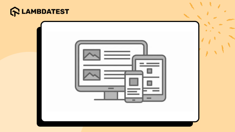
Optimizing for mobile responsiveness is essential for providing a consistent and accessible experience across devices. With more customers accessing websites via mobile phones, ensuring your website adapts to different screen sizes has become a top priority.
A mobile responsive design adjusts the layout, images, text, and navigation components to fit the screen size without compromising usability or content display.
A responsive design ensures that users can access your site seamlessly, regardless of the device. It makes text readable without zooming, buttons are easy to click, and images are properly sized for smaller screens. This creates a smooth experience, encouraging users to explore deeper content and complete desired actions, such as making purchases or filling out forms.
Tips to Optimize for Mobile Responsiveness:
- Adopt a Mobile-First Approach: Design your website for mobile devices first, then scale to larger screen sizes. This ensures the most critical elements are prioritized, offering users a smooth mobile experience.
- Fluid Grids and Flexible Images: Use a fluid grid layout with CSS media queries to adjust your layout based on screen resolution. Ensure images and other elements are scalable and responsive.
- Remove Unnecessary Content: Eliminate excessive text, images, or videos that slow down mobile load times or clutter the layout.
- Simplify Navigation: Use hamburger menus (three horizontal lines) on mobile versions of your site to reduce visual clutter. Ensure navigation is intuitive and easy to interact with on smaller screens.
Maintaining readability is one of the most challenging aspects of mobile responsiveness. The text needs to be legible on smaller displays, so use appropriately sized fonts and adequate spacing.
Optimizing for mobile responsiveness in your website visual design guarantees that users on all devices enjoy a consistent experience. This enhances usability, improves SEO performance, and increases the likelihood that mobile users will engage with the content, contributing to the overall success of the website.
Improve Load Speed
Page load speed is critical as it directly impacts user experience and website performance. Slow-loading pages can frustrate users, leading to increased bounce rates and fewer conversions. Users expect websites to load quickly, and if yours is too slow, they will leave and seek alternatives.
Improving load speed involves optimizing various aspects of the website, including image sizes, scripting, and server performance. This ensures users can access content quickly, regardless of their connection speed or device. Faster websites retain more visitors and rank higher on search engines like Google, which favor fast, user-friendly sites.
Tips to Improve Load Speed:
- Compress Images: Use image compression tools to reduce file size without losing quality. Modern formats like WebP can help with faster loading.
- Minimize JavaScript and CSS Files: Remove unnecessary code and combine CSS and JavaScript files to reduce HTTP requests.
- Use Browser Caching: Implement caching techniques to save resources locally, speeding up load times for repeat visitors.
- Use a Content Delivery Network (CDN): Distribute content over multiple servers to ensure faster delivery based on the user’s location.
Optimizing load speed is crucial for user retention and overall website performance. By improving images, reducing heavy scripts, and streamlining code, you enhance your website’s visual design and build a mobile-friendly website.
Best Website Visual Design Examples
Whether you’re starting your first web design project or looking to redesign an existing one, these visually striking and unique websites can inspire creativity. These designs not only stand out visually but also excel in functionality and user experience, setting the standard for modern web design.
Here are some top examples of website visual design that have made a significant impact through their distinctive approaches to both aesthetics and usability.
Lacoste Heritage

Lacoste Heritage website is a standout example of website visual design, particularly for its innovative approach to celebrating the brand’s 90th anniversary. In collaboration with the creative agency Bonhomme, the site integrates animated content and cutting-edge WebGL technology, offering an interactive and engaging user experience.
The design seamlessly combines elegance with fun, with the iconic crocodile logo guiding users through a dynamic, color-changing journey that vividly portrays Lacoste’s rich history.
This blend of elegance and modernity not only makes the website visually appealing but also user-friendly, effectively reflecting the Lacoste brand legacy.
Airbnb

Airbnb‘s graphic style exemplifies simplicity and user-centricity. The website features a clean, minimalist design with ample white space, ensuring that users’ focus remains on property listings and the booking process. The limited color palette contributes to a unified, visually pleasing experience.
The typography, a key element of good website visual design, is clear and accessible, enabling easy navigation and helping users find what they’re looking for. The design also incorporates storytelling elements, creating memorable user experiences with meticulous attention to detail. This approach not only enhances the customer experience but also reinforces Airbnb’s brand purpose, “Belong Anywhere.”
This combination of simplicity, functionality, and storytelling makes Airbnb a standout example of effective website visual design.
What Is Missing

Maya Lin’s What Is Missing is visually captivating and meticulously crafted to convey a powerful message about ecological history and conservation. The website’s main graphic element is a global map that highlights stories of abundance, loss, and recovery across various habitats, species, waterways, and towns. Dynamic features and animations engage users, making the data more accessible and compelling.
The design is simple yet beautiful, focusing on visual storytelling to emphasize the critical need for habitat protection and restoration. The color palette and typography are thoughtfully chosen to convey a sense of urgency and hope, guiding users toward a deeper understanding and encouraging action.
This combination of engaging visuals and a strong, purpose-driven message makes What Is Missing an exceptional example of website visual design.
Unseen Studio

Unseen Studio is a creative production agency renowned for crafting visually stunning content and immersive digital experiences. Their website showcases this expertise with a clean, modern design that effectively presents their portfolio.
The use of vibrant colors, dynamic animations, and high-quality photography creates an engaging user experience. The interface is intuitive and easy to navigate, guiding visitors through a wide range of projects, from brand identity to motion productions.
Unseen Studio’s commitment to innovation and originality is evident in every aspect of the website, making it a standout example of exceptional website visual design.
Curious & Company

Curious & Company‘s visual style is a captivating mix of mystery and engagement. The first frame immediately grabs attention with a nod to the mystery genre, inviting users to explore. As they move their cursors, a small section of the background artwork illuminates, providing a sense of discovery and keeping visitors engaged.
The website’s most prominent feature is the all-seeing eye, which moves gracefully in an oval pattern. This intriguing design element not only adds to the mysterious atmosphere but also guides users to the site’s main menu, directing them to the Service, About, and Contact tabs.
The design excellently combines attention-grabbing elements with smooth navigation, making it a standout example of effective website visual design.
Conclusion
A good website visual design goes beyond aesthetic appeal. The principles discussed in this article—from establishing a clear visual hierarchy to ensuring mobile responsiveness—form the foundation for creating a user-friendly and engaging website. These principles work together to ensure a site is both visually appealing and functional, providing the best possible user experience.
By focusing on user needs, maximizing efficiency, and maintaining consistency across platforms, you can create a design that is not only eye-catching but also encourages meaningful interactions. When applied effectively, these principles enhance a website’s usability and help brands build trust while achieving their business objectives.
Frequently Asked Questions (FAQs)
What is Performance Testing?
Performance testing evaluates how well an application performs under various conditions. It measures aspects such as speed, scalability, and stability to ensure the system meets expected performance standards.
What are the key types of Testing?
The key types of testing include functional testing, non-functional testing, manual testing, automation testing, and regression testing, among others. Each type serves a different purpose to ensure the software is reliable and meets requirements.
What is the role of Selenium in automation testing?
Selenium is a popular open-source tool for automating web browsers. It allows testers to write tests in multiple programming languages and simulate user interactions with web applications to ensure they function correctly across different browsers.
Got Questions? Drop them on LambdaTest Community. Visit now


