17 Dreadful Website Redesign Mistakes To Avoid In 2023
Harish Rajora
Posted On: March 28, 2023
![]() 197217 Views
197217 Views
![]() 27 Min Read
27 Min Read

A website is the face of your business. Whether it is a big billion-dollar firm like Amazon or a freelancer showing his portfolio, a website is an indispensable part of your business that helps increase potential clients’ interest in your products. Over time, like any other technology variant, web technologies also keep changing and upgrading every couple of years.
Whatever we use today might not be so popular or relevant years from now. Therefore, it becomes necessary to analyze your website occasionally to determine what’s working and what’s not. And after that, you can decide if your website needs a redesign. However, redesigning a website could be tricky, and you must consider many things to avoid repercussions.
With that in mind, given below are 17 website redesign mistakes you should avoid at all costs.
Without ado, let’s dive deep in.
TABLE OF CONTENTS
Importance of Website Design in Digital Business
The importance of website design in digital business cannot be overstated. A well-designed website can make a lasting impression on visitors and help businesses to establish their brand identity online. Here are some reasons website design is essential for any business looking to succeed online.
- First Impression: For many potential customers, your website is their first point of contact. An attractive website can give a favorable first impression to encourage visitors to stay longer and drive them to discover more about what you offer.
- User Experience: A well-designed website makes navigating and locating the information they need simple. Users that find your website challenging to use may quit it in frustration, which could result in missed sales.
- Brand Identity: Your website’s design must reflect your brand’s values and message. It should support the development of brand recognition and be consistent with your other marketing materials.
- SEO: A well-designed website has a higher chance of ranking in search engine results, making it more straightforward for potential clients to locate you online.
- Mobile Responsiveness: Due to the popularity of mobile devices, your website must be mobile-responsively created. This ensures that your website is user-friendly on all platforms and will adjust to different screen widths.
Therefore, it is necessary to know the essential checklist for website design. Read our comprehensive guide on the website design checklist that you must follow while designing your website.
When should you Redesign a Website?
When a website no longer serves the business’s requirements or its users, it should be redesigned or revamped. The following reasons necessitate a website to be changed or redesigned:
- Content Updates: A website redesign might allow you to update and revise the content on your website if it needs to be updated or corrected information.
- Technological Advances: If your website was created using outdated technology, it might be time to update it to be safe, dependable, and compliant with current online standards and fashions.
- Low Conversion Rates: If visitors to your website aren’t becoming leads or customers, a redesign will help you find and fix the problems blocking conversions.
- Outdated Design: If your website has an outdated design or has an outdated look, it may be time for a redesign to give it a more contemporary appearance.
- Rebranding: Whether your business has altered its brand identity, target market, or both, a redesign can help reflect these changes and better reflect the new brand or emphasis.
Overall, it is crucial to know the latest website design trends before starting your website redesign and stay at the top.
Advantages of Redesigning your Website
In a world where everything is moving faster, having a website that stands out from the crowd is crucial. A website redesign can provide numerous advantages, helping businesses and organizations to stay competitive and relevant. It can be an opportunity to refresh a website’s design and functionality and make it more user-friendly and engaging for visitors.
- Improved Brand Image: By projecting a more professional, modern, and consistent appearance, a redesigned website can assist in boosting the brand image and perception of the company.
- Improved Traffic and Engagement: A revamped website can draw in more users and promote greater engagement, increasing traffic and leading to leads or purchases.
- Increased Conversion Rates: A redesign can find and fix problems that keep users from becoming customers, increasing conversion rates.
- Improved Mobile Accessibility: A website redesign may ensure the site is mobile-friendly, which is essential as more and more people use smartphones and tablets to access the internet.
- Improved SEO: A website redesign may involve search engine optimization, which can raise the site’s placement on search engine result pages and increase visibility and traffic.
- Increased Functionality: By including new features, improving existing functions, and ensuring the site is user-friendly and accessible, a redesign can make the site more functional.
Things to remember while Redesigning a Website
Redesigning a website can be an exciting but daunting task. A well-designed website can help attract and retain visitors, increase engagement, and ultimately drive business success. However, there are many factors to consider when undertaking a website redesign, from the purpose and audience of the site to its functionality and performance. Here are some key things to keep in mind when redesigning a website.
- Goals and Objectives: Specify the goals and objectives for the redesign. What do you want the new website to accomplish? What criteria will you use to evaluate your progress?
- Perform a thorough website audit: To determine the areas that require improvement, you must conduct a website audit. You can find problems with your present website by doing a website audit, such as broken links, sluggish loading times, bad user experiences, and out-of-date material.
- Understand your audience: The success of your website redesign depends on understanding your audience. You must know the industry’s wants and expectations for the user experience they will have when using your website.
- Content: Assess the existing content to see what should be updated, removed, or added. Ensure the new information is appealing, pertinent, and optimized for search engines.
- Test and Iterate: After launching your newly built website, you must test it repeatedly to enhance the user experience. To ensure your website meets its goals and objectives, you must monitor user behavior, gather feedback, and implement the appropriate modifications.
Avoid these 17 Website Redesign Mistakes at all Costs
While redesigning a website, businesses should ensure that changes do not negatively impact their brand’s online presence. A website redesign can breathe new life into your online presence but can lead to problems if not executed properly.
Some website redesign mistakes include neglecting the website responsiveness test, ignoring SEO best practices, failing to back up the old website, not setting clear goals, failing website speed and security, using outdated design, and many more.
Therefore, to ensure your redesign is a success, it’s crucial to avoid these 17 common website redesign mistakes at all costs. By avoiding these common pitfalls, you can ensure that your website redesign is a success and helps to achieve your business goals.
Website Redesign Mistake #1: Not Making the Website Responsive
Let’s start with the development part. Since the development part is personal to the organization or the individual, one thing always remains constant: the website’s responsiveness. Responsiveness is the property of a website to scale down or up automatically according to the screen on which it is being rendered.
Think of a case when the buttons on your website scale down if opened on any mobile screen and become so small that the users’ finger accidentally presses a wrong button, which they didn’t intend on clicking. When working on a big website, you will encounter many scenarios like this, and the developer should know how to deal with each. Although this is just the tip of the iceberg, responsiveness is much more in reality, and a detailed guide on Responsive design helps you in this regard.
As per a Statista survey, 59% of the website traffic now comes from mobile devices worldwide. Hence it is essential to scale down everything, so the mobile user has a great user experience. Therefore, whenever going for a website redesign, ensure your website remains responsive across all devices to avoid these website redesign mistakes. To ensure your website is well-optimized for mobile, it’s essential to perform responsive testing.
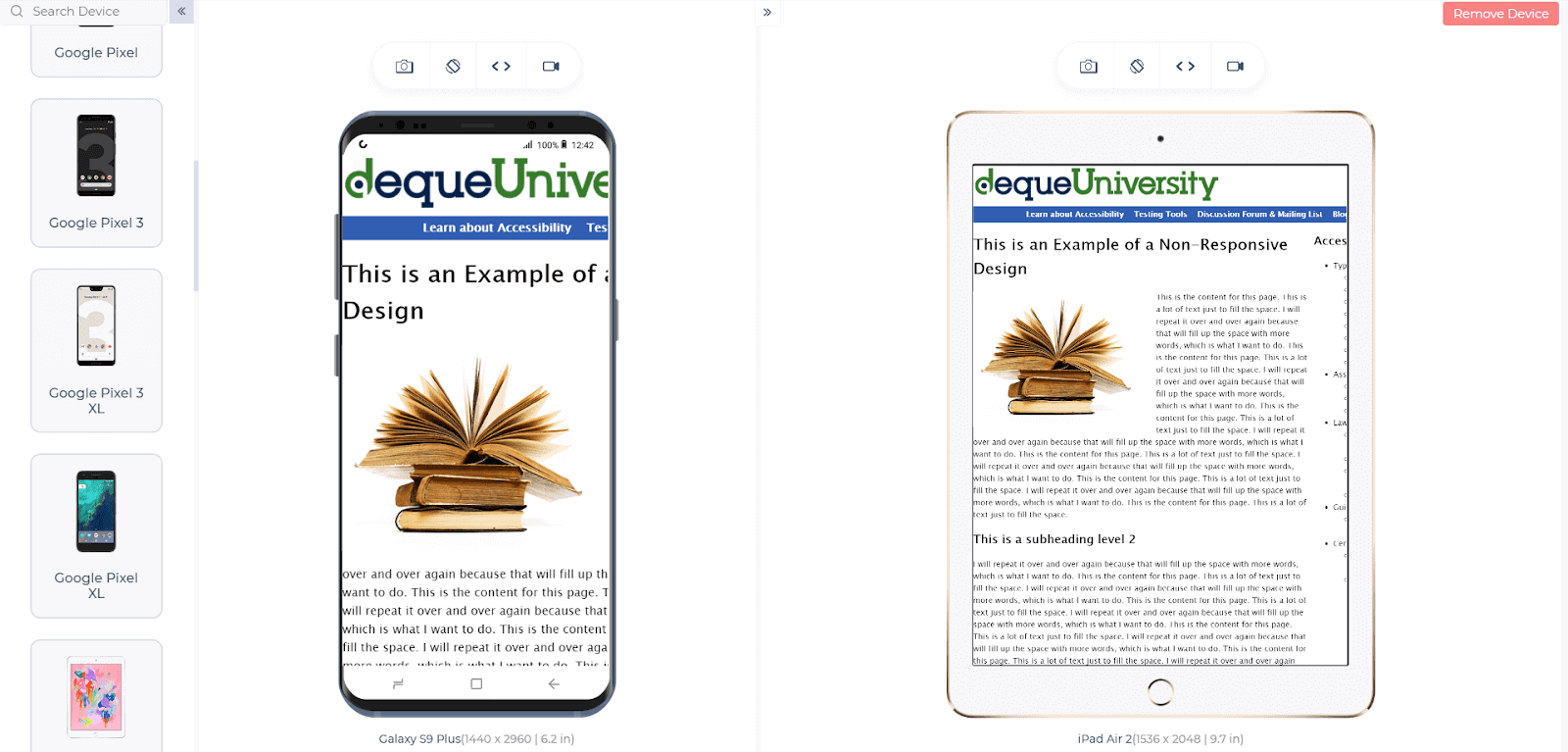
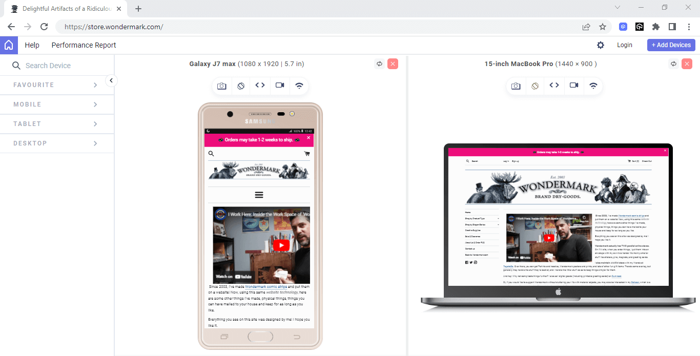
Tools like LT Browser 2.0, a dev-friendly browser by LambdaTest, can help you check the mobile view of a website on different screen sizes and resolutions. The tool allows you to simultaneously perform live mobile view debugging of your website on mobile, tablet, desktop, and laptop and see their impact on the go on over 53+ pre-installed devices!
You just need to enter the URL like in any local browser, select your desired devices simultaneously, and view your web application in just a few seconds.
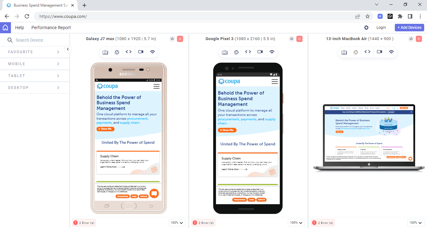
Whether it’s an iPhone, iPad, Samsung, or even a MacBook, you get all the resolutions in the LT Browser 2.0.
Website Redesign Mistake #2: Not Setting The Final Goals
Website redesign is about more than just using the latest techniques and technologies. You need to understand why you are taking this step and investing so much money and time in redesigning.
For example, an eCommerce business might want to change the older version of its website, which probably had complicated and horrible navigation, to something much more straightforward, considering how vital navigation is on a shopping website. An online teaching business might want to embed some extra features into its website using new technologies to take its user experience to the next level. These are a couple of goals a business needs to set before redesigning its website.
Setting final goals will give you a clearer perspective on things. This will help you understand the process and divide the workload by compartmentalizing and assigning a specific set of tasks to separate teams. This way, the website architecture and overflow become more seamless and streamlined. On the other side, not deciding on your final goals and starting in a directionless manner might compel you to change the complete strategy at the very last hour. This is one of the most common website redesign mistakes made.
Website Redesign Mistake #3: Not Deciding on The Technology To Use
Once we have settled down on the final goals and have divided the task among separate teams, the next step is to figure out what technology to maximize output within the shortest possible time. One of the common website redesign mistakes to avoid is not deciding on the technology to use while redesigning. Choosing technology is very important, not only for the present but for future use as well. Using the most recently-launched and latest technology in the market buys the team a considerable amount of time before the next redesign occurs.
The technologies you finalize are independent of the year they were released but are more dependent on your final goals. For example, if speed and single-page application are required, the best option could be going with React. Similarly, if your website is in Python, Django as a framework could be the right choice.
Looking for a suitable automation framework for your website testing needs? Check out our comprehensive guide on the best automation testing frameworks to choose from according to your requirements.
Website Redesign Mistake #4: Not Chalking Out An Effective Redesign Strategy
While a haphazard and spontaneous approach to redesigning your website might seem alluring, leaving adequate room for speculating and developing a well-planned and strategic approach is essential. This helps prevent many easily avoidable website redesign mistakes, saving time and resources!
A step-by-step strategy for planning changes in your website redesign should start with analyzing the current scenario and fishing for flaws. A website design must be on par with your target audience.
Hence, moderating the plan according to your current and potential client’s needs should be the next step. It is always advisable to watch for your competitors and assess their strategies to incorporate effective mechanisms as and when possible. It is also essential to understand that website redesign is tedious, challenging and requires a lot of pre-planning.
Website Redesign Mistake #5: Not Paying Adequate Attention To The Content
One of the most common website redesign mistakes to avoid, often made by developers, is choosing design over content. It may be tempting to jump on an impulse and start designing the website, paying no heed to the content that manipulates the entire core of your design. This approach can nullify your entire redesign strategy and lead to a waste of time and money.
This is why the correct approach to redesigning your website should be to opt for content creation and moderation first and then shift toward designing. The way to go is to develop lead-orientated and exciting content that focuses on the target audience’s demands. People are attracted to your website off-hand because of the content you feed them. The purpose of a web redesign should be to complement and enhance your content rather than take the limelight away from it.
Website Redesign Mistake #6: Not Simplifying Website Design
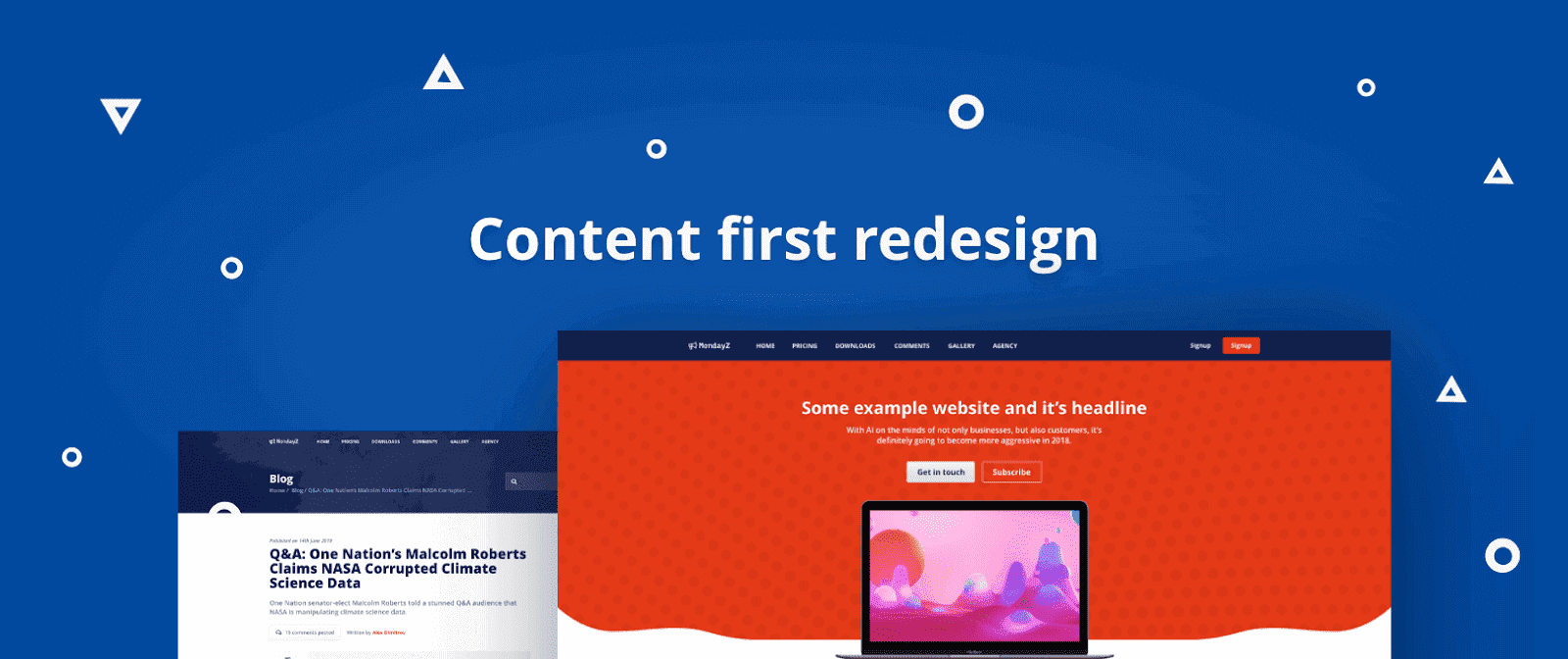
Simplicity is the new trend in website design. The more simplistic the developer’s design approach, the more attractive it becomes. Look at the following image, which demonstrates the minimalistic design approach used today:

Please ensure your users are aware of the options. For example, in the above image, only one button dominates the page. This will encourage users to stay focused, increasing the average time on the page. Now look at the following image:
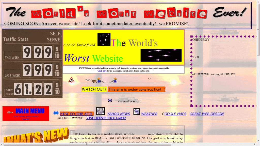
Doesn’t it look overwhelming by the amount of information and distractions given on a website’s home page? This is one of the worst website redesign mistakes to avoid recently. Going with such a design will increase the probability that the user will hit the back button and open another link from the web search results, drastically increasing your page’s bounce rate.
Also, avoid putting up all the information on the front page; the navigation bar should be simplified as much as possible and divided into categories. Keep the design to the minimum in the redesign process and keep the user stuck to your website.
Website Redesign Mistake #7: Not Calculating Overall Redesign Budget
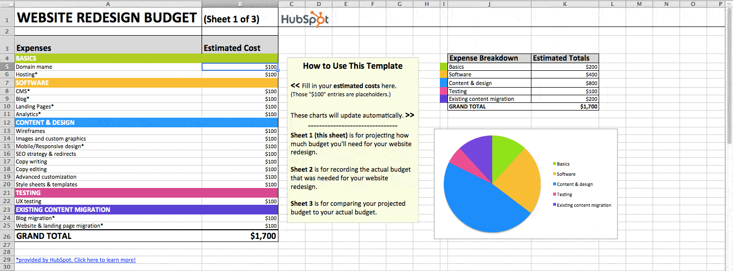
Walking through the steps mentioned above is a challenge, but it may occur to you that if this strategy poses no constraints, wouldn’t everybody be doing the same? It is partly true. But another critical aspect to consider and decide on is the budget, which raises a significant issue during a website redesign, just like in anything you want to do.
We need to determine how long it would take to accomplish our goals. The longer the redesigning process, the longer it will take for the server to consume resources, and charges will be extended, including the team’s salary to redesign the site. Therefore, it is essential to decide on a budget and then move ahead with the planning to avoid these common website redesign mistakes.
Website Redesign Mistake #8: Not Optimizing Your Website Design For Lead Generation
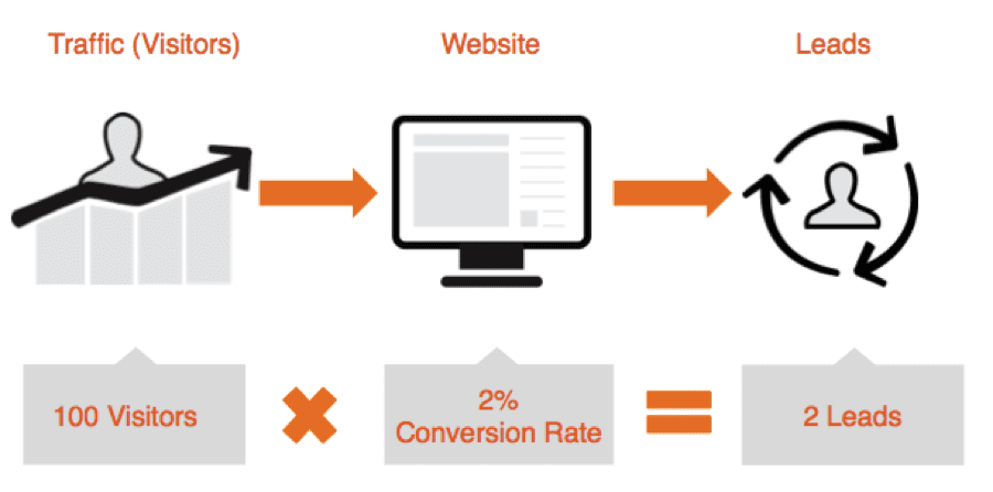
B2B companies used to function as online brochures making no attempts at generating leads or promoting scope for business development, not anymore. This is one of the most dreadful website redesign mistakes to avoid in improving your business’s scope. Recently, B2B companies have been coming to the forefront and upping their game by investing in redesigning their website to establish their brand’s credibility.
This, in turn, helps convert casual visitors to your website into potential clients interested in investing in your products and amenities. Refraining from moderating your website to generate leads for your business is one of the main website redesign mistakes to avoid. The primary agenda of the content you put up on the web and all the time, effort, and money put in to do the same should have a specific payback and make the desired contribution to your business’s end.
Website Redesign Mistake #9: Not Designing A Functional And Mobile-Optimized Website
Designing an optimized website to look appealing and work efficiently on a set of different browsers, OS, and devices is imperative to ensure that consistency is maintained throughout. A well-designed and functional website works uniformly and seamlessly on all operating systems, devices, and browsers. It is not optimized to suit the needs of a single browser or system. To avoid these common website redesign mistakes, platforms like LambdatTest come into the picture.
Perform responsive testing of your website. Try LambdaTest Now!
Website Redesign Mistake #10: Not Setting A Realistic Launch Date
Setting a date comes after we have become familiar with what we are doing and using to accomplish that, and how much do we have in our pockets? Once these three questions have been answered, the next question we automatically ask is, when do we need to launch the website? This is essential, as businesses often have tight constraints and fixed deadlines for meeting their target.
For example, an eCommerce company would want a launch date before any festive season, considering the user number would spike up. However, the problem is that there are too many variables to be considered while setting up a launch date. Such website redesign mistakes can be avoided by looking at the calendar. Another mistake you must avoid is making a change that your team needs help handling.
For example, what if it is necessary to design the new front-end in Vue.js, but only one person in your team knows about it? And in the worst-case scenario, he, too, is not an expert! Like any other software, a website would go into numerous testing and debugging phases that would successfully consume a considerable amount of time; keep that in mind.
Numerous other factors are also vital, from the planning until the website’s launch. Hence, setting an unrealistic launch date will either make the website suffer in terms of quality, or you might have to settle for less than your expectations. Therefore, it is advisable to start as early as possible and set a realistic date for the website’s relaunch. This will allow them to learn the practical applications of the technologies and make the overall process a smooth ride.
Website Redesign Mistake #11: Not Analyzing Previous Version Analytics And Feedbacks
Analytics services provide detailed reports about website analysis. The most famous example is Google Analytics. Like feedback (a way for anyone to improve themselves), analytics helps determine how much your website’s strong and weak points are.
This is an essential aspect of a website redesign. When you are new to the business, you do not know what people like in what area of the world, what type of users visit your website most, etc. A detailed analysis of the target audience will help you gain more transparency regarding functional areas and improvements to your website’s design for a better user experience.
Website redesigning should be done, considering that your weak points should vanish with this deployment. Hence, when you are redesigning, you already have this data type in your hand to analyze. These website redesign mistakes are huge to overlook such data and not work on it with the teams.
Website Redesign Mistake #12: Not Testing Enough
Now that we have crossed the development phase without any lapses, we can begin testing. Web testing is an indispensable step, given that there is no shortage of devices that are either different physically or from the inside. Regression testing, usability testing, and A/B testing are just a few, as other goals demand different testing types.
One of the most extensive website redesign mistakes teams make is taking a redesigned website for granted and not performing website testing rigorously. I have talked to some testers in this regard, and the most popular opinion is that a redesigned website possesses the same logic as the previous one.
So, why should you bother to check the functionality rigorously? There are better approaches than this, and it is an unforgivable blunder in the redesigning part. Many things can go wrong, such as cross browser compatibility. Therefore, always test your website with an equal commitment to optimize and make it bug-free for your audiences.
Website Redesign Mistake #13: Not Deploying After The Initial Launch
One of the common website redesign mistakes is to stop here, thinking that all the work is done. In our website redesign journey, we have come across planning, deciding on the tech, setting a launch date, etc. Now that we are done with the complete procedure and have tested it thoroughly, we deploy the website and push it onto the internet for the people to see.
After publishing the website, analyzing the early feedback and analytics received on the tools is essential. Every website is flawed, and no software stands the rage of time. With time, technologies and people’s perception keeps changing, which requires us to modify and optimize our website for better engagement from the user. Therefore, always keep your eyes on the feedback and work on improving these areas.
Website Redesign Mistake #14: Neglecting SEO and using Ineffective CTAs
Search engine optimization (SEO) should be considered while redesigning a website to ensure potential customers can find it quickly and easily. When SEO is addressed, a website may rank well in search results, making it challenging for potential customers to find it and decreasing the effectiveness of marketing initiatives.

While rebuilding the website, it’s crucial to consider SEO variables like keyword research, on-page optimization, and technical SEO to avoid making this error. This can involve changing the page names and meta descriptions, speeding up the website, and ensuring it is mobile-friendly.
An ineffective call to action (CTAs) can negatively impact a website’s performance. All websites need CTAs to persuade users to perform a desired activity, such as purchasing or completing a form. However, using CTAs that could be clearer, more concise, or more descriptive might lead to a reduced conversion rate and missed opportunities. It’s critical to specify the desired actions for each page in detail and ensure that CTAs are obvious, visually appealing, and simple to grasp to avoid making this error. This may entail employing action-oriented language, emphasizing advantages, and creating a sense of urgency.
Businesses can enhance the user experience, boost conversion rates, and increase traffic to their website by emphasizing SEO and improving CTAs. Therefore, avoiding such common website redesign mistakes is essential while working with SEO practices.
Website Redesign Mistake #15: Excessive images with minimal text
One of the typical website redesign mistakes that can harm the user experience and SEO is using too many images and short text. It can be challenging for a website to rank effectively in search engine results pages if there is an excessive reliance on photos and little text. This is because there won’t be enough material for search engines to scan (SERPs). The website’s visibility and traffic may decline.

As a result, they are decreasing the effectiveness of marketing initiatives. The overuse of graphics can also impact user experience, particularly for users with slow internet connections. Big, high-resolution photos are slow to load, which can be annoying and result in high bounce rates.
It’s crucial to balance visual appeal and text content to avoid making website redesign mistakes. Pictures should be strategically and intentionally employed and accompanied by enough text to give search engines context and relevance. Including pertinent keywords into picture file names and using descriptive alt tags for images are two examples of how to do this. Photos should also be optimized for web use with the proper file sizes and compression to reduce load times.
Website Redesign Mistake #16: Complex Website Navigation
Among various website redesign mistakes, the one that negatively affects user experience and overall efficacy is complex website navigation. Users anticipate being able to swiftly and efficiently find what they’re looking for when they visit a website. Visitors may grow frustrated and leave a website if the navigation could be more straightforward, precise, or easier to use, resulting in missed opportunities and decreased engagement.

Several factors contribute to complex website navigation, including overly convoluted menus, ambiguous labeling, and hidden navigational components. This can be particularly problematic for websites that contain a lot of material or a variety of goods or services, as users may need help discovering what they’re looking for.
While rebuilding a website’s navigation, it’s crucial to put the user experience and usability first to avoid making this error. Clear labeling, hierarchical arrangement, and intuitive, uncomplicated navigation should exist.
For visitors to locate what they’re looking for more quickly, this can involve having a straightforward and uncomplicated menu structure, adding breadcrumb trails, and including search capabilities. Businesses can increase website usability, engagement, and conversion rates by prioritizing user experience and mobile responsiveness.
With the growing usage of mobile devices, it has become necessary to ensure that your website works properly on all devices, whether Android, Windows, or iOS. In this need for testing, LambdaTest offers Real Device Cloud that allows developers and testers to test their websites and native applications over a wide range of real mobile devices.
LambdaTest is an intelligent unified digital experience testing cloud that helps businesses drastically reduce time to market through faster test execution, ensuring quality releases and accelerated digital transformation. The platform allows you to perform real-time and automation testing across 3000+ environments and real mobile devices, making it a top choice among other cloud testing platforms.
All you need to do is follow these simple steps to get started with LambdaTest:
- Sign up for free or log in to your LambdaTest account.
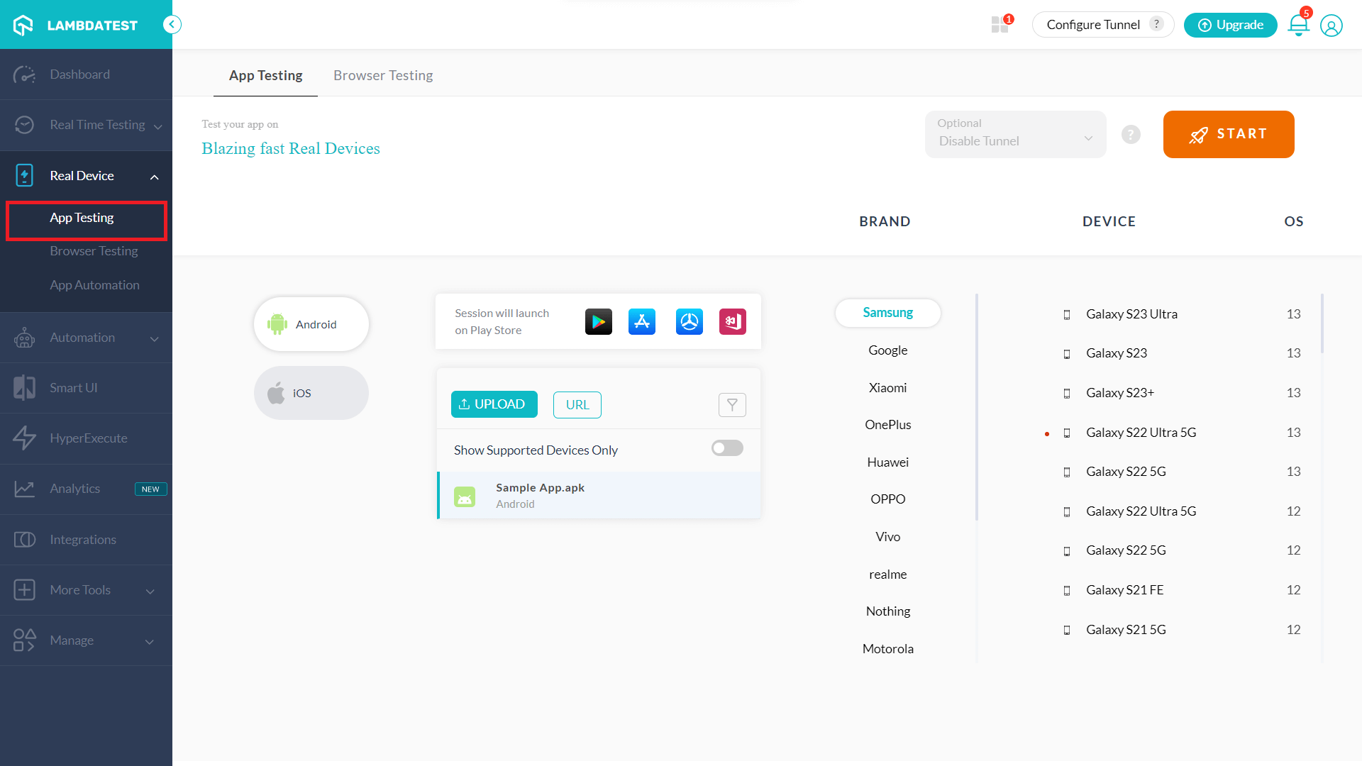
- You will get the below modal box. Click on the Real Device Testing card.
- Simply upload your .apk & .ipa files directly or Install/Import from Google Play Store, App Store, App Center, and Test Flight! And Select the required brand, device, and OS on which you wish to test your website. Click on START to launch the test.

You can also watch the video below to learn how to test your websites on mobile devices with the LambdaTest platform.
You can also subscribe to our LambdaTest YouTube Channel to learn about testing frameworks like Selenium, Playwright, Appium, and many more.
Website Redesign Mistake #17: Compromising user experience for aesthetics
Businesses frequently make the mistake of sacrificing user experience for aesthetics when updating their websites. Although aesthetics and visual appeal are crucial, the user experience must always come first.

Using huge graphics, animations, or movies that may be visually appealing but take longer to load is one of the most frequent website redesign mistakes companies make. Poor user experience can result from slow loading times, and users may leave the website before it fully loads. The website’s usability as a whole may be harmed by having too many photos or videos, which can make it challenging for users to access the information they need.
Businesses also commit the error of using convoluted navigation menus or obstructing essential information with excessive clicks. Visitors may need help finding what they’re looking for, leading to high bounce rates and low engagement.
Organizations should put the customer experience first when redesigning their website to avoid making such website redesign mistakes. They should concentrate on building a user-friendly, aesthetically pleasing website. This can be accomplished by employing straightforward menus for navigation, high-quality graphics and videos that load quickly, and ensuring that critical information is clearly and easily accessible.
Wrapping Up!
Having an appropriate and well-designed website is something every business aspires to achieve. But in today’s changing world, nothing is constant, and your website redesign is no exception.
Today, a website’s life has been reduced to a mere few years as new trends and technologies keep coming. Since a website is your business’s face, it needs to be leveled up with the market trends leading us to redesign our websites. But redesigning your website will not serve you if you make these website redesign mistakes mentioned in this article.
So remember these website redesign mistakes and try avoiding them at all costs to avoid bad repercussions while redesigning your website in 2023. And now we want to hear from you. Are there any other recent website redesign mistakes you have encountered? If Yes, please leave a comment below.
Frequently Asked Questions (FAQs)
What makes a poorly designed website?
A poor design can hurt your brand’s identity. Some common factors include cluttered layouts, confusing navigation, slow page load times, unresponsive design, and poor quality or irrelevant content. These factors can be challenging for users to navigate and interact with the website leading to a high bounce rate and decreased user engagement.
Why should a website avoid a complete redesign?
When redesigning a website, starting fresh with a new design can be tempting. However, a complete redesign can have significant drawbacks, including the potential for lost traffic, loss of SEO rankings, and user confusion. Instead, consider making incremental updates and improvements to your existing design by focusing on user experience.
What are the disadvantages of a website redesign?
A redesign can be costly and time-consuming and may result in lost traffic and reduced SEO rankings. Additionally, it can cause user confusion and frustration if it significantly changes the layout or functionality of the website. However, planning and executing a redesign can mitigate these risks and ensure a successful outcome.
What causes website designs to fail?
Your website’s design can fail for many reasons, including poor user experience, ineffective navigation, and slow loading times. Major failure happens when website design aligns differently with the brand’s identity or fails to communicate the message to customers effectively. Therefore, it’s essential to understand your brand’s identity and goals before designing a website.
Got Questions? Drop them on LambdaTest Community. Visit now


