What Are Variable Fonts: A Complete Tutorial With Examples
Nikhil
Posted On: June 6, 2019
![]() 182176 Views
182176 Views
![]() 18 Min Read
18 Min Read
One of the key cornerstones of Modern web design is Typography. For those who are aware of the eminence of typography in web experience, no explanation is necessary. For those who don’t, no explanation would suffice. While the web is entering a new, exciting and uncharted domain, web fonts have remained static and stagnant since time immemorial. That all changed with the arrival of ‘Variable Fonts’ which have revolutionized the way we see and interact with web fonts. Variable Fonts have unleashed a whole new world of creative possibilities along with enhancing website’s readability, accessibility, performance, flexibility, and responsiveness. Developers no longer need to rely on standard static fonts bound with fixed design limitations but rather embrace variable fonts to unlock thousands of typographic variations along with font animations and creating unique custom font styles.
Variable fonts are part of ‘OpenType’ specification originally developed as a joint collaborative project between the 4 major giants – Apple, Microsoft Adobe and Google. The key concept behind variable fonts is to utilize unlimited font style variations of a specific typeface by relying on just a single font file. This allows a developer to fully utilize the potential of RWD(responsive web design) by modifying or animating the typeface based on device viewport, device type, device orientation, mouse events, etc. On the contrary, standard static font requires separate font files for each font style, resulting in dreadful site performance.
In this article, we will explore what variable fonts are, their advantages over static fonts, how to use them in your web pages and how to add necessary static font fallbacks for unsupported browsers by leveraging the power of Lambdatest Cross browser compatibility Cloud tool.
Problem With Traditional Static Fonts
Before diving deeper into variable fonts, here is a small excerpt that explores the limitations and problems that you would encounter while using traditional static fonts. Let’s say for your next web project, you need to select two static font typefaces – ‘Roboto’ for headings and ‘Open sans’ for paragraph texts. You are essentially selecting a ‘font-family’. A font family, in turn, comprises of various ‘font-styles’ – variations based on different font weight and italics.
In our example case, let’s assume you require the following font style variations –
- ‘light 300’
- ‘regular 400’
- ‘semi bold 600’
- ‘bold 700’
- ‘regular 400 italic’
You would need to download separate files for each of the font styles (or use google fonts embed link), for both the typefaces – ‘Roboto’ and ‘Open Sans’. As you can see in the image below, Google fonts will display a warning alert, indicating a poor load time for our test case needs. This will in turn adversely affect your website’s performance. The load time indicator will keep dropping from fast to moderate to slow as we keep adding different font styles. Slower load time would indicate low ranking on Google SERPs(Search Engine Result Pages). Wondering why? We have explained it in great detail in our blog where we talked about the importance of testing a mobile website.
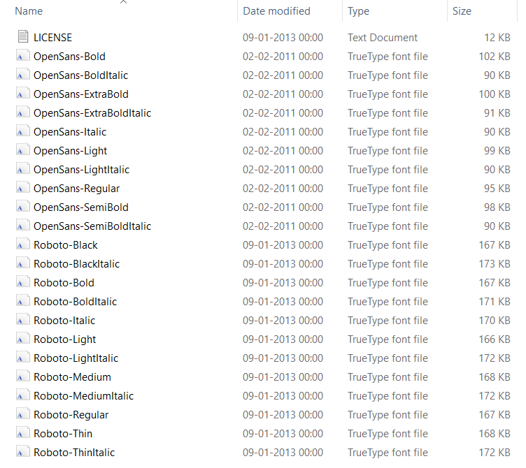
Although ‘Roboto Medium’ and ‘Roboto Bold’ are very similar and belong to the same font family, each one of them has its own independent font file.
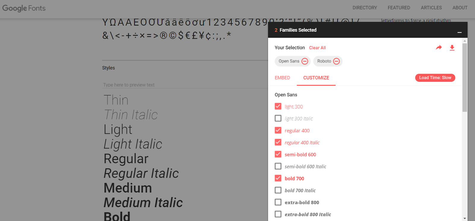
As per our example case for ‘Roboto’ and ‘Open Sans’, you would end up needing 22 files with the combined size of approximately 3mb! These font files are downloaded by every visitor’s browser on your website to accurately display the text with the intended font face. This causes a surge in website load time and would create a frustrating user experience for any visitor especially on a slower mobile connection.
CSS stylesheets, JavaScript files, plugins, images, videos, analytics trackers and other dependencies contribute to the size of the website which is directly proportional to the loading speed. A website’s loading speed is arguably the biggest performance factor for SEO(Search Engine Optimisation) and user experience. Therefore, developers in their quest to optimize their websites come to a compromise to let visual appearance suffer in favor of better performance and usually restrict themselves to a couple of font faces and not more than 3-4 font styles as each additional font file is a burden on the page performance.
Traditional static fonts have zero flexibility and are bound with limited number of fixed font styles like ‘light’, ‘regular’, ‘regular-italic’, ‘semi-bold’, ‘bold’, ‘extra-bold’. For example, ‘open sans’ font family has just 10 styles compared to ‘Roboto’s’ 12. Some font families like ‘Lobster’ and ‘Abril Fatface’ have just a single font style available. This is where variable font comes to your rescue unlocking the possibility for developers to use potentially thousands of font style variations from a single file without compromising on performance.
What Are Variable Fonts?
A Variable font comprises of an entire typeface or commonly known as font family in a single font file instead of having separate font files for every font style variation. By the help of CSS @font-face and style rules, thousands of different font weight, width and style permutations can be created. Moreover, unlike static fonts, variable fonts supports CSS transition and animation properties that help to achieve smooth and fluid shifting animations between various font styles. Variable Fonts also offer the ability to create a custom font style. This is quite useful for creating unique branding and Logo designs that can set your designs apart from the rest. Are you aware of the top 17 UI Design mistakes that lead to failure of your website?
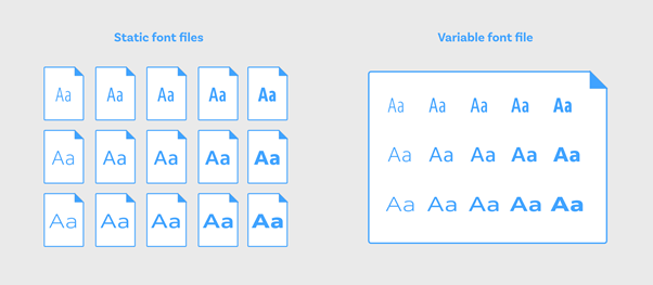
You must note that although the size of a variable font file is slightly larger compared to the traditional static font file, on a whole a variable font offers much better efficiency. Taking into consideration that on an average, you would require at least 4 to 5 font style variations for each font family, a single variable font file size is significantly smaller than the combined size of 4-5 static font files.
As far as the history of variable fonts are concerned, and how it came into inception, this feature was part of ‘OpenType’ font format version 1.8 specification released in 2016-17 by the collaboration of one of the biggest giants in design and web space – Microsoft, Apple Google, and Adobe. OpenType format is an extension of TrueType format, therefore has “.otf” or “.ttf” extension.
How Do Variable Fonts Work?
The key notion behind Variable fonts is the concept of “Axes of Variations”. These axes control all the aspects of the font style – how bold or light the font letters are, how wide or narrow the letters are or whether the letters are italic or not. OpenType Font specifications define 2 kinds of Axis of variations –
- Standard Axes of variation
- Custom Axes of Variation.
Standard Axes of Variation
OpenType specs defines 5 standard Axes of variations, each represented by a 4 character long tags tags comprised of small case letters-
- Weight “wgth” Axis: Controls the variable font’s weight. The value can vary from 1 to 999. The value is controlled using the font-weight CSS property.
- Width “wdth ” Axis: Controls the variable font’s width. The value is in % and can usually vary from 0% to 100%(or higher). Higher values like for example 120% or 150% will be adjusted to the highest permitted value as defined by the font. The value is controlled using the font-stretch CSS property.
- Slant “slnt” Axis : Controls the variable font’s slant. The value is in deg and can vary from -90deg to 90deg. By default set to 20 deg. The value is controlled using the font-style CSS property set to oblique.
- Italics “ital” Axis: controls whether the variable font is italics or not. The value is controlled using the font-style CSS property set to ‘italic’ or ‘none’. In order to avoid confusion with the slnt axis, set font-synthesis: none;
- Optical-Sizing “opsz ” Axis: controls the variable font’s optical sizing. The value is controlled using the font-optical-sizing property CSS property set to either ‘auto’ or ‘none’. Optical Sizing comes into play if you wish to increase or decrease the overall stroke thickness of letters based on the overall font size.
Apart from defining the values of the standard axis of variations using font-weight, font-style, font-stretch, and font-optical sizing properties, there is another way that we will discuss in a moment.
Custom Axes of Variation
OpenType Spec allows you to define as many custom axis of variation as you like. The one key difference to remember is that unlike Standard axes of variations which are defined by using 4 characters long tags of small letters, the Custom axis of variations is defined by using Capital letters.
For example, a variable font called ‘Decovar’ has a custom axis of variations –
- SKLA: Inline Skeleton
- BLDA: Inline
- TRMA: Rounded
- SKLD: Stripes
As discussed above there are 2 ways of defining values for axes of variations at your disposal for implementing variable fonts –
1. Using CSS properties associated with each axis – font-weight, font-stretch, font-style and font-optical-sizing properties.
2. Using “font-variation-settings” property
Second way to define font variation axes for implementing variable fonts is by using a new property called – “font-variation-settings”, introduced by W3C as part of CSS Font Modeule Level 4 recently.
Syntax for the new property is
font-variation-settings:‘wgth’ <value>, ‘wdth’ <value>, ‘ital’ <value>, ‘slnt’ <value>, ‘opsz’ <value>, ‘PROP’ <value>,…… ;
Here is an example below –
Note: Standard/Registered Axes of variations can be defined using both the methods while Custom Axis of variations can only be set using the second method.
Differences between the 2 methods –
-
- Values for ‘font-optical-sizing’ is ‘auto’ or ‘none’. This property can only be used to turn off or turn on optical-sizing. However if you are using the second method – ‘font-variation-settings’, you can add a numerical value. For example –
-
- You do not need to add a % symbol when setting the value of ‘font-stretch’ when using ‘font-variation-settings’. For example –
-
- Value for ‘font-style’ italics is either ‘none’ or ‘italic’. However if you are using ‘font-variation-settings’ property, the value can be either ‘0’ or ‘1’. For example –
-
- You do not need to add a deg symbol when setting the value of ‘font-style’ slant when using ‘font-variation-settings’. For example –
Both methods will result in the same output. However, as per W3C recommendations, it is advised to use the first method – font-weight, font-stretch, font-style and font-optical-sizing properties over the second method – “font-variation-settings” for controlling values of the five standard axes of variations. This helps browsers to comprehend and have an insight into the meaning of all the font variations and apply it to other formats as well. However, as discussed above, for controlling custom axes of variations, font-variation-settings property is necessary.
Cross Browser Compatibility Support For Variable Fonts
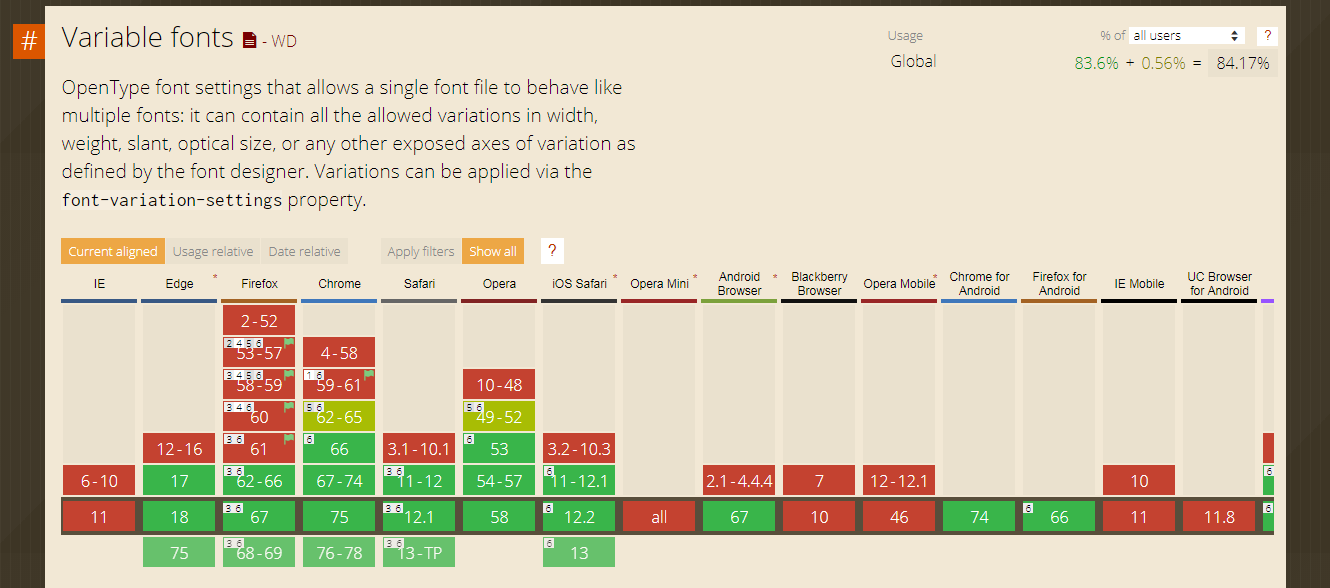
As of June 2019, variable fonts are supported by 84.17% of user browsers worldwide. The current versions of all major browsers provide full support for this feature with the only exception being the much-dreaded Internet explorer which is notorious for its poor browser support. Among desktop browsers – Microsoft edge 17+, Google Chrome 66+, Firefox 62+, Safari 11+, Opera 53+ while among mobile browsers – Chrome 74, Firefox 66, iOS Safari 11+ and Android browser 67 provide support for Variable fonts. There are no polyfills or other fixes to provide cross browser compatibility for variable fonts. If your website visitors are still using IE or older browser versions then variable fonts might not be your cup of tea. However, by using @supports CSS feature queries, you can provide fallbacks for unsupported browsers to ensure a uniform experience to a certain degree.
How LambdaTest Can Help In Cross Browser Testing?
LambdaTest is a cloud-based, cross browser testing tool which offers 2000+ browsers & browser versions to help you ensure how well your website fares across different desktop, & mobile browsers. It offers numerous services for web-app testing these include:
- Responsive website testing
- Automated bulk screenshot testing across different browsers
- Visual regression testing for a pixel to pixel comparison
- Selenium Grid to help you perform automated cross browser testing
- Live-interactive cross browser testing experience using virtual machines running on cloud. This service is called “Real-time testing” at LambdaTest. I will be making use of this service offered by LambdaTest to interact with different browsers in real-time for validating cross browser compatibility of variable fonts.
With that said, let’s head back to performing animation using variable fonts.
Incorporate Variable Fonts Using CSS @font-face Rule
To incorporate variable fonts in your stylesheet, use the CSS @font-face rule which allows you to load any custom fonts on a webpage. You must first define a name for the font followed by the source and font format followed by value range for each variation axis. For example:
Note that standard static fonts have formats “truetype” or “woff”/”woff2”. In order to distinguish between static fonts and variable fonts set font format to either “truetype-variations” or “woff2-variations” indicate the browser that it is a variable font. Majority of variable fonts would have .ttf format. However, it is recommended to use .woff or .woff2 formats for better performance and smaller sizes. You can convert your fonts to woff2 using the popular google command line tool here.
Below is an example code for incorporating a variable font named “Amstelvar”. You can alter the values of “wgth” weight, “wdth” width, and “opsz” optical sizing axis either by using axis CSS properties or by using font-variations settings.

Animating Variable Fonts
Variable fonts can be used to create creative font animations. There are two ways to achieve this task –
- CSS transition property
- CSS @keyframes animation rule.
As stated earlier, I will demonstrate both of them below using LambdaTest, a cross browser testing cloud to show these animations of variable fonts over different browsers.
Animating Variable Fonts Using CSS Transition Property
CSS transition property can be used in cases when font animation is linked to an event like a mouse click or mouse hover. The code snippet below is an example of how to animate the variable font ‘Amstelvar’ using CSS transition property when the mouse cursor has hovered over it. When the text class ‘heading-3’ is hovered, the ‘wgth’ weight axis value is changed from 300 to 999, ‘wdth’ width axis value is changed from 40% to 70% and ‘opsz’ optical-sizing axis value is changed from 0 to 70.
Now, let us perform cross browser testing to evaluate the difference of rendering between Opera & IE 11. Note that variable fonts are supported in the desktop version of the Opera browser but not in Opera mini which is meant for mobile. Below I am comparing the cross browser compatibility difference between desktop Opera & IE11 using LambdaTest.
First, we have a look at Opera Desktop version 61 Dev.
Now, we have a look at Internet Explorer 11.
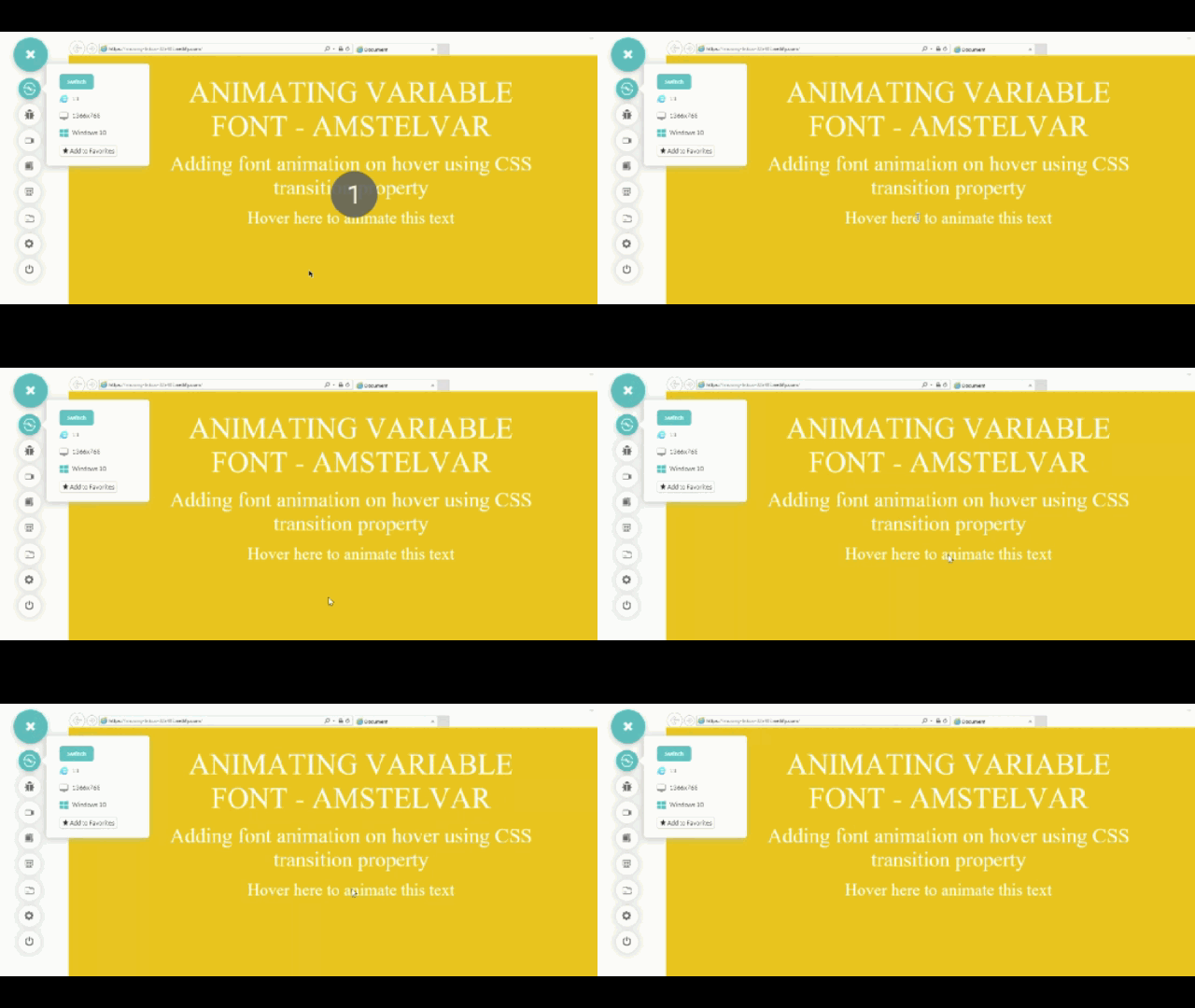
After performing cross browser testing, we ensured that the CanIUse table represented above holds correctly with respect to variable fonts implementation across different browsers.
Animating Variable Fonts Using CSS @keyframes Rule
Apart from CSS transition property, there is another way to animate Variable Fonts using @keyframes animation rule. The code snippet below is an example of creating an infinite animation with an animation duration of 3s changing the ‘wdth’ width axis value from 100 to 600.
Time to perform cross browser testing and see how our code works across different browsers. In this example for variable fonts, we will compare IE 11 with Safari, running on Windows 10 & macOS Mojave respectively.
First, we have a look at Safari Desktop Mac mojave.
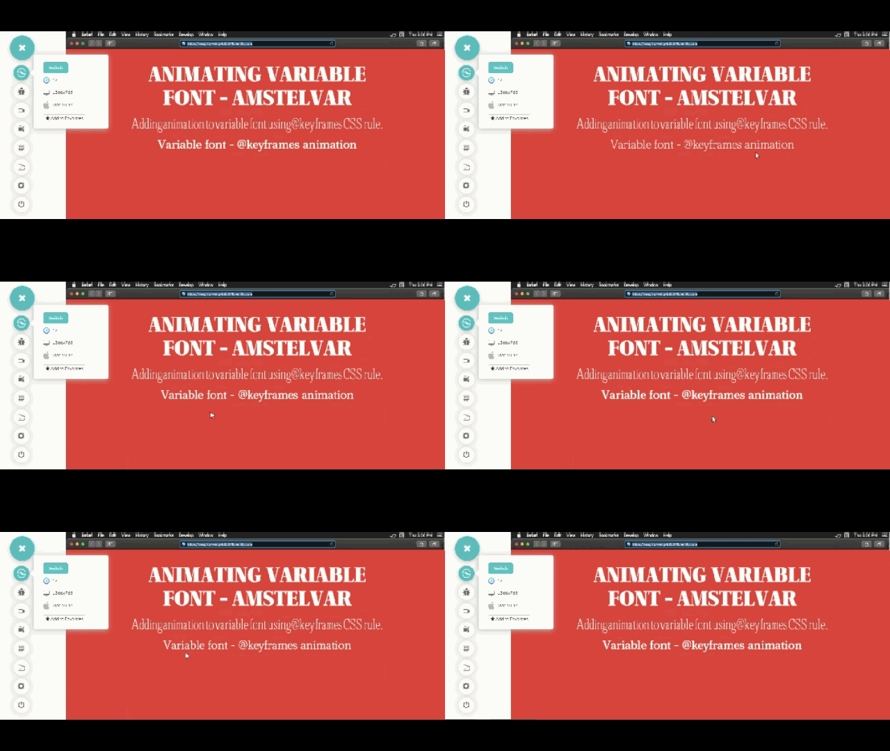
Now, we have a look at Internet Explorer 11.
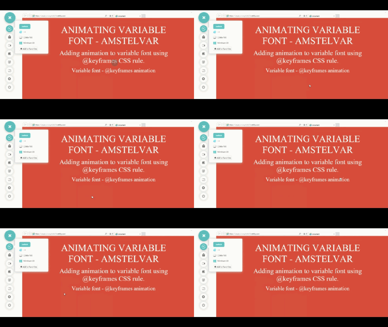
You may not be certain if variable fonts are the right call for your website. However, after performing cross browser testing for variable fonts, you are certain that they won’t be working for website visitors who are using IE 11 or below version.
So what can you do if font variables won’t work for you? If your a considerable amount of visitors on your website are coming through Internet Explorer, how can you present them with well-designed font variations? Don’t worry, I have got a solution for you.
Fallbacks For Unsupported Browsers
The easiest way to provide a fallback for variable fonts in unsupported legacy browsers like Internet Explorer or mobile browsers like opera mini and UC browser is to provide two file versions of the same font inside the @font-face Rule. The first version is the variable font file having a ‘woff2-variations’ or ‘truetype-variations’ format while the second file is the traditional static font file having a ‘woff’, ‘woff2’ or ‘ttf’ format. Without providing static font format, variable fonts will not render on an unsupported browser.
, For example, one of the most popular variable fonts ‘IBM Plex’ is available in both variable and static font formats. If you want to have a fallback for IBMPlex with two font-styles having font-weights 400 and 700 in unsupported browsers, add the following code –
Browsers which provide support for variable fonts feature will download the ‘woff2-variations’/ ‘truetype-variations’ font format while those browsers which don’t support this feature will download the ‘woff’, ‘woff2’ or ‘ttf’ formats as specified inside the @font-face rule.
To make sure that browsers download the correct font format as intended based on their feature support, make use of @supports CSS feature queries as shown below –
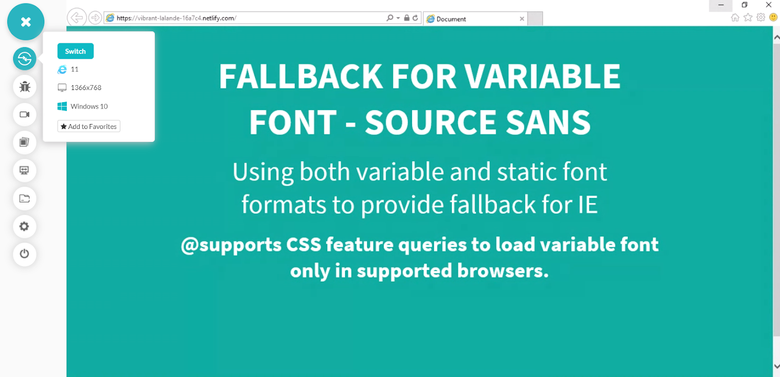
Here is another example using the variable font ‘Source Sans’ by Adobe. I will once again use LambdaTest Cross browser compatibility test tool to view my webpage with variable font on modern browser like Chrome and test for fallback static font on an unsupported browser like Internet Explorer 11. Links for – SorceSans Variable and SourceSans Static. Download the ‘.ttf’ formats of both versions.
Let’s perform cross browser testing and observe if our fallbacks are working as we thought it would. This time I will be comparing cross browser compatibility difference between Chrome 75 beta & IE 11.
First, we have a look at Chrome Desktop version 75 Beta.
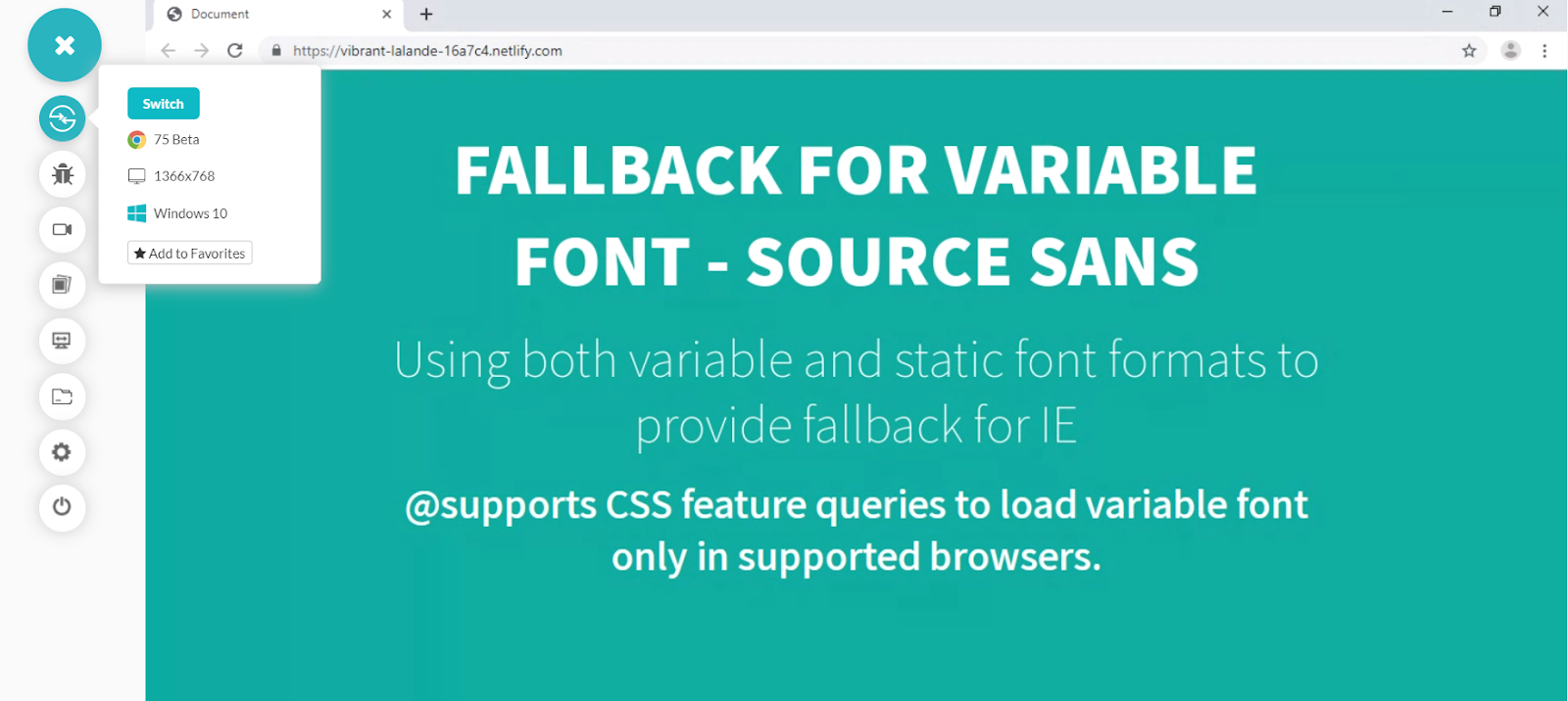
Now, we have a look at Internet Explorer 11.
If you want to learn more about feature detection using @supports CSS feature queries, you can refer to my previous blog on CSS feature detection for cross browser compatibility.
Resources
There are two amazing tools that I would recommend where you can discover, play along and experiment with variable fonts before incorporating them into your project.
Although the selection of variable fonts at your disposal at the moment is not that large compared to traditional static fonts. But the selection is growing by the day and is well poised to expand in the future. For ensuring better performance and visual aesthetics, this is a small trade off.
We also used a cross browser testing tool – LambdaTest to test our website in old legacy browsers and check whether your fallbacks and polyfills are working properly or not.
500,000+ users rely on LambdaTest for their cross browser testing needs. Start testing for free.
Should You Choose Variable Fonts Over Static Fonts For Your Website Or Web App?
A lot of developers might be hesitant to try out variable fonts because of its perceived lack of universal cross browser compatibility support. However, as discussed above, this perception is rather deceptive. With the exception of Internet Explorer, all other major browsers including Microsoft Edge offer complete support for this feature. Variable Fonts present a whole new world of exciting possibilities for developers to explore and is one of the most exciting additions to CSS in recent times. Having the ease and liberty of using thousands of different font styles from a single file, along with the ability to animate and add transforms to your fonts has pushed typography to the forefront of web design once again. Here are the top 19 Typography tips for mobile web that will change the way you design. Last but not least, keep an eye out for newly emerging web design trends as variable fonts continue to gain traction in the developer community. Cheers!
Got Questions? Drop them on LambdaTest Community. Visit now


