Top 20 CSS Toggle Switches [2024]
Harish Rajora
Posted On: March 7, 2024
![]() 91095 Views
91095 Views
![]() 7 Min Read
7 Min Read
When it comes to building a responsive design, web designers face different challenges. One such challenge is choosing between toggle switches, checkboxes, or radio buttons. However, using toggle switches is a far better choice, as it allows you to select between opposite modes, such as on/off, turning on a light bulb, turning off a microwave, and so on. CSS toggle switches are an excellent technique to increase website responsiveness, functionality and include micro-interactions.
By incorporating CSS toggle switches in the websites and web applications, you can certainly keep your visitors engaged. A central concept in mobile devices, toggle switches are extremely UI friendly and uplifts a web page’s confidence in front of its users.
In this post, we look at what CSS toggle switches are, how to construct a basic CSS toggle switch, and the best CSS toggle switches examples.
Let’s begin!
What Are CSS Toggle Switches?
The CSS toggle switch is a front-end concept of defining a checkbox in a UI-rich method that works as a toggle between anything you want. For example, you can use the toggle switch to toggle between the dark theme and light theme, or you can use the toggle switch as a “Yes or No” answer for a question. A recent one of the CSS toggle switches examples are shown below:

There are no written rules or restrictions on using the CSS toggle switches. As a result, it can be used for absolutely anything you want to do with your websites (or web applications).
How To Create A Basic CSS Toggle Switch?
This section will discuss the basic elements of web design involved in the CSS toggle switches and how to combine them to construct one.
First of all, a toggle switch is a checkbox element which got a makeover. A plastic surgery, perhaps. Abiding by the rules of a checkbox, you can use the toggle switch for binary associations only. These may include “Buy or Sell,” “Yes or No,” “Left or Right,” “Day or Night,” and so on.
Below is the source code for constructing a checkbox.
|
1 2 |
<input id="toggle_switch" name="toggle_switch" type="checkbox" /> <label for="toggle_switch"></label> |
We will hide the checkbox from the display as we don’t need people to see it in the front-end even though we need to know about its current stage for toggling.
|
1 2 3 4 5 6 7 |
<style> input[type="checkbox"] { width: 0; height: 0; visibility: hidden; } </style> |
Now we have an empty web page at the display and a checkbox in our code. As a next step, we design the toggle box and connect it with our checkbox.
The following code will help you get a head start.
|
1 2 3 4 5 6 7 8 9 10 |
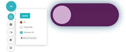
label { display: block; width: 450px; height: 150px; background-color: #551759; border-radius: 100px; position: relative; cursor: pointer; transition: 0.5s; box-shadow: 0 0 50px #477a85; |
The output of the code looks as follows:
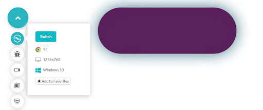
You can design this label in any shape and color you want. The above code runs on an AI-powered test orchestration and execution platform – LambdaTest. LambdaTest can help you render websites and web apps quickly on many browsers, browser versions, operating systems, and resolutions. Hosting such a collection aims to help developers ensure their web applications are consistent across various platforms. So you can give it a try and experience the features it offers.
We are now ready with the space that will act as toggle boundaries on our web page. Here we need a beautiful button on it and move it across each end. To make that element, knowledge of pseudo-elements. is necessary. If you want to recall pseudo-elements and their work, you can refer to our ultimate CSS selectors cheat sheet blog.
The following code creates a different colour shape inside the label:
|
1 2 3 4 5 6 7 8 9 10 11 |
label::after { content: ""; width: 120px; height: 120px; background-color: #cca5cf; position: absolute; border-radius: 70px; top: 15px; left: 15px; transition: 0.5s; } |
The output would look as follows:
We can mix CSS animation to let the browser know we intend to move this smaller element inside to the other end.
|
1 2 3 4 |
input:checked + label:after { left: calc(100% - 15px); transform: translateX(-100%); } |
To know more about calc function, refer to our blog fluid typography with CSS clamp.
The combined code now produces the animation, as shown below.
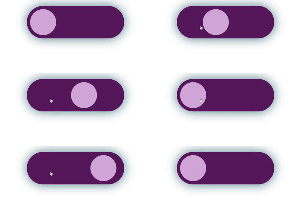
Like how I connected animation to the checked input button in the above demonstration, you can connect JavaScript and perform the necessary actions. In the next section, we will see some attractive examples of the CSS toggle switches.
CSS Toggle Switch Examples
In this section, let’s see some of the top CSS toggle switches.
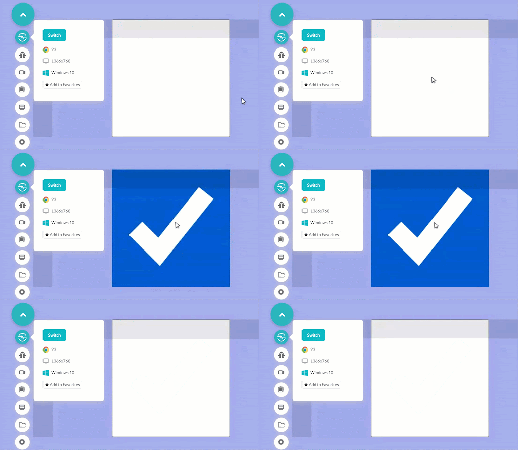
1. The Checkbox Toggle Switch
See the Pen
Untitled by Harish Rajora (@harishrajora)
on CodePen.
Output:
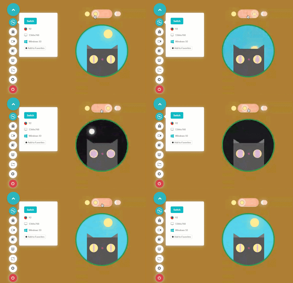
2. Cat CSS Toggle Switch – Day And Night
See the Pen
Untitled by Harish Rajora (@harishrajora)
on CodePen.
Output:
3. Physical Button Type CSS Toggle Switch
See the Pen
Toggle Switch 3 by Harish Rajora (@harishrajora)
on CodePen.
Output:
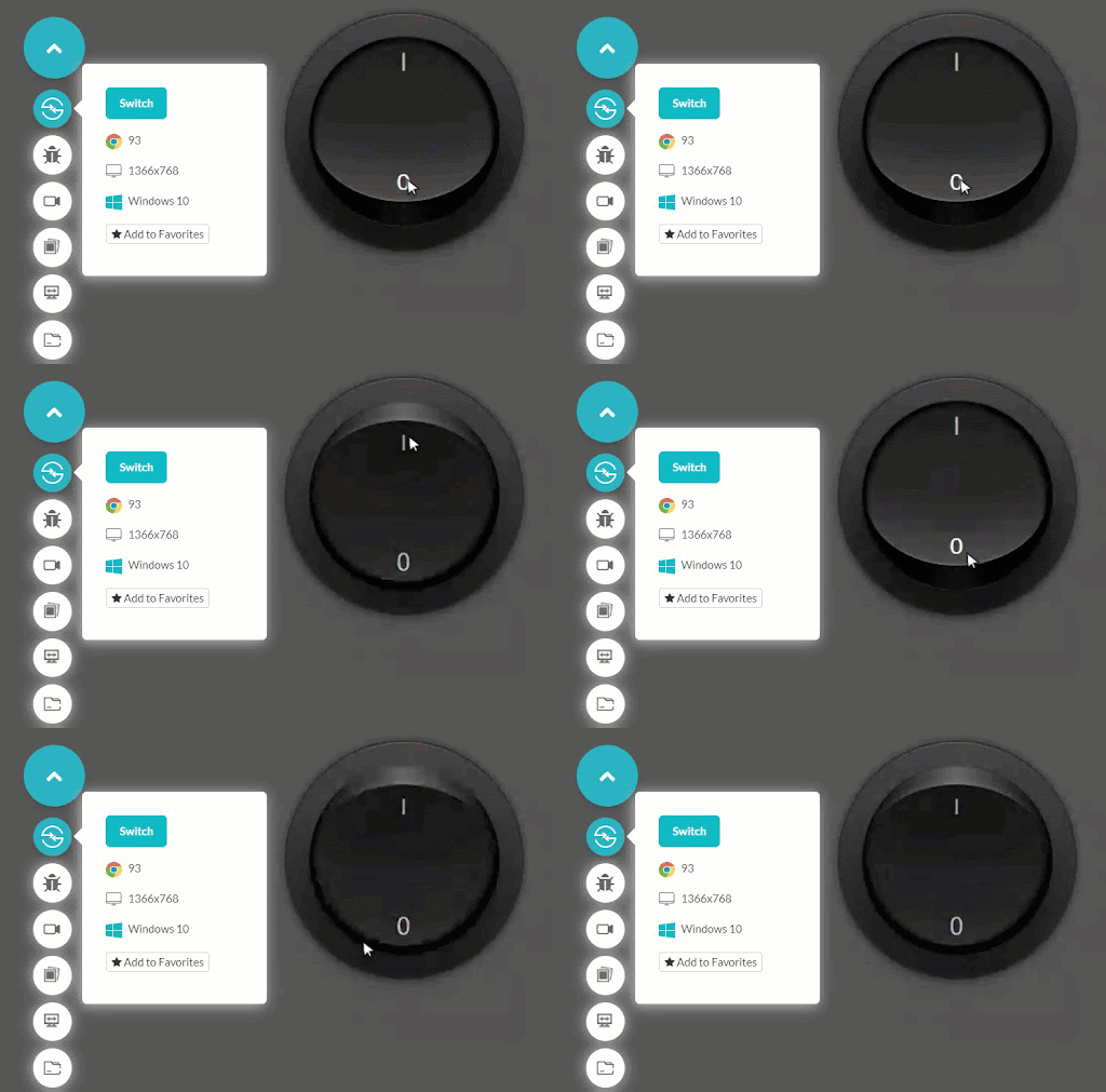
4. Rolling Ball CSS Toggle Switch
See the Pen
Untitled by Harish Rajora (@harishrajora)
on CodePen.
Output:
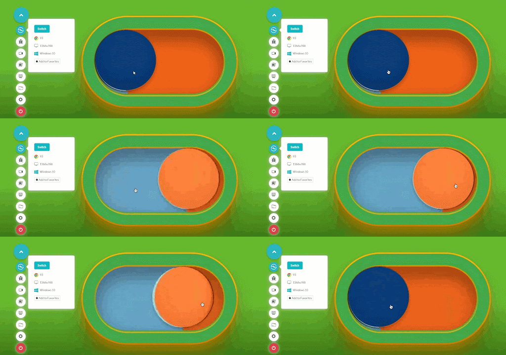
5. Gender Symbols CSS Toggle Switch
See the Pen
Untitled by Harish Rajora (@harishrajora)
on CodePen.
Output:
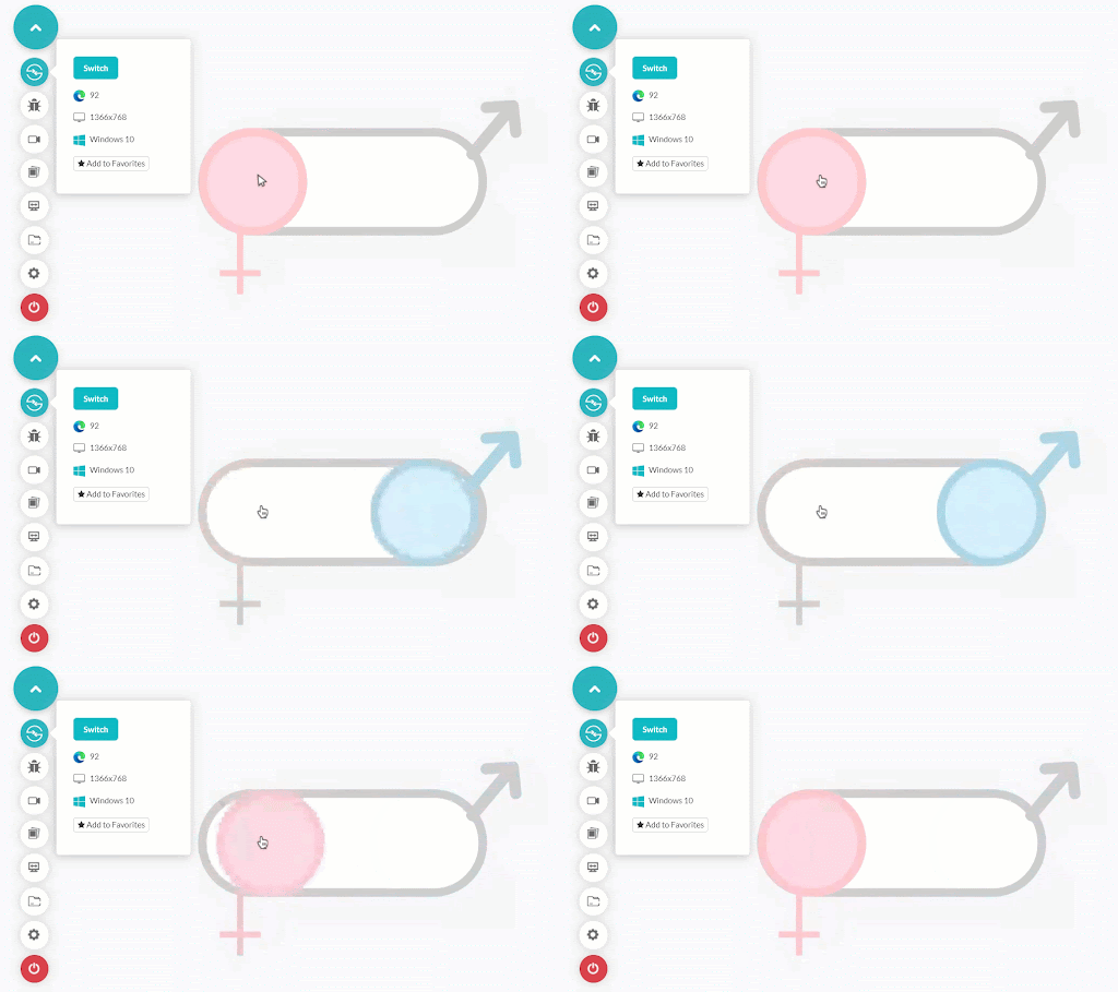
6. Accept Cookies CSS Toggle Switch
See the Pen
Untitled by Harish Rajora (@harishrajora)
on CodePen.
Output:
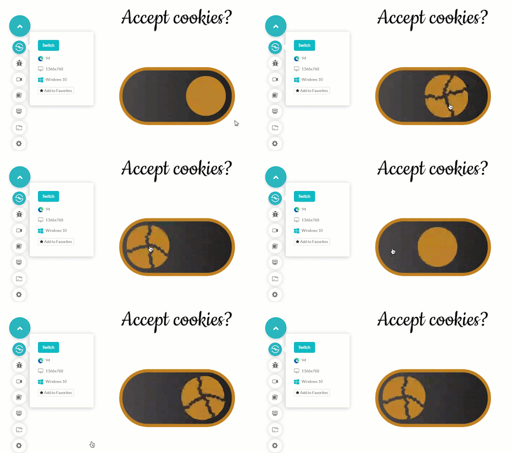
7. Tick-Cross CSS Toggle Switch
See the Pen
Untitled by Harish Rajora (@harishrajora)
on CodePen.
Output:
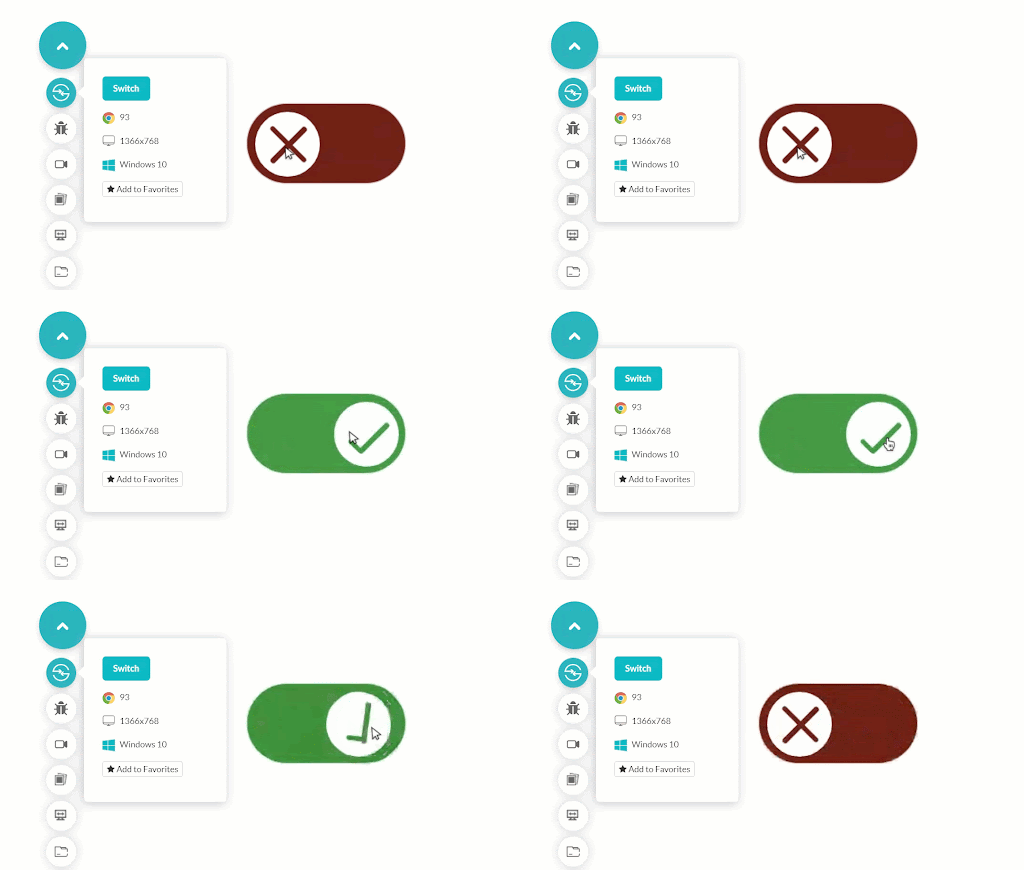
8. Subscribe With Image And Text CSS Toggle
|
1 2 3 4 5 6 7 8 9 10 11 12 13 14 15 16 17 18 19 20 21 22 23 24 25 26 27 28 29 30 31 32 33 34 35 36 37 38 39 40 41 42 43 44 45 46 47 48 49 50 51 52 53 54 55 56 57 58 59 60 61 62 63 64 65 66 67 68 69 70 71 72 73 74 75 76 77 78 79 80 |
<!DOCTYPE html> <html lang="en" dir="ltr"> <head> <meta charset="utf-8"> <title>Basics of CSS Toggle</title> <style> * { user-select: none; -webkit-tap-highlight-color:transparent; } body { height: 100vh; margin: 0; } input[type="checkbox"] { display: none; } #button { position: relative; display: block; width: 700px; height: 350px; background-color: #000; border-radius: 350px; cursor: pointer; transform: scale(0.4); margin: 50px auto; } #knob { width: 290px; height: 290px; background-image: url(your_intended_url_of_the_image); background-size: 700px; position: relative; top: 30px; left: 30px; border-radius: 290px; transition: 0.4s ease left, 0.4s ease background-position; z-index: 2; } #subscribe, #alright { position: absolute; top: 50%; transform: translateY(-50%); color: #fff; font-size: 58px; font-weight: bold; font-family: "Segoe UI", Tahoma, Geneva, Verdana, sans-serif; margin-left: 389px; z-index: 1; } #alright { margin-left: 30px; } #lol-checkbox:checked + #button #knob { left: 380px; background-position: -350px 0; } </style> </head> <body> <input type="checkbox" id="lol-checkbox"> <label id="button" for="lol-checkbox"> <div id="knob"></div> <div id="subscribe">Subscribe</div> <div id="alright">eh? alright</div> </label> </body> </html> |
Output:

9. Pentagon CSS Toggle Switch
See the Pen
Untitled by Harish Rajora (@harishrajora)
on CodePen.
Output:
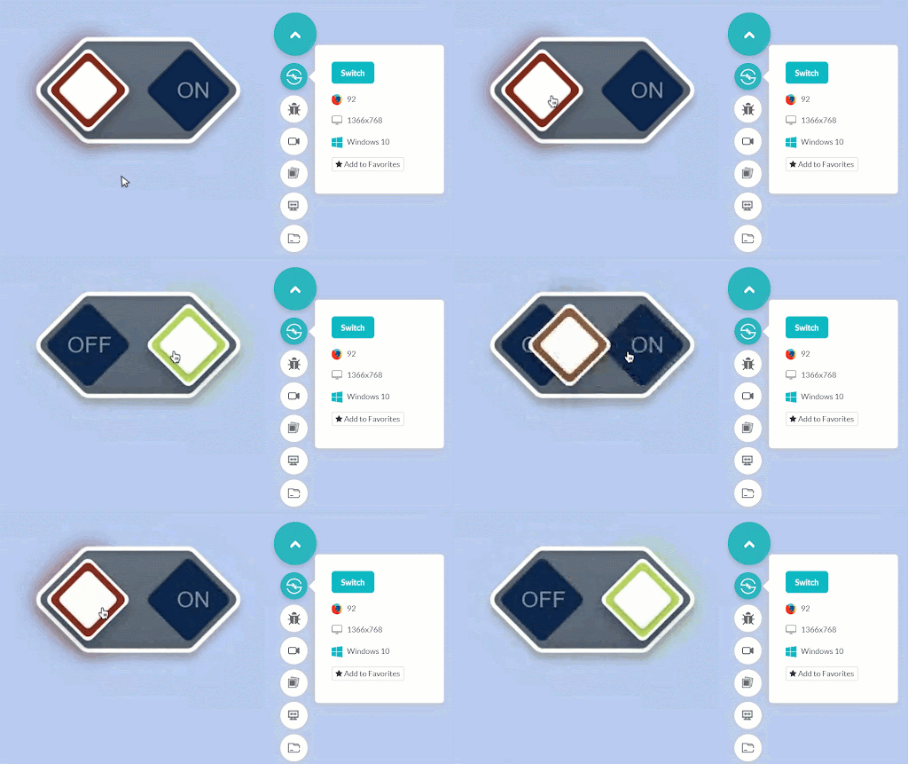
10. Slider CSS Toggle Switch
See the Pen
Toggle Switch 9 by Harish Rajora (@harishrajora)
on CodePen.
Output:
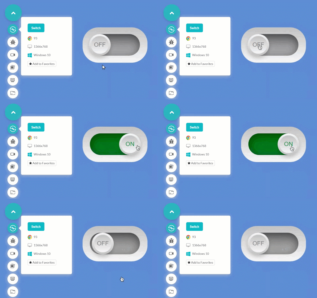
11. Rebel-Empire CSS Toggle Switch
See the Pen
Toggle Switch 9 by Harish Rajora (@harishrajora)
on CodePen.
Output:
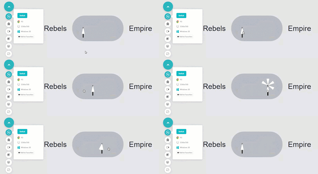
12. Ice and Fire CSS Toggle Switch
See the Pen
Toggle Switch 10 by Harish Rajora (@harishrajora)
on CodePen.
Output:
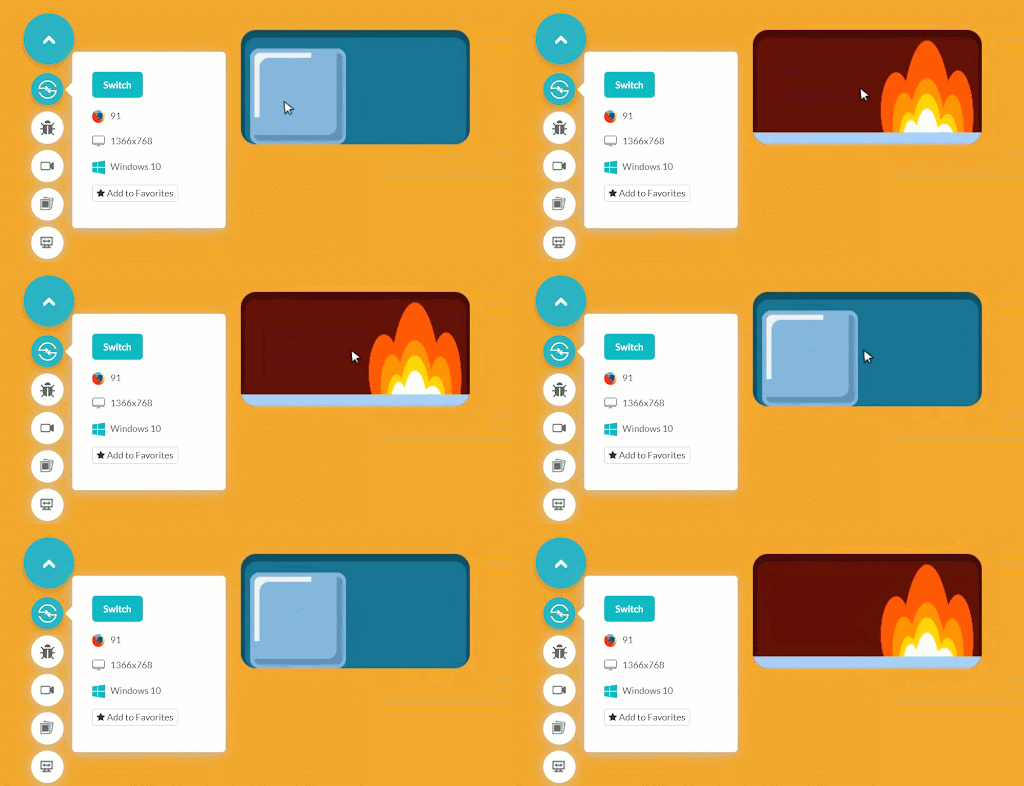
13. Tick-Cross Buttons CSS Toggle Switch
See the Pen
Toggle Switch 11 by Harish Rajora (@harishrajora)
on CodePen.
Output: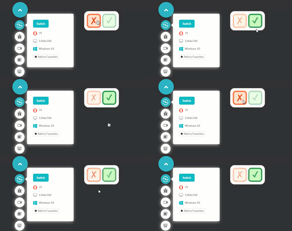
14. Overlapping Circles CSS Toggle Switch
See the Pen
Untitled by Harish Rajora (@harishrajora)
on CodePen.
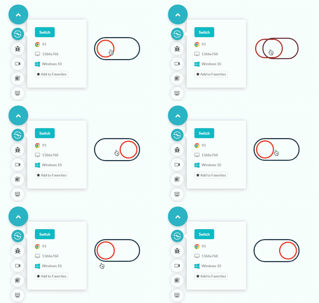
15. Simple Subscribe Toggle Switch
See the Pen
Toggle Switch 13 by Harish Rajora (@harishrajora)
on CodePen.
Output:
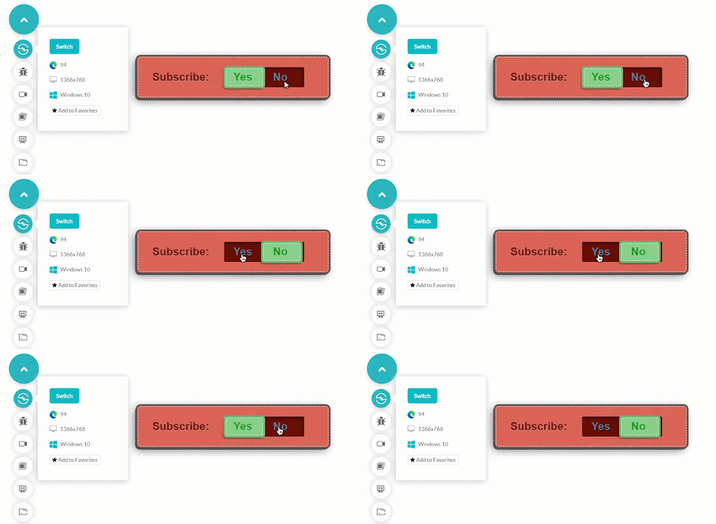
16. Indicator CSS Toggle Switch
See the Pen
Toggle Switch 13 by Harish Rajora (@harishrajora)
on CodePen.
Output:
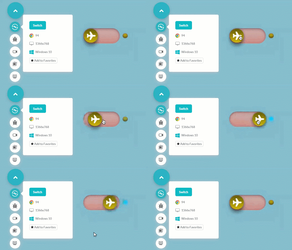
17. Single Yes-No Toggle
See the Pen
Toggle Switch 14 by Harish Rajora (@harishrajora)
on CodePen.
Output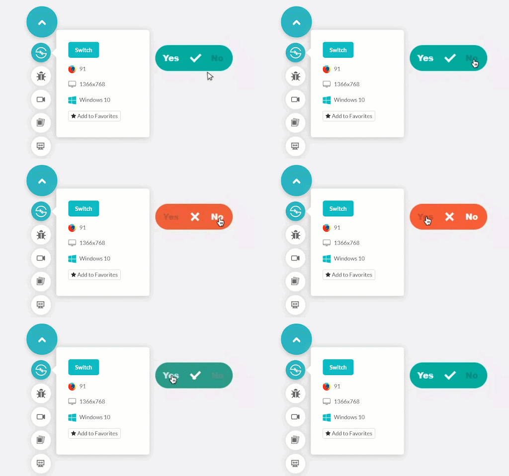 :
:
18. Folding CSS Toggle Switch
See the Pen
Untitled by Harish Rajora (@harishrajora)
on CodePen.
Output:
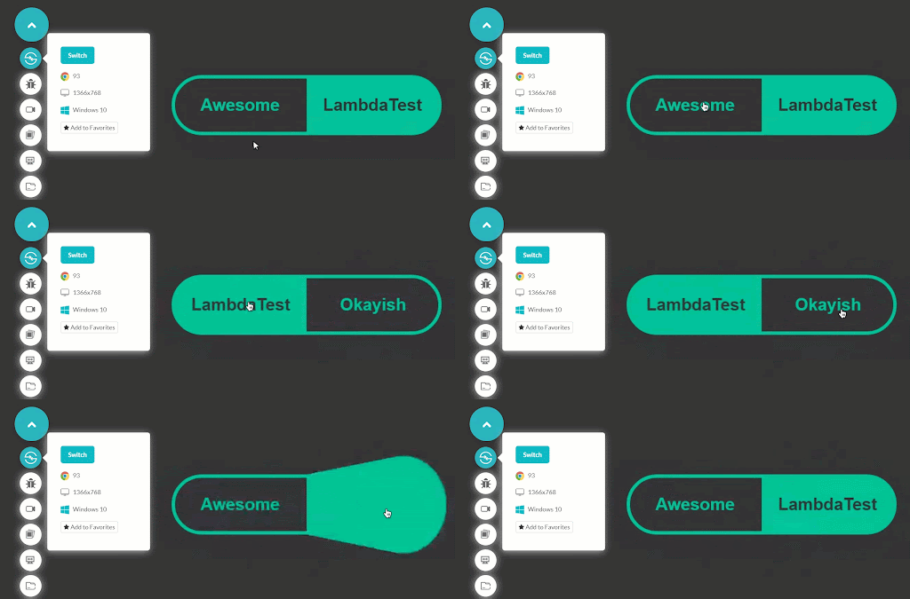
19. Sliding Bar CSS Toggle
See the Pen
Untitled by Harish Rajora (@harishrajora)
on CodePen.
Output:
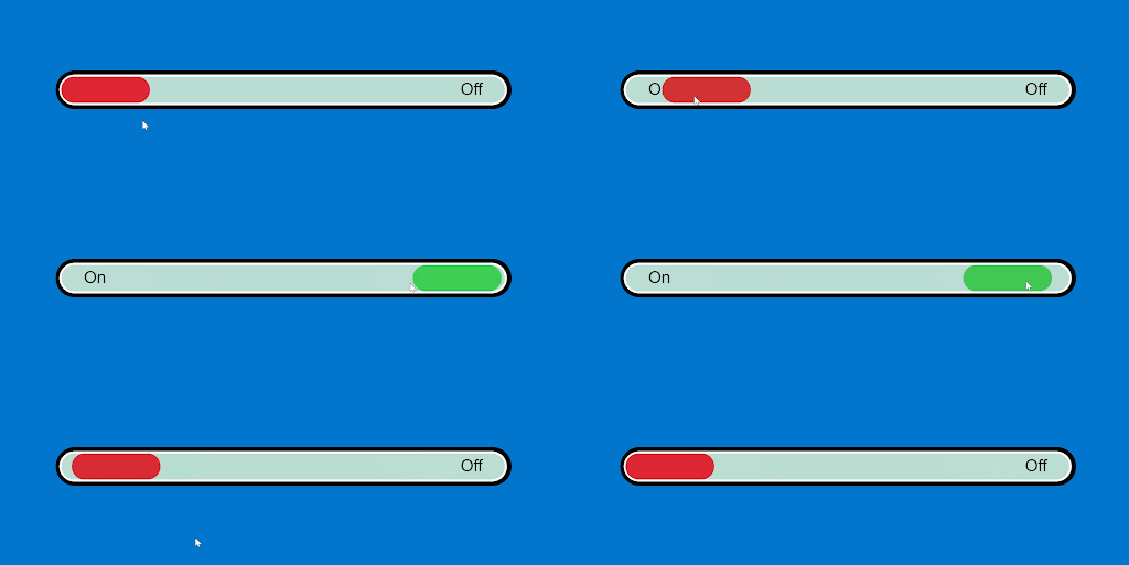
20. Eye Sleeper CSS Toggle
See the Pen
Untitled by Harish Rajora (@harishrajora)
on CodePen.
Output:
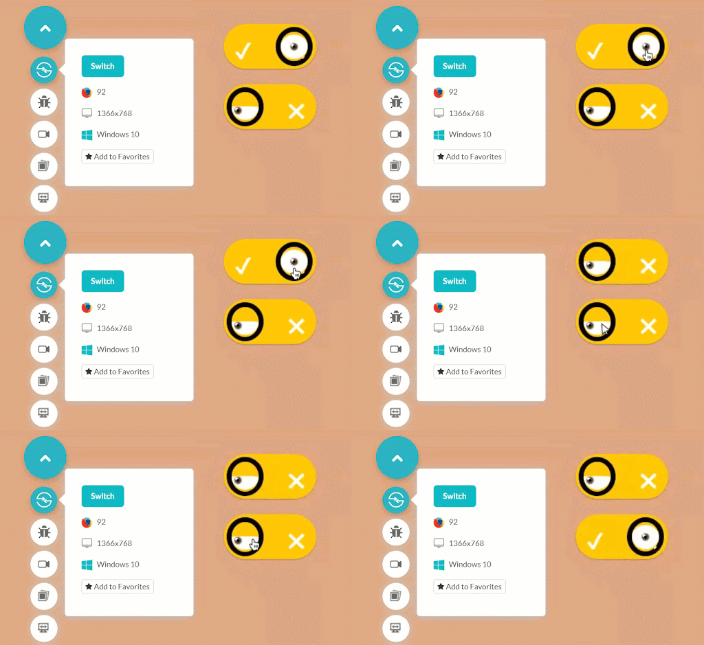
Performing Responsiveness Test Of CSS Toggle Switches
Developers can choose and apply any CSS toggle switches based on the website’s design and functionality needs. However, when we design CSS toggle switches, we want them to be compatible with different screen sizes, including smartphones, tablets, desktops, and laptops. Therefore, to create a responsive web design using toggle switches, we must first conduct responsive testing with a responsive web checker tool.
Manual responsiveness tests regularly can be time-consuming and expensive. Therefore, to save time and quickly test web designs, you should invest in robust and free responsive web testing solutions like LT Browser.
With LT Browser, you can do mobile view debugging across 50+ pre-installed device viewports, build custom device resolutions, network simulation, hot reloading, create Google Lighthouse performance reports, and much more.
Submit Your Own CSS Toggle Switches
The above examples demonstrate how adaptable, helpful, and creative toggle switches can be. A CSS toggle switch can make an excellent first impression while also providing users with a useful feature. Leaving aside the styling part, the skeleton is quite simple and is explained in the first section of this post. As you might have already observed, none of the code includes SCSS or JS to confuse you. This makes this post more vivid and different from other posts about CSS toggle switches.
After going through all the twenty codes, I hope you will understand how to construct CSS toggle switches and perform responsiveness tests before making them live for the users. If you enjoyed reading this article on CSS toggle switches, we would love to see some interesting CodePen solutions in the comment section.
Got Questions? Drop them on LambdaTest Community. Visit now


