Some Common Layout Ideas For Web Pages
Shubham Saxena
Posted On: August 21, 2018
![]() 17456 Views
17456 Views
![]() 6 Min Read
6 Min Read
The layout of a web page is one of the most important features of a web page. It can affect the traffic inflow by a significant margin. At times, a designer may come up with numerous layout ideas and sometimes he/she may struggle the entire day to come up with one. Moreover, design becomes even more important when it comes to ensuring cross browser compatibility.
Do you ever wonder why people tend to visit websites? Have you ever wondered why all websites seem similar? Most web designers keep their design subtle not merely due to sheer laziness or lack of ideas, but series of basic rules that come along with hidden advantages. They tend to follow it as a rule of thumb no matter much they want to satisfy the goals of the project.
The common layout of a web page holds a sense of familiarity with the user boosting their connection with the website. This leads to a shift of focus from the lavish designing of page to the substantial content which holds the supreme importance.
Overtime layouts have become usable, well-structured and easy to understand. This also enhances the reusability of existing web-layout reducing the time and money investment to a large extent., Let’s absorb the major thumb rules for the web layouts which holds a vital stand among the mainstreaming websites:
TABLE OF CONTENTS
Present An Enthralling Start
The user mainly focuses on how simple or complex the information presented is. Header, yes the major the major attention to your brand begins here. The logo, links to contact, and other relevant information regarding website all lies in this one place. The one value proposition of the brand name can be enriched by working on essential features which can be incorporated in the website.
Make Readability Laid-back
For a reader, it is cumbersome to scroll a page horizontally. A majority of the users prefer the web browser to be wide enough in order to avoid horizontal scroll . The main viewing window should be at least 780 pixels wide. Thus enhancing the readability level.
A website contains many pages, but no visitor tends to read beyond the first page. Therefore, web site designers try wrapping maximum amount of information into a single page. This usually leads to designing of web pages with width ranging from 780 to 640 pixels.
The Main Content
The maximum space of the website should be covered with well-structured content. Although this part of website holds the maximum transitions but the main content is preferably static.
Content can be put up through divisions of the layout into one column or two or maybe three. It is in the hands of the designer to add a spin to this section depending on the website and client requirement.
1-column layout
This kind of layout is generally preferred with the upcoming revolution for mobile browsers. This is one of the easiest layouts as not only does it provide smooth navigation to users but also fits mobile screen perfectly. This kind of layout is best suitable for personal blogs and microblogs like Tumblr. The addition of ‘sticky’ for this layout allows comfortable scrolling through pages, making the visitor avoid scrolling way back up to navigate.
2-column layout
Often termed as the split-screen layouts, it is most preferable for medium sized screens like laptops and tablets. A website tends to offer such designs if information to be presented holds equal weightage . It is advisable to avoid this layout style, but one can try adding animation or visual representations to make the outcome more engaging and dynamic
The 2-column layout can have an upgraded version with asymmetric column which helps the user to differentiate between useful and less useful content. The asymmetric view uplifts better segregation behaviour by focusing user’s attention on the informative objects. The use of high colour contrast can add weightage to this version.

3-column layout
The only suitable layout for big screens like desktop comes through this section. The entire focus lies on the central part of this layout. Because content is all that you survive on! The unequal arrangement in this column earns the website a quick glance as well as makes the navigation rapid.
Though we had a brief insight of the most common transformations which can be done with this version, but the real magic begins when we mix match them and come up with brewing layouts.
Fixed Sidebars
Along with the top-side horizontal navigation, it is also possible to provide assistance of menus by keeping them static in the side bars of the web page. If the website holds limited navigation options this layout supports the designer. It is a preferable look for a majority of websites as it gives the user an overview of the entire website in a single glance.
Footer
While you are underestimating the importance of footers, it is saving the day all around the internet. Before the visitor hits the bottom of the web page, it catches the visitor like those safety nets. Footer is nothing but choosing how to conclude, with a purpose of helping visitors and meeting the business goals.
This layout is visible at the bottom of every page of the web site. Likeheader, this section generally covers the often ignored yet global information like copyrights, contact details, office locations.
With the growing twists to each section, this static footer can be transformed to dynamic by upgrading it with easy-to-navigate feature to other sections of the web page. How much can you make the visitor scroll down depends on how well you summarize your footer.
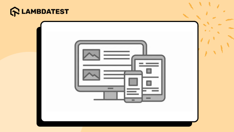
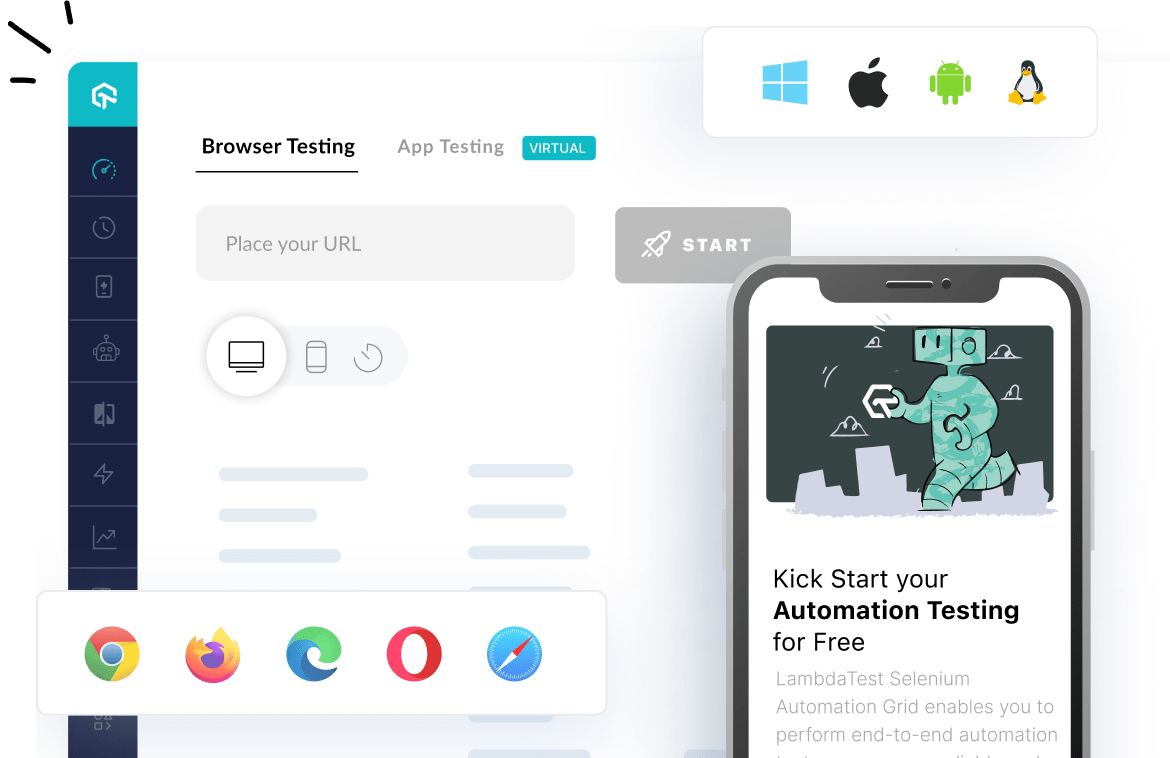
Designing and developing a web page is one thing but making sure that it is working as intended, the other. Yet, both are equally important. So, you need to make sure that the webpage that you have developed works perfectly across all browsers, OS, and devices( mobile, desktop, and tablets). You can use LambdaTest after developing your web page to test for cross browser compatibility.
Well, now that your mind is all set with the structure and ideas to shape a perfect yet simple website, make sure that content remains the king. A website manages to be sustainable if among all the visual variations it manages to channelize the traffic towards itself. We know that clients often demand tested and tried solutions but with a basic understanding the layouts, we can come up with designs that are outstanding and would not get lost in the sea of homogeneity.
Got Questions? Drop them on LambdaTest Community. Visit now


