How to Add a Smooth Scroll in CSS
Vincent Chosen
Posted On: April 16, 2024
![]() 131780 Views
131780 Views
![]() 23 Min Read
23 Min Read
According to Adobe, 59% of people browse a website with an appealing design. Factors like faster page loads, smooth scroll, dynamic content loading, etc., can go a long way in improving the overall time spent on the site. Therefore, user engagement and time spent on your websites are mostly influenced by the quality and relevance of your web design and content.
Smooth scroll in CSS is a critical aspect of web design that contributes to an excellent user experience. Navigating through different web page sections becomes effortless with smooth transitions, which makes it easier for people to explore the content. Adding a smooth scroll in CSS to your website can be implemented using the scroll-behavior property that streamlines the entire process.
In this blog, we will look at the scroll-behavior property, which can be used to add a smooth scroll in CSS. We’ll look at how it can improve the scrolling experience for users with just one line of code.
- Understanding Browser Scroll Behavior
- Importance of Smooth Scroll in CSS
- How Does Smooth Scroll in CSS Work?
- What is CSS scroll-behavior?
- How to Implement Smooth Scroll in CSS?
- Browser Compatibility of CSS scroll-behavior
- Smooth Scroll With JavaScript
- Smooth Scrolling and Accessibility
- Best Practices for Adding Smooth Scroll in CSS
- Frequently Asked Questions (FAQs)
Understanding Browser Scroll Behavior
When you view a web page, you can scroll up and down to navigate its content or click on a link to go directly to a particular section of the page. By default, browsers use instant or jumpy scrolling, which has no default built-in user settings to eliminate this effect.
This means that when you scroll through the content or click on a link, the browser moves quickly from one section of the web page to another, with no gradual transition. This default approach may feel abrupt, particularly when switching between sections of a web page.
Consider a smoother and more elegant way of navigating a web page. This is where smooth scroll in CSS comes into play. When the scroll-behavior property is enabled, the browser adds a touch of elegance to your scrolling experience.
By eliminating abrupt jumps, users can seamlessly transition between sections, reaching their desired content faster and with a more intuitive experience.
Importance of Smooth Scroll in CSS
Beyond aesthetics, smooth scrolling holds significant value for developers and designers. Here are some of the benefits of implementing smooth scrolling on your website.
Smooth scrolling increases user engagement by encouraging users to explore further content and spend more time on your website. This, in turn, reduces the bounce rate, indicating that people value your content while simultaneously sending a positive SEO signal.
Furthermore, websites focusing on the user experience by including smooth scrolling are frequently seen as more modern, aligning with current web design trends. These positive perceptions can help to increase user satisfaction and possibly lead to prolonged user engagement.
To summarize, a smooth scroll in CSS significantly impacts a website’s usability and aesthetics. It contributes greatly to positive user interactions and impressions by providing a more comfortable and visually appealing navigational experience. Additionally, a smooth scroll in CSS can be seamlessly implemented with React. To integrate smooth scrolling with React, you can refer to this Stack Overflow thread.
How Does Smooth Scroll in CSS Work?
Smooth scrolling can be implemented using CSS and, in some instances, JavaScript.
It is particularly beneficial for long-scrolling pages or websites with multiple sections, as it reduces the perceived load on the user and provides a superlative and distraction-free feel to the navigation. Consider a LambdaTest Blog page as an example.
The image above demonstrates how a smooth scroll in CSS makes navigation more enticing. Clicking on the links on the right side of the page takes you to a certain section of the blog with a smooth transition.
It has become a standard necessity in modern web design, contributing to creating user interfaces that prioritize aesthetics and ease of use.
A smooth scroll in CSS improves the way users engage with your websites. Instead of abrupt movement, content glides into view, resulting in a smoother transition between sections. This controlled and consistent scrolling speed improves navigation while preventing abrupt shifts that could disrupt the flow. When implementing smooth scroll in CSS, always remember to consider accessibility.
What is CSS scroll-behavior?
The CSS scroll-behavior property controls the scrolling behavior of an element’s content. It allows developers to customize the speed and vertical movement of scrolling within a certain container.
This property takes in two main values, which are auto and smooth.
auto
This is the scroll-behavior property’s default value. When set to auto, the browser reverts to its default scrolling behavior. When a scroll event or an anchor link is triggered, this usually causes an abrupt and instant scroll to the specified section.
smooth
When the CSS scroll-behavior property is set to smooth, it enables a smooth scrolling action. Scrolling becomes animated and gradual. Instead of jumping directly to the target location, the browser slowly transitions the scroll, resulting in a smooth effect. This is especially important for giving users a more comfortable and refined scrolling experience.
We also have other global values, which include:
| Values | Description |
|---|---|
| inherit | Takes the scroll-behavior value from its parent element to ensure uniformity inside a nested structure. |
| initial | Sets the scroll-behavior property to its default value, usually equivalent to auto. In most browsers, auto indicates abrupt scrolling between elements. |
| revert | Resets the scroll-behavior property to the computed value, which considers all inherited styles and browser defaults. It is most useful when overriding multiple levels of inheritance. |
| unset | Removes the scroll-behavior property declaration altogether, falling back to inherited styles or browser defaults |
With these additional values, you now have flexible options for customizing smooth scrolling behavior in CSS.
How to Implement Smooth Scroll in CSS?
In this section, we’ll see how to incorporate smooth scroll in CSS into your website. From creating the basic HTML structure to using the scroll-behavior property in CSS, each major step will be clearly explained for easy understanding.
To achieve this, you’ll need the following:
- Understand how to create a simple HTML document with tags such as <html>, <head>, <body>, and various content elements.
- Understanding CSS syntax, selectors, properties, and how to link a CSS file to an HTML document.
- Access to a text editor or Integrated Development Environment (IDE). Visual Studio Code is preferable.
- A web browser for previewing and testing the smooth scrolling implementation.
We’ll look at two instances of implementing smooth scroll in CSS on a website.
Smooth Scroll in CSS on the Landing Page
First, we’ll see how a smooth scroll in CSS can make a landing page look better. Landing pages are crucial for capturing leads and conversions and show various information divided into various sections, each dedicated to a particular piece of content or point of view. Navigating between these sections can significantly influence user engagement.
Open your code editor, create an HTML file (index.html), and add the following code:
HTML:
This HTML template contains a simple landing page with three sections: automation, about, and testing. Each section has its own navigation link that allows you to navigate between them.
Create a styles.css file and link it to your HTML document. Now, include the following CSS code:
CSS:
We’ve added some styling to the landing page. Let’s add the scroll-behavior property with various values to test how the web page behaves when scrolling.
auto
Most browsers default to an auto value for the scroll-behavior property, resulting in sudden jumps when scrolling between elements.
If you visit this website in a browser, you will see that the sections are stacked vertically. Clicking on the links in the navbar (provided they link to the appropriate section IDs) will instantly jump to the desired section. This can seem unsettling, especially if sections are long.
Output:
The page jumps straight to the desired section when a link is clicked, which is an average user experience. A smooth scroll in CSS shines here, eliminating the instant jump between sections.
Smooth scroll in CSS allows users to effortlessly navigate between sections, improving the flow of information and retaining focus.
value
We will add smooth value to make the experience more seamless and engaging. Still, in styles.css, remove the auto value and replace it with smooth to enable smooth scrolling.
Now that we’ve changed the scroll-behavior value to smooth, let’s see the scroll experience.
Output:
The above output shows the smooth scroll effect achieved with just a single line of CSS code! This simple yet effective property can substantially improve the usability of your landing page and create a positive first impression for your visitors.
You can use this interactive example to see the difference between the smooth and auto values for yourself. It’s inspired by Rik Schennink’s CodePen work. This sample lets you play with both options and see how they affect scrolling behavior.
Smooth Scroll in CSS on the Blog Page
The second scenario we’ll look at is a blog page. Blogs are valuable sources of information, but accessing long content may be time-consuming, particularly on mobile devices.
Scrolling through vast amounts of content can be overwhelming and reduce user engagement. This is where smooth scroll in CSS comes in, providing a solution for improving the reading experience on blog pages.
HTML:
This HTML code is the foundation for our blog post example of smooth scroll in CSS. Let us break down the important elements:
- Navigation (nav): This section includes the website’s logo, menu bar, navigation links, and buttons.
- Main Content (main): This section contains the blog post’s primary content, such as the header, section list, and numerous content sections.
- Sections (section): Each section contains particular content relating to various topics inside the blog post, identifiable by unique IDs.
- List (ul): This list contains links to various portions of the blog post, letting viewers navigate straight to certain parts.
CSS:
This CSS code styles various elements on the blog page while introducing the scroll-behavior property, whose value is smooth for seamless scrolling.
Output:
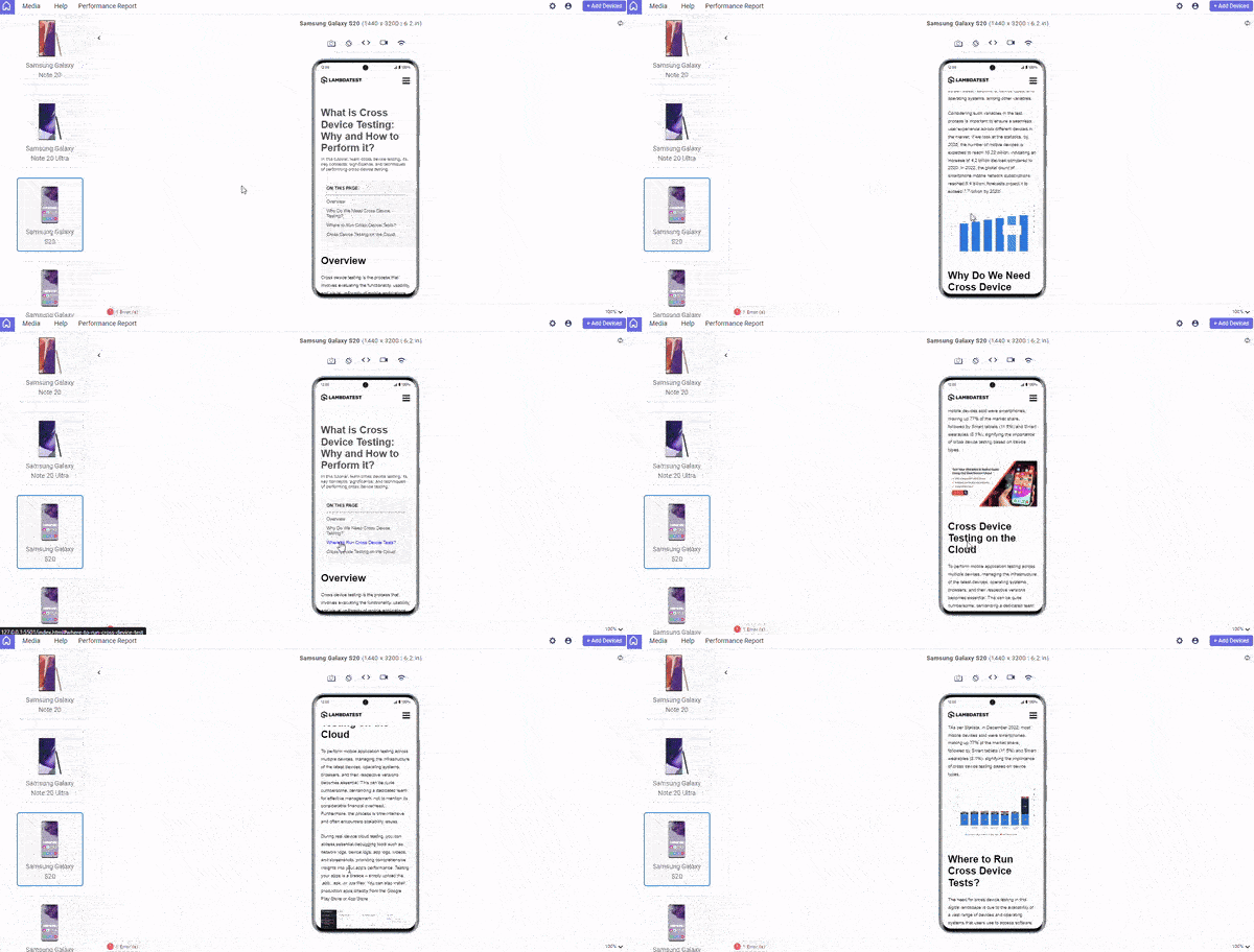
I used LT Browser to check the responsiveness of mobile layouts.
LT Browser is a mobile site tester that simplifies responsive testing across several screen sizes and resolutions, providing developers and testers with a seamless experience for previewing and debugging websites.
Responsive design is of the utmost importance. With an increasing number of different devices and screen sizes, ensuring that your website adapts seamlessly to different viewports is important for offering the best user experience.
We’ll use media queries for standard devices to apply different styles depending on screen width, ensuring responsiveness. For example, we can change text sizes, layout structures, and navigation menus to fit different screens while maintaining usability.
6. Media queries
Media queries allow you to apply different styles based on the characteristics of the user's device.
For example, you can use a media query to apply a different layout for users on a small screen, or to hide certain elements on a mobile device.— Ailín Tobin (@tobinthe2nd) December 7, 2022
CSS code with a media query:
On larger displays, the navigation bar is fixed, and the list of section links is positioned to the right for quick access.
Output:
As can be seen from the above example, implementing a smooth scroll in CSS can help users navigate your content more effectively. This creates a more delightful and interesting reading experience, enabling users to navigate easily.
Browser Compatibility of CSS scroll-behavior
The scroll-behavior property is a reliable method to enable a smooth scroll in CSS. It is widely supported by modern browsers, which eliminates compatibility problems. However, it is still crucial to consider the browsing trends of your target audience and provide a consistent experience across multiple platforms.

The image above shows that while the scroll-behavior property is widely supported, it may have limitations in specific older browsers. Try using alternate smooth scrolling technologies or JavaScript-based options to ensure maximum compatibility.
Also, to ensure browser compatibility of your scroll behavior, you can leverage cloud-based testing platforms like LambdaTest.
It is an AI-powered test orchestration and execution platform that lets you perform live-interactive browser testing on a remote test lab of different browsers, devices, and operating systems. With LambdaTest, you can test scroll behavior on the latest and legacy web browsers online. This includes testing on Chrome browser online, Firefox browser online, Microsoft Edge online, Internet Explorer online, and more.
Subscribe to the LambdaTest YouTube Channel. Get real-time updates on various automation testing tutorials covering Selenium, automation testing, and more.
Smooth Scroll With JavaScript
While scroll-behavior: smooth property can be used to add a basic smooth scroll in CSS, JavaScript allows more precise control and flexibility.
In this section, we’ll look at achieving smooth scrolling with JavaScript, continuing from the landing page example we explored earlier. We’ll look at the navigation links container within the navigation bar (<nav></nav>).
HTML:
Each anchor tag (<a>) contains a href element that specifies the ID of the linked section. For example, clicking the About link (<a href=”#about”>About</a>) will smoothly scroll to the section with the ID about.
JavaScript:
Create a script.js file or place the JavaScript code within a <script> tag at the end of your HTML file, just before the closing </body> tag.
Let’s break down the JavaScript code that enables smooth scrolling:
Selecting Navigation Links

This line selects all anchor tags (<a>) within the element with the class nav-links (presumably the navigation menu).
Adding Event Listeners

This code iterates through each selected anchor tag and adds a click event listener. When a link is clicked, the smoothScroll function is triggered.
smoothScroll Function

This line prevents the default behavior of anchor tags, which is to abruptly jump to the linked section.

This retrieves the ID of the target section from the clicked link’s href attribute.
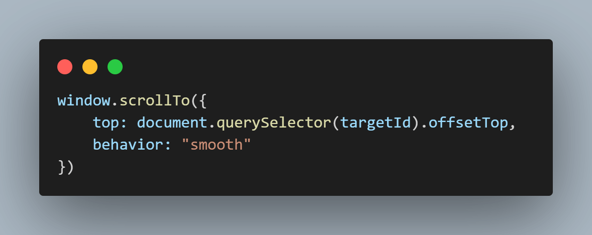
This line is the core of the smooth scrolling functionality. It uses the window.scrollTo() method to scroll the page. The top: document.querySelector(targetId).offsetTop calculates the vertical distance (in pixels) from the top of the page to the target section’s top. behavior: “smooth” enables the smooth scrolling animation.
With this code in place, clicking on any navigation link will activate the smoothScroll function, resulting in a smooth transition to the corresponding section on the webpage.
Output:
A significant benefit of utilizing JavaScript over CSS is the ability to adjust the scroll speed to meet specific design needs. Let’s look at how we can leverage this flexibility and customize the scrolling behavior to our needs.
We’ll be working with the existing HTML code from our previous example. Only the JavaScript code will change. You can also view the complete code on CodePen.
Here’s a detailed explanation of the JavaScript code for controlling scroll speed:
Selecting Navigation Links

This line uses querySelectorAll to find all anchor tags (a) within an element with the class nav-links. These anchor tags are the navigation links on the webpage.
Adding Click Event Listeners

This line iterates through each navLink (the anchor tags) using a forEach loop. Inside the loop, a click event listener is added to each link. When a link is clicked, the smoothScroll function is triggered.
Preventing Default Behavior
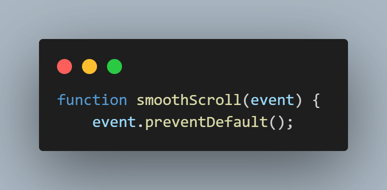
This line (inside the smoothScroll function) prevents the default behavior of anchor tags, which is to jump to the target section abruptly. This allows us to control the scrolling animation instead.
Getting Target Information

The first line retrieves the href attribute of the clicked link (event.currentTarget). The href attribute typically holds the ID of the section the link points to. The second line uses querySelector to find the element on the page that matches the ID retrieved in the previous step. This targetElement is the section you want to scroll through smoothly.
Calculating Scrolling Details
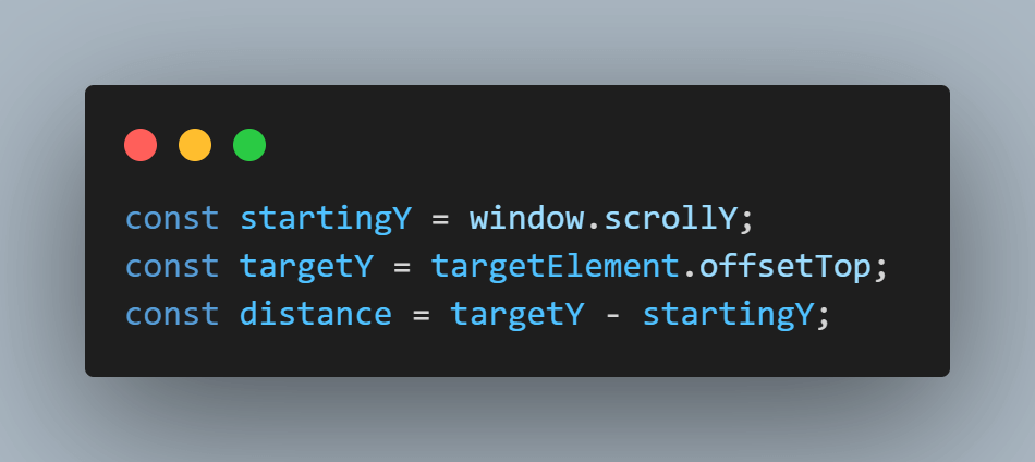
The first line gets the current vertical scroll position of the page using window.scrollY. The second line retrieves the vertical offset (distance from the top) of the targetElement on the page. The third line calculates the total distance (positive or negative) you must scroll to reach the target element.
Creating Animation Loop
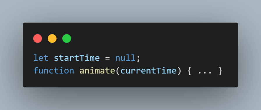
The first line declares a variable startTime to keep track of the animation start time. The second line defines an inner function, animate, that’s called repeatedly to create the smooth scrolling animation.
Calculating Animation Progress

The first line calculates the elapsed time since the animation started. The second line calculates the ease value, which controls the speed and smoothness of the animation. A higher value creates a slower animation, and a lower value creates a faster animation.
Calculating New Scroll Position
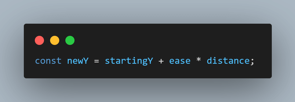
This line calculates the new vertical scroll position based on the starting position (startingY), the animation progress (ease), and the target distance (distance).
Updating Scroll Position
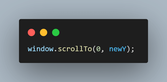
This line updates the scroll position of the page smoothly to the calculated newY value.
Continuing Animation

This conditional statement checks if the animation has reached the target scroll position yet. Based on the direction (positive or negative distance) and whether newY has crossed the targetY, the animation loop continues using requestAnimationFrame if needed.
Output:
The smooth scrolling animation in the example above appears to be slower because the ease value in the code is set to 900—a higher ease value results in a slower transition. You can change this value to set the appropriate animation speed.
In conclusion, a smooth scroll in CSS is an excellent choice for a quick and straightforward setup. However, JavaScript offers greater flexibility and control when tailoring the animation or targeting certain items.
Smooth Scrolling and Accessibility
A smooth scroll in CSS can add a touch of polish to your website and improve the user experience. However, it is crucial to consider accessibility when integrating this functionality. Uncontrolled smooth scrolling can pose difficulties for people with impairments.
Users who are sensitive to motion or have vestibular disorders may experience nausea or dizziness due to abrupt or excessive scrolling animations. Fluid scrolling animations may be difficult for individuals who use keyboards to navigate. Excessive or rapid scrolling can impair their ability to focus on certain page components, making it difficult to navigate and retrieve content.
Furthermore, unexpected scrolling motions might break the flow of information for screen reader users, making it difficult to understand the web page layout. To improve accessibility, scrolling animations should not interfere with the screen reader’s ability to comprehend and transmit material properly.
Providing a consistent and predictable scrolling experience can significantly improve the accessibility of your website for all users. To ensure web accessibility, you can use the LambdaTest platform to perform accessibility testing at scale across 3000+ real environments. Plus, you can leverage LambdaTest Accessibility DevTools Chrome extension to run quick and hassle-free accessibility tests.
WCAG Considerations
It is important to ensure smooth scroll implementation follows the Web Content Accessibility Guidelines (WCAG). Consider the following WCAG success criteria to keep smooth scrolling accessible:
- Success Criterion 1.3.1 – Meaningful Movement: When using smooth scroll in CSS, make sure the scrolling animation serves a clear function and does not introduce unnecessary or unexpected movement. Smooth scroll in CSS should improve navigation and content presentation without causing confusion or discomfort for users. – WCAG Info and Relationships.
- Success Criterion 2.1.1 – Keyboard: Smooth scrolling should not disrupt keyboard navigation. Users who rely on keyboard input should be able to move across elements smoothly, tabbing through content without interruption. Ensure that keyboard navigation remains practical and intuitive, in addition to smooth scrolling – WCAG Keyboard Accessible.
- Success Criterion 3.2.1 – Consistent Navigation: A good user experience requires consistency in navigation. Maintain a predictable and consistent focus order while implementing smooth scroll in CSS to guarantee that users can move through the content with ease. Smooth scrolling should not break the logical flow of navigation or cause uncertainty about focus order – WCAG On Focus Level A.
By aligning smooth scrolling with these WCAG success criteria, you can ensure that your website is always accessible to all users, creating a seamless and accessible browsing experience.
Recommendations for Accessible Smooth Scrolling
Here are some suggestions for creating an accessible, smooth scrolling experience for users:
- Consider Accessibility for All Users: A smooth scroll in CSS may have a negative impact on specific disabilities, such as motion sensitivity or vestibular disorders. Users who prefer traditional scrolling behavior may disable smooth scrolling in their browsers with the following steps:
First, open your browser and type chrome://flags. (For other browsers, replace chrome with the browser name, such as edge://flags.). You should see something like this.

After that, search for smooth scrolling in the search box on the screen.
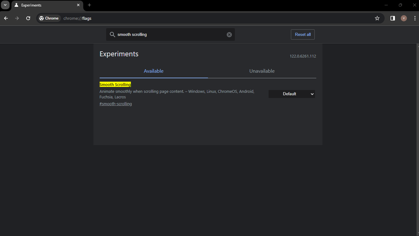
- Use Subtle and Controlled Animations: Use smooth scrolling animations that are moderate and predictable, avoiding excessive movement or rapid changes.
- Maintain Focus During Scrolling: Ensure focus remains on the intended element, even during smooth scrolling transitions. This helps users with keyboard navigation maintain control.
- Test With Assistive Technologies: To detect and address accessibility issues, thoroughly test your implementation using assistive technologies like screen readers and keyboard navigation.
Lastly, you can select the options as either Default, Enabled, or Disabled.
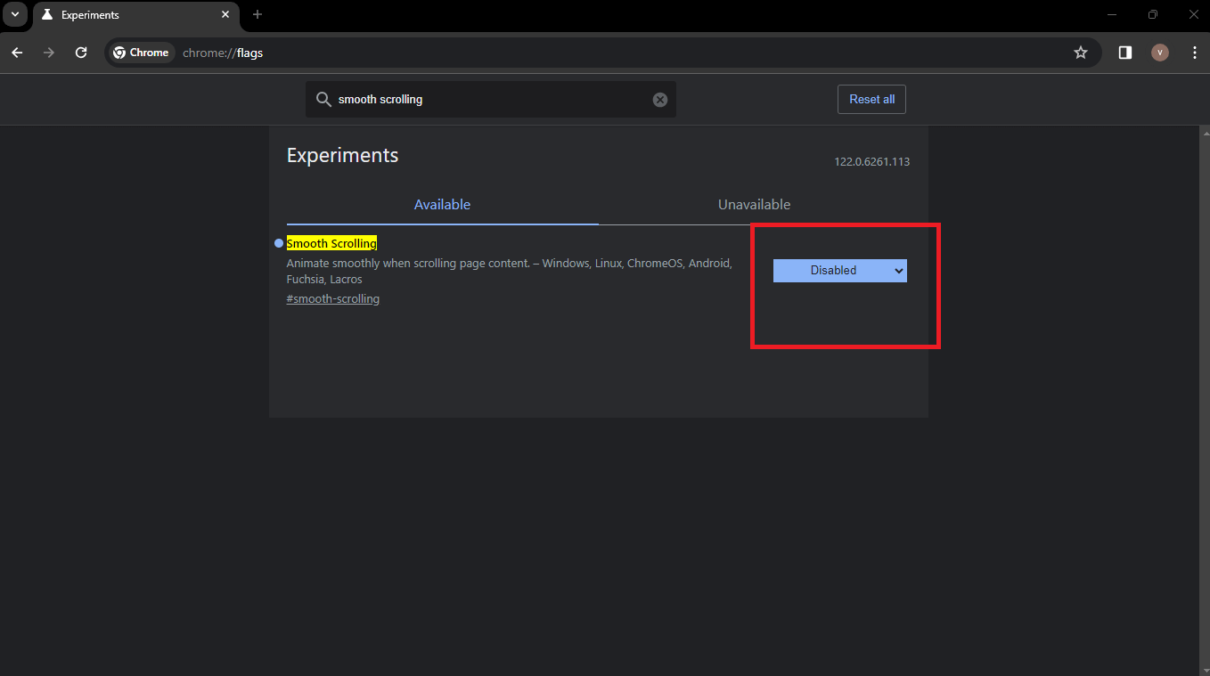
By adhering to these principles and recommendations, you can successfully add smooth scroll functionality that improves the user experience for everyone, including people with disabilities.
 Note
NoteTest your smooth scroll in CSS on real devices. Try LambdaTest Today!
Best Practices for Adding Smooth Scroll in CSS
Applying the scroll-behavior: smooth property is not enough to implement a smooth scroll on your webpage. Here are some best practices to ensure a successful and optimized implementation:
Start With Progressive Enhancement
Start with the scroll-behavior: smooth property provided by CSS. This offers a solid foundation. However, consider layering on additional solutions, such as JavaScript-based smooth scrolling. This method allows for greater customization while also ensuring compatibility with a variety of browsers and devices.
Ensure Consistent Section Height and Semantic Elements
Maintaining consistent heights within your scrollable section. Uniform heights contribute to a more predictable scrolling experience. Additionally, leverage semantic HTML elements like <section>, <article>, and <nav> to organize your content. These elements not only enhance accessibility but also create distinct anchor points for smooth scrolling, ensuring a well-structured foundation.
Use Link IDs and Anchor Links
Give your sections meaningful IDs and use anchor links (<a href=”#sectionID”>) for easy navigation. This enables visitors to navigate directly to specified sections of your website, improving user experience and accessibility.
Customize Scroll Speed Using JavaScript
When necessary, use JavaScript to alter the scroll speed. This allows for fine-tuning of the scrolling behavior to correspond with design needs and user preferences.
Optimize Performance
Improve performance by reducing complex animations, especially on resource-intensive pages. Reduce redundant animations to enable smooth scroll in CSS and a positive user experience across all devices and platforms.
Ensure Consistency Across Platforms
Verify the consistency of your smooth scroll implementation across various web browsers and devices. As mentioned earlier in this blog, you can leverage tools like LT Browser by LambdaTest for comprehensive, responsive testing to ensure that all users have a smooth scrolling experience, regardless of device or browser.
Conclusion
In this blog on adding a smooth scroll in CSS, we discovered a simple yet effective approach to improving the user experience on our web pages. A smooth scroll provides a touch of elegance, making CSS transitions between sections more visually appealing and user-friendly.
Remember that successful implementation is more than simply the code; it also requires careful design considerations. A smooth scrolling experience is made possible by semantic HTML, consistent section heights, and fine-tuned scroll behavior. We’ve also prioritized accessibility, progressive enhancement, and documentation to offer a complete and inclusive solution.
As technology advances and user expectations change, the art of seamless scrolling will continue to play an important part in designing future digital experiences.
Frequently Asked Questions (FAQs)
How do I make my CSS scroll smoother?
You can use overflow: scroll with scroll-behavior: smooth on the scrollable element or explore JavaScript libraries for more customization.
What is a smooth scroll?
A smooth scroll is a feature where the website’s content transitions smoothly when scrolling, creating a more pleasant user experience.
How do you smooth scroll between sections in CSS?
You can assign IDs to sections, create anchor links with href=”#section-id”, and apply scroll-behavior: smooth to the anchor links in CSS.
How do you smoothly scroll to the bottom in CSS?
You can link to an anchor at the bottom (e.g., href=”#bottom”) with a smooth scroll applied or use JavaScript to detect and scroll to the bottom smoothly.
Got Questions? Drop them on LambdaTest Community. Visit now


