Responsive Testing Of A Locally Hosted Website | A Complete Guide
Harshit Paul
Posted On: August 14, 2020
![]() 59868 Views
59868 Views
![]() 12 Min Read
12 Min Read
This article is a part of our Content Hub. For more in-depth resources, check out our content hub on Responsive Testing Tutorial.
After Knowing how to create a responsive website Responsive testing of web apps is a crucial component that needs to be executed at every stage to ensure that it meets the end-user requirements. There are countless devices, browsers, or operating systems that consumers use to access a website and this is bound to grow exponentially. The challenge here is to find the most effective and efficient way to test how responsive your website is over those multitudes of devices.
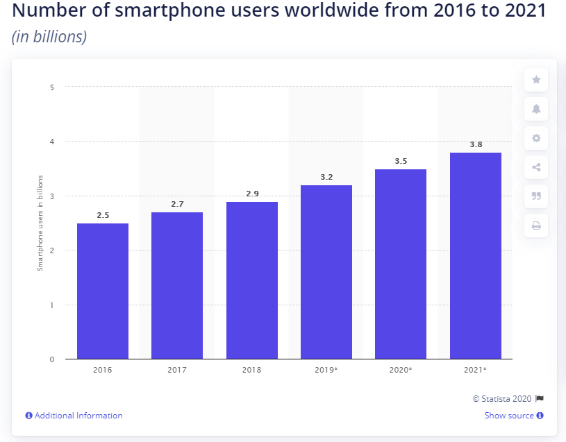
According to Statista‘s report, there are over three billion smartphone users in the world and around 63% of the total web traffic comes from mobile devices. Testing the responsiveness of locally hosted websites across mobile devices is more crucial than ever. If your web app is not mobile responsive, there are chances of higher bounce rates, and Google might not consider your website user friendly. Check your Responsive Test today!!!
Responsive testing is crucial for every online business. Period. Now, it makes you want to wonder how to check the mobile view of a website on the localhost? Because you obviously want to test your new changes before they are pushed to production.
How to test responsive websites locally? What about locally hosted websites that are not ready for end-users yet?
This is exactly what I am going to answer for you in this article. But if some of you are confused about whether or not you even need to test the responsiveness of a website locally? Then let me help you that first before we get to the practical part.
With this Responsive testing tutorial for beginners, you will learn how to perform Responsive Testing of your website on the LambdaTest platform.
Advantages of Responsive Testing of Locally Hosted Websites
The primary reason to test a responsive website locally is to ensure that a website’s content renders according to the device or screen size that a user is using. Also, it certifies that your site loads quickly without any alterations. Below are some extensive benefits that show why it is essential to test responsive websites locally.
- Improves Traffic on Your Site: As per SimilarWeb, it is noticed that more than half of the web traffic on the USA websites comes from mobile devices. Thus, having a responsive website across all platforms will help you gain more traffic than usual. So ensuring your changes look well beforehand is only going to help with that.
- Catch Bug Early: By ensuring a mobile view of the website on localhost, you can catch bugs at an early stage. That helps you align better with Shift left testing methodology. If bugs are caught at an early stage, you end up saving time and resources as compared to when they are caught at a later stage.
- Lower Bounce Rates:Well, if the mobile view of your website will look as it should then the responsive web design will definitely help with user retention and decrease the bounce rate of that page. So it is always advisable to perform responsive testing locally in that regard.
- Quick Page Loading:
53% of visits are abandoned if a mobile site takes longer than three seconds to load.
–Daniel An(Google)It is only natural for users to expect your website to load faster. Especially on mobile, because different types of networks i.e. 3G, 4G, and 5G will make reflect a drastic change in loading a mobile website. Another reason is the network reception, so your mobile website can be accessed by visitors on the go while they are commuting, traveling, etc. And the network reception might dip in some areas resulting in longer loading time for your website.
So you want your website to be on the top of the game, performance-wise. This is why it becomes important to test responsiveness locally and measure the actual loading speeds than the expected ones.
- Rank Higher in Search Engines: Responsive design is now a crucial factor in search engine optimization. Google itself prefers responsive sites to rank higher on search results as compared to other websites. Thus, ensuring a mobile-friendly responsive design locally will always keep you in clean chits of Google SERP.
Interesting read: Ultimate Guide To Building A Mobile Friendly Website.
Challenge With Responsive Testing For A Locally Hosted Website
Most developers prefer to test responsive design locally so that once the website goes live, users get what they are expecting from it. However, considering the number of devices and operating systems, it’s not that easy to test responsive design locally. Also, as people move towards the mobile-first approach, they prefer to browse the internet over mobile devices.
There are literally thousands of viewports, screen sizes that you need to mobile device testing, and doing it manually is quite an impossible task. Testing the responsiveness of a website on real devices is always the go-to method but that also involves shelling out huge chunks of money out of pocket. Can you imagine what it would cost to test your website on every possible device combination?
So how do we go about responsive testing for locally hosted websites?
Are you aware of the top responsive web design challenges?
How to Test Responsive Design Locally?
Honestly speaking, there are not many options available that help test responsive websites locally. We have access to some responsive web design testing tools locally and automated solutions that can be utilized to test the responsive design of locally hosted sites. Let’s have a look at these methods.
1st Method – LT Browser For Locally Hosted Web Apps
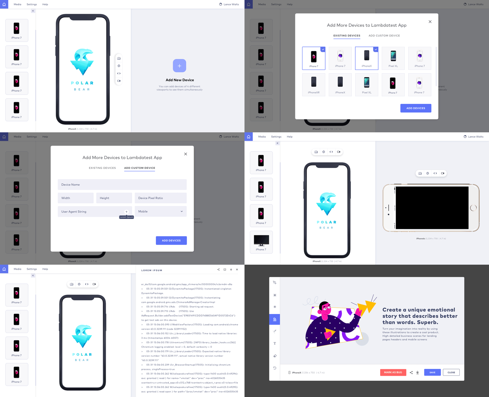
LT Browser has turned out to be one of the best automation tools that are used to test the responsiveness of your web app across various mobile devices. It is a live mobile view debugging tool that also helps in finding bugs in your responsiveness.
With this browser for developers, you can test the responsive website locally across more than 50 mobile screen resolutions. It even allows you to add custom devices for screen resolution test / responsive testing with various screen resolutions and sizes so that you can test your locally hosted website as per your requirements.
Moreover, it enables you to compare your site’s mobile versions across multiple devices with a side-by-side view. It is integrated with minor action features, which helps to replicate the actions on other devices, which are performed on the first device.
The in-built debugging feature of LT Browser enables you to validate the fixes on locally hosted web pages on the go. And if you want to share the testing report with your colleagues or team members, you can mark the bugs during the testing and share it directly with your team members across project management tools like Jira, Asana, Trello, etc.
To test responsive design locally with LT Browser, you don’t have to go through the installation of any additional utility or framework. It follows a smooth process with simple steps, which includes:
- Downloading the LT Browser and installing it on your system.
- Enter the localhost string as the URL in the LT Browser header to access your localhost server.
- For example, if the localhost server is Apache via XAMPP with the website in XAMPP’s htdocs folder, open the localhost, and add the URL with the web page or website folder want to test.
This is how you can test locally hosted websites easily with the LT Browser. (Refer LT Browser Tutorial to learn more about it).
In this detailed walkthrough of LT Browser tutorial video, we will help you get started with LT Browser.
2nd Method – Developer Tools Available In The Browser
The Toggle device toolbar available in the developer tools of browsers is the most easily accessible responsive web design testing tool local. It allows you to check the mobile-friendliness of your locally hosted web pages across the most popular smartphones. You can easily find this tool in both Firefox and Chrome browser by pressing the F12 key on your keyboard.
In the Chrome browser, the tool is represented with the same name as the Toggle Device toolbar, whereas in Firefox, it is described as Responsive Design mode. Here, we will talk about the Mozilla Firefox browser.
Once you click the F12 key, the developer tools section will appear on your screen. Here, select the Responsive Design mode, and the browser will display the mobile version of your website.
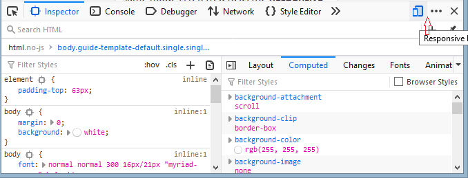
Now, from the top menu, click the Responsive option to display all the available versions of devices that are integrated with the browser, such as iPhone 11 Pro, Samsung Galaxy, Apple iPads, etc. You can select the specific device to test the responsive design of your locally hosted website.
It will help you analyze how the web app would render across various platforms once it is live. Moreover, you can also change the screen’s resolution as per your requirements to see how your web pages render across different screen sizes.
Developers prefer to use it to get an idea about a website’s responsiveness but then again, it offers a simulation of mobile devices. Simulators do mimic the real devices but they don’t replicate the hardware requirements of any device. So it won’t be surprised if a website looks okay on a simulator but breaks on the real mobile device.
If you wish to mimic the hardware requirements of a mobile device along with the viewport then you need to opt for browser emulators. You cannot trust the Developer’s tool to test responsive design locally and expect your website to sail smoothly after going live. Google themselves recommend relying on online browser emulators:
“Your job doesn’t end with ensuring your site runs great across Chrome and Android. Even though Device Mode can simulate a range of other devices like iPhones, we encourage you to check out other browsers solutions for emulation.”
3rd Method – LambdaTest Tunnel For Testing Locally Hosted Website

LambdaTest Tunnel is another excellent tool from LambdaTest that allows you to connect your local system with the LambdaTest servers via an SSH-based integration tunnel so that you can test responsive design locally across a wide combination of browsers, operating systems, and devices.
It acts as a secure shell tunnel, which can also be used to test PHP, HTML, CSS, Python, or other similar web files that are saved locally. Furthermore, it doesn’t require executing any command from the terminal. You just need to establish a secure connection between your OS and Lambdatest server with underpass GUI.
Read More– Build world-class mobile websites with our mobile friendly test.
Once the tunnel establishes a secure connection with your locally hosted web pages, you can test its responsiveness across more than 3000 browsers, operating systems, and devices. Here’s how it will look on LambdaTest:
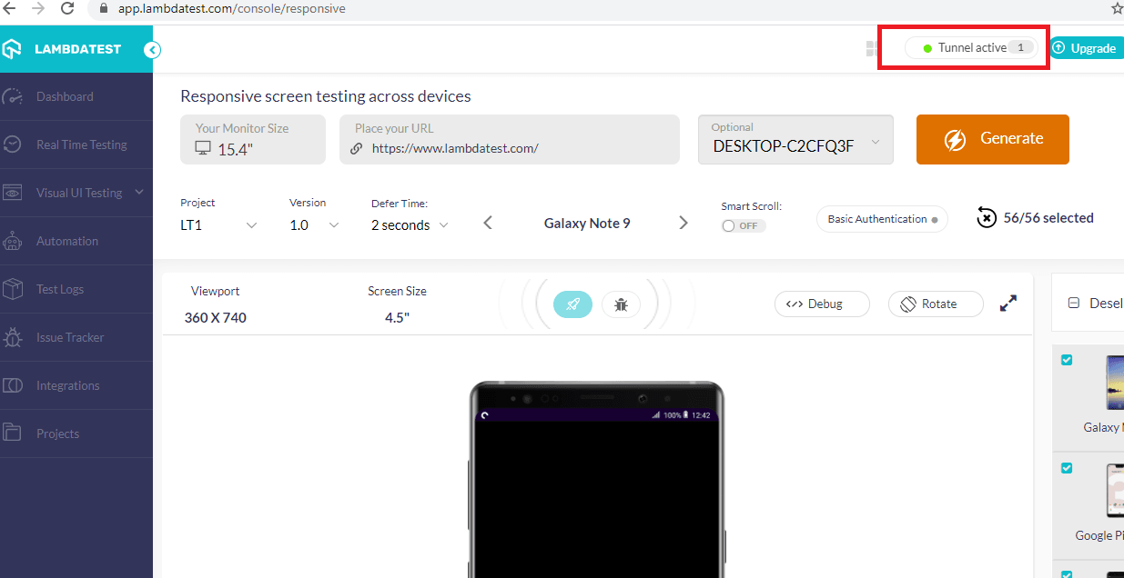
With LambdaTest Tunnel, you can execute the following tasks:
- Connect with Windows and Test Locally
- Connect with Mac and Test Responsive Design Locally
- Connect with Linux and Test Locally Hosted Websites
LambdaTest Tunnel is an ideal option for those who want to test the responsiveness of their locally hosted website across multiple operating systems and browsers. It provides you with additional features and functionalities, making it easier to test responsive design locally.
To know more about responsive testing from LambdaTest, please have a look at the detailed video below:
Test Responsive Website Locally with LambdaTest
Testing locally hosted websites for responsiveness can be beneficial in avoiding future issues related to the user-friendliness of the website. Although you will have to test the site again and again when it goes live or whenever any changes are implemented, it’s a good idea to check it locally so that you can prepare yourself for future problems in advance. If it is possible to get your hands on real devices, that is the best way to test website responsiveness.
This is why the most preferred way of doing so is by using emulators and simulators to mimic those devices. If you would rather not spend money on setting all this up, go for a tool like LambdaTest which does it all for you via a cloud environment. LambdaTest allows you to test responsive design locally and test responsive websites locally for a combination of 3000+ browsers, operating systems, and their versions.
In this article, we discussed the most useful methods that can be utilized to test responsive design locally. We will be back with more; till then Happy Testing! 🙂
Got Questions? Drop them on LambdaTest Community. Visit now


