Mastering Responsive Design CSS: All You Need To Know
Harish Rajora
Posted On: August 27, 2020
![]() 153224 Views
153224 Views
![]() 29 Min Read
29 Min Read
This article is a part of our Content Hub. For more in-depth resources, check out our content hub on Responsive Testing Tutorial.
In the late 90s, it was an easy life for the developers. The internet was fairly new and only two browsers ruled the world wide web. The screens were fixed and small desktops were all that anybody could purchase. There was no choice after all. You either buy this or nothing at all. Today, it looks like a faded world making it hard to imagine how those people functioned. But if I see it from a web developer’s point of view, everything is a mess now.
When Jack Ma started building websites, he didn’t worry about how it would look on a mobile or tablet because they didn’t exist. There were fewer elements; developers would just put a few hyperlinks, a lot of content, and maybe one poor quality image. Nobody cared about the bandwidth because everyone was working on poor internet network connections. I remember watching an interview when Jack Ma was asked, “How did you convince your team to work on something called the Internet which was fairly new in those days?”and he said, “It was very hard to do. I called my team members into my apartment to show them how the Internet works and a single web page took 20 minutes to load. They were not convinced, not even one.”
Jack Ma’s teammates might have been wary of the internet but that is definitely not the case anymore. As the Internet started to grow wider and wider, building websites became interesting and complicated at the same time. From a basic website to a responsive css website, we have come a long long way. The magnitude of the internet and devices accessing it is definitely a little scary. But this responsive CSS design tutorial will guide you all the way through in creating an impressive mobile view of a website.
Responsive web design is an approach that enables web pages to adapt seamlessly across different screen sizes and devices. It involves using HTML and CSS to resize, hide, shrink, enlarge, or move content for an optimal view on any screen. Key steps include defining breakpoints where the site’s layout changes, creating a fluid grid for elements to resize and reposition, and setting the viewport via a meta tag to control display on various devices. Additionally, optimizing images and videos is crucial to ensure faster loading times and prevent layout distortion. This methodology facilitates a consistent user experience across devices, promoting better usability and engagement.
Do check out this guide to Building A Mobile Friendly Website
TABLE OF CONTENT
- What Is A CSS Responsive Website?
- What Is Responsiveness?
- Viewport & Meta Viewport Tag
- CSS Media Queries
- CSS Grids
- Responsive Images
- CSS Flexbox
- Responsive With Other Web Languages
- Developer Tools In Responsive CSS Design Tutorial
- Webpage Optimization For Better Responsiveness
- Alternatives To CSS Responsive Design
What Is A CSS Responsive Website?
If you go to a store to purchase a mobile phone, the salesman floods you with so many devices and all of them differ from tip to toe physically. The “number of inches” has become a common parameter for a person to judge his phone. Devices are available in any size you want with any specification loaded onto them. Desktops are no different. The following example will show you how diverse these products have become. In my own house, I can open a website on my mobile (6.1 inches), on my father’s mobile (5.5 inches), my laptop (15.6 inches), my tablet (13 inches) and my TV (42 inches). Obviously this is just a small portion of the devices available in the market today. Take a look at the global stats (from July 2019- July 2020) according to GS StatCounter–
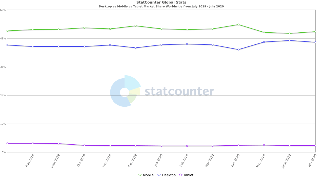
A responsive CSS website will be able to render and function efficiently in each of these devices, regardless of the screen size, operating system, or browser version. This brings us to the question, “How can we adjust our website to any screen that opens it?” This responsive CSS design tutorial is all about that and will help you convert your website into a responsive one.
Needless to say, designing a responsive CSS website is the most important thing to consider while developing a website today. This responsive CSS design tutorial will also guide you about overcoming the responsive web design challenges. But before learning the techniques, I should clarify what responsiveness is so that we all are on the same track.
What Is Responsiveness?
Responsiveness is a website’s ability to adjust or adapt to the browser’s viewport automatically. In layman’s terms, a CSS responsive website “responds” to the browser’s viewport dimensions. A CSS responsive website will automatically shrink on my mobile phone to preview a mobile view of the website and will automatically expand on my desktop. Whereas a non-responsive website just ignores the viewport dimensions and the result is something like this:
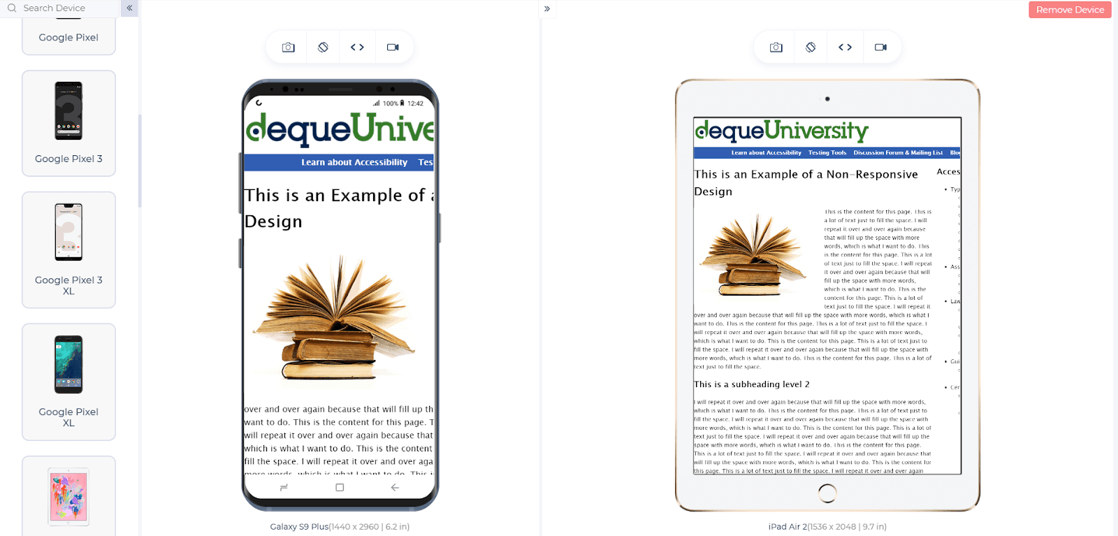
Responsiveness has now been with us for some time and it is the nucleus of research in web development today. But CSS responsiveness does not end here. With everyday improvements and subtle design tactics, we have brought responsiveness to another dimension. Today, a CSS responsive website is not just about adjusting to the screen size but to adjust your elements and design too. A website on the desktop will have an element like “Watch Now on Prime” and it will disappear when the same website is opened on the mobile phone. Not only this, but elements also adjust themselves and create new elements for a better presentation and user experience. To display on to a tablet and a mobile screen, I have used the LT Browser – a responsive website emulator.
In this detailed walkthrough of LT Browser tutorial video, we will help you get started with LT Browser.
This detailed guide on UI design mistakes that can be avoided for better mobile view of a website will help you understand this responsive CSS design tutorial more. All in all, creating a mobile view of a website does not happen magically! Developers code it into the website and this is what we are here to learn. Moving on with this responsive CSS design tutorial, we will discuss every aspect of a CSS responsive website one by one and find out how you, as a developer, can adjust it for the mobile view of the website.
Viewport & Meta Viewport Tag
First things first, websites are not humans. They won’t adjust automatically to the browser window. It is a comfortable guess that first to shrink or expand our website, we need to calculate the viewport of the browser and take it as a reference for our calculations. A viewport is an area that is visible to the user on the browser window. A bigger screen will have a larger viewport and a smaller screen will have a viewport less in number.
Isn’t it? Actually, this is partially true. The viewport is not fixed on any of the devices. So, if you are thinking that my laptop will have a fixed viewport then let me resize my browser screen and show you the viewport now. For example, the following code will display the viewport to the user on full-screen mode (Microsoft Edge):
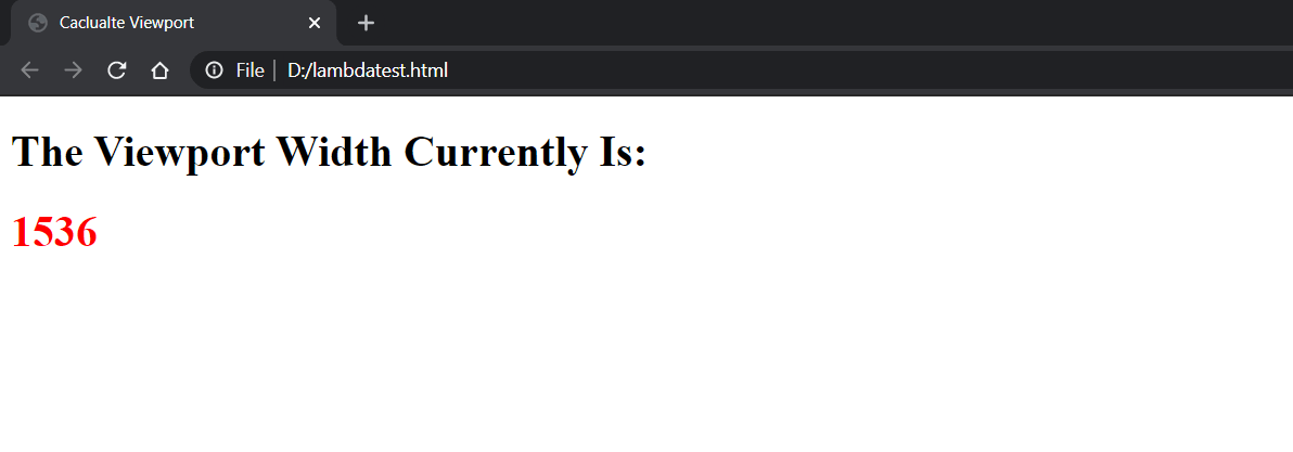
Notice how the number changes when the same browser window is resized on the same device:
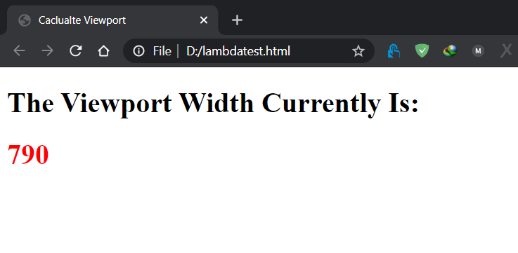
The code for the above HTML file is as follows:
| <!DOCTYPE HTML> | |
| <head> | |
| <title>Caclualte Viewport</title> | |
| </head> | |
| <body> | |
| <h1>The Viewport Width Currently Is: <h1 id = "VW" style = "color: red">Calculating....</h1></h1> | |
| <script> | |
| var w = window.innerWidth; | |
| var h = window.innerHeight; | |
| document.getElementById("VW").innerHTML = w; | |
| </script> | |
| </body> | |
| </html> |
This defines one more case in our journey of responsive CSS design tutorials. Not only should the website look great when the user presses Enter on that browser but it should also adjust itself when the user resizes the browser window. I will cover it in the later sections of this responsive CSS design tutorial.
Setting the viewport is a very easy job and it should always and always be the first thing you do before coding the website. The following tag is used to calculate the viewport and adjust the elements of the website automatically so that the elements scale accordingly.
|
1 |
<meta name="viewport" content="width=device-width, initial-scale=1.0"> |
Width = device-width is used to tell the machine to adjust the width of the website according to the width of the browser i.e. a 100% scale. The website will be adjusted (expanded) according to the viewport. This attribute can also have a fixed property such as width = 500. Assigning a fixed value is denoting the minimum viewport value required for the website. If the viewport is larger than that, the CSS responsive website is expanded accordingly.
The initial-scale = 1 denotes the zoom level I am setting in order to match the browser’s pixels. A value of 1 means keep the relationship as 1:1 for the browser’s pixels and the website’s. Increasing the initial scale value to two will zoom to 2x. All of this happens after the webpage has been fetched from the server in its original form. The process of adjusting the webpage happens at the browser’s end. Viewport also supports a few more attributes.
Viewport Attributes
There are other attributes available for the adjustment of the viewport:
Minimum-scale: This property defines the minimum zoom that a webpage can be done when rendered.
Maximum-scale: Converse to the minimum-scale, this property defines the maximum zoom that a webpage can be done when rendered.
|
1 |
<meta name="viewport" content="initial-scale=1, maximum-scale=1"> |
User-scalable: The user-scalable property is used for specifying the browser whether to scale the webpage or not. If the user-scalable is set to 0 or “no” then the webpage will not scale on the browser screen.
Viewport Adjustments On Orientations
It is clear by now that the browser will fetch the webpage in its original form. The browser will then calculate the viewport and the webpage will be adjusted accordingly. But the orientation part comes under special cases when we refer to this responsive CSS design tutorial. The webpage will adjust normally if the website was fetched keeping the mobile in the landscape orientation or portrait orientation. But, if the user changes the orientation, the browser will zoom the page in order to make it look like the webpage adjusted according to the viewport.
It often leads to chaos as this process creates a horizontal scroll when elements expand out of the range. To prevent such scenarios, the developer can use the minimum-scale and maximum-scale properties to give a better user experience. The minimum-scale and maximum-scale properties are often not recommended because of their outlandish behavior. If you are 200% sure about the results, they often come handy.
Viewport adjustment is just the baseline for the complete CSS responsive design tutorial that we need to follow. In practical scenarios, we need to take care of a lot of the things alongside the viewport. Standing out among all the important factors are the media queries which we will discuss in the next section of this responsive CSS design tutorial.
CSS Media Queries
Media rules were introduced with CSS2 with an aim to provide different styles for different media types such as mobiles or desktops or even printers. With @media rules, a developer could provide different style sheets for printers, a different one for mobiles, etc. But, instead of unwinding the complexities of the @media rules, the developers chose the path of ignoring these rules. This was also forced by the fact that at that time, these media were not so popular, and investing the time in developing a separate stylesheet was not worth it.
With CSS3, the media rules saw a little modification and instead of focusing on the type of media, the media rules were converted to media queries focusing on the behavior and specification of the media type keeping intact the media rules of CSS2. These behaviors may include calculating the orientation of the device, the height, and width of the device, viewport’s dimensions, etc.
A media query contains:
Media Type: The media type includes the type of media we are targeting through queries such as a screen, a printer, etc. This field is optional though.
Media Expression: This is the expression we would like to implement once we find the target media type.
Media Types In CSS
The CSS media query rules include four types of media types:
- Speech
- Screen
- All
These are all self-explanatory media types. When these media types were introduced first in CSS2, they had a lot of their friends such as TV, projection, braille, aural, etc. All of these have been deprecated except the four mentioned above.
A simple media query with media type screen can be written as:
|
1 2 3 |
@media only screen and {expressions} //CSS styling |
In the above example, you must have noticed the use of the word “and” used for conjunction as done in the English language. This is the operator which is helpful in adding the media type to the media expression and executing both of them together. The CSS code defined in the media rule will be executed only when both of the conditions will be true. For example, the media type is found to be a screen and of width = 320px.
Along with “and”, the other logical operators used in media rules are:
- Not
- Only
- Comma
Similar to the logical operations used in coding, “and” will require to return all the media types to be true whereas while using “comma” only a single media query is enough to be true.
Media Features In CSS
Once the developer is done with deciding the media type he wants to target (although he can skip that part), next comes an important and compulsory part of media query which is writing the features. Media features describe the changes you would want to make once the query is executed. For example, look at the following media query which is written for the screen and targets an aspect ratio of 13/6.
|
1 |
@media screen and (aspect-ratio: 13/6) {….} |
This is the main core of our understanding of the CSS responsive design tutorial. Although we can use a mixture of the media type and features to implement beautiful CSS designs, we need the following attributes of the media feature query:
- Orientation: Defines the orientation of the viewport.
- Height: Calculates the height of the viewport.
- Aspect-Ratio: Width to height aspect ratio of the viewport.
The following media query checks for the height of the viewport through the height attribute. If the height is found to be more than 680px and the orientation being landscape, the expressions/styling is followed.
|
1 |
@media (min-height: 680px) and (orientation: landscape) {…..} |
Multiple Stylesheets For Multiple Media Queries
Apart from defining everything into the main HTML source code, the developer can also prefer using multiple media queries for multiple media types and just link them on the main page by defining these queries in different stylesheets. For example, creating a separate stylesheet for the screen devices, a separate one for the printers, etc.
The following code will refer an external sheet for a media type:
| <!DOCTYPE HTML> | |
| <head> | |
| <title>External CSS Stylesheet</title> | |
| <link rel = “stylesheet” media = “ mediatype (logical operator) media expressions” href= “file_link.css”> | |
| </head> | |
| <body> .. … .. …</body> | |
| </html> |
Going through such a way produces cleaner and shortcode. Using an external sheet does not mean that the file will be downloaded only when the file is needed. All the files will be downloaded along with the web page to the browser whether the browser uses them or not. Therefore, we would not recommend this method as it increases the load time and utilizes extra bandwidth. But, if you are applying a lot of media queries (which, again, is not recommended) you should clean them by putting in different files paying extra precaution to use as minimum as possible.
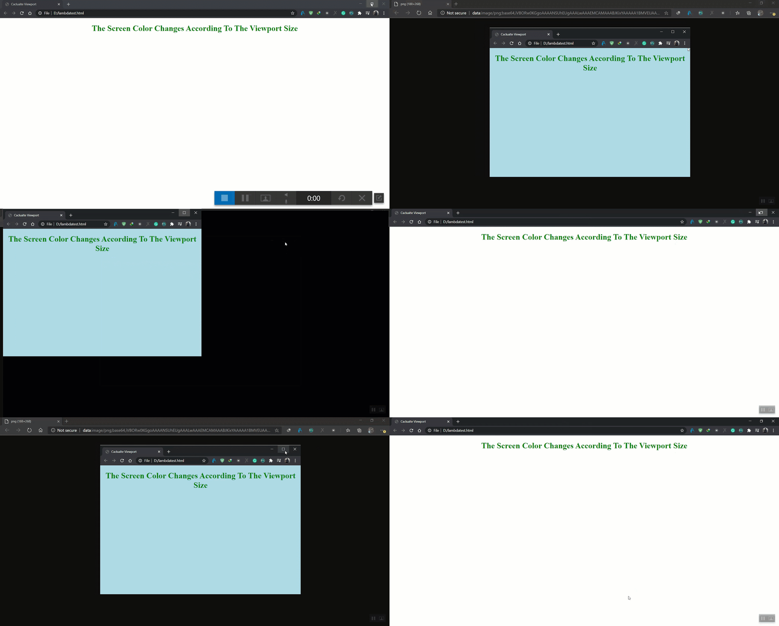
Below is an example of using the media queries:
This example changes the color of the background when the screen size decreases.
| <!DOCTYPE HTML> | |
| <head> | |
| <title>Caclualte Viewport</title> | |
| <meta name="viewport" content="width=device-width, initial-scale= 2.0"> | |
| <style> | |
| @media only screen and (max-width: 800px) { | |
| body { | |
| background-color: lightblue; | |
| } | |
| } | |
| </style> | |
| </head> | |
| <body style = "color : green"> | |
| <center> | |
| <h1>The Screen Color Changes According To The Viewport Size</h1> | |
| <script> | |
| var w = window.innerWidth; | |
| var h = window.innerHeight; | |
| document.getElementById("VW").innerHTML = w; | |
| </script> | |
| </center> | |
| </body> | |
| </html> |
CSS Grids
In the development of a website, we often fill the page with multiple columns. Look at the current page on which you are reading this CSS responsive design tutorial. A left column contains the sharing options. The right columns contain the category of articles and the middle column contains the main article content. This is a multi-column strategy that is very common and you would find it in almost every other website. The requirement of a helpful technique for the development of a CSS responsive website content was most requested by the developers all around the world and this led to the introduction of CSS Grids.
CSS Grids are used to create content divided into multiple rows or columns.

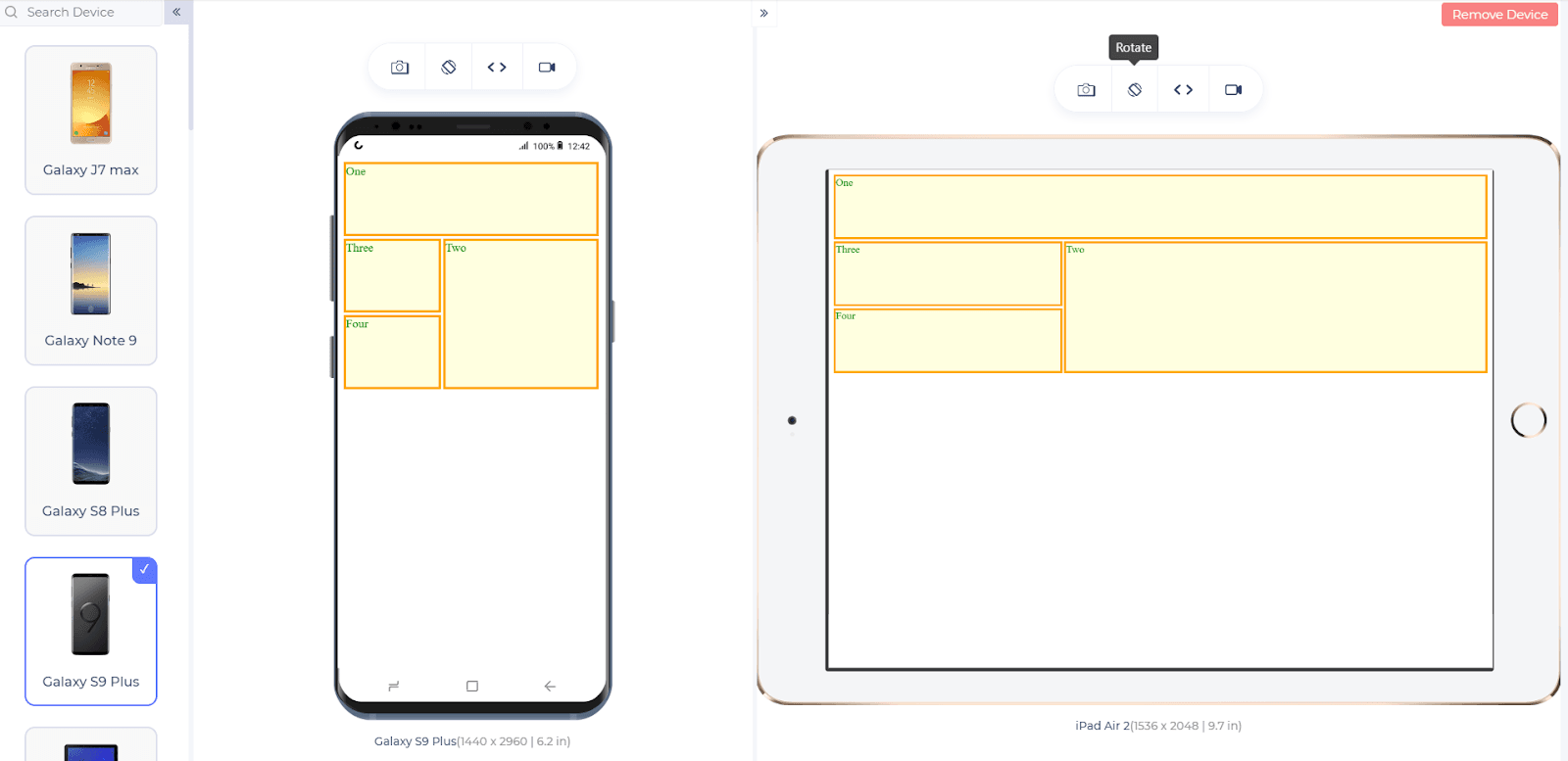
Although it is possible to create the Grid like structure with the help of @media queries, this leads to a long and complex code. The same can be done via grids in just a few lines. Grids are responsive in nature. Therefore, the developer need not do any extra work to make it adjust onto different screen sizes. So, the grid boxes will automatically change their sizes i.e. width and the height when the webpage is loaded onto a smaller screen.
Let’s see how to make responsive website grids in CSS.
To make an element into the “grid” structure, you need to specify the grid property in the display attribute.
|
1 2 3 4 5 |
class_name { display: grid } |
A good example of responsive CSS grids is as follows:
| <!DOCTYPE HTML> | |
| <head> | |
| <title>Caclualte Viewport</title> | |
| <meta name="viewport" content="width=device-width, initial-scale= 2.0"> | |
| <style> | |
| .gridclass { | |
| display : grid; | |
| grid-gap: 3px; | |
| grid-auto-rows: minmax(100px, auto); | |
| } | |
| .firstgrid { | |
| grid-column: 1/4; | |
| grid-row: 1; | |
| border: 3px solid orange; | |
| background-color: lightyellow; | |
| } | |
| .secondgrid { | |
| grid-column: 2/4; | |
| grid-row: 2 / 4; | |
| border: 3px solid orange; | |
| background-color: lightyellow; | |
| } | |
| .thirdgrid { | |
| grid-column: 50%; | |
| grid-row: 20%; | |
| border: 3px solid orange; | |
| background-color: lightyellow; | |
| } | |
| .fourthgrid { | |
| grid-column: 25%; | |
| grid-row: 25%; | |
| border: 3px solid orange; | |
| background-color: lightyellow; | |
| } | |
| </style> | |
| </head> | |
| <body style = "color : green"> | |
| <div class="gridclass"> | |
| <div class="firstgrid">One</div> | |
| <div class="secondgrid">Two</div> | |
| <div class="thirdgrid">Three</div> | |
| <div class="fourthgrid">Four</div> | |
| </div> | |
| </body> | |
| </html> |
To provide gaps between the elements, you can use grid-row-gap and grid-column-gap property.
With this Responsive testing tutorial for beginners, you will learn how to perform Responsive Testing of your website on the LambdaTest platform.
CSS Responsive Images
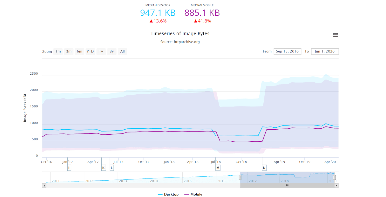
A website’s integral parts are images. Images constitute a good portion of the size of the viewport as well a good size of the total web page’s size. A study found out that 50% of a webpage’s size is that of images. Images that are not responsive can mess up the whole alignment of the website. Non-responsive images are also unable to deliver the meaning on the mobile view of the website that they were delivering on the desktops.
Dealing with the images while developing or testing the website is a trickier job than applying media rules and coding a CSS grid. There are numerous cases where an image can force the user to press that close button on the tab. For example, an image may be rendered in its original dimension which would look enlarged on the mobile device. Or an image can shrink so much that the subject of the image is not visible clearly. In this section of the CSS responsive design tutorial, I will highlight the major precautions that a developer should take while placing the image on the website.
For a better mobile view of the website, we need to take care of the image’s dimension and ensure that the dimensions scale down according to the screen size automatically. This can be done by defining the max-width attribute in percentage terms.
max-width: 100%
This is the percentage of the viewport and since the smaller devices have a smaller width, their 100% will be smaller than the desktop. So, the image will scale down accordingly.
This is a very quick fix and makeshift option while trying to make the images responsive. But using this option doesn’t heal where it hurts the most: the bandwidth consumption and the loading time of the webpage.
By rescaling the image, we may be able to show the full image to the user, but it still gets downloaded in its original size and original resolution. Therefore, even though our main content has been loaded seconds earlier on the webpage, a single image can burn the bridge between the user and the developer. To avoid such situations there are a couple of important steps.
- SRCSET attribute
- Art direction and the picture element.
The SRCSET Attribute
The “srcset” is an attribute of the image tag that takes the reference of multiple images as an input and provides an appropriate image to the browser. Appropriate here refers to an image that will most closely resemble the resolution of the screen. For a bigger screen, the same image but with bigger resolution is fetched from the server and vice-versa. For a developer, it makes sense to provide a user with lower bandwidth with a considerably smaller sized image. But on the downside, we need to save multiple image copies on the server. This increases our server resource usage.
The srcset attribute is written inside the image tag:
|
1 |
<img loading="lazy" srcset="boat-480.jpg 480w, boat-800.jpg 800w" sizes="(max-width: 600px) 480px, 800px" src="boat-800w.jpg" alt="Boat Landscape"> |
Picture Element For Image Responsiveness
Using srcset attribute is good but it poses one major non-technical problem. If an image is having a subject such as a man, the same image when rendered on the smaller screens will make the subject so small that the beauty of the image is disturbed. For example, look at the following image:
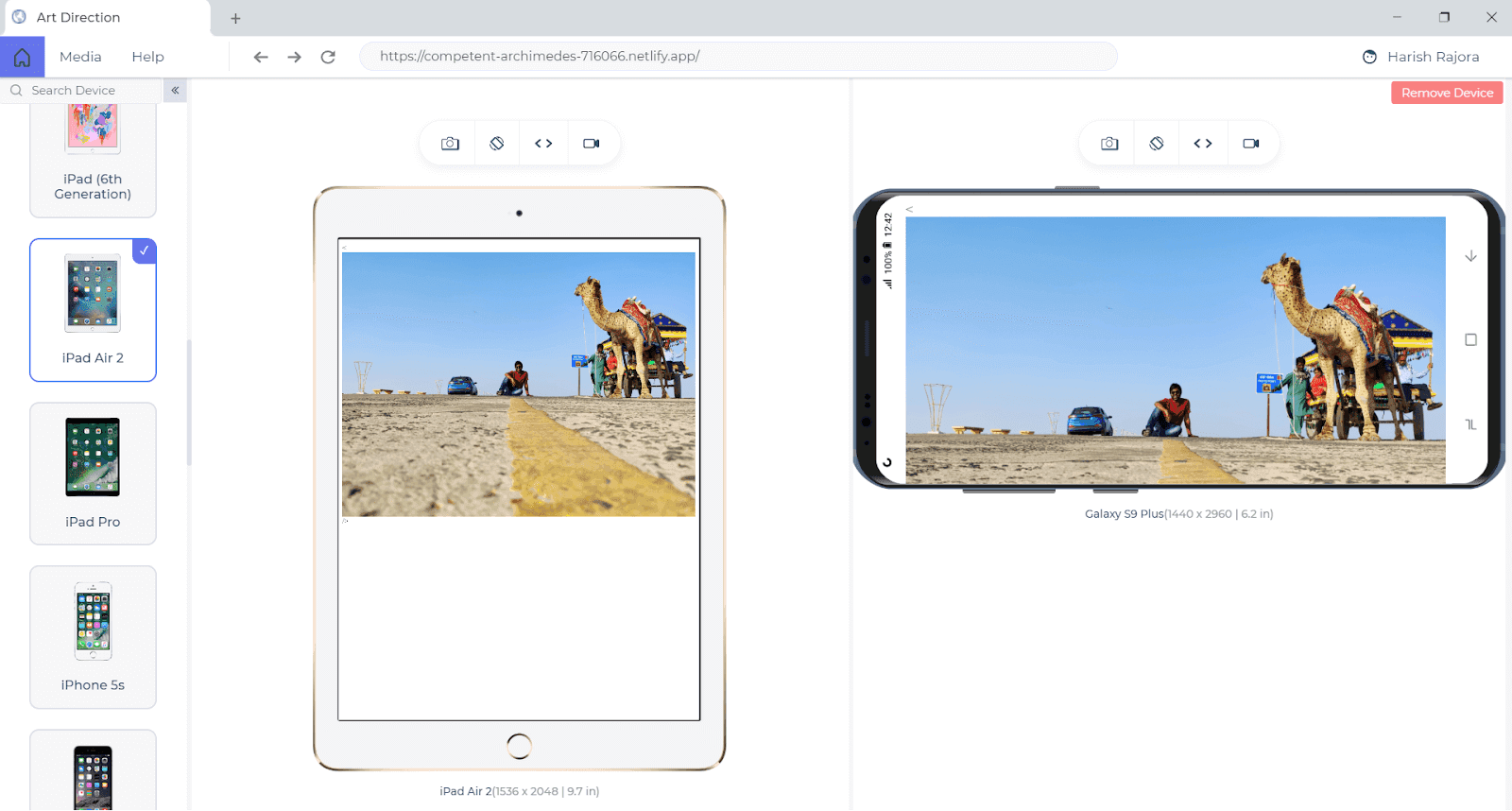
This image is rendered on a desktop. Now when I render the same image on a mobile screen, I am not able to focus on the subject anymore. The subject is too small to be clear.
We can deal with such cases not by providing multiple copies of the same image but by providing the same image altogether. By saying “same image” I mean the same image but with multiple cropped versions. For this, we go with the picture element.
The picture element is not an attribute as “srcset” but is a new tag like img. The picture element has the following syntax:
|
1 2 3 4 5 6 7 8 9 10 11 |
<picture> <source/> <source/> …..... <img loading="lazy"/> </picture> |
The source tag specifies the multiple files and the resolution for which they should be selected. The “< img >” tag is very important in the picture tag otherwise the image is not loaded. So, as an example, I have saved multiple copies of the same image I displayed above and rendered using the picture element.
|
1 2 3 4 5 6 7 8 9 |
<picture> <source media = “(max-width: 799px)” srcset = “kutch-480.jpg”> <source media= “(min-width: 800px)” srcset = “kutch-800.jpg”> <img loading="lazy" src= “kutch.jpg” alt= “Rann Of Kutch Landscape” /> </picture> |
The browser support for both of these elements is really good and you can use any one according to your requirements. For a detailed guide on using these elements and a few more responsive CSS design tactics, you can learn how to make Responsive Images.
CSS Flexbox
The flexbox module is short for a flexible box which is quite similar to the CSS Grids. Both of the modules focus on adjustments of the different elements on the webpage. But there is a very slight difference. Flexbox is a one-dimensional module whereas CSS Grids is a two-dimensional module. By one-dimensional module, I mean that at one time while designing the box, we can focus on only one dimension. But as you have noticed in the grid section of this responsive CSS design tutorial, we focussed on two axes at that time. This axis on which we focus in Flexbox is called the main axis and is defined by the attribute flex-direction.
Flex-direction has four attributes:
- Row
- Row-reverse
- Column
- Column-reverse
Another great thing is that you won’t have to worry about the CSS writing modes in the flexbox. They are set according to the language you are using. To create a flex, create a container in which we will design the flexbox. This is done easily by setting the display property to flex.
display: flex
The following code designs a flexbox in the row-reverse direction i.e. it starts in the reverse direction of the row (right to left).
| <!DOCTYPE HTML> | |
| <head> | |
| <title>Flexbox</title> | |
| <meta name="viewport" content="width=device-width, initial-scale= 2.0"> | |
| <style> | |
| .flexbox { | |
| display: flex; | |
| flex-direction: row-reverse; | |
| } | |
| .box { | |
| background-color: lightyellow; | |
| border: 2px solid orange; | |
| padding: 2px; | |
| width: 20%; | |
| height: 30px; | |
| } | |
| </style> | |
| </head> | |
| <body style = "color : green"> | |
| <center> | |
| <div class="flexbox"> | |
| <div class="box">One</div> | |
| <div class="box">Two</div> | |
| <div class="box">Three</div> | |
| <div class="box">Four</div> | |
| </div> | |
| </center> | |
| </body> | |
| </html> |
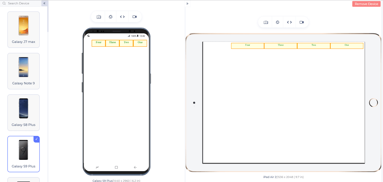
Responsive With Other Web Languages
If you have developed a website, preferably the front-end, or are aiming to develop one, you must be knowing the combination of languages we use during development. Apart from CSS, the most popular languages for front-end web development are JavaScript and jQuery and they are equipped with a lot of interesting features for mobile view of website.
Responsiveness With JavaScript and jQuery
JavaScript and jQuery can be used to do the same stuff that we did in the above section of the responsive design tutorial. For example, using CSS for calculating the width of the viewport or image responsiveness, etc. JavaScript and jQuery provide extra features and functions which would help you to provide something more than what you were provided with the CSS base functions.
With the following code you can easily calculate the viewport width:
|
1 2 3 4 |
<script> var w = window.innerWidth; var h = window.innerHeight; </script> |
With the following code, you can select the element from the HTML and apply any function to it.
|
1 2 3 |
const selctimg= document.querySelectorAll("img"); selctimg.forEach(elem => elem.addEventListener("click", shrinkSize)); |
You can then use this element to shrink in size and place it on the website.
Developer Tools In Responsive Design Tutorial
While developing a website, no matter how hard we work to design it perfectly there are very high chances that one or the other element will break. A website contains a lot of elements that work with each other synchronously. Even a single misalignment may result in another element’s misalignment and the chain reaction follows. So, if we have coded everything according to the responsive CSS design standards and still something breaks, should we recheck the code manually? No, that’s a really bad idea. A better option is using the browser’s developer tools.
All the major browsers provide these amazing features of developer tools which will log and display each and everything your website is doing. Developer tools also provide breakpoints into the JS code so that you can even check the variable values that the variable possesses at that stage.
Developer tools have so many features that it is just impossible to mention them here. We have a detailed post on Google Chrome Developer Tools that you can go through to learn more. Although the post is specific to the Google Chrome browser, it actually does not matter what developer tool you use based on this responsive CSS design tutorial. These features are present in every major browser with the same name or sometimes with a different name.
Webpage Optimization For Better Responsiveness
By following the above methods and processes, we have successfully done our part to convert the website to a responsive website. In this section of the CSS responsive design tutorial, I would like to mention the three most common mistakes that a new or experienced web developer makes while developing the website. These mistakes can shake the elements in the view of responsiveness, but not always. So, we always recommend developers to be cautious while designing the mobile view of the website rather than making huge efforts later on. I am listing down a few pointers to keep in mind while designing a CSS responsive website:
Use Visibility: Hidden very carefully: A lot of the times I have noticed that the developer just hides the element they do not want to show on the smaller screen devices. This is alright if the element is a lighter one (such as one paragraph etc) but when the same practice is applied to multiple heavy elements on the website, we are practically fetching everything from the server and just hiding it on the client-side. This method is of no use and increases the load time.
Always apply threshold points after experimentations: What if I say to you that I need this image to be of max-size as of a tablet. Does that clearly indicate what size I want? No! But still, developers have a practice of just memorizing certain pixel values and use them as they develop the website. For example, 640px for mobiles becomes a standard for most of the developers. This number should always be applied after the experimentations and applying the breakpoints while testing. A breakpoint is a threshold value up to which the element is giving us no trouble. The best practice is to keep experimenting with the number for the same element in the browser’s developer tool and then conclude on a threshold number.
Optimize the written content: So, it is obvious as a developer that if the width of the screen is getting reduced, so does the font-size and the words written per line. But how much should we reduce it? If we make the font-size too small then the user might not get interested in reading the content. If we make it too big, the user does not want to scroll so much. Optimum size is having 8 to 10 words in a line. This will scale according to the screen size but the research shows that 8 to 10 words are a perfect size for anyone who is interested in reading.
Alternatives To Responsive Design
Everything that I discussed above in this responsive CSS design tutorial basically revolves around coding. By coding, I mean analyzing and writing the logic from the scratch. For example, writing the media queries to suit the screen size and calculating the threshold sizes, etc. But there are other alternatives that I would like to discuss before wrapping up this responsive design tutorial.
Bootstrap
Bootstrap is a framework that is made purely for a CSS responsive website design. Bootstrap is very helpful for each and every developer as it has everything optimized beforehand for responsiveness. So, when I am making an input field for the registration forms, it automatically shrinks to the appropriate size if I am using Bootstrap methods. They are inbuilt methods and the developer need not worry much about the responsiveness. Although Bootstrap is not 100% effective. Since bootstrap will contain only a few methods for different purposes such as forms and images etc, for other elements like div, you need to do the hard work. So, a combination of both is much better.
Templates Designed for Responsiveness
Templates are available all over the internet which are already optimized for CSS responsiveness and you just need to change the data. It works much like WordPress templates. Using a template is generally not recommended because it restricts the freedom of a developer and bounds him into restraints. It is alright to use a responsive CSS template when the time is less for the project, otherwise, ignore this method.
Perform Cross-Browser Testing
The above-stated practices are meant for the development of the website. Once that is achieved by applying everything mentioned in this responsive design tutorial, it is time to act like an end-user and perform testing on the website. Testing a website for multiple browsers is very important since till now you were focused onto your own browser. There are a lot and lots of options for the end-user and he can open your website on any of the browser, operating system, resolution, and version of his choice. Therefore, it is better to test before publishing.
Refer to the complete guide to the Responsive Testing of a Locally Hosted Website for more.
Testing a website for such scenarios is called cross browser testing and there are a number of ways to do it. You can choose the manual path which although is never recommended seeing the time constraints and the number of browsers available. The automated cross browser testing path contains two major roads, one is the device labs and the other is cloud-based cross browser testing. Both of these options are equally efficient and equally good. It depends completely on the tester’s choice. Personally, I prefer cloud-based testing because it is pocket friendly, faster, and more detailed than the device labs.
Also, some cloud-based cross-browser testing platforms like LambdaTest have created a separate section for Responsive Test. Therefore, it gives a better idea towards our product i.e. the website. Some key features Of Responsive Testing that you can try out on LambdaTest, which allows you to test cross browser compatibility on 3000+ browsers and operating systems.
As an option to cross-browser testing, you can also choose cross-browser testing specific browsers. These browsers are really great! They are meant to perform cross-browser testing and hence contain specific features such as opening the website on two devices together to compare how they are rendered.
Conclusion
The market has changed today and so has the products. In a race to attract more and more customers, engineers and researchers are coming up with a huge number of variations in the product and constantly improving the ones that already exist. This has flooded the market with mobile devices which are so similar yet so different, making it harder for developers to create responsive websites. It is impossible to create a version for each device of a particular size hence we go with the responsiveness of the device. This responsive design tutorial has touched every aspect of responsiveness which can help create responsive websites. Once the website is created, a must do the task in the checklist is the cross browser testing of the website to be sure before anything falls apart.
I hope this responsive design tutorial helped you in understanding all the necessary steps to create the best mobile view of the website. If you have some other ideas and methods of responsiveness, please do share in the comment sections and we will try to take it up in our next post. Hope you enjoyed the post.
Happy testing!
Frequently Asked Questions
What is the responsive in CSS?
Web pages should be designed to look good and be easy to use regardless of the device used to view them. Responsive CSS web design refers to the practice of using CSS and HTML to resize, hide, shrink, enlarge, or move content so that it looks good on any screen.
How do I make my CSS code responsive?
The viewport meta tag must be included in the HTML code to make a web page responsive. This sets the page width to the device width and the initial zoom to 1. If the meta tag is not included, mobile or tablet users will see a desktop version of your website that might not fit properly on their screens.
What is responsive coding?
Responsive coding refers to designing and developing websites or applications that can adapt and adjust their layout and content to different screen sizes and devices. A responsive website can be viewed and used effectively on desktops, laptops, tablets, and smartphones without losing functionality or usability.
What are responsive design basics?
Responsive design basics include the use of fluid grids, adaptable images, and media queries to guarantee seamless website and application adaption across various screen sizes and devices. It makes it possible for user-friendly interactions that improve usability and accessibility for all users.
What is responsive CSS vs reactive CSS?
Responsive websites automatically resize to the screen size the website is being viewed on, while reactive websites display a website especially designed for the device type the website is being viewed on.
Got Questions? Drop them on LambdaTest Community. Visit now


