Enhancing Performance Tests with Control Charts
Mike Harris
Posted On: May 3, 2024
![]() 33439 Views
33439 Views
![]() 12 Min Read
12 Min Read
It is now one hundred years since the introduction of control charts. I use control charts to analyze the results of performance tests. If you have a Fitbit you will be using control charts because the personal ranges for your health data are based on control charts.
On 16 May 1924, Walter Shewhart gave his manager at Bell Labs a one-page memo that suggested a way to use statistics to improve quality (Dobyns and Crawford-Mason p52). With his memo “Walter Shewhart launched the modern scientific study of process control” (Adams and Butler p61). The memo included a drawing of what might have been the first control chart. A control chart is a tool which managers and teams can use to continually improve quality by listening to the voice of their process.
Bell Labs made telephones and advertised using the slogan “as alike as two telephones” and hoped to replace “as alike as two peas in a pod”.The technical problems were severe and people demanded reliable phones. (Dobyns and Crawford-Mason p52). To improve the quality of the telephones” Shewhart created a statistical system to improve production quality” (Willis and Lewis p30). The statistical system he created used control charts.
What is a Control Chart?
A control chart is a time series graph with three extra lines and is a “simple and effective way to define the voice of the process” (Wheeler p23). The graph has a central line to help detect trends and has two control limits equidistant from the central line. These control limits are computed from the changes in the process’ time series data, and so can be described as the voice of the process. (Wheeler p23)
You can create control charts to analyse your LamdaTest data by using the LambdaTest API to export data to a spreadsheet or to create a dataset using Geckoboard Datasets API. LamdaTest also has a test analytics and observability Suite.
Analyzing Qualities
Control charts are invaluable for analyzing the objective and measurable aspects of the product under testing. When assessing a product’s quality, we often consider its inherent characteristics. However, defining quality solely as the “goodness” of an object is overly vague and impractical. Quality, derived from the Latin word “qualitas,” signifies “how constituted,” implying that every application comprises numerous attributes.
Each conceptual “something” consists of various conceptions, indicating that a thing possesses qualities rather than a single quality. In the context of testing an application, these qualities encompass usability, performance, and accuracy. While some qualities are objective and quantifiable, such as performance, others are subjective and challenging to measure, like usability.
Analyzing Data in a Control Chart
Analysis of objective qualities, such as the performance of the application, can be made using control charts, and doing so will enable you to listen to the voice of the performance tests.
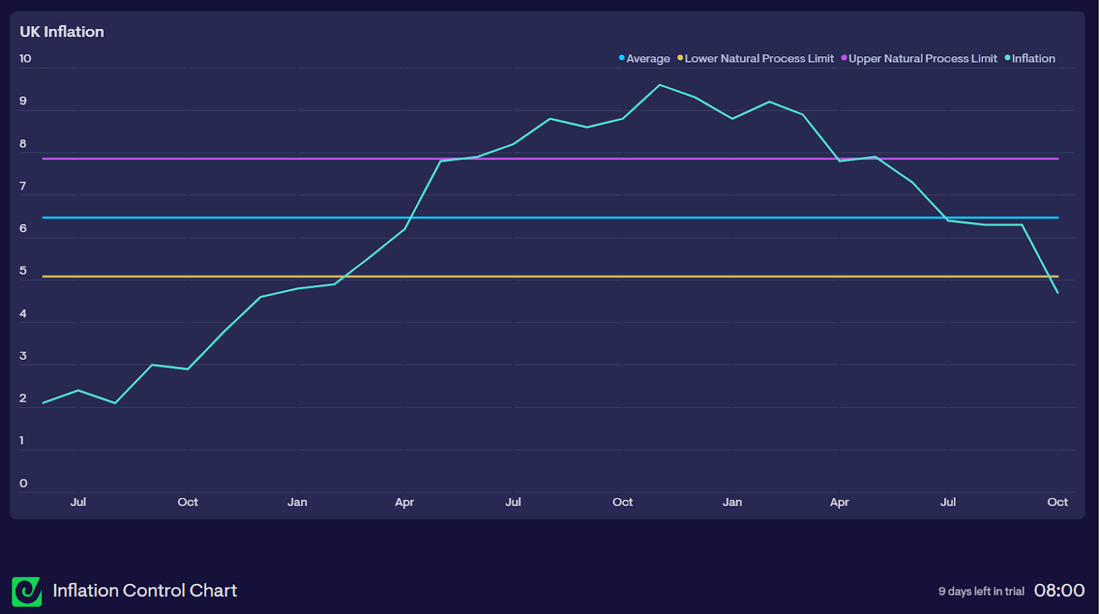
Below is an example control chart. An objective quality of the economy is inflation. Inflation can be analysed in a control chart. The control chart below shows recent UK inflation rates as they spiked post covid:

In addition to the inflation time series data a central line, the mean average, has been added “for detecting shifts or trends” (Wheeler p23). Upper and lower control limits have also been added. The control limits are labelled as Natural Process Limits.
Faults that fall outside the control limits are described as having a special cause, and faults within the control limits are described as having a common cause. You can describe “faults of the system as common causes of trouble, and faults from fleeting events as special causes” (Deming p314). “When a control chart indicates no special cause present, the process is said to be in statistical control, or stable”. (Deming p176)
The inflation control chart shows that the time series graph of inflation starts below the control limits, goes above the control limits and goes back down below the control limits. This shows that the variation in UK inflation, in the period shown, had a special cause. The chart also shows that in the period shown in the chart, UK inflation was not in statistical control.
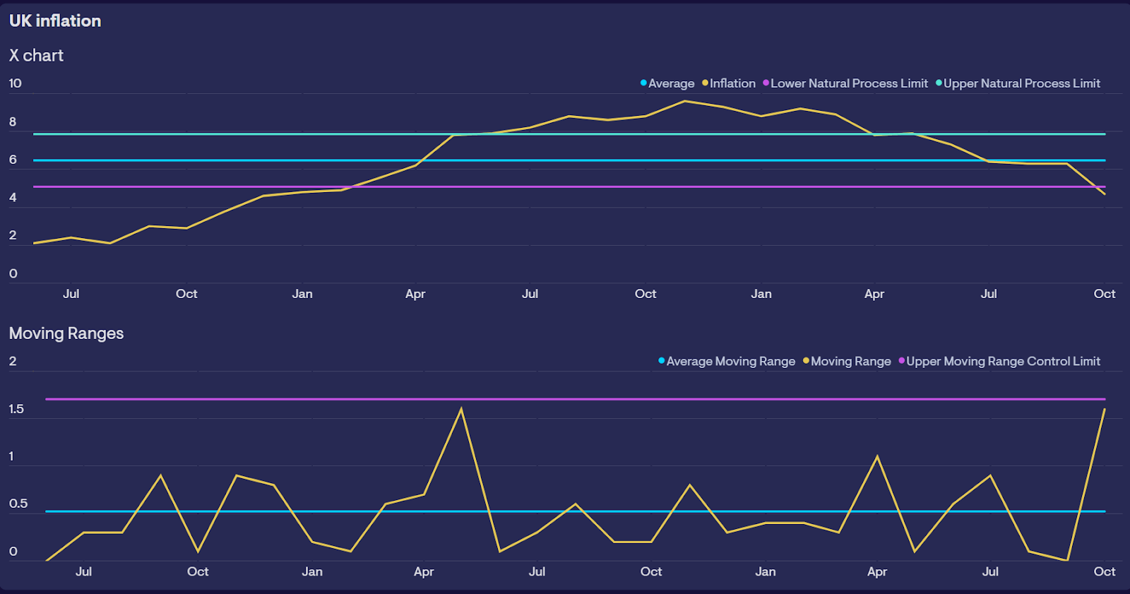
We can extend the control chart to include a chart for the moving ranges of the time series data in the control chart, as in the chart below.

An X chart is displayed above the MR (moving ranges) chart. The Natural Process Limits (control limits) on the X chart are calculated using the moving ranges. “The Natural Process Limits are the voice of the process. They define what the process will deliver as long as it continues to operate as consistently as possible.” (Wheeler p43)
The moving ranges are the differences between each data point in the time series data. The moving ranges chart includes the average of the moving ranges and an upper control limit. The two charts together are known as an XMR chart. The control chart is known as the X chart and the moving ranges chart is known as the MR chart. The moving ranges time series are the differences between the data points in the control chart. The moving ranges chart can pinpoint when changes occurred. The X chart shows that inflation was out of statistical control. The moving ranges chart shows two events when there were large changes in inflation when inflation went out of statistical control.
You can experiment with control charts to discover more about your process. If the above XMR chart was displaying the results of your performance tests you would want to investigate the two events shown by the MR chart. You could also create more control charts. The XMR chart shows the process, but this chart can be seen as showing three processes. One before the two events, one between the two events and a new process after the two events. If you created a new control chart using the data before the first of the two events, a second chart for the process between the two events and a third for the process after the two events you could compare the charts and see how the process has changed. Control charts can show if the process after the two events is different to the process before the two events.
Analyzing performance test data
Measurable data, such as performance test results, can be analysed in an XMR chart. The X chart will, for example, show if the performance of an application is in statistical control and the MR chart will show when any large changes in performance occur.
The noise in time series data caused by variations in the data makes analysis difficult if it id displayed on a line chart. It can be hard to decide if the perceived signal from time series data is a signal or noise. Is the difference from the historic average a signal or noise? Control charts make it easier to differentiate between signals and noise. On a control chart, “signals are indicated by points which fall outside the control limits or by obvious non-random patterns of variation around the central line” (Wheeler p30).
A control chart containing the results of your performance tests will show whether the variation in the results falls inside or outside the control limits, and so will show if the variation has a common cause from the system or a special cause from outside the system. If the variation has a common cause and you wish to reduce the variation in performance you will need to improve the system. If the variation has a special cause you will need to “fix” the special cause”.
The control chart will also enable an analysis of the data that is within the control limits by looking to see if the data follows one of the eight Nelson Rules. If the data follows one of these rules it is a signal not noise. These rules are:
- One point above the upper control limit or below the lower control limit
- Two points above/below 2 sigma from the average
- Four out of five points above/below 1 sigma from the average
- Eight points in a row above or below the average
- Six points in a row ascending or descending (trend)
- 15 points in a row “hugging” the average line (between -1 and +1 sigma)
- 14 points in a row alternating up and down
- Eight points in a row above 1 sigma or below -1 sigma from the average
If the data in your performance test stays within the control limits then you know that the performance of your application is in statistical control and to improve performance you need to improve the system. When the data is outside the control limits you need to look for a special cause of the variation to improve performance.
Charts often compare data to goals, budgets and targets. This will result in either a favourable or unfavourable outcome because the goal, budget or target is either met or missed. Performance tests can have a goal or target. Goals, budgets and targets are specifications that can be regarded as the voice of the customer. People feel pressured to meet goals, budgets and targets. Brian Joiner pointed out that there are three ways to proceed when someone is pressured to meet a target value:
- They can work to improve the system
- They can distort the system
- Or can they can distort the data (Wheeler p20)
An example of how a system can be distorted to meet a target would be a sales team I once heard of that met its quarterly target by including sales in the current quarter they expected to get in the following quarter.
Advantages of Control Charts
Control charts do not compare your test results to goals or targets. Goals and targets are the ‘voice of the customer’, they define what you want. A control chart is the ‘voice of the process’, it defines what you will get from the system (Wheeler p79). A control chart will enable you to listen to the voice of your process, such as your application’s performance and so help you to improve your system.
It is cheaper to produce higher quality than it is to fix errors, for example, it is cheaper to fix a bug in development than to fix a bug in production Control charts enable managers and teams to produce higher-quality output because they enable managers and teams to analyse failures before customers experience them and help find bugs earlier.
Control charts provide an alternative to blame. Before control charts quality assurance included blame, an inspector would inspect products coming off the production line. If products were substandard they would either have been put in the trash or sent for rework. The production line that produced the substandard products would have been blamed for the faults. Using control charts meant that managers could, instead of blaming individuals, find the causes of errors. They could, for example, compare production lines and seek to understand why some production lines produced fewer faults than others.
The use of systems thinking is facilitated by the use of control charts. Control charts enable teams and managers to view the process. They can, for example, see in the control charts the results of changes to inputs to the system, for example, they can see the effects on performance of changes to the system.
Continual improvement is helped by control charts. Walter Shewhart also created the plan-do-study-act cycle which is better known as the Deming Cycle. Teams and managers can use the cycle to take the initiative to improve the results they see in a control chart. Using the cycle they can plan the initiative, “do” the initiative, study the results of the initiative including seeing how they affect the results in a control chart and then act on what they have learned.
The Evolution and Ubiquity of Control Charts
Control charts started with Walter Shewhart’s memo on 16 May 1924 and a century later are widely used. They are used in DevOps automated governance, analysis of unit testing, load testing, customer satisfaction, health care, nuclear power, car manufacturing, education quality management systems, managing stock levels, supermarkets, and marketing Campaigns.
After one hundred years of use control charts are not on trial. They can help developers and testers, for instance in analysing the results of performance tests. “The question is not whether or not the techniques will work – but rather whether or not you will make them work” (Wheeler p121). I would encourage you to experiment and create a control chart so that you can hear the voice of your process. These are resources that I am using and they can help you:
- This book contains all the information you need to create a control chart: Understanding Variation: The Key to Managing Chaos by Donald J. Wheeler
- I am using Geckoboard Datasets API to create control charts, such as the ones used to illustrate this article.
- This video by Dennis Sergent gives a useful overview of control charts: Profound Book Club Control Charts by Dennis Sergent
I would also like to thank John Willis, Dennis Sergent, Rob Park and the other members of the Deming Profound Book Club for helping me learn about control charts.
Works Cited
- Adams, Stephen B., and Orville R. Butler. Manufacturing the Future A History of Western Electric. 1999.
- Deming, William Edwards. The new economics for industry, government, education. Massachusetts Institute of Technology, Center for Advanced Engineering Study, 1994.
- Deming, William Edwards. Out of the crisis. Massachusetts Institute of Technology, Center for Advanced Engineering Study, 1986.
- Dobyns, Lloyd, and Clare Crawford-Mason. Quality Or Else: The Revolution in World Business. Houghton Mifflin, 1991.
- Shewhart, Walter A. Economic Control of Quality of Manufactured Product. Martino Publishing, 1931.
- Wheeler, Donald J. Understanding Variation: The Key to Managing Chaos. SPC Press, 1993.
- Willis, John, and Derek Lewis. Deming’s Journey to Profound Knowledge: How Deming Helped Win a War, Altered the Face of Industry, and Holds the Key to Our Future. IT Revolution Press, 2024.
Got Questions? Drop them on LambdaTest Community. Visit now


