Complete Guide To Modern CSS Color Functions And Spaces
Harish Rajora
Posted On: July 22, 2022
![]() 33674 Views
33674 Views
![]() 21 Min Read
21 Min Read
Web designers have always been fascinated by the vibrant spectrum of colors in the real world. They could be working on any web development framework, but the fascination never leaves them alone. Over the years, displays have focused heavily on three color spectrums: Red, Blue, and Green. Each denotes 256 types; therefore, the total amount becomes 256 x 256 x 256, which is around 16.77 million colors (slightly more than that).
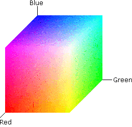
From CTA design to web page background, the color you use plays a key role. During 2005 and 2015, manufacturers often promoted their displays as 16 million color screens. Screens and the web have been using this standard for years. However, this color space does not encompass the entire spectrum, which is why new technologies have been emerging in screen manufacturing and website development in recent years. With the growth of online web browsers, we need to consider CSS color functions and spaces more than ever.
In this article on CSS color functions, we explore some modern CSS color functions and spaces that developers and designers can leverage for their web design.
Are you new to CSS? Here is our ultimate CSS Cheat Sheet.
TABLE OF CONTENTS
Why bother learning about colors?
When we talk about CSS color function, the first thing to ponder is why we should bother about colors and color spaces? This question may be answered by the research titled- The impact of color on Website appeal and users’ cognitive processes. In this research, the authors Nathalie Bonnardel et al. tried to experiment with the effect a website’s colors may have on a user in three different areas:
- The influence on their website navigation.
- The information they retain when presented to them on the home page in the form of a paragraph.
- A questionnaire.
The researchers chose two domains associated with a web app – designers and users – to learn how different people involved in a website perceive colors. The findings of this research indicate how designers preferred a set of colors but relied entirely on their experience and technical expertise to influence the decision. Their thoughts were not tailored to users’ desire for a more interactive experience.
Color is more than just different colored pixels arranged in a random pattern. Numerous studies have determined how colors affect our psychology, emotion, and mood. It is not a coincidence that doctors wear white and that hospital curtains are always green, no matter where you are in the world. When a user visits a website, a similar effect is always visible. Since the website contains a wide range of colors, we might have to consider the contrasts of the nearby colors. That’s where CSS color functions come into play.
Color is an important factor in a website. It’s always advisable to use a website testing checklist before and after you finalize the color palette for your website.
CSS color function – a brief introduction
The previous section helped us understand the significance of colors and why we should spend time deciding which colors to use. On the other hand, this process is entirely dependent on the research team and other design experts. As a result, we can skip it here in our analysis of color spaces and functions. However, we must consider one critical scenario: What if a designer requires color, but we don’t have it in our CSS color function when they want to create responsive CSS images?
This was not a common scenario previously, but recent advancements in color spaces and exploring a wider range of colors have prompted us to understand that CSS color functions should be much more than they are now.
Many of you who use CSS color function may be familiar with this code:
or
These are the popular ways to implement a background color to any element. The right part here defines the spectrum we are considering our color in.
For example, rgb(255,255,255) means choosing the red, green, and blue colors at maximum intensity. This would result in white color.
However, when it comes to CSS colors, we need to consider two factors: the screen on which we display the colors and the CSS library. CSS developers have spent a long time figuring out how to represent colors on a broad spectrum so that a designer and developer can collaborate easily. The following section discusses CSS color function, representations, relevance, and meanings.
Tap on this link to learn about browser compatibility testing of CSS colors.
Representing CSS colors in different spaces
The method you use to implement the CSS color function will significantly affect which color space you use. In other words, different methods will provide different options for selecting a color.
A color may not exist in one space but may exist in another.
In this section, we’ll start with the most basic CSS color function and spaces and work our way up to more complex ones.
RGB
The RGB color space, abbreviated for Red, Green, and Blue, is a derived space from the spectrum a human eye can detect. From just 216 color spaces in the initial systems, HTML has moved to 16.77 million colors in the same space. This has become possible due to 24-bit displays that allow the lights to display more colors on single pixels.
When we talk about RGB space, we are essentially talking about throwing three different colored lights and mixing them to get the color we want. Here, the intensity and hue may depend on each color’s intensity we want to achieve.
For example, a fundamental foundation of RGB can be understood by the following image:
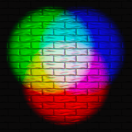
With just three colors, we can observe various colors in the above image, such as yellow, cyan, magenta, etc. Since we overlap or add these different lights, the RGB space becomes a sub-part of additive color spaces. We can point out each color represented in this color space by presenting each color on the axis of a cube with one vertex as 0 (complete black).
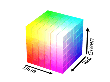
However, there is a small catch here. RGB space might not be able to represent the same color as you would see while developing a web page. You can even see the difference when the same web page is projected on a different manufactured screen. This depends on the part used to project light and its use age. A new and an old part may project a slightly different color with the same RGB value.
In CSS, we apply RGB color with the rgb() function built into the library. It asks for three values which determine each for Red light, Green light, and Blue light. The coordinate can then be located in the cube to paint the pixel.
Syntax for RGB CSS color function
The argument values range from 0 to 255, presenting the values for each of the bits allotted to each color.
A small variation of the rgb() function is the rgba() function with an additional alpha parameter. The alpha parameter defines the opacity required in the color scheme when it renders on the screen.
So an alpha value of 0 will produce a transparent background –

An alpha value of 1 will produce a completely opaque background.

Note: The parameters can be separated by comma or spaces in both rgb and rgba functions. Read our blog on HTML CSS tricks for additional hacks.
Browser support for RGB CSS color function
RGB space is supported on all modern browsers, including Chrome, Firefox, Edge, and Safari.

Check out LambdaTest learning hub to learn more about responsive testing?
Hexadecimal
The next type of notation is hexadecimal notation. A hexadecimal notation represents the similar space as represented by the RGB. Therefore we always refer to hexadecimal as “notation” rather than “space”. The only difference is in the writing part. Any RGB combination can be represented in the hexadecimal by converting it to a triplet of one byte each. Each byte represents a red, green, and blue segment from 00 to FF.
Syntax for Hex CSS color function
So, for example, I have an RGB combination of rgb(36, 104, 160). In hexadecimal, 36 will become 24, 104 will become 68, and 160 will become A0. Hence, rgb(36,104,160) becomes equivalent to #2468A0.
The hexadecimal notation is hard to remember for designers and developers. Therefore, as a practice, it is a good idea to use RGB values instead for a better understanding of the color. But, the choice of notation depends on the team and how comfortable they are with each of them.
Why not make use of a virtual browser to test RGB color space? It’s going to save more time for developers and testers.
Browser support for Hex CSS color function
The hex notation system for defining colors in a web page boasts the following browser support.

Since it is just a notation, it is supported on all modern browsers.
Test your website on 3000+ browsers, OS, and devices. Try LambdaTest Now!
sRGB
Sometimes, you might hear the term sRGB on the Internet and more popularly on designing software like Photoshop. sRGB is a standard RGB color space released in 1996 to cater to the needs of the devices that were available then. It is still used today as an rgb() function and uses the same space to implement colors.
So, by definition, sRGB is purely color space, not a function, library, etc. This means that you cannot apply it as rgb(), but it defines the colors from which you can pick up one color for your element. Practically, sRGB lacks many colors that we can have our devices represent and are available in nature. However, over the years, it has become the most widely accepted color space and is used as a standard for devices near launch. A device that can represent 50% of colors in the sRGB space is better than a device that can represent only 40%.
Display-P3
RGB function, including the sRGB color space in the CSS, does not use the complete gamut of colors available to us. CIE 1931 chromaticity diagram shows the sRGB color space and the area inaccessible with sRGB:
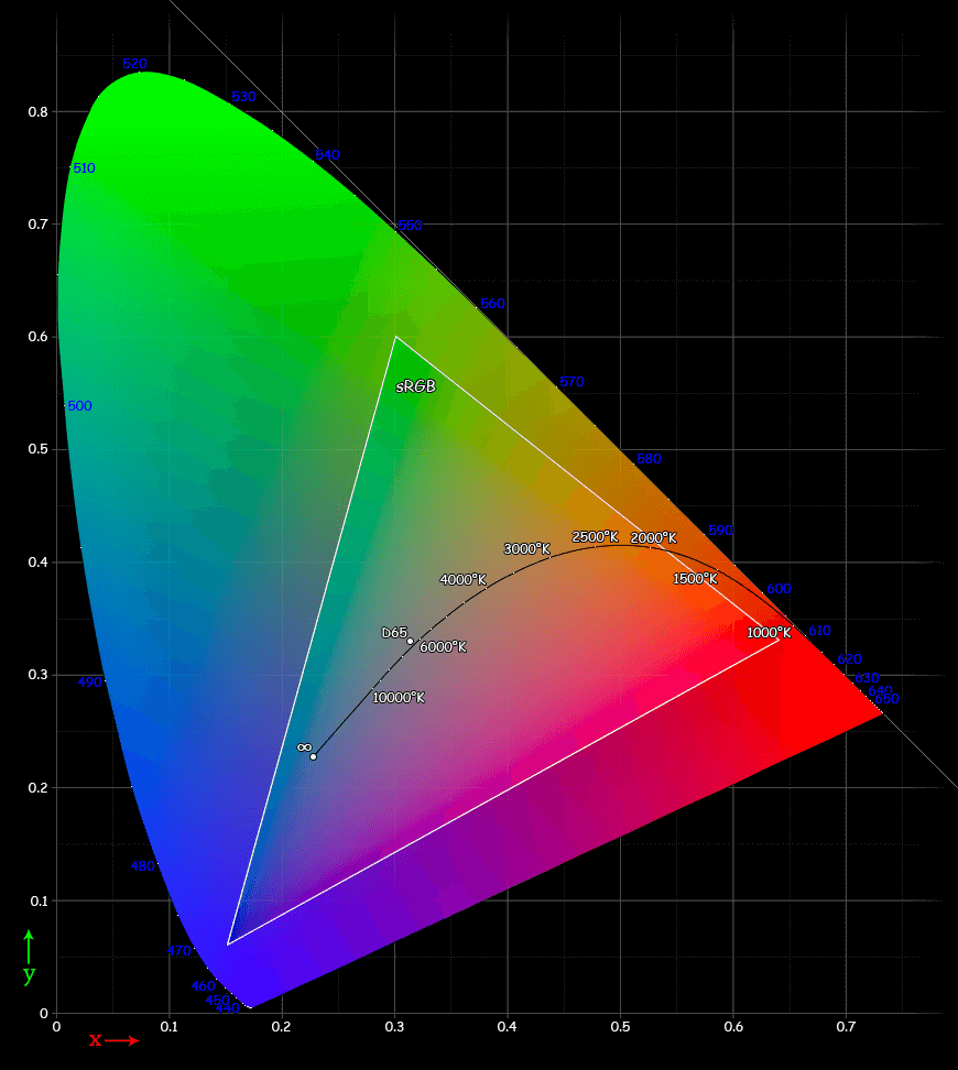
Triangle represents sRGB while the rest is the part currently not accessible through rgb().
As seen in this graph, we are not only missing colors but also different luminosity of the same color shade. Therefore, this restricts designers and developers while working on an sRGB workspace.
Owing to this difference, in 2005, P3 (also called DCI-P3) was documented as a different type of color space (although a type of RGB color space) that can help us access more colors in a better way. The diagram presented above works as a benchmark to decide the gamut of the color space and compare them on the foundational level. With P3, we access 45.5% of this space with various dominating wavelengths for various types of colors. The result is a 25% larger color space than sRGB.
The graph representing both P3 and sRGB pointing towards the same color looks as follows:
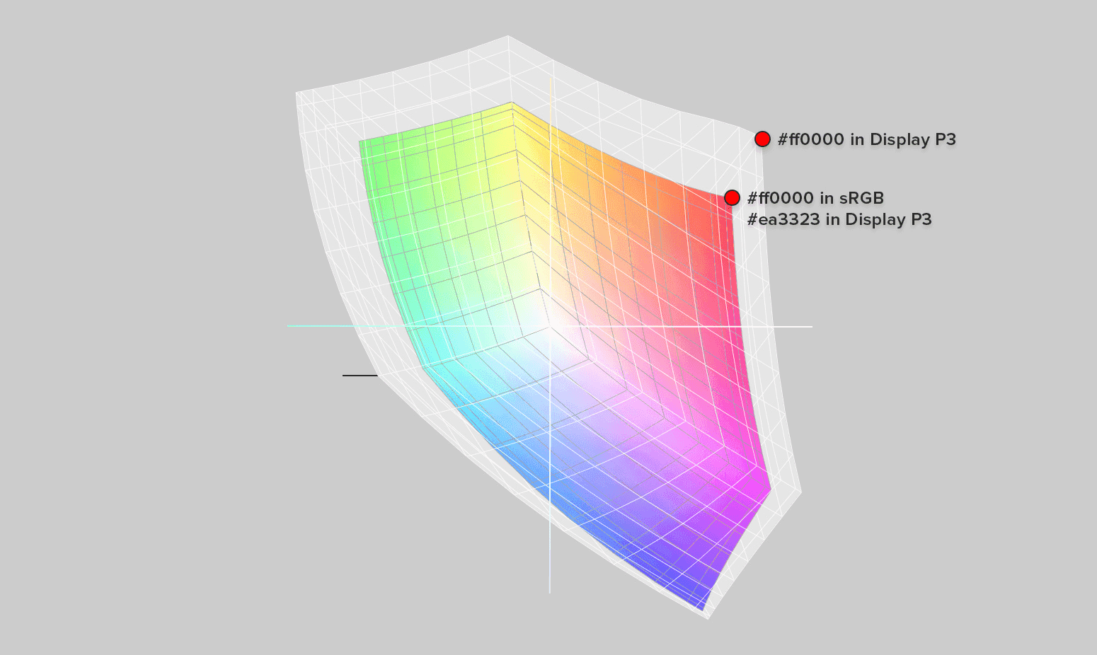
This shows how we increase our gamut when we choose display-p3 instead of sRGB space that can show different results on a designer’s system and a consumer’s system.
However, the work on this type of color space was primarily focused on digital cameras and other photo-specific equipment. As their quality increased over time (in the hardware section), we could implement a wide range of colors in them. In the computer systems, however, we have struggled due to the restrictive constraints of the monitor screens. In WWDC 2017, Apple announced the support for display p3 (naming their feature based on P3 but is essentially the same thing) and became the first commercial computer manufacturing company to do so.
As seen in the following image, Apple discloses that display-P3 will help “close the gap” between various gradients (or bands of the same color).
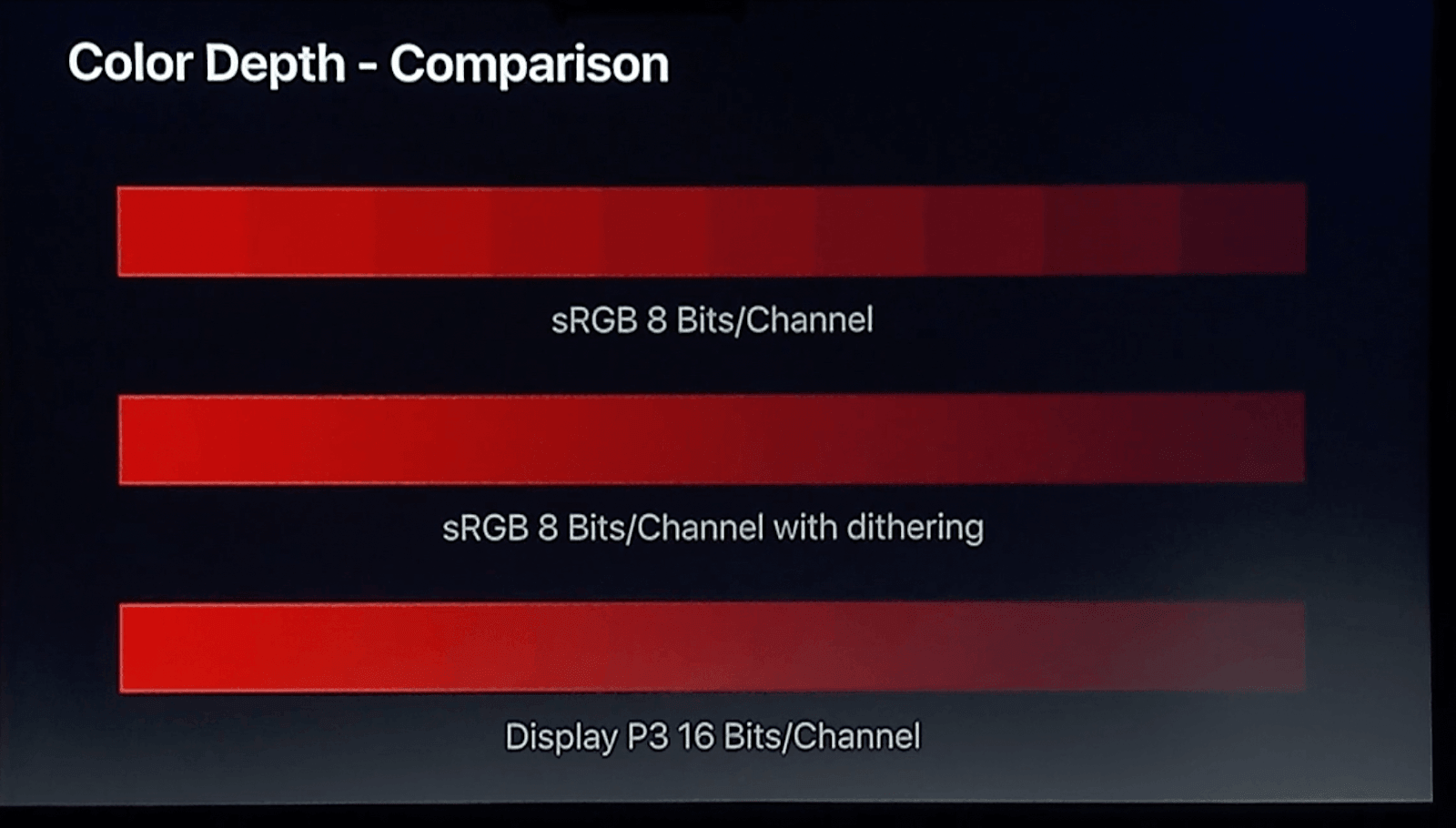
Unfortunately, choosing display-p3 is a luxury only available to Apple users (on Safari).
Let’s see how we can do this and explore the difference between both spaces’ gamut.
Accessing display-p3 gamut in Safari
To access the display-p3 gamut, inspect any web page with a color element. If you do not have a Safari browser on your system, you can access the Safari browser online for free on cross browser testing platforms like LambdaTest.
Cloud testing platforms like LambdaTest offer an online browser farm of 3000+ real browsers and operating systems combinations to perform website testing at scale. With LambdaTest, you can detect cross browser compatibility issues in CSS and fix them to ensure a consistent user experience across different browsers & OS combinations.
Follow the below steps to perform real-time testing on the LambdaTest platform:
- Login to your LambdaTest account. In case you don’t have an account, sign up for free.
- Once in the user Dashboard, select Real Time Testing > Browser Testing from the left sidebar.
- From the Browser Testing tab, enter a test URL and select browser VERSION, OS, and RESOLUTION. Click START.
- Right-click and select Inspect Element.
- Select a color element from the web page.
- Right-click on the color box and select Convert to Display-P3.
- Hover over the color box to see the extra gamut that opens up after we convert to the display-p3 color space.


A cloud-based virtual machine will launch running real browsers and operating systems for web-based browser testing.


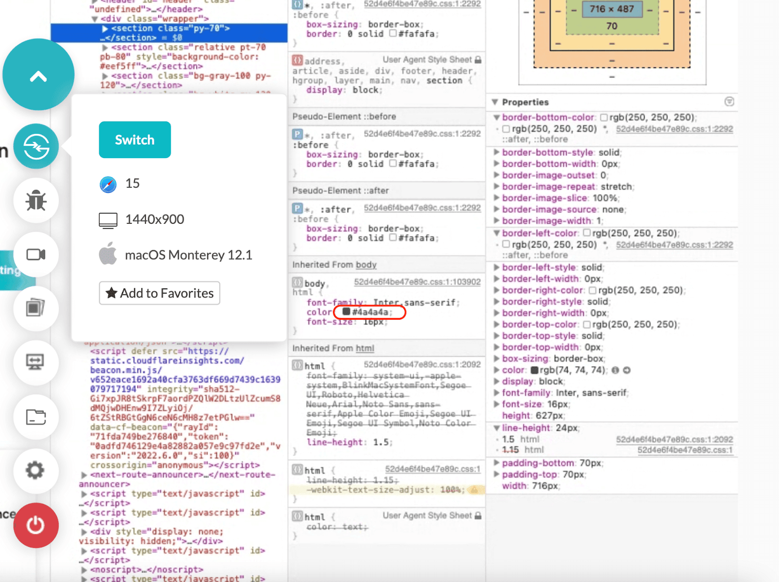
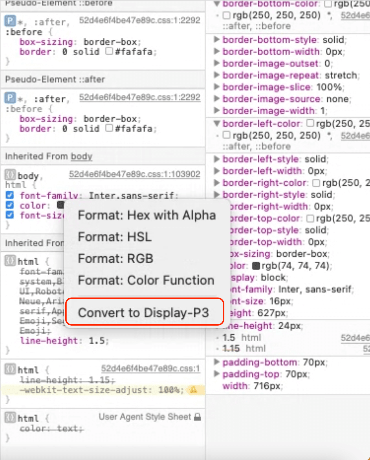
Choosing this option will convert our previous color definition to display-P3 color definition.
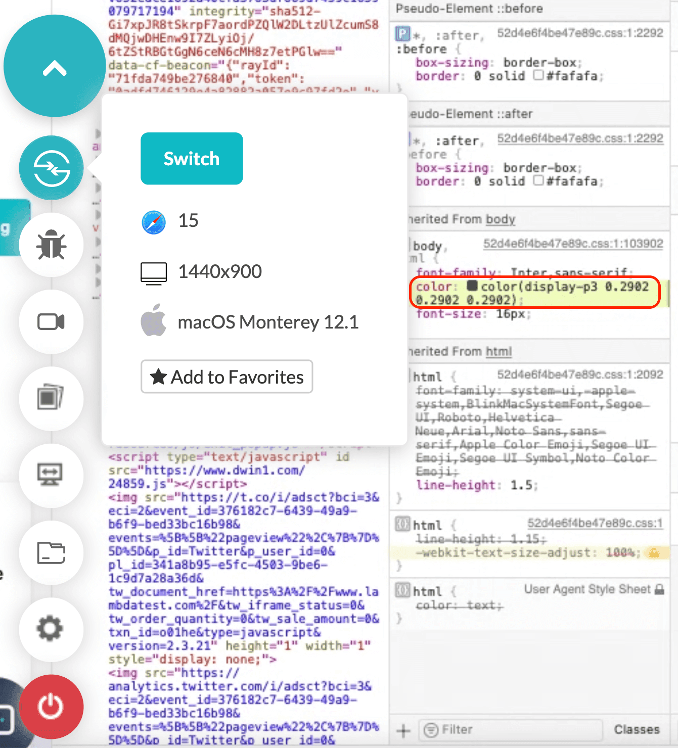
Remember that the color values for each channel in RGB change when we convert it to display-p3 space. So, an sRGB value of (0,255,0) will not remain the same when we view it in display-p3, even as an RGB triplet.
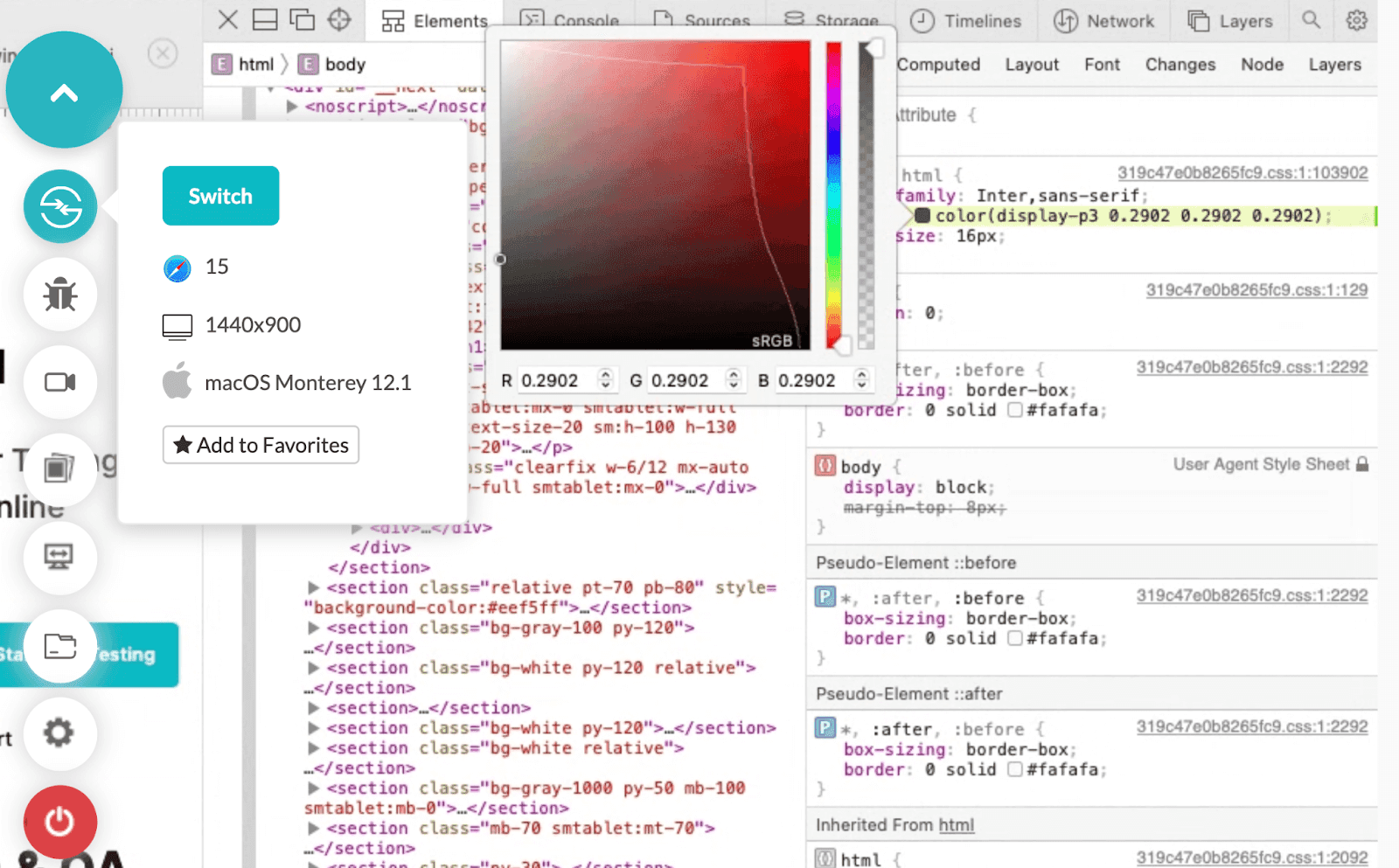
The line shows the gamut of sRGB on the left and display-p3 added on the right for the red shade only.
Syntax for display-p3 CSS color function
As we observe the syntax when we “convert to display-p3”, we realize that the CSS color function is used to implement this functionality in macOS. This is required to let the browser know which color space we are implementing on the element.
Breaking down the syntax of display-p3, we see four arguments –
- display-p3: Represents the type of color space we are looking for implementation.
- Parameters: The three parameters following the “display-p3” are the values of the channels associated with red, blue, and green colors. The combination of these values decides the resulting color from the color space.
Browser support for display-p3 CSS color function
Currently, it is supported on Safari browsers only. You can use our online browser farm to test on Safari browsers.
HSL
While RGB color space is the subset of the spectrum our human eye can see, sRGB space does not let us choose more natural colors. When we look at the colors appearing in nature, we not only talk about a specific color, such as “this is red,” but also the shade of it. The main factor that differentiates these shades is the lightness and saturation factor.
Having control over lightness and saturation lets us widen our gamut and choose a more specific color we would want as a designer. This was identified by Georges Valensi in 1938 when he invented this color space. Today, it is widely used in digital mediums giving us more control over our colors.
To understand how HSL works in digital mediums, let’s consider a circle as shown below.

This is known as the Hue-Saturation circle, and it will assist us in selecting hue, saturation, and lightness. The circle is divided in the following ways:
| S.No. | Hue (degree) | Color |
|---|---|---|
| 0 | 0° | Red |
| 1 | 60° | Yellow |
| 2 | 120° | Green |
| 3 | 180° | Cyan |
| 4 | 240° | Blue |
| 5 | 300° | Magenta |
| 6 | 360° | Red |
The circle works in three directions, with each direction letting us select hue, saturation, and lightness. Hue is the color we want to select on this circle.
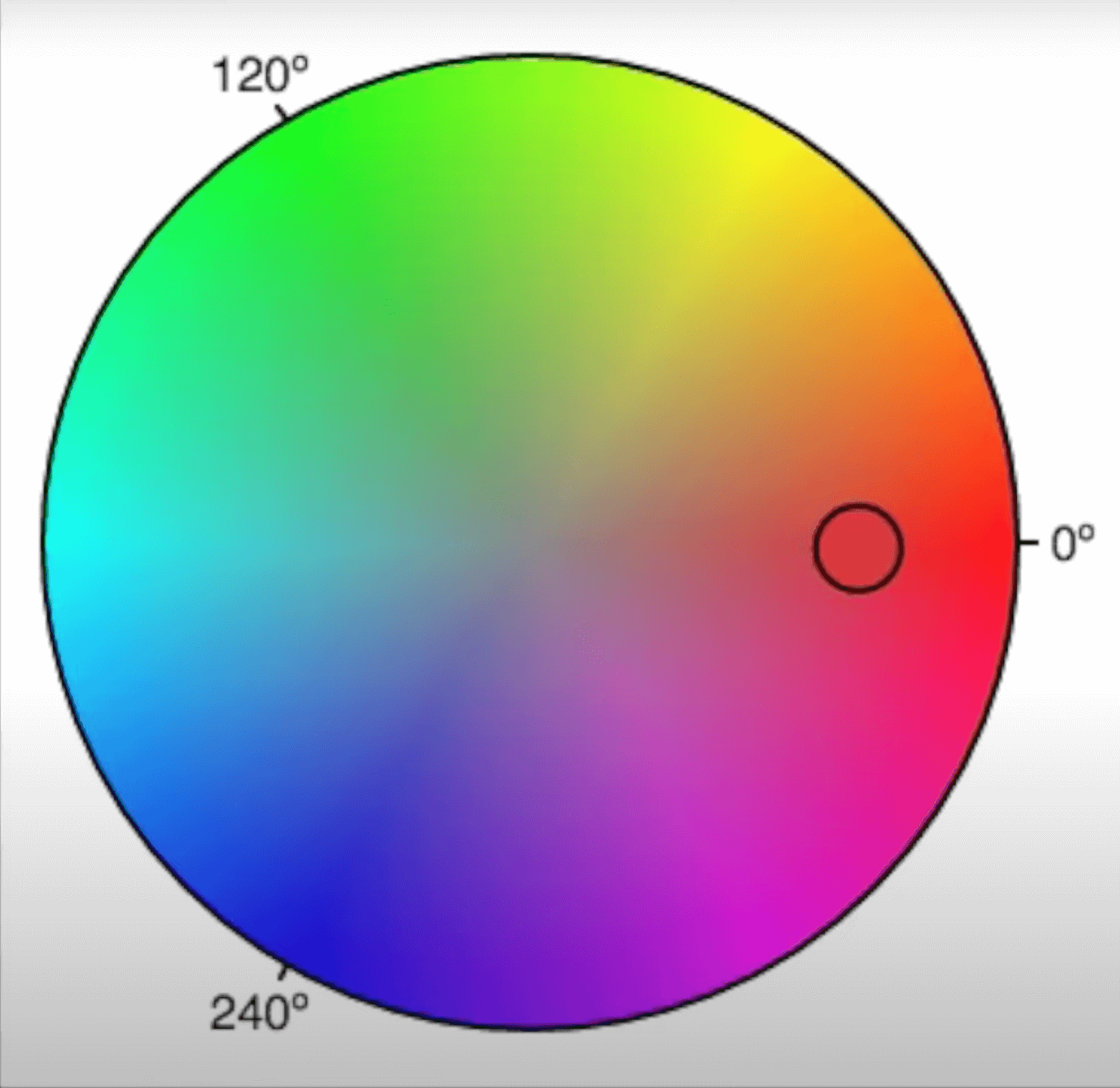
The smaller circle you see is the current selection. This small circle can move only in the circular direction while selecting the hue. The distance from the boundary and center will remain the same in this case. It does not matter if you get your perfect color here, but it should be close enough to occur in the circle.
Once done, we select the saturation of the color we selected using hue. Remember that saturation is selected by moving the smaller circle in the straight line passing through the center. This means while selecting the saturation, you can either move the circle towards the center or away from it but not in a circular direction.
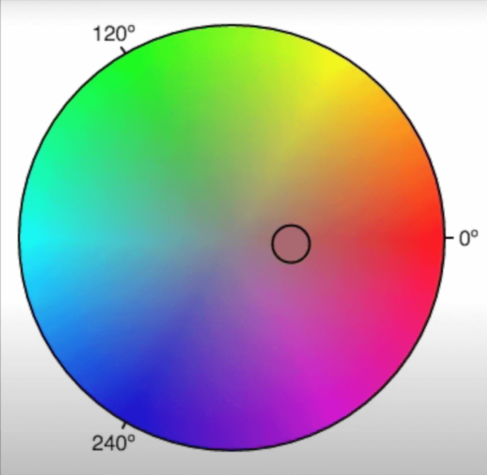
Here, I have moved the circle closer to the center. If I draw a straight line passing through the center and the smaller circle, it will pass through the hue selection. The saturation value increases away from the center while decreasing towards it. Therefore, if the selected color’s saturation is moved to the center, it becomes gray, i.e., no saturation.
Finally, we need to choose the lightness component of the color we have chosen (hue and saturation fixed). Consider a large number of these circles stacked on top of each other, each with a different lightness.
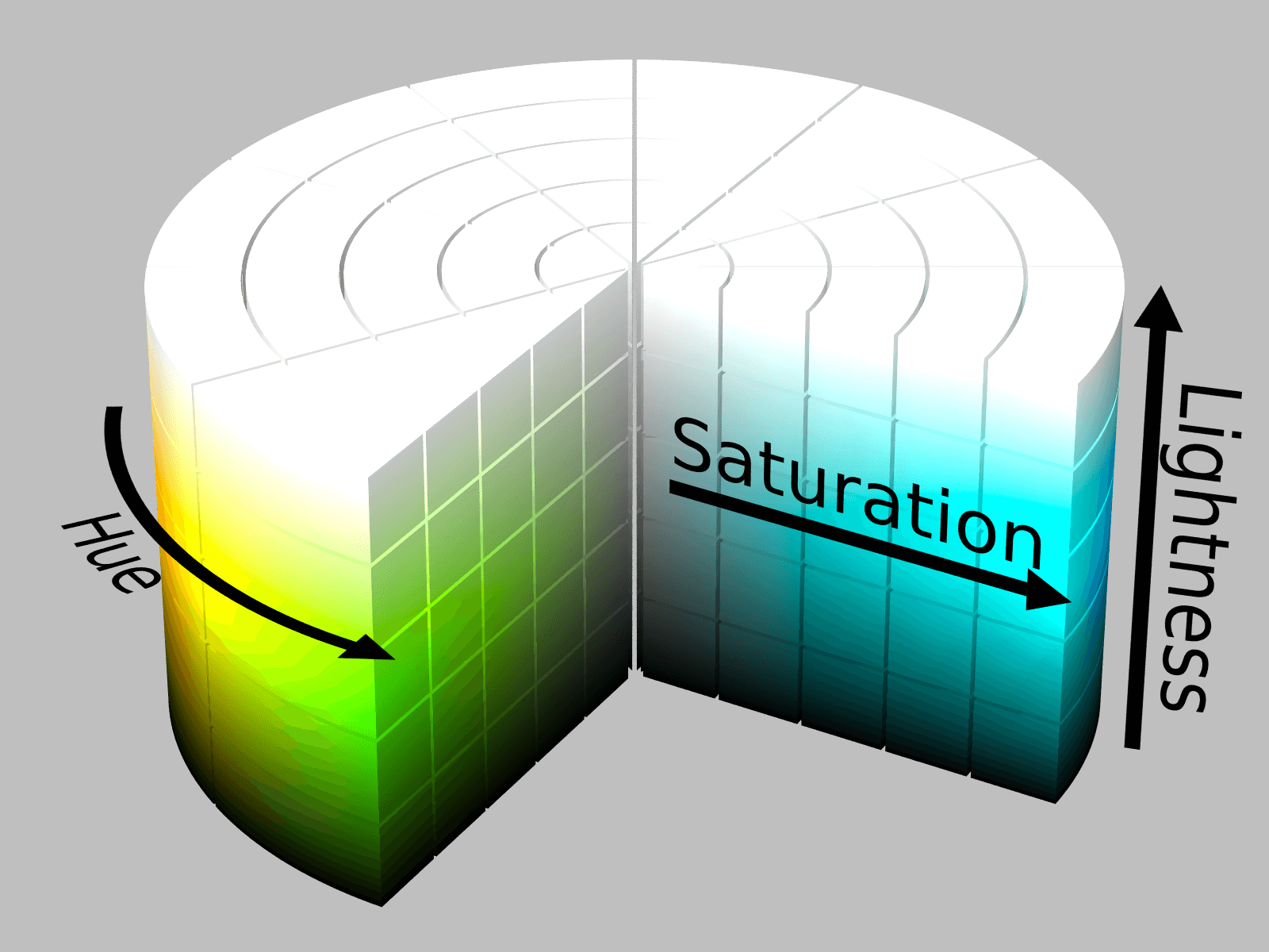
As seen, the bottom-most circle will be the darkest while the top-most is the lightest. If you think that the highest lightness value will make the color white and the lowest will make it black, then you are thinking correctly. Since lightness dominates the combination of RGB color’s addictiveness, it will influence the final color output.
With these three components, as you would have already guessed, we get more control and a wider gamut of colors. Here, we can select a perfect shade of color using lightness and saturation, which were missing in RGB.
Syntax for HSL CSS color function
The syntax of using HSL is similar to RGB, except the values are in percentage for saturation and lightness. The syntax looks as follows:
Example:
Note that similar to rgba, you can use hsla too, where “a” has a similar meaning of alpha and similar values.
Conversion of HSL to RGB
If you are wondering whether it is possible to convert HSL values to RGB values (and vice versa) and implement them in your code, then yes, it is possible, and many developers do it to cover a range of devices.
However, there is a bit of complex math behind it, which is out of the scope of this post. I stumbled around a descriptive post and simplified math formulas to achieve the same on Waldman Media. I hope this will help you if you wish to learn it ahead.
Alternatively, you may find some websites that can do this task in seconds. They are a recommended method as they save time. HSLpicker is one of the websites that I use personally in my projects. If you have your preference, let us know in the comment section, and we will check it out.
Limitations of HSL CSS color function
Using HSL does provide us an idea of working in a broader gamut than RGB, but the basic working behind it may be misleading. In HSL, we use constant lightness (as a cylinder) for any hue or saturation we select. This is not how nature provides colors and is not perceived by humans too. If we look at the sRGB diagram again, we will notice that the lightness is not constantly spread across the various colors in the space. Some are provided with more lightness values while some aren’t.
The perfect mix-up of hue, saturation, and lightness does not bring perceived colors to the table. So, for example, the user selected saturated yellow and saturated blue may have the same lightness value for both. However, this is not so when we perceive naturally occurring colors (saturated blue and saturated yellow). Their lightness differs practically, which may bring us to question the usage of HSL.
Check out our Random Color Generator tool to pick random colors for your color palette.
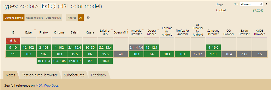
Browser support for HSL CSS color function
HSL is supported on all the popular browsers like Chrome, Firefox, Edge, and so on.
HSV or HSB
A similar color space is HSV (Hue, Saturation, and Value), also known as HSB (Hue, Saturation, and Brightness). The first two parameters are the same as HSL, with only one slight variation considering value and brightness.
The difference between HSV or HSB and HSL is about the lightness part and is most explicitly visible when we consider a lightness of 100% in HSL and a value of 100% on the same color with the same hue and saturation.
So, as gathered from our previous knowledge, 100% lightness value on a color in HSL means pure white (a slight difference in the shade of pure white could be observed depending on the device’s projecting parts though). A user would not see the color selected in this case as we increase the lightness to a maximum. In HSV or HSB, though, we do not consider the lightness of the color but the intensity of light thrown at it.
Here, consider a light source is throwing light on an object with a hue and saturation decided by you. For example, consider the following image taken from CodePen, selecting a hue, a saturation, and keeping the value (or brightness) as 100% results in the following:
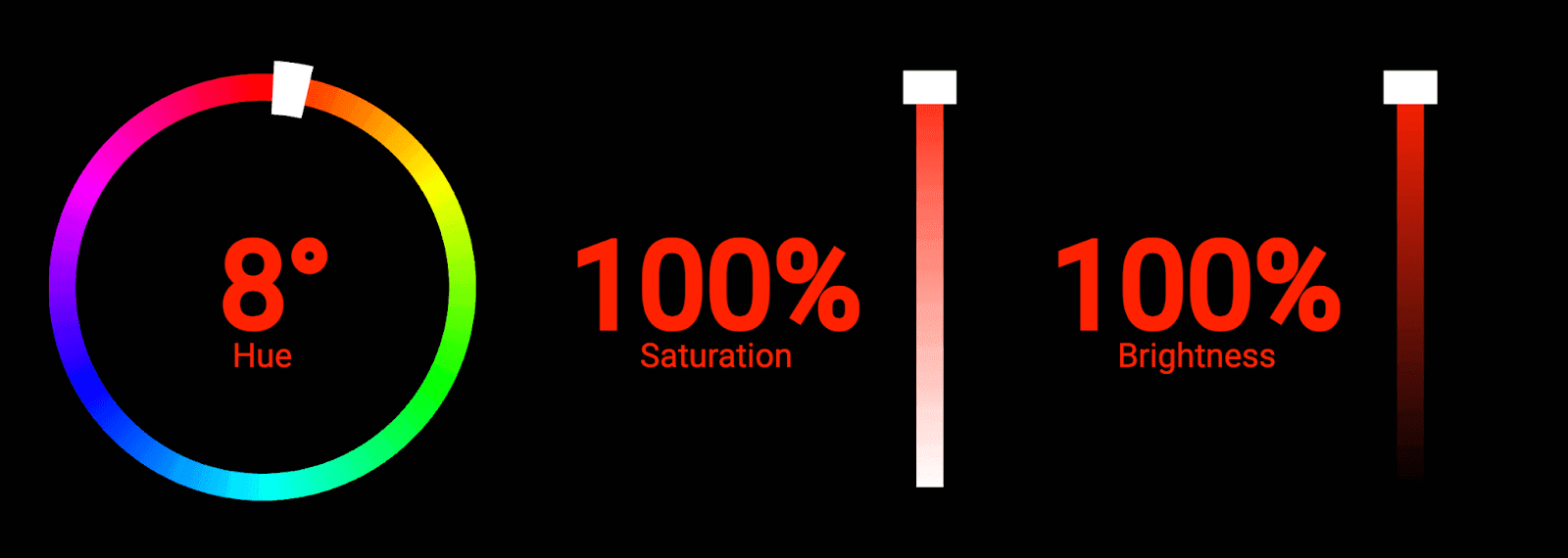
The color of the digits is what the resultant color would look like. This is not white, which would be the result in HSL. In HSV, we talk about a color under a light source with intensity as “value” or “brightness”. However, in HSL, we are talking about the lightness part of that particular color.
When considering the operation of HSV or HSB, it is somewhat intuitive that this color space scheme is better for humans than HSL. We would not naturally see a white color when an object is exposed to full-intensity light.
Test your website like a pro.Try LambdaTest Now!
HWB
To cater to the faster computation of color space, the creator of HSV – Alvy Ray Smith, created another color space called HWB. The letters here correspond to Hue, White, and Black. A fairly simple color space to understand, HWB selects a color which is hue on a 360-degree scale (same as above) and mixes a certain amount of white and black to it.
So when we take W and B values like 50% each, the color will become gray.

A value of W as 100% would generate a white color, while a value of B as 100% would generate a black color no matter the hue value.
Also, it is interesting to note that a white and black balance would depend on each other. If you mix too much white, the black part will reduce automatically and vice-versa. So a value of hwb(0,100,100) would not be possible, and the same logic applies to a value of hwb(0,0,0).
This color space is more intuitive when perceived in terms of the naturally appearing hue, saturation, and lightness. The color space considers that the available colors’ shades appear as part of the white and black mix into a primary color selection. However, the usage of this color space is limited.
Browser support for HWB CSS color function
The browser compatibility of HWB CSS color function is shown below –

LAB color space
A wider gamut of colors that can be applied to an image presenting more colors is using LAB color space. LAB is a different and more complex color space that tends to explore more colors with more control to the users.
LAB stands for lightness, channel A and channel B. Unlike HSL, HSV, and HWB, which used a cylindrical representation, LAB uses a 3-axis system in which we get control over four different primary colors and lightness. The axis looks as follows:
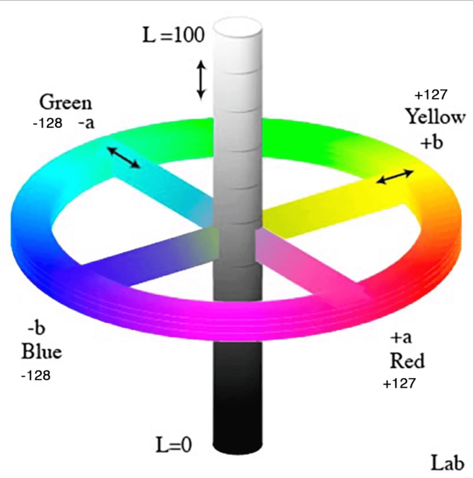
To understand better, we break this image down into three axes. However, note that there are no such standard notations except for channel A and channel B representations.
Let’s consider axis A as the center axis, i.e., lightness. It represents the lightness of the color we have selected. It works the same way we discussed in the previous sections.
Another axis represents channel A, two primary colors located at the extreme ends on both sides. One end contains magenta, while the other is set as green. The magenta contrasts the red color used in previous color spaces and provides a better transition from one extreme to another. Similarly, in the channel B axis, one end is yellow while another is blue.
Next comes the setting of the value of our color. Considering the intersection of the lightness axis as the origin of our graph, one of the colors would represent a negative axis value while the other would represent a positive one.
It’s important to note that cold colors are termed positive and warm colors are termed negative in our LAB color space. So moving towards green means increasing the value, while moving towards yellow would mean decreasing it.
Values supported in LAB
As shown in the axis diagram for LAB above, the values of each channel vary between -128 to +127. The lightness is described in percentage terms from 0 to 100%, describing how much lightness you want.
Syntax for LAB CSS color function
The syntax of LAB is calling a function with parameters written in the order of lightness, channel A and channel B.
In the above syntax, the value of lightness is 40%, channel A as 100 and channel B as 100.
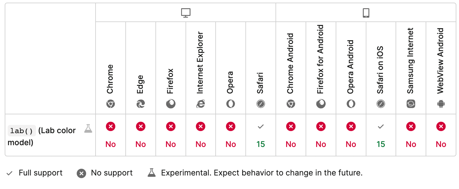
Browser support for LAB CSS color function
The browser support for the LAB CSS color function is poor, which is the main reason for its limited usage on the web page and internet in general. The only area where LAB is used is in Photoshop, when the designer needs to print the image or their designs on t-shirts or mugs, etc.

Check your website at different network speeds. Try LambdaTest Now!
LCH color space
The final color space we will consider in this post could be defined as the “closest to the human vision” due to its ability to adapt to lightness in a way that we humans perceive. LCH color space is abbreviated for lightness, chroma, and hue. The color space tends to explore more colors in the sRGB color and overcome the HSL’s shortcoming in perceiving lightness.
In HSL, we discussed how lightness makes a color look different and not according to how we perceive colors naturally. Since lightness is distributed constantly no matter what color you have chosen in the hue part, it makes colors look different when more lightness is applied.
In her excellent post around LCH, Lea Verou shows the following image in which the same color would look different due to the lightness factor:

This is where HSL lacks practical usage and can irk the designers, etc. The above two images do not even look like a shade of the same color.
LCH uses chroma instead of lightness, defined as the “amount of color” used in the final render. This gives a uniform color even though you use lightness with varying values in various scenarios. For example, the following colors have different hue values but the same lightness. Notice how different their lightness looks depending on the hue selected:

The chroma parameter here is unbounded in theory. This means the values chroma can take for one particular hue can vary in number, and the bound is not defined for this. LCH is a much better color space and the transition of one color into another also depicts how widely this spectrum takes us into the sRGB space compared to HSL.

The transition is smooth with equal intensity as perceived by human vision naturally. But as you must have noticed, LCH and HSL are different even in their coordinate system. HSL works on a circular dial, while LCH is more like LAB with the same primary colors discussed in the LAB color space.
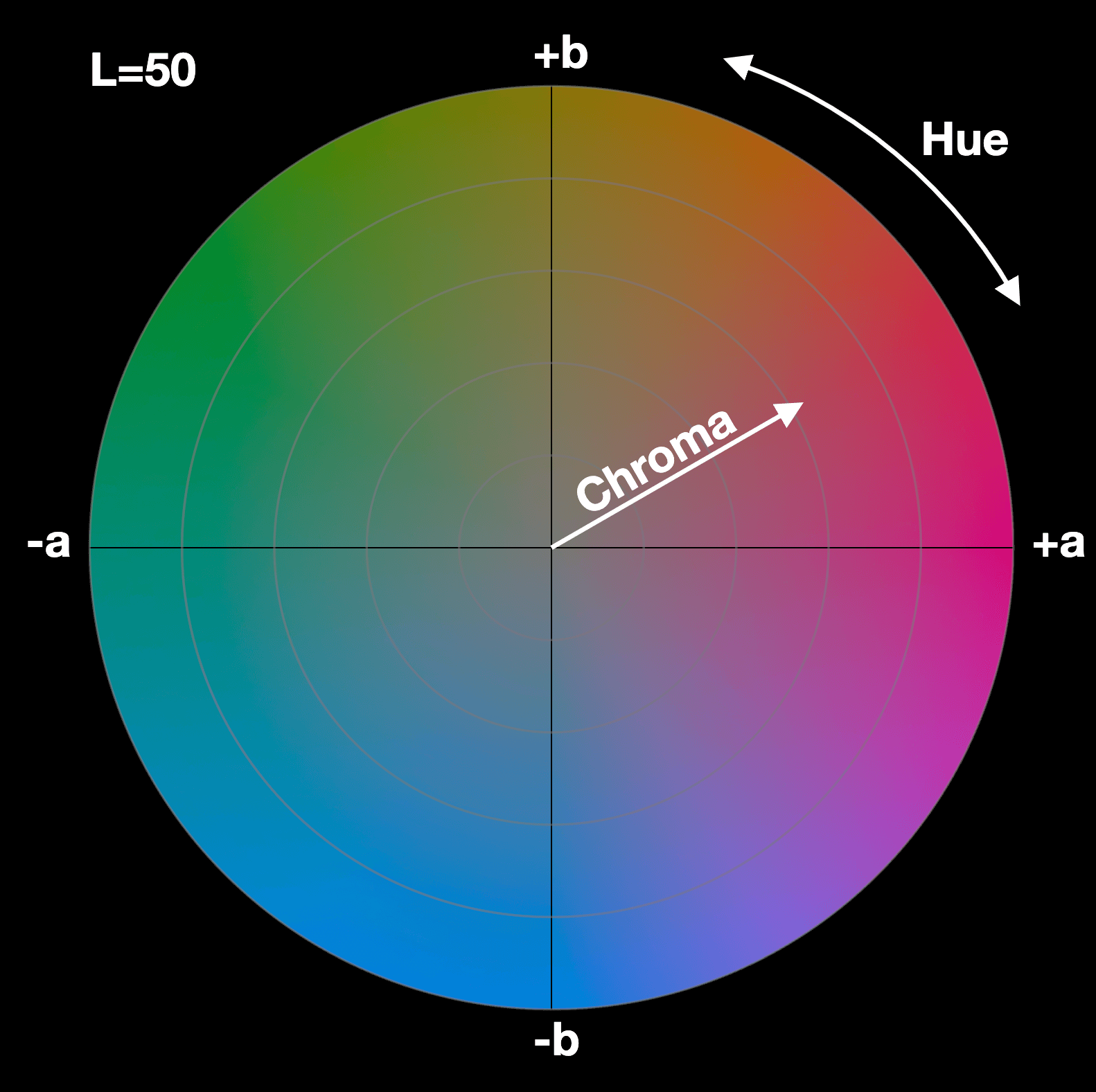
Syntax for LCH CSS color function
The syntax for using LCH CSS color space is similar to the LAB CSS color function. The parameters passed into the function are lightness, chroma value, and hue in the same order.
Note that alpha value can also be passed as the fourth parameter in the same range of 0 to 1 or in percentage terms up to 100.
Browser support for LCH CSS color function
The browser support for the LCH CSS color function is currently very poor, with only Safari supporting this color space. However, we are quite positive that LCH will be worked upon in the near future, with updates rolling out soon. The color space will help explore a much wider range of colors helping the designer working on CSS frameworks express more vividly through images.
Build a bugless website. Try LambdaTest Now!
Few points to remember before using color spaces
As a final note, it is worth mentioning a bunch of points that we must remember before using a color space.
- Display-P3 space uses the color function, which other spaces do not. This CSS color function helps the browser understand the type of space used for the element. The reason for this is still not clear by Apple.
- All the color spaces are convertible to one another. In this post on CSS color functions and spaces, we mentioned converting RGB to display-p3 using LambdaTest on Safari and converting HSL to RGB in the HSL section. It has not been repeatedly mentioned in other spaces because the need is minimal. However, you can always find online color converters and tools that can help you if the need arises.
- Conversion of one color space to another does not ensure the implementation of unsupported devices. So, for example, if you intend to use LCH color selection and convert it to RGB for browsers other than Safari, it will result in color, hue, and saturation losses. The color would be raw but close to the LCH selection.
Always ensure color spaces and color selections on multiple devices, operating systems, and browsers. All these three impact how a user would see your color and ensure beforehand would help avoid sudden surprises. If you are interested in learning more about CSS, why not check our blog on CSS toggle switches?
How do you avoid Cross Browser Compatibility issues? Here is our video:
Subscribe to the LambdaTest YouTube channel to learn more about real time testing, real device testing, and test orchestration using HyperExecute.
Watch this webinar to know how HyperExecute can help businesses achieve quicker time-to-market by intelligently reducing the test execution time.
Verifying color spaces on multiple systems
The last point in the above section is a bit important, so we thought to dedicate one brief section to help you guys get started in the journey. In this section, I will use an online cross-browser testing tool LambdaTest that will help us choose any platform from their robust infrastructure available completely on the cloud.
- To start testing our colors on any website, first, we need to signup for free on LambdaTest.
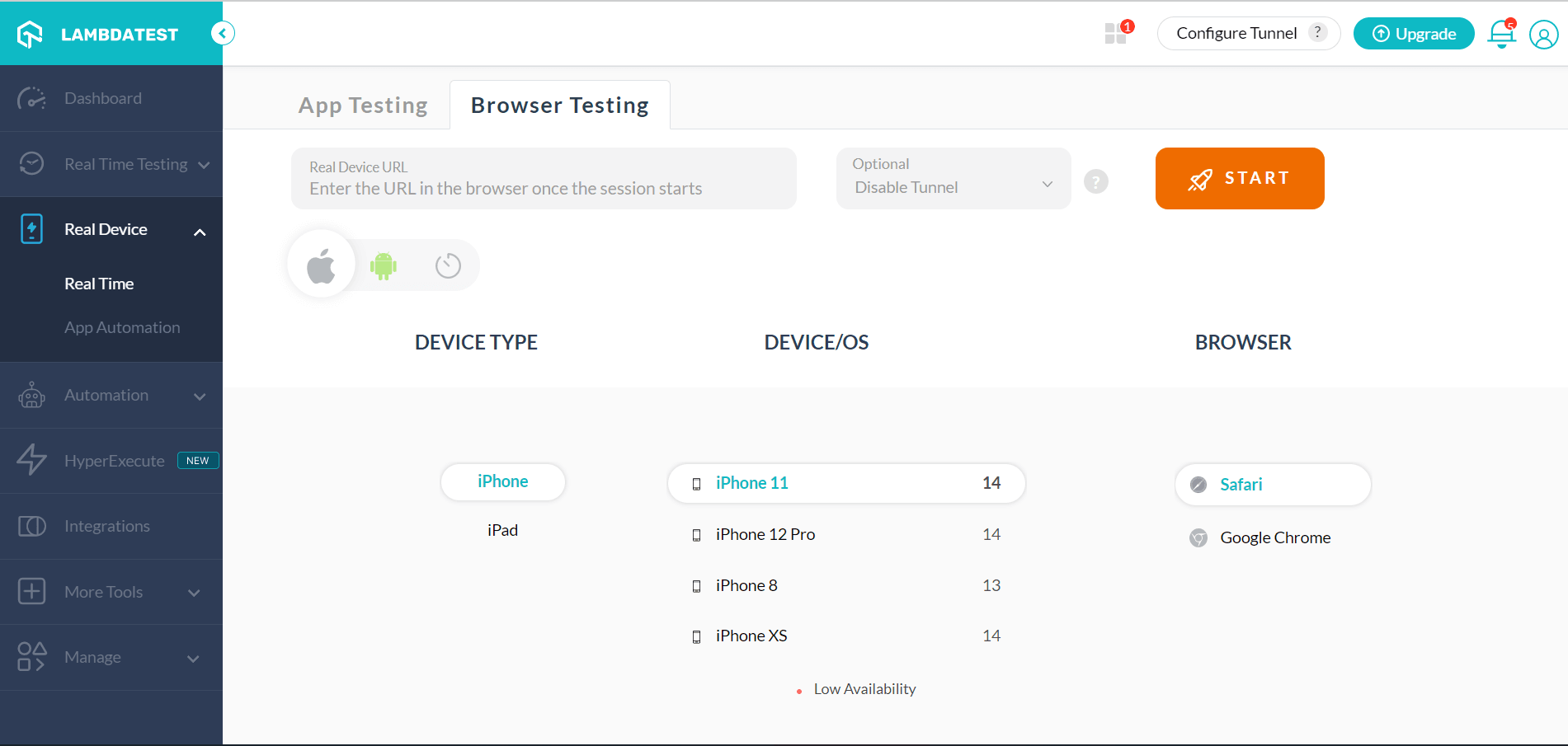
- Move to the Real Time Testing > Browser Testing panel for online browser testing by clicking it from the left toolbar.
- Enter the website you wish to check the color on. Choose the browser, VERSION, OS, and RESOLUTION to launch the website on the same specification.
- Press START to launch the test session.




Here, you can experiment with colors and analyze all your design-related images.
You may also need to analyze the same color schemes and spaces on mobile applications. As discussed earlier, device manufacturers may use different parts to project color on the screen. Therefore, you might observe a change in color on different devices with similar specifications and similar browsers. Fortunately, LambdaTest does offer real devices on their cloud to let the testers install their applications and test color-related issues.
For this, you need to navigate to Real Device. You can also look at the list of desktops and browsers we support.
- Follow step 1 mentioned above.
- Go to Real Device > Real Time on the side panel to access the real device cloud.
- Here, you can enter the website URL in the browser once the session starts on the operating system of your choice and navigate around the web application verifying your colors.
- You can also perform app testing by uploading your app and test color related issues.

Wrapping up!
CSS color functions and spaces play an important role in all our lives. We aim to implement CSS color functions and spaces and constantly work on them to get closer to nature as much as possible. The more naturally appearing colors we see on our screens, the more we are attracted to them.
In the same line of thought, we discussed many color spaces in this post, including their coverage in the sRGB color spaces. With their definition, we understand that we have a lot of color spaces with an extremely wide gamut but cannot be represented on the screen like LAB or LCH. We believe this is in a phase of constant development, and since the color is of so much value to us, sooner or later, we will see all of them on our handheld devices and desktops.
You can also explore other CSS tutorials like CSS breakpoints, CSS overflow, and CSS animations.
I hope this post on CSS color functions and spaces enlightens you with more profound color space knowledge on the web. If you would like a post on any topic or have any feedback or suggestions for this one, do let us know in the comment section. Thanks for your time.
Frequently Asked Questions (FAQs)
How many CSS colors are there?
CSS offers the names of 145 colors. It could range anywhere from basic colors such as white, black, yellow, orange, and blue to the most specific colors like orchid, lawn green, and crimson. Since many find it hard to remember the names of colors.
What are valid CSS colors?
The W3C HTML and CSS standards have gone on to list only the color names of 16 valid colors: black, aqua, blue, gray, fuchsia, lime, green, navy, maroon, teal, olive, red, purple, silver, yellow and white. You can leverage the HEX values if you need valid HTML or CSS.
How do you color in CSS?
All you need to do is add the appropriate CSS selector for defining the color property containing your preferred value.
Got Questions? Drop them on LambdaTest Community. Visit now


