Mobile Website Design: 23 Best Examples
Nazneen Ahmad
Posted On: August 9, 2024
![]() 126502 Views
126502 Views
![]() 17 Min Read
17 Min Read
Mobile website design focuses on optimizing websites for smartphones and tablets. A well-organized, user-friendly mobile design can significantly boost your business. With most online traffic coming from mobile devices, ensuring your website is mobile-friendly is essential.
Poor mobile website design can lead to slow loading speeds, navigation challenges, and unresponsive layouts. Therefore, organizations and businesses must prioritize building a robust mobile website design to stay competitive.
TABLE OF CONTENTS
- What Is Mobile Website Design?
- Best Mobile Website Design Examples
- LambdaTest
- Lyft
- Jereshia Hawk
- Nike
- Mattia Di Stasi
- World Encounter
- Etsy
- Typeform
- Shutterfly
- Walt Disney
- Adobe
- Puffin Packaging
- Elf on the Shelf
- Yang’s Place
- Balloon
- Slack
- Stripe
- Evernote
- Pixelgrade
- SAP
- KISSmetrics
- Lean Labs
- Zappos
- How to Build Mobile Website Design Effectively?
- Mobile Website Design Best Practices
- Frequently Asked Questions (FAQs)
What Is Mobile Website Design?
Mobile website design focuses on creating mobile-friendly websites that function well on phones and tablets. It ensures a positive browsing experience with fast loading, attractive small-screen displays, and easy touch navigation.
Instead of resizing standard sites, it considers how users interact on the go. Key features include bigger text, easy-to-tap buttons, and layouts for vertical and horizontal scrolling, prioritizing quick access to information and ease of use on mobile devices.
Below are the benefits of mobile website design:
- Better User Experience: It focuses on key features for mobile users. This makes the design simple and easy to use.
- Improved SEO: Mobile friendly sites rank higher. Search engines prefer websites built for mobile first.
- Faster Load Times: Optimized pages have smaller file sizes. This helps them load quickly on slow networks.
- Wider Reach:The website works well on different devices. More users can access it easily.
- Content Prioritization:It prepares websites for more mobile traffic. It also supports new mobile technologies.
- Easy Scaling:The design adapts smoothly to larger screens.
Best 23 Mobile Website Design Examples
Below are some of the best mobile website design examples to help developers understand how your website must look on small screens like smartphones and tablets.
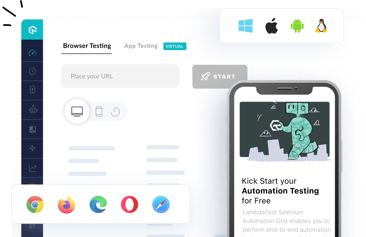
1. LambdaTest

The mobile website design of LambdaTest features a modern, user-centric approach emphasizing user-friendliness, functionality, and visual appeal. Using efficient typography, colors, and spacing, the design enhances readability and user engagement through easy navigation. Engaging elements such as animations and live demo videos to attract visitors effectively and showcase their testing capabilities.
 Note
NoteTest mobile-friendly websites across 53+ pre-installed viewports.Try LT Browser now!
2. Lyft

The design for Lyft uses large, bold typography to ensure messages are easily readable on smaller screens, enhancing clarity and usability. They have used bright, engaging images and intuitive icons that naturally guide users through the site, making navigation straightforward and visually appealing.
The menu is designed for quick access, allowing users to easily identify as riders or drivers and navigate to relevant sections effortlessly.
This approach ensures users find what they need without unnecessary clicks. It has easy steps for booking rides with clear calls-to-action and an intuitive interface.
The layout fits various screens and ensures visual elements are easily accessible on small screens, such as maps and form fields. It has amazing features like live location tracking and ETA updates, enhancing user experience by providing timely and accurate information.
3. Jereshia Hawk

The mobile version of Jereshia Hawk’s website is very impressive. The hero image is in portrait orientation, which is best for mobile viewing. The hero section is rearranged so the headline, photo, and description fit neatly on a mobile screen. Additionally, the chat button in the corner allows visitors to easily reach out with questions.
4. Nike

The mobile website design for Nike focuses on simplicity, responsiveness, and user engagement. It features a touch-friendly interface and high-quality images that adjust to various screen sizes. The minimalistic design with bold typography ensures readability.
Core elements include a hamburger menu for easy navigation, a sticky navigation bar, and a prominent search function. The checkout process is smooth, the website loads quickly, and usability is optimized for users to browse and shop on small screens.
5. Mattia Di Stasi

Mattia Di Stasi’s mobile website design is clean and visually pleasing, embracing a minimalist approach that reduces clutter on smaller screens. This design choice enhances user experience by making navigation straightforward and content easily accessible.
Its features are eye-catching and well-organized on mobile screens, ensuring that images and graphics remain engaging without overwhelming the user.
The content has well-organized sections, intuitive touch interactions, and responsive elements that adapt smoothly to different screen sizes.
6. World Encounter

World Encounter’s website is rich with graphics and engaging content; none of this is compromised in the mobile version. Everything is perfectly resized for smaller screens, ensuring a great experience for mobile visitors.
Elements like buttons and menus are designed for easy touch navigation, enhancing user interaction and accessibility and maintaining brand consistency with clear color schemes, fonts, and visual elements that reflect the desktop experience.
Its visual elements are easy to access, ensuring that mobile users can easily interact with it.
7. Etsy

The mobile website design for Etsy is adjusted to fit various screen sizes, ensuring the products are listed with content and images in a visually appealing way.
The elements on the mobile website are easy to access and enhance usability, and the product images are well-optimized for mobile screens. A simplified menu and an easy search bar option allow users to easily browse and find specific items without unnecessary complexity.
Additionally, it has features like saved searches, favor shops, and accessible recommendations, enabling users to engage with product sellers if they are interested; the site is optimized to ensure quick loading of pages and images.
8.Typeform

Typeform design focuses on simplicity by using ample white space to focus user attention on form fields without distraction; forms are optimized for mobile screens and can be viewed and used on various screens while marinating a smooth, user-friendly interface.
It also leverages its signature one-question-at-a-time approach, the best approach that increases user engagement by focusing users on individual questions, making the process less tedious.
Visual elements are touch-friendly; it has used High-quality graphics and smooth transitions between questions to create a visually appealing and engaging user experience, enhancing the overall feel of the form.
9. Shutterfly

Shutterfly design features high-quality images and vibrant visuals, making photo-centric services and products stand out. Image galleries are well-organized and easily navigable, allowing users to quickly access their photos or projects.
A simplified bottom-navigation bar provides easy access to key sections such as photo upload, projects, and shopping, enhancing user convenience.
The hamburger menu organizes the navigation by additional options and settings. It supports effortless photo uploads and editing, allowing users to quickly add and manage their images from their mobile devices.
Visual elements like buttons and sliders are designed to facilitate smooth interactions and are touch-friendly across various screen sizes.
10. Walt Disney

The mobile website design of Walt Disney signifies a user-friendly experience. The mobile menu guides users effortlessly to learn about the organization’s initiatives, leading to pages designed with beautiful imagery, vibrant buttons, and brand-consistent background colors.
Throughout the site, Disney also uses a card design (featuring an image, heading, and text) for articles, providing users with a preview of the content they can read.
11. Adobe

The mobile website design allows users to easily explore Adobe‘s software solutions. The main menu lists broad product categories, which expand to more specific options upon selection.
It uses high-quality images and intuitive icons to make products visually engaging and straightforward.
The calls to action are clear and intuitive, maintaining the accessibility and readability of all content, including text, images, and interactive elements.
12. Puffin Packaging

The design is carefully created to align with its tone, messaging, and visual identity; this Puffin Packaging mobile website maintains consistency, ensuring that the brand’s tone and visual identity are seamlessly carried over to smaller screens.
It communicates its offerings and desired user understanding, making it easy for users to grasp the value proposition.
Its primary Call-To-Action (CTA) in the first fold directs users to “How it Works,” explaining services before users proceed.
Contact information is strategically placed prominently rather than at the bottom, making it easy to read for users needing more information; this site is content-rich and informative, clearly conveying Puffin Packaging’s eco-friendly values.
13. Elf on the Shelf

Elf on the Shelf mobile website design showcases different types of products via large, appealing tiles, making the items visual and easy to browse on a small screen. It creates an immersive experience by making users feel like they are adopting an elf or pup rather than just buying one. The layout is intuitive and straightforward, enabling users to easily navigate on small screens.
14. Yang’s Place
![]()
Yang’s Place logo is prominently displayed at the top of the mobile screen, serving as a key navigation element that links back to the homepage.
The design includes a clear and accessible menu, allowing users to quickly find key sections like the location, contact information, and more
The layout fits various screen sizes, ensuring all elements, including text and images, are easily readable and interactable on smaller screens.
It uses high-quality images and clear typography to enhance the visuals. Buttons and other elements are designed to be touch-friendly, ensuring a smooth user experience on small screens.
15. Balloon

This mobile site for the short film Balloon keeps fans informed with award badges, upcoming screenings via the Wix Events app, and the latest news on the blog. It also links to relevant social media channels, including the movie’s IMDB page.
The site features the film’s trailer embedded using Video Box, with a snippet playing automatically as users scroll, inviting them to watch the full trailer.
16. Slack

Slack is another mobile website design example. This website prioritizes getting users to sign up and download its application on mobile devices. It shows a large, vibrantly colored download call to action.
When you explore the page, it will describe the use of platforms for different business types. The image remains clear and readable, which allows users to understand the capabilities of the tools and the realistic application.
17. Stripe

Stripe is a banking company that allows online payments for individuals and businesses; it excels in making its mobile and desktop sites user-friendly and visually appealing.
The mobile menu is color-coordinated and organized in a two-column layout for easy navigation. Product pages feature dynamic imagery of software components, making them easy to see, and subtle links are large enough for effortless clicking.
18. Evernote

Evernote‘s mobile website design maintains its brand style and color palette, featuring a clean and simple layout. The site’s centered call-to-action, “Sign up for free,” clearly directs users toward conversion while emphasizing the app’s value without distraction.
19. Pixelgrade
![]()
Pixelgrade‘s WordPress themes, including the Pile theme, are mobile-friendly, minimal, and sleek. The Pile theme effectively showcases services and past work on mobile devices, preserving the content’s message and aesthetic while optimizing the design for mobile use.
20. SAP

SAP, a leader in enterprise software, simplifies CTAs and menus on its mobile site. The company streamlines business operations and customer relations through a condensed mobile experience. Information is managed with combined CTAs in sliders, contrasting with the horizontal layout on the desktop.
This approach prevents mobile users from feeling overwhelmed by information overload while ensuring readability.
21. KISSmetrics

KISSmetrics uses color to segment content and highlight CTAs on mobile screens. Their site presents information in a list format with alternating dark and light modules, making content easy to scan on smaller devices.
22. Lean Labs

Lean Labs, a marketing agency known for high-conversion web solutions, uses fly-in animations and distinct content sections for storytelling as users scroll. Their mobile site enhances user experience with strategic scale, contrast, typeface differentiation, and engaging fly-in animations for images.
23. Zappos

Zappos’ mobile site prioritizes easy navigation through its extensive inventory of shoes and clothing. The latest offerings are visible upon page load, with prominently placed search bars at the top and bottom for user convenience.
The above are just a few examples of mobile-friendly websites that are responsive and easy to navigate when viewed on mobile devices and tables. Further are some of the best practices that any developers and designers must keep in mind when building a website that is not only accessible on desktops but also on smaller screens.
How to Build Mobile Website Design Effectively?
Below are the steps that will help you build mobile website design effectively:
- Plan a Mobile-First Layout: Design for smaller screens first. Use a vertical layout that allows users to scroll down naturally. Leave enough white space around elements to avoid a crowded look and ensure readability.
- Optimize Navigation for Touch: Create large, well-spaced buttons and links. Since mobile users navigate with their fingers, ensure that clickable areas are easy to tap without accidental clicks.
- Prioritize Clarity and Simplicity: Mobile users often browse on the move. Focus on delivering key information quickly. Keep designs clean and remove unnecessary clutter to enhance efficiency.
- Use Responsive and Clean Design Elements:Implement a responsive design that adjusts to various screen sizes. Use less text, brief headings, and a clean interface that highlights the value proposition clearly.
- Place Important CTAs Prominently: Position your primary call-to-action (CTA) at the top of the page where it’s easy to find. Ensure CTAs are clear, concise, and easy to tap.
- Ensure Finger-Friendly Interaction: All interactive elements—like buttons and menus—should be large, well-labeled, and spaced apart to provide a smooth and frustration-free user experience.
Mobile Website Design Best Practices
To implement mobile website design, you can follow some of the best practices:
- Design with Thumbs in Mind: Ensure ample spacing for thumbs by spreading out links and buttons and keeping them away from the edges of the page.
- Increase Button Size and Readability: Make buttons large enough for thumb activation and use self-explanatory symbols for straightforward functionality.
- Minimize Page Elements: Focus on essential content and hide non-essential elements to maximize screen space.
- Emphasize CTAs: Ensure call-to-actions and buttons are prominent and easily accessible. They should stand out, be easy to click, and be strategically placed to facilitate fingertip navigation.
- Incorporate a Back to Top button: Enable users to quickly return to the top of the page with a customizable Back to Top button.
- Scale Down the Menu: Simplify extensive desktop navigation for mobile by using a hamburger menu (three horizontal lines) that expands when clicked. Alternatively, use a Quick Action Bar for easy access to key actions.
- Optimize Your Images: Ensure images are visible on the small screens. You must align your images to fit the entire screen. Avoid using landscape photos; instead, use square or portrait photos. Compress images to reduce load times, as mobile devices have less computing power than desktops.
- Avoid Using Pop-ups: Pop-ups can be difficult to close on mobile devices, so it’s best to avoid them entirely. If necessary, ensure they can be easily dismissed. Full-screen pop-ups are particularly frustrating for mobile users.
- Use Fonts: Choose large, legible fonts that are easy to read and avoid intricate designs to enhance readability on mobile devices.
- Use Google Analytics: Google Analytics is a free tool that tracks your website traffic. It gives real data on the user traffic, and you can use it to improve your mobile website design. It helps you understand user interaction and identify necessary changes to enhance the user experience.
- Increase Loading Speed: Increase loading speed by minimizing HTTP requests, enabling browser caching, and using a CDN. Compress images and host videos externally.
- Ensure the Logo Links to the Homepage: Provide an easy way for users to return to the homepage by linking the logo.
- Simplify Your Layout: Keep the design simple and intuitive. Include only essential elements and use vertical drop-down menus or a search feature for easier navigation.
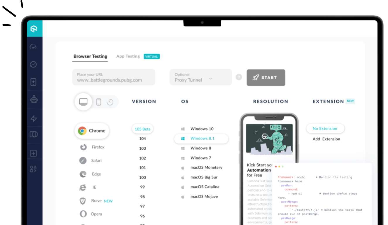
- Refine Mobile Website Design With Testing: Validate your website’s functionality and user-friendliness by testing it on various devices. Cloud platforms like LambdaTest offer tools such as LT Browser, which supports over 53+ device viewports and screen sizes.
It is a web device testing tool that helps ensure your site is responsive across various platforms and devices; with LT Browser, you can compare the view of your website side by side and synchronize interactions like scrolling, clicking, and navigation seamlessly.
To use LT Browser and validate your application’s responsiveness, download the .exe file below. Run it to access the LT Browser feature and explore its capabilities.

Conclusion
Successful mobile website design relies on a smooth user experience and accessibility on different devices. By looking at website design examples such as Adobe and Lyft, which have been successful, we can understand how the use of responsive layouts, easy navigation, and strategic content placement can improve user interaction and increase sales.
User satisfaction is enhanced by incorporating best practices like mobile-first design, quick loading times, mobile website testing, and touch-friendly elements. Prioritizing these principles as mobile usage grows will help keep your website competitive in the changing digital environment.
Frequently Asked Questions (FAQs)
Why is mobile website design important?
Mobile website design ensures that your site is accessible and user-friendly on smartphones and tablets, catering to the increasing number of mobile users.
How can I optimize my mobile site for speed?
Optimize images, minimize HTTP requests, and leverage browser caching to improve loading times, enhancing user experience and SEO rankings.
What are some key elements of mobile-friendly navigation?
Use simple menus, intuitive icons, and sticky headers to facilitate easy navigation on smaller screens, ensuring users can find information quickly.
How do I test the usability of my mobile website?
Conduct usability testing on different mobile devices and screen sizes. Evaluate navigation flow, load times, and user interactions to identify areas for improvement.


Author’s Profile
Nazneen Ahmad
Nazneen Ahmad is an experienced technical writer with over five years of experience in the software development and testing field. As a freelancer, she has worked on various projects to create technical documentation, user manuals, training materials, and other SEO-optimized content in various domains, including IT, healthcare, finance, and education.
Blogs: 47
Got Questions? Drop them on LambdaTest Community. Visit now