CSS Website Layout For Dual Screen And Foldable Devices
Anurag Gharat
Posted On: February 9, 2023
![]() 78963 Views
78963 Views
![]() 19 Min Read
19 Min Read
With more and more Dual Screen phones being introduced in the market, it is fair to say that we are entering an “Era of Dual Screen Devices.” And why not? Dual Screen phones are so much better for productivity and media consumption.
Dual Screen (or Foldable) phones come with all form factors to suit every user’s needs. In Dual Screen devices, you can have a phone that can be folded into a size that fits in your palm, while on the other side, you can have a phone which unfolds into the size of a regular tablet.
According to a report in 2021, Dual Screen phones have a 0.5 percent share of the total smartphone market. This is expected to grow by 69.9 percent CAGR by 2025. So it’s fair to say that this decade we will see a lot of foldable and multiscreen phones in the market, and in no time, they will be mainstream.
But with new form factors comes a new screen resolution and compatibility issues for the front-end developers. So now, with the already existing devices in the market, a front-end developer also has to make his website responsive on Dual Screen Devices and Foldables.
Hence looking at this growing adoption of multi-screen or Foldable devices, in 2020 Microsoft announced new Web APIs specially designed for Dual Screen phones. These new Web APIs include CSS Screen Spanning Media Feature and JavaScript Visual Viewport Segment API, which help developers to enhance their website experience on Dual Screen phones.
In this blog on CSS Website Layouts, we will dive deep into these newly announced Dual Screen Web APIs and learn how to use them to make your website responsive. In the end, we will take an example of a Blog page and make it responsive for Dual Screen and Foldable phones. If you are new to Responsive web design, check the guide on Responsive Design.
TABLE OF CONTENTS
Styling on a Foldable or Dual Screen device
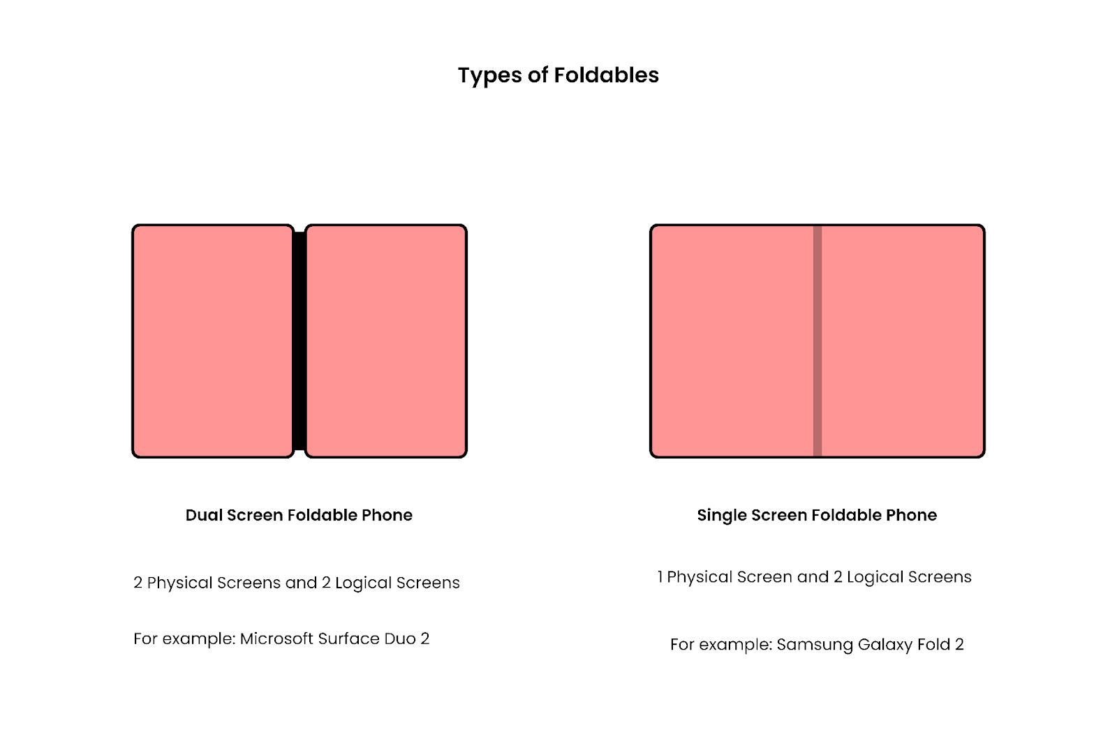
You can categorize Foldables or Dual Screen devices into two categories:
- Two separate screens joined by a mechanical hinge.
- One Single Screen where the actual screen folds from the middle.
A Foldable or Dual Screen device can have 4 Possible orientations
- Single Screen Portrait mode.
- Single Screen Landscape mode.
- Dual Screen Portrait Mode.
- Dual Screen Landscape Mode.
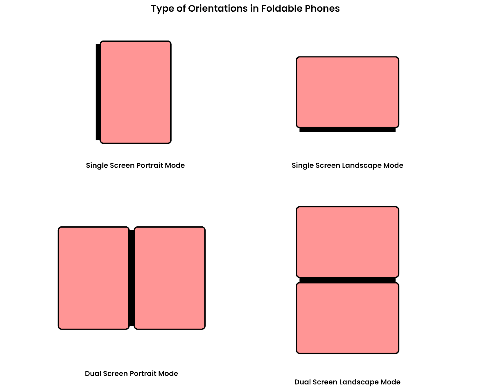
So as you can see, you must consider many viewport scenarios while constructing your queries. The second issue with the Dual Screen display is the position of the hinge.
Dual Screen phones like Microsoft Duo 2 have a mechanical hinge that divides the display into two logical screens. The position of the hinge is exactly in the middle, so any centered content gets hidden behind the hinge.
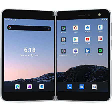
Let’s consider our favorite YouTube website and see how it looks on a Dual Screen device.
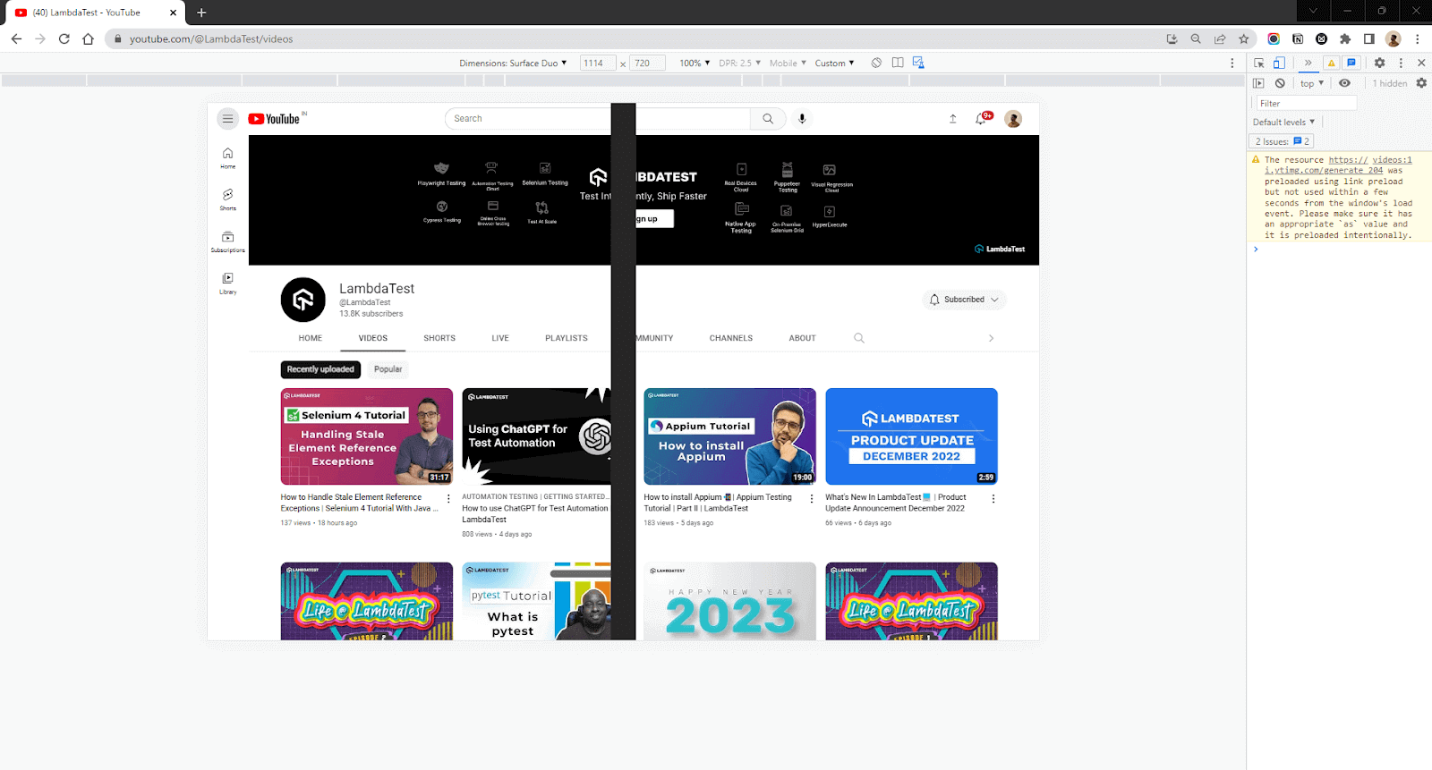
As you can see, the screen gets divided at the center; hence any object present behind the hinge is lost. This issue gets worse in the case of modals or buttons that are placed exactly at the center.
So we need to design the website in such a way that it breaks the content into two separate sections and avoids showing any content at the center, something similar to a book. This design is great for improving User Experience and Productivity.
By breaking the content into separate sections, we can fit in more information than a usual Single Screen device.
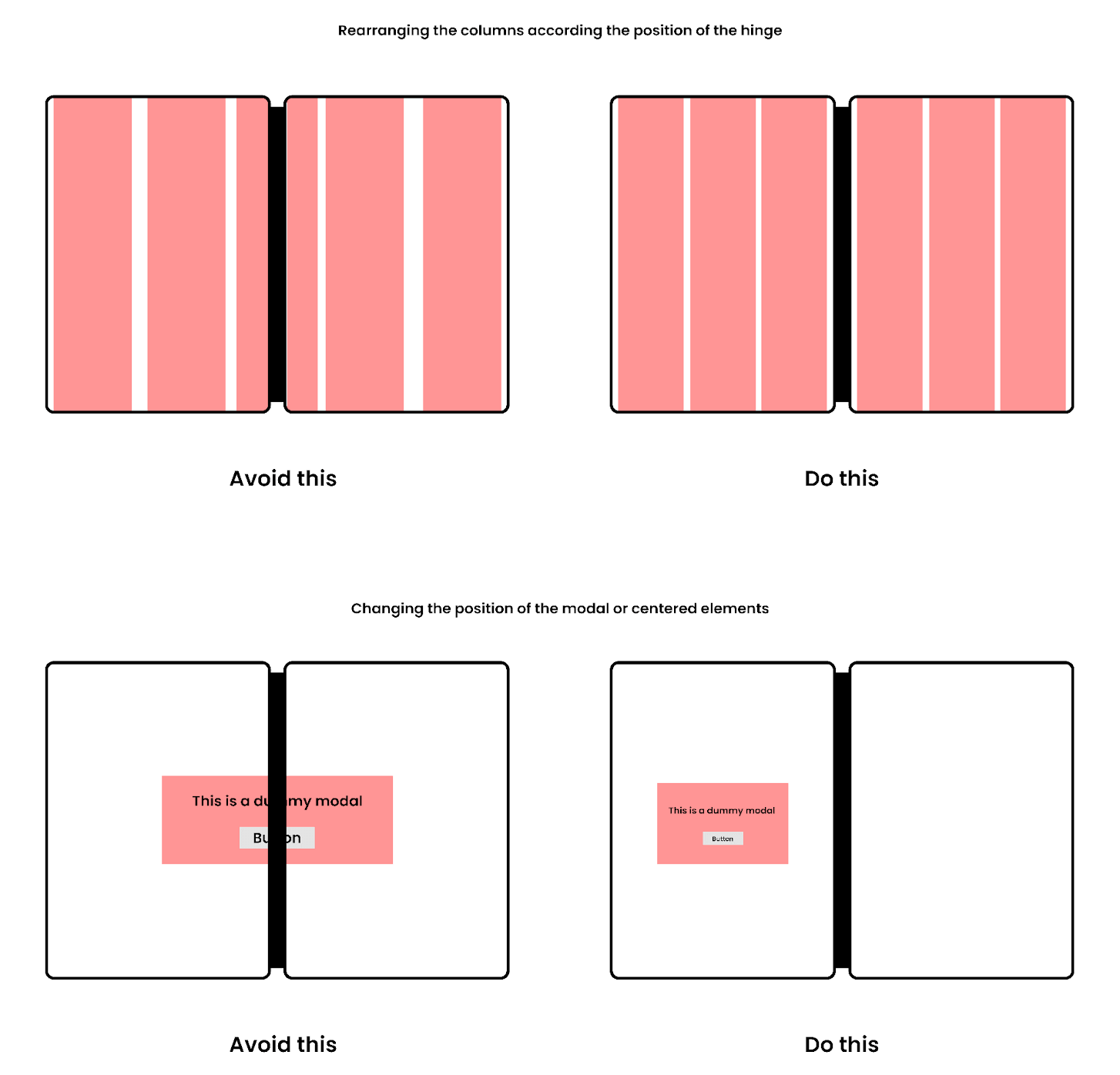
Before we move onto the crux of the topic, let’s talk about browser availability and how to test the output on a Dual Screen device in your Browser.
Browser Support and Availability
Currently, the Dual Screen APIs are available in all the latest versions of all Chromium browsers like Microsoft Edge and Google Chrome but are still in the experimental phase. You need to enable these features in your browser settings to use them.
To enable these features, go to Chrome://flags if you are on chrome or Edge://flags if you are using Edge. In the search bar, type Experimental Web Platform features and change the disabled flag to enable and relaunch the browser.
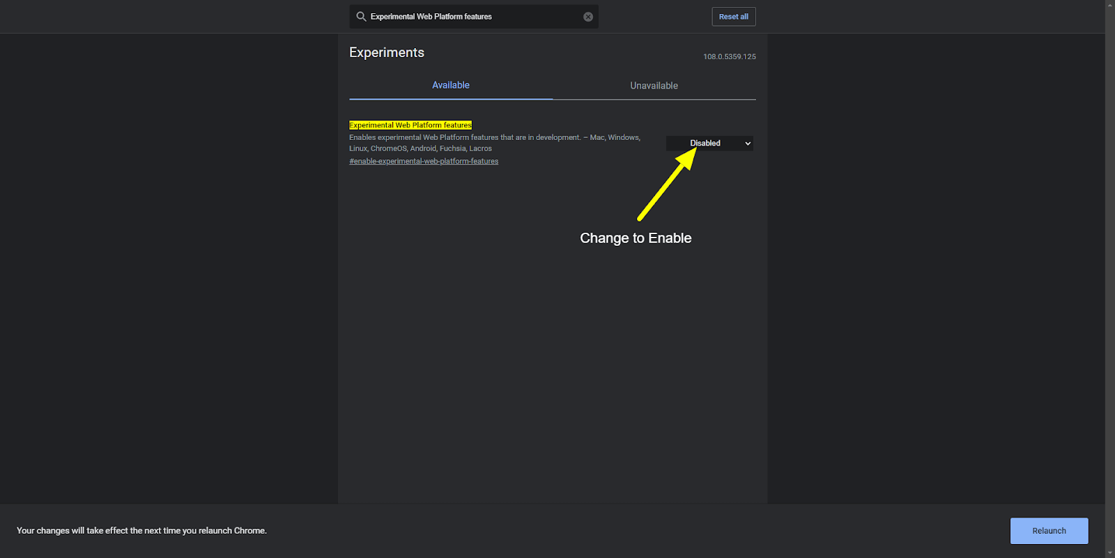
You can test the queries using the developer tools in Chrome or Edge, as we do for other devices.
Open your website in Google Chrome and press CTRL+SHIFT+I to open the Developer tools panel. You can choose a Dual Screen Device in the output panel to show your output. If you can’t find a Dual Screen Device, click on the edit option on the bottom and add Microsoft Surface Duo as a new device.
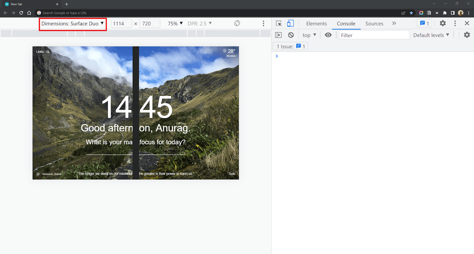
Dual Screen Web APIs
Looking at the rise of Foldables and Multiscreen Devices in the market, Microsoft announced two new Web APIs in 2020. These APIs integrate with the existing CSS Media Queries and JavaScript Visual Viewport API so that developers can work more towards utilizing the Dual Screen space for a better user experience than learning an entirely new feature from scratch. These Dual Screen Web APIs include
- CSS Screen Spanning Media Feature.
- JavaScript Segments Enumeration API.
In the next section of this blog on CSS Website Layouts, we will discuss the CSS Screen Spanning Media feature.
CSS Screen Spanning Media Feature
CSS Screen Spanning Media feature consists of specifically designed media queries to help front-end developers optimize the content for Dual Screen or Foldable devices. This new Media feature is an addition to the existing CSS Media queries we use to add responsiveness to our website.
If you don’t know what a Media Query in CSS is,
Media Query is a CSS rule used to apply a set of CSS properties based on some conditions. CSS Media queries form an integral part of Responsive Web Design.
The CSS screen-spanning media query detects whether your website is opened on a multi-screen device and applies styles based on that. This Query has two variations:
- horizontal-viewport-segments
- vertical-viewport-segments
Horizontal Segments Media Query
This CSS screen-spanning query is used to check the number of Horizontal screens available on the Output device. This query is triggered when the Foldable device is held in Dual Screen Portrait Mode (Like a Book) where the fold or hinge is vertically in the middle.
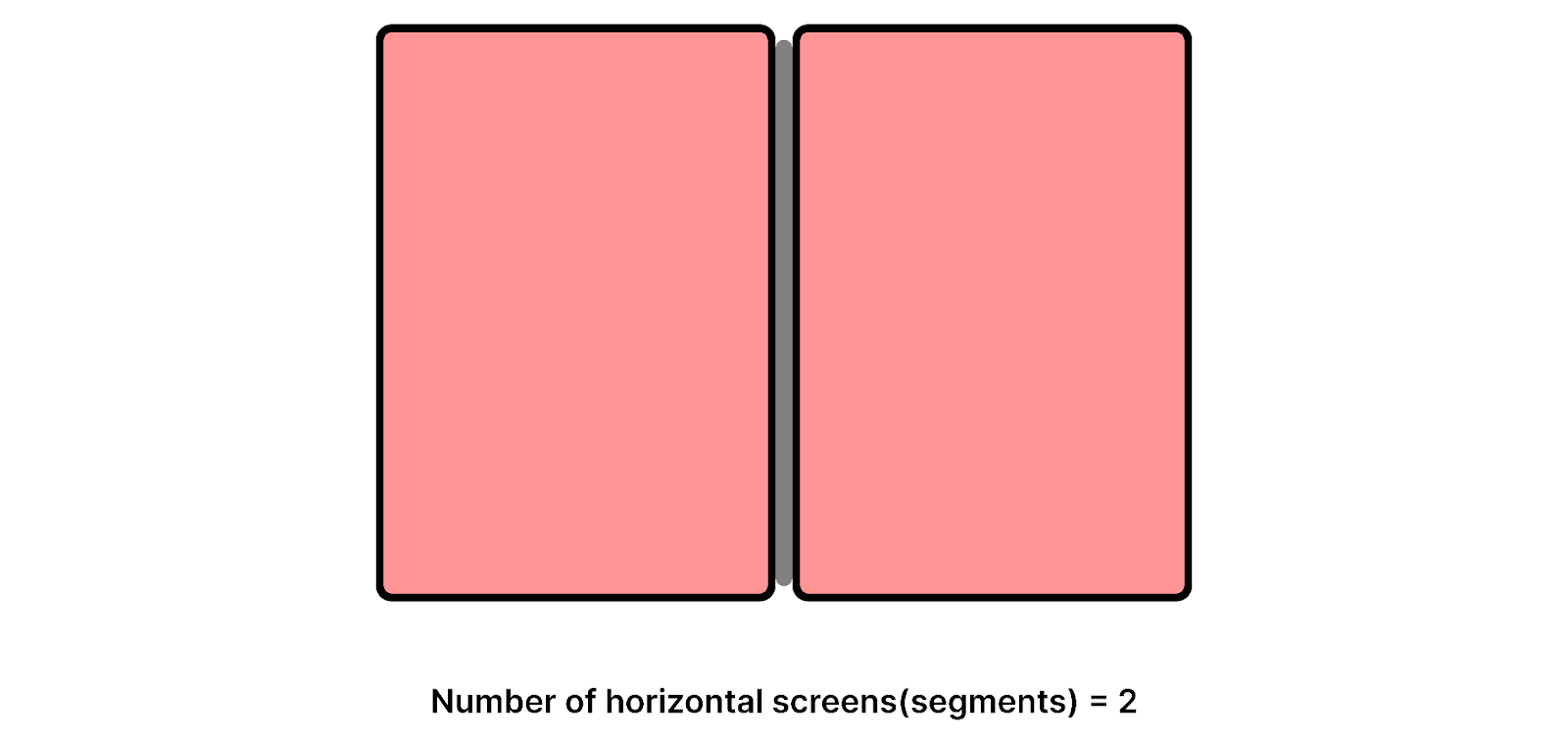
Syntax:
Example:
Let’s design a media query where the background color of the body will change to red if the Device is opened in Dual Screen Portrait mode and has 2 screens horizontally beside each other.
CSS Media Query:
Vertical Segments Media Query
Vertical Segments query is used to check the number of Vertical screens available on the output device. This query is triggered when the Foldable device is held in Dual Screen Landscape Mode (Like a Vertical Book) where the fold or hinge is present horizontally in the middle.
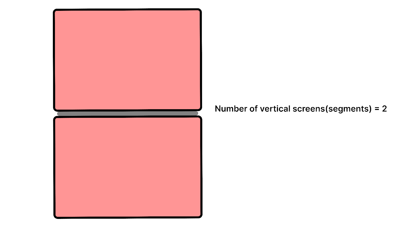
Syntax:
Let’s design a media query where the background color of the body will change to red if the Device is opened in Dual Screen Landscape mode and has 2 screens vertically above each other.
Example:
Chaining Multiple Queries
You can also chain CSS Screen Spanning media queries with additional conditions like the width or height of the viewports.
Here we are writing a query where the styles will be applied if the vertical viewport segments are 2 and the minimum width of the segment is 400px.
CSS Environment Variables
Along with Web APIs, developers can also utilize 6 newly introduced CSS Environment variables to calculate the Geometry of the display region on the screens. These variables can be used to
- Get the display area of the screen
- Calculate the geometry of the hinge (if present)
- Align the content on the screen
The x and y position represent the coordinates of the 2D grid with the center(0,0) in the top-left corner. Using these positions, the screen can be divided into two separate regions denoted by 0 and 1.
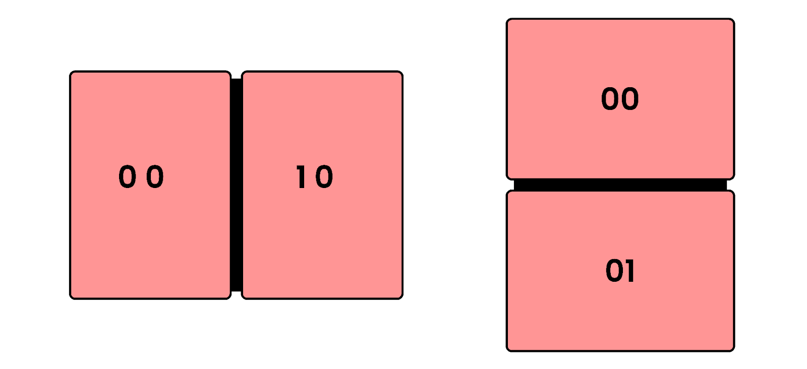
Example:
Represents the width of the left screen in Dual Portrait mode:
Represents the width of the right screen in Dual Portrait mode.
Represents the width of the top screen in Dual Landscape mode.
Represents the width of the bottom screen in Dual Landscape mode.
Similarly, we can get the height and the corner positions using these variables. Let’s look at how we can calculate the hinge width when the device is used in Dual Screen Portrait mode.
To get the width of the hinge, we must first get the position of the left-top and right-top corners of the hinge.
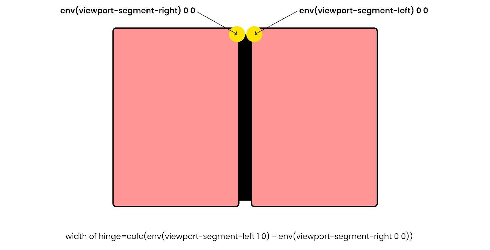
Subtracting the left corner of the right screen from the right corner of the left screen will get you the width of the hinge.
Similarly, you can get the height of the hinge by
You can pass the height as a value to a CSS property.
JavaScript Visual Viewport Segments API
In cases where the developer is unable to use CSS to detect a Foldable or Dual Screen Device, he can make use of JavaScript visualViewport.segments API.
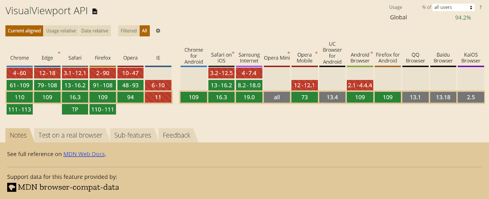
In the initial draft, a completely new JavaScript API called JavaScript Windows Segment Enumeration API was proposed. But after getting feedback from the developer community, they decided to implement it in the existing Visual Viewport API.
The VisualViewport API represents the visual viewport for the screen. The API has properties like
- visualViewport.width – returns the viewport width
- visualViewport.height – returns the viewport height
- visualViewport.scale – returns the scaling factor
- visualViewport.offsetLeft – returns the offset of the left edge
- visualViewport.offsetTop – returns the offset of the top edge
- visualViewport.pageLeft – returns the x coordinate of the top edge
- visualViewport.pageTop – returns the y coordinate of the top edge
In addition to the existing properties, a new property named visualViewport.segments was introduced. This property provides the count of segments available on the device where the browser is being used.
Output:
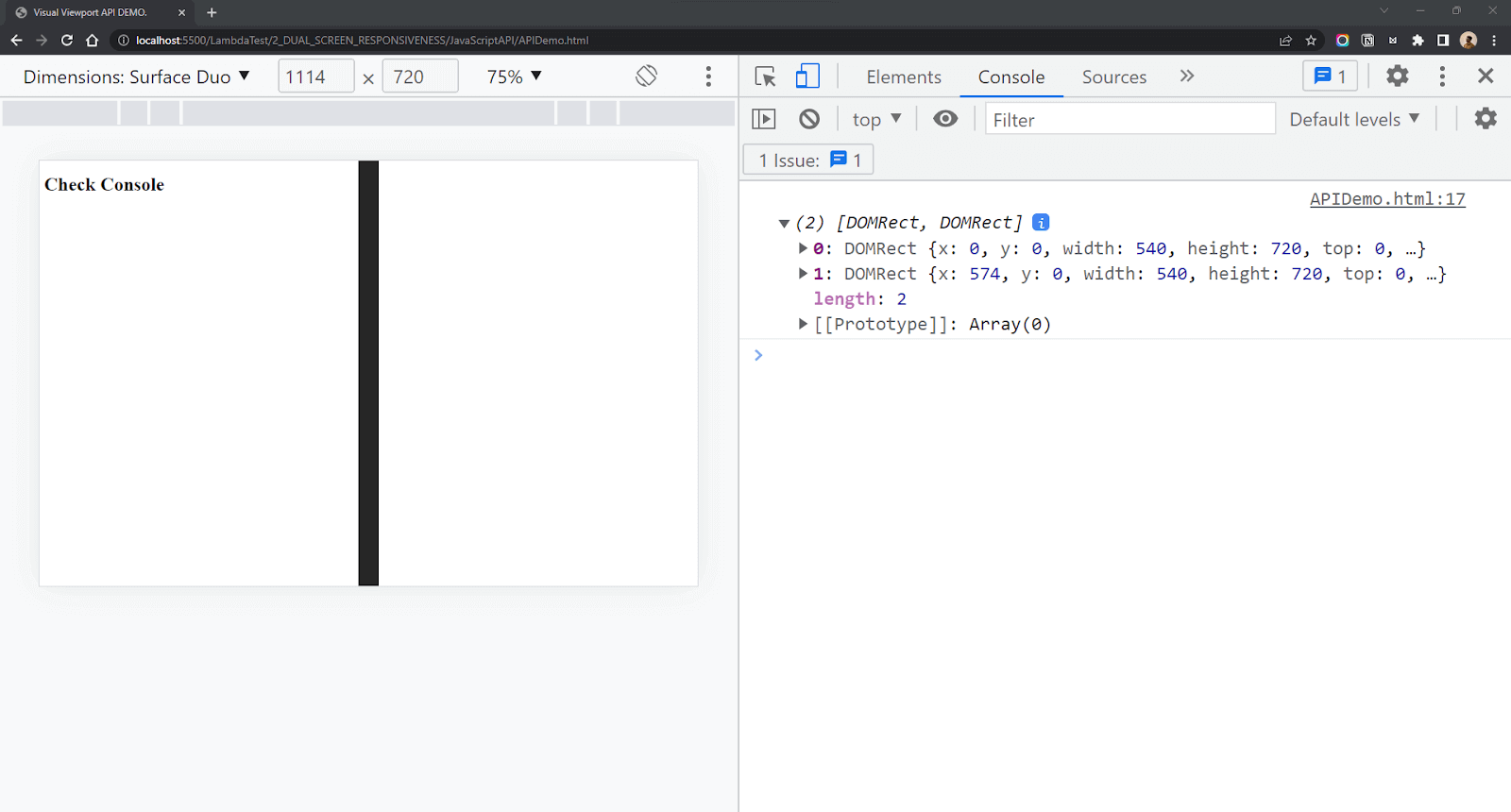
The window.visualViewport.segments property returns an array containing the DOMRects across which the browser is spanned. Each DOMRect object contains the height and width of each screen along with its x, y, left, right, top, and bottom coordinates. Using these coordinates, you can easily calculate the width and height of the hinge. The query will return a null value if the number of displays is 1.
So in the case of a Microsoft Surface Duo, which is open in Dual Screen Portrait mode, the value returned from window.visualViewport.segments will be an array with 2 values representing the screens. The first object represents the left/top screen, and the second object represents the right/bottom screen. For a single viewport (Desktop, Mobile, Laptop), the value of segments will be null.
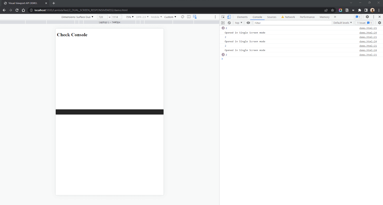
The value returned is an immutable snapshot of the device’s state when the object property was queried. So in case the device is rotated, or the state of the displays is changed, the value will no longer be valid. In such cases, we can add an event listener for ‘resize’ and pass a function that will calculate the number of segments available.
Example:
Output:
Demonstration: Building a simple Blog page using CSS Website Layouts
In this section of this blog on CSS Website Layouts, we will demonstrate how to build a simple blog page using CSS Website Layouts.
Now that we know about Dual Screen Web APIs let’s test our knowledge by building a small project. We will build a simple Blog page that we will try to make responsive for Dual Screens. Let’s take a look at the design first.
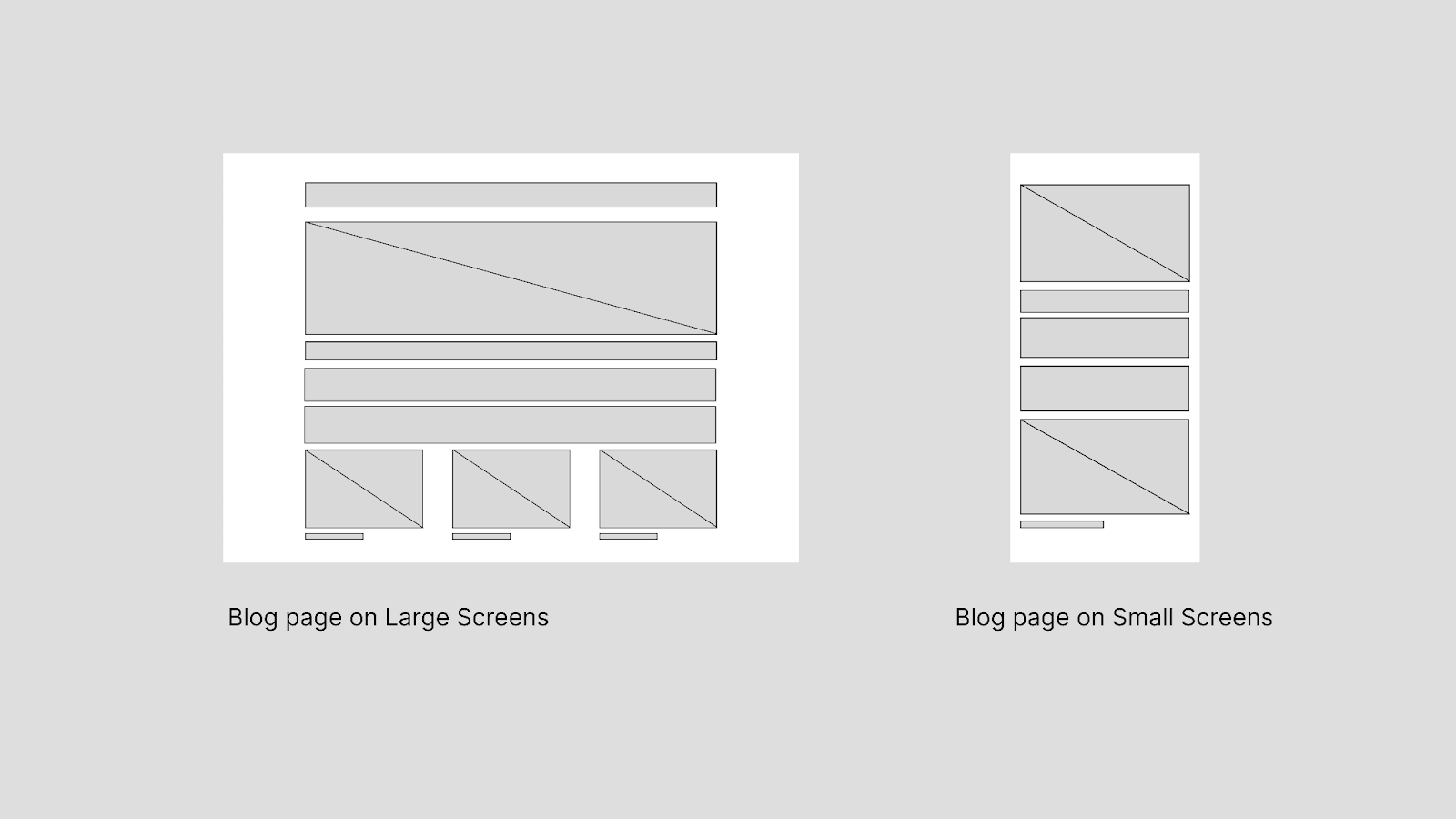
Let’s start with the HTML first. We have a heading, an image, some dummy content, and 3 image cards.
HTML:
For CSS, I am using Flexbox to align the content. If you are more comfortable with Grid, you can use CSS Grid.
CSS:
This is what we have finished until now. Clean and simple design.
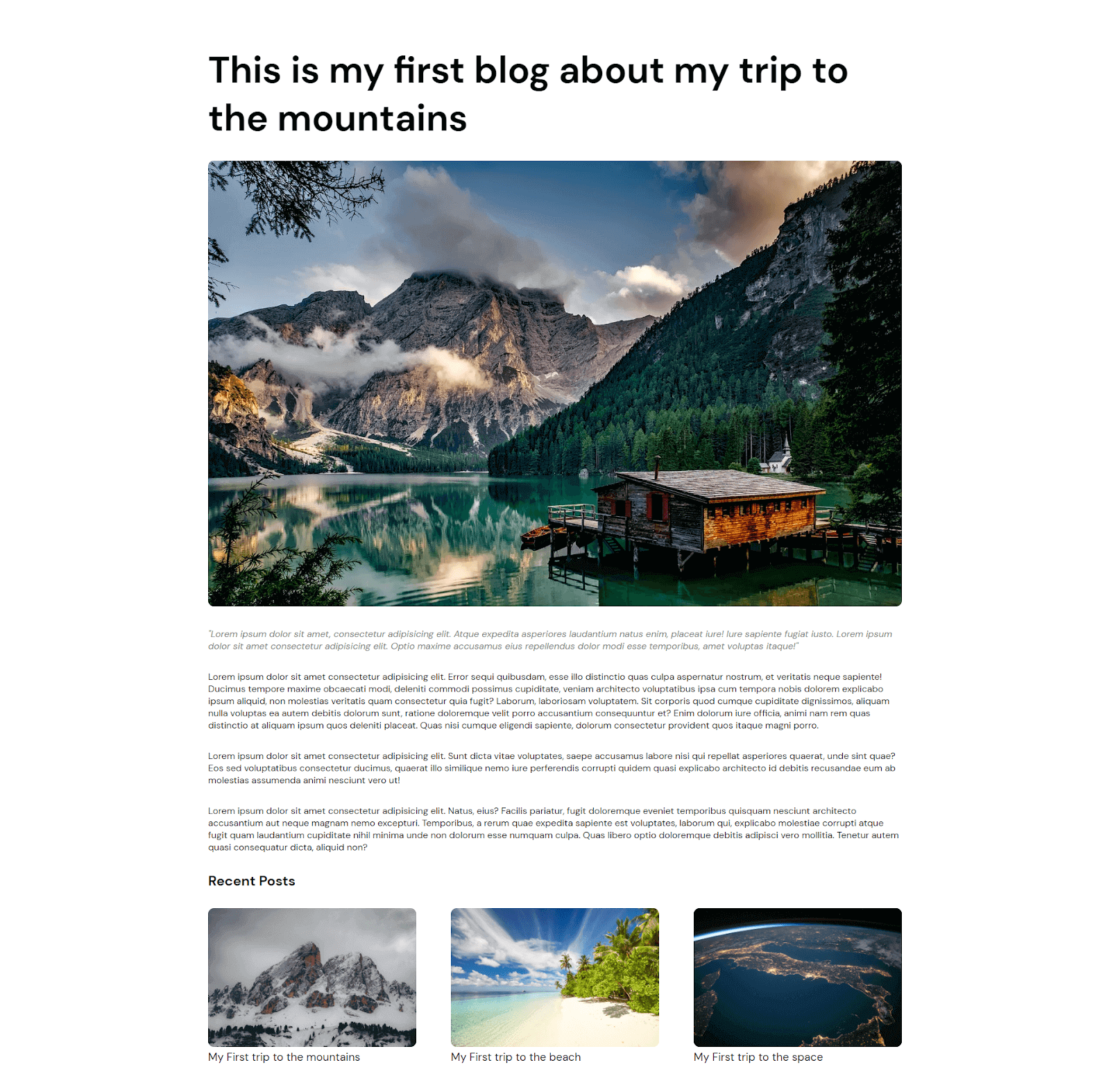
The basic layout of the blog is done. Time to add responsiveness to our blog. Let’s start with adding media queries for mobile and tablet devices.
Output:
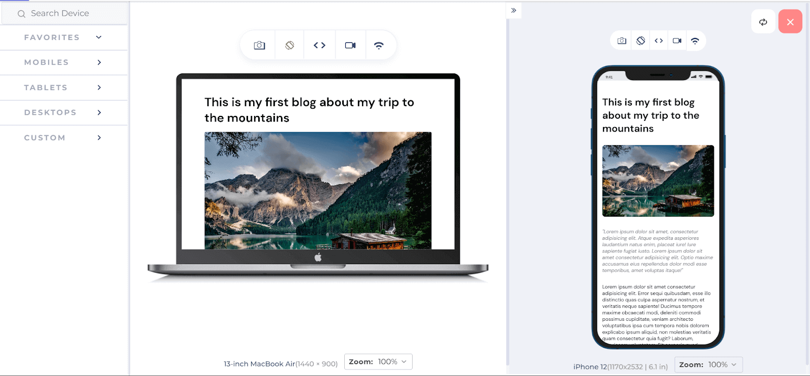
I am using the LT Browser to check the output of CSS Website Layouts on various device viewports. As you can see, I can test the responsiveness on a laptop and a mobile viewports side by side.
LT Browser is a mobile-friendly test tool that enables you to conduct responsive testing of your CSS Website Layouts and guarantee your layout’s adaptability across different device viewports. Using LT Browser, you can assess your website’s responsiveness on more than 50 pre-configured device viewports, comprising smartphones, tablets, laptops, and desktops.
Now let’s move on to the objective of this tutorial on CSS Website Layouts, which is Dual Screen Responsiveness. But before that, let’s see how our Blog page looks without adding Media queries for Dual Screen display in the next section of this tutorial on CSS Website Layouts.
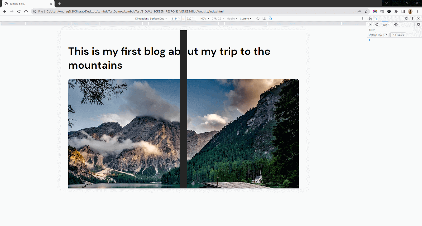
As you can see, the content is getting blocked by the hinge. Here’s a design of how I want the website to look on Dual Screen Display.
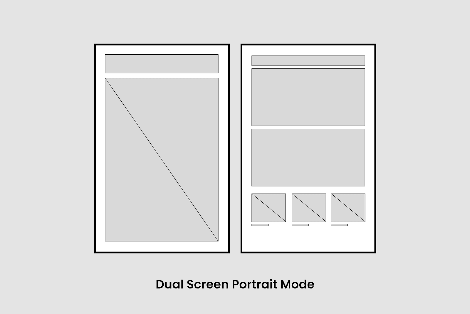
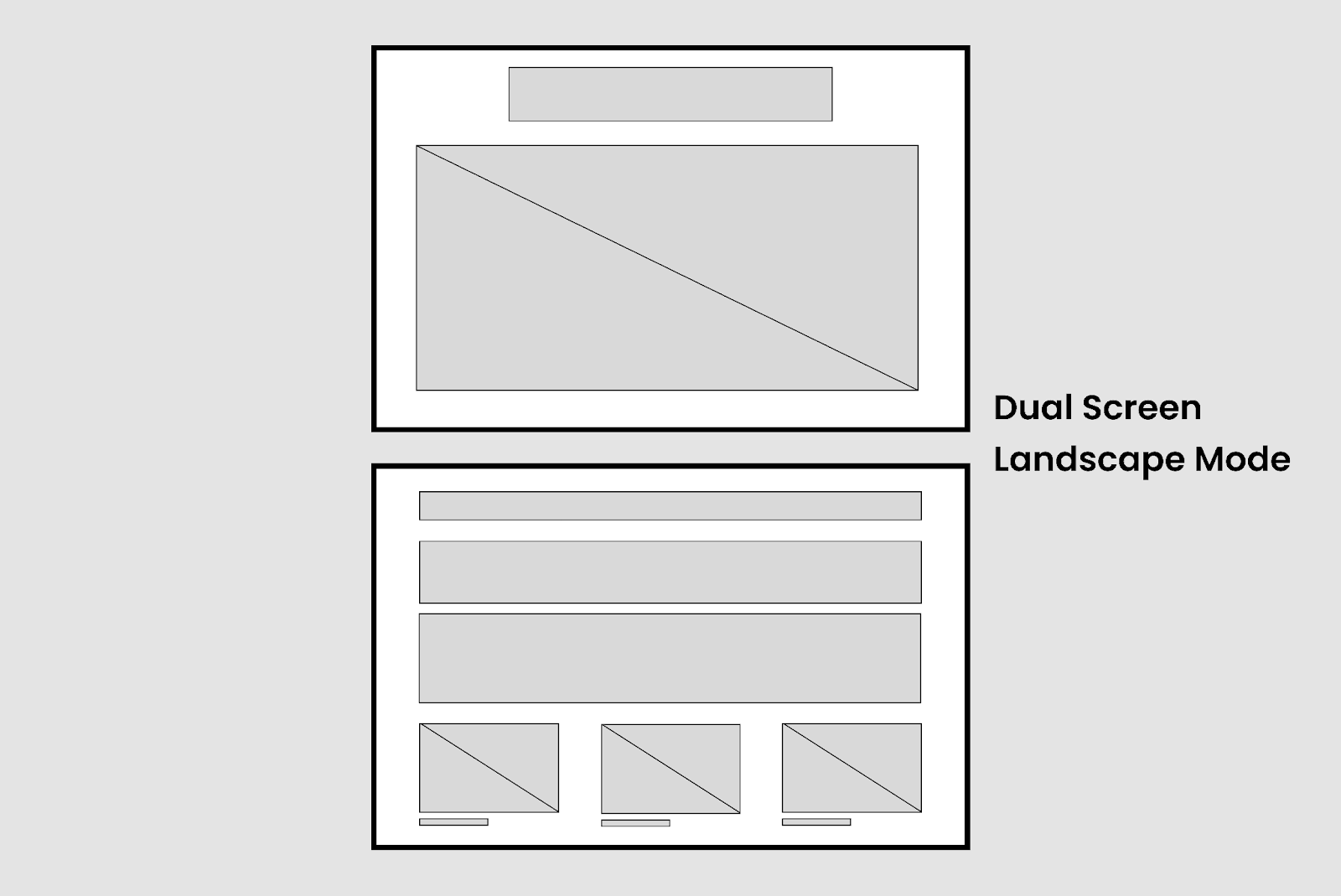
We are starting with Dual Screen Portrait mode and then moving to Dual Screen Landscape mode.
First, we need to change the flex-direction of the blog content to row format so that we can get a two-column layout with an image and heading on the left and content on the right.
Output:
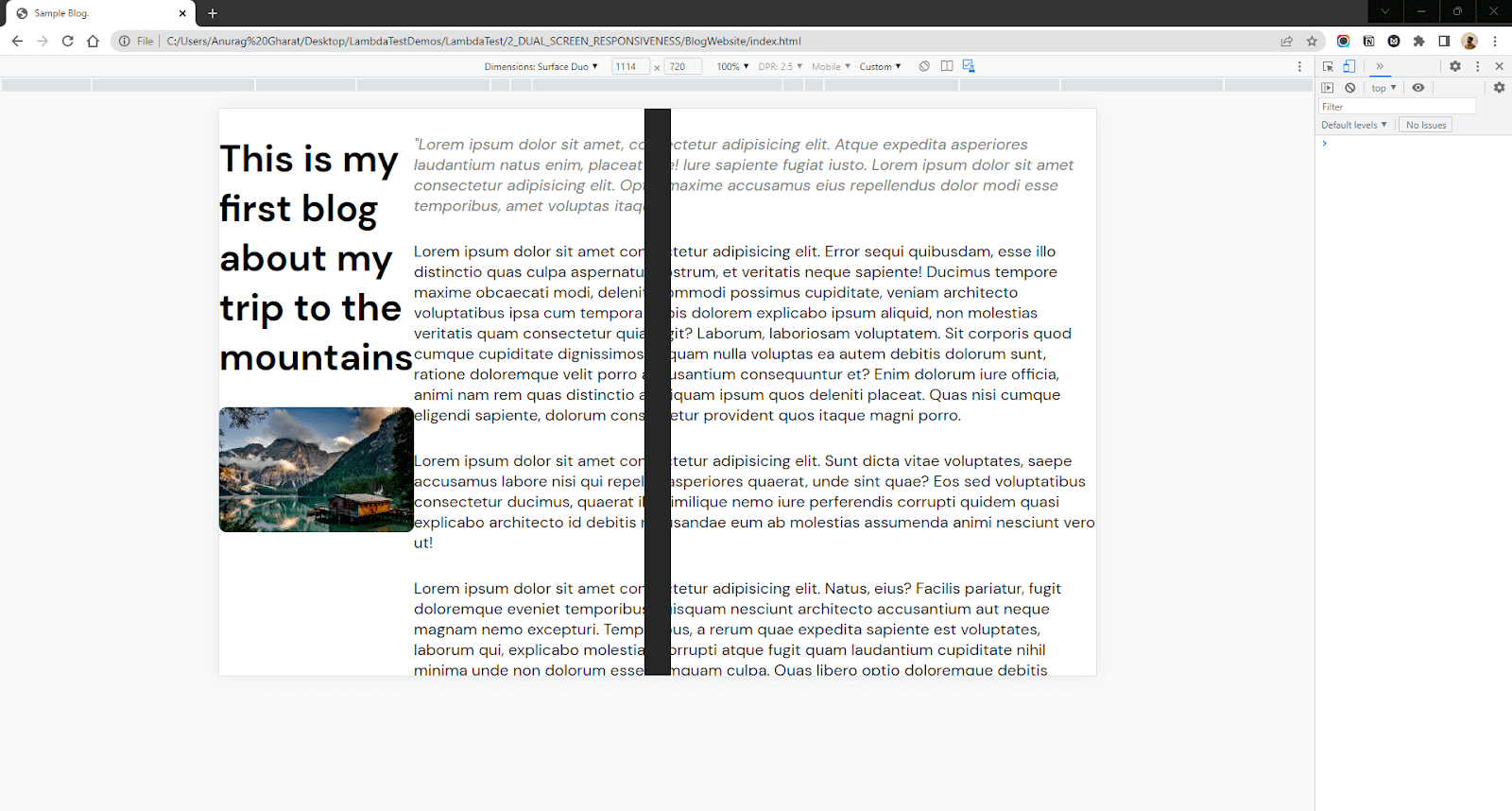
As you can see, the content is flexed in a row but still not as we want it. Let’s set the width of the element that contains an image and heading equally to the width of the left screen. We will use env variables to get the width of the left screen.
We will do the same with text content. We will set the minimum content width equal to the screen’s width on the right.
Output:

The result looks far better than we started with in this blog on CSS Website Layouts, but still, the design needs improvement. If you look closely, the left part of the content is blocked by the hinge. It’s behind the hinge; hence it’s cropped from the screen.
We can solve that by adding a margin-left to the article tag. This margin value should be equal to the width of the hinge.
Output:
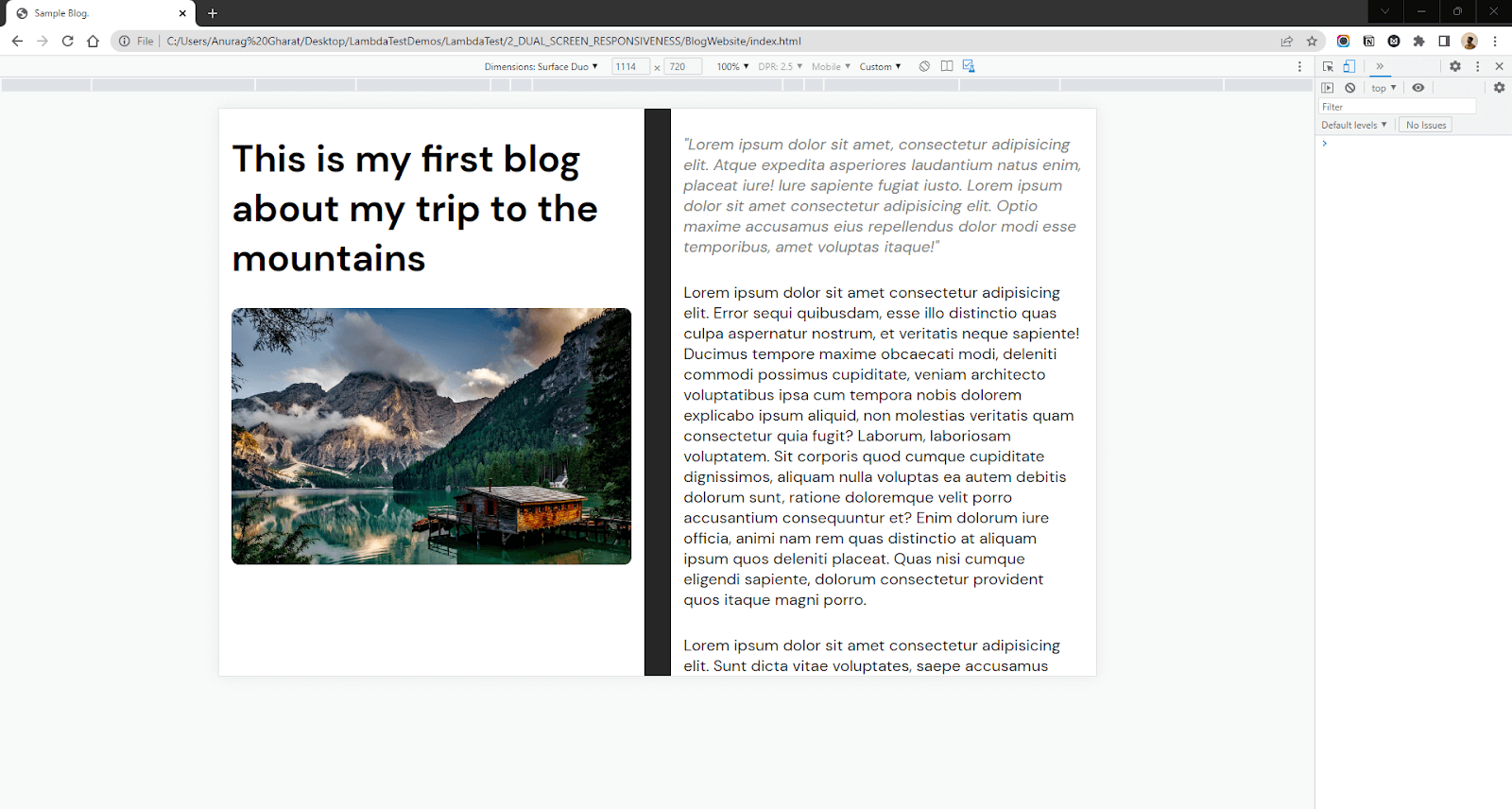
There you go, we have made our Blog page responsive for Dual Screen devices. You can check the code for the Simple Blog here on my CodePen. Now let’s move on to the second mode – Dual Screen Landscape mode. Here we need to do some alignment to display the content properly.
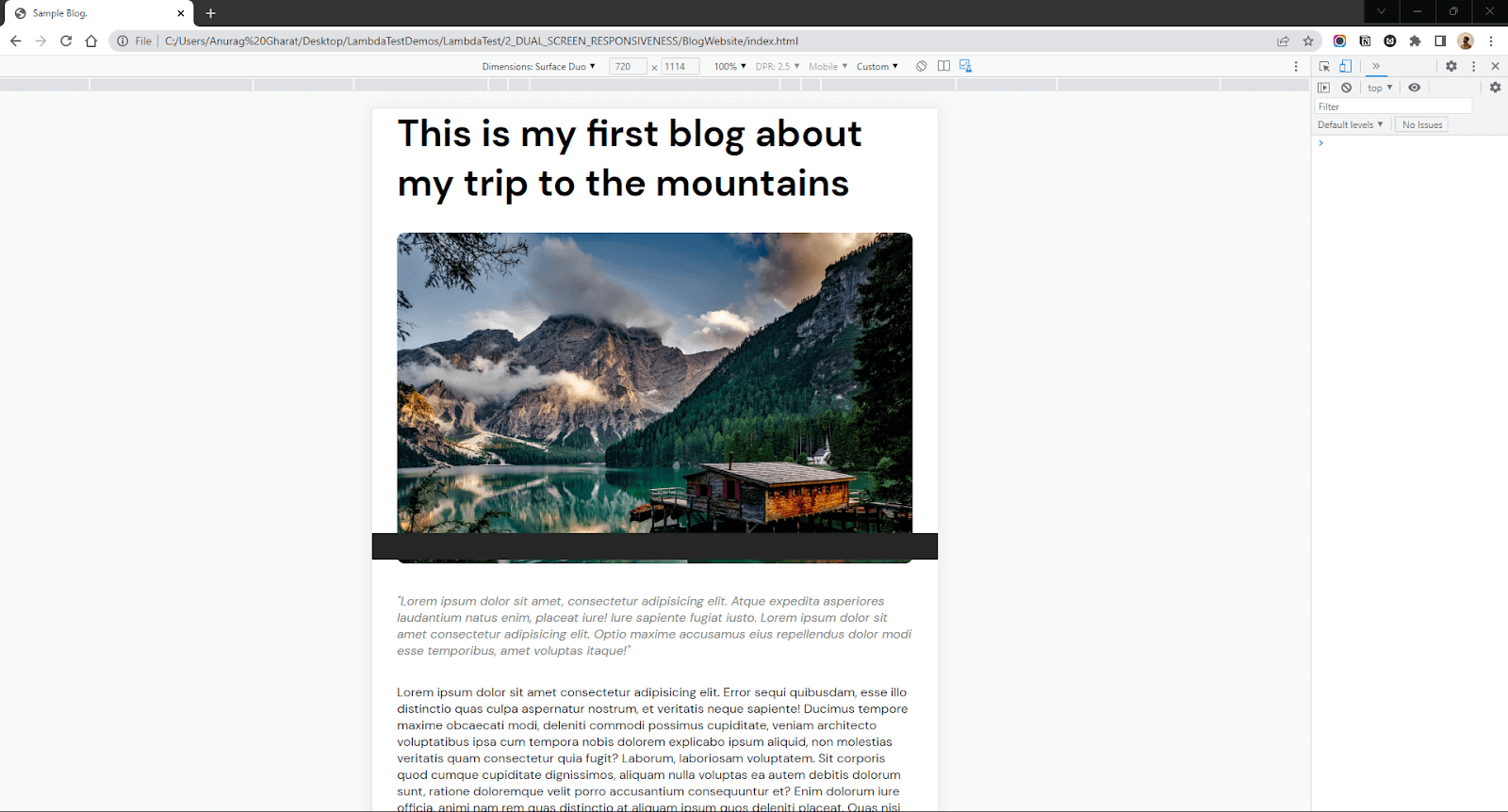
CSS:
In this section of this blog on CSS Website Layouts, the top is spanned across the entire top screen and added a margin-top for the content present on the bottom screen so that the text does not get hidden behind the hinge.
Output:
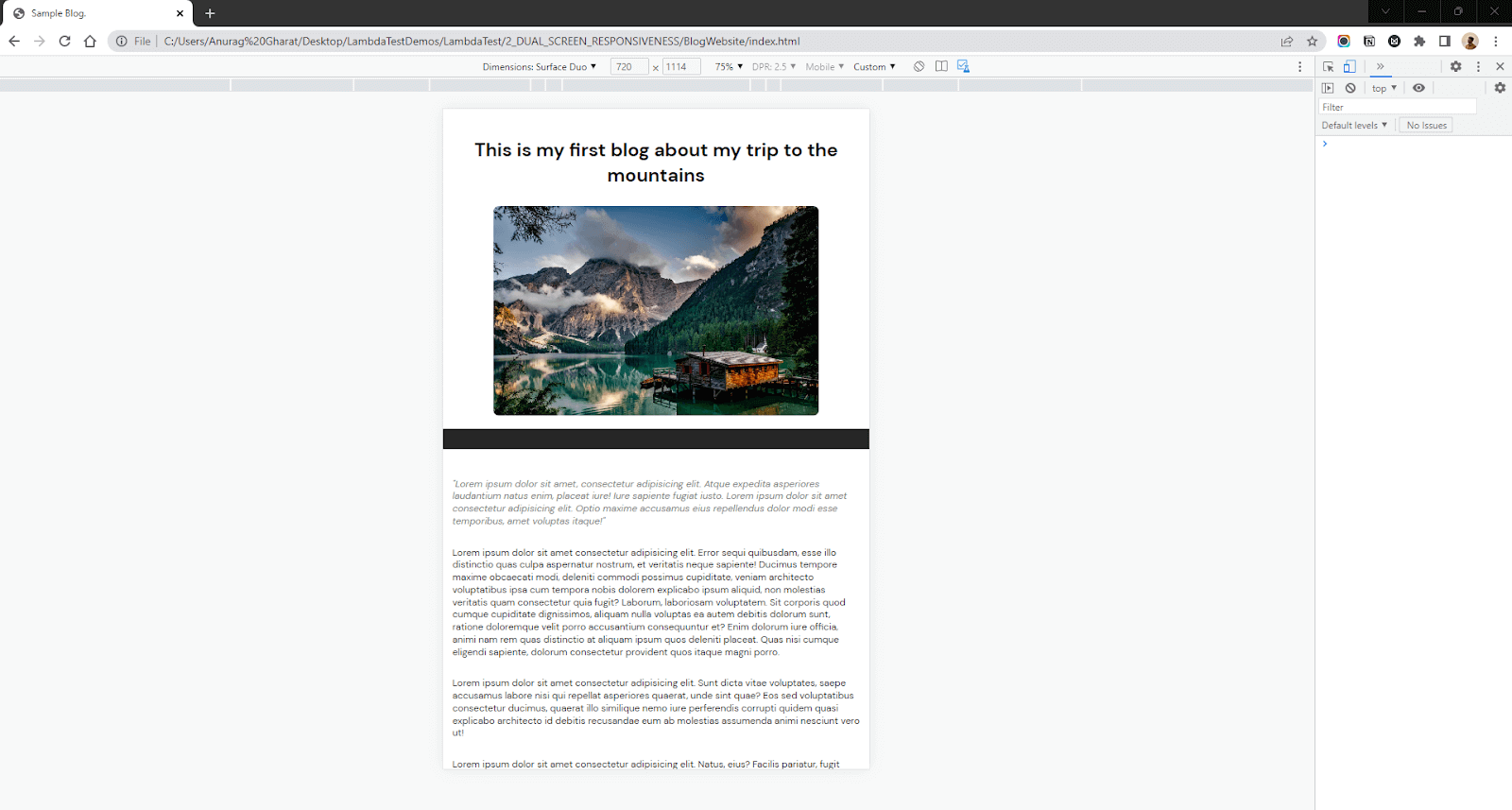
Now in most cases, what we did would be enough. But I want to go one step up and think about the UX. In this section of this blog on CSS Website Layouts, we haven’t fully utilized the multi-screen setup.
Both screens are scrolled together in Dual Screen Portrait mode when we scroll. Hence the image is lost and the left screen is blank. It would be better if we stick the image and heading on one screen and allow the user to scroll only the textual region (right screen).
Final Output:
In my opinion, this looks better than the previous ones. I could keep the image in focus fixed on one side of the display while allowing the user to read the content from another side.
CSS (for the above output):
Dual Screen APIs are still in the experimental phase; hence these APIs won’t work in real-world devices. In such a case, you can use Viewport Segments Polyfill. This Polyfill is an alternative to JavaScript Viewport Segments API. There is still no alternate API for CSS Spanning Media Queries.
Another option will be to make your website perfectly responsive for handheld devices like phones. Hence, users can view the website on a Single Screen instead of spanning it across both screens.
UX in Dual Screen displays
With the introduction of new form factors for devices, there are new challenges for the developers to build their apps and websites that adapt and work well on such devices. But along with the challenges, there are new opportunities to showcase their creativity and use the extra space. But how can you make your website or app better for Dual Screens?
First, think about how you can fully utilize the Dual Screens. Dual Screen means extra screen real estate to fit your content. Think about making life easy for the User by showing more content and better accessibility.
Example:
Let’s say you are creating an app or websites like Instagram or Facebook. In such apps, you can create a single photo screen such that the post image is fixed on the left while the image caption, comments, and likes are shown on the right screen. This allows users to absorb more content than regular design. The user does not need to scroll below to see the comments. He can check the comments with the image still on the screen.
Similar things can be done for Video playing websites like YouTube, where you can play a Video on one screen and comments, descriptions, and other important metadata related to the post on the other screen. Thus improving the User Experience.
Wrapping it Up
In 2022, more than 60% of the web traffic was through mobile devices. Every developer and designer must adapt to the changes as the devices evolve.
In this blog on CSS Website Layouts, we discussed a new generation of devices, the Foldable and Dual Screen Devices. We understood why designing a Foldable or Dual Screen device is difficult and how the new CSS Media query solves our problem. We then saw examples of the new queries and how to use them. Later, we built a small Blog page and made it responsive for Dual Screen devices.
So next time you are working on your website, don’t forget to test the responsiveness of your CSS Website Layouts on Dual Screen devices. I hope you found this blog on CSS Website Layouts helpful. Happy Coding!
Frequently Asked Questions (FAQs)
Can we use the Dual Screen Web API in Production?
Dual Screen Web APIs are still in the experimental phase, so they won’t work on real-world devices until the users enable the Experimental features. So till the time these APIs are standardized, you can use regular media queries to add responsiveness.
What other tools can I use to test the output on dual Screen devices?
Apart from the browser dev tools, you can use a Dual Screen device emulator to test your website. Microsoft Surface Duo is a popular one in this case.
Where can I test my website for responsiveness?
You can use the LT browser to test the responsiveness of your website. LT Browser is a mobile-friendly tester offered by LambdaTest – a continuous quality cloud testing platform for manual and automated testing for web and mobile. With LT Browser, you can test your website’s responsiveness on over 50+ device viewports. It supports responsive testing on mobile, tablet, desktop, and even laptops.
When to use JavaScript API vs CSS Media Query?
Use JavaScript API when there is no CSS involved. For example: creating a browser game or working with Canvas2D or WebGL objects. Use CSS Media queries to alter styles based on the device.
Got Questions? Drop them on LambdaTest Community. Visit now


