 TestMu 2025 - The Largest Virtual Software Testing Conference is Back | 50,000+ Attendees
Understanding CSS Sibling Selectors: A Beginner’s Guide
Chosen Vincent
Posted On: July 30, 2024
14 Min


CSS provides a wide range of selectors for targeting specific elements in an HTML document. While class and ID selectors are commonly used, they can’t always target elements based on their relationship to other elements. This is where CSS sibling selectors come into play.
CSS sibling selectors are crucial for creating sophisticated and flexible web layouts, allowing you to style elements based on their relative position to other elements. They are particularly useful when the design depends on element placement and uses various combinators, such as Descendant Combinator, Child Combinator, Adjacent Sibling Combinator, and more. This approach allows you to apply styles to specific elements without adding extra classes or IDs, reducing code clutter.
What Are CSS Sibling Selectors?
CSS sibling selectors are used to select elements that are siblings (share the same parent element), i.e., it helps you select HTML elements based on their relationship to other elements sharing the same parent. These combinators are unique symbols that help browsers understand the relationship between HTML elements.
There are two types of CSS sibling selectors:
- Adjacent sibling selector (+)
- General sibling selector (-)
Here’s why CSS sibling selectors are crucial for web developers:
- Enhanced Specificity: Compared to generic selectors, sibling selectors allow for more precise styling of elements. This enhances the maintainability and organization of your CSS code.
- Dynamic Layouts: By focusing on items’ positions relative to siblings, you can develop layouts that adapt to the content structure. Imagine styling the first and last child of a container differently.
- Visual Relationships: It enables you to create visual relationships between items. Think about highlighting captions followed by corresponding images or adding borders between adjacent sections.
- Reduced Code Repetition: When you need to style elements depending on their position within a certain container, sibling selectors can eliminate the need for repetitive class assignments, resulting in cleaner code.
- Efficiency: It can result in more efficient CSS by minimizing redundancy. Instead of writing many rules to target certain items under different conditions, sibling selectors allow you to write simple, reusable CSS rules that adapt to the document structure.
- Responsive Design: It can be extremely handy in responsive web design. They let you adjust the layout or look of items based on their relationship to others, which is critical for providing a consistent user experience across several devices and screen sizes.
CSS sibling selectors allow you to progress beyond a purely element-based approach to styling. They enable you to harness the hierarchical structure of the HTML to produce a more consistent and visually pleasing user experience.
Types of CSS Sibling Selectors
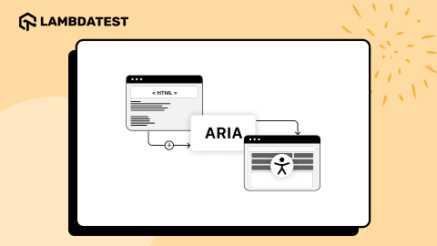
There are two types of CSS sibling selectors: adjacent and general selectors. Both are important in allowing developers to target elements based on their sibling relationships, but they operate differently.

The above diagram shows the sibling selectors in CSS and how they target elements.
Adjacent Sibling Selector (+)
The adjacent sibling selector, represented by a plus symbol (+), allows you to target an element immediately after another element with the same parent element. This means it will only target the first sibling element that appears directly after the specified element, allowing for precise and context-sensitive styling without additional classes or IDs.
This selector provides a high level of precision, allowing you to style elements based on their exact position inside the HTML structure.
Syntax:
In this syntax:
- element1: Represents the element that precedes the target element.
- element2: Represents the element you want to style, which must directly follow element1.
- Plus sign (+): Acts as the combinator, signifying the specific relationship between the elements.
Uses:
As mentioned earlier, this selector targets an element immediately following another specified element. This is useful when you style an element based on its direct sibling.
- Styling Form Elements: When a user focuses on an input field, you might want to highlight the label immediately following it.
- Content Formatting: You can apply special formatting to a paragraph that follows a heading.
Example: LambdaTest Blog Page
Let’s consider an example from the LambdaTest blog page to show the adjacent sibling selector’s use.
Let’s break down different instances where the adjacent sibling selector was used:
This targets the list item (<li>) positioned immediately after the element with class .platform. In the navigation menu, this rule positions the element with the class .enterprise (which comes right after .platform) to be styled with position: relative. This allows the dropdown menu within the .enterprise element to be positioned using absolute positioning.
This targets the button element that is positioned immediately after the button with the class .login. It sets the styles (padding, border, etc.) specifically for the second button, creating a different visual distinction between the login and the following button.
This targets the search input container element positioned immediately after the element with the class .button-container. It sets the search input container’s styles (width, positioning, etc.).
This is a slightly different use case. Here, the adjacent sibling selector targets the .search-icon element, but only when the .search-input element has focus (when the user clicks inside the search bar). This way, you can change the icon’s color and size to provide visual feedback to the user when interacting with the search input.
General Sibling Selector (~)
The general sibling selector, represented by the tilde symbol (~), allows you to target and style elements that share the same parent and follow a specified element. Unlike the adjacent sibling selector, which only targets the immediate sibling, the general sibling selector affects all subsequent siblings.
Syntax:
The syntax for the general sibling selector is:
In this syntax:
- element1: Represents the reference element.
- element2: Represents the target element, which follows element1 and shares the same parent.
The general sibling selector is handy when you style components related to the HTML structure but not necessarily adjacent to one another. For example, you can use it to style all paragraphs that follow an <h1> HTML tag element, even if there are other elements between them.
Uses:
The general sibling selector targets all siblings of a specified element who share the same parent, regardless of their position.
- Navigation Links: Use the general sibling selector to style any navigation links that follow a highlighted link.
- Styling Lists: If you want to style all list items after a specific one, use the general sibling selector.
- Theming Sections: Apply a different style to all sections that follow a specific section within the same parent in a document.
Example: LambdaTest Docs Page
In the LambdaTest Docs Page example, the general sibling selector styles all <a> elements that follow a .docs-title div within the .docs-category section. This approach helps differentiate the links from other content and creates a structured layout. It ensures that all related links are visually grouped and styled consistently, maintaining a clean and organized design.
In the above example, the CSS rule, .docs-title ~ a targets all anchor (<a>) elements that come after a .docs-title div. The styles used include a block display, a margin for spacing, and specific text color, size, and weight.
Understanding these two sibling selectors enables more targeted and dynamic styling on your web pages. However, are CSS sibling selectors compatible with all browsers?
Browser Compatibility
CSS sibling selectors with combinators are widely supported across modern browsers, including Chrome, Firefox, Safari, and Edge. However, it is still good practice to check compatibility with older browser versions and to test your website on different browsers to ensure consistent behavior.

To test your website’s styles across various browsers and ensure everything functions as expected, consider using a cloud-based platform like LambdaTest. It is an AI-powered test execution platform that allows you to run manual and automated browser compatibility tests at scale across 3000+ browsers and OS combinations.

Best Practices and Considerations
Using CSS sibling selectors can greatly enhance your website design. Still, following best practices and being aware of certain considerations is important to ensure your CSS stylesheets remain efficient and maintainable.
Combine Selectors for Specificity
CSS sibling selectors offer lower specificity than classes and IDs. This means that if there is a conflicting style rule with a higher specificity, the more specific rule takes precedence. Be aware of conflicts and ensure your sibling selector styles target the correct components.
Sibling selections can be combined with other CSS Selectors to improve specificity and prevent conflicts. This can prevent styles from being applied in undesired instances.
To learn more about improving specificity and avoiding conflicting CSS styles, follow this blog on CSS Specificity.
Avoid Overuse of Sibling Selectors
Excessive usage of sibling selectors can make CSS more difficult to read and manage. Try simplifying and clarifying your style sheets to make them easier to understand. Consider using classes or nesting items for more sophisticated targeting scenarios.
Limit Scope of Selectors
Avoid using overly broad selectors that might unintentionally style more elements than intended. For example, use .nav-item ~ .nav-item instead of div ~ div to ensure you target only the relevant elements.
Ensure Responsiveness and Compatibility
Ensuring your website appears attractive and works properly across all devices and browsers is essential. While using CSS sibling selectors in specific contexts, it is critical to prioritize responsiveness and broad compatibility.
Here are some important considerations:
- Media Query: Use media queries to customize your styles based on screen sizes and device orientation. This ensures that your website’s layout adapts for optimal viewing on desktops, laptops, tablets, and smartphones. To validate the responsive design across various devices and browsers, use the LT Browser offered by LambdaTest. This mobile website testing tool allows you to test your site on 53+ device viewports, ensuring a consistent and positive user experience across different devices.
- Browser Compatibility: Test your website’s functionality and appearance across multiple browsers to ensure that your styles and layouts render consistently. Browsers may interpret CSS code slightly differently, so testing helps identify and address inconsistencies. As learned above, you can use LambdaTest to perform cross browser testing to validate if your websites are supported across various browsers and work as expected.
The CSS media query below targets styles for screens 992 pixels wide or less, typically including tablets and smartphones in portrait mode. Within this media query, you can adjust the body’s height to auto and set the height of .logo-container img to 40px, among other changes.

The code snippet below is an example of a media query that adjusts the blog posts section layout for screens 992 pixels wide or smaller. It sets .blog-image-text-container to display as a flex container with a column direction and adjusts its width to 100%. The images inside .blog-image-container are styled with a width of 100% and a height of auto. Additionally, .table-of-content is hidden using display: none.
Result:

The above result is shown on LT Browser to validate the responsiveness of your websites over desktop, mobile, and tablet devices.
To start using LT Browser and test the responsiveness of your application, simply click the download button below.
Watch the video below to learn more about LT Browsers and how to get started.
By prioritizing responsiveness and compatibility, you can build a website that provides a seamless user experience for all users, regardless of their device or browser.
Use Classes for Clarity
CSS sibling selectors are useful for targeting items based on their position in the HTML structure; however, using them excessively can result in less maintainable code. Using classes can help with code readability and long-term maintainability.
Imagine a scenario where you use a sibling selector like:
This code immediately targets all elements following a <h1> element. Consider a page with numerous sections containing a <h1> and a <p> for a summary.
Using the CSS sibling selector here becomes less clear. What happens if you add another element between the <h1> and <p> in specific sections? The CSS sibling selector may no longer target the intended <p> for those sections.
Using classes, you can specify the relationship between elements, making your CSS code readable and maintainable. Here’s how is how it can be done:
HTML:
CSS:
In this example, you can include classes like .article-section, .article-title, .article-summary, etc. CSS styles now target these specific classes, making the code clearer and more understandable. Using classes improves code readability, maintainability, and reuse.
Adopting this method ensures your CSS code is maintainable as your website grows. Remember that clear and well-organized code saves time in the long run and facilitates collaboration with other developers.
 Note
NoteCreate cleaner and more responsive layouts with CSS sibling selectors in your web design. Try LambdaTest Today!
Conclusion
In conclusion, sibling selectors are effective CSS features that allow developers to develop sophisticated and dynamic styles based on item relationships. This blog focuses on two types of sibling selectors: adjacent (+) and general (~).
To demonstrate sibling selectors’ utility, we reviewed the fundamentals, included practical examples, and looked at real-world applications. In addition, we’ve emphasized best practices and considerations to keep your CSS efficient and manageable.
Understanding and properly using adjacent and general sibling selectors allows you to improve your web designs and develop more sophisticated, visually appealing layouts. To achieve the greatest results, properly test your styles and keep your code clean and well-organized.
Happy Coding!
Frequently Asked Questions (FAQs)
Can CSS sibling selectors be used with pseudo-classes?
How do CSS sibling selectors improve website styling efficiency?
Can sibling selectors target elements across different levels of a document hierarchy?
Author
Chosen is a dedicated software developer, technical writer, and educator. He loves studying, researching, and, most importantly, sharing his extensive knowledge with others. He is also a blockchain enthusiast who is interested in the world of decentralized possibilities. Aside from coding, he enjoys chess and positively discusses technologies.
Blogs: 2


