CSS is used to style and design web pages or websites, allowing developers to manipulate an element’s appearance using various functions. One powerful feature in CSS is the rgba() function.
The CSS rgba() function lets you define colors with red, green, blue, and alpha (transparency) values. This feature allows for the creation of subtle overlays, dynamic effects, and layered elements that reflect your brand. The alpha value controls the transparency of the color, giving you full control over your website’s styling.
In this blog, we will learn in detail what the CSS rgba() function is, why to use it, how to build a transparency effect using CSS rgba(), and more.
What Is rgba() Function in CSS?
All three colors—red, green, and blue—and the Cascading Style Sheets (CSS) alpha value (between 0 and 1) are passed as parameters to the CSS rgba() function.
The syntax for using the CSS rgba() color function is:
rgba(red, green, blue, alpha)
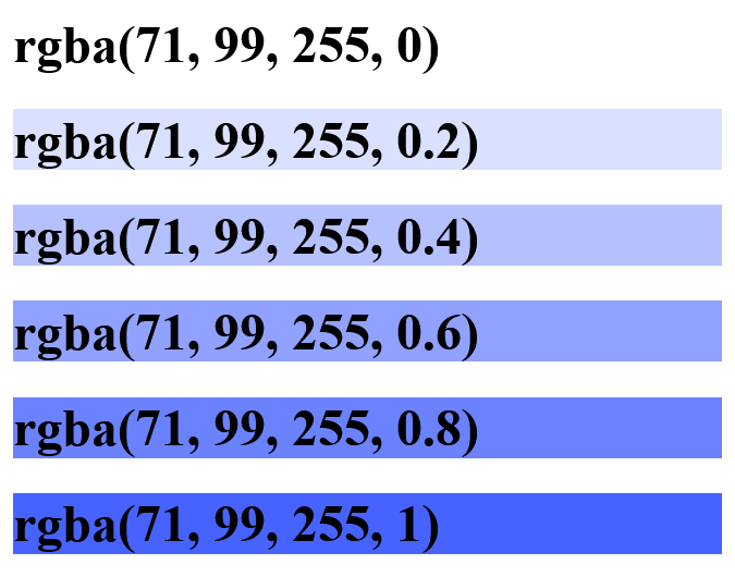
In the color parameters, the intensity of each color can be adjusted from 0 to 255. Starting at 0, the color’s intensity increases as the value is increased, reaching its peak at 255. In the alpha parameter, 0 indicates complete transparency, and 1 indicates full opacity. For example, a semi-transparent red can be created with rgba(255, 0, 0, 0.5), whereas a fully opaque blue can be created with rgba(0, 0, 255, 1).

The image above shows the variation of the alpha parameter for a shade of blue. 0(zero) means completely transparent, while a value of 1 means completely opaque(dark).
This range covers the spectrum of intensity levels for each color component, while the alpha parameter takes decimal values from 0 to 1.
Why Use the CSS rgba() Function?
The CSS rgba() function gives developers precise control over color and transparency, allowing them to create dynamic and visually appealing web designs. The CSS rgba() enhances the flexibility in styling elements, making achieving various effects like overlays and subtle transitions easier. These align with modern web design trends emphasizing minimalism and interactive user experiences.
The CSS rgba() function offers advantages. Here are a few reasons why you should use the CSS rgba() function:
Transparency
Transparency is one of the primary reasons for using the CSS rgba() function, as it allows for creating visually appealing and modern designs on the web. By specifying an alpha value, you can control the opacity of an element, allowing elements to be transparent and overlaying elements to show through.
An example of the reason for transparency in the CSS rgba() function can be seen in the design of some modern websites and web applications.
As seen in the image below, we can have a transparent overlay on top of images to make text more readable.
This is achieved using the rgba() function to specify the color of the overlay with a low alpha value or a high alpha value, allowing the underlying image to show through while still providing a visually appealing background for the text.

The image below is the code used to achieve it.

Another example can be found in the design of the Squarespace navigation menu. Most websites use transparent or semi-transparent backgrounds for navigation menus to create a modern and sleek look, making texts more readable and clear, as seen in the image below.

Source
In a nutshell, the CSS rgba() function allows developers to specify the desired color with partial transparency, enabling the background or underlying elements to show through, adding depth and visual interest to the website.
Color Blending
The CSS rgba() function offers the advantage of color blending, which allows for creating visually appealing and complex color effects. This capability is particularly powerful because it includes an alpha parameter, which helps make color blending possible. By leveraging the CSS rgba() function, developers can blend colors with varying opacities to achieve a wide range of visual effects.

Source
From the design above, you can see that the ability to blend colors using CSS rgba() supports the creation and enhances the aesthetics and user experience of a web page (or application). This effect can also be achieved using CSS gradients, allowing smooth transitions between colors and adding depth and dimension to your designs.
Another example can also be seen on the LambdaTest’s HyperExecute page. Here, the alpha parameter in CSS rgba(), which can blend colors, helps create visually appealing websites and enhances the aesthetic view of the websites.

Source
From the image above, you can see that using the CSS rgba() when color blending adds to the website’s aesthetic. Allowing colors to merge with backgrounds or other web page elements makes the website visually appealing.
Accessibility
Improving the accessibility of web content is greatly achieved by the CSS rgba() function. Allowing the production of transparent or semi-transparent colors enables developers to employ visual strategies that cater to users with diverse accessibility needs as prescribed by WCAG guidelines.
One key advantage of employing CSS rgba() for accessibility is its ability to permit the overlay of text or other content on top of images or background colors. By altering the alpha value, developers can manage the level of transparency in the overlay, ensuring that the underlying content remains readable. This aids readability and comprehension for visually impaired people by maintaining clear contrast between text and background elements.
A great example can be seen in the Mitsubishi Electric website, whereby manipulating the red, green, blue, and alpha values, intensity and saturation are improved, making it visible and eligible to read by everyone.

Source
You can validate the website functionality and ensure it adheres to WCAG guidelines by performing accessibility testing. One of the easiest ways to test, manage, and report accessibility issues is to use the Accessibility DevTools Chrome extension and ensure that your website is accessible to all users, including those with disabilities.
Powered by Axe-core, Accessibility DevTools is a Chrome extension offered by LambdaTest, an AI-powered test execution platform that lets you run manual and automated tests at scale with over 3000+ real devices, browsers, and OS combinations.
Some of the features offered by Accessibility DevTools are:
- Full Page Scan: It conducts comprehensive accessibility scans to establish a baseline and schedule regular scans to monitor WCAG compliance effectively.
- Partial Page Scan: It focuses accessibility scans on specific webpage elements to identify and resolve issues more efficiently.
- Multi-Page Scan: It ensures website consistency by running automated accessibility scans across multiple URLs simultaneously.
- Workflow Scan: It continuously monitors accessibility by dynamically capturing interactions and changes on web pages.
If you wish to use the Accessibility DevTools feature, follow the support document on Installing LambdaTest Accessibility Toolkit. You can also download the extension directly from the Chrome web store by clicking the link below.
Watch the video below to discover how to ensure inclusivity for all users with the Accessibility DevTools Chrome extension.
Enhance your web designs and improve accessibility with CSS rgba() for dynamic transparency and color effects. Try LambdaTest Now!
How Does the CSS rgba() Function Work?
The level of the color intensity, which ranges from 0 to 255, defines the three colors: red, green, and blue. No color is shown by a value of 0, while the full intensity of the color is represented by 255. The alpha parameter, which can take on values between 0 and 1, in the RGBA model defines how transparent a color is.
For example, a very deep opaque red is rgba(255, 0, 0, 1).
Mixing Colors:
To combine colors in rgba(), mix the intensity values from each color component. For example, to generate a shade of yellow, you would increase the strength of red and green while decreasing the intensity of blue: rgba(200, 220, 20, 1).

Also, if you want to create a shade of purple, you mix red and blue by specifying values for the red and blue components while keeping the green component at zero: rgba(200, 0, 255, 1).

Demonstration of CSS rgba() Function
To understand how the CSS rgba() function works, let’s create a project that includes a landing page and a registration form utilizing the rgba() function.
Creating the Landing Page Using CSS rgba() Function
The CSS rgba() function is essential for creating a landing page. For example, you can use rgba() to apply an opaque shade of purple over a background image, giving the page a more appealing look.
Below is the HTML and CSS code for creating a landing page.
HTML:
1 2 3 4 5 6 7 8 9 10 11 12 13 14 15 16 17 18 19 20 21 22 23 24 25 26 27 28 29 30 31 32 33 34 35 36 37 38 39 40 41 42 43 44 45 46 47 48 49 50 51 52 53 54 55 56 57 58 59 60 61 62 63 64 65 66 67 68 69 70 71 72 73 74 75 76 77 |
<!DOCTYPE html> <html> <head> <meta charset="UTF-8" /> <meta name="viewport" content="width=device-width, initial-scale=1.0" /> <link rel="preconnect" href="https://fonts.googleapis.com" /> <link rel="preconnect" href="https://fonts.gstatic.com" crossorigin /> <title>CSS rgba</title> <link href="https://fonts.googleapis.com/css2?family=Be+Vietnam+Pro:ital,wght@0,400;0,700;1,400&family=Fraunces:ital,opsz,wght@0,9..144,100;1,9..144,900&family=Outfit:wght@400;700&family=Poppins:wght@400;500;700&display=swap" rel="stylesheet" /> <link rel="icon" href="https://github.com/onwuemenejoshua/CSS-rgba/blob/main/images/favicon-32x32.png?raw=true"/> <link href="/dist/main.css" rel="stylesheet" /> </head> <body> <header> <div id="phoneLogo"> <img src="https://raw.githubusercontent.com/onwuemenejoshua/CSS-rgba/b0f4d4201e6416c098f217cb84b7aaf529789f66/images/logo.svg" alt="Huddle Logo" /> </div> <div id="desktopLogo"> <img src="https://raw.githubusercontent.com/onwuemenejoshua/CSS-rgba/b0f4d4201e6416c098f217cb84b7aaf529789f66/images/logo.svg" alt="Huddle Logo" /> </div> </header> <main> <div id="mainDiv"> <div id="image"> <img src="https://raw.githubusercontent.com/onwuemenejoshua/CSS-rgba/b0f4d4201e6416c098f217cb84b7aaf529789f66/images/illustration-mockups.svg" style="max-width: 100%" alt="mockup" /> </div> <div id="content"> <h1>Build The Community Your Fans Will Love</h1> <p> Huddle re-imagines the way we build communities. you have a voice, but so does your audience. Create connections with your users as you engage in genuine discussion. </p> <div id="buttonDiv"> <button>Register</button> </div> </div> </div> </main> <footer> <div id="footerDiv"> <svg xmlns="http://www.w3.org/2000/svg" viewBox="0 0 320 512"> <path fill="currentColor" d="M279.14 288l14.22-92.66h-88.91v-60.13c0-25.35 12.42-50.06 52.24-50.06h40.42V6.26S260.43 0 225.36 0c-73.22 0-121.08 44.38-121.08 124.72v70.62H22.89V288h81.39v224h100.17V288z" /> </svg> <svg xmlns="http://www.w3.org/2000/svg" viewBox="0 0 512 512"> <path fill="currentColor" d="M459.37 151.716c.325 4.548.325 9.097.325 13.645 0 138.72-105.583 298.558-298.558 298.558-59.452 0-114.68-17.219-161.137-47.106 8.447.974 16.568 1.299 25.34 1.299 49.055 0 94.213-16.568 130.274-44.832-46.132-.975-84.792-31.188-98.112-72.772 6.498.974 12.995 1.624 19.818 1.624 9.421 0 18.843-1.3 27.614-3.573-48.081-9.747-84.143-51.98-84.143-102.985v-1.299c13.969 7.797 30.214 12.67 47.431 13.319-28.264-18.843-46.781-51.005-46.781-87.391 0-19.492 5.197-37.36 14.294-52.954 51.655 63.675 129.3 105.258 216.365 109.807-1.624-7.797-2.599-15.918-2.599-24.04 0-57.828 46.782-104.934 104.934-104.934 30.213 0 57.502 12.67 76.67 33.137 23.715-4.548 46.456-13.32 66.599-25.34-7.798 24.366-24.366 44.833-46.132 57.827 21.117-2.273 41.584-8.122 60.426-16.243-14.292 20.791-32.161 39.308-52.628 54.253z" /> </svg> <svg xmlns="http://www.w3.org/2000/svg" viewBox="0 0 448 512"> <path fill="currentColor" d="M224.1 141c-63.6 0-114.9 51.3-114.9 114.9s51.3 114.9 114.9 114.9S339 319.5 339 255.9 287.7 141 224.1 141zm0 189.6c-41.1 0-74.7-33.5-74.7-74.7s33.5-74.7 74.7-74.7 74.7 33.5 74.7 74.7-33.6 74.7-74.7 74.7zm146.4-194.3c0 14.9-12 26.8-26.8 26.8-14.9 0-26.8-12-26.8-26.8s12-26.8 26.8-26.8 26.8 12 26.8 26.8zm76.1 27.2c-1.7-35.9-9.9-67.7-36.2-93.9-26.2-26.2-58-34.4-93.9-36.2-37-2.1-147.9-2.1-184.9 0-35.8 1.7-67.6 9.9-93.9 36.1s-34.4 58-36.2 93.9c-2.1 37-2.1 147.9 0 184.9 1.7 35.9 9.9 67.7 36.2 93.9s58 34.4 93.9 36.2c37 2.1 147.9 2.1 184.9 0 35.9-1.7 67.7-9.9 93.9-36.2 26.2-26.2 34.4-58 36.2-93.9 2.1-37 2.1-147.8 0-184.8zM398.8 388c-7.8 19.6-22.9 34.7-42.6 42.6-29.5 11.7-99.5 9-132.1 9s-102.7 2.6-132.1-9c-19.6-7.8-34.7-22.9-42.6-42.6-11.7-29.5-9-99.5-9-132.1s-2.6-102.7 9-132.1c7.8-19.6 22.9-34.7 42.6-42.6 29.5-11.7 99.5-9 132.1-9s102.7-2.6 132.1 9c19.6 7.8 34.7 22.9 42.6 42.6 11.7 29.5 9 99.5 9 132.1s2.7 102.7-9 132.1z" /> </svg> </div> </footer> </body> </html> |
The code above has three sections: the header, which contains the logo; the body, which contains the main content; and the footer, which includes all the social media icons.
- Header: The header contains a logo that we will display the desktop logo on the desktop view and hide on the mobile view to display the mobile logo.
- Main Fold: This section contains two <div> elements, one for the image and one for the content. Each <div> occupies 50% of the screen’s width and flex to ensure responsiveness.
- Footer: This <footer> section contains three <svg> tags for displaying social media icons like Facebook, Twitter, and Instagram.
To learn more about CSS properties like flex, flex-direction, and more, follow this guide on CSS Flexbox, and get in-depth insights into various CSS properties for making content and web page layouts responsive.
CSS:
1 2 3 4 5 6 7 8 9 10 11 12 13 14 15 16 17 18 19 20 21 22 23 24 25 26 27 28 29 30 31 32 33 34 35 36 37 38 39 40 41 42 43 44 45 46 47 48 49 50 51 52 53 54 55 56 57 58 59 60 61 62 63 64 65 66 67 68 69 70 71 72 73 74 75 76 77 78 79 80 81 82 83 84 85 86 87 88 89 90 91 92 93 94 95 96 97 98 99 100 101 102 103 104 105 106 107 108 109 110 111 112 113 114 115 116 117 118 119 120 121 |
body { padding: 3rem; font-family: "Poppins", "sans-serif"; background-image: url("https://raw.githubusercontent.com/onwuemenejoshua/CSS-rgba/b0f4d4201e6416c098f217cb84b7aaf529789f66/images/bg-desktop.svg"); background-repeat: no-repeat; background-position: center; background-size: cover; background-color: rgba(90, 22, 90, 1); } #phoneLogo { display: flex; justify-content: center; align-items: center; } #desktopLogo { display: none; } #mainDiv { display: flex; margin-top: 3rem; flex-direction: column; gap: 2rem; } h1 { font-size: 1.5rem; line-height: 2rem; line-height: 1.625; color: rgba(255, 255, 255, 1); } p { padding-top: 1.25rem; margin-bottom: 1.5rem; letter-spacing: 0.1em; color: rgba(255, 255, 255, 1); } #buttonDiv { display: flex; justify-content: center; align-items: center; } button { padding: 0.75rem 2.25rem; border-radius: 20px; text-align: center; cursor: pointer; font-weight: bold; color: rgba(0, 0, 0, 0.8); background-color: rgb(201, 219, 236, 0.5); } #footerDiv { display: flex; margin-top: 1.75rem; flex-direction: row; gap: 1.25rem; justify-content: center; color: rgba(255, 255, 255, 1); } svg { width: 1.25rem; height: 1.25rem; cursor: pointer; } @media (min-width: 768px) { #phoneLogo { display: none; } #desktopLogo { display: block; } #mainDiv { flex-direction: row; } #image { width: 50%; } #content { width: 50%; margin-top: -30px; } h1 { font-size: 3rem; line-height: 1; } #buttonDiv { justify-content: flex-start; } #footerDiv { justify-content: flex-end; } } @media screen and (max-width: 768px) { body { background-image: url("https://raw.githubusercontent.com/onwuemenejoshua/CSS-rgba/b0f4d4201e6416c098f217cb84b7aaf529789f66/images/bg-mobile.svg"); } } .phoneLogo { width: 200px; } @media screen and (max-width: 685px) { #content { text-align: center; } } |
See the Pen
CSS rgba() by Onwuemene Ikechukwu Joshua (@JoshIke)
on CodePen.

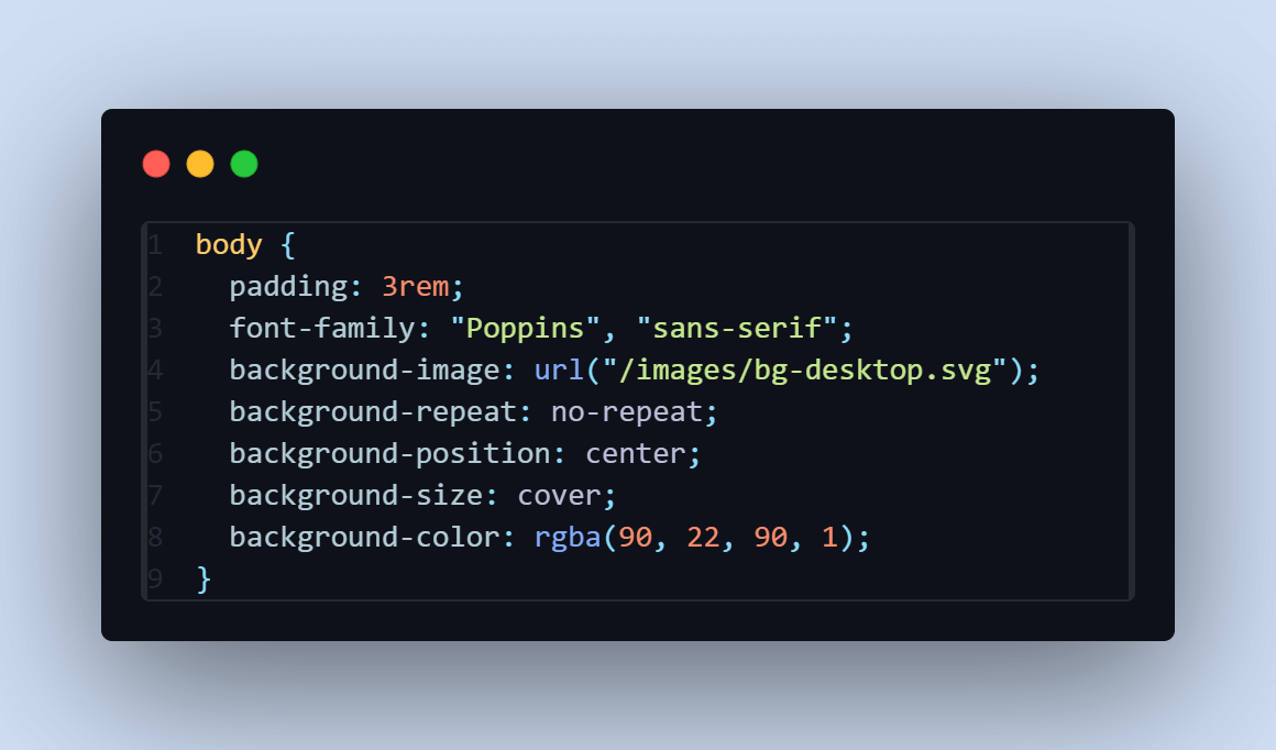
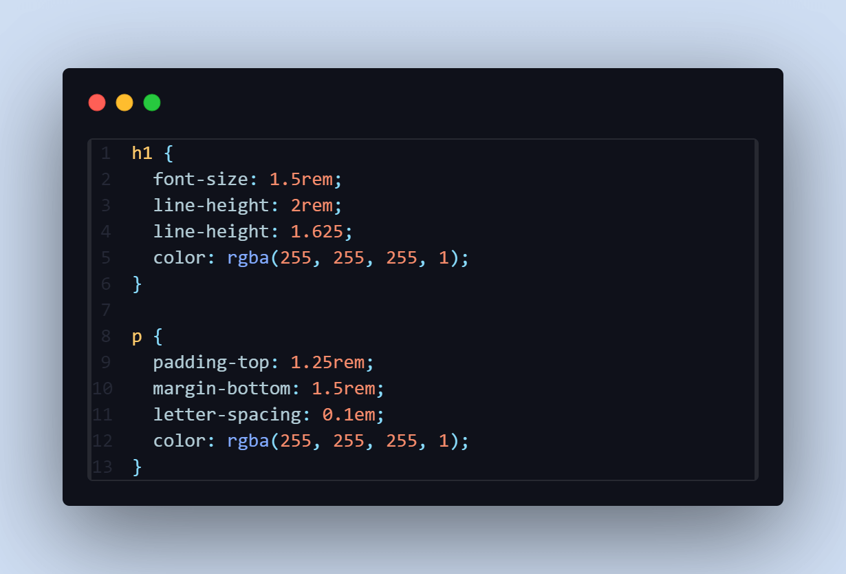
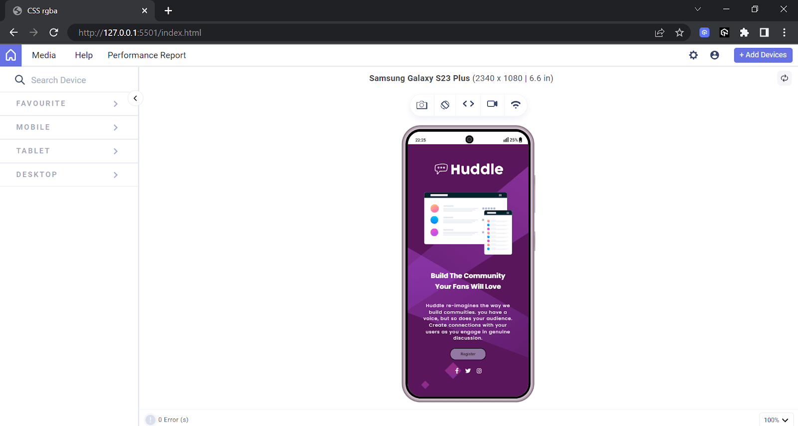
From the screenshot of the code above, the text p and h1 have the CSS rgba() color of white and an alpha value of 1 to make it clearer (easier to read) and accessible to everyone, even those with visual impairment. The white text with the background image makes the project appealing to the eye.
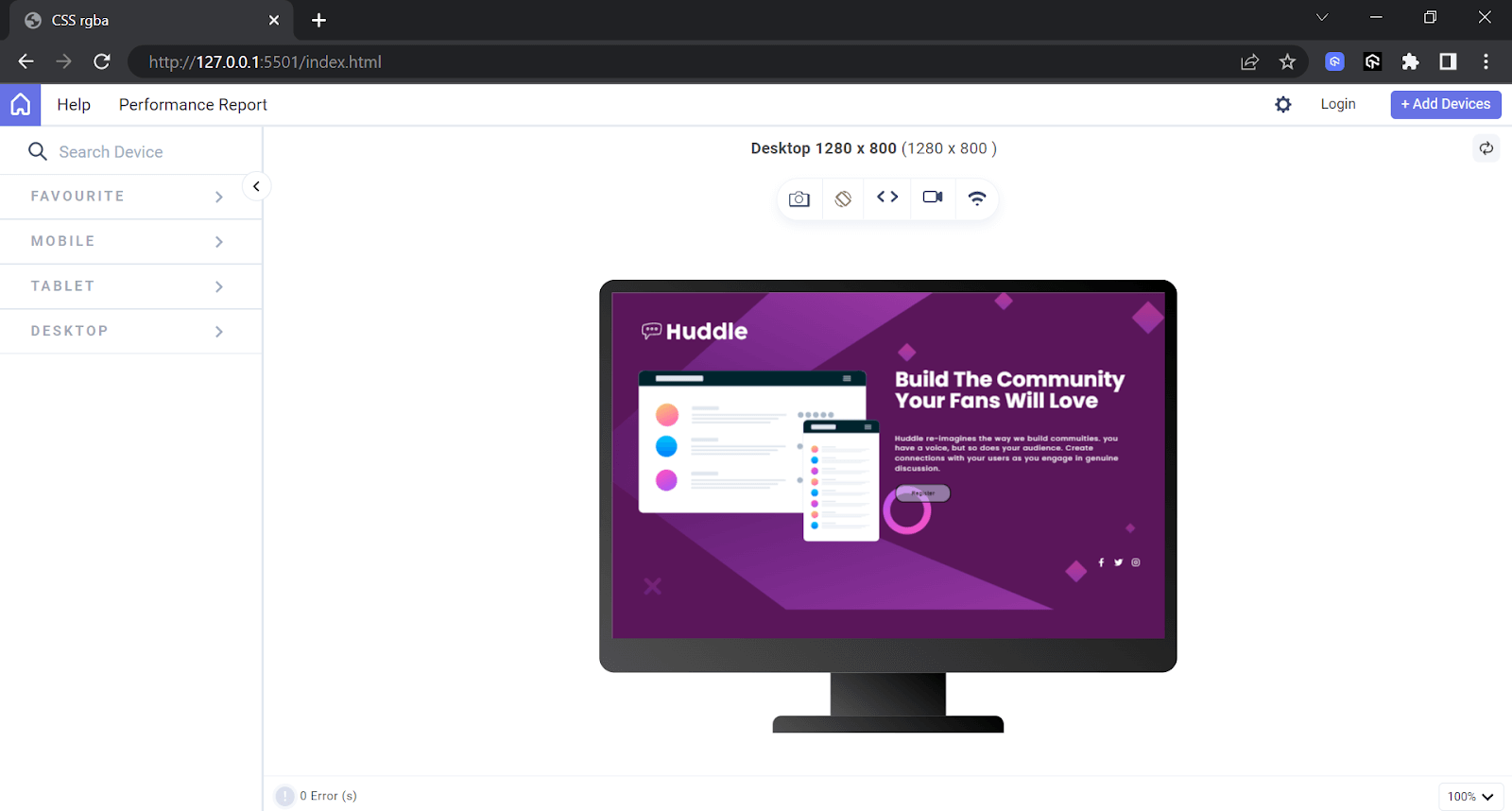
The <button> with the text “Register” has black text and a semi-transparent blue background, allowing the page’s background image to see through, enhancing the visual appeal.
Desktop View:

Mobile View:

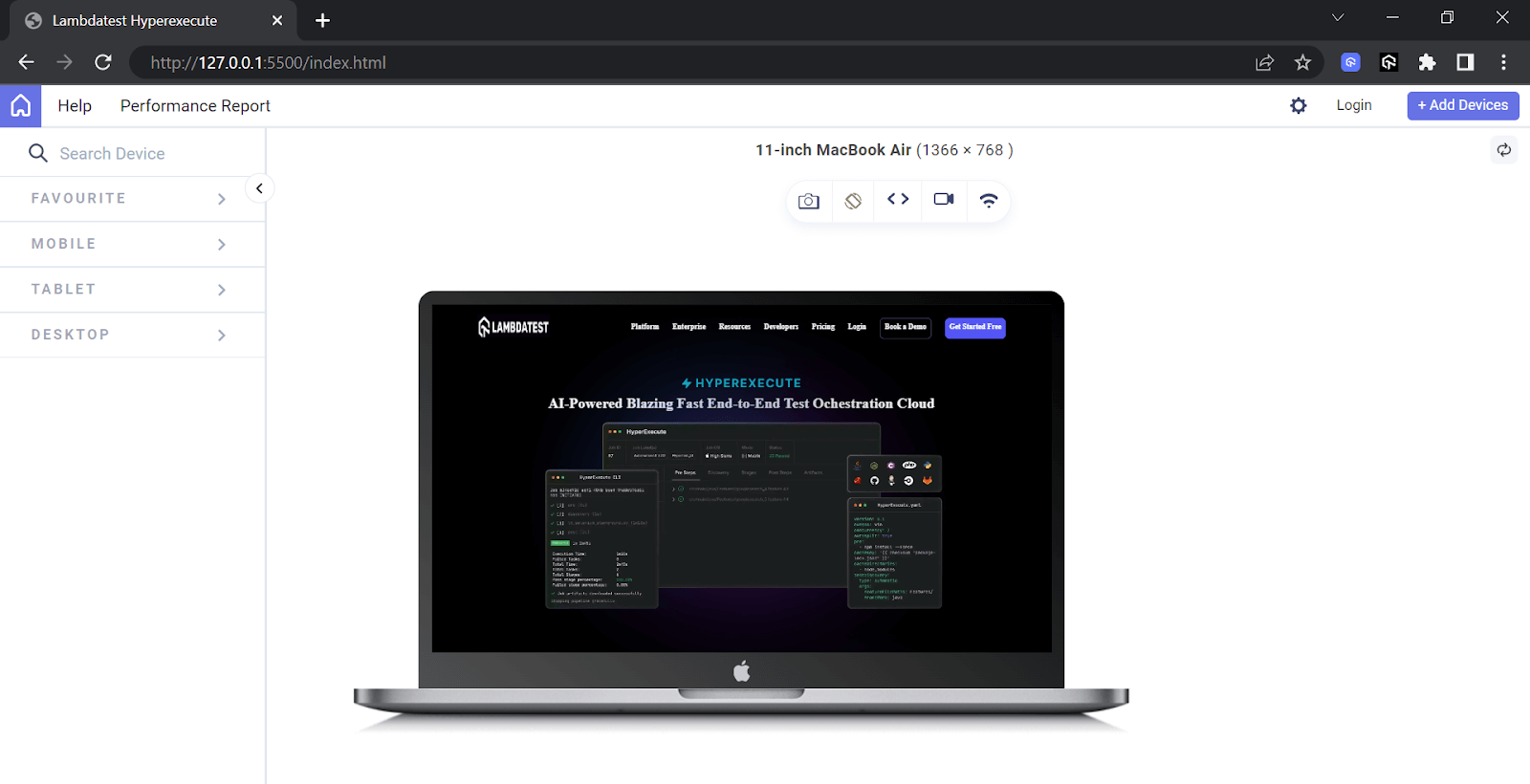
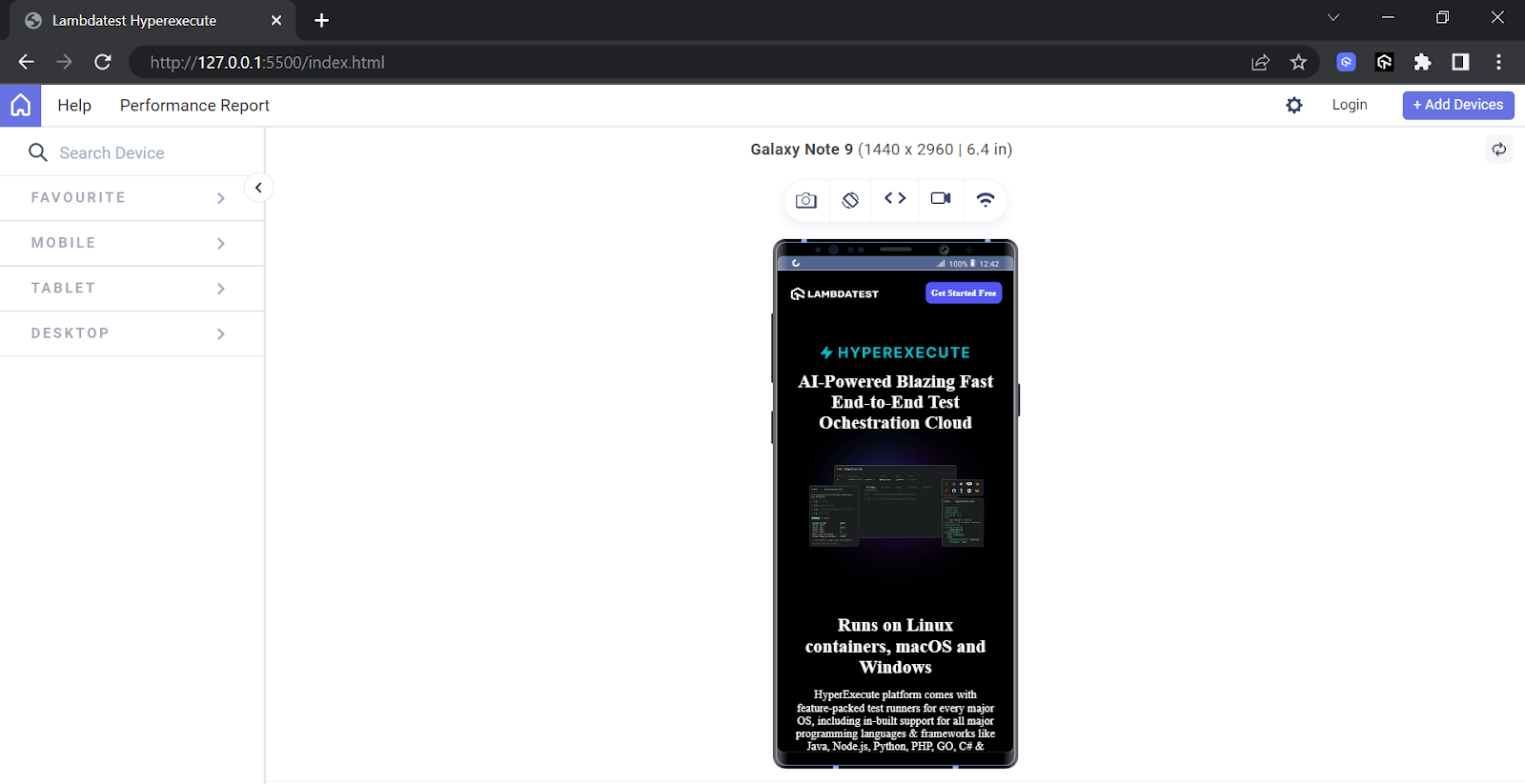
The results above are displayed via LT Browser, a mobile website testing tool that lets you preview how a website appears on various devices. With over 53+ device viewports, you can have a side-by-side comparison view and perform live testing, including clicking and navigation. It enables responsive web development on a wide range of devices, all for free,
To use LT Browser, click on the download button below and get started with validating the responsiveness of your mobile-friendly websites.
DOWNLOAD LT BROWSER 2.0 
Watch the video tutorial below to familiarize yourself with the features and functionalities of LT Browser.
Creating the Registration Form Using CSS rgba() Function
Web forms are a common feature on websites, allowing users to interact by providing details such as names, emails, passwords, contacts, and other necessary details.
Let’s take an example of creating a simple registration form to understand how the CSS rgba() function works around registration forms.
Below is the HTML code for the simple registration form created using the CSS rgba() color function. The CSS rgba() color function allows us to style the form uniquely.
HTML:
1 2 3 4 5 6 7 8 9 10 11 12 13 14 15 16 17 18 19 20 21 22 23 24 25 26 27 28 29 30 31 32 33 34 35 36 37 38 39 40 41 42 43 44 45 46 47 48 49 50 51 52 53 54 55 56 57 58 59 60 61 62 63 64 65 66 67 68 69 70 71 72 73 74 75 76 77 78 79 80 81 |
<!DOCTYPE html> <html lang="en"> <head> <meta charset="UTF-8" /> <meta http-equiv="X-UA-Compatible" content="IE=edge" /> <meta name="viewport" content="width=device-width, initial-scale=1.0" /> <title>Responsive form</title> <link rel="icon" href="favicon-32x32.png" /> <link rel="stylesheet" href="form.css" /> </head> <body> <main> <div id="totalForm"> <div id="content"> <h2>Learn to code by watching others</h2> <p> See how experienced developers solved problems in real-times. Watching scripted tutorials is great, but understanding how developers think is invaluable. </p> </div> <div id="form"> <button>Try it free 7 days then $20/mo. thereafter</button> <form action="#" method="post"> <div> <input type="text" name="firstname" id="name" placeholder="First name" required /> </div> <div> <input type="text" name="lastname" id="name" placeholder="Last name" required /> </div> <div> <input type="email" name="mail" id="mail" placeholder="Email Address" required /> </div> <div> <input type="password" name="password" id="password" placeholder="password" required /> </div> <div class="submitButton"> <input type="submit" name="" id="submit" value="SUBMIT" /> </div> <br /> <p id="click"> By clicking the button, you are agreeing to our <a href="#"> <span>Terms and Services</span></a> </p> </form> </div> </div> </main> </body> </html> |
CSS:
1 2 3 4 5 6 7 8 9 10 11 12 13 14 15 16 17 18 19 20 21 22 23 24 25 26 27 28 29 30 31 32 33 34 35 36 37 38 39 40 41 42 43 44 45 46 47 48 49 50 51 52 53 54 55 56 57 58 59 60 61 62 63 64 65 66 67 68 69 70 71 72 73 74 75 76 77 78 79 80 81 82 83 84 85 86 87 88 89 90 91 92 93 94 95 96 97 98 99 100 101 102 103 104 105 106 107 108 109 110 111 112 113 114 115 116 117 118 119 120 121 122 123 124 125 126 127 128 |
@import url("https://fonts.googleapis.com/css2?family=Poppins:wght@400;500;600;700&display=swap"); body { background-image: url("https://raw.githubusercontent.com/onwuemenejoshua/responsive-form/main/bg-intro-mobile.png"); background-color: rgba(255, 122, 122, 1); color: rgba(255, 255, 255, 1); font-family: "Poppins", "sans-serif"; padding: 3rem; } #totalForm { display: flex; justify-content: center; align-items: center; flex-direction: column; } h2, p { text-align: center; } #form { width: 50%; } button { background-color: rgba(96, 85, 165, 0.8); color: rgba(255, 255, 255, 1); border-radius: 10px; margin-bottom: 20px; padding: 10px; width: 100%; } #form { width: fit-content; } form { background-color: rgba(255, 255, 255, 1); border-radius: 8px; padding: 20px; } form p { text-align: center; color: rgba(0, 0, 0, 0.8); } input { padding: 10px; border-radius: 6px; width: 90%; border: 2px solid rgba(218, 217, 232, 1); margin-bottom: 12px; display: flex; flex-direction: column; } input:focus { border: 2px solid rgba(119, 115, 140, 0.5); outline: none !important; } .submitButton { display: flex; justify-content: center; } input#submit { background-color: rgba(56, 204, 140, 1); color: rgba(255, 255, 255, 0.8); cursor: pointer; border: none; width: 50%; align-items: center; } #click { color: rgba(0, 0, 0, 0.8); font-size: 13px; } span { color: rgba(255, 0, 0, 1); } a { text-decoration: none; } @media (min-width: 768px) { body { background-image: url("https://i.postimg.cc/c19kSn2j/bg-intro-desktop.png"); padding: 3rem; } #totalForm { flex-direction: row; gap: 30px; } #content { width: 50%; } #form { width: 50%; margin-right: 10%; margin-top: 35px; } h2 { font-size: 2rem; } } body { background-image: url("https://raw.githubusercontent.com/onwuemenejoshua/responsive-form/main/bg-intro-mobile.png"); background-color: rgba(255, 122, 122, 1); color: rgba(255, 255, 255, 1); font-family: "Poppins", "sans-serif"; padding: 3rem; } |
See the Pen
responsive form by Onwuemene Ikechukwu Joshua (@JoshIke)
on CodePen.
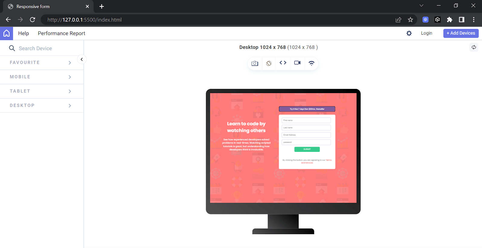
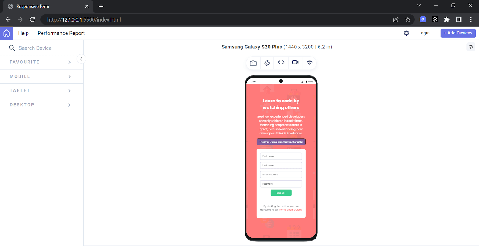
The above code styles the body with a background image and a pink background color as an overlay. It sets the text color to white for better visibility. Additionally, it adds a padding of 3rem to the mobile view to create space between the content and the border.
To learn more about accurately defining spacing between your UI elements and content, follow this guide on CSS padding and CSS margin properties.
Desktop View:

Mobile View:

So far, we have understood the concept of the CSS rgba() function by demonstrating a landing page and creating a simple registration form. To enhance our learning on the rgba() function, we will create a web page to replicate the look and feel of LambdaTest’s HyperExecute web page in the below section.
Creating the LambdaTest HyperExecute Page Using CSS rgba() Function
Let’s take an example of creating LambdaTest’s HyperExecute page to understand how the CSS rgba() function works around it.
Below is the HTML and CSS code for creating the HyperExecute web page.
HTML:
1 2 3 4 5 6 7 8 9 10 11 12 13 14 15 16 17 18 19 20 21 22 23 24 25 26 27 28 29 30 31 32 33 34 35 36 37 38 39 40 41 42 43 44 45 46 47 48 49 50 51 52 53 54 55 56 57 58 59 60 61 62 63 64 65 66 |
<!DOCTYPE html> <html lang="en"> <head> <meta charset="UTF-8" /> <meta name="viewport" content="width=device-width, initial-scale=1.0" /> <title>Lambdatest Hyperexecute</title> <link href="index.css" rel="stylesheet" /> <script src="main.js" defer></script> </head> <body> <nav> <!-- The mobile menu --> <div class="logo"> <img src="https://github.com/onwuemenejoshua/Lambda-Cloud/blob/main/image/LT-HyperExecute-Logo.png?raw=true" class="lambdaLogo" alt="Hyperexecute logo" /> </div> <!-- The desktop menu --> <div id="desktop"> <a href="#" class="desktop-link">Platform</a> <a href="#" class="desktop-link">Enterprise</a> <a href="#" class="desktop-link">Resources</a> <a href="#" class="desktop-link">Developers</a> <a href="#" class="desktop-link">Pricing</a> <a href="#" class="desktop-link">Login</a> <a href="#" class="desktop-link" id="demo">Book a Demo</a> <a href="#" class="desktop-link" id="free">Get Started Free</a> </div> <!-- The mobile view --> <div id="mobile"> <a href="#" class="mobile-link">Get Started Free</a> </div> </nav> <main> <div id="mainContent"> <div id="Hyperexecute"> <img src="https://raw.githubusercontent.com/onwuemenejoshua/Lambda-Cloud/569e0c82e2b94ea7b3ef7482393362121498c1f4/image/hyperlogo.svg" alt="Hyperexecute logo" /> </div> <h1>AI-Powered Blazing Fast End-to-End Test Ochestration Cloud</h1> <div id="cloud"> <img src="https://raw.githubusercontent.com/onwuemenejoshua/Lambda-Cloud/main/image/banner1.webp" class="hyperImage" alt="banner1" /> </div> <div id="linus"> <div id="text"> <h1 class="run">Runs on Linux containers, macOS and Windows</h1> <p> HyperExecute platform comes with feature-packed test runners for every major OS, including in-built support for all major programming languages & frameworks like Java, Node.js, Python, PHP, GO, C# & more. </p> <a href="#" class="try" id="desktop-link">Try it Now</a> </div> <div class="last-image"> <img src="https://github.com/onwuemenejoshua/Lambda-Cloud/blob/main/image/OnPremise.png?raw=true" class="install" alt="Run on Linus" /> </div> </div> </div> </main> </body> </html> |
The HTML is divided into two folds: the header fold, which wraps the menu, and the main fold, which wraps the body. The body contains all the content to be displayed on the web page except the header.
CSS:
1 2 3 4 5 6 7 8 9 10 11 12 13 14 15 16 17 18 19 20 21 22 23 24 25 26 27 28 29 30 31 32 33 34 35 36 37 38 39 40 41 42 43 44 45 46 47 48 49 50 51 52 53 54 55 56 57 58 59 60 61 62 63 64 65 66 67 68 69 70 71 72 73 74 75 76 77 78 79 80 81 82 83 84 85 86 87 88 89 90 91 92 93 94 95 96 97 98 99 100 101 102 103 104 105 106 107 108 109 110 111 112 113 114 115 116 117 118 119 120 121 122 123 124 125 126 127 128 129 130 131 132 133 134 135 136 137 138 139 140 141 142 143 144 145 146 147 148 149 150 151 152 153 154 155 156 157 158 159 160 161 162 163 164 165 166 167 168 169 170 171 172 173 174 175 176 177 178 179 180 181 182 183 184 185 186 187 188 189 190 191 192 193 194 195 196 197 198 199 200 201 202 203 204 205 206 207 208 209 210 211 212 213 214 215 216 217 218 219 220 221 222 223 224 225 226 227 228 229 230 231 232 233 234 235 236 237 238 239 240 241 242 243 244 245 246 247 248 249 250 251 252 253 254 255 256 257 258 259 260 261 262 263 264 265 266 267 268 269 270 271 272 273 274 275 276 277 278 279 280 281 282 283 284 285 286 287 288 289 290 291 292 293 294 295 296 297 298 299 300 301 302 303 304 305 306 307 308 |
@import url("https://fonts.googleapis.com/css2?family=Be+Vietnam+Pro:ital,wght@0,100;0,200;0,300;0,400;0,500;0,600;0,700;0,800;0,900;1,100;1,200;1,300;1,400;1,500;1,600;1,700;1,800;1,900&family=Roboto:wght@100;300;400;500;700;900&family=Rubik:wght@300;400;500;600;700;800;900&display=swap"); * { margin: 0; padding: 0; box-sizing: border-box; } body { padding: 2rem; background-color: rgba(0, 0, 0, 1); color: rgba(255, 255, 255, 1); } nav { display: flex; flex-direction: row; justify-content: space-between; position: fixed; top: 0; left: 0; width: 100%; padding: 20px 20px; z-index: 100000; transition: 0.6s; font-weight: bold; } nav.sticky { padding: 18px 20px; background-color: rgba(0, 0, 0, 1); color: rgba(255, 255, 255, 1); } #desktop { display: none; } .logo { margin-top: 10px; position: relative; transition: 0.6s; } #mobile { background-color: rgba(84, 86, 243, 1); padding: 10px; border-radius: 10px; text-decoration: none; } .mobile-link { text-decoration: none; color: rgba(255, 255, 255, 1); position: relative; transition: 0.6s; } .lambdaLogo { width: 160px; height: 25px; margin-top: -3px; } main { margin-top: 70px; } #mainContent { padding-top: 30px; display: flex; flex-direction: column; align-items: center; justify-content: center; } .hyperImage { width: 350px; height: 350px; margin-top: -50px; } h1 { font-size: bold; padding-top: 15px; text-align: center; } #linus { display: flex; flex-direction: column; justify-content: space-between; } #text { display: flex; flex-direction: column; gap: 20px; } .run { font-size: bold; text-align: center; } .install { width: 350px; height: 350px; margin-top: -50px; } p { font-size: 20px; text-align: center; } .try { border: 1px solid rgba(162, 182, 255, 0.7); border-radius: 10px; padding: 10px; } #desktop-link { text-decoration: none; color: rgba(255, 255, 255, 1); text-align: center; } .last-image { text-align: center; } @media screen and (max-width: 1185px) and (min-width: 768px) { #desktop { display: flex; margin-top: 20px; gap: 10px; } .desktop-link { text-decoration: none; color: rgba(255, 255, 255, 1); position: relative; transition: 0.6s; font-size: 10px; } #mobile { display: none; } #demo { border: 1px solid rgba(162, 182, 255, 0.7); border-radius: 10px; padding: 10px; margin-top: -10px; color: rgba(255, 255, 255, 1); } #free { background-color: rgba(84, 86, 243, 1); padding: 10px; border-radius: 10px; color: rgba(255, 255, 255, 1); margin-top: -10px; } #mainContent { padding-left: 30px; display: flex; align-items: center; justify-content: center; } .hyperImage { width: 900px; height: 900px; margin-top: -250px; } #linus { display: flex; flex-direction: row; justify-content: space-between; margin-top: -80px; } .install { height: 30rem; width: 30rem; margin-top: -90px; } } @media screen and (min-width: 1186px) { nav { padding: 40px 100px; font-weight: bold; color: rgba(255, 255, 255, 1); } nav.sticky { padding: 25px 100px; background-color: rgba(0, 0, 0, 1); } #desktop { display: flex; gap: 30px; position: relative; } .logo { margin-top: -5px; } .lambdaLogo { width: 160px; height: 50px; margin-top: -13px; } .desktop-link { text-decoration: none; color: rgba(255, 255, 255, 1); position: relative; transition: 0.6s; } #demo { border: 1px solid rgba(162, 182, 255, 0.7); border-radius: 10px; padding: 10px; margin-top: -10px; color: rgba(255, 255, 255, 1); } #free { background-color: rgba(84, 86, 243, 1); padding: 10px; border-radius: 10px; color: rgba(255, 255, 255, 1); margin-top: -10px; } #mobile { display: none; position: relative; } #mainContent { padding: 60px; display: flex; align-items: center; justify-content: center; } .hyperImage { width: 1000px; height: 1000px; margin-top: -280px; } h1 { font-size: bold; color: rgba(255, 255, 255, 1); padding-top: 10px; } #linus { display: flex; flex-direction: row; justify-content: space-between; } .install { height: 650px; width: 650px; margin-top: -250px; } #text { display: flex; flex-direction: column; gap: 40px; margin-top: -70px; } .run { font-size: bold; text-align: left; } p { font-size: 20px; text-align: left; } .try { border: 1px solid rgba(162, 182, 255, 0.7); border-radius: 10px; padding: 10px; } #desktop-link { text-decoration: none; color: rgba(255, 255, 255, 1); } } |
JavaScript:
|
|
window.addEventListener("scroll", function () { const nav = document.querySelector("nav"); nav.classList.toggle("sticky", window.scrollY > 0); }); |
See the Pen
Lambda Cloud rgba by Onwuemene Ikechukwu Joshua (@JoshIke)
on CodePen.
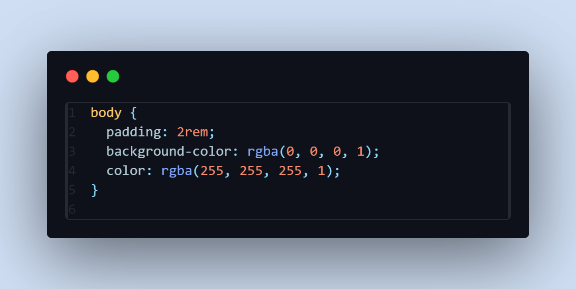
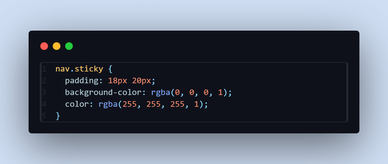
The code mentioned below is used to achieve it.

The background color of the body is set to black, with white text to ensure visibility for all users. This choice enhances the website’s visual appeal.
The JavaScript code is used to toggle the sticky class as we scroll through the web page.

The above CSS code applies the styles to an <nav> element with the class “sticky”. It:
- Adds padding of 18px on the top and bottom and 20px on the left and right.
- Sets the background color to solid black.
- Sets the text color to solid white.
Desktop View:

Mobile View:

Based on the examples of a landing page, registration form, and LambdaTest’s HyperExecute page, using the CSS rgba() function enhances the visual appeal of a web page or website by providing a unique color blend that suits its purpose.
Browser Compatibility
Despite the global usage of 98.07% using the CSS rgba() function, it is essential to know that not all versions of browsers support it. So, as a developer, it is important to address any exceptions or inconsistencies found during testing.

Source
Conclusion
The CSS rgba() function offers a powerful tool for web developers to enhance the visual appeal and usability of your websites. By allowing the specification of colors with transparency, the rgba() function helps create modern, dynamic, and accessible web designs. Whether for creating subtle overlays, blending colors for unique effects, or ensuring text readability on various backgrounds, rgba() provides the flexibility needed to meet diverse design requirements.
As demonstrated, integrating rgba() into various web elements, from landing pages to forms, significantly enriches the user experience while adhering to best practices in web accessibility. By mastering the use of rgba(), you can unlock new possibilities in web design, ensuring your projects look stunning and function seamlessly across different devices and user needs. Now, you can create that web page or website using CSS rgba() to make better visuals for a better user experience and gain better user attention.
Go ahead, practice, and build!
Frequently Asked Questions (FAQs)
How do I convert a hex color code to an RGBA color code?
Convert the hex to its RGB components and add an alpha value. For example, #FF5733 becomes rgba(255, 87, 51, 1).
Can you use rgba() values in SVG graphics, and how?
Yes, use rgba() within SVG style attributes or CSS to define fill or stroke colors, e.g., <circle style=”fill: rgba(255, 87, 51, 0.5);” />.
What is RGBA in hex?
RGBA in hex includes the alpha channel, written as #RRGGBBAA, where AA represents the opacity level.
Should I use RGBA or hex?
Use hex for simplicity and solid colors; use RGBA when you need to specify transparency.
Joshua is a skilled Technical Writer good at translating complex technical concepts into simplified easy-to-digest content that resonates with developers and non-technical audiences for seamless user experience. He is also skilled at creating well-articulated articles, white papers, tutorials and documentation. And also a self-taught front-end developer that loves solving problems through programming👩🏼💻🚀
![]() 213322 Views
213322 Views ![]() 4 Min Read
4 Min Read
