A Guide To Newly Supported CSS Pseudo-Class Selectors
Tahera Alam
Posted On: March 1, 2023
![]() 160384 Views
160384 Views
![]() 22 Min Read
22 Min Read

Have you ever wondered how websites add that extra layer of style to certain buttons when they’re hovered over, or change the color of visited links? The secret lies in the power of CSS pseudo-class selectors!
But, before you dismiss this as just another mundane guide on CSS Selectors, let me tell you: we are not doing that here.
Pseudo-classes like hover have been around for a long time. I promise not to bore you by discussing them for the 1000th time. We will instead discuss the powerful modern pseudo-class selectors that you may not be familiar with yet.
Before we deep dive into CSS pseudo-class selectors, if you are unfamiliar with the hover pseudo-class or even what a pseudo-class is, let’s do a quick recap.
Pseudo-class selectors in CSS are selectors that define a special state of an element. They start with the colon character(:) and allow you to apply styles based on the interaction or behavior of the element. For example, you can use CSS pseudo-class selectors to style an element when users hover their mouse over it.
Here’s an example of the :hover pseudo-class:
|
1 2 3 |
button:hover{ background-color: blue; } |
Wondering what’s different about the modern CSS pseudo-class selectors? They play a crucial role in user experience and accessibility. Their ability to target specific elements based on their state allows us to create interactive user interfaces that are inclusive and accessible to all users, including those with impairments.
While they offer immense power, they also come with their drawbacks. It’s critical to consider cross browser compatibility while using them. For example, some selectors may not be fully supported by specific browsers, so it’s crucial to have fallback options in place to ensure that all users have a consistent experience, regardless of their device or browser.
In this guide, I’ll dive into the modern CSS pseudo-class selectors, providing the knowledge you need to use them in your next project and make your website stand out. In addition, it will give you the knowledge you need to take your CSS skills to the next level.
So, let’s get started!
TABLE OF CONTENTS
What are Modern CSS pseudo-class selectors?
Modern pseudo-class selectors are a set of new selectors that have been added to the CSS specification in recent years. They offer a range of new and advanced features compared to the older pseudo-class selectors.
Some features include targeting elements based on their relationship to others or selecting elements based on more complex conditions.
These modern CSS pseudo-class selectors bring a level of advanced styling to the table that was not possible earlier.
Deep dive into CSS pseudo-class selectors
In this guide section, we will explore the different CSS pseudo-class selectors. Let’s look at them one by one.
:any-link pseudo-class
The :any-link pseudo-class is a way to simultaneously select both link and :visited states of an element. Typically, the :link is used to style unvisited links, while :visited is used to style links the user has visited.
By using :any-link instead of :link and :visited, you can apply the same styles to both links without repeating the styles. It will match an anchor hyperlink as long as it has the href attribute.
It is handy when applying a particular style to all links regardless of their visited status.
Here’s an example:
|
1 2 3 |
:any-link { color: #2a9d8f; } |
See the Pen
:any-link pseudo class by Tahera Alam (@alam_tahera)
on CodePen.
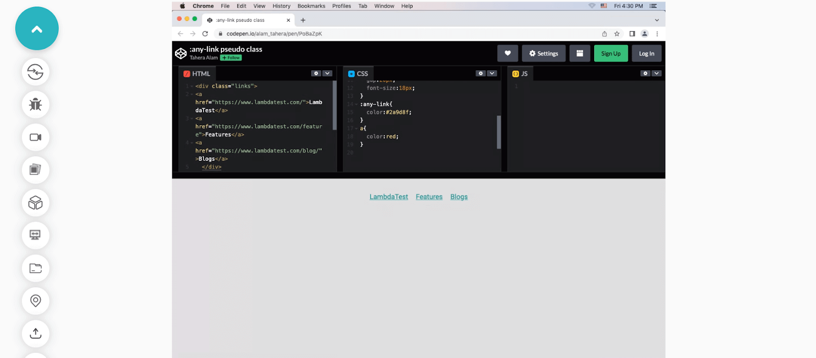
In the example, we selected all the links using the :any-link pseudo-class and applied the blue color(#2a9d8f) to them.
An important thing to note is that :any-link selector has a higher specificity than the ‘a’ selector. This means that if an anchor element style is defined using both :any-link and ‘a’, the style for :any-link will be applied to the element.
|
1 2 3 4 5 6 |
:any-link { color: #2a9d8f; } a { color: red; } |
Here, the bluish color (#2a9d8f ) is being applied to our anchor tags instead of red because the :any-link selector has higher specificity than the ‘a’ selector.
In addition, here’s an example showcasing the implementation of :any-link selector using LambdaTest’s Real Time Testing feature.
LambdaTest is a continuous quality cloud testing platform that allows you to test web and mobile applications for cross browser compatibility across on-demand real browsers, devices, and operating systems combinations. With its Real Time Testing, you can perform manual live-interactive testing across different desktop and mobile browsers with instant access to the latest and legacy web browsers, browser versions, and screen resolutions.
Learn more about LambdaTest’s Real Time Testing from the below tutorial.
You can also Subscribe to the LambdaTest YouTube Channel and stay updated with the latest tutorials around Selenium, Appium, Playwright, and more.
:focus-visible pseudo-class
Before we talk about :focus-visible, I will discuss a common accessibility violation. I am sure you’re aware that it’s a common practice among developers to remove the outlines of interactive elements such as form inputs, buttons, and links during their focus state.
|
1 2 3 |
input:focus { outline: none; } |
Now, the issue is that the visible focus state is critically important for users who use the keyboard to navigate.
When a user navigates an interface using the keyboard (e.g., by pressing the tab key), a visible focus state can act as a way-finding tool, helping the user understand which element currently has keyboard focus. This can be especially important for users with difficulty using a mouse or other pointing device and those with cognitive or visual impairments. To know the importance of web accessibility, read our tutorial on accessibility testing.
When we set outline none, it significantly degrades the interface’s usability, which we don’t want. That’s where :focus-visible comes in.
The :focus-visible pseudo-class is used to ensure that the focus ring (outline) is only visible when it is needed. It was designed to distinguish between “implicit,” and “explicit” focus, where mouse clicks are considered “implicit” focus, and keyboard navigation is considered “explicit” focus. It uses heuristics, a set of rules and procedures the browser uses to determine when to show the focus ring.
For example, when you tab into an interactive element using a keyboard, the browser will apply the :focus-visible styles. But, if you click the element with a mouse, the browser will not apply the :focus-visible styles.
However, there are some exceptions, like text inputs and text areas, which should show the :focus-visible styles for all focus input types. This makes the focus ring consistent with the user’s expectation and helps reduce the visual noise and improve accessibility.
Enough explanation, right? Let’s look at an example to understand this better.
HTML:
|
1 2 3 4 5 |
<div class="links"> <a href="#">LambdaTest</a> <a href="#">Features</a> <a href="#">Blogs</a> </div> |
CSS:
|
1 2 3 |
a:focus-visible { background-color:#ddd; } |
See the Pen
:focus-visible pseudo class by Tahera Alam (@alam_tahera)
on CodePen.
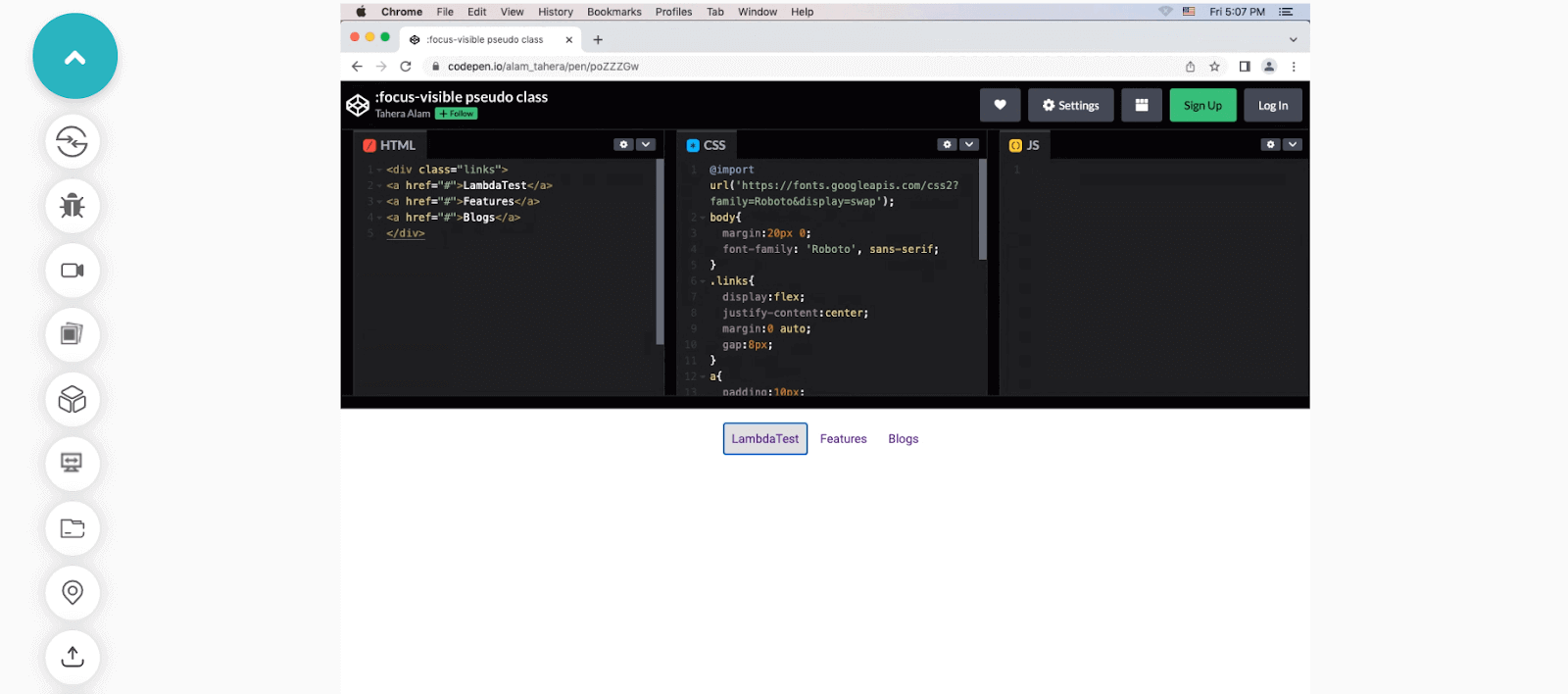
In this example, we have three links, and we asked the browser to apply a background color (in this case #ddd) when any of the links are in focus. Notice if you click them using a mouse pointer, the style doesn’t get applied because the element does not receive the focus-visible status since it’s an implicit click.
But, if you click them using the tab, the background color does get applied because the element receives the focus-visible status since the click is explicit.
Let’s see how our example would function with LambdaTest’s Real Time Testing.
:focus-within pseudo-class
The :focus-within pseudo-class in CSS allows you to apply styles to a parent element when one of its child elements is in focus. Imagine you have a form with multiple input fields, the :focus-within pseudo-class allows you to highlight the entire form container (the parent element) when one of the input fields (child element) is selected and in focus.
A practical application of the :focus-within pseudo-class is to style a form label when its associated input field has focus. To achieve this, you can wrap the label and input in a container element, then apply the :focus-within pseudo-class to that container. This allows you to select the label and apply styles when the associated input field is in focus.
Let’s look at an example of that.
HTML:
|
1 2 3 4 |
<div class="form-group"> <label for="name">Name:</label> <input type="text" id="name" /> </div> |
CSS:
|
1 2 3 |
.form-group:focus-within label { color: #2196f3; } |
In this example, we have a form with a single input field for the user’s name. The label and input are wrapped in a container element with a class of .form-group. We then use :focus-within on the .form-group container to tell the browser that when the input of that container is in focus, change the color of the label to blue.
See the Pen
:focus-within pseudo class by Tahera Alam (@alam_tahera)
on CodePen.
:is() pseudo-class
The :is() CSS pseudo-class function (formerly called :matches() :any()) takes a list of selectors as its argument and selects any element that can be selected by one of the selectors in that list. This allows for more concise writing when selecting multiple elements and helps make your code more readable.
For example, instead of targeting each heading element individually, you can target a group of headings using :is(h1, h2, h3).
The :is() selector list has unique features that set it apart from other selectors.
One of its coolest features is that even if one selector in the list is invalid, the rule will still apply to the valid selectors. This means you can group multiple selectors without worrying about the whole rule breaking just because of one small mistake.
Another important thing to note is that the rule’s specificity will match that of the selector with the highest specificity in the list. For example, a rule using :is(#id, p) will have the same specificity as the #id selector, while a rule using :is(p, a) will have the same specificity as the selector.
Let’s look at an example of this.
HTML:
|
1 2 3 |
<h1>LambdaTest</h1> <h2>Cross-browser testing platform</h2> <h3>Automated testing solution</h3> |
CSS:
|
1 2 3 4 5 |
/* Apply styles to h1, h2, and h3 elements */ :is(h1, h2, h3) { font-weight: bold; color: purple; } |
See the Pen
:is() pseudo-class by Tahera Alam (@alam_tahera)
on CodePen.
In this example, the :is(h1, h2, h3) selector matches all h1, h2, and h3 elements and applies the styles of font-weight: bold and color: purple to them.
:where() pseudo-class
The :where() pseudo-class function takes a list of selectors as an argument and selects elements that can be selected by any of the selectors in that list.
It is almost similar to :is() except for one difference. The difference between :where() and :is() lies in their specificity. :where() always has a specificity of 0, whereas :is() gets the specificity of the most specific selector in its argument list.
Let’s look at an example to see how :where() works.
HTML:
|
1 2 3 4 |
<div class="container"> <img src="https://images.unsplash.com/photo-1674530493752-719b5514a7f2?ixlib=rb-4.0.3&ixid=MnwxMjA3fDB8MHx0b3BpYy1mZWVkfDQ2fGJvOGpRS1RhRTBZfHxlbnwwfHx8fA%3D%3D&auto=format&fit=crop&w=600&q=60 "alt=""/> </div> |
CSS:
|
1 2 3 4 5 6 |
:where(img) { border: 10px solid blue; } img { border: 10px solid orange; } |
See the Pen
:where() pseudo-class by Tahera Alam (@alam_tahera)
on CodePen.
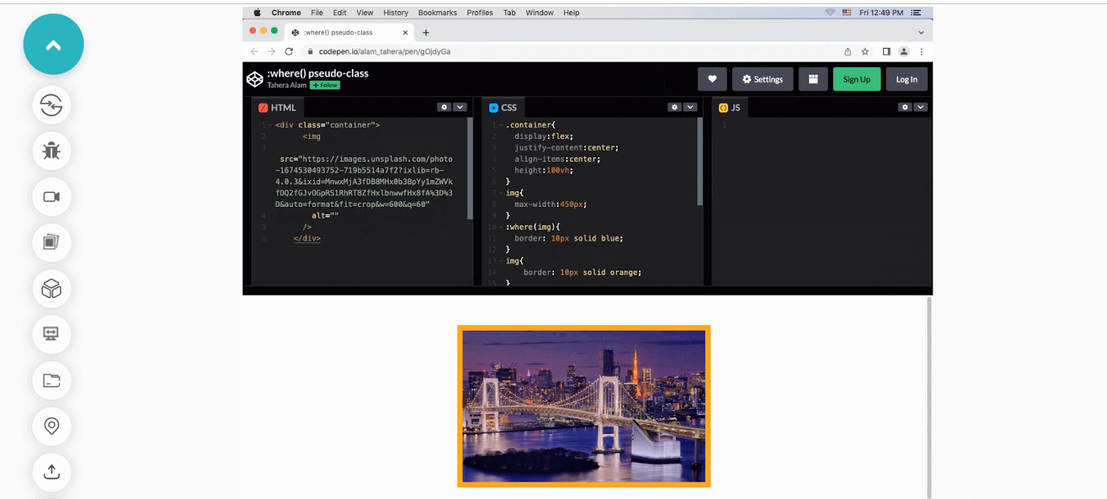
In this example, we select the image using :where() pseudo-class and add a blue border to it. Then, we again select the image using the img selector and set an orange border. Since :where() has 0 specificity, the second style wins, resulting in the orange border of the image.
The following is an example of implementing :where() using LambdaTest’s Real Time Testing feature.
:not() pseudo-class
The :not() CSS pseudo-class selector matches elements that do not match a given selector. It means you can exclude specific elements from a selection of elements. The syntax is :not(selector), where the (selector) is the selector to be excluded.
For instance, p:not(.main) matches all < p > elements that don’t have the class main.
HTML:
|
1 2 3 4 5 6 7 8 9 10 11 12 |
<div class="container"> <h1>LambdaTest</h1> <p> The ultimate cloud-based cross-browser testing platform. Test on over 3000 browsers, devices, and OS. </p> <p>Accelerate your GTM with powerful cloud testing.</p> <p class="main"> Integrate <a href="https://www.lambdatest.com/">LambdaTest</a> with your favorite tools for seamless testing. </p> </div> |
CSS:
|
1 2 3 4 5 6 7 8 |
p { font-weight: bold; color: blue; } /* Select all elements except the ones with .main class */ p:not(.main) { font-weight: normal; } |
See the Pen
:not() pseudo-class by Tahera Alam (@alam_tahera)
on CodePen.
In this example, we have three paragraph tags: first, we apply blue color and bold font-weight to all paragraphs with the p selector. Then, we use the :not() pseudo-class to exclude the last p element that has the .main class from receiving normal font-weight and keep its bold font-weight as set by the p selector.
:has() pseudo-class
The :has() pseudo-class is unique and something we never had in CSS. It’s like a detective on a mission to find specific elements based on the clues of their descendants.
Imagine you have an HTML document with a list of items, and you want to give a unique style to those items that have an extra emphasis, represented by a span element. How can you achieve that? Yes, the answer is :has() pseudo-class.
The :has() pseudo-class allows you to select elements based on whether they have a certain descendant element. Isn’t it fascinating? Let’s take a closer look with an example.
HTML:
|
1 2 3 4 5 |
<ul> <li>Item 1</li> <li>Item 2 <span>with emphasis</span></li> <li>Item 3</li> </ul> |
CSS:
|
1 2 3 4 |
li:has(span) { font-weight: bold; background-color: yellow; } |
See the Pen
:has() pseudo-class by Tahera Alam (@alam_tahera)
on CodePen.
In this example, the :has() pseudo-class selects the li elements that have a span descendant. When it finds a match, it applies the styles of font-weight and background-color, making the text bold and the background yellow.
Note that this example may not work for you on a Firefox browser. However, we have an interesting workaround just for you in the browser compatibility section.
:empty pseudo-class
The :empty pseudo-class in CSS selects elements that have no children, including text nodes. This means that an element that has only white space will also be selected by the :empty pseudo-class.
This comes in handy in certain scenarios. For example, you have a div in which you dynamically add content using JavaScript. When content gets appended, you want the div to have some padding and background, but if there’s no content, you don’t want it to take any space on the page. You can very simply hide that div using the :empty pseudo-class.
HTML:
|
1 2 |
<div>Since the below div element is empty, :empty() pseudo-class selects and hides it.</div> <div></div> |
CSS:
|
1 2 3 4 5 6 7 8 9 |
div { background-color: orange; padding: 10px; text-align: center; } /* Select the empty div element */ div:empty { display: none; } |
See the Pen
:empty pseudo-class by Tahera Alam (@alam_tahera)
on CodePen.
:placeholder-shown pseudo-class
The :placeholder-shown pseudo-class in CSS is used to select and style an < input > or < textarea > element that is currently displaying placeholder text.
The :placeholder-shown pseudo-class provides a convenient way to style the placeholder text in a specific way, separate from the other styles of the input element. This allows us to create more intuitive and user-friendly forms by improving the visual cues for placeholder text.
Let’s look at an example.
HTML:
|
1 2 3 4 5 6 7 8 |
<form> <label for="name">Name:</label> <input name="name" type="text"placeholder="Your name"> <label for="email">Email Address:</label> <input name="email" type="email" placeholder="john@example.com"> </form> |
CSS:
|
1 2 3 4 5 |
input:placeholder-shown { background-color: #ddd; border: 2px solid orange; border-radius: 4px; } |
See the Pen
:placeholder-shown pseudo class by Tahera Alam (@alam_tahera)
on CodePen.
In this example, we have a form with three input fields for name, email, and age. Each input has a placeholder text. We used input:placeholder-shown CSS pseudo-class to style the input fields that are currently displaying placeholder text. When a user begins to type into an input field, the placeholder text will be replaced by the user’s input, and the styles will no longer apply.
:read-only pseudo-class
As the name suggests, the :read-only CSS pseudo-class represents an element that is not editable by the user, meaning its value cannot be changed. This selector can be used to apply styles to elements that have the readonly attribute or have been dynamically set to be read-only through JavaScript.
Following is an example of the same.
HTML:
|
1 2 3 4 5 6 7 8 |
<form> <label for="name">Name:</label> <input name="name" type="text"placeholder="Your name"readonly> <label for="email">Email Address:</label> <input name="email" type="email" placeholder="john@example.com"> </form> |
CSS:
|
1 2 3 4 5 |
input:read-only { background-color: #ddd; border: 1px solid gray; pointer-events: none; } |
See the Pen
read-only pseudo-class by Tahera Alam (@alam_tahera)
on CodePen.
In the example, the first input that has the readonly attribute is selected by the :read-only pseudo-class selector and the specified styles only gets applied to that element.
The :read-only CSS pseudo-class removes all the styling that makes the inputs look like clickable fields, making them look like read-only paragraphs.
read-write pseudo-class
The :read-write pseudo-class matches elements that are either editable or have the contenteditable attribute set to true.
Some HTML elements, such as input and textarea, are editable by default, but others, such as div and p, are not. The contenteditable attribute can be added to any element to make it editable. The :read-write pseudo-class allows us to specify styles specifically for editable elements, whether they are editable by default or made editable with the contenteditable attribute.
Below is an example.
HTML:
|
1 |
<div contenteditable="true">This is an editable div.</div> |
CSS:
|
1 2 3 |
div[contenteditable="true"]:read-write { background-color: lightgreen; } |
See the Pen
read-write pseudo-class by Tahera Alam (@alam_tahera)
on CodePen.
In this example, the :read-write pseudo-class will match the div element with the contenteditable attribute set to true, and the background-color gets applied. It also works for elements that are editable by default, such as inputs and textareas.
:indeterminate pseudo-class
The :indeterminate pseudo-class targets specific form elements, such as checkboxes and radio buttons, as well as progress elements, that are in an intermediate or indeterminate state.
For example, an < input type="checkbox" > can be set to an indeterminate state through JavaScript by setting its indeterminate property to true. Similarly, radio buttons can be considered indeterminate when all buttons with the same name value in the form are unchecked. And < progress > element can be set to an indeterminate state if it doesn’t have a defined value or progress status.
Below is an example for each of them.
- :indeterminate CSS pseudo-class with a checkbox
- :indeterminate CSS pseudo-class with a radio button
- :indeterminate CSS pseudo-class with a progress element
HTML:
|
1 2 |
<input type="checkbox" id="checkbox" /> <label for="checkbox">Check me</label> |
CSS:
|
1 2 3 |
input[type="checkbox"]:indeterminate + label { color: red; } |
See the Pen
:indeterminate pseudo-class by Tahera Alam (@alam_tahera)
on CodePen.
In this example, we created a checkbox input with an id of checkbox and a label that says “Check me.” The JavaScript code sets the indeterminate property of the checkbox to true, which makes the checkbox appear in an indeterminate state. In CSS, we used the :indeterminate pseudo-class to select the checkbox and its adjacent label and set the color of the label to red.
HTML:
|
1 2 3 4 5 6 7 |
<form> <input type="radio" name="LambdaTestFeatures" id="LambdaTestFeatures" /> <label for="webTesting">Web testing</label> <input type="radio" name="webTesting" id="webTesting" /> <label for="cypressTesting">Cypress testing</label> <input type="radio" name="seleniumTesting" id="seleniumTesting" /> <label for="selen |
CSS:
|
1 2 3 |
input[type="radio"]:indeterminate + label { color: red; } |
See the Pen
:indeterminate pseudo class by Tahera Alam (@alam_tahera)
on CodePen.
In this example, all the radio buttons are in an indeterminate state because none of them have been selected yet. We use the :indeterminate pseudo-class to target the label for each radio button and change its color to red. When a radio button is selected, it no longer matches the :indeterminate selector, and the label returns to its default color.
HTML:
|
1 |
<progress></progress> |
CSS:
|
1 2 3 4 |
progress:indeterminate { width: 50vw; height: 30px; } |
See the Pen
:indeterminate pseudo-class by Tahera Alam (@alam_tahera)
on CodePen.
In this example, the :indeterminate CSS pseudo-class selects the progress element and applies specified styles to it because it has no value and is in an indeterminate state.
Browser compatibility of CSS pseudo-class selectors
Let’s talk about one of the most important aspects of modern web design, i.e., browser compatibility. All your fancy and shiny CSS features are useless if the user’s browser doesn’t support them. That’s why you need to keep browser compatibility in mind.
In this section, we will look at the browser support of all the CSS pseudo-class selectors discussed.
Additionally, to run browser compatibility tests of the CSS features, you can use a cloud-based cross browser testing platform like LambdaTest that offers an online browser farm of numerous real browsers and operating systems combinations to test your websites (and web apps). It lets you perform tests at scale to detect cross browser compatibility issues in HTML/CSS and fix them so that your website or web app works seamlessly across different browsers & OS combinations.
Perform browser compatibility testing across 3000+ real browsers. Try LambdaTest Now!
:any-link()
The :any-link() CSS pseudo-class selector has varying levels of support across different browser versions. In Chrome, it is supported with the prefix -webkit– from version 15 to 64 and is fully supported without the prefix from version 50.
Similarly, in Safari, support is available from version 6.1 to 8 with the prefix -webkit-and is fully supported in later versions.
|
1 2 3 |
:-webkit-any-link { color: blue; } |
In Firefox, it is supported from version 3 to 49 using the prefix -moz- and fully supported from version 50.
|
1 2 3 |
:-moz-any-link { color: blue; } |
Browser Compatibility:

:focus-visible
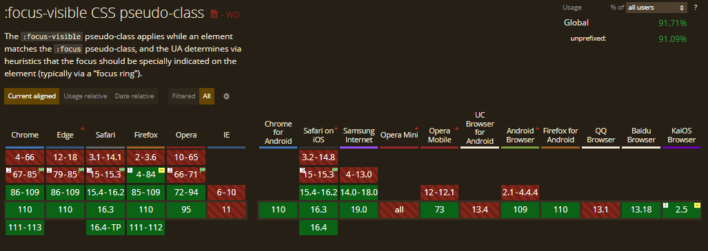
The :focus-visible CSS pseudo-class is supported in Chrome from version 86. In Firefox, it is supported from version 4 to 84 using the prefix -moz- and fully supported from version 85.
:focus-within
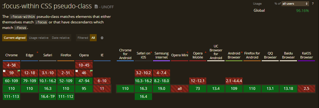
Here’s an image illustrating the support for the focus-within pseudo-class across different browser versions.
:is()
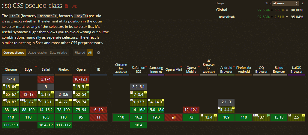
The :is() CSS pseudo-class is supported in Chrome from version 88, and Firefox supports it from version 78.
:where()
The :where() pseudo-class is supported in Chrome from version 88 and in Firefox from version 78.

:not()
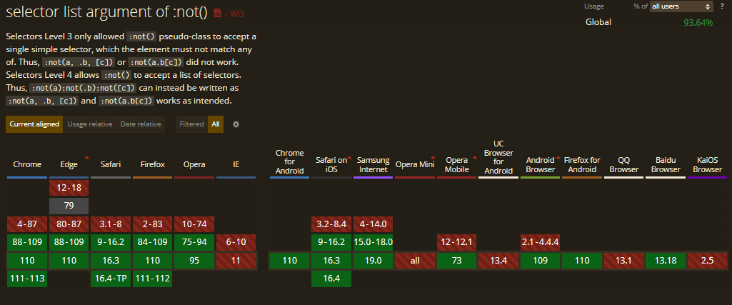
The :not() CSS pseudo-class is supported in Chrome from version 88. Firefox has support for it from version 84 and Opera from version 75.
Here’s an image that showcases the browser support for this property.
:has()
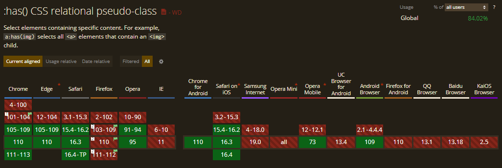
The :has() CSS pseudo-class selector is supported in some modern browsers, with Chrome offering support from version 105 and Safari from version 15.4.
Note that earlier versions of Firefox (2-102) do not support the :has CSS pseudo-class. However, you can enable this powerful feature as an experimental option in version 103 and later by simply flipping the layout.css.has-selector.enabled flag to true.
Here is an excellent demo inspired from this CodePen example to demonstrate the implementation of :has pseudo-class in Firefox 103 and later:
CSS:
|
1 2 3 4 5 |
figure:has(figcaption) img { outline: 10px dashed red;As we know, the :has pseudo-class isn’t supported in Firefox by default. So, you need to enable it to see the demo in action. } |
See the Pen
:has() pseudo-class selector demo by Tahera Alam (@alam_tahera)
on CodePen.
In the given example, the :has() CSS pseudo-class targets any figure element that has a figcaption within it. In the HTML document, we have a figure element with a figcaption, so the browser correctly identifies the matching figure element and applies the red border.
To enable it, search for about:config in your Firefox address bar and hit Enter.

Finally, search for layout.css.has-selector.enabled and turn it to true.

Congratulations! You just enabled the powerful :has selector support in your Firefox browser.
:empty()
The :empty() CSS pseudo-class selector is widely supported in modern browsers, with Chrome offering support from version 4, Safari from version 3.1, and Firefox from version 2.

:placeholder-shown
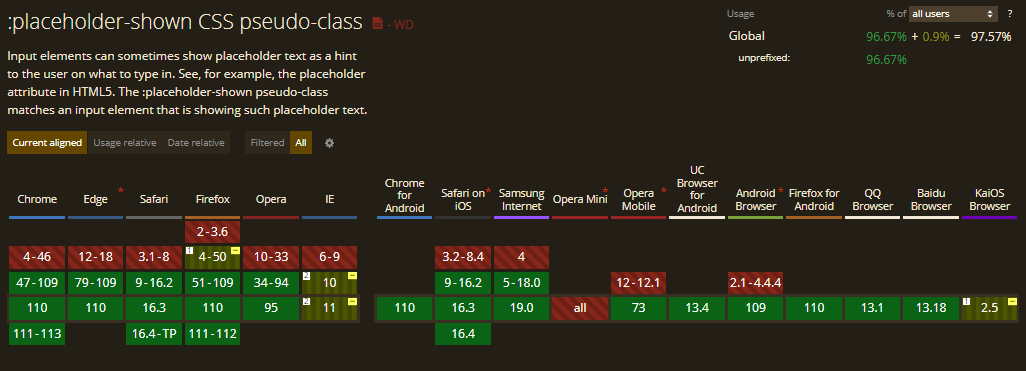
The :placeholder-shown CSS pseudo-class is supported in Chrome from version 47. In Firefox, it is partially supported from version 4 to 50 using the prefix -moz-placeholder (instead of placeholder-shown) and fully supported from version 51.
:read-only and read-write
The read-only and read-write pseudo-classes are partially supported in Chrome from version 15 to 35, with support limited only to inputs and textarea fields and not elements with contenteditable attribute. But from version 36, these selectors are fully supported. Similarly, Safari has support from versions 4 to 8 only for inputs and textarea fields and supports fully from version 9.
Firefox supports them from version 3 to 77 using the prefix -moz and fully supports from version 78.

:indeterminate
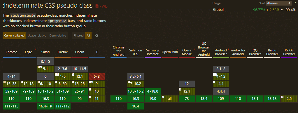
The :indeterminate CSS pseudo-class has partial support in Chrome from version 15-38 with limitations in selecting radio buttons. It won’t select radio buttons if the group of radio buttons doesn’t have a checked option.
Similarly, Firefox version 4-50 doesn’t support radio buttons. Additionally, version 4-5 doesn’t support the < progress > element.
Chrome has full support from version 39 and Firefox from version 51.
Wrapping up
As a web designer or developer, you understand the value of constantly learning and exploring new techniques. The introduction of newly supported CSS pseudo-class selectors opens up a world of possibilities to create stunning, interactive, and engaging web experiences. In this guide, we’ve taken a closer look at selectors such as :has(),:any-link(), and :focus-visible, etc., which are at the forefront of modern CSS design.
It’s important to stay updated about the latest browser support for these selectors and to experiment with different ways to incorporate them into your work. Whether you’re building a simple website or a complex web application, these selectors can add an extra layer of style and interactivity to your web projects.
I hope this guide has been helpful to you and has inspired you to use CSS pseudo-class selectors in your designs. So, go ahead, dive in, and let your creativity run wild!
Until then, Happy Styling!
Frequently Asked Questions (FAQs)
How do you create pseudo-classes in CSS?
A CSS pseudo-class specifies a special state of the selected element(s). In CSS, pseudo-classes are defined with a colon (:) and their names. For example :hover.
What are pseudo-class and pseudo-element in CSS?
The CSS pseudo-class defines a special state for an element. For example, it can be used when the user hovers over an element. Alternatively, CSS pseudo-elements are used to style specific parts of elements.
Got Questions? Drop them on LambdaTest Community. Visit now


