Web developers utilize various components and layout methods to build responsive and user-friendly web pages. These layouts have evolved to address the limitations of previous methods, such as the normal flow and float layouts. To overcome these limitations, the concept of CSS layouts has evolved to include CSS Grid and Flexbox, which tackle the challenges and limitations of web design.
CSS layouts play a crucial role in creating structured, responsive, and visually appealing web designs. They help developers position and align web elements correctly, making web pages more accessible and user-friendly across different devices and screen sizes.
What Are CSS Layouts?
CSS layouts refer to the rules and algorithms used in web development to arrange and order items within a web page. These layouts determine the structure and visual representation of the web page, including the alignment of text and images and the order in which components appear. They define how elements interact within their containers, such as spacing, sizing, alignment, and distribution.
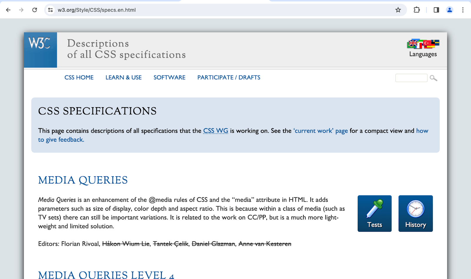
CSS specifications play an important role in defining these layout modes. A CSS specification is a set of rules and guidelines specifying how Cascading Style Sheets (CSS) are to be written and implemented by web browsers. It provides a standard to follow when styling web pages, incorporating the positioning and coloring of elements. The specification ensures consistency and compatibility across different browsers and devices.
Source
There have been three major CSS specifications: CSS1, CSS2, and CSS3. Unlike its predecessors, CSS3 is not a single specification. Instead, it is a collection of independent modules that expand the functionality of CSS. To learn more about CSS3 follow the detailed guide on CSS3 tutorial.
These layout modes usually make HTML elements deviate from their flow order, as in the document. We can access these modes using different CSS properties, the most common being display.
The table below shows some properties we use to opt into these layout modes.
| Property
|
Value
|
Layout
|
| display
|
block
|
normal flow
|
| display
|
inline
|
normal flow
|
| display
|
grid
|
grid
|
| display
|
flex
|
flex
|
| display
|
table
|
table
|
| float
|
left or right
|
float
|
| position
|
Any of the values except static
|
positioning
|
| columns
|
[column count e.g 3, column-width e.g 2em]
|
Multi-column
|
Test your website across 3000+ real browsers. Try LambdaTest Now!
Let’s learn the different types of CSS layouts used to create web pages or website layouts.
Types of CSS Layouts
If you give an image a float property value of inline-start, the image will display as intended according to the writing mode, as shown in the image below.
Normal Flow CSS Layout
This refers to the default hierarchical layout structure that a web page’s content follows in an HTML document. In this layout, block-level and inline elements are positioned according to the block flow direction and inline flow direction based on the parent’s writing mode.
Block elements stack vertically, and inline elements lay side by side until they wrap onto the next line when the space in a particular line is filled. The default writing mode is horizontal-tb, so content for languages like English and Arabic is laid out from top to bottom.
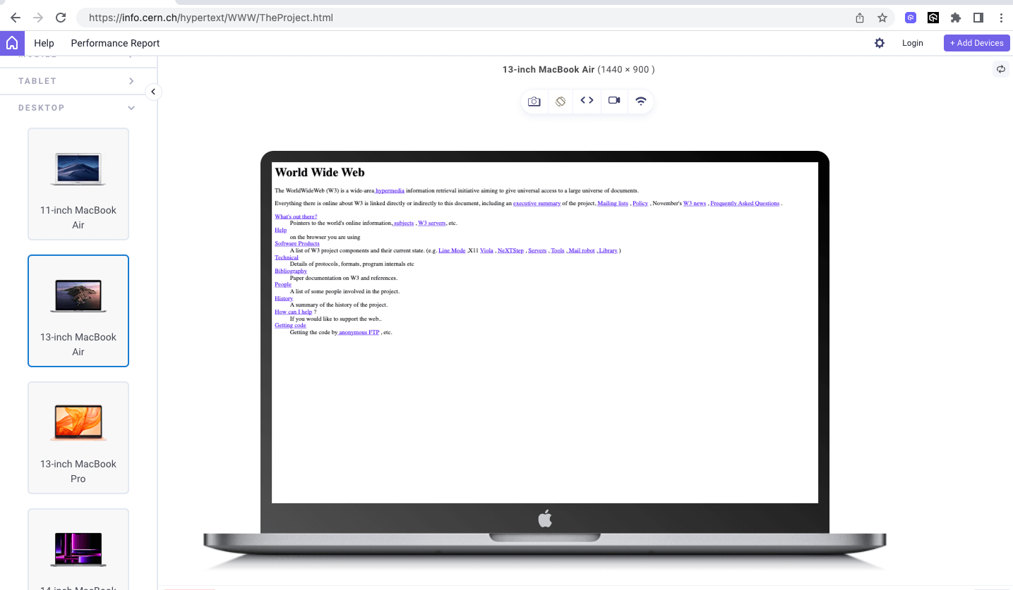
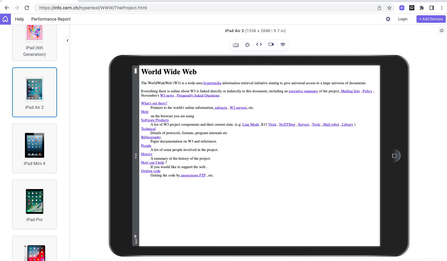
A good example of a normal flow is the famous first website (hypertext) created by Tim Berners-Lee.
To preview the first website (hypertext), you can use browsers and devices, but you might not be able to visually see the difference properly if you wish to see it on a wide range of devices and browsers.
The images below demonstrate how the first website lays out its content according to the block and inline flow direction of the HTML elements on desktop, tablet, and mobile viewports.
Desktop View:
Tablet View:
Mobile View:
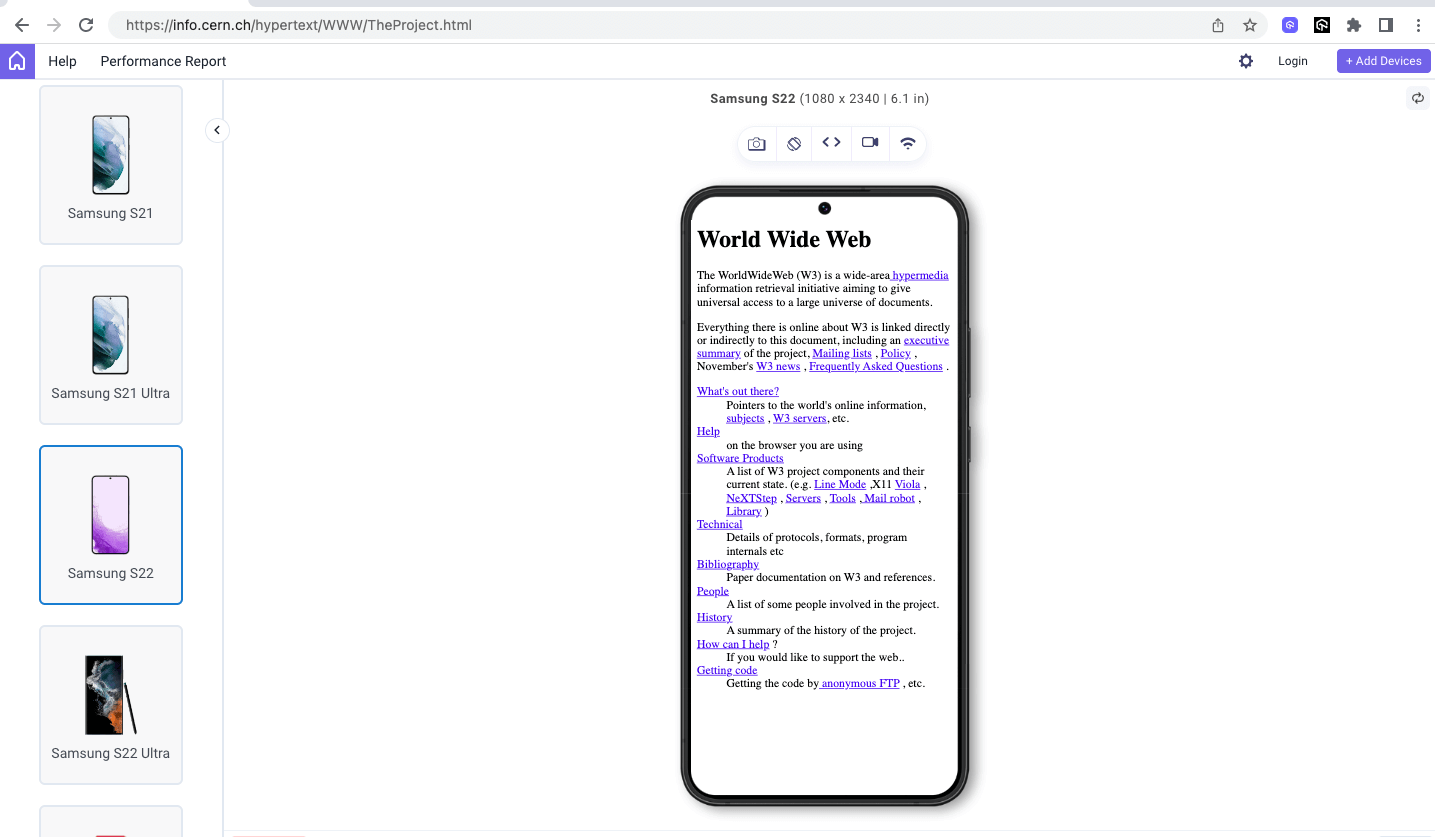
The above result is displayed on LT Browser to render the first website (hypertext) on different device viewports for better website visuals. It’s a web device testing tool built by LambdaTest to test your responsive web layouts across 53+ pre-installed viewports for mobile, tablet, desktop, and laptop. This helps ensure that CSS layouts do not break even when the webpage is rendered on various screen resolutions.
To learn more about LT Browser and how to use it, watch the video tutorial below.
To understand how other CSS layouts work, it’s essential to familiarize ourselves with the default, normal flow layout. We often use it with other CSS layouts like CSS Grid and Flexbox or on its own for simple pages with basic styling.
Some of the pages where it is commonly used include the following.
- Privacy information
- Terms of use/service
- About
- Policies
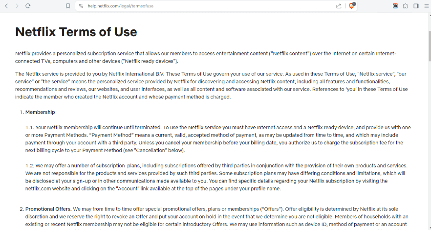
The image below shows how Netflix largely follows the normal flow layout on its Terms of Use page with basic styling on the text and spacing. Also, the content is still accessible.
Source
The primary advantage of a normal flow layout is readability. Its solid and well-structured nature makes it easy for old browsers and devices like screen readers and magnifiers to interpret, enhancing accessibility. Additionally, normal flow layouts require minimal maintenance and troubleshooting compared to documents with other layouts.
The code below illustrates the normal flow CSS layout with some styling to make the page more visually appealing  without affecting the HTML document layout.
HTML:
1 2 3 4 5 6 7 8 9 10 11 12 13 14 15 16 17 18 19 20 21 22 23 24 25 26 27 28 29 30 31 32 33 34 35 36 37 38 39 40 41 42 43 44 45 46 47 48 49 50 51 52 53 54 55 56 57 58 59 60 61 62 63 64 65 66 67 68 69 70 71 72 73 74 |
<!DOCTYPE html> <html lang="en"> <head> <meta charset="UTF-8"> <meta http-equiv="X-UA-Compatible" content="IE=edge"> <meta name="viewport" content="width=device-width, initial-scale=1.0"> <link rel="stylesheet" href="styles.css"> <title>LambdaTest's privacy page</title> </head> <body> <header> <div class="nav-logo-container"> <div class="logo"> <img src="https://www.lambdatest.com/resources/images/logos/logo.svg" alt=""> </div> <nav> <ul> <li><a href="#">Platform</a></li> <li><a href="#">Enterprise</a></li> <li><a href="#">Resources</a></li> <li><a href="#">Developers</a></li> <li><a href="#">Pricing</a></li> </ul> </nav> </div> <div class="ctas"> <a class="login" href="#">Login</a> <button>Book a demo</button> <a class="get-started" href="#">Get started Free</a> </div> <svg xmlns="http://www.w3.org/2000/svg" fill="none" viewBox="0 0 24 24" stroke-width="1.5" stroke="currentColor" class="w-6 h-6"> <path stroke-linecap="round" stroke-linejoin="round" d="M3.75 6.75h16.5M3.75 12h16.5m-16.5 5.25h16.5" /> </svg> </header> <main> <h1>Terms of Service</h1> <section> <p> These Terms of Service (the “Terms”) govern access to and/or use of LambdaTest Services as defined below. </p> <p> <!---More----> </p> </section> <section> <h2> 1. Definitions <span> <img src="https://www.lambdatest.com/resources/images/link.svg" alt=""> </span> </h2> <div> <p style="padding-top: 5px;"> For the purpose of this Agreement following words and expressions shall have the meanings assigned to them below: </p> <ul class="points-list"> <li> <strong>“Account-Related Information”</strong> means contact information about Customer and/or Customer’s representatives used to access LambdaTest Services. </li> <li> <!---More----> </li> </ul> </div> </section> </main> </body> </html> |
CSS:
1 2 3 4 5 6 7 8 9 10 11 12 13 14 15 16 17 18 19 20 21 22 23 24 25 26 27 28 29 30 31 32 33 34 35 36 37 38 39 40 41 42 43 44 45 46 47 48 49 50 51 52 53 54 55 56 57 58 59 60 61 62 63 64 65 66 67 68 69 70 71 72 73 74 75 76 77 78 79 80 81 82 83 84 85 86 87 88 89 90 91 92 93 94 95 96 97 98 99 100 101 102 103 104 105 106 107 108 109 110 111 112 113 114 115 116 117 118 119 120 121 122 123 124 125 126 127 128 129 130 131 132 133 134 135 136 137 138 139 140 141 142 143 144 145 146 147 148 149 |
*, *::before, *::after { margin: 0; padding: 0; box-sizing: border-box; } body { background: #fff; font-family: Inter, Arial, sans-serif; line-height: 1.7; } :is(header, header nav ul, .nav-logo-container, .ctas) { display: flex; } header { height: 15vh; background: #fff; justify-content: space-between; padding: 0rem 4rem; align-items: center; box-shadow: 0px 4px 10px 0px rgba(100, 100, 111, 0.2); } header nav ul { gap: 2rem; } .nav-logo-container { gap: 4rem; } nav ul li { list-style: none; } a { text-decoration: none; color: #000; font-weight: 500; } ul li a:hover { color: #b9b9b9; } .ctas { align-items: center; gap: 2rem; } .ctas button { background: #fff; border: 2px solid blue; padding: 10px; font-size: 16px; border-radius: 3px; cursor: pointer; } .ctas .get-started { background: linear-gradient(91.88deg, #2c57f3 0.88%, #a506d8 98.71%); color: #fff; padding: 9px; border-radius: 3px; } svg { width: 60px; height: 40px; cursor: pointer; display: none; } main { padding: 2rem 16rem; } main h1 { font-size: 3rem; text-align: center; padding: 2rem; } main h2 { font-size: 1.875rem; font-weight: 500; border-top: 1px solid #dbdbdb; border-bottom: 1px solid #dbdbdb; padding: 1.2rem; } main p { padding-bottom: 1.1rem; } section img { width: 20px; height: auto; } section .points-list { padding-left: 5rem; } .points-list li { padding-bottom: 1.4rem; cursor: pointer; } @media screen and (min-width: 320px) and (max-width: 1080px) { main { padding: 2rem; } nav, .ctas { display: none; } svg { display: block; } } |
Result:
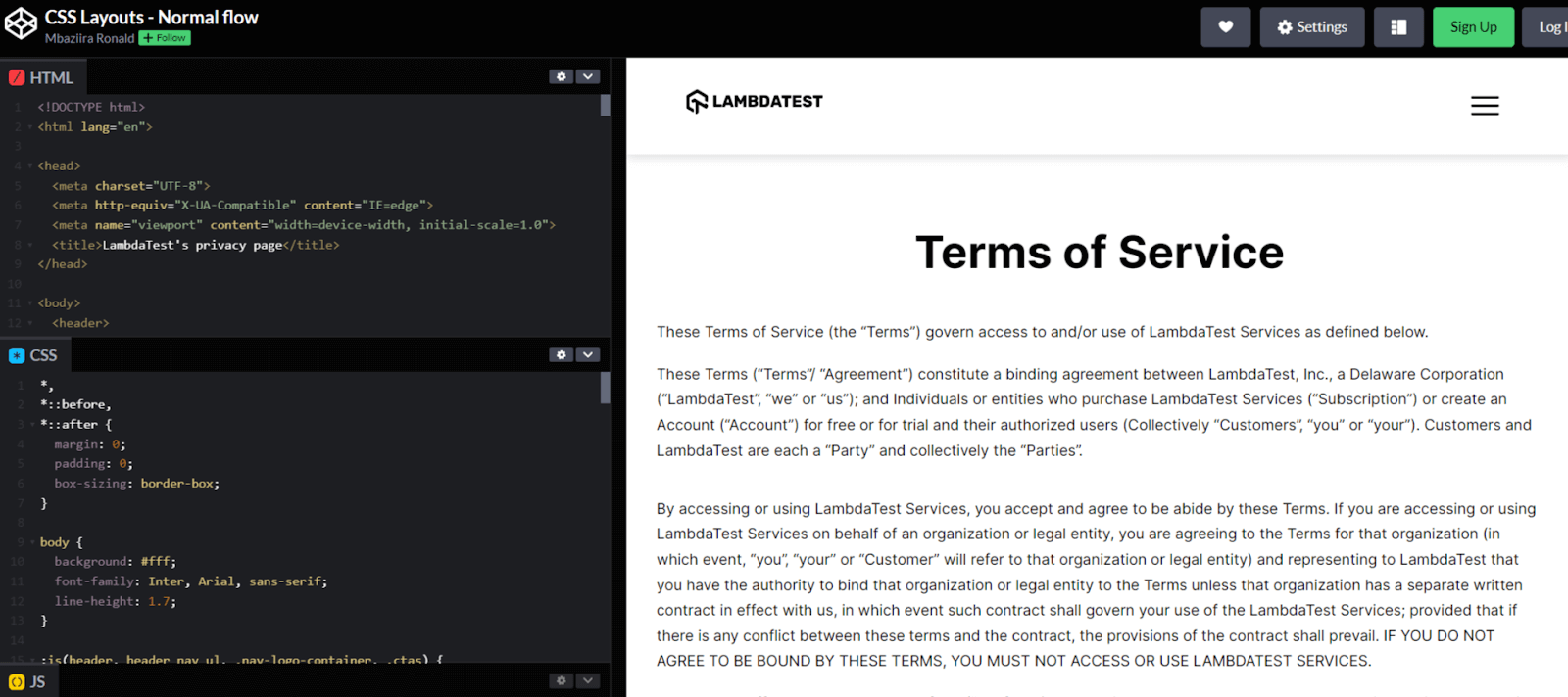
In the output above of the Terms of Service page, we have styled the HTML elements and their containers while maintaining a normal flow layout.
CSS Float Layout
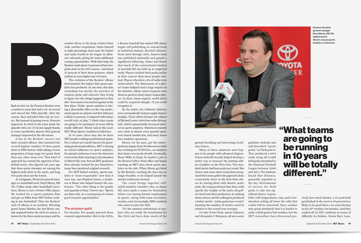
Floats were initially introduced to create web layouts similar to those in print layouts like newspapers and magazines, where text wraps around images.
To give you a picture look at the image below of MIT Technology Review on Sports magazine, which shows how normal text wraps around the large quote on the right page of the magazine.
Source
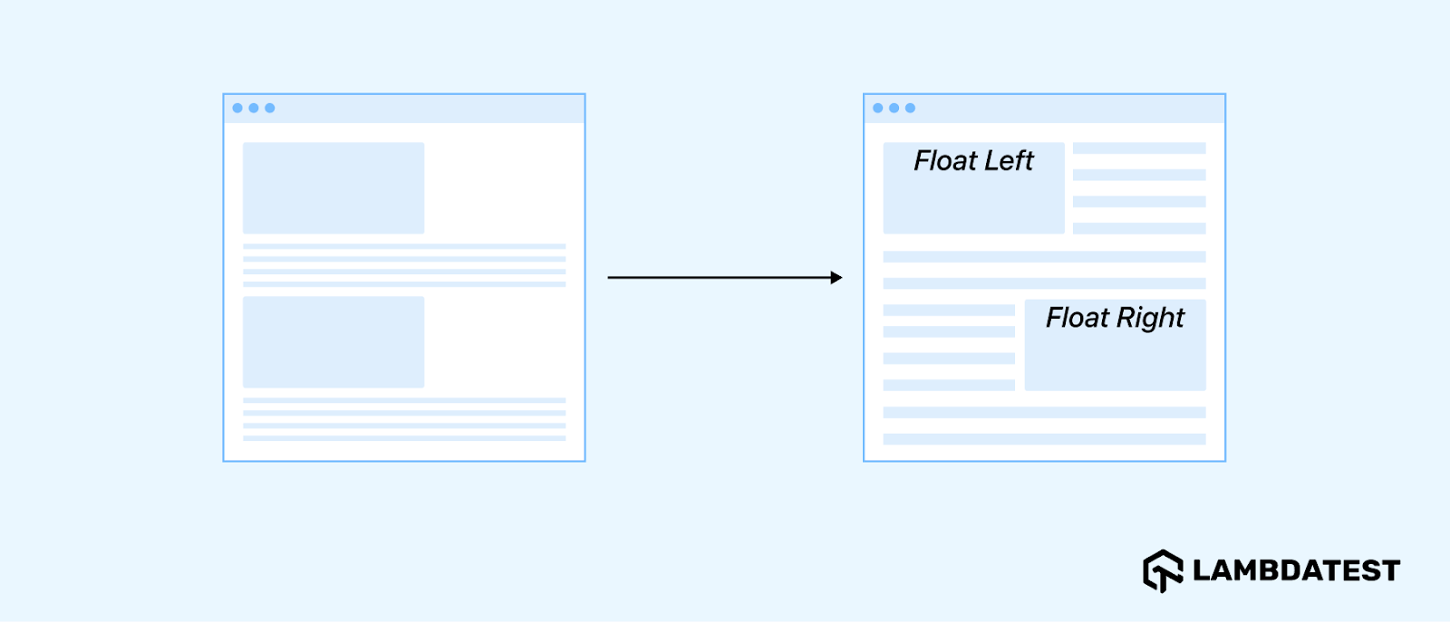
CSS Float layout empowers us to create print layouts, as shown in the magazine image above. It transforms the web page from the normal flow layout to layouts resembling those found in newspapers and magazines.
The image below shows a web page layout without a float on the left and a float on the right, illustrating how the CSS layout transforms with a float layout.
We use the CSS float property to position elements within the float layout. The property accepts the following keyword values:
| Float value
|
Role
|
| none
|
Specifies that the element must not be a float. It is the default value of the property.
|
| right
|
Makes the element float on the right side of its container.
|
| left
|
Makes the element float on the left side of its container.
|
| inline-start
|
Makes the element float on the start side of the container, depending on the HTML document’s writing mode.
|
| inline-end
|
Makes the element float on the end side of the container, depending on the HTML document’s writing mode.
|
When you apply the CSS float property to an element, two main things happen:
- The floated element is taken out of the normal flow of the document.
- Other content, such as text and inline elements, will wrap around the floated element.
The example below illustrates the above points on how float works.
HTML:
1 2 3 4 5 6 7 8 9 10 11 12 13 14 15 16 17 18 19 20 21 22 23 24 25 26 27 28 29 30 31 32 33 34 |
<!DOCTYPE html> <html lang="en"> <head> <meta charset="UTF-8"> <meta http-equiv="X-UA-Compatible" content="IE=edge"> <meta name="viewport" content="width=device-width, initial-scale=1.0"> <title>Float</title> </head> <body> <div class="container"> <h1>What Are Virtual Machines And How Do They Work?</h1> <img src="https://www.lambdatest.com/blog/wp-content/uploads/2024/03/What-Are-Virtual-Machines-Feature-Image.png" alt=""> <p> A virtual machine (VM) emulates or virtualizes an actual computer system. It provides all the functionalities of a physical computer but exists as a software-based emulation rather than a tangible object. </p> <p> A virtual machine, also called a “guest,” is constructed on a physical computer known as a “host,” using resources like a computer’s CPU core and memory. Each VM operates independently, having its own operating system, memory, storage, CPU, and network interfaces, running autonomously from other VMs on the hardware host. </p> <p> <!---More--> </p> </div> <div> <h2>Need for Virtual Machines</h2> <p> The need for virtual machines can be illustrated through an example: software development and software testing for a cross-platform application. </p> <p> <!---More--> </p> </div> </body> </html> |
CSS:
1 2 3 4 5 6 7 8 9 10 11 12 13 14 15 16 17 18 19 20 21 22 23 24 25 26 27 28 29 30 31 |
*, *::before, *::after { margin: 0; padding: 0; box-sizing: border-box; } body { font-family: Inter, Arial, sans-serif; line-height: 1.7; padding: 5rem; } h1 { margin-bottom: 1.2rem; } .container img { float: left; margin-right: 1.4rem; margin-bottom: 0.438rem; } p { padding-bottom: 1.2rem; } |
Result:
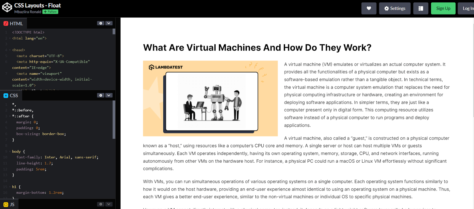
In the output above, the text content in normal flow wraps around the image, following its boundaries, similar to how it appears in the magazine image we saw earlier.
The float image or element can still be of any shape, and normal flow content will wrap around it.
1 2 3 4 5 6 7 8 9 10 11 12 13 14 15 16 17 18 19 |
img { float: left; margin-right: 1.4rem; margin-bottom: 1rem; clip-path: polygon(0% 15%, 32% 39%, 15% 0%, 85% 0%, 60% 40%, 100% 15%, 100% 85%, 63% 63%, 85% 100%, 15% 100%, 35% 65%, 0 81%); shape-outside: polygon(0% 15%, 32% 39%, 15% 0%, 85% 0%, 60% 40%, 100% 15%, 100% 85%, 63% 63%, 85% 100%, 15% 100%, 35% 65%, 0 81%); } |
Result:
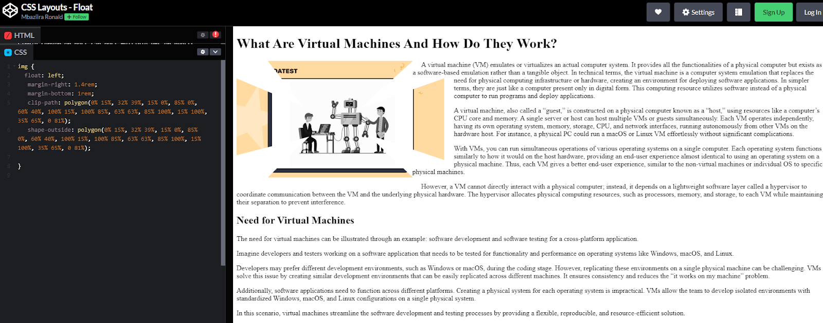
As CSS began introducing newer and advanced CSS layout techniques like CSS Grid and Flexbox, the use of floats to create CSS layouts began to decline. However, it remains the go-to layout mode for wrapping text around elements.
CSS Positioning Layout
A positioned element is an element that has any of the position values: relative, sticky, fixed, or absolute. Positioning refers to the technique that allows you to specify the final position of an element using any of these values relative to itself, its container, or the viewport.
From the definition of positioning in the paragraph above, we can understand why CSS has this layout mode. In a normal flow layout, elements stack according to their order in the HTML code. With this positioning property of CSS, you are allowed to change the order.
To move positioned elements from their initial places in the normal flow layout, you use the offset properties: top, right, bottom, and left. The top and bottom properties control the vertical offset, while the left and right properties control the horizontal offset.
With the position property, you can use positioning, and with the z-index property, you can control the stacking order of positioned elements. All major browsers like Chrome and Firefox support this property.
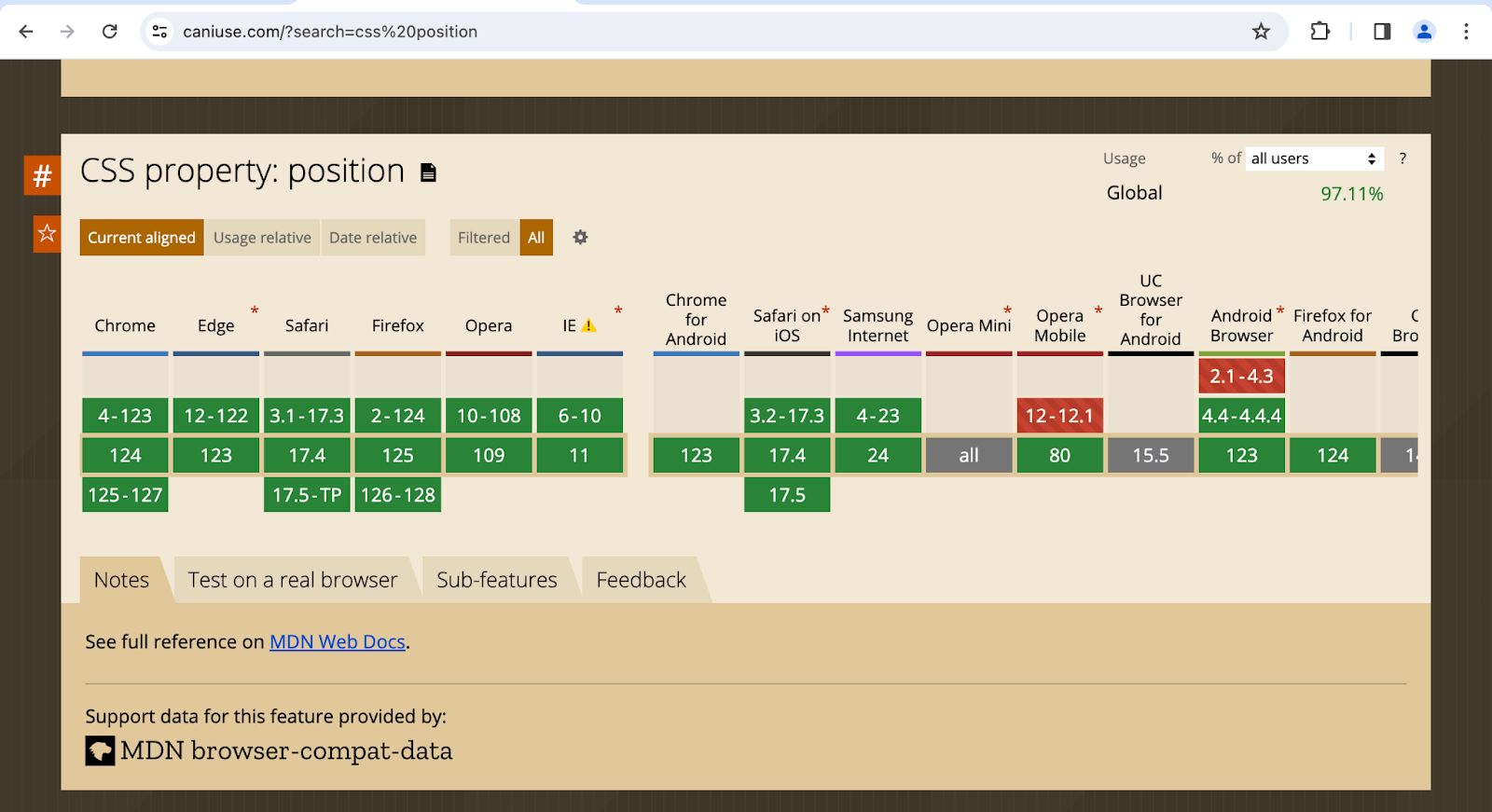
Source
The position property takes the following keyword values:
| Position value
|
Role
|
| static
|
Positions an element in its place in normal flow. It’s the default value of the property for all HTML elements.
|
| relative
|
Positions an element per normal flow but allows you to change its position relative to itself using offset properties.
|
| absolute
|
Removes the element from normal flow and positions it relative to its closest positioned ancestor.
|
| fixed
|
Removes an element from the normal flow and no longer occupies space in the layout. It is positioned relative to its initial containing block.
|
| sticky
|
Positions an element per normal flow until it reaches a specific scroll position. It combines the aspects of relative and fixed.
|
Let’s now look at the individual keyword value of the position property in more detail.
CSS Static Positioning
HTML elements have a default position value of static. This value positions elements in line with the normal flow. However, unlike other position values, static doesn’t allow changing an element’s position using the top, right, bottom, and left properties.
Additionally, the z-index property, which controls the stacking order of positioned elements, does not affect elements with a static position. When you don’t declare the position property on an element, it assumes the static value by default.
HTML:
1 2 3 4 5 6 7 8 9 10 11 12 13 14 15 16 17 18 19 20 21 22 23 24 25 26 27 28 29 30 31 32 |
<!DOCTYPE html> <html lang="en"> <head> <meta charset="UTF-8"> <meta http-equiv="X-UA-Compatible" content="IE=edge"> <meta name="viewport" content="width=device-width, initial-scale=1.0"> <link rel="stylesheet" href="styles.css"> <title>Position: Static</title> </head> <body> <main class="container"> <div> <h3>What is Real Time Testing?</h3> <p> Real time testing involves validating the functionality and performance of software applications in the live environment. The primary purpose of real time testing is to lower the probability of the failure of software applications in a real time environment. </p> </div> <div> <h3>Real Time Testing Example</h3> <p> A mobile application that gives real-time weather updates to users, extracts data from different APIs. </p> </div> <div> <h3>Where to Perform Real Time Testing?</h3> <p> Performing testing in real-time can be accomplished either on a local machine or in the cloud, each with its unique advantages and disadvantages. </p> </div> </main> </body> </html> |
CSS:
1 2 3 4 5 6 7 8 9 10 11 12 13 14 15 16 17 18 19 20 21 22 23 24 25 26 27 28 29 30 31 32 33 34 35 36 37 38 39 40 41 42 43 44 45 46 47 48 49 50 51 52 53 54 55 56 57 58 59 60 61 62 63 64 65 66 67 68 69 70 71 72 73 74 75 76 77 78 79 80 81 82 83 84 85 86 87 88 89 90 91 92 93 94 95 96 97 98 99 100 101 102 103 104 105 106 107 108 109 110 111 112 113 114 115 116 117 118 119 120 121 122 123 124 125 126 127 128 129 130 131 132 133 134 135 136 137 138 139 140 141 142 143 144 145 146 147 148 |
*, *::before, *::after { margin: 0; padding: 0; box-sizing: box-sizing; } body { font-family: Inter, Arial, sans-serif; background: #ccf; display: flex; align-items: center; justify-content: center; min-height: 100vh; line-height: 1.6; } .container { background: #fff; width: 80vw; padding: 2rem; } .container > div { margin: 20px; width: 400px; border-radius: 5px; padding: 2rem; } h3 { font-weight: 100; font-size: 1.4rem; padding-bottom: 1rem; } p { color: gray; font-weight: 200; } div:nth-child(1) { background: #f2f2f2; position: static; } div:nth-child(2) { background: #eef5ff; } div:nth-child(3) { background: black; } div:nth-child(3) h3 { color: #fff; } |
Result:
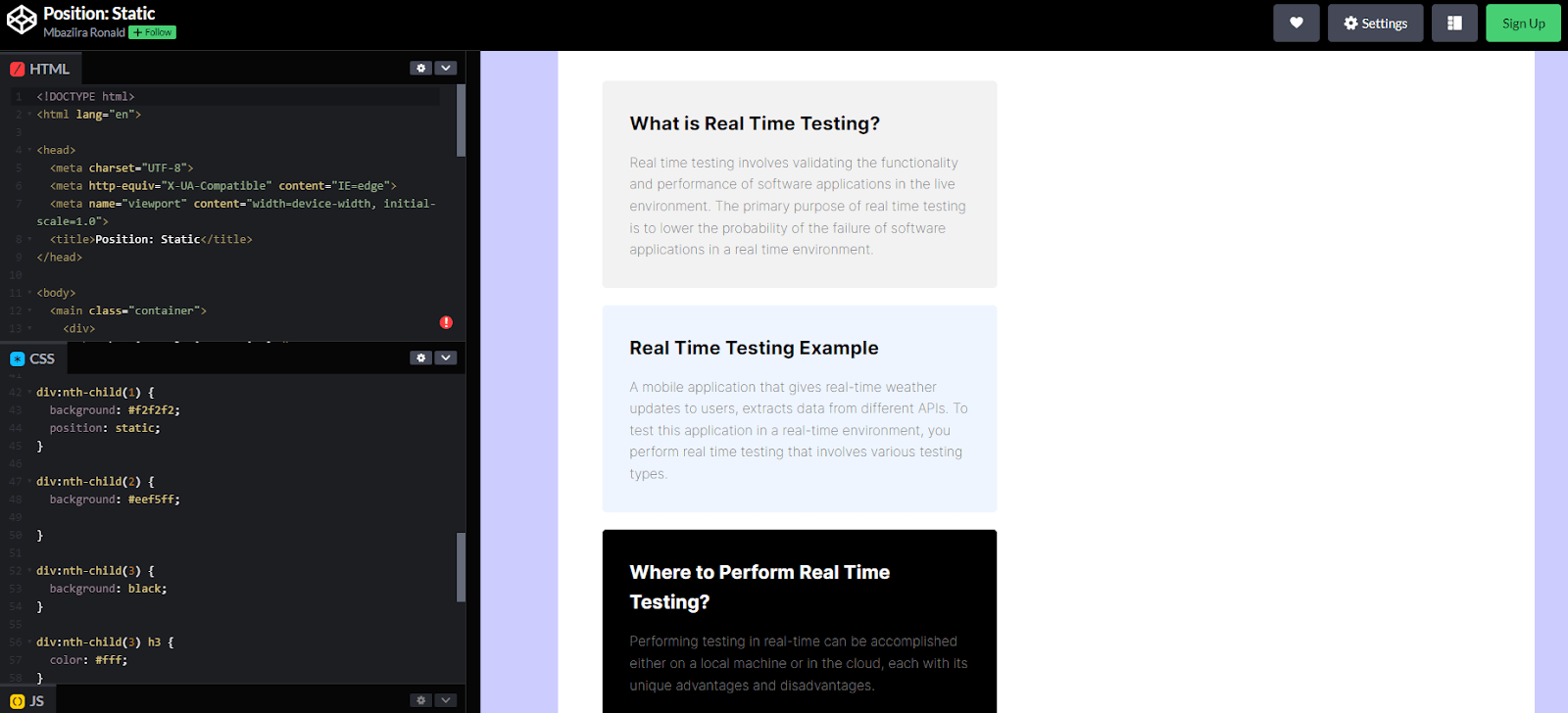
In the result above, we have given the first card a position value of static. This value doesn’t affect the card’s position; it keeps it in the document’s normal flow layout.
CSS Relative Positioning
When an element has a position value of relative, it stays in the normal flow. However, unlike static, the element’s position can be shifted using offset properties like bottom and right relative to itself. This means you can move the element relative to its original position.
It doesn’t affect the positions of other elements. Even when the relatively positioned element is shifted, nearby elements continue to behave as if they are still in their original place. Relative positioning is often used in combination with absolute positioning.
The example below illustrates how it works.
HTML:
1 2 3 4 5 6 7 8 9 10 11 12 13 14 15 16 17 18 19 20 21 22 23 24 25 26 27 28 29 30 31 32 33 34 35 36 37 38 39 40 41 42 43 44 45 46 47 48 49 50 |
<!DOCTYPE html> <html lang="en"> <head> <meta charset="UTF-8"> <meta http-equiv="X-UA-Compatible" content="IE=edge"> <meta name="viewport" content="width=device-width, initial-scale=1.0"> <title>Relative positioning</title> </head> <body> <main> <section> <div> <h2>Features To Accelerate Cross Browser Testing</h2> </div> <div class="cards"> <div class="card"> <img class="card-img" src="https://www.lambdatest.com/resources/images/automation/vector.svg" alt=""> <div class="card-lower-section"> <h3>Plugins & Extensions</h3> <p> Dedicated WordPress plugin and Chrome Extension to help you perform cross-browser testing and capture full-page screenshots. </p> </div> </div> <div class="card"> <img class="card-img" src="https://www.lambdatest.com/resources/images/automation/local.svg" alt=""> <div class="card-lower-section"> <h3>Test Locally hosted pages</h3> <p> Local hosted web testing to help you test in dev environments and save your website or app from after deployment bugs. </p> </div> </div> <div class="card"> <img class="card-img" src="https://www.lambdatest.com/resources/images/automation/globe.svg" alt=""> <div class="card-lower-section"> <h3>Geolocation testing</h3> <p> Test your website or mobile app from different geoIPs to make sure your users get the perfect experience across all locations. </p> </div> </div> </div> </section> </main> </body> </html> |
CSS:
1 2 3 4 5 6 7 8 9 10 11 12 13 14 15 16 17 18 19 20 21 22 23 24 25 26 27 28 29 30 31 32 33 34 35 36 37 38 39 40 41 42 43 44 45 46 47 48 49 50 51 52 53 54 55 56 57 58 59 60 61 62 63 64 65 66 |
*, *::before, *::after { margin: 0; padding: 0; box-sizing: border-box; } body { font-family: Inter, Arial, sans-serif; line-height: 1.7; background: rgb(243, 244, 245); min-height: 100vh; } section { padding: 4rem 4rem; } h2 { text-wrap: balance; text-align: center; margin-bottom: 4rem; font-size: 2.4rem; } .card { display: inline-block; background: #fff; padding: 3rem 3rem; width: 380px; border-radius: 0.75rem; } .card:not(:first-child) { margin-left: 2rem; } .card:nth-child(2) { position: relative; top: 200px; left: 0px; } .card-img { height: 60px; width: 60px; } .card h3 { font-size: 1.2rem; padding-bottom: 0.7rem; } .card-lower-section { padding-top: 1rem; } |
Result:
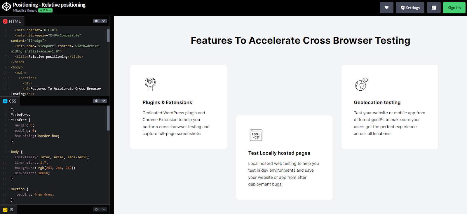
In the result above, we gave the middle card a relative position and pushed it 330px from the top. You can observe that even though the middle card is shifted, the other cards continue to behave as if the middle card is still in its original position.
Relative positioning is often combined with absolute positioning in use cases such as pop-ups and modal dialog boxes.
CSS Absolute Positioning
Absolutely positioned elements are removed from the document flow and occupy no space in the page layout. They are positioned relative to their nearest positioned ancestor. If no such ancestor exists, the element becomes relative to its initial containing block. The final position of the element depends on the values of the offset properties.
Uses of absolute positioning in combination with relative positioning include creating text or image overlays, popovers, modals, and tooltips.
In the example below, Xbox uses absolute positioning to place the game title over the image, creating an eye-catching design and saving space.
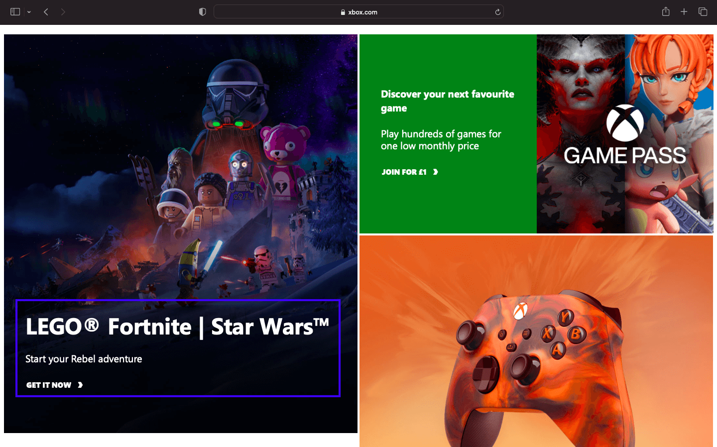
Source
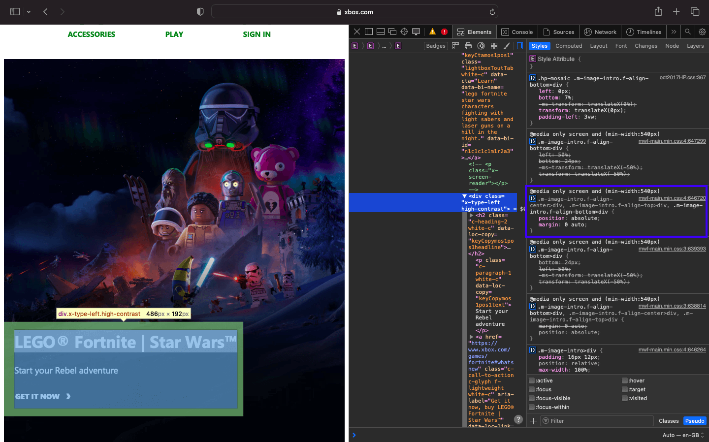
In the demo code below, you can see how to use absolute positioning to create a design effect similar to the one above but with blog cards.
HTML:
1 2 3 4 5 6 7 8 9 10 11 12 13 14 15 16 17 18 19 20 21 22 23 24 25 26 27 28 29 30 31 32 33 34 35 36 37 38 39 40 41 42 43 44 45 46 47 48 49 50 51 52 53 54 55 56 57 58 59 60 61 62 63 64 65 66 67 68 69 70 71 72 73 74 75 76 77 78 79 80 81 |
<!DOCTYPE html> <html lang="en"> <head> <meta charset="UTF-8"> <meta http-equiv="X-UA-Compatible" content="IE=edge"> <meta name="viewport" content="width=device-width, initial-scale=1.0"> <title>Absolute positioning</title> </head> <body> <header> <div class="nav-logo-container"> <div class="logo"> <img src="https://www.lambdatest.com/resources/images/logos/logo.svg" alt=""> </div> <nav> <ul> <li><a href="#">Platform</a></li> <li><a href="#">Enterprise</a></li> <li><a href="#">Resources</a></li> <li><a href="#">Developers</a></li> <li><a href="#">Pricing</a></li> </ul> </nav> </div> <div class="ctas"> <a class="login" href="#">Login</a> <button>Book a demo</button> <a class="get-started" href="#">Get started Free</a> </div> <svg xmlns="http://www.w3.org/2000/svg" fill="none" viewBox="0 0 24 24" stroke-width="1.5" stroke="currentColor" class="w-6 h-6"> <path stroke-linecap="round" stroke-linejoin="round" d="M3.75 6.75h16.5M3.75 12h16.5m-16.5 5.25h16.5" /> </svg> </header> <main> <div class="hero"> <h1>LambdaTest Learning Hub: Testing tutorials, guides, examples, and best practices</h1> <div class="categories"> <span>Recent</span> <span>Selenium</span> <span>Responsive</span> <span>Cross Browser Testing</span> <span>CI/CD</span> </div> </div> <!-- Cards --> <div class="cards"> <div class="card"> <img src="https://www.lambdatest.com/resources/images/performance-testing-tutorial-2.svg" alt="Docker Cypress" /> <div class="card-header"> <a class="title-link" href="#"> <h5>Performance Testing Tutorial</h5> </a> <span class="badge">17 Chapters</span> </div> <div class="card-body"> <p class="card-description"> Learn the importance of performance testing in software development, its process, and best practices for ensuring application stability, speed, and scalability. </p> </div> </div> <div class="card"> <img src="https://www.lambdatest.com/resources/images/cypress-docker-tutorial.svg" alt="Docker Cypress" /> <div class="card-header"> <a class="title-link" href="#"> <h5>Cypress Docker Tutorial</h5> </a> <span class="badge">10 Chapters</span> </div> <div class="card-body"> <p class="card-description"> The Cypress Docker Tutorial will help you learn how to simplify and streamline your testing process with Cypress and Docker. </p> </div> </div> </div> </div> </div> </main> </body> </html> |
CSS:
1 2 3 4 5 6 7 8 9 10 11 12 13 14 15 16 17 18 19 20 21 22 23 24 25 26 27 28 29 30 31 32 33 34 35 36 37 38 39 40 41 42 43 44 45 46 47 48 49 50 51 52 53 54 55 56 57 58 59 60 61 62 63 64 65 66 67 68 69 70 71 72 73 74 75 76 77 78 79 80 81 82 83 84 85 86 87 88 89 90 91 92 93 94 95 96 97 98 99 100 101 102 103 104 105 106 107 108 109 110 111 112 113 114 115 116 117 118 119 120 121 122 123 124 125 126 127 128 129 130 131 132 133 134 135 136 137 138 139 140 141 142 143 144 145 146 147 148 149 150 151 152 153 154 155 156 157 158 159 160 161 162 163 164 165 166 167 168 169 170 171 172 173 174 175 176 177 178 179 180 181 182 183 184 185 186 187 188 189 190 191 192 193 194 195 196 197 198 199 200 201 202 203 204 205 206 207 208 209 210 211 212 213 214 215 216 217 218 219 220 221 222 223 224 225 226 227 228 229 230 231 232 233 234 235 236 237 238 239 240 241 242 243 244 245 246 247 248 249 250 251 252 253 254 255 256 257 258 259 260 261 262 263 264 265 266 267 268 269 270 271 272 273 274 275 276 277 278 279 280 281 282 283 284 285 286 287 288 289 290 291 292 293 294 295 296 297 298 299 300 301 302 303 304 305 306 307 308 309 310 311 312 313 314 315 316 317 318 319 320 321 322 323 324 325 326 327 328 329 330 331 332 333 334 335 336 337 338 339 340 341 342 343 344 345 346 347 348 349 350 351 352 353 354 355 356 357 358 359 360 361 362 363 364 365 366 367 368 369 370 371 372 373 374 375 376 377 378 379 380 381 382 383 384 385 386 387 388 389 390 391 392 393 394 395 396 397 398 399 400 401 402 403 404 405 406 407 408 409 410 411 412 413 414 415 416 417 418 419 420 421 422 423 424 425 426 427 428 429 430 431 432 433 434 435 436 437 438 439 440 441 442 443 444 445 446 447 448 449 450 451 452 453 454 455 456 457 458 459 460 461 462 463 464 465 466 467 468 469 470 471 472 473 474 475 476 477 478 479 480 481 482 483 484 485 486 487 488 489 490 491 492 493 494 495 496 |
*, *::before, *::after { margin: 0; padding: 0; box-sizing: border-box; } body { font-family: Inter, Arial, sans-serif; background: #fff; line-height: 1.7; } :is(header, header nav ul, .nav-logo-container, .ctas) { display: flex; } header { height: 15vh; background: #fff; justify-content: space-between; align-items: center; padding: 0rem 4rem; box-shadow: 0px 4px 10px 0px rgba(100, 100, 111, 0.2); } header nav ul { gap: 2rem; } .nav-logo-container { gap: 4rem; } .logo { display: flex; align-items: center; } nav ul li { list-style: none; } a { text-decoration: none; color: #000; font-weight: 500; } ul li a:hover { color: #b9b9b9; } .ctas { align-items: center; gap: 2rem; } .ctas button { background: #fff; border: 2px solid blue; padding: 10px; font-size: 16px; border-radius: 3px; cursor: pointer; } .ctas .get-started { background: linear-gradient(91.88deg, #2c57f3 0.88%, #a506d8 98.71%); color: #fff; padding: 9px; border-radius: 3px; } svg { width: 60px; height: 40px; cursor: pointer; display: none; } .hero { padding: 4rem 4rem; background: #fdeded; text-align: center; line-height: 1.5; } .hero h1 { font-size: 2.4rem; padding-bottom: 2rem; text-wrap: balance; } .hero .categories { display: flex; justify-content: center; align-items: center; gap: 1.8rem; flex-wrap: wrap; } .categories .badge:first-child { outline: 1px solid #000; padding: 0.35rem 1.4rem; border-radius: 100px; } .cards { padding: 3rem 4rem; display: flex; gap: 2rem; flex-wrap: wrap; justify-content: center; } .card { border: 2px solid #88daff; border-radius: 1.2em; width: 320px; position: relative; } .card-header { background :rgba(136, 218, 255, 0.3); padding: 3rem 1.4rem; } .card img { position: absolute; top: -26px; left: 50%; transform: translateX(-50%); height: auto; width: 52px; } .title-link { text-decoration: none; font-weight: 500; line-height: 1.2; font-size: 1.8rem; color: #000; } .title-link:hover { text-decoration: underline; } .card-header h5 { margin: 0; padding-top: 0.8rem; padding-bottom: 0.3rem; } .card-header span { color: #fff; font-size: 0.8rem; background: #ffb500; padding: 0.3rem 0.6rem; border-radius: 50px; } .card-body { padding: 0.8rem 1.4rem; font-size: 0.95rem; } .card-description { font-weight: 400; font-family: Segoe UI, Roboto, Helvetica Neue; line-height: 1.5; } @media screen and (min-width: 320px) and (max-width: 1080px) { nav, .ctas { display: none; } svg { display: block; } } @media screen and (min-width: 320px) and (max-width: 720px) { .hero h1 { font-size: 1.8rem; } } @media screen and (min-width: 320px) and (max-width: 835px) { .card { width: 400px; } } |
Result:
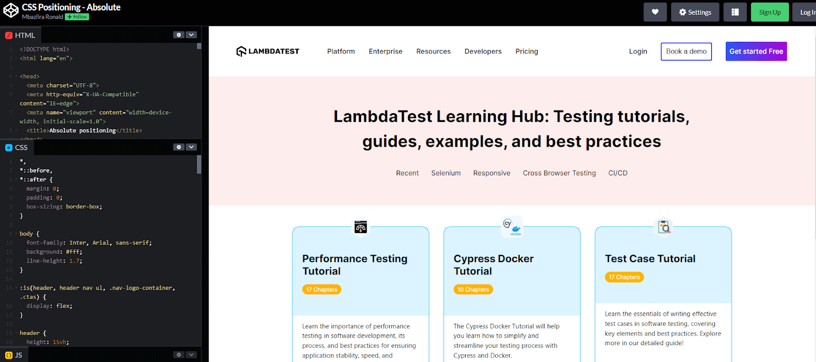
In the output above, we positioned the card images relative to their card container. We pushed the images halfway from the left and 26px above the top edge of the card container. Additionally, we added a transform of -50% on the x-axis to center the images horizontally.
The use of absolute positioning for the images makes the card content easily scannable. This allows readers to identify the subject matter of the content before even reading the card description, improving the overall user experience.
CSS Fixed Positioning
Fixed elements are removed from the normal document flow and positioned relative to the viewport. As a result, the element remains in the same position even when the user scrolls through the page, overlaying the normal flow content.
The element doesn’t occupy any space in the page layout, so it doesn’t affect the positions of other elements. Microsoft uses fixed positioning to show or hide its Back to Top button depending on the user’s scroll position. When the user scrolls halfway down the page, the button appears; above that point, the button is hidden.
This feature provides users an easy way to navigate back to the top of the page without having to scroll all the way.
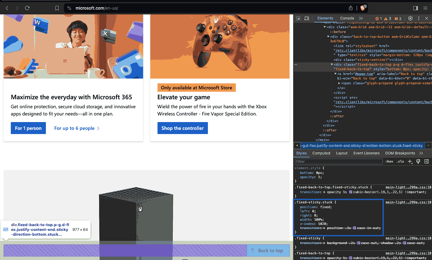
Source
In the demo code below, you can see how to use fixed positioning to create a design effect similar to the one above with the fixed position of the chat option.
HTML:
1 2 3 4 5 6 7 8 9 10 11 12 13 14 15 16 17 18 19 20 21 22 23 24 25 26 27 28 29 30 31 32 33 34 35 36 37 38 39 40 41 42 43 44 45 46 47 48 49 50 51 52 53 54 55 56 57 58 |
<!DOCTYPE html> <html lang="en"> <head> <meta charset="UTF-8"> <meta name="viewport" content="width=device-width, initial-scale=1.0"> <link rel="stylesheet" href="styles.css"> <title>CSS positioning - fixed</title> </head> <body> <main> <section class="title-and-description"> <h1>More Reasons To Love LambdaTest</h1> <p>Along with 3000+ browsers and devices combinations to test we provide you <br> additional features to make sure you give your users a perfect experience.</p> </section> <section class="cards"> <div class="card"> <img src="https://www.lambdatest.com/resources/images/headset.svg" alt=""> <div class="card-text-content"> <h3>24/7 Support</h3> <p> Got questions? Throw them to our 24/7 in-app customer <a href="https://www.lambdatest.com/#none">Chat support</a> or email us on <a href="mailto:support@lambdatest.com">support@lambdatest.com</a> </p> </div> </div> <div class="card"> <img src="https://www.lambdatest.com/resources/images/Integration-logo.svg" alt=""> <div class="card-text-content"> <h3>Third-Party Integrations</h3> <p> With a single click, push bugs in your choice of project management tools, directly from LambdaTest platform. </p> </div> </div> <div class="card"> <img src="https://www.lambdatest.com/resources/images/header/LambdaTest-Documentation.svg" alt=""> <div class="card-text-content"> <h3>Documentation</h3> <p> Step-by-step <a href="https://www.lambdatest.com/support/docs/supported-languages-and-frameworks/">documentation</a> for various test automation frameworks to help you run your first Selenium script. </p> </div> </div> </section> <!-- Section --> <section class="trust-section"> <div> <h2>The LambdaTest Trust</h2> <p>Helping you build trust with your customers is important to us and so is building trust with you. Having all the essential security, compliance and legal matters in a place is critical in protecting and the work we share.</p> </div> <img src="https://www.lambdatest.com/resources/images/ep_certified.png" alt=""> </section> <div class="fixed"> <img src="https://files.zohopublic.com/public/LiveDesk/download/1711619219542_556542000000002050?x-cli-msg=%7B%22x-siq-filetype%22%3A%22fsticker_online%22%2C%22x-siq-lsid%22%3A%22556542000000002050%22%2C%22x-siq-soid%22%3A%22715023981%22%2C%22x-siq-ispreview%22%3Afalse%2C%22x-siq-pfname%22%3A%22Chatbot%20from.png%22%2C%22x-siq-downloadtype%22%3A%22default%22%7D" alt=""> </div> </main> </body> </html> |
CSS:
1 2 3 4 5 6 7 8 9 10 11 12 13 14 15 16 17 18 19 20 21 22 23 24 25 26 27 28 29 30 31 32 33 34 35 36 37 38 39 40 41 42 43 44 45 46 47 48 49 50 51 52 53 54 55 56 57 58 59 60 61 62 63 64 65 66 67 68 69 70 71 72 73 74 75 76 77 78 79 80 81 82 83 84 85 86 87 88 89 90 91 92 93 94 95 96 97 98 99 100 101 102 103 104 105 106 107 108 109 110 111 112 113 |
*, *::before, *::after { margin: 0; padding: 0; box-sizing: border-box; } body { font-family: "Inter", sans-serif; font-size: 0.938; line-height: 1.6; font-weight: 400; letter-spacing: 0.013rem; color: #242424; } main { min-height: 100vh; padding: 4rem; display: flex; justify-content: center; align-items: center; flex-direction: column; gap: 5rem; background: #eef5ff; } .title-and-description { text-align: center; writing-mode: horizontal-tb; } .title-and-description h1 { font-size: 2.4rem; } .cards { display: grid; grid-template-columns: repeat(auto-fit, minmax(300px, 1fr)); gap: 1rem; } .card { background-color: #fff; padding: 3rem; display: flex; flex-direction: column; align-items: center; gap: 2rem; } .card a { color: #2563eb; } .card-text-content { text-align: center; } .card-text-content h3 { font-weight: 500; } .card-text-content p { color: rgb(75 85 99); } .trust-section { background: #fff; width: 100vw; display: flex; align-items: center; padding: 2rem 6rem; gap: 2rem; } .trust-section div { display: flex; flex-direction: column; gap: 2rem; } .trust-section div h2 { font-size: 2.5rem; } .trust-section img { width: 1800px; height: 400px; } .fixed { position: fixed; bottom: 10px; right: 10px; cursor: pointer; } |
Result:
From the output above, as you scroll on the page, the chat icon remains in the right corner at the specified position. The chat icon is always visible, fixed in one place, and accessible to users needing help via chat support.
CSS Sticky Positioning
A stickily positioned element remains part of the normal document flow until the user scrolls to a specific point defined by the offset properties of the top, right, bottom, and left. When the user scrolls to that point, the element becomes fixed and remains visible as the user scrolls.
The sticky positioned element is treated as though it is relatively positioned until it reaches the defined point, which becomes fixed. Sticky positioning creates sticky UI features like sidebars, site headers, and table headers.
For example, CodePen uses sticky positioning to keep the navigation sidebar visible to users as they scroll down the page. This ensures the navigation panel remains accessible, making it easier for users to move around the website.
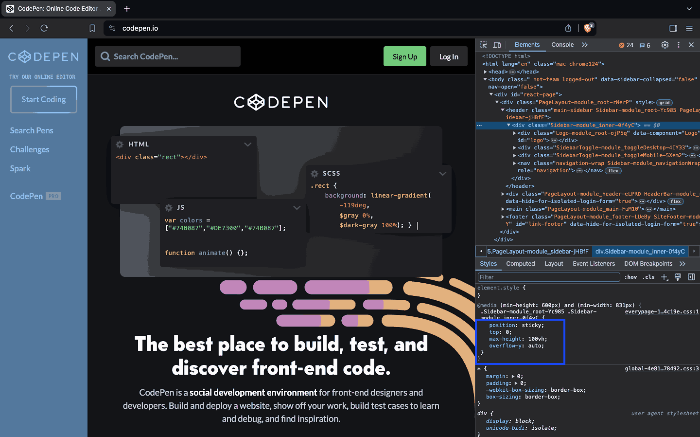
Source
Let’s see how it works by creating a sticky header in the demo below.
HTML:
1 2 3 4 5 6 7 8 9 10 11 12 13 14 15 16 17 18 19 20 21 22 23 24 25 26 27 28 29 30 31 32 33 34 35 36 37 38 39 40 41 42 43 44 45 46 47 48 49 50 51 52 53 54 55 56 57 58 59 60 61 62 63 64 65 66 67 68 69 70 71 72 73 74 75 76 77 78 79 80 81 82 83 84 85 86 87 88 89 90 91 92 93 94 95 96 97 98 99 100 101 102 103 104 105 106 107 108 109 110 111 112 113 114 115 116 117 118 119 120 121 122 123 124 125 126 127 128 129 130 131 132 133 134 135 136 137 138 139 |
<!DOCTYPE html> <html lang="en"> <head> <meta charset="UTF-8"> <meta http-equiv="X-UA-Compatible" content="IE=edge"> <meta name="viewport" content="width=device-width, initial-scale=1.0"> <link rel="stylesheet" href="styles.css"> <title>Position sticky</title> </head> <body> <header class="sticky-header"> <div class="nav-logo-container"> <div class="logo"> <img src="https://www.lambdatest.com/resources/images/logos/logo.svg" alt=""> </div> <nav> <ul> <li><a href="#">Platform</a></li> <li><a href="#">Enterprise</a></li> <li><a href="#">Resources</a></li> <li><a href="#">Developers</a></li> <li><a href="#">Pricing</a></li> </ul> </nav> </div> <div class="ctas"> <a class="login" href="#">Login</a> <button>Book a demo</button> <a class="get-started" href="#">Get started Free</a> </div> <svg class="hamburger" xmlns="http://www.w3.org/2000/svg" fill="none" viewBox="0 0 24 24" stroke-width="1.5" stroke="currentColor" class="w-6 h-6"> <path stroke-linecap="round" stroke-linejoin="round" d="M3.75 6.75h16.5M3.75 12h16.5m-16.5 5.25h16.5" /> </svg> </header> <main> <!-- Challenges faced by enterprises --> <section class="challenges"> <h2>Challenges Faced By Enterprises</h2> <div class="cards"> <div class="card"> <img class="card-img" src="https://www.lambdatest.com/resources/images/eee-complex.svg" alt=""> <div class="card-lower-section"> <h3>Complex Test Environments</h3> <p> Heterogeneous applications, multiple test automation frameworks (Selenium, TOSCA Playwright, TestComplete, Cypress, etc.) COTS apps (SFDC, SAP, Simulators etc.) </p> </div> </div> <div class="card"> <img class="card-img" src="https://www.lambdatest.com/resources/images/eee-vulner.svg" alt=""> <div class="card-lower-section"> <h3>Vulnerable Test Environments</h3> <p> For regulated industries such as FSI, Healthcare, etc., R&D departments public test cloud infrastructure is a deterrent. </p> </div> </div> <div class="card"> <img class="card-img" src="https://www.lambdatest.com/resources/images/eee-automation.svg" alt=""> <div class="card-lower-section"> <h3>Automation slows down at scale</h3> <p> Complexity and cost of managing in-house test infrastructure increases exponentially at high concurrency. Also impacting release velocity. </p> </div> </div> </div> </section> <!-- Why Enterprises Love LambdaTest? --> <section> <h2>Why Enterprises Love LambdaTest?</h2> <div class="cards-2"> <div class="card-2"> <img class="card-img" src="https://www.lambdatest.com/resources/images/single_sign_on.svg" alt=""> <div class="card-lower-section"> <h3>Single Sign-On</h3> <p> Easily enable Single Sign-On (SSO). Integrate LambdaTest with identity and access management tools Okta, Active Directory, and OneLogin to seamlessly onboard your teams. </p> </div> </div> <div class="card-2"> <img class="card-img" src="https://www.lambdatest.com/resources/images/multi_channel.svg" alt=""> <div class="card-lower-section"> <h3>Multi-channel Support</h3> <p> Access our free in-product training modules, detailed support documentation, learning hub resources, connect with your dedicated account manager or leverage our 24x7 customer support to quickly get up to speed and experience our platform’s full potential. </p> </div> </div> <div class="card-2"> <img class="card-img" src="https://www.lambdatest.com/resources/images/powerful_integrations.svg" alt=""> <div class="card-lower-section"> <h3>Powerful Integrations</h3> <p> From CI/CD, project management, codeless automation to test management and reporting tools, we’ve got them all. Our 120+ out-of-the-box integrations will ensure increased productivity and seamless collaboration between your teams. </p> </div> </div> <div class="card-2"> <img class="card-img" src="https://www.lambdatest.com/resources/images/tailor_made.svg" alt=""> <div class="card-lower-section"> <h3>Tailor-made Plans to Suit Your Needs</h3> <p> Every business has unique requirements and we understand that. Businesses can pick and choose the features they want. No questions asked. </p> </div> </div> <div class="card-2"> <img class="card-img" src="https://www.lambdatest.com/resources/images/high_perfromance.svg" alt=""> <div class="card-lower-section"> <h3>High Performance Infrastructure</h3> <p> Our VMs are designed to be single-use to ensure the perfect testing conditions each time. No need to depend on expensive and daunting-to-maintain in-house infrastructure anymore! </p> </div> </div> <div class="card-2"> <img class="card-img" src="https://www.lambdatest.com/resources/images/ep_insights.svg" alt=""> <div class="card-lower-section"> <h3>Actionable Insights</h3> <p> Gain access to comprehensive reports on test runs, browser and OS coverage, platform utilization, execution logs, and videos, among others. Integrate with the analytics tool of your choice to create your own insight report. </p> </div> </div> </div> </section> </main> <script src="script.js"></script> </body> </html> |
CSS:
1 2 3 4 5 6 7 8 9 10 11 12 13 14 15 16 17 18 19 20 21 22 23 24 25 26 27 28 29 30 31 32 33 34 35 36 37 38 39 40 41 42 43 44 45 46 47 48 49 50 51 52 53 54 55 56 57 58 59 60 61 62 63 64 65 66 67 68 69 70 71 72 73 74 75 76 77 78 79 80 81 82 83 84 85 86 87 88 89 90 91 92 93 94 95 96 97 98 99 100 101 102 103 104 105 106 107 108 109 110 111 112 113 114 115 116 117 118 119 120 121 122 123 124 125 126 127 128 129 130 131 132 133 134 135 136 137 138 139 140 141 142 143 144 145 146 147 148 149 150 151 152 153 154 155 156 157 158 159 160 161 162 163 164 165 166 167 168 169 170 171 172 173 174 175 176 177 178 179 180 181 182 183 184 185 186 187 188 |
*, *::before, *::after { margin: 0; padding: 0; box-sizing: border-box; } html { scroll-behavior: smooth; } body { font-family: Inter, Arial, sans-serif; background: #fff; line-height: 1.7; } :is(header, header nav ul, .nav-logo-container, .ctas) { display: flex; } header { height: 15vh; background: rgb(243, 244, 245); justify-content: space-between; align-items: center; padding: 0rem 4rem; position: sticky; top: 0; } .show { box-shadow: 0px 4px 10px 0px rgba(100, 100, 111, 0.2); background: #fff; } header nav ul { gap: 2rem; } .nav-logo-container { gap: 4rem; } .logo { display: flex; align-items: center; } nav ul li { list-style: none; } a { text-decoration: none; color: #000; font-weight: 500; } ul li a:hover { color: #b9b9b9; } .ctas { align-items: center; gap: 2rem; } .ctas button { background: #fff; border: 2px solid blue; padding: 10px; font-size: 1rem; border-radius: 3px; cursor: pointer; } .ctas .get-started { background: linear-gradient(91.88deg, #2c57f3 0.88%, #a506d8 98.71%); color: #fff; padding: 9px; border-radius: 3px; } svg { width: 60px; height: 40px; cursor: pointer; display: none; } .card-img { height: 50px; width: 50px; } section { padding: 4rem 4rem; } .challenges { background: rgb(243, 244, 245); } h2 { text-align: center; margin-bottom: 4rem; text-wrap: balance; font-size: 2.5rem; } .cards { display: flex; justify-content: center; gap: 2rem; flex-wrap: wrap; } .cards > .card { background: #fff; padding: 3rem 3rem; } .cards .card p { color: rgb(102, 102, 102); } .card { width: 380px; border-radius: 0.75rem; } .card h3 { font-size: 1.5rem; } .card-lower-section { padding-top: 1rem; } .cards-2 { display: grid; grid-template-columns: repeat(auto-fit, minmax(300px, 1fr)); row-gap: 6rem; column-gap: 5rem; } @media screen and (min-width: 320px) and (max-width: 1080px) { nav, .ctas { display: none; } .hamburger { display: block; } } |
JavaScript:
|
|
const stickyHeader = document.querySelector('.sticky-header'); window.addEventListener('scroll', () => { window.scrollY > 100 ? stickyHeader.classList.add('show') : stickyHeader.classList.remove('show'); }); |
Result :
In the above result, we created a sticky header that remains stationed at the top as the user scrolls down the website. When the user scrolls past 100px from the top, the header is given a box shadow and changes its background.
The sticky header enhances content accessibility by providing uninterrupted navigation. Because it provides convenient access to navigation options, it silently encourages users to interact with the CTAs and explore additional content.
To learn more about the sticky position in CSS, its use cases, and its limitations, follow this guide on CSS position sticky and learn how to use the sticky position effectively.
CSS Flexbox Layout
When CSS float and positioning were the primary methods for creating web layouts, developers encountered limitations with these approaches.
One major limitation was the inability to create children nodes of a container that take an equal amount of available width and height, regardless of the available space. Another significant limitation was the challenge of vertically centering content inside its container.
To solve the limitations mentioned above and other similar issues, the Flexbox layout model was created. CSS Flexbox layout is a one-dimensional (1D) module part of CSS3. It is one-dimensional because it fundamentally deals with arranging, aligning, and distributing elements along one axis, horizontally(along a row) or vertically(along a column).
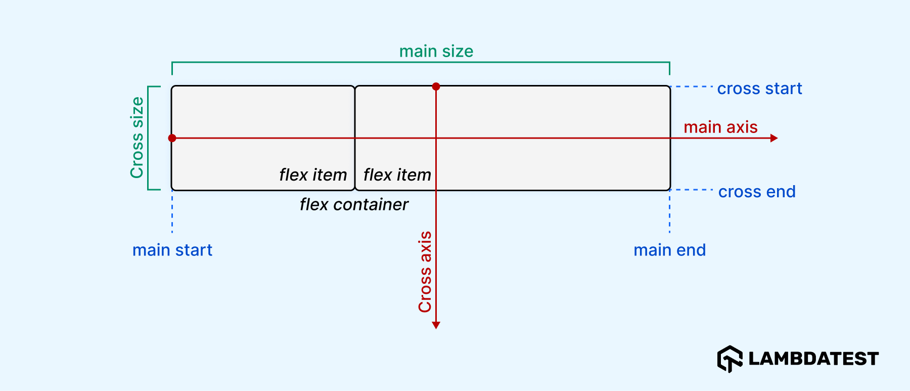
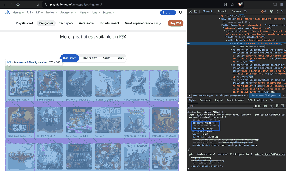
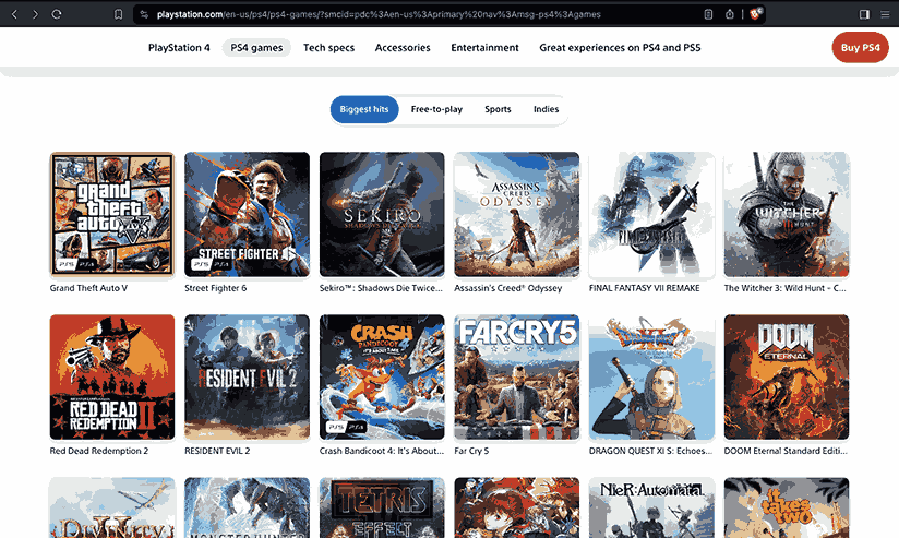
PlayStation utilizes CSS Flexbox to create a responsive gallery of cards for its “Biggest Hits” games tab. The cards are designed to be the same height and adapt to different screen sizes by wrapping them onto the next line when necessary.
Source
Terminology:
As you learn about the Flexbox layout, you must familiarize yourself with its terminology to understand it properly.
| Term
|
Meaning
|
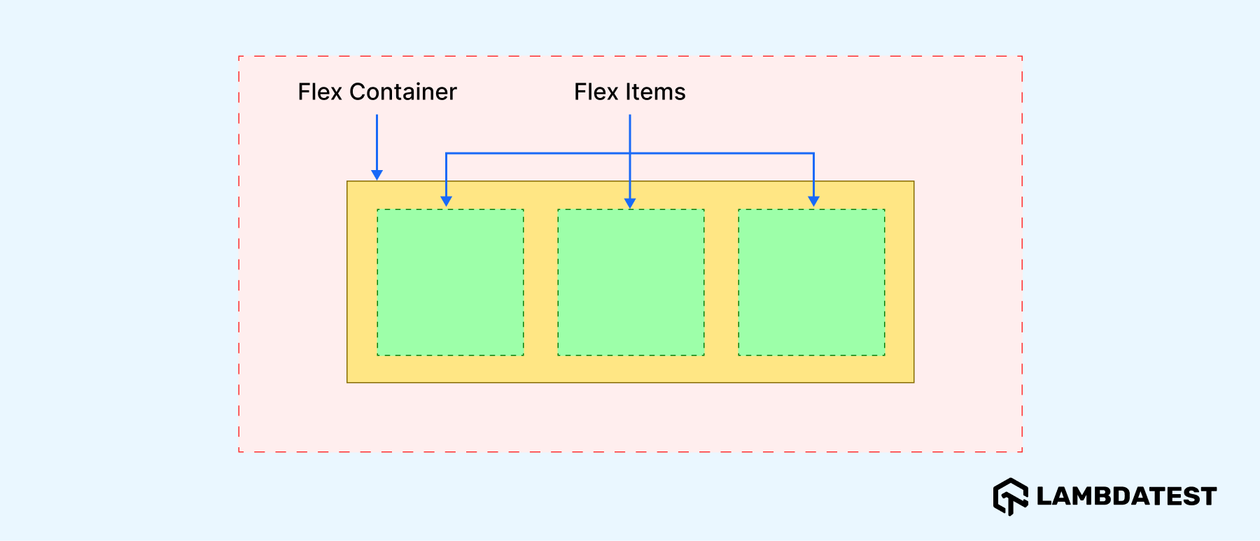
| flex container
|
It is an element whose display value is flex.
|
| flex items
|
These are the children/items of a flex container. They are laid out as flexible boxes.
|
| main axis
|
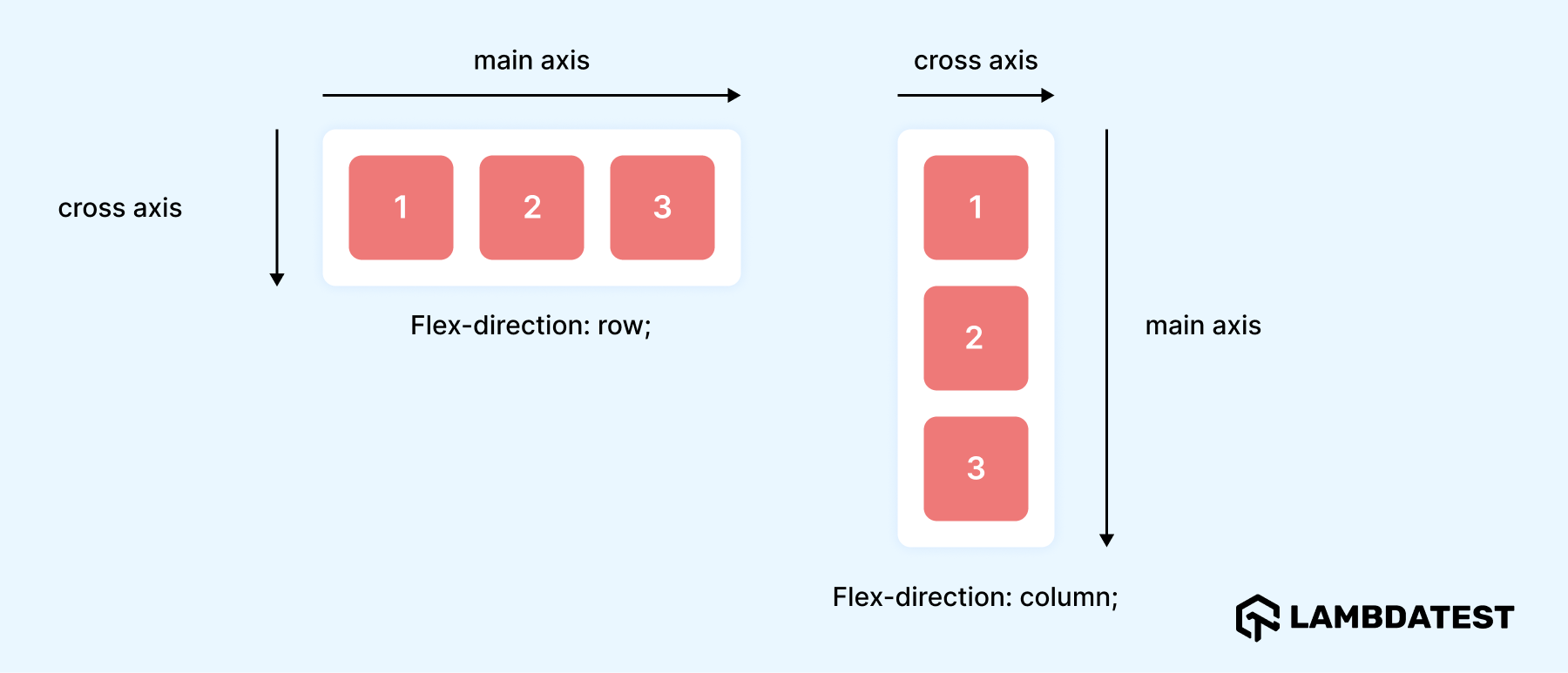
This is the axis along which the flex items are laid out. The side of this axis varies depending on whether the flex container is a row or column. The start and end of the axis are the main start and main end.
|
| cross axis
|
This is the axis perpendicular to the flex items layout direction (It intersects the main axis at 90°). Its start and end are cross start and cross end.
|
As we now understand CSS Flexbox terminologies better, let us learn more about Flexbox properties in detail below.
CSS Flexbox Properties
These can be divided into two, parent and child properties. Parent properties apply to the flex container, while child properties apply to flex items.
Parent Properties
Below are some of Flexbox’s parent properties and what they do.
| Flex Container Properties (Parent)
|
Roles
|
| display
|
It makes a container a flex container, and its children flex items. It can be block or inline depending on the value given.
display: flex | inline-flex;
|
| flex-direction
|
Defines the direction of the main axis in a flex container. In simpler terms, it specifies whether the flex items should be laid out in a row or column and the direction in which they flow. By default, the value is set to row.
flex-direction: row | row-reverse | column | column-reverse;
|
| flex-wrap
|
Defines whether flex items are forced to wrap onto the next line. Its default value is nowrap.
flex-wrap: nowrap | wrap | wrap-reverse;
|
| justify-content
|
Defines how space is distributed between and around the flex items along the main axis.
justify-content: space-between | space-around | space-evenly | stretch | flex-start | flex-end ... + safe;
|
| align-items
|
Defines the alignment of items along the cross axis.
align-items: stretch | start | center | end | flex-start | flex-end ... + safe;
|
| gap
|
It sets the gap between rows and columns. It is a short-hand for row-gap and column-gap.
gap: row-gap, column-gap;
|
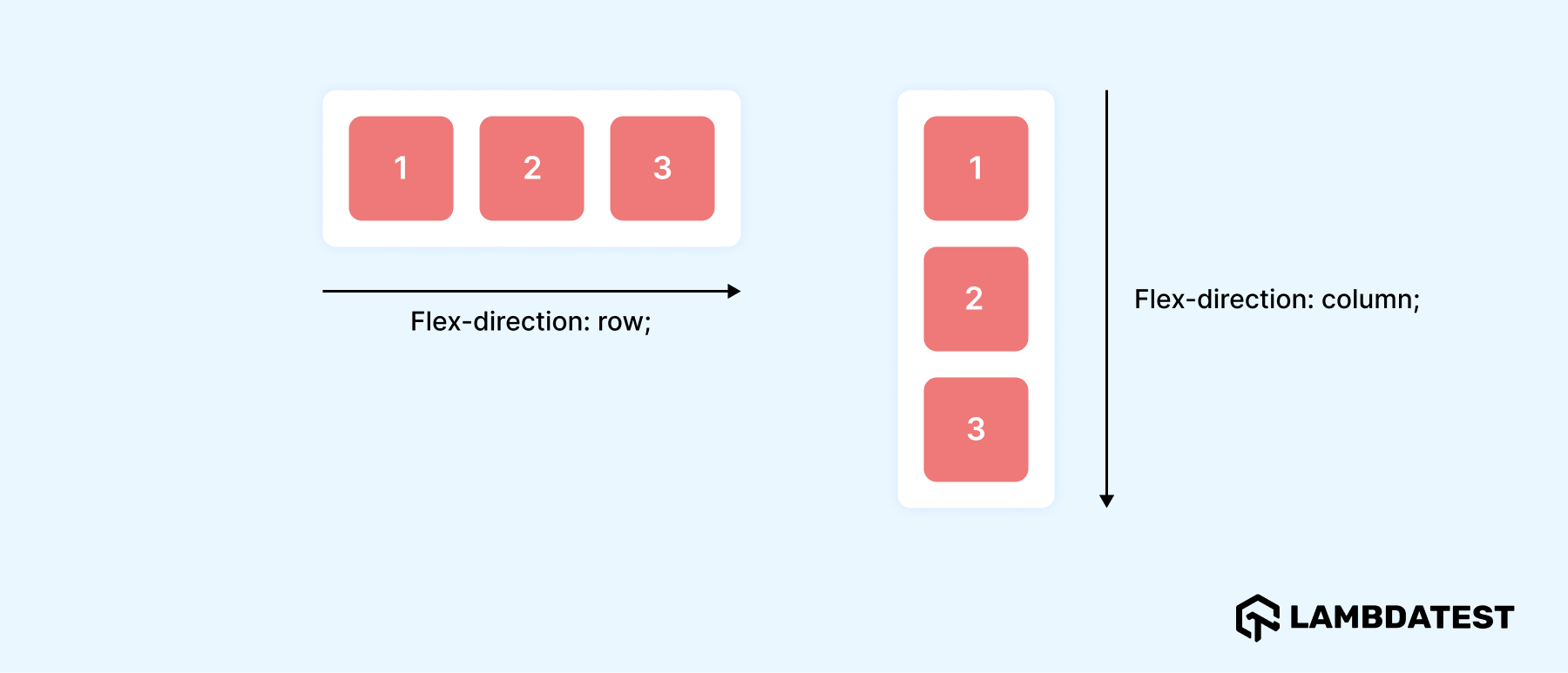
The image below demonstrates how flex items flow based on the flex-direction property.
Child Properties
Below are some of Flexbox’s child properties and what they do.
| Flex Container Properties (Child)
|
Role
|
| order
|
Defines the order in which flex items appear in the flex container. By default, the items flow in their normal order as is in the HTML code.
order: <integer>;
|
| flex-grow
|
Defines the growth factor of a flex item. In other words, it defines how much a flex item can grow (the space it should fill up) in the container. The default value is 0.
flex-grow: <number>;
|
| flex-shrink
|
defines the shrink factor of a flex item (by how much an item can shrink). The default value is 1.
flex-shrink: <number>;
|
| flex-basis
|
Defines the initial main size of a flex item.
|
| flex
|
It’s a shorthand property for flex-grow, flex-shrink and flex-basis.
flex: none | [ <'flex-grow'> <'flex-shrink'>? || <'flex-basis'> ]
|
| align-self
|
The value of this property overrides the align-items value but for the individual flex items.
|
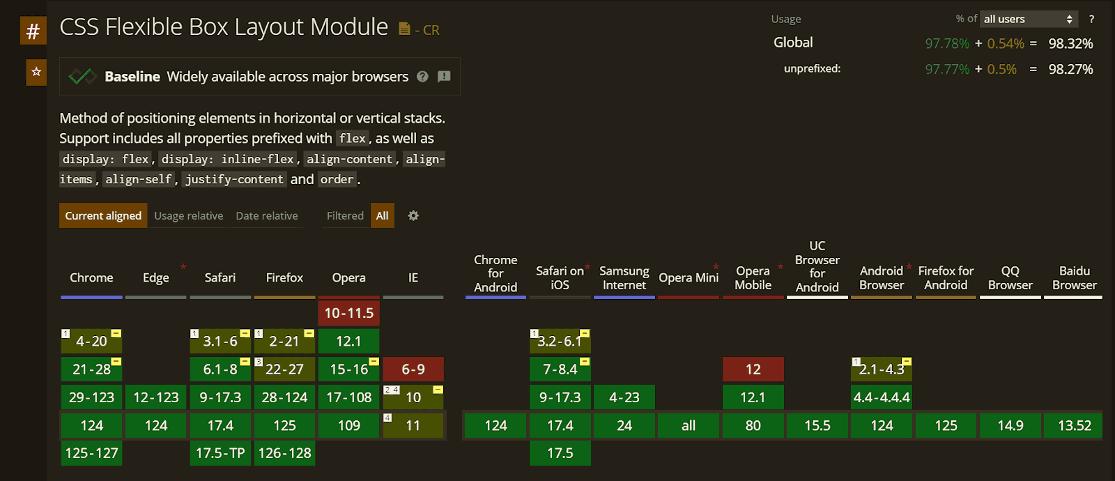
Flexbox layout has wide support across modern browsers, making it a dependable choice for creating flexible layouts.
Here’s an illustration detailing its support:
Source
Flexbox is one of the most widely used layout modes in CSS. In a survey conducted on X (formerly Twitter), 84% of the 88 participants reported using Flexbox to create layouts. This high percentage reflects the significant share Flexbox has in terms of layout method usage.
With that in mind, the demo code below illustrates the usage of Flexbox with responsive capabilities.
HTML:
1 2 3 4 5 6 7 8 9 10 11 12 13 14 15 16 17 18 19 20 21 22 23 24 25 26 27 28 29 30 31 32 33 34 35 36 37 38 39 40 41 42 43 44 45 46 47 48 49 50 51 52 53 54 55 56 57 58 59 60 61 62 63 64 65 66 67 68 69 70 71 72 73 74 75 76 77 78 79 80 81 82 83 84 85 86 87 88 89 90 91 92 93 94 95 96 97 98 99 100 101 102 103 104 105 106 107 108 109 110 111 112 113 114 115 116 117 118 119 120 121 122 123 124 125 126 127 128 129 130 131 |
<!DOCTYPE html> <html lang="en"> <head> <meta charset="UTF-8"> <meta http-equiv="X-UA-Compatible" content="IE=edge"> <meta name="viewport" content="width=device-width, initial-scale=1.0"> <title>CSS Layouts - Flex</title> </head> <body> <header> <div class="nav-logo-container"> <div class="logo"> <img src="https://www.lambdatest.com/resources/images/logos/logo.svg" alt=""> </div> <nav> <ul> <li><a href="#">Platform</a></li> <li><a href="#">Enterprise</a></li> <li><a href="#">Resources</a></li> <li><a href="#">Developers</a></li> <li><a href="#">Pricing</a></li> </ul> </nav> </div> <div class="ctas"> <a class="login" href="#">Login</a> <button>Book a demo</button> <a class="get-started" href="#">Get started Free</a> </div> <svg xmlns="http://www.w3.org/2000/svg" fill="none" viewBox="0 0 24 24" stroke-width="1.5" stroke="currentColor" class="w-6 h-6"> <path stroke-linecap="round" stroke-linejoin="round" d="M3.75 6.75h16.5M3.75 12h16.5m-16.5 5.25h16.5" /> </svg> </header> <main> <div class="hero"> <h1>LambdaTest Learning Hub: Testing tutorials, guides, examples, and best practices</h1> <div class="categories"> <span>Recent</span> <span>Selenium</span> <span>Responsive</span> <span>Cross Browser Testing</span> <span>CI/CD</span> </div> </div> <!-- Cards --> <div class="cards"> <div class="card"> <div class="card-header"> <img src="https://www.lambdatest.com/resources/images/performance-testing-tutorial-2.svg" alt="Docker Cypress" height="48px" /> </div> <div class="card-body"> <div class="body-upper"> <a class="title-link" href="#"> <h5>Performance Testing Tutorial</h5> </a> <span class="badge">17 Chapters</span> </div> <p class="card-description"> Learn the importance of performance testing in software development, its process, and best practices for ensuring application stability, speed, and scalability. </p> </div> </div> <div class="card"> <div class="card-header"> <img src="https://www.lambdatest.com/resources/images/cypress-docker-tutorial.svg" alt="Docker Cypress" height="48px" /> </div> <div class="card-body"> <div class="body-upper"> <a class="title-link" href="#"> <h5>Cypress Docker Tutorial</h5> </a> <span class="badge">10 Chapters</span> </div> <p class="card-description"> The Cypress Docker Tutorial will help you learn how to simplify and streamline your testing process with Cypress and Docker. </p> </div> </div> <div class="card"> <div class="card-header"> <img src="https://www.lambdatest.com/resources/images/test-case-logo.svg" alt="Docker Cypress" height="48px" /> </div> <div class="card-body"> <div class="body-upper"> <a class="title-link" href="#"> <h5>Test Case Tutorial</h5> </a> <span class="badge">17 Chapters</span> </div> <p class="card-description"> Learn the essentials of writing effective test cases in software testing, covering key elements and best practices. Explore more in our detailed guide! </p> </div> </div> <div class="card"> <div class="card-header"> <img src="https://www.lambdatest.com/resources/images/software-testing-logo.svg" alt="Docker Cypress" height="48px" /> </div> <div class="card-body"> <div class="body-upper"> <a class="title-link" href="#"> <h5>Software Testing Tutorial</h5> </a> <span class="badge">19 Chapters</span> </div> <p class="card-description"> Software testing ensures software works as intended, finding and fixing errors before users encounter them. Explore its phases, importance, tools, and more. </p> </div> </div> <div class="card"> <div class="card-header"> <img src="https://www.lambdatest.com/resources/images/model-based-testing-logo.svg" alt="Docker Cypress" height="48px" /> </div> <div class="card-body"> <div class="body-upper"> <a class="title-link" href="#"> <h5>Modal-Based Testing</h5> </a> <span class="badge">12 Chapters</span> </div> <p class="card-description"> In this comprehensive guide, we will explore model-based testing in detail with some examples and best practices. </p> </div> </div> </div> </main> </body> </html> |
CSS:
1 2 3 4 5 6 7 8 9 10 11 12 13 14 15 16 17 18 19 20 21 22 23 24 25 26 27 28 29 30 31 32 33 34 35 36 37 38 39 40 41 42 43 44 45 46 47 48 49 50 51 52 53 54 55 56 57 58 59 60 61 62 63 64 65 66 67 68 69 70 71 72 73 74 75 76 77 78 79 80 81 82 83 84 85 86 87 88 89 90 91 92 93 94 95 96 97 98 99 100 101 102 103 104 105 106 107 108 109 110 111 112 113 114 115 116 117 118 119 120 121 122 123 124 125 126 127 128 129 130 131 132 133 134 135 136 137 138 139 140 141 142 143 144 145 146 147 148 149 150 151 152 153 154 155 156 157 158 159 160 161 162 163 164 165 166 167 168 169 170 171 172 173 174 175 176 177 178 179 180 181 182 183 184 185 186 187 188 189 190 191 192 193 194 195 196 197 198 199 200 201 202 203 204 205 206 207 208 209 210 211 212 213 214 215 216 217 218 219 220 221 222 223 224 225 |
*, *::before, *::after { margin: 0; padding: 0; box-sizing: border-box; } body { font-family: Inter, Arial, sans-serif; background: #fff; line-height: 1.7; } :is(header, header nav ul, .nav-logo-container, .ctas) { display: flex; } header { height: 15vh; background: #fff; justify-content: space-between; align-items: center; padding: 0rem 4rem; box-shadow: 0px 4px 10px 0px rgba(100, 100, 111, 0.2); } header nav ul { gap: 2rem; } .nav-logo-container { gap: 4rem; } .logo { display: flex; align-items: center; } nav ul li { list-style: none; } a { text-decoration: none; color: #000; font-weight: 500; } ul li a:hover { color: #b9b9b9; } .ctas { align-items: center; gap: 2rem; } .ctas button { background: #fff; border: 2px solid blue; padding: 10px; font-size: 16px; border-radius: 3px; cursor: pointer; } .ctas .get-started { background: linear-gradient(91.88deg, #2c57f3 0.88%, #a506d8 98.71%); color: #fff; padding: 9px; border-radius: 3px; } svg { width: 60px; height: 40px; cursor: pointer; display: none; } .hero { padding: 4rem 4rem; background: #fdeded; text-align: center; line-height: 1.5; } .hero h1 { font-size: 2.4rem; text-wrap: balance; padding-bottom: 2rem; } .hero .categories { display: flex; justify-content: center; align-items: center; gap: 1.8rem; flex-wrap: wrap; } .categories span:first-child { outline: 1px solid #000; padding: 0.35rem 1.4rem; border-radius: 100px; } .cards { padding: 3rem 4rem; display: flex; gap: 2rem; flex-wrap: wrap; justify-content: center; } .card { border: 1px solid #ccc; border-radius: 1.2em; flex: 320px; } .card-header { text-align: center; background: rgba(33, 37, 41, 0.03); border-bottom: 1px solid #ccc; padding: 6px 0; } .card-body { padding: 0.8rem 1.4rem; font-size: 0.95rem; } .body-upper { padding-bottom: 1rem; } .title-link { text-decoration: none; font-weight: 500; line-height: 1.2; font-size: 1.25rem; color: #000; } .title-link:hover { text-decoration: underline; } .card-body h5 { margin: 0; padding-top: 0.8rem; padding-bottom: 0.3rem; } .card-body span { color: #fff; font-size: 0.8rem; background: #ffb500; padding: 0.3rem 0.6rem; border-radius: 50px; } .card-description { font-weight: 400; font-family: Segoe UI, Roboto, Helvetica Neue; line-height: 1.5; color: #505050; } @media screen and (min-width: 320px) and (max-width: 1080px) { nav, .ctas { display: none; } svg { display: block; } } @media screen and (min-width: 320px) and (max-width: 720px) { .hero h1 { font-size: 1.8rem; } } @media screen and (min-width: 320px) and (max-width: 835px) { .card { flex: 400px; } } |
Result:
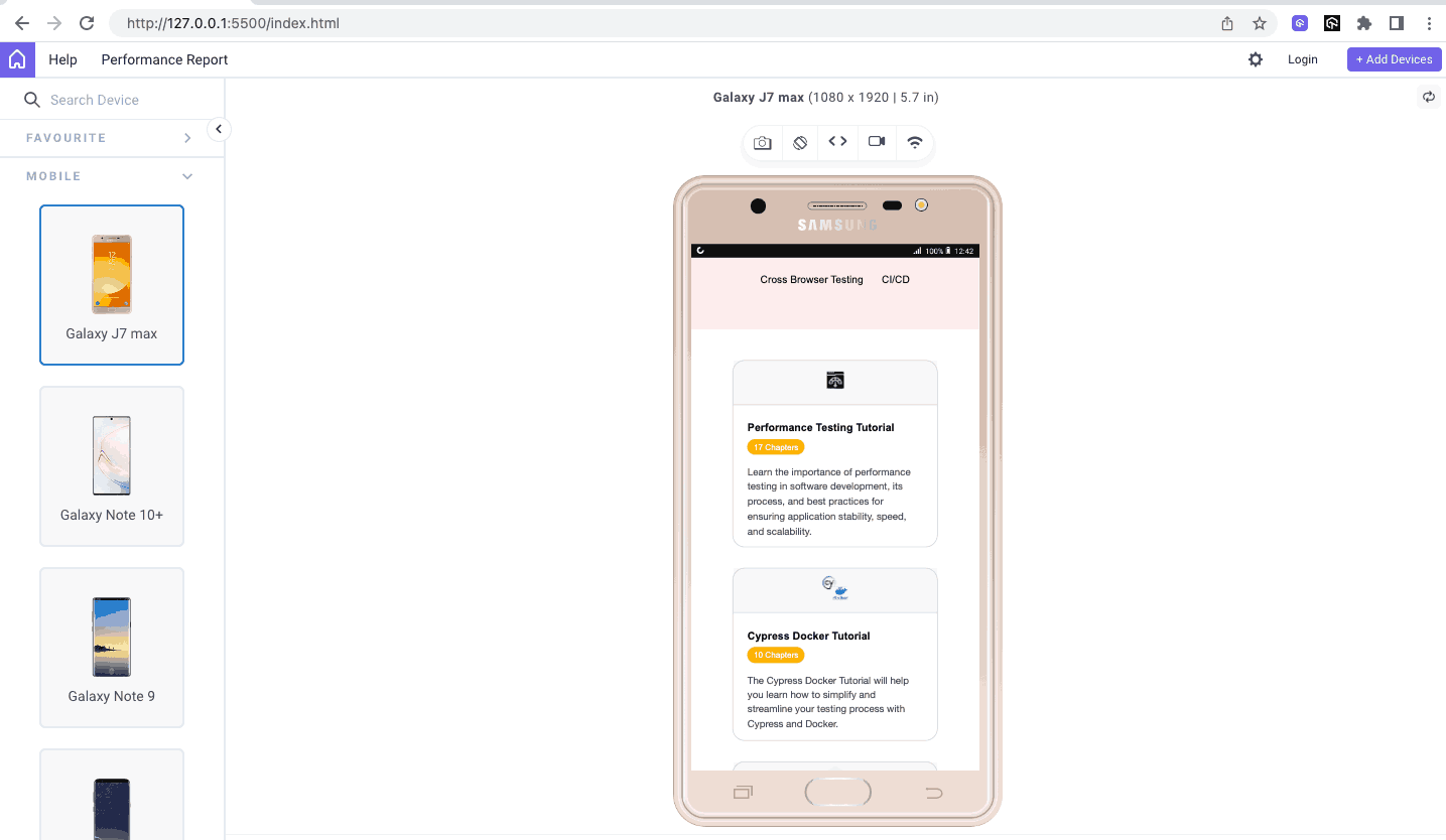
In the above output, two things mainly stand out. One, all the blog cards are of the same height, and two, the cards wrap onto the next line as the space containing them shrinks. Those came about mainly because of two properties:flex and flex-wrap.
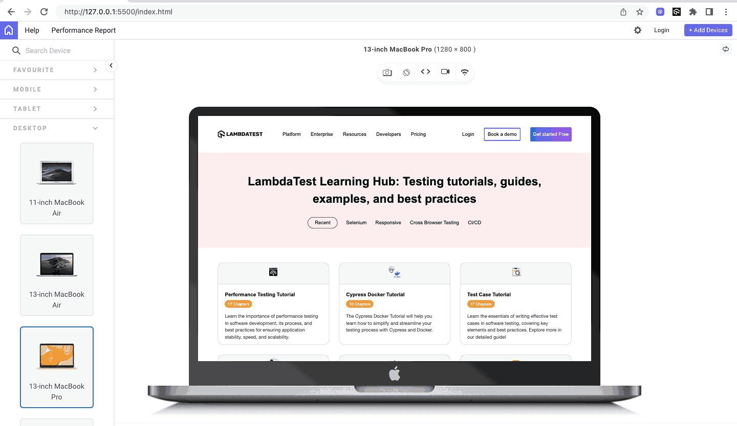
Let’s preview on desktop, tablet, and mobile through the lens of the common devices we use as they speak a clearer picture.
Desktop View:
Tablet View:
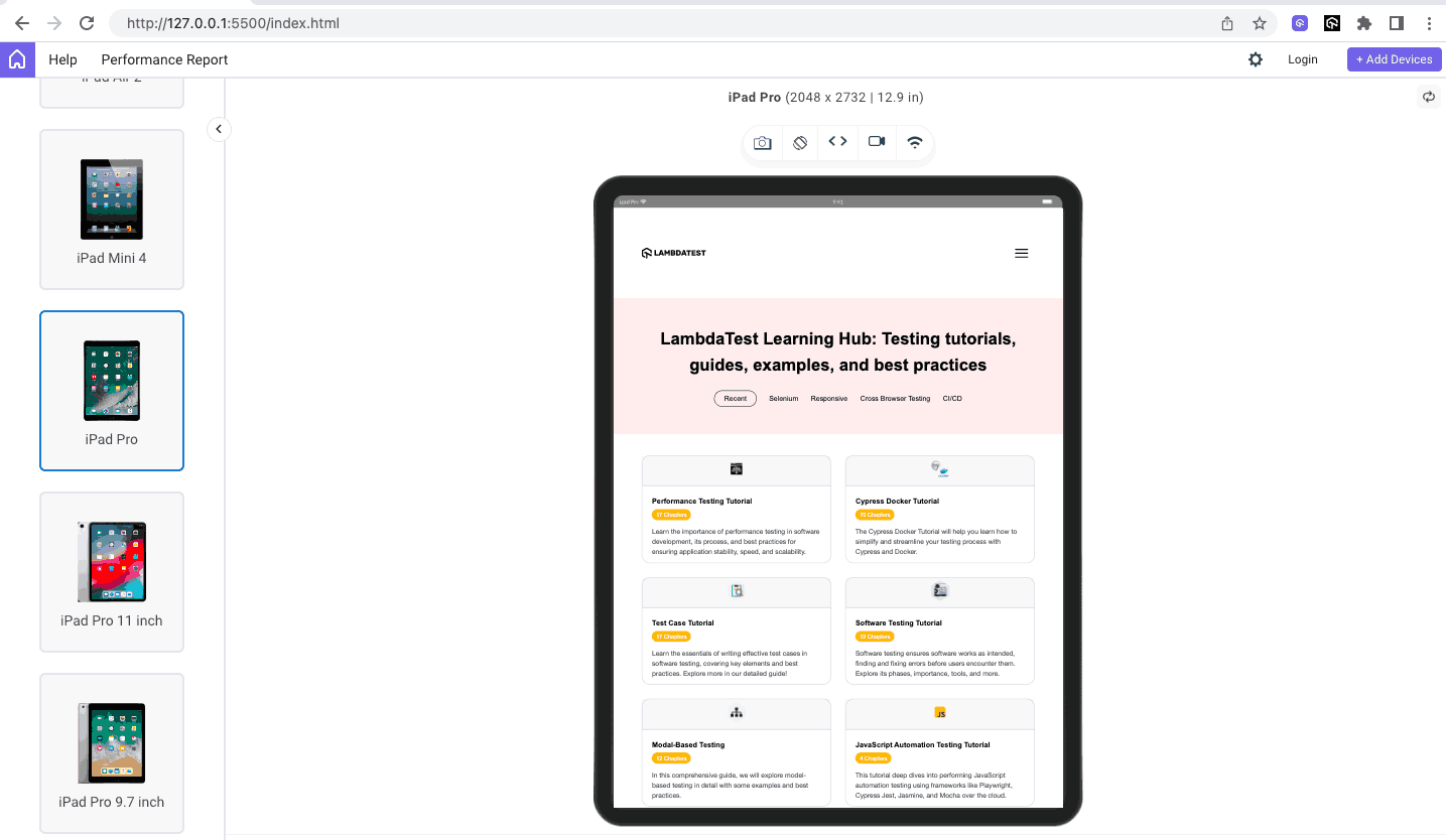
Mobile View:
I made a series of threads on X (Twitter) covering Flexbox; you can check it out if you like.
CSS Grid Layout
The CSS Grid layout is similar to CSS Flexbox, but with a key difference: Flexbox is one-dimensional (1D), meaning it lays out elements either horizontally or vertically. In contrast, the Grid is two-dimensional (2D), laying out elements in both the horizontal (row) and vertical (column) directions simultaneously.
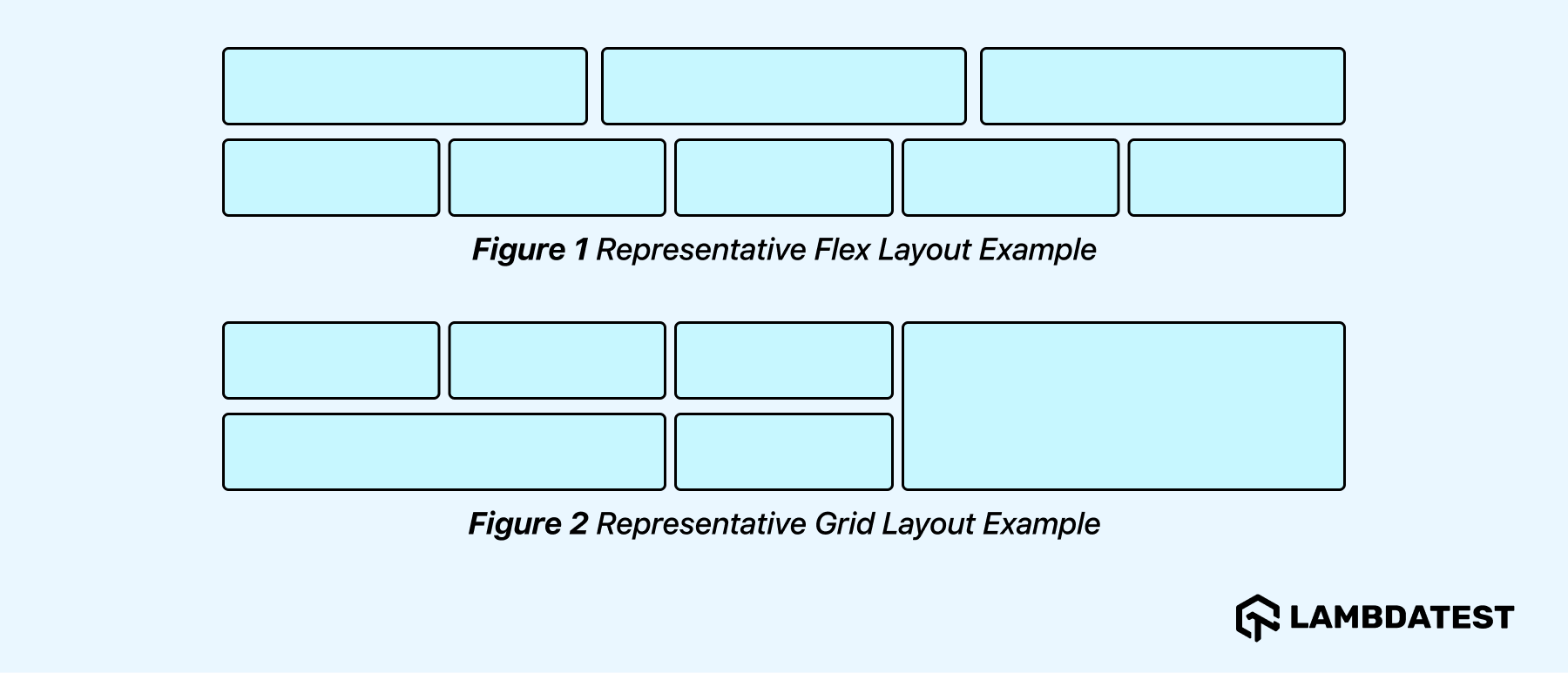
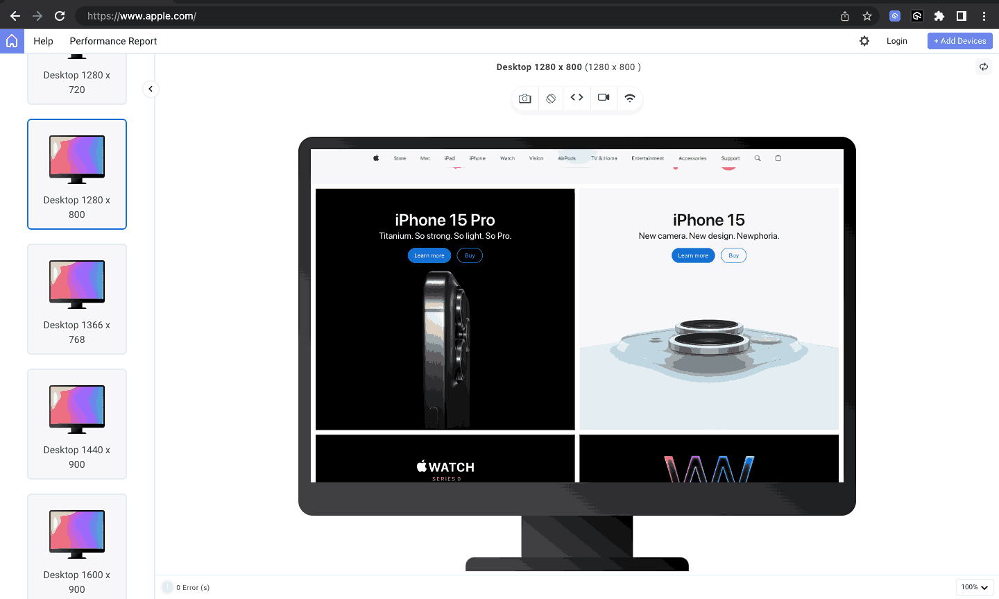
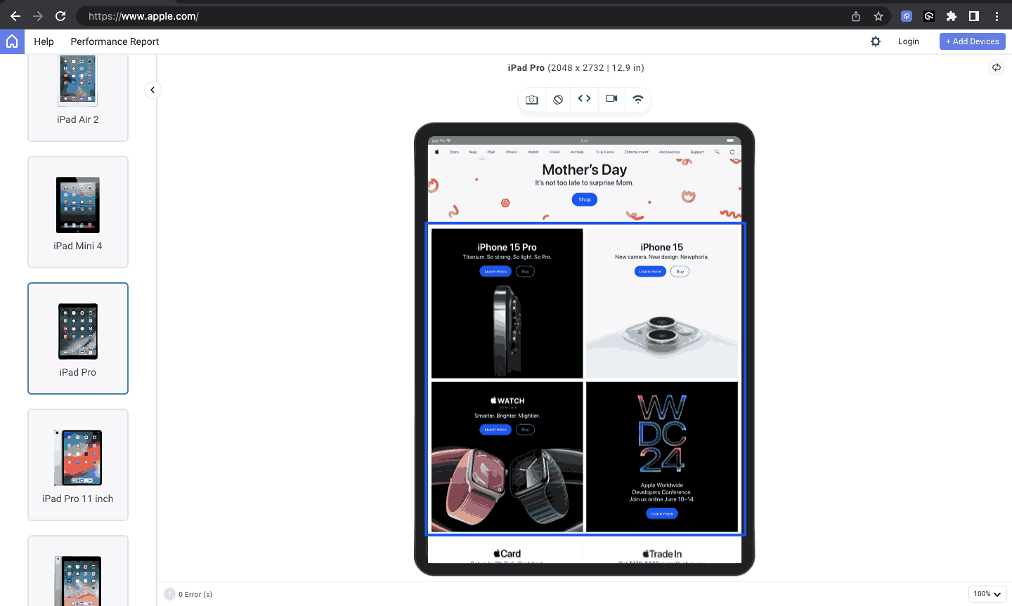
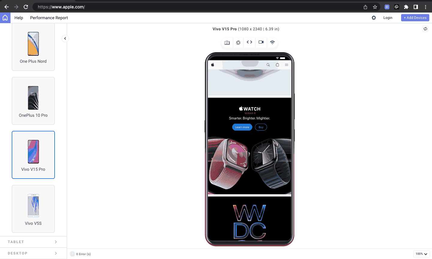
CSS Grid allows for creating complex layouts with rows and columns, making it ideal for creating responsive designs. In this case, Apple uses CSS Grid to arrange product information, such as images, titles, descriptions, and prices, in a visually appealing and responsive manner.
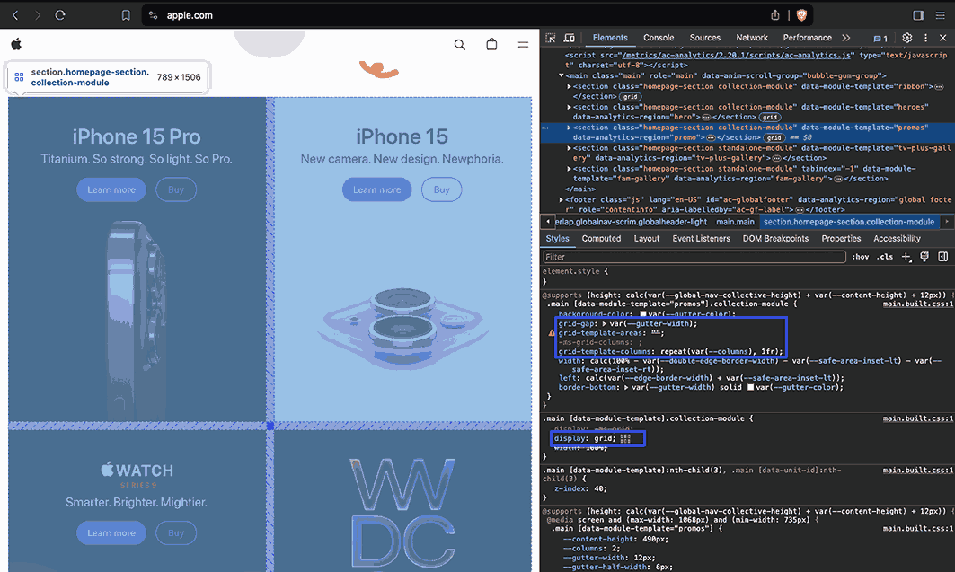
Source
Desktop View:
Tablet View:
Mobile View:
Terminology:
Generally, a grid is a set of intersecting horizontal and vertical lines that form a series of squares or rectangles.
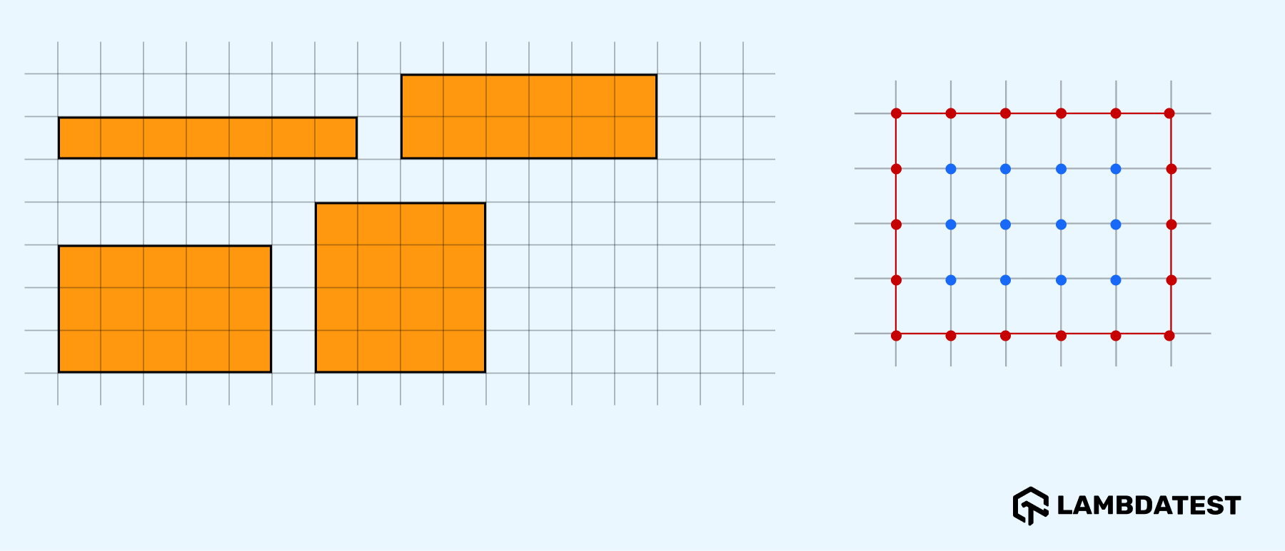
However, much like Flexbox, let’s first familiarize ourselves with the terminology of this CSS Grid layout mode below.
Understanding the terminology in CSS Grid is crucial for grasping how the layout works. Familiarizing yourself with these terms is essential for a proper understanding of CSS Grid.
| Term
|
Meaning
|
| grid container
|
This is the element whose display value is the grid. The elements it contains become grid items.
|
| grid items
|
These are the children or elements inside a grid container.
|
| grid lines
|
These are the lines that make up the grid.
|
| grid cell
|
It is the space between four intersecting grid lines. It usually forms a square and is called a unit.
|
| grid track
|
It is the space between two adjacent grid lines. Similar to Flexbox, you can take them to be the rows and columns. The horizontal track is a row, and the vertical track is a column.
|
| grid area
|
It is one or more grid cells.
|
| gutter
|
It is the gap between grid tracks (rows and columns).
|
As we now have a better understanding of CSS Grid terminologies, let us learn more about grid properties in detail below.
CSS Grid Properties
CSS Grid properties can be divided into parent properties, which apply to the grid container, and child properties, which apply to the grid items.
We will cover the major and most commonly used properties in the below tabular form.
Parent Properties
Below are the properties that apply to the grid container and their roles.
| CSS Grid Properties (Parent)
|
Role
|
| display
|
Makes an element a grid container and all its children’s grid items. The grid container can be a block-level grid or an inline grid, depending on the value given.
|
| grid-template-columns
|
Defines the grid’s columns and their sizes.
|
| grid-template-rows
|
Defines the grid’s rows and their sizes.
|
| column-gap
|
Sets the size of the gap between columns. You can call it the vertical gutter width.
|
| row-gap
|
Sets the sizes of the gap between rows. You can call it the horizontal gutter width.
|
Child Properties
Below are the properties that apply to the grid items and their roles.
| CSS Grid Properties (Child)
|
Role
|
| grid-column-start & grid-column-end
|
These define the start and end points of grid columns along the grid lines.
|
| grid-row-start & grid-row-end
|
These define the start and end points of grid rows along the grid lines.
|
After familiarizing yourself with grid terminology and major parent and child properties, you will see that the CSS Grid layout has broad support across modern browsers, making it an ideal choice for creating layouts.
The below illustration provides a detailed view of the support for CSS Grid:
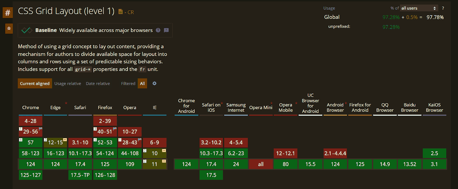
Source
Let’s see the demo code below that illustrates the usage of CSS Grid with responsive capabilities.
HTML:
1 2 3 4 5 6 7 8 9 10 11 12 13 14 15 16 17 18 19 20 21 22 23 24 25 26 27 28 29 30 31 32 33 34 35 36 37 38 39 40 41 42 43 44 45 46 47 48 49 50 51 52 53 54 55 56 57 58 59 60 61 62 63 64 65 66 67 68 69 70 71 72 73 74 75 76 77 78 |
<!DOCTYPE html> <html lang="en"> <head> <meta charset="UTF-8"> <meta http-equiv="X-UA-Compatible" content="IE=edge"> <meta name="viewport" content="width=device-width, initial-scale=1.0"> <link rel="stylesheet" href="styles.css"> <title>CSS Grid layout</title> </head> <body> <header> <div class="nav-logo-container"> <div class="logo"> <img src="https://www.lambdatest.com/resources/images/logos/logo.svg" alt=""> </div> <nav> <ul> <li><a href="#">Platform</a></li> <li><a href="#">Enterprise</a></li> <li><a href="#">Resources</a></li> <li><a href="#">Developers</a></li> <li><a href="#">Pricing</a></li> </ul> </nav> </div> <div class="ctas"> <a class="login" href="#">Login</a> <button>Book a demo</button> <a class="get-started" href="#">Get started Free</a> </div> <svg xmlns="http://www.w3.org/2000/svg" fill="none" viewBox="0 0 24 24" stroke-width="1.5" stroke="currentColor" class="w-6 h-6"> <path stroke-linecap="round" stroke-linejoin="round" d="M3.75 6.75h16.5M3.75 12h16.5m-16.5 5.25h16.5" /> </svg> </header> <main> <section class="hero"> <h1>LambdaTest Videos</h1> <div class="categories"> <span>All</span> <span>Product Walkthrough</span> <span>Automation Testing</span> <span>HyperExecute</span> <span>Real Time Testing</span> <span>Real Device Testing</span> </div> </section> <section class="content"> <section class="video-categories"> <h2>Product Walkthrough</h2> <div class="cards"> <a href="#"> <div class="card"> <img src="https://img.youtube.com/vi/7aZv7knyViw/hqdefault.jpg" alt=""> <h3>How To Perform End-To-End Testing Using HyperExecute | LambdaTest</h3> <span>Product Walkthrough</span> </div> </a> <a href="#"> <div class="card"> <img src="https://img.youtube.com/vi/1B27vRreyKU/hqdefault.jpg" alt=""> <h3>How To Perform Local Testing Using Underpass | LambdaTest</h3> <span>Product Walkthrough</span> </div> </a> <a href="#"> <div class="card"> <img src="https://img.youtube.com/vi/0Nzrfjcqymw/hqdefault.jpg" alt=""> <h3>How To Integrate Azure Pipelines And HyperExecute | LambdaTest</h3> <span>Product Walkthrough</span> </div> </a> </div> </section> </section> </main> </body> </html> |
CSS
1 2 3 4 5 6 7 8 9 10 11 12 13 14 15 16 17 18 19 20 21 22 23 24 25 26 27 28 29 30 31 32 33 34 35 36 37 38 39 40 41 42 43 44 45 46 47 48 49 50 51 52 53 54 55 56 57 58 59 60 61 62 63 64 65 66 67 68 69 70 71 72 73 74 75 76 77 78 79 80 81 82 83 84 85 86 87 88 89 90 91 92 93 94 95 96 97 98 99 100 101 102 103 104 105 106 107 108 109 110 111 112 113 114 115 116 117 118 119 120 121 122 123 124 125 126 127 128 129 130 131 132 133 134 135 136 137 138 139 140 141 142 143 144 145 146 147 148 149 150 151 152 153 154 155 156 157 158 159 160 161 162 163 164 165 166 167 168 169 170 171 172 173 174 175 176 177 178 179 180 181 182 183 184 185 186 187 188 189 190 191 192 193 194 195 196 197 198 199 200 201 202 203 204 205 206 207 |
*, *::before, *::after { margin: 0; padding: 0; box-sizing: border-box; } body { font-family: Inter, Arial, sans-serif; background: #fff; line-height: 1.7; } :is(header, header nav ul, .nav-logo-container, .ctas) { display: flex; } header { height: 15vh; background: #fff; justify-content: space-between; align-items: center; padding: 0rem 4rem; box-shadow: 0px 4px 10px 0px rgba(100, 100, 111, 0.2); } header nav ul { gap: 2rem; } .nav-logo-container { gap: 4rem; } .logo { display: flex; align-items: center; } nav ul li { list-style: none; } a { text-decoration: none; color: #000; font-weight: 500; } ul li a:hover { color: #b9b9b9; } .ctas { align-items: center; gap: 2rem; } .ctas button { background: #fff; border: 2px solid blue; padding: 10px; font-size: 1rem; border-radius: 3px; cursor: pointer; } .ctas .get-started { background: linear-gradient(91.88deg, #2c57f3 0.88%, #a506d8 98.71%); color: #fff; padding: 9px; border-radius: 3px; } svg { width: 60px; height: 40px; cursor: pointer; display: none; } .hero { padding: 4rem 4rem; background: rgb(246, 247, 250); text-align: center; line-height: 1.5; } .hero h1 { font-size: 2.8rem; padding-bottom: 2rem; } .hero .categories { display: flex; justify-content: center; align-items: center; gap: 1.8rem; flex-wrap: wrap; cursor: pointer; font-weight: 300; } .content { background: #fff; padding: 4rem 6rem; } .categories span:not(:first-child) { background: #fff; padding: 0.5rem 0.8rem; } .categories span:first-child { padding: 0.5rem 0.8rem; border-radius: 6px; background: rgb(5, 105, 255); color: #fff; font-weight: 500; } .video-categories:not(:last-child) { padding-bottom: 3rem; } .video-categories h2 { padding-bottom: 1rem; } .cards { display: grid; grid-template-columns: repeat(auto-fit, min-max(200px, 1fr)); gap: 3rem; } .card { display: flex; flex-direction: column; gap: 1rem; } .card > img { height: 100%; width: 100%; clip-path: polygon(0 13%, 100% 13%, 100% 88%, 0 88%); object-fit: cover; } .card h3 { font-size: 1rem; } .card span { background: rgba(5, 105, 255, 0.2); width: fit-content; padding: 0.3rem 0.5rem; border-radius: 6px; font-weight: 300; font-size: 0.8rem; } @media screen and (min-width: 320px) and (max-width: 1080px) { nav, .ctas { display: none; } svg { display: block; } } @media screen and (min-width: 320px) and (max-width: 720px) { .hero h1 { font-size: 2.2rem; } } |
Result:
From the output above, we have used the grid-template-columns and gap properties to make the layout adapt responsively depending on the screen size. The columns adjust automatically to fit the available space, with each having a minimum width of 200px that expands to fill the available space to a maximum of (1fr) fractional unit of the space available.
To learn more about fr (fractional unit) in CSS, follow this guide on CSS units and get detailed insights.
To understand CSS Grid and Flexbox for effective web development, follow the blog on CSS Grid vs Flexbox. It explains their key differences and how to use them efficiently, essential for beginners and experienced developers alike.
CSS Multi-Column Layout
Multiple-column layouts, also known as Multi-column or Multicol, divide content into several columns. This layout was introduced to help developers create web layouts with content spanning multiple columns, similar to printed media such as magazines and newspapers.
The magazine images below illustrate the use of multiple text columns in this layout.
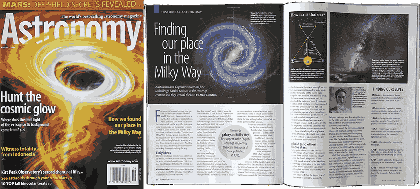
Source
The multi-column layout is unique among CSS layout modes in that it can be responsive without requiring CSS media queries. Its basic functionality involves specifying the number of columns for content, setting the gap between columns, and applying styles as needed.
Below are some of the main properties of the layout.
| Multi-Column Properties |
Role |
| column-count |
Sets the number of columns into which to break content. |
| column-width |
Sets the width of the columns |
| columns |
It is a shorthand property for column-count and column-width. |
| column-rule |
It is a shorthand property for column-rule-color, column-rule-style, and column-rule-width.
column-rule: <column-rule-width> | <column-rule-style> | <column-rule-color>;
|
| column-span |
Sets whether an element spans all or none of the columns. |
| column-fill |
Sets how an element’s content is balanced when broken into columns. |
The multi-column layout has support in the latest versions of Safari and partial support in other major browsers like Chrome and Firefox.

Source
Let’s see the demo code below that illustrates how to create CSS layouts using multiple-column layouts.
HTML:
1 2 3 4 5 6 7 8 9 10 11 12 13 14 15 16 17 18 19 20 21 22 23 24 25 |
<!DOCTYPE html> <html lang="en"> <head> <meta charset="UTF-8"> <meta http-equiv="X-UA-Compatible" content="IE=edge"> <meta name="viewport" content="width=device-width, initial-scale=1.0"> <link rel="stylesheet" href="styles.css"> <title>Multi-column layout</title> </head> <body> <div class="container"> <h1>What Is Android Testing: A Detailed Guide</h1> <p> Learn about Android testing, its tools, and strategies, and make your Android testing more effective. </p> <h3>OVERVIEW</h3> <p> Android testing evaluates the functionality and performance of mobile applications over a wide range of Android devices to ensure they meet quality standards. It involves testing various aspects such as functionality, performance, usability, and compatibility across multiple devices. </p> <p> Android is the world's most widely used operating system. Andy Rubin initially developed it as an open-source alternative to the iPhone and Palm OS. In the early 2010s, Android rose to prominence and became the dominant mobile operating system. </p> </div> </body> </html> |
CSS:
1 2 3 4 5 6 7 8 9 10 11 12 13 14 15 16 17 |
body { font-family: Inter, Arial, sans-serif; padding: 2rem 3rem; } .container { column-count: 3; column-gap: 2rem; column-width: 15em; } h3 { padding-top: 2rem; font-weight: 300; } p { line-height: 1.8; letter-spacing: 0.3px; } |
As mentioned earlier, Multi-column is the only layout that doesn’t need us to use media queries.
Result:
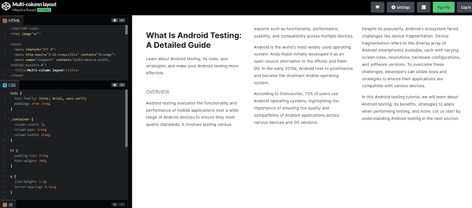
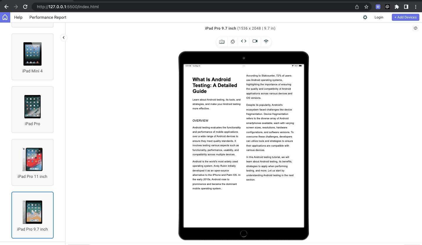
Let’s preview the results of the above code on different devices of various screen sizes.
Desktop View:
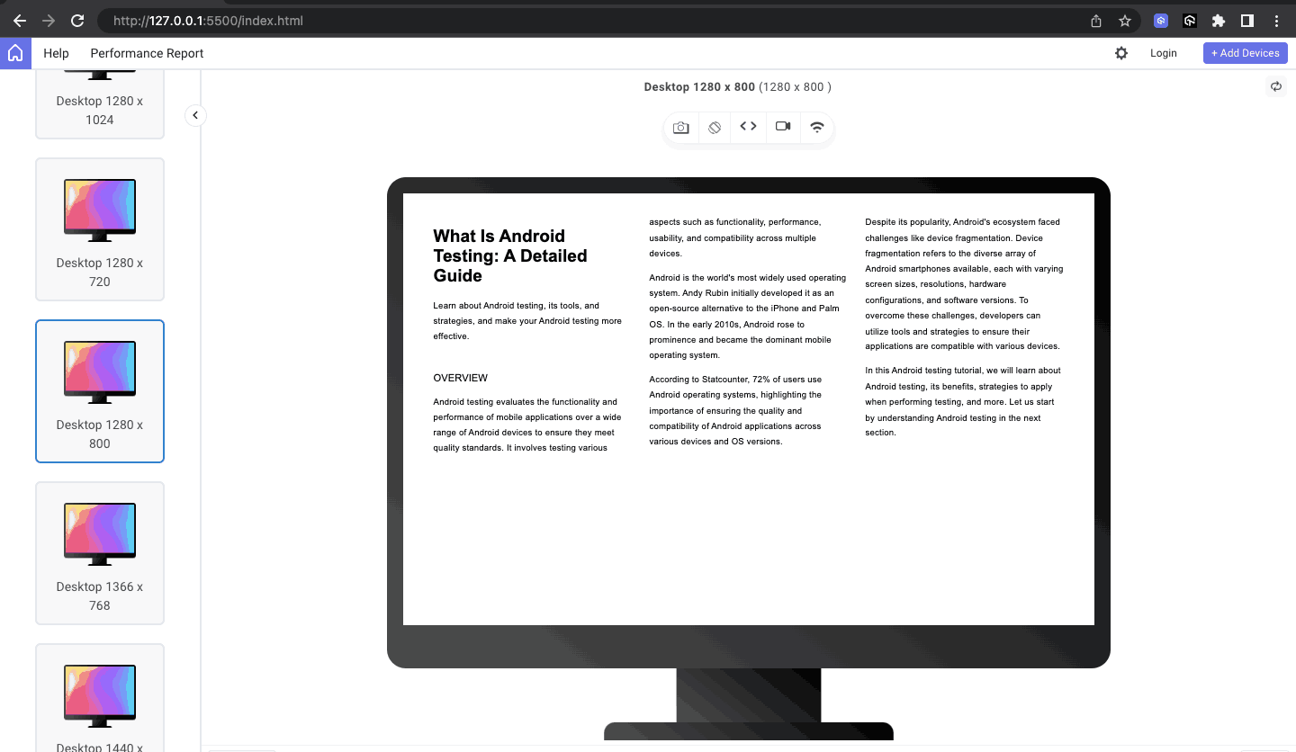
Tablet View:
Mobile View:
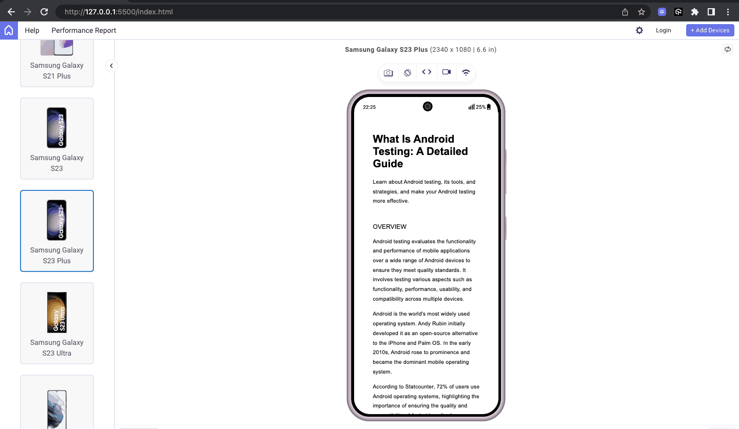
Initially, in the code, we defined three columns for the content to span, but from the above previews, you can see that the content adapts as the screen sizes become smaller and the space on which to span is reduced.
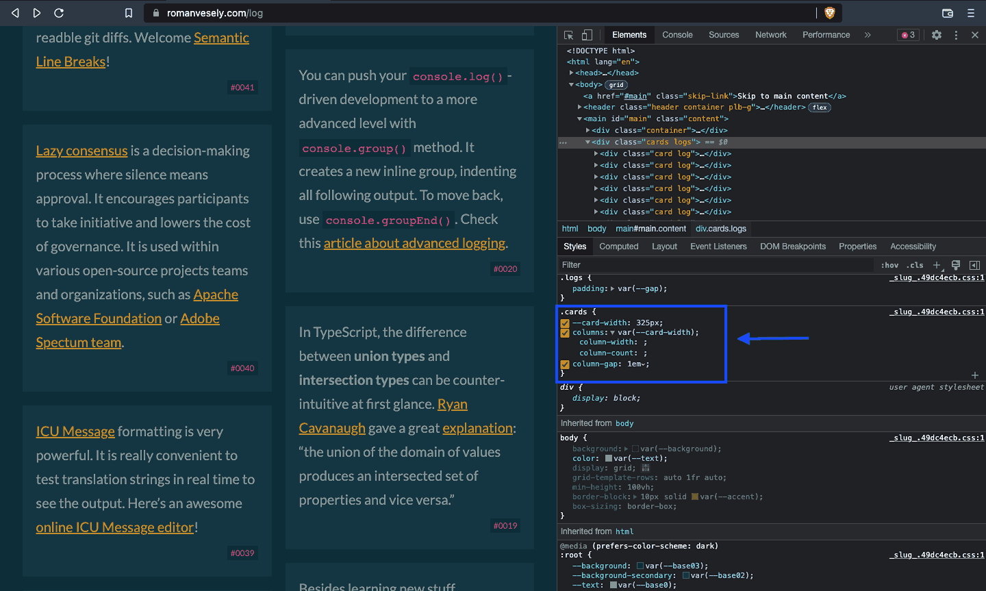
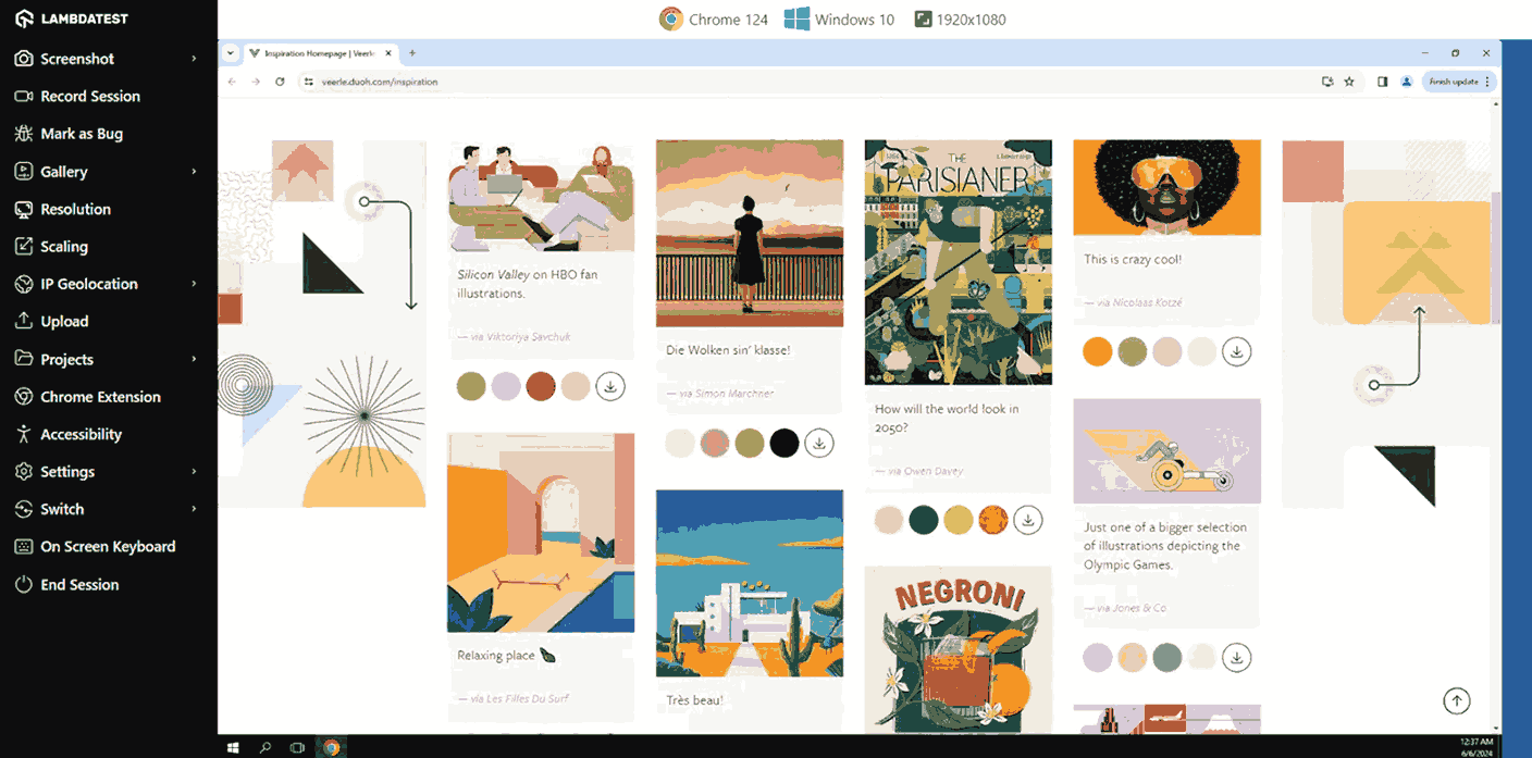
Though the multi-column layout was originally designed to enable the development of magazine and newspaper-like multiple-column text content, there are clever creations that some developers have come up with.
The first example shows how Roman Vesely used multi-column to create a responsive masonry-like effect for tips on his website.
Veerle Pieters uses the same to create a beautiful, similar-like effect on her website.
Overall, multi-column layouts are rarely used as a web development skill due to the major reason that the reader would have to scroll up and down, which can be irritating and cause a bad user experience.
You can create CSS layouts that meet your project needs, including masonry-like effects, using these CSS Grid layout generators.
With all these CSS layout types, we have learned there are always some issues that developers might face; let’s learn some of the issues faced and how to fix them effectively.
Common CSS Layout Issues and How To Fix Them
When working with layout, hurdles and issues are only waiting to happen. As such, we will look at some common ones in this section and how you can overcome them.
Cross Browser and Device incompatibility
Designing a website that works well in one browser but not another or renders perfectly on one device but poorly on another can be incredibly nerve-wracking. The fear of losing clients due to these rendering inconsistencies adds to the stress.
To tackle these challenges, it’s crucial to conduct tests such as cross-browser testing for your websites. This ensures compatibility across various browsers like Safari and Chrome, as well as devices like Android and iPhone. By doing so, you can transform potential client loss into gain by ensuring smooth responsiveness and adaptation of your website across various platforms.
In the code below, we will perform real-time browser testing to ensure the compatibility of the CSS Flexbox properties for the demo using macOS and Chrome’s 123 version with a 1440 * 900 resolution.
HTML:
1 2 3 4 5 6 7 8 9 10 11 12 13 14 15 16 17 18 19 20 21 22 23 24 25 26 27 28 29 30 31 32 33 34 35 36 37 38 39 40 41 42 43 44 45 46 47 48 49 50 51 52 53 54 55 56 57 58 59 60 61 62 63 64 65 66 67 68 69 70 71 72 73 74 75 76 77 78 79 80 81 82 83 84 |
<!DOCTYPE html> <html lang="en"> <head> <meta charset="UTF-8"> <meta http-equiv="X-UA-Compatible" content="IE=edge"> <meta name="viewport" content="width=device-width, initial-scale=1.0"> <title>CSS Layouts - Flex</title> </head> <body> <header> <div class="nav-logo-container"> <div class="logo"> <img src="https://www.lambdatest.com/resources/images/logos/logo.svg" alt=""> </div> <nav> <ul> <li><a href="#">Platform</a></li> <li><a href="#">Enterprise</a></li> <li><a href="#">Resources</a></li> <li><a href="#">Developers</a></li> <li><a href="#">Pricing</a></li> </ul> </nav> </div> <div class="ctas"> <a class="login" href="#">Login</a> <button>Book a demo</button> <a class="get-started" href="#">Get started Free</a> </div> <svg xmlns="http://www.w3.org/2000/svg" fill="none" viewBox="0 0 24 24" stroke-width="1.5" stroke="currentColor" class="w-6 h-6"> <path stroke-linecap="round" stroke-linejoin="round" d="M3.75 6.75h16.5M3.75 12h16.5m-16.5 5.25h16.5" /> </svg> </header> <main> <div class="hero"> <h1>LambdaTest Learning Hub: Testing tutorials, guides, examples, and best practices</h1> <div class="categories"> <span>Recent</span> <span>Selenium</span> <span>Responsive</span> <span>Cross Browser Testing</span> <span>CI/CD</span> </div> </div> <!-- Cards --> <div class="cards"> <div class="card"> <div class="card-header"> <img src="https://www.lambdatest.com/resources/images/performance-testing-tutorial-2.svg" alt="Docker Cypress" height="48px" /> </div> <div class="card-body"> <div class="body-upper"> <a class="title-link" href="#"> <h5>Performance Testing Tutorial</h5> </a> <span class="badge">17 Chapters</span> </div> <p class="card-description"> Learn the importance of performance testing in software development, its process, and best practices for ensuring application stability, speed, and scalability. </p> </div> </div> <div class="card"> <div class="card-header"> <img src="https://www.lambdatest.com/resources/images/cypress-docker-tutorial.svg" alt="Docker Cypress" height="48px" /> </div> <div class="card-body"> <div class="body-upper"> <a class="title-link" href="#"> <h5>Cypress Docker Tutorial</h5> </a> <span class="badge">10 Chapters</span> </div> <p class="card-description"> The Cypress Docker Tutorial will help you learn how to simplify and streamline your testing process with Cypress and Docker. </p> </div> </div> </div> </div> </main> </body> </html> |
CSS:
1 2 3 4 5 6 7 8 9 10 11 12 13 14 15 16 17 18 19 20 21 22 23 24 25 26 27 28 29 30 31 32 33 34 35 36 37 38 39 40 41 42 43 44 45 46 47 48 49 50 51 52 53 54 55 56 57 58 59 60 61 62 63 64 65 66 67 68 69 70 71 72 73 74 75 76 77 78 79 80 81 82 83 84 85 86 87 88 89 90 91 92 93 94 95 96 97 98 99 100 101 102 103 104 105 106 107 108 109 110 111 112 113 114 115 116 117 118 119 120 121 122 123 124 125 126 127 128 129 130 131 132 133 134 135 136 137 138 139 140 141 142 143 144 145 146 147 148 149 150 151 152 153 154 155 156 157 158 159 160 161 162 163 164 165 166 167 168 169 170 171 172 173 174 175 176 177 178 179 180 181 182 183 184 185 186 187 188 189 190 191 192 193 194 195 196 197 198 199 200 201 202 203 204 205 206 207 208 209 210 211 212 213 214 215 216 217 218 219 220 221 222 223 |
*, *::before, *::after { margin: 0; padding: 0; box-sizing: border-box; } body { font-family: Inter, Arial, sans-serif; background: #fff; line-height: 1.7; } :is(header, header nav ul, .nav-logo-container, .ctas) { display: flex; } header { height: 15vh; background: #fff; justify-content: space-between; align-items: center; padding: 0rem 4rem; box-shadow: 0px 4px 10px 0px rgba(100, 100, 111, 0.2); } header nav ul { gap: 2rem; } .nav-logo-container { gap: 4rem; } .logo { display: flex; align-items: center; } nav ul li { list-style: none; } a { text-decoration: none; color: #000; font-weight: 500; } ul li a:hover { color: #b9b9b9; } .ctas { align-items: center; gap: 2rem; } .ctas button { background: #fff; border: 2px solid blue; padding: 10px; font-size: 16px; border-radius: 3px; cursor: pointer; } .ctas .get-started { background: linear-gradient(91.88deg, #2c57f3 0.88%, #a506d8 98.71%); color: #fff; padding: 9px; border-radius: 3px; } svg { width: 60px; height: 40px; cursor: pointer; display: none; } .hero { padding: 4rem 4rem; background: #fdeded; text-align: center; line-height: 1.5; } .hero h1 { font-size: 2.4rem; text-wrap: balance; padding-bottom: 2rem; } .hero .categories { display: flex; justify-content: center; align-items: center; gap: 1.8rem; flex-wrap: wrap; } .categories span:first-child { outline: 1px solid #000; padding: 0.35rem 1.4rem; border-radius: 100px; } .cards { padding: 3rem 4rem; display: flex; gap: 2rem; flex-wrap: wrap; justify-content: center; } .card { border: 1px solid #ccc; border-radius: 1.2em; flex: 320px; } .card-header { text-align: center; background: rgba(33, 37, 41, 0.03); border-bottom: 1px solid #ccc; padding: 6px 0; } .card-body { padding: 0.8rem 1.4rem; font-size: 0.95rem; } .body-upper { padding-bottom: 1rem; } .title-link { text-decoration: none; font-weight: 500; line-height: 1.2; font-size: 1.25rem; color: #000; } .title-link:hover { text-decoration: underline; } .card-body h5 { margin: 0; padding-top: 0.8rem; padding-bottom: 0.3rem; } .card-body span { color: #fff; font-size: 0.8rem; background: #ffb500; padding: 0.3rem 0.6rem; border-radius: 50px; } .card-description { font-weight: 400; font-family: Segoe UI, Roboto, Helvetica Neue; line-height: 1.5; color: #505050; } @media screen and (min-width: 320px) and (max-width: 1080px) { nav, .ctas { display: none; } svg { display: block; } } @media screen and (min-width: 320px) and (max-width: 720px) { .hero h1 { font-size: 1.8rem; } } @media screen and (min-width: 320px) and (max-width: 835px) { .card { flex: 400px; } } |
Result:
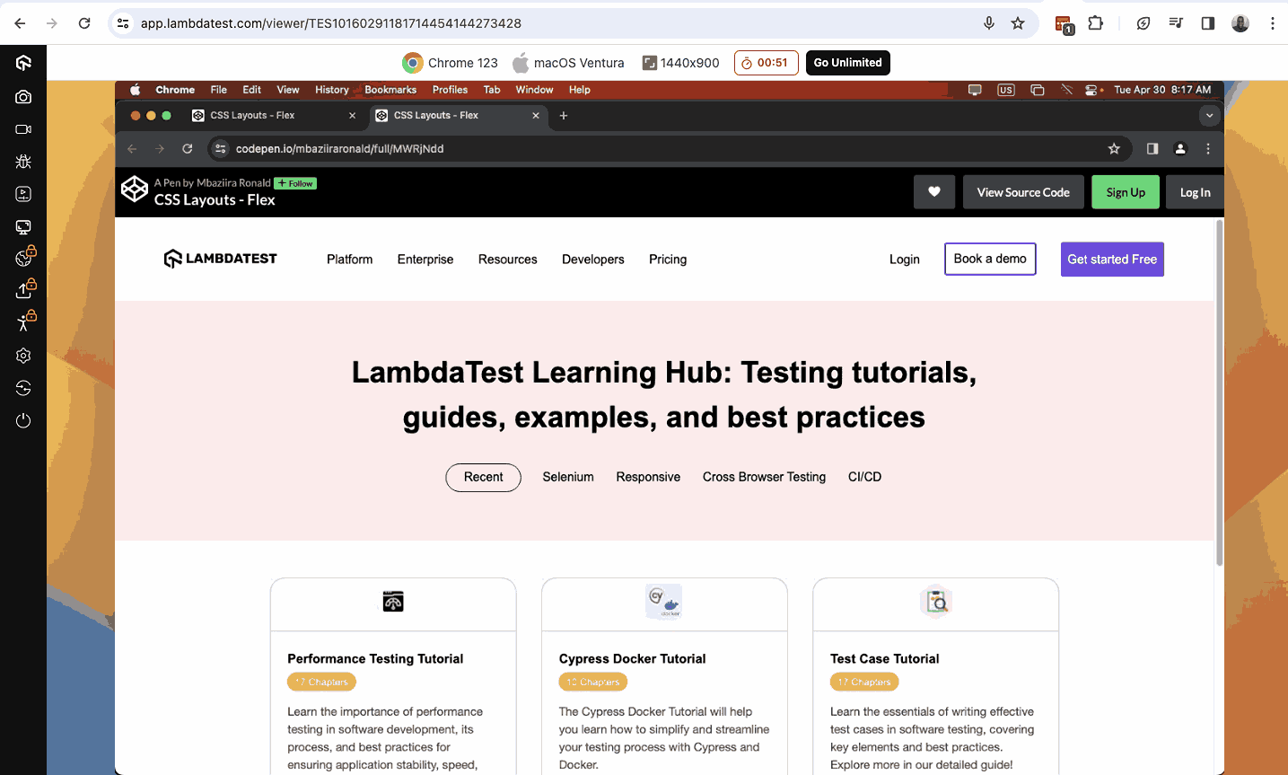
The above result is displayed on LambdaTest, an AI-powered test execution platform, which allows you to run manual and automated tests at scale on a remote test lab of 3000+ real devices, browsers, and OS combinations. This platform offers live and real-time testing, enabling testers and developers to report bugs, record testing activity, and share them with their team.
It is ideal for performing browser compatibility testing to validate the functionality of your website across different browsers like Chrome, Firefox, Safari, and Edge. With this platform, you can ensure your website delivers a consistent and smooth user experience, regardless of the browser used.
Varying Card Height
Found on almost any page of a website, cards are among the most common UI components and common UI bugs to be found today. Easily scannable, modular, and engaging, cards can be found everywhere, from blogs to pricing pages.
However, web developers often encounter cards of varying heights due to the different types of content they contain.
The problem can be solved by giving the card container a display of flex.
In the code below, we have made the cards of equal height regardless of the content each contains.
HTML:
1 2 3 4 5 6 7 8 9 10 11 12 13 14 15 16 17 18 19 20 21 22 23 24 25 |
<section> <div class="cards"> <div class="card"> <img class="card-img" src="https://www.lambdatest.com/resources/images/eee-complex.svg" alt=""> <div class="card-lower-section"> <h3>Complex Test Environments</h3> <p>Heterogeneous applications, multiple test automation frameworks (Selenium, TOSCA Playwright, TestComplete, Cypress, etc.) COTS apps (SFDC, SAP, Simulators etc.)</p> </div> </div> <div class="card"> <img class="card-img" src="https://www.lambdatest.com/resources/images/eee-vulner.svg" alt=""> <div class="card-lower-section"> <h3>Vulnerable Test Environments</h3> <p>For regulated industries such as FSI, Healthcare, etc., R&D departments public test cloud infrastructure is a deterrent.</p> </div> </div> <div class="card"> <img class="card-img" src="https://www.lambdatest.com/resources/images/eee-automation.svg" alt=""> <div class="card-lower-section"> <h3>Automation slows down at scale</h3> <p>Complexity and cost of managing in-house test infrastructure increases exponentially at high concurrency. Also impacting release velocity.</p> </div> </div> </div> </section> |
CSS:
1 2 3 4 5 6 7 8 9 10 11 12 13 14 15 16 17 18 19 20 21 22 23 24 25 26 27 28 29 30 31 32 33 34 35 36 37 38 39 40 41 42 43 44 45 46 47 48 49 50 51 52 53 54 55 56 57 58 59 60 61 |
*, *::before, *::after { margin: 0; padding: 0; box-sizing: border-box; } body { font-family: Inter, Arial, sans-serif; line-height: 1.7; background: rgb(243, 244, 245); height: 100vh; } section { padding: 4rem 4rem; } .cards { display: flex; /* justify-content: center; */ gap: 2rem; flex-wrap: wrap; } .cards > .card { background: #fff; padding: 3rem 3rem; } .cards .card p { color: rgb(102, 102, 102); } .card { width: 380px; border-radius: 0.75rem; } .card-img { height: 50px; width: 50px; } .card h3 { font-size: 1.5rem; } .card-lower-section { padding-top: 1rem; } |
Result:
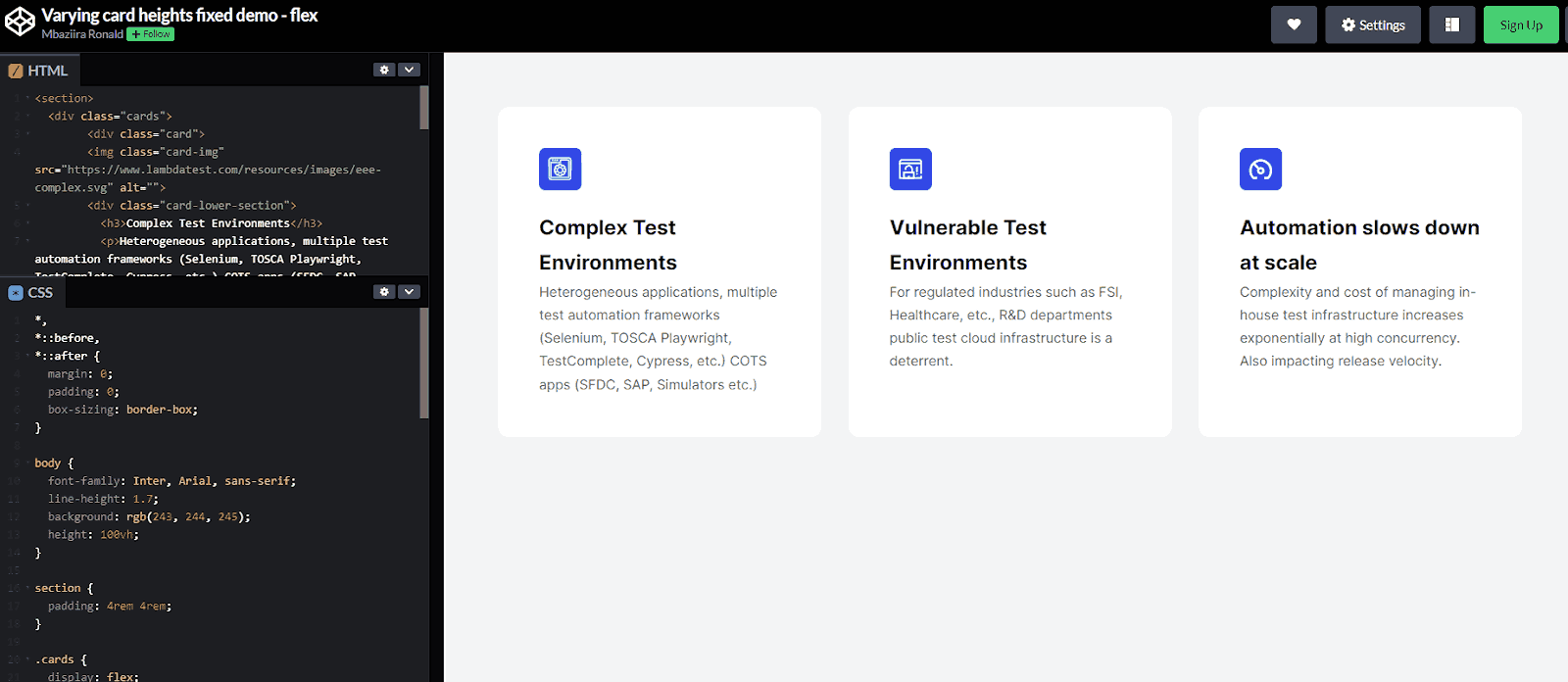
Z-index Conflicts
When elements start overlapping, especially in layouts like CSS Grid and positioning, we use the z-index property to control their stacking order. The element with a higher z-index value will appear on top of elements with lower values.
The image below shows how different elements stack on top of each other on the web page.
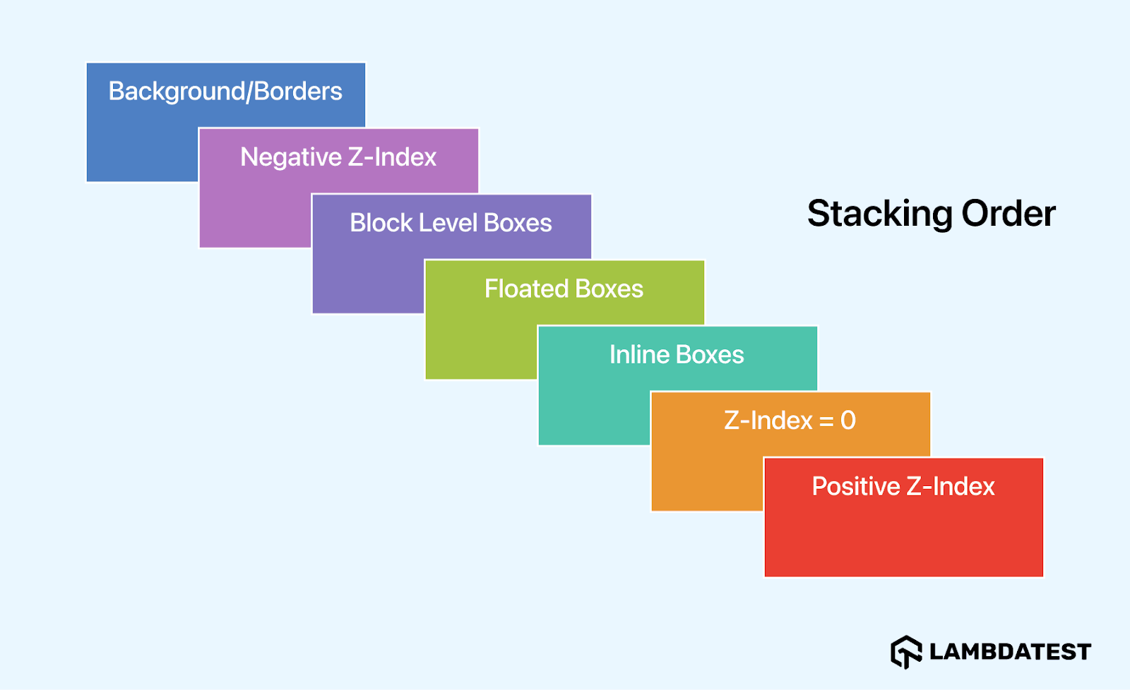
However, things can get complicated when different stacking levels intertwine. Therefore, it is recommended that we learn and explore the z-index property more. For example, investigate the differences between stacking order and stacking context.
As we have learned the common issues faced when dealing with CSS layouts and how to fix them, there are some of the best practices that a web developer must follow when working with CSS layouts to avoid making common mistakes.
Understanding the relationship between CSS layouts and the CSS box model is important as it allows us to learn how the box model contributes to building better CSS layouts.
Relationship Between the CSS Layouts and the Box Model
In the CSS box model, every element on a webpage is said to behave and interact with other elements as a box. This box has four aspects: margin, border, padding, and content.
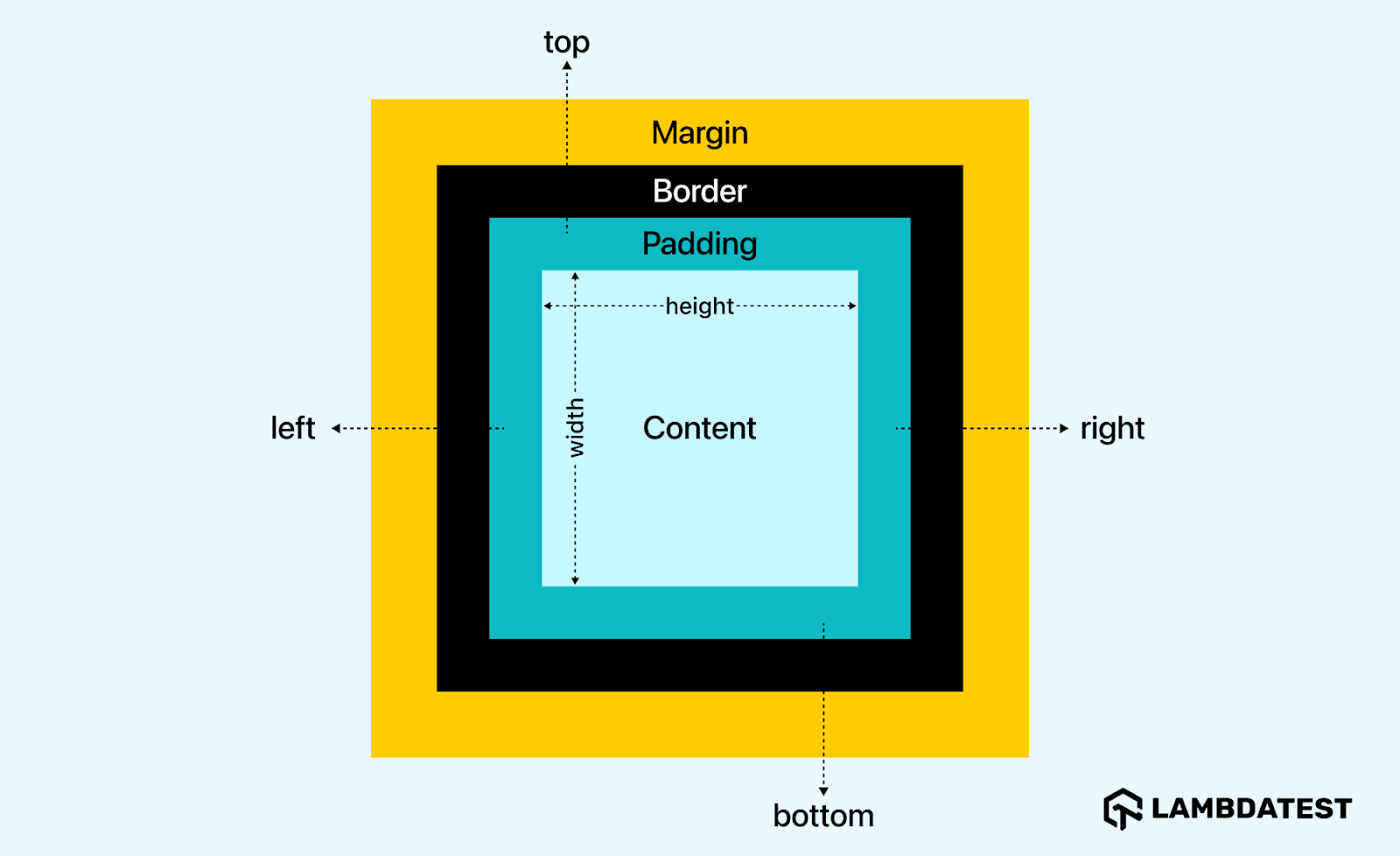
- Content: This refers to the content of the element itself, which can be text, an image, or other nested elements.
- Padding: This controls the internal spacing surrounding the element’s content.
- Border: This defines the outer boundary of the element’s content. It affects the size of the box through the border-width property.
- Margin: This controls the external spacing of the given element with other web page elements.
Remember the CSS box-sizing property, which we usually declare at the beginning of the stylesheet files? The property tells browsers how they should calculate the total width and height of elements. It enables us to work with the CSS box model.
A good understanding of the box model concept is essential to avoid some inconsistencies like overflowing content, overlapping of elements, misaligned items, and more. To make this clearer, consider the example below.
In the below code, we have a parent element with a width of 200px and a border of 3px. Nested in it is another element inner, which inherits 100% of its parent’s width, a border of 3px, and a padding of 40px. Though undeclared, the value of the box-sizing property.
HTML:
|
|
<div class="parent"> <div class="inner"></div> </div> |
CSS:
|
|
.parent { width: 300px; border: 3px solid blue; } .inner { width: 100%; border: 4px solid red; padding: 45px; } |
Output:

In the output above, you can see that the nested element inner is overflowing its container, parent. This is because the nested element’s total width exceeds that of its container.
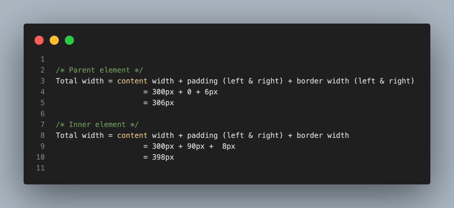
From the calculations above, you can see that the inner element exceeds the parent element by 92px. Manually making these calculations for each element to ensure they behave as expected can be time-consuming. Thankfully, there’s a better way 
 .
.
Let’s now see the difference when we declare box-sizing to be border-box.
CSS:
|
|
* { box-sizing: border-box; } .parent { width: 300px; border: 3px solid blue; } .inner { width: 100%; border: 4px solid red; padding: 45px; } |
Output :

Instead of calculating the width as we did previously, the browser calculates the inner element’s width differently, thus shrinking it. The calculation would be:
Total width = 300px – 90px – 8px = 202px
Therefore, to work with CSS layouts comfortably, a good understanding of box model concepts is necessary, as it can affect the overall balance and spacing of your design.
As we have understood how the box model contributes to building better CSS layouts, let us also learn the relationship between CSS layouts and CSS writing modes.
Relationship Between the CSS Layouts and Writing Modes
It might be rare to find yourself designing or creating websites with non-LTR (left-to-right) languages or content, but with the help of CSS writing modes, you can determine the direction in which text is displayed on a web page, influencing how lines of text are laid out horizontally or vertically, and how characters are positioned within those lines. CSS offers four main writing modes:
- Horizontal (lr-tb): Text flows from left to right (e.g., in English or other left-to-right languages).
- Vertical (tb-rl): Text flows from top to bottom, with characters arranged vertically (e.g., in traditional Chinese or Japanese).
- Vertical-RL (tb-lr): Text flows from top to bottom, with characters arranged vertically from right to left (e.g., in Mongolian or some forms of Arabic).
- Sideways-RL: Text flows horizontally, but characters are rotated 90 degrees, arranged from top to bottom, and from right to left (e.g., in vertical Mongolian or some forms of East Asian calligraphy).
To get a better visual perspective of websites with right-to-left content, here is an example of Al Jazeera Arabic. From the text and icons to images and logos, everything runs horizontally from right to left.
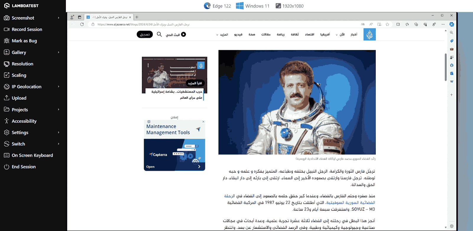
Here’s another example of traditional Mongolian on a site, which, unlike other vertical scripts like Japanese, runs from left to right rather than right to left.
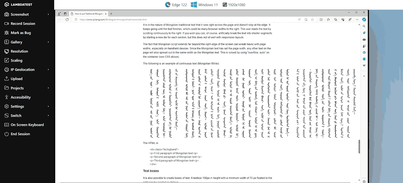
We specify writing modes using the CSS writing-mode property, which allows us to define whether lines of text should lay horizontally or vertically and how these lines stack. The writing-mode property is often combined with the text-orientation and direction properties.
When discussing accessibility and multilingualism, CSS logical properties become important. For non-left-to-right (LTR) layouts, physical properties such as CSS margin, padding, and width need to be substituted with logical ones.
Box model properties like padding-top and margin-left have logical counterparts. For example, padding-top is padding-block-start, and margin-left is margin-inline-start. The same logic applies to layout modes like CSS Flexbox and CSS Grid.
The table below shows some physical properties and their logical counterparts. These adjust depending on the writing mode. The physical counterpart for block-size in LTR languages, for example, is height, but for vertical languages, it is width.
| Physical property
|
Logical Property
|
| top
|
block-start
|
| right
|
inline-end
|
| bottom
|
block-end
|
| left
|
inline-start
|
| width
|
inline-size
|
| height
|
block-size
|
| margin-top
|
margin-block-start
|
| margin-left
|
margin-inline-start
|
| padding-bottom
|
padding-block-end
|
| padding-right
|
padding-inline-end
|
| border-left
|
border-inline-start
|
| border-top
|
border-block-start
|
From the table above, you will notice that the terms start and end replace their physical equivalents of left, right, top, and bottom in most cases. Layout modes like CSS Grid were built with different writing modes and text orientations in mind, such as vertical-lr. Thus, you will usually see properties like grid-column-start or grid-row-end using the terms start and end rather than left and right.
If you give an image a float property value of inline-start, the image will display as intended according to the writing mode, as shown in the image below.
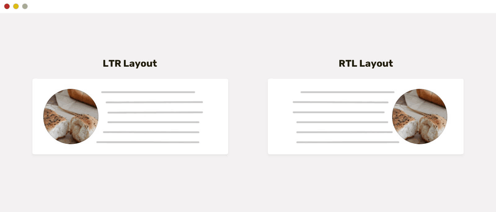
Hence, how you plan website layouts will vary depending on the writing mode you are working with or which region of the world you are designing the website for.
To learn more about text orientation when creating websites, follow this guide on CSS text orientation for detailed insights on writing modes and text orientations.
Best Practices When Working With CSS Layouts
After addressing the CSS layout issues, let’s learn a few best practices that can help minimize challenges and streamline your development process.
- Use Media Queries
With the introduction of CSS layout modes like Flexbox and Grid, creating responsive web designs has become smoother. However, they don’t always work as expected across various device viewports and orientations. To cater to specific viewports and orientations, we use CSS media queries.
Media queries enable us to make fine-tuned layout adjustments specific to any viewport size or orientation. By combining media queries with the CSS layout modes like Grid, you can create precise changes at specific breakpoints.
- Use Positioning Sparingly
Positioned elements are removed from the normal document flow, making it challenging to maintain their CSS layouts across multiple screen sizes. When there is more than one positioned element on the page, it introduces another level of complexity. Positioning should be used when there is an element or elements you want to shift to a specific area of the webpage that other CSS layout modes do not enable you to achieve.
- Use CSS Resets
A CSS reset is a set of rules meant to normalize the default styles and behaviors of HTML elements across different browsers. Here, each developer writes a CSS reset according to their current needs.
Below is an example of a simple, typical CSS reset:
CSS:
1 2 3 4 5 6 7 8 9 10 11 12 13 14 15 16 17 18 19 20 21 22 |
*, *::before, *::after { box-sizing: border-box; } * { margin: 0; padding: 0; } body { line-height: 1.5; } img, pic, video { max-width: 100%; display: block; } |
This reset removes margins, paddings, and default styles from various elements, ensuring a more consistent starting point for styling across different browsers.
Different browsers can interpret HTML markup and CSS rules differently, leading to browser quirks or inconsistencies. A CSS reset helps mitigate these issues by resetting the default styles for HTML elements across different browsers, providing a more consistent starting point for styling.
- Perform Responsive Testing
Performing extensive responsive testing can help prevent screen and browser discrepancies, ensuring your website displays as intended on all targeted devices and viewports. Testing can also help catch and fix layout issues quickly before they occur in production, minimizing potential damage. To validate the appearance of your websites and their functionality across various devices, browsers, and OS combinations. You can make use of mobile website testing tools like LT Browser from LambdaTest, as mentioned above in the blog.
To learn more about other features offered by the LambdaTest platform, subscribe to the LambdaTest YouTube Channel and stay updated with the latest video tutorials on automated UI testing, cross-device testing, and more.
Conclusion
In recap, we have looked at the different CSS layouts and why they exist, what they can do, the common issues faced in dealing with CSS layouts, and how to fix them.
As CSS modules are continuously being developed by the CSS Working Group (the group tasked with developing and maintaining CSS), we can expect more advanced features for the current CSS layouts or even new methods. In the meantime, the current CSS layouts cater to most of the development needs.
Frequently Asked Questions (FAQs)
Is CSS Grid only for main or larger layouts?
No. You can use CSS Grid for small layouts, for example, those of sections, and large ones like page layouts. You can use it to align elements in any container and are free to nest grids.
What is the difference between fixed and sticky positioning in CSS?
Elements with fixed positions are removed from the normal document flow and positioned relative to the viewport of the page. They remain stationary in one place and visible even when the user scrolls through the page.
Meanwhile, elements with position sticky remain part of the normal document flow until the user scrolls to a point defined by the offset properties of top, right, bottom, and left. When the user scrolls to that point, they become fixed and remain visible as the user scrolls.
Should I use CSS Flex or Grid?
Well, it depends. Flexbox aligns and distributes elements along one dimension (vertically or horizontally), whereas Grid can do it along two dimensions simultaneously (both vertical and horizontal).
Thus, Flexbox is more suitable for layouts like navigation menus and card layouts, while Grid can cater to grid-based and more complex layouts like image galleries.
Mbaziira Ronald is a software developer and technical writer. He has expertise in technologies like Tailwind CSS, JavaScript, and WordPress. He frequently dabbles with Figma to improve his design skills.
![]() 293126 Views
293126 Views ![]() 38 Min Read
38 Min Read


pic.twitter.com/vuLGIP3H96


Understand CSS Responsiveness in Depth
⇩ pic.twitter.com/QYSF9lDKS7
(@Adarsh____gupta) February 25, 2024


