CSS Grid Best Practices: Guide With Examples
Tahera Alam
Posted On: February 28, 2025
13 Min


CSS Grid is a layout system that allows you to create complex and responsive grid-based layouts with ease. It provides a two-dimensional grid-based layout system, making it particularly powerful for handling both rows and columns.
To ensure your layouts are both flexible and responsive, it’s essential to adhere to certain CSS Grid best practices. It enhances maintainability, making your code easier to understand and modify.
CSS Grid Best Practices
When working with CSS Grid, following best practices is key to creating responsive, maintainable layouts. Check out some of the CSS Grid best practices that you can incorporate into your web designs.
Use Flexible Units for Grid Track Sizes
Instead of specifying fixed pixel values for your grid track sizes, use flexible units like fr or minmax. This is one of the core CSS Grid best practices that will make your layout more responsive to different screen sizes.
When you specify grid track sizes using fixed pixel values, you’re essentially setting a rigid structure for your layout. As screen sizes vary, fixed pixel values can lead to distorted layouts, causing elements to overlap or stretch excessively.
To overcome these limitations, CSS Grid provides flexible units like fr and minmax, which enable your layouts to adapt gracefully to different screen sizes.
These units dynamically adjust their dimensions based on the available space, ensuring that your layout remains consistent and visually appealing across various devices.
For instance, in a scenario like the above, you could use minmax() to say that the cards should have a minimum width of 200px and maximum width of 1fr.
|
1 2 3 4 5 |
.cards-container { display: grid; grid-template-columns: repeat(auto-fill, minmax(200px, 1fr)); grid-gap: 1rem; } |
Here, the grid-template-columns property uses minmax(200px, 1fr) to specify that the cards should have a minimum width of 200px and a maximum width of 1fr.
As a result, on smaller screens, the cards will maintain a minimum width of 200px, while on larger screens, they can expand to fill the available space up to a maximum width of 1fr. This approach ensures a flexible and responsive card layout.
Use Appropriate Grid Structure
Another important aspect of CSS Grid best practices is to use appropriate grid structure. When working with CSS Grid, a fundamental decision revolves around choosing between an explicit and implicit grid for defining the layout of grid items within a grid container.
With an explicit grid, you have precise control over how you structure your content. However, with an implicit grid, you have less control as it adapts to content without specific column or row definitions. You can still have some degree of control, though, using properties like grid-auto-rows and grid-auto-columns.
Explicit Grid
Explicit grids offer precise control over layout structures and foster predictability in design. It is particularly beneficial for components with fixed items, such as navigation bars or pricing cards.
In the above example, we used an explicit grid layout to create a pricing card component that seamlessly adapts to different screen sizes and devices.
The combination of using auto-fit and minmax ensures that the layout adapts seamlessly to different screen sizes and devices. Since we know we want three pricing cards, we used grid-template-columns to define the same.
|
1 2 3 4 5 6 7 |
.pricing-container { display: grid; grid-template-columns: repeat(auto-fit, minmax(300px, 1fr)); gap: 25px; justify-content: center; margin: 50px; } |
Implicit Grid
Implicit grids automatically adjust based on your content, making them ideal for dynamic situations where the amount of content can vary.
In the below example, we have a product page that allows a user to add products dynamically by clicking the Add Product button. Each product has a name, an image, and a price.
Here, since our elements are being dynamically generated and the amount of content can vary, we used an implicit grid in combination with an explicit grid to define the layout.
First, we defined the columns explicitly using the grid-template-columns property:
|
1 2 3 4 5 6 |
.product-list { grid-template-columns: repeat( auto-fill, minmax(250px, 1fr) ); /* Explicit grid for columns */ } |
This creates a flexible grid with columns that are at least 250px wide but can grow to occupy available space. The use of auto-fill and minmax(250px, 1fr) lets you create as many columns as can fit in the container, each at least 250px wide but able to grow 1fr if there is extra space.
Next, we used an implicit grid to set the size of rows because our content may have varying heights:
|
1 2 3 4 |
grid-auto-rows: minmax( 300px, auto ); /* Implicit grid for rows with dynamic sizing */ |
This ensures that the implicit rows will have a minimum height of 300px, but if the content requires more space, they can grow dynamically based on the content’s height (auto).
So, we combined both explicit grid (for columns) and implicit grid (for rows with dynamic sizing) in the .product-list grid container. It allows us to have a structured column layout while providing flexibility in the row heights based on the content.
Test compatibility of CSS Grids across 3000+ environments. Try LambdaTest Now!
Select Positioning Methods
One of the CSS Grid best practices is to carefully select positioning methods that align with your layout’s requirements.
One question that arises when using grid layouts is whether to use grid-template-areas or grid-template-columns/rows for positioning the elements. The short answer to that is to use them based on the complexity and nature of your layout.
By complexity and nature of a layout, we mean that if you want your layout to be straightforward and easy to understand, especially when you have different sections with specific purposes, then it might be helpful to use grid-template-areas.
|
1 2 3 4 5 6 7 8 |
.container { display: grid; grid-template-areas: "header header header" "nav main sidebar" "footer footer footer"; min-height: 100vh; } |
In the above example, we have a layout that has a header, a navbar, a main section, a sidebar, and a footer. To name the specific sections of the layout that the grid items will occupy, we used grid-template-areas.
In this case, it specifies three rows and three columns for the grid.
- The first row is for the header and spans all three columns.
- The second row has areas for a navbar, main content, and a sidebar.
- The third row is for the footer and spans all three columns.
|
1 2 3 4 5 6 7 8 |
.container { display: grid; grid-template-areas: "header header header" "nav main sidebar" "footer footer footer"; min-height: 100vh; } |
Now that we have named grid areas, it’s time to assign elements to these areas. To place content in grid areas, we use the grid-area property:
This instructs the content inside the ‘specific element’ to go into the area named ‘that element’ in the grid. For instance, in the case of header, it basically says that the content inside the HTML element with the <header> tag should go into the area named ‘header’ as defined in the grid template areas.
Now, if you’re more about having precise control and keeping things simple, especially when it comes to the size and position of each part, then the grid-template-columns or grid-template-rows property is the way to go.
|
1 2 3 4 5 6 7 8 |
.container { display: grid; grid-template-columns: 1fr 2fr; align-items: center; padding: 0 60px; gap: 20px; min-height: 100vh; } |
In the above example, we have an image on the right and some text on the left. To position it, we used grid-template-columns and defined two columns of 1fr and 2fr, which makes the first column take up 1 fraction of the available space and the second column take up 2.
Nest Grid As Needed
There’s a misconception that nesting grids is not good practice. However, it’s absolutely acceptable to nest grids. You can make any grid item a grid container and have grid items within it.
This approach enables the creation of subgrids, providing precise control over the layout within specific areas of the parent grid. It is helpful when dealing with complex structures or nested content that might be challenging to manage using a single-grid method.
|
1 2 3 4 5 6 7 8 9 10 11 12 13 14 15 16 17 18 19 20 21 22 23 24 25 26 27 28 |
.outer-grid { display: grid; grid-template-columns: repeat(3, 1fr); gap: 20px; padding: 20px; background-color: #fff; border-radius: 8px; box-shadow: 0 0 10px rgba(0, 0, 0, 0.1); margin: 20px auto; max-width: 800px; } .inner-grid { display: grid; grid-template-columns: repeat(2, 1fr); gap: 10px; } .item { border: 1px solid #ddd; padding: 20px; background-color: #fff; border-radius: 8px; box-shadow: 0 2px 4px rgba(0, 0, 0, 0.1); text-align: center; } |
In this example, we have a container div with the class outer-grid and several child divs. Inside the outer-grid, there is another div with the class inner-grid that contains two additional items.
The outer-grid represents the main grid container, and divides its content into three columns using the grid-template-columns. Inside the main outer-grid, we nest another grid called the inner-grid. This means we create a smaller grid within one of the columns of the main grid and divide its content into two columns.
This nesting allows for a more intricate layout where certain items are grouped and follow a different grid structure compared to the items in the parent grid.
Add Multiple Grids on One Page
This is something even I used to think of as a bad practice. However, contrary to popular belief, there is nothing wrong with having more than one grid on a page.
Traditionally, there has been a tendency to associate a single grid with an entire layout. However, using multiple grids on a page can enhance the overall structure and flexibility of the layout.
For example, you can use a grid for the main layout while using additional grids for smaller components like featured sections or sidebars. This not only simplifies the design process but also makes it easier to manage and update specific sections without affecting the entire layout.
Applying grids to smaller components allows for a modular approach. Each section can have its own layout structure, making it easier to manage and update independently.
The above example shows how you can have multiple grids on one page, each with its individual layout structure and purpose.
Moreover, you can also create 12-column CSS Grids. Want to know how? Refer to this blog on 12 Column CSS Grid.
Use Grid With Flexbox
Combining Grid with Flexbox is one of the recommended CSS grid best practices. CSS Grid is useful for creating flexible and responsive layouts, but it’s not always the best solution for every situation. In some cases, it may be more effective to combine grid layout with other layout mechanisms, such as flexbox or floats.
One common practice is to combine Grid with CSS Flexbox, such as in a card layout. CSS Grid sets up the primary structure of the layout, defining the overall grid and positioning of major elements. Flexbox is then used within each grid cell to manage the internal arrangement of items.
While CSS Grid is good for setting up rows and columns, Flexbox is useful for neatly arranging elements in a row or column, especially when they’re different sizes.
By employing both methodologies, you can use CSS Grid to provide the overall framework while relying on Flexbox to handle the finer details within each section of your layout. This combination allows you to offer a balance between high-level structure and granular control, resulting in a clean and efficient way to organize content.
In this example, we created a responsive card-based layout using CSS Grid and Flexbox.
The .grid-container class defines the grid layout, which starts as a single-column layout and switches to a two-column layout on screens wider than 500px and a four-column layout on screens wider than 850px.
|
1 2 3 4 5 6 7 8 9 |
.grid-container { width: 90%; max-width: 1240px; margin: 0 auto; display: grid; grid-template-columns: 1fr; grid-template-rows: auto; grid-gap: 20px; } |
The .card class represents the individual card component. The .card element is a flex container, and it has a flex-direction: column property that specifies that the flex items should be arranged in a column.
|
1 2 3 4 |
.card { display: flex; flex-direction: column; } |
The .card article class is also a flexbox container for the card’s textual content, arranging the content in a column with even spacing between its elements.
|
1 2 3 4 5 6 7 |
.card article { display: flex; flex: 1; justify-content: space-between; flex-direction: column; padding: 20px; } |
Confused about CSS Grid vs Flexbox? Discover which layout tool is right for your project. Read this full comparison of CSS Grid vs Flexbox now!
Test CSS Grids for Responsiveness
One of the crucial CSS Grid best practices is testing CSS Grids for responsiveness. This is to ensure your layout adapts seamlessly across various screen sizes and devices. Responsive grids help maintain a consistent user experience, regardless of the device being used. By testing, you can identify and fix issues like overlapping content or poor alignment early in the development process.
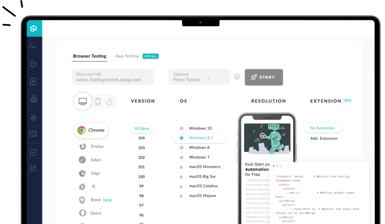
Tools like LT Browser provide a simple way to perform mobile website testing of CSS Grids on different viewports, helping you optimize your layout for a wide range of device viewports and ensure a smooth browsing experience for all users.

Download LT Browser now and start testing your grid responsiveness 👇

Conclusion
CSS Grid is extremely powerful when it comes to designing modern web layouts. It allows you to create two-dimensional layouts with rows and columns by providing a more flexible and efficient way to design layouts compared to traditional methods like floats or positioning.
By incorporating the CSS Grid best practices, you can leverage the full potential of CSS Grid and create flexible, responsive, and visually stunning modern web layouts.
You can also check out these CSS Grid layout generators and start building stunning layouts today.
Frequently Asked Questions (FAQs)
How do you make a perfect grid in CSS?
You can use grid-template-columns and grid-template-rows to define the grid structure, ensuring responsive design with minmax() and auto-fit for flexibility.
Is CSS Grid recommended?
Yes, CSS Grid is highly recommended for creating complex, responsive layouts with ease, offering more control and flexibility compared to older layout methods.
Is CSS Grid better than Bootstrap?
CSS Grid offers more control and flexibility for custom layouts, while Bootstrap is better for quick, standardized designs with built-in components.
Author
Tahera is a freelance Frontend Developer and Technical Writer with over 2 years of hands-on experience in JavaScript, React, Next.js, TypeScript, Tailwind CSS, and Git/GitHub. She specializes in building responsive user interfaces and writing clear, engaging documentation, tutorials, and API guides on technologies like Selenium, Cypress, and modern web development. Tahera has contributed to open-source projects focused on improving UI components and documentation. She has built a following of 7,000+ on X, with some of her posts reaching 400,000+ views, showcasing her influence in the frontend and tech writing community. She currently collaborates with clients on web development and long-form technical content. Although her academic background is in Polity & IR (Bachelor’s) and English Literature (Master’s), she has built her technical expertise through continuous learning and real-world projects.
Blogs: 12