CSS Flexbox Tutorial: A Complete Guide
Harish Rajora
Posted On: June 17, 2021
![]() 98458 Views
98458 Views
![]() 18 Min Read
18 Min Read
CSS has become the backbone of front-end web development and is now a more sophisticated and efficient problem solver than ever. What a web developer used to perform with extensive JavaScript code is slowly being brought to CSS with specific properties. Be it CSS aspect ratio, CSS scroll-snap, or CSS subgrids; the CSS library has been expanding ever since. Still, achieving responsiveness has been a significant challenge in aligning multiple elements on a web page. With CSS Flexbox coming into the picture, we can now introduce various items without worrying about how they will be arranged or overflow. Instead, it gives results to complex website design and perfectly spaced elements!

This CSS Flexbox tutorial will help you develop responsive and browser compatible websites and web apps to ensure their cross browser compatibility. We will deep dive into the construction of the Flexbox in CSS and the range of properties it offers to create convenient yet beautiful CSS Flexbox responsive web designs.
New to CSS Selectors? Check out this Ultimate CSS Selector cheat sheet to boost your web designing career.
TABLE OF CONTENT
Let’s begin with our CSS Flexbox tutorial!
What is CSS Flexbox?
CSS Flexbox is a CSS property to align and organize the elements inside a container efficiently. A CSS Flexbox starts by creating a flexible space on the web page called a container (the outer layer) that can expand as we insert various elements into it, called items. The expansion also includes the spacing that each item would take to fill the space in the container. The Flexbox in CSS grows in the direction of a single axis which can be either horizontal or vertical, which we will demonstrate later in this CSS Flexbox tutorial.
A simple Flexbox will look as follows:

Is CSS Flexbox Responsive?
CSS Flexbox has taken down the usage of plugins, JS code, and calculative prediction in CSS since its introduction. In addition, CSS Flexbox is highly responsive to create Flexbox responsive designs that can mold on any device screen.
But, as we discussed in this CSS Flexbox tutorial, Flexbox comes with many important properties, and apart from a few properties, all are used popularly in constructing a Flexbox in CSS. Due to many influences working on the container and its items, assuming everything would be responsive naturally can be a mistake. That is why it is necessary to check CSS Flexbox’s responsive design before pushing code to production. It can be done in a variety of ways, with the best one being a responsive tool.
One such tool is the LT Browser. LT Browser is developed to fulfill our responsive needs to assure that our website renders seamlessly across different screen sizes. LT Browser is a dedicated native browser application that comes with pre-installed features which make responsive testing highly efficient. Some of these features are pre-installed popular mobile, tablet, desktop, and laptop screens, performance reports of websites for desktop and mobile, network throttling to test websites on different networks, live mobile-view debugging, bug sharing, and session recording. As a web developer, the LT Browser is a must-try tool for web development.
Read More: 11 Reasons Why Developers Should Use LT Browser
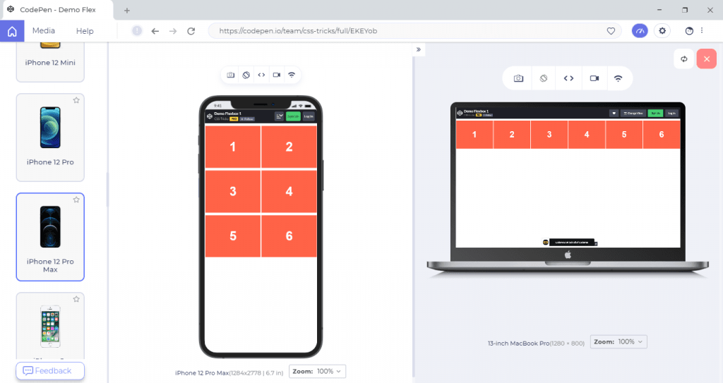
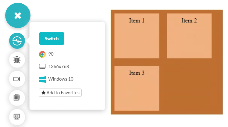
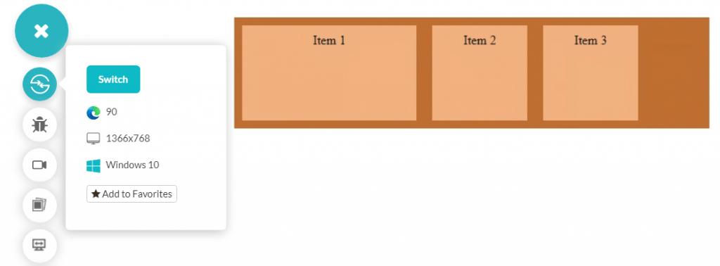
The demonstration of CSS Flexbox on two different device viewports in LT Browser is shown below.
Flexbox Container And Items
A Flexbox comprises two elements: a container and an item(s).
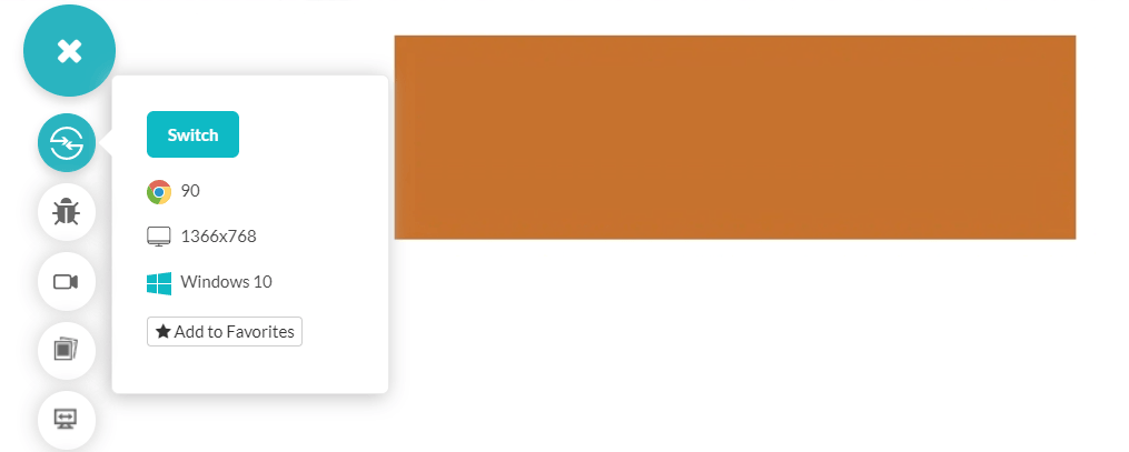
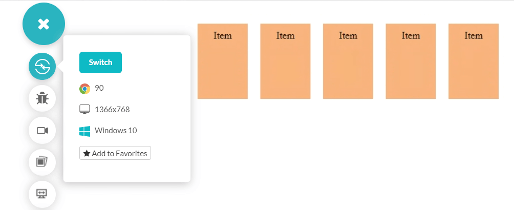
The container is the outside layer, while the items are the elements encapsulated in it. So, the above Flexbox image can be dissected into container and items as follows:
The Container:
The Items:
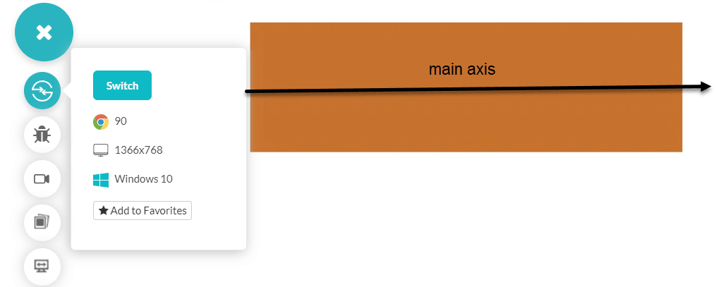
The container works in the direction of the main axis, which the developer can alter through the flex-direction property (discussed later). The default direction is horizontal from left to right, though.
The main axis is shown in the following figure:
Perpendicular to the main axis lies the cross-axis of the Flexbox. Once the items in the main axis are filled, the arrangements move in the cross-axis direction. To alter any default setting on the CSS Flexbox, we can use in-built Flexbox properties. These properties are either applied to the container or the child elements (the items). From the next section of the CSS Flexbox tutorial, let’s see them one by one.
CSS Flexbox Container Properties
The basics of CSS Flexbox are limited to what is mentioned in the previous sections. A container and multiple elements inside it, and that is it. We work our way inside the container, adjusting the items within that space quickly. But what makes Flexbox “efficient” is the properties of its container and elements.
Let’s have a look at these container properties.
Creating a Flexbox Container
To work with the Flexbox in CSS, we need to create one Flexbox on our web page. Flexbox is not something like a block element “div” as a foundation. Instead, we convert one such element into the Flexbox.
Remember that the property we use is for Flexbox containers only. Below is the following syntax to define a Flexbox container.
|
1 2 3 |
.Flexboxcontainer { display: flex; } |
Once we have attached the “display: flex” property to a container, everything inside the container will work according to the flex properties.
In the below code output, the display is not set to flex. It is due to the “div” inside in which these items are, which is a block-level element expanding vertically with newer elements.
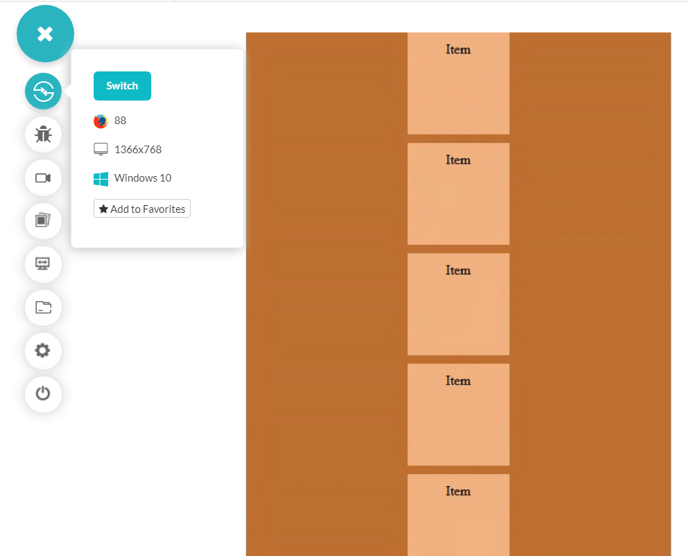
Below is the same code with the display: flex property.
|
1 2 3 4 5 6 7 8 9 10 11 12 13 14 15 16 17 18 19 20 21 22 23 24 25 26 27 28 29 30 31 32 33 |
<html lang="en" dir="ltr"> <head> <meta charset="utf-8"> <title>Flexbox demo</title> <style> .container { display: flex; background-color: rgb(191, 110, 48); width: 500px; } .item { background-color: rgb(240, 175, 125); height: 100px; padding: 10px; margin: 10px; width: 100px; } </style> </head> <body> <br> <center> <div class = "container"> <div class = "item">Item</div> <div class = "item">Item</div> <div class = "item">Item</div> <div class = "item">Item</div> <div class = "item">Item</div> </div> </center> </body> </html> |
The output of the display: flex property is shown below.
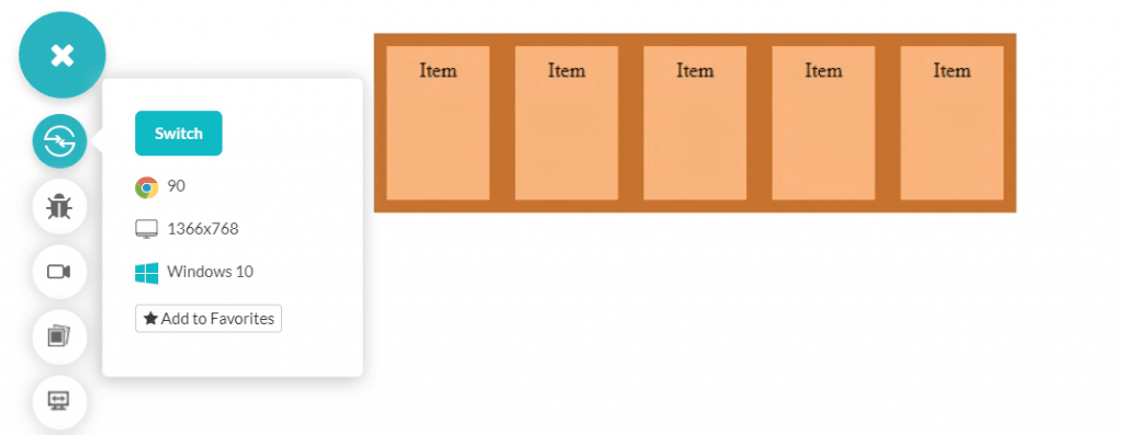
Notice how the elements move in the direction of the main axis, from left to right, rather than stacking up on one another.
The Direction Of The Flexbox: flex-direction property
By default, as seen in the previous code, the items inside the Flexbox container are arranged horizontally from left to right. It is our default main axis. However, this is not a strict regulation and can be controlled through the flex-direction property.
|
1 2 3 4 |
.container { display: flex; flex-direction: row-reverse; } |
Below is the Flexbox in CSS code to show the number of items.
|
1 2 3 4 5 6 7 |
<div class = "container"> <div class = "item">Item 1</div> <div class = "item">Item 2</div> <div class = "item">Item 3</div> <div class = "item">Item 4</div> <div class = "item">Item 5</div> </div> |
Our CSS Flexbox now looks as follows.
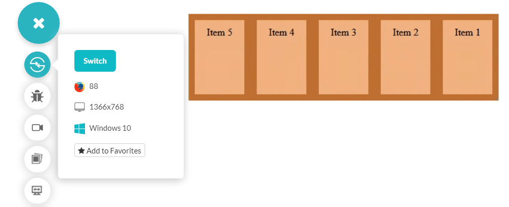
Notice the direction of item numbers has changed now even though the main axis is still on the same plane.
The flex-direction property takes the following values:
- row: This is the default arrangement. If the writing mode is ltr then the row will arrange the items in the left to the right direction or else right to left.
- row-reverse: This is the reverse of what the value row would have produced in both writing modes.
- column: Column value will make the main axis vertical, and the items will be arranged from top to bottom with this value.
- column-reverse: This is the reverse of what the value column would have produced.
For more information on writing modes in HTML, please refer to our blog Complete Guide To CSS Writing Modes.
The following image shows the column-reverse arrangement.
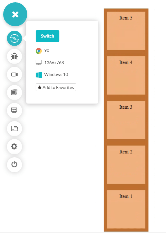
Browser Compatibility for flex-direction
The flex-direction property comes with great support from browsers. All browsers, including internet explorer, support the flex-direction property.

Wrapping Flexbox Items: flex-wrap property
Like the word-wrap property, the flex-wrap property seeks to wrap the items inside the container to the next line in case of insufficient space. By default, the items do not wrap and are arranged in a single line along the main axis—the flex-wrap works from top to bottom.
Below is the syntax for the flex-wrap property.
|
1 2 3 4 |
.container { display: flex; flex-wrap: <value> } |
The output of the flex-wrap property is shown below.
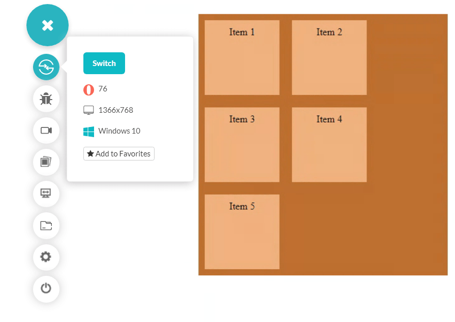
The flex-wrap property takes on the following values:
- nowrap: The items will be arranged in a single line. It is the default value of flex-wrap and can lead to the overflow of the flex container.
- wrap: Wrap the items to the next line when required.
- wrap-reverse: Wrap the items to the next line when needed but in the reverse order.
The flex-wrap: wrap-reverse property will look as shown below.
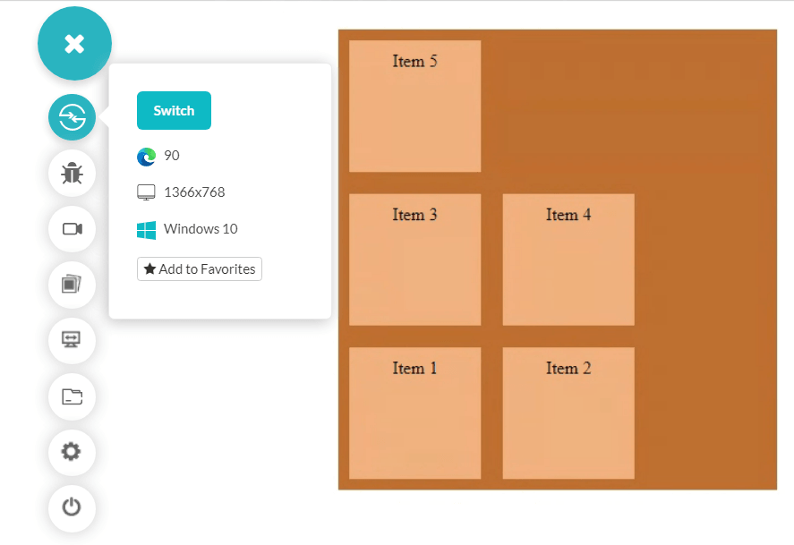
Tip: The flex-flow property can also be used as a shorthand for the flex-direction and flex-wrap property, defining both values in a single line.
The below code contains the flex-direction and flex-wrap properties.
|
1 2 3 4 5 |
.container { display: flex; flex-direction: row-reverse flex-wrap: wrap-reverse; } |
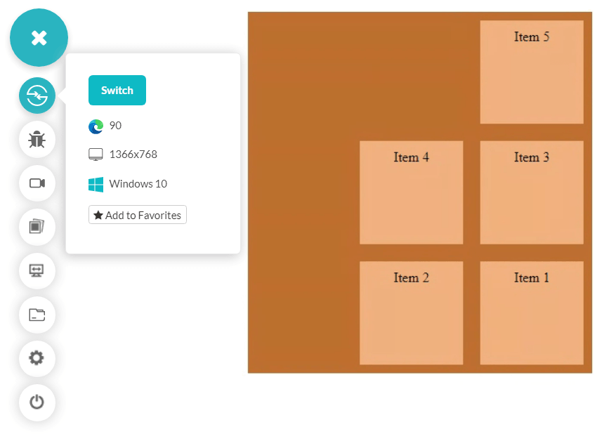
Therefore the shorthand notation for the above code is as follows.
|
1 2 3 4 |
.container { display: flex; flex-wrap: row-reverse wrap-reverse; } |
Output for the above shorthand code.
Browser Compatibility For flex-wrap
Similar to the flex-direction property, flex-wrap too enjoys excellent support from the browsers.

Internet Explorer supports the property, but there have been many complaints regarding inconsistent outputs on different screen sizes. Therefore, it is not recommended to use flex-wrap on internet explorer.
Align Flexbox Elements On Main Axis: justify-content property
The justify-content property aligns the elements along the main axis and distributes the leftover space equally within these items.
Below is the syntax for the justify-content property
|
1 2 3 4 |
.container { display: flex; justify-content: <value>; } |
The justify-content property in CSS Flexbox takes the following values:
- flex-start: The Flexbox items are arranged towards the start of the axis.
- flex-end: The items of Flexbox in CSS are arranged towards the end of the axis.
- start: The items are arranged toward the start of the writing mode direction.
- end: The items are arranged towards the end of the writing mode direction.
- center: The items are packed along the center of the container (or main axis).
- space-between: The items are spaced equally on the line, with the first item at the start of the line and the last item at the end of the line.
- space-around: The items have an equal amount of space around them. With this value, the first item does not touch the container as in space-between. The same rule applies to the last item.
- space-evenly: The items are packed with equal space all around them. The difference between space-around and space-evenly is that in space-around, the edge space is x in the start item while the right space is 2x. It is because the next item will also have a space of x around it.
In the following two images, notice the first item’s space towards the edge in space-around and space-evenly values.
Space-Around:
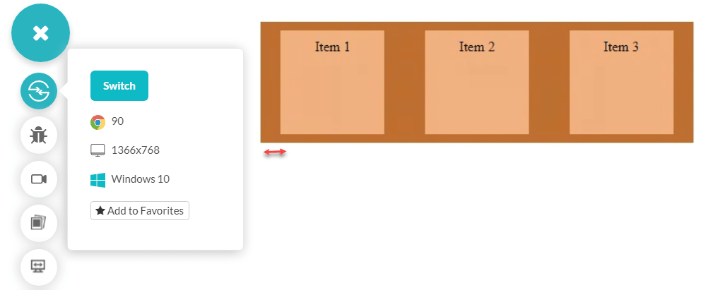
Space-Evenly:
You may find some more values while learning about justify-content, but they are rarely used while designing the Flexbox in CSS. Also, most of them are not considered as they are not still included in the browsers and should be avoided.
Browser Support For Justify-Content Property
The browser support for the justify-content property is good, but it also depends on the value you use. The values “start” and “end” have inferior support and therefore are not recommended. It is always advisable, therefore, to check the browser support for the value you are using. As far as the property is concerned, only internet explorer and Opera mini are still reluctant to include it in their browsers.
CSS Flexbox Items Properties
All the above properties are applied to the CSS Flexbox container and do not directly affect the items (they do indirectly). In this section of the CSS Flexbox tutorial, we will see a few properties applied to the Flexbox items and directly affect them.
Changing The Order Of Flexbox Items: The order property
The appearance of the Flexbox items is fixed according to how they are written inside the HTML source code. So an element (say A) written before another element (say B) will appear ahead of B in the Flexbox container. This order, however, can be altered with the “order” property of the Flexbox items.
The order property takes an integer value and arranges the elements from lower to higher order (lower number means high priority). You can also consider this arrangement in ascending order.
The following code demonstrates the order property of Flexbox items.
|
1 2 3 |
itemclass { order: <value> } |
The complete code would look as follows, with each item with its own style.
|
1 2 3 4 5 6 7 8 9 10 11 12 13 14 15 16 17 18 19 20 21 22 23 24 25 26 27 28 29 30 31 32 33 34 35 36 37 38 39 40 41 42 43 44 45 46 47 48 49 50 51 52 53 |
<html lang="en" dir="ltr"> <head> <meta charset="utf-8"> <title>Flexbox demo</title> <style> .container { display: flex; background-color: rgb(191, 110, 48); width: 500px; } .item { background-color: rgb(240, 175, 125); height: 100px; padding: 10px; margin: 10px; width: 100px; } .item1 { order: 3; } .item2 { order: 5; } .item3 { order: 2; } .item4 { order: 1; } .item5 { order: 4; } </style> </head> <body> <br> <center> <div class = "container"> <div class = "item item1">Item 1</div> <div class = "item item2">Item 2</div> <div class = "item item3">Item 3</div> <div class = "item item4">Item 4</div> <div class = "item item5">Item 5</div> </div> </center> </body> </html> |
Notice the order value of each item in the style tag. The output of the above code would be as follows.

The items with the same order value are represented according to their appearance in the source code.
So if an item (say A) and another item (say B) have the same order but B is written before A in the source code will bring B ahead in the output.
The order attribute in CSS Flexbox also accepts negative numbers.
Browser Compatibility For Order property
Every browser from very early versions supports the order property of Flexbox items!

Change The Width Of Flexbox Items: The flex-grow property
By default, all the Flexbox items expand in the same ratio and take the same amount of space in the container (equal width). But it can be changed through the flex-grow property. However, remember that the flex-grow property will change the dimension aligned with the container’s main axis. If the flex-direction is set to “row,” the item’s width will change, and if the flex-direction is set to “column,” the item’s height will change.
The flex-grow property takes a positive integer or fractional value. Negative values are not allowed in the flex-grow. All the negative values are considered as 0. If an item has a flex-grow set to 2, it will take twice as much remaining space as other elements (considering other elements have flex-grow as 1).
The remaining space is the difference in the amount of space in the container and the space taken by all the items.
|
1 2 3 4 5 6 7 8 9 10 11 |
.item1 { flex-grow: 1; } .item2 { flex-grow: 2; } .item3 { flex-grow: 1; } |
Output:

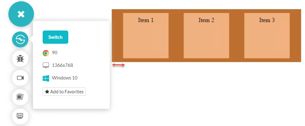
As seen in the output, it is clear that even though the flex-grow of the middle item is set at 2, it does not mean it will be extended to twice the size of other items. Therefore, the word “remaining phrase” was used in the introduction of this property. To check their width, we can also inspect these items and confirm the proportion they have extended.
Item1 and Item3 have a width of 190.

Here Item2 has a width of 260, which is not twice of 190.

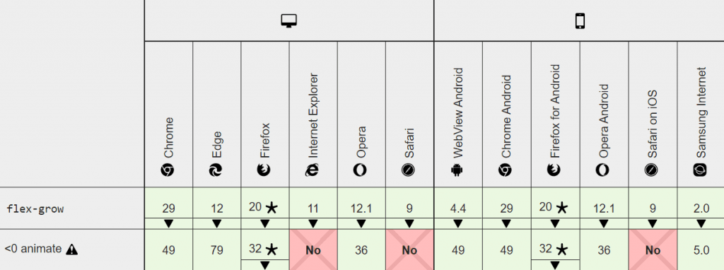
Browser Compatibility For flex-grow property
Every browser supports the flex-grow property of CSS Flexbox.
Shrink The Flexbox Item: The flex-shrink property
The flex-shrink property in the CSS Flexbox is just the opposite of the flex-grow property. The flex-shrink property shrinks the item with respect to the other element’s width. This happens when there is not enough space to accommodate all the items inside the container.
|
1 2 3 4 5 6 7 8 9 10 11 |
.item1 { flex-shrink: 2; } .item2 { flex-shrink: 1; } .item3 { flex-shrink: 1; } |
Output:
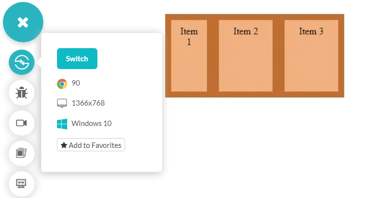
You can also inspect these items as we did in flex-grow to see their width and the proportion they have shrunk. Also, it is essential to remember that flex-shrink works only when the container size is not big enough to accommodate the items inside it. For example, if we increase the container size to a comfortable width, Item1 will have equal width to Item2 and Item3.
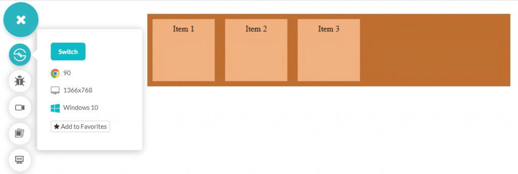
You will see the same results if the size is smaller for the items to accommodate, but you have used the flex-wrap property to “wrap.” Again, it is due to the flex items having permission to move to the next line if space is not enough.
|
1 2 3 4 5 6 7 8 9 10 11 12 13 14 15 16 17 18 19 20 21 22 23 24 25 26 |
.container { display: flex; background-color: rgb(191, 110, 48); width: 300px; flex-wrap: wrap; } .item { background-color: rgb(240, 175, 125); height: 100px; padding: 10px; margin: 10px; width: 100px; } .item1 { flex-shrink: 2; } .item2 { flex-shrink: 1; } .item3 { flex-shrink: 1; } |
Output:
The default value of flex-shrink is one and indicates that all the items in the Flexbox will shrink to an equal proportion. Hence, they will be equal in size.
Browser Compatibility For Flex-Shrink
Like the flex-grow property of CSS Flexbox, flex-shrink enjoys excellent support from all browsers from their legacy versions.

Both of these properties are used mainly to deal with cross-browser compatibility issues to tackle the different screen sizes in the market. You can learn more about cross browser testing in the linked post.
|
1 2 3 |
.item1 { flex-basis: 200px; } |
Output:
You can try to experiment with the flex-basis with other properties to see the effect.
The flex-basis property takes a percentage and fixed value as defined above. Other values include auto, and content is not supported in older browsers.
Browser Compatibility For flex-basis
The browser support for flex-basis depends on the value you are using in the property. For example, the “content” property has poor support while all the browsers support the “auto.”
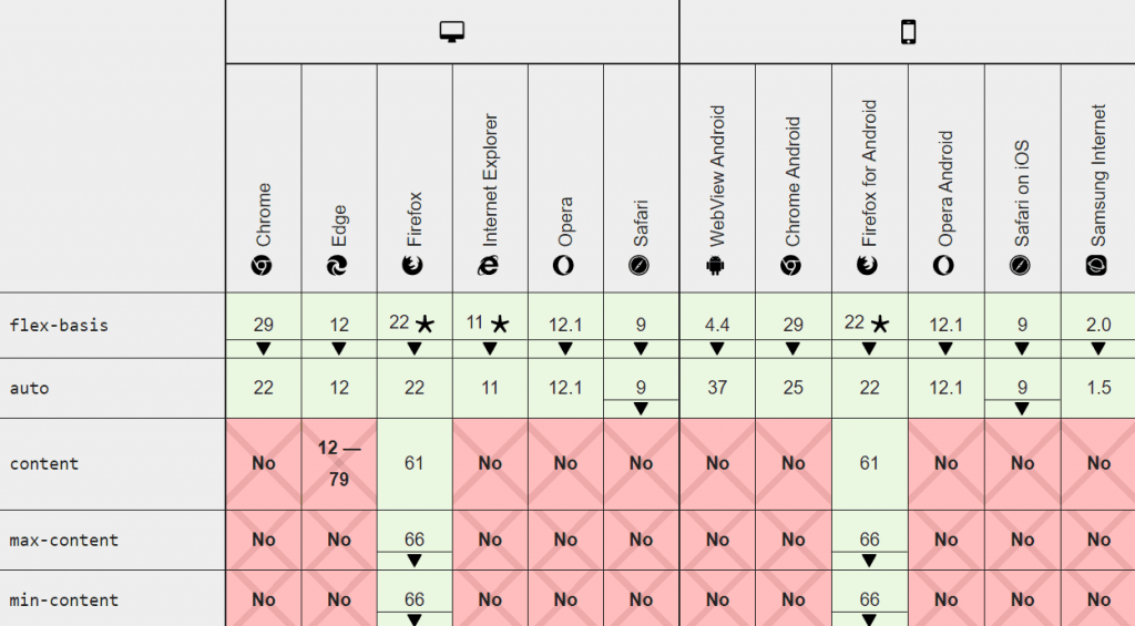
It is recommended to either use a fixed value (px or percentage) or go with the auto for a better cross-browser compatible design. Both of these are supported by all browsers.
Shorthand For flex-shrink, flex-basis, And flex-grow: the flex property
Since CSS Flexbox provides several properties, sometimes it results in long codes as we define each property in one line. In such cases, shorthands offer a concise way of defining multiple properties in a single line. One such shorthand is the “flex” property.
The flex property defines three different sets of values. The first one is for “flex-grow,” the second one for flex-shrink, and the last one for flex-basis. So, the syntax would follow the following structure:
|
1 2 3 |
.item { flex: 0 2 200px; } |
Browser Compatibility For flex property
Since the flex property uses the three most popular and most acceptable properties as a combination, there could be no doubt about its popularity. Moreover, the flex property is supported in all browsers.

CSS Grids Vs. CSS Flexbox
CSS grids and Flexbox are popular among the developers as it looks like both create a box structure and fills elements inside them. In reality, they are similar in many aspects but different in many too!
The basic principle in CSS grids and CSS Flexbox is that CSS grids work in two dimensions, i.e., row-wise and column-wise, simultaneously. It does not happen in CSS Flexbox. As discussed in the flex-direction, the CSS Flexbox moves in a single dimension along its main axis. If you require it to move in both axes, CSS grids are probably a better choice.
The next parameter is whether you need to place items without worrying about their size or you do? CSS Flexbox creates a container space and fills items into it after that. These items will take the required space in the container (as a part of moving in a single direction). On the other hand, CSS grids create tracks in the container with fixed-sized items. The items are then filled inside the boxes with limited size.
The following image shows a Flexbox in CSS with five items.

Changing the container to grid gives the following output.

While both modules serve their purpose, it is up to the web developer how he wants to publish the items on a web page.
Even if all of these conditions are satisfied by your project on CSS grids and CSS Flexbox, the decision will come down to the properties each of them offer. The property that gives you more convenience is a better property for that project. As a point to remember, if you are changing too many properties and making too many adjustments, you probably are using the wrong module.
Conclusion
CSS Flexbox comes with different vital properties, but in my experience, there will be hardly any instance when you will not use any of them. This is because they are essential in web design and give the Flexbox the strength and power for which it was developed.
While using Flexbox in CSS, it becomes imperative to perform cross browser compatibility testing due to its unpredictable output in different browsers. Unfortunately, even if we observe the issue, it is not that simple to get rid of them without changing the meaning of the Flexbox.

In this CSS Flexbox tutorial, we discussed the Flexbox properties with examples to demonstrate how they change the CSS Flexbox accordingly. CSS Flexbox does magical things that are pleasing to a developer. We appreciate such codes and hence would love to see them in the comment section. It will help the developers practice CSS Flexbox in a better way.
Got Questions? Drop them on LambdaTest Community. Visit now


