14 Common UI Bugs and How to Avoid Them
Vishal Sahu
Posted On: April 1, 2024
![]() 96128 Views
96128 Views
![]() 18 Min Read
18 Min Read
A software application’s user interface (UI) is critical as it directly impacts the user experience. UI bugs can cause problems that frustrate users and affect the application’s usability.
To avoid user problems like unresponsive buttons or confusing layouts, it’s crucial to fix UI bugs before users notice them. If users find issues, they might stop using the app, causing revenue loss. So, identifying and fixing UI bugs through testing is vital for a smooth user experience.
So the question is, what factors must you look for while testing your website or app’s interface design? What are the most common bugs that can go unnoticed?
This blog will highlight the most common UI bugs encountered in web applications and provide strategies for effectively monitoring them. Familiarizing oneself with these issues can empower the QA community to identify and address them promptly during future testing journeys.
TABLE OF CONTENTS
What are UI Bugs?
In simple language, “bugs” refer to mistakes or problems in computer programs or systems. When people write computer code to create software applications, they sometimes make errors or overlook things. These errors can cause the application to behave unexpectedly or not work correctly.
UI bugs are glitches or errors in the design of a website or app interface that cause visual or functional issues. These issues can impact user experience, making the interface appear or behave incorrectly.
What is UI Testing?
UI testing, or User Interface testing, is a process to ensure that all the things you can click, see, or interact with on a website or app are working correctly. It includes checking if the buttons, menus, images, colors, and other visual elements are working correctly according to the plan. It’s like ensuring everything looks good and works smoothly for people using the website or app.
Why is UI Testing Important?
Websites have grown more prominent, with hundreds of pages and elements on a single page. It can strain the server fetching the website, leading to a slow website. Testing this scenario falls under UI testing and can improve performance.
UI testing is crucial because it focuses on the part of the website or app that users interact with the most. The goal is to make it simple and easy for users to navigate. During UI testing, we also check that any changes to how things look or work make sure the overall functionality of the website or app is maintained. So, it’s not just about making things pretty; it’s about ensuring everything stays functional and user-friendly.
According to a Google survey, 53% of users abandon tasks that take longer than 3 seconds to load. You can reduce this delay by optimizing JavaScript and CSS. Therefore, testing the user interface is necessary to improve the website’s performance.
Let’s discuss some essential and common UI bugs that can cause issues. Finding and fixing these UI bugs during testing ensures users have a smooth and easy experience, ultimately making them happier overall.
Common UI Bugs in Web Applications
This section explores the top 14 common UI bugs in web applications, ranging from misaligned elements to unresponsive designs, that can significantly affect user experience and functionality.
Cross-Browser Incompatibility
Cross-browser incompatibility occurs when a website or application does not render consistently across various browsers. Inconsistencies may manifest as layout, styling, or functionality differences, leading to a fragmented user experience. For example, a flawless webpage in Google Chrome might exhibit misalignments or broken elements when viewed in Firefox, Edge, or Opera.

These inconsistencies are often attributed to variations in how different browsers interpret and execute code, handle CSS styles, or manage JavaScript functions. As a result, users accessing the same site through different browsers may encounter visual disparities or functionality issues.
How to Avoid Cross-Browser Incompatibility?
To avoid such common UI bugs, you can perform cross-browser testing to help you identify compatibility issues early in the development cycle, enabling quick fixes. Waiting until later stages can lead to increased stress and challenges. Since cross-browser compatibility testing involves testing in multiple environments, starting early can help minimize these issues later in the cycle.
Maintaining consistency over various browsers and OS combinations can be a challenge. To overcome this challenge and leverage UI testing capabilities, you can use a cloud-based platform like LambdaTest that offers cross-browser testing capabilities that will help you maintain consistency.
LambdaTest is an AI-native test orchestration and execution platform that lets you run manual and automated tests at scale on over 10,000+ real devices, 3000+ browsers and OS combinations.
This platform allows you to run parallel testing, provides test infrastructure, and handles security, which ensures you run your tests seamlessly.
Some of the key features of leverage LambdaTest are:
- It enables comprehensive cross-platform and cross-browser testing, ensuring seamless functionality across various platforms for your website or app.
- It eliminates the need to maintain physical testing infrastructure. It offers a scalable cloud environment, reducing hardware setup and maintenance costs. Additionally, it enables parallel test execution, significantly reducing testing time.
- It seamlessly integrates with popular automation frameworks like Selenium, Cypress, Playwright, and Appium. This flexibility lets you leverage existing framework expertise and easily migrate tests to the cloud.
- It leverages AI-native features like visual testing to automatically compare screenshots across different browsers and devices, highlighting visual inconsistencies. It can significantly improve visual regression testing efficiency.
- It provides HyperExecute, an AI-native end-to-end test orchestration platform that significantly accelerates the speed and efficiency of your automation testing. It goes beyond cloud-based test execution by offering intelligent features that automate and optimize the testing process.
To learn more about LambdaTest features and various functionality, watch this video tutorial and get valuable insights.
You can also subscribe to the LambdaTest YouTube Channel and get detailed tutorials on Selenium testing, Cypress testing, Playwright testing, and more.
 Note
NoteIdentify and fix common UI bugs efficiently by performing UI testing. Try LambdaTest Today!
Responsive Design Bugs
Ensuring a consistent user experience across all platforms is a significant challenge, given the proliferation of devices with different screen sizes and resolutions. Text truncation, misalignment, and overlapping elements are common symptoms of responsive design bugs on various screen sizes.

Here are common responsive design glitches that can trip you up and how to identify them:
- Content Overflow: Images, text, or buttons spill outside their containers on smaller screens.
- Element Misalignment: Buttons, forms, or other elements appearing out of place or overlapping at different screen sizes.
- Broken Layouts: Entire sections of your website collapse or disappear entirely on specific devices.
How to Avoid Responsive Design Bugs?
Testing the performance of your website across various screen sizes involves checking user interaction, page loading, images, navigation, text alignments, and more. Doing this manually is tedious, so you need an all-in-one solution for responsive testing.
Investing in a robust and free mobile-friendly tool like LT Browser is a feasible and time-saving option. LT Browser is a complementary tool offered by the LambdaTest platform.
With LT Browser, you can perform responsive design testing across 53+ pre-installed device viewports, including mobile, tablets, desktops, and laptops.
Watch the video tutorial and get detailed insights on how to use the LT browser.
Form Validation Bugs
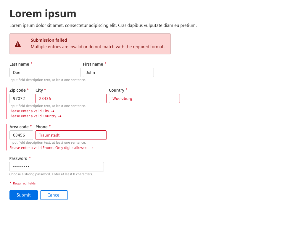
Form validation bugs occur when web forms fail to check user input information properly. It means that users can submit incorrect or incomplete data without warning. These bugs happen when the rules for checking the data aren’t set up correctly, or the form doesn’t handle errors well. Fixing these bugs is crucial because they can lead to inaccurate data, security issues, and a bad user experience.
How to Avoid Form Validation Bugs?
To avoid such common UI bugs, you can perform comprehensive testing on input forms for validation and error handling. Conduct functional testing with valid, invalid, and edge-case inputs for validation to ensure correct form behavior. Additionally, you can also perform usability testing to verify clear error messages and appropriate field highlighting, ensuring a seamless user experience.
Color Inconsistencies
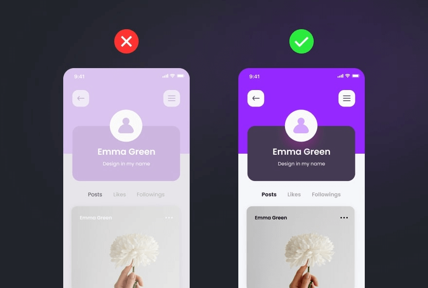
UI color inconsistencies refer to mismatched hues, shades, or tones within a website or application. When colors don’t align, it can confuse the user experience. Imagine buttons changing shades unexpectedly. These inconsistencies can confuse users and impact brand perception.
How to Avoid Color Inconsistencies?
To avoid such common UI bugs, you can perform accessibility testing to check color contrast using tools like WebAIM’s Color Contrast Checker or Contrast Checker. This ensures text and elements have sufficient color contrast for readability and usability. Additionally, you can perform UX testing sessions to gather feedback on the color scheme and identify user experience issues.
Alignment Issues
Alignment issues occur when website or app elements don’t align correctly. Imagine text, images, or buttons not sitting in their designated places, causing a messy and unorganized appearance. These bugs can disrupt the user experience, making navigation confusing and frustrating. Whether it’s text misaligned with images or buttons placed awkwardly, these alignment issues hinder a website’s seamless flow.
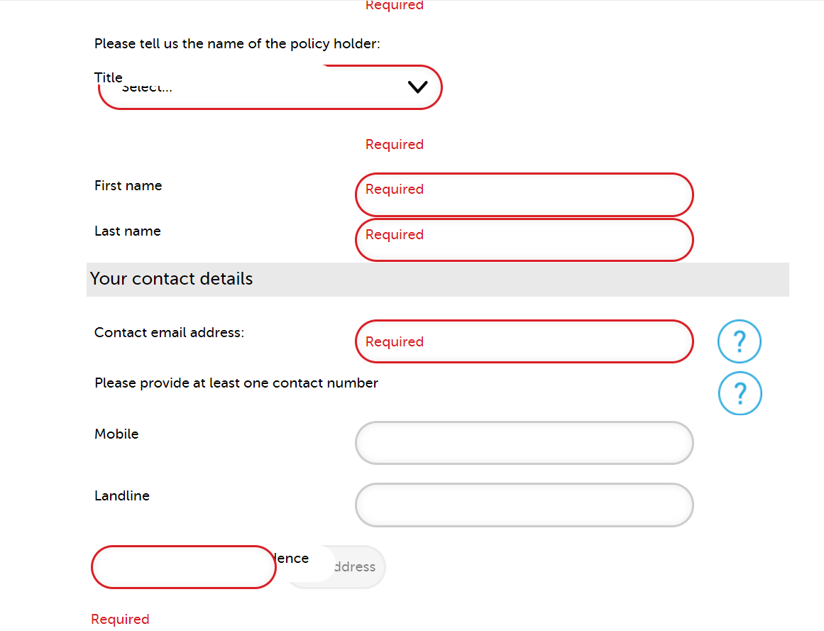
How to Avoid Alignment Issues?
To avoid such common UI bugs, you can perform visual testing to identify form alignment across various browsers and devices. Additionally, manually inspect the website’s layout and design to catch any alignment issues that automated testing tools may miss.
Broken Links and Navigation
In simple terms, broken links and navigation are all the non-working pathways within a site or application for user interaction. The problem might arise in numerous ways, such as hyperlinks that lead to a 404 not found error, buttons that refuse to take users where they intend, etc. If something prevents users from smoothly passing through the interface, these are described as broken links or navigational defects.

How to Avoid Broken Links And Navigation?
To avoid such common UI bugs in the future, you must regularly check all the links on your web application to ensure that they are working correctly. You can also use tools like W3C Link Checker or Online Broken Link Checker.
Invisible Clickable Areas
Invisible clickable areas refer to elements within a user interface that appear non-interactive but are clickable. These can include buttons, links, or other elements that fail to display visual cues, making it challenging for users to identify and interact with them. Such UI bugs often frustrate users and impact the interface’s usability.
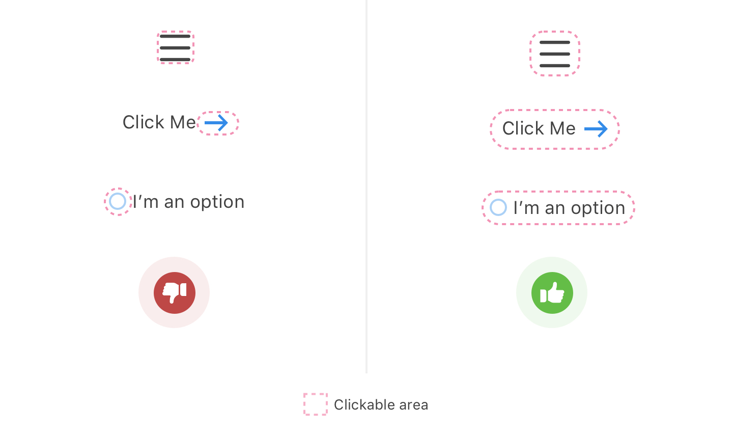
How to Avoid Invisible Clickable Areas?
To avoid such common UI bugs, you can perform usability testing to identify and address issues related to invisible clickable areas in a user interface. This testing involves observing real users as they interact with the UI. This helps identify areas of improvement where users struggle to identify the clickable element.
Inconsistent Fonts and Typography
Inconsistent fonts and typography in UI design refer to the need for uniformity in the text presentation across different user interface elements. This can manifest in various ways, such as mismatched font styles, sizes, or spacing. Such inconsistencies compromise the UI’s visual appeal and lead to clarity and better user experience. UI testers often encounter this issue, as it can affect the overall coherence and professionalism of the interface.

How to Avoid Inconsistent Fonts And Typography?
To avoid such common UI bugs, you can use a consistent font stack with fallback fonts to avoid font inconsistency and typography in the UI. This will ensure consistent typography across different browsers and devices. You can also use web fonts and ensure they are loaded properly when shifting layouts. It is a good practice to regularly check your CSS for any overrides of font style causing inconsistency.
Slow Loading Times
Slow loading times in UI testing refer to the delay experienced when accessing or interacting with user interfaces. These delays can significantly impact user experience and hinder the smooth functioning of applications. They often occur due to inefficient code, heavy graphics, or network issues. Identifying and addressing slow loading times ensures optimal UI performance and overall user satisfaction.
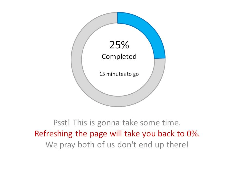
How to Avoid Slow Loading Times?
To avoid such common UI bugs, you can perform performance testing to evaluate the responsiveness and stability of an application under different load conditions. Slow loading times can also occur due to heavy traffic on the application. Conducting load testing helps avoid heavy traffic and identify potential application performance bottlenecks.
Bad Iconography
Icons are often considered the simplest part of a design, sometimes seen as a decorative add-on. However, they play a crucial role in modern interfaces, especially on mobile, where they often serve as primary navigational elements. Choosing icons that communicate their meaning and maintaining a consistent style throughout your app is essential.

How to Avoid Bad Iconography?
To avoid such common UI bugs, select icons representing their intended action and maintain a consistent style for a clear look and feel. Conduct user testing to ensure icons are easily understood and accessible to all users, including those with visual impairments. Perform visual regression testing to check if icons and UI elements display correctly across browsers and devices, avoiding issues caused by new releases.
Cluttered Pop-Ups
Pop-ups are generally disliked by users, and it’s important to respect your customers’ experience. Avoid using intrusive pop-ups with tiny close buttons that lead to unrelated pages. If you do use pop-ups, ensure they are relevant and appear after the user has engaged with the content. Also, keep the design simple and concise to improve readability and user experience.
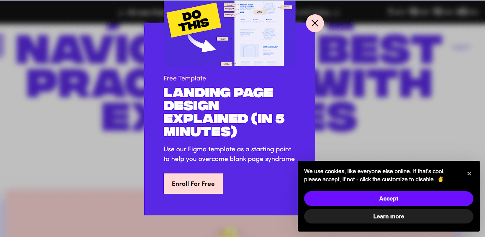
How to Avoid Cluttered Pop-Ups?
To avoid such common UI bugs, you must use a simple design with clear content and a visible close button to avoid pop-up-related issues. Conduct user testing to collect feedback and improve the pop-ups based on user insights.
Messy Layout
A bad layout can impact user experience and lead to high bounce rates; if the website’s layout is cluttered, disorganized, and difficult to navigate, your target audience can be frustrated and leave the site quickly.
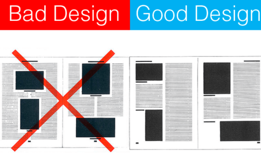
How to Avoid Messy Layout?
Ensure your website follows a better hierarchy to avoid common UI bugs. It is important to place the elements for easy user navigation and readable fonts and maintain an aligned layout and spacing to guide visitors easily through your websites.
Inconsistent Scrolling
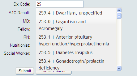
When an application requires users to scroll extensively to access content, it can lead to usability issues and negatively impact the user experience. Long pages with heavy content can slow down the application’s performance and cause scrolling inconsistencies, such as stuttering behavior, which can frustrate users.
How to Avoid Inconsistent Scrolling?
To avoid such common UI bugs, you must use pagination to break your long page content into smaller and more manageable sections. You can also use sticky navigation elements that remain visible as users scroll through the application. It is good practice to keep the important content near the top section of the application page so that users can easily see the sticky navigation elements that remain visible as they scroll.
Complex Navigation
Users expect easy navigation and a clear path to find information when visiting a website. However, some websites have complex navigation that confuses visitors. While the website design may be impressive, navigating through it becomes a significant UI issue.

How to Avoid Complex Navigation?
To avoid such common UI bugs, you must create a website with simple and intuitive navigation, using clear labeling and logical content organization. Conduct usability testing to validate the user flow, collect feedback, and identify navigation issues. Provide prominent calls to action (CTAs) to guide users, ensuring a smooth user experience.
Now that we have learned the common UI bugs faced by the QA team, in the section below, we will look into the checklist that must be followed while performing UI testing to prevent UI bugs from occurring.
UI Testing Checklist
In this section, we will learn the UI checklist developers and testers must follow to avoid common UI bugs. This checklist can help ensure that the user interface of a website or application is robust and provides a seamless user experience.
- Check for consistency in brand colors, font, spacing, buttons, etc.
- Verify UI elements such as buttons, menus, and images for consistent display and functionality across different resolutions and orientations.
- Optimize UI performance for fast loading times and smooth transitions, enhancing user satisfaction and retention.
- Ensure your UI functions seamlessly across web browsers like Chrome, Firefox, Safari, and Edge. Test for consistency in UI layout, responsiveness, and functionality to guarantee a smooth user experience across all platforms.
- Ensure all user inputs are thoroughly validated to prevent UI bugs. Validate input formats, lengths, and ranges to maintain data integrity and enhance UI functionality. UI testing must include rigorous checks for accurate data handling.
User Acceptance Testing (UAT), the final UI testing phase, is performed to validate the above checklist. In this phase, real users interact with the UI to validate its functionality, usability, and compatibility with their needs. It ensures that the UI meets user expectations and business requirements before deployment.
Conclusion
In conclusion, UI bugs can significantly hinder user experience, affecting usability and satisfaction. Through thorough UI testing, developers can ensure a smooth interface, including checks for cross-browser compatibility, responsive design issues, form validation bugs, color inconsistencies, alignment problems, broken links, invisible clickable areas, font inconsistencies, and slow loading times. Using platforms like LambdaTest and adhering to a comprehensive UI testing checklist is essential for identifying and rectifying these common bugs, ultimately enhancing user satisfaction and retention.
Frequently Asked Questions (FAQs)
What are the bugs in UI design?
Common bugs in UI design include inconsistent spacing, overlapping elements, broken links, unclear navigation, poor contrast, and slow loading times. These issues can hinder user experience and should be addressed promptly to ensure smooth interaction.
What is the UI issue in testing?
The UI issue in testing refers to any problem or flaw that affects the user interface of a software or application. It could include layout inconsistencies, navigation errors, or functionality glitches that hinder user experience. Addressing these issues is crucial for ensuring a seamless and intuitive interface for users.
What are user interface defects?
Common interface design faults include inconsistency, unclear button hierarchy, poor text organization, bad iconography, unaligned elements, low contrast, confusing forms, and inadequate touch targets.
Got Questions? Drop them on LambdaTest Community. Visit now


