Accessibility is all about going the extra mile!
Manoj Kumar
Posted On: May 18, 2023
![]() 24709 Views
24709 Views
![]() 5 Min Read
5 Min Read
It is that time of the year when the spotlight is (rightfully) on accessibility again.
It is accessibility day and month and I wanted to take this opportunity to share my views on the subject.
I’ve worked extensively in this space and what my experience has taught me is this–there’s always more one can do!
One of the earliest inspirations for me to work and explore this space came from a simple medium–a cartoon!

What this cartoon conveyed was pretty direct–Accessibility is all about inclusivity!
How should companies think about accessibility?
In many cases, people/teams look at accessibility as a technical aspect to tick off from a list. While that is partly true, it isn’t the whole picture. Similarly, people assume that accessibility is about ensuring that specially-abled folks are able to seamlessly use your product. Again true, but is that all it is?
How about this use case? Imagine there’s a customer of yours who is using your app while carrying two bags in one hand. Can they use your app with just the other hand? That’s accessibility too! Imagine if you did solve it, you’d have earned a loyal customer who knows that your company is going the extra mile!
It really is about putting yourself in the shoes of every possible user/every possible scenario of/for your product.
Just to dig a bit deeper, accessibility can be thought of in three distinct sub-divisions.
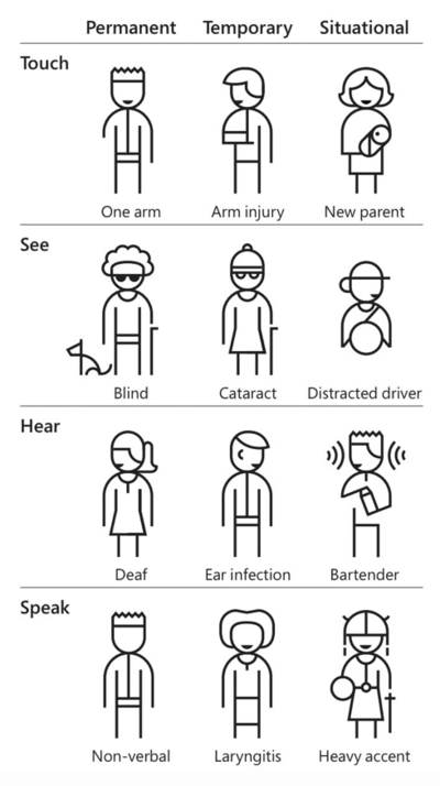
Source- Microsoft Inclusive Design Kit
If your app/digital asset isn’t accessible, you are creating barriers & making their impairment a disability. Be inclusive and your brand will reap benefits!
What’s the global standard?
A question I often get asked is, how can my business achieve global standards? Is there a benchmark?
Yes!
The Web Accessibility Initiative at the World Wide Web Consortium outlined four main web accessibility principles in the Web Content Accessibility Guidelines: WCAG.
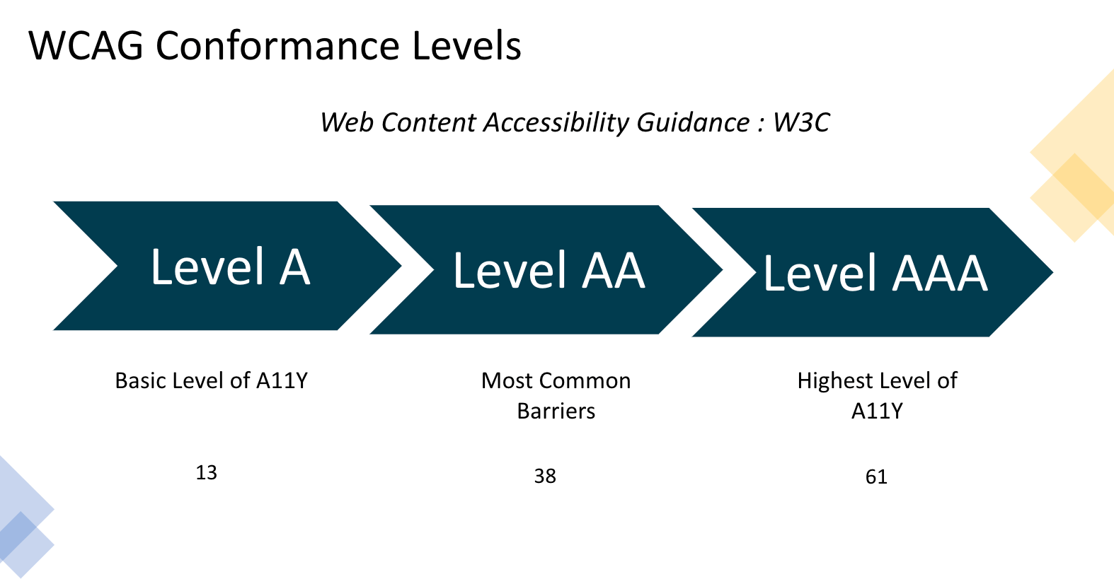
Given that there are three levels of accessibility–A, AA, and AAA. Each level comes with its set of ‘targets’.
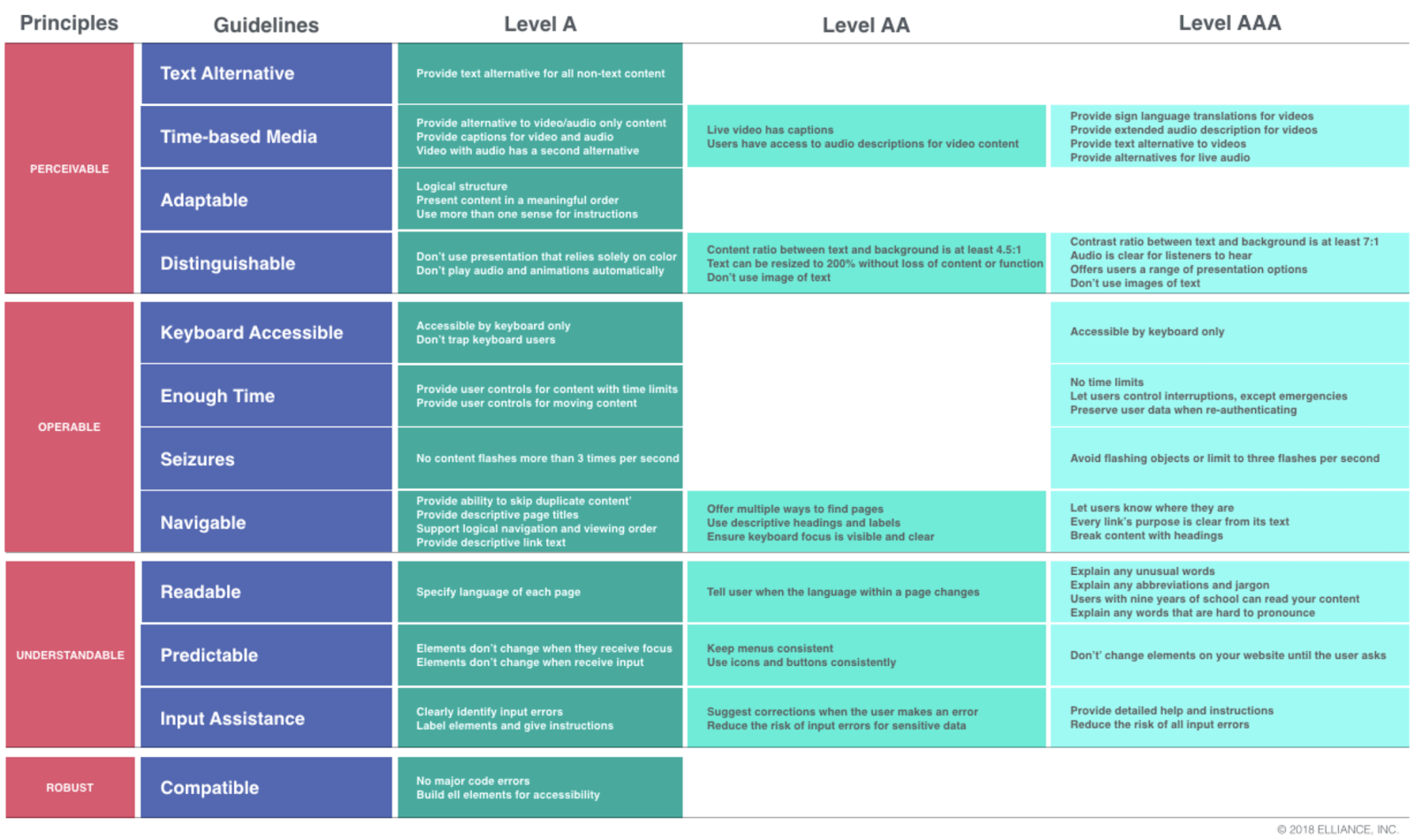
Where can companies start with accessibility?
The first thing to do is to come up with a plan to bring in a continuous culture of unlearning and learning across functions in the firm. It is prudent for companies to conduct workshops on A11Y to understand, deep dive, and create accessible components.
The mantra that has to be instilled through these workshops is–Accessibility (A11Y) isn’t “someone else’s job”; Accessibility is everyone’s responsibility.
For starters, accessibility can be divided into four phases, initially:
1- Accessibility in the Analysis and Planning Phase
Taking off from the WCAG conformance levels, you can first understand the guidelines and select the level you want to adhere to. The next thing to do is to advocate inclusive design practices. This includes coming up with a product roadmap with user personas that includes special abilities/situations. The end goal of this product roadmap must be to make any interaction with your digital asset more human-centered, natural, and contextual.
Also, early planning will ensure reduced legal risks and improve the customer experience of your brand.
2- Accessibility in the design phase
The prudent thing to do when it comes to design is to set the foundation right. Begin by defining your design ethos. Introduce your design kit (with inclusive color contrast) like Atlassian does, Global Experience Language (GEL) like BBC, and bake in A11Y into your ethos. And start as early as possible with UX prototypes. More importantly, do your research and avoid a design that is known to be inaccessible.
3- Accessibility in the development phase
This phase of accessibility can be defined in one line–design what everyone can use and not what is easy to develop. The workshops I mentioned above will be helpful here as engineers need to think inclusively. It is important that engineers research Web Accessibility Initiative- Accessible Rich Internet Applications (WAI-ARIA). It specifies how companies can increase the accessibility of web pages and UI components.
Finally, the team must ponder on getting the focus order right. Focus order helps design the interaction in such a way that people with mobility impairments who rely on keyboard access to operate a page can do so in a logical, usable focus manner.
4- Accessibility in the testing phase
Testing is the cornerstone of accessibility. You must test extensively. This testing must involve people with special abilities to get actual user feedback. Do add A11Y tests as part of your build, across all levels of the test pyramid. Based on my experience, automated accessibility is not a silver bullet, but it is still good enough for 40-50% of A11Y issues.
You must test for:
- Keyboard navigation
- Touch target size
- Landmarks
- Color contrast ratio
- Form labels,
and, also test with assistive devices.
So, what can companies expect by focusing on accessibility?
There is no right answer here. It really depends on how deep you can go into this rabbit hole. Trust me, it pays rich dividends.
Just to drive home the point, here’s an anecdote. I was working with a large national bank in the ANZ region for one of my previous assignments. We worked ground-up to make their mobile app more accessible. The end result–6X increase in app usage.
Accessibility does reward you and after all, it is the right thing to do!
“No matter the sport-no matter the human endeavor, really- total effort will win people’s hearts”.
— Phil Knight, Shoe Dog: A Memoir by the Creator of Nike.
Got Questions? Drop them on LambdaTest Community. Visit now

