Common CSS Breakpoints For Media Queries
As technology is growing every day, the diversification in the types of electronic devices is also expanding.
July 27, 2023
![]() 232542 Views
232542 Views
![]() 22 Min Read
22 Min Read
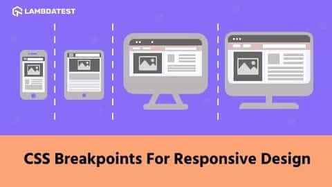
How To Use CSS Breakpoints For Responsive Design
Today’s potential customers are smart, sophisticated, and time-starved and they want their requirements to be addressed instantly. Therefore, an ultimate user experience is crucial to the success and survival of organizations that aim to enhance their user’s engagement.
July 20, 2021
![]() 233375 Views
233375 Views
![]() 18 Min Read
18 Min Read
• LambdaTest Experiments • Tutorial • Web Development
Understanding CSS Sibling Selectors: A Beginner’s Guide
CSS provides a wide range of selectors for targeting specific elements in an HTML document. While class and ID selectors are commonly used, they can’t always target elements based on their relationship to other elements. This is where CSS sibling selectors come into play.
July 30, 2024
![]() 244196 Views
244196 Views
![]() 14 Min Read
14 Min Read
• Selenium WebDriver • Automation • Tutorial
How to Use Breakpoints for Debugging in Selenium WebDriver
Testers using Selenium WebDriver often deal with flaky tests, tricky element locators, and the unpredictable timing of WebElements. Therefore, debugging in Selenium WebDriver becomes essential to stabilize tests, ensure everything works across different browsers, and handle complex data interactions.
June 21, 2024
![]() 403859 Views
403859 Views
![]() 7 Min Read
7 Min Read
• LambdaTest Experiments • Tutorial • Web Development
How to Use CSS Layouts For Responsive Websites
Web developers utilize various components and layout methods to build responsive and user-friendly web pages. These layouts have evolved to address the limitations of previous methods, such as the normal flow and float layouts. To overcome these limitations, the concept of CSS layouts has evolved to include CSS Grid and Flexbox, which tackle the challenges … Continue reading How to Use CSS Layouts For Responsive Websites
June 7, 2024
![]() 280312 Views
280312 Views
![]() 38 Min Read
38 Min Read
• Web Development • LambdaTest Experiments • Tutorial
How to Implement The Mobile First CSS Approach
Adopting the mobile first CSS approach is crucial as more people access the Internet via mobile phones than desktop devices. This approach helps developers refine website logic, functionality, design, accessibility, performance, and overall optimization for mobile usability.
May 17, 2024
![]() 268670 Views
268670 Views
![]() 11 Min Read
11 Min Read
• Web Development • LambdaTest Experiments • Tutorial
CSS Grid vs Flexbox: Which to Choose and When
Layout is one of the most important aspects of web design. It determines how the elements of a web page are arranged and displayed. This is where CSS Grid and Flexbox come into play – two powerful CSS layout features that help design how content appears on a webpage.
May 7, 2024
![]() 131383 Views
131383 Views
![]() 36 Min Read
36 Min Read
• Web Development • LambdaTest Experiments • Tutorial
How to Set CSS Media Query For Portrait Orientation
When it comes to web design, CSS media queries are crucial for creating responsive layouts. They enable developers to adjust how a website appears depending on factors like screen size and whether the device is in portrait or landscape mode.
April 18, 2024
![]() 126391 Views
126391 Views
![]() 23 Min Read
23 Min Read
• Web Development • LambdaTest Experiments • Tutorial
How To Resize Images Using object-fit in CSS
Images and videos are fundamental aspects of modern-day websites; you can hardly see a website that contains just text and not images or videos.
April 9, 2024
![]() 132315 Views
132315 Views
![]() 20 Min Read
20 Min Read
Sizing Up Layouts: A Detailed Guide to CSS fr Unit
Responsive design has become a cornerstone of modern web development, ensuring smooth experiences across diverse screens. However, achieving responsiveness can be challenging.
March 20, 2024
![]() 77132 Views
77132 Views
![]() 17 Min Read
17 Min Read

