Creating Responsive Animations for Different Screen Sizes
Dun Yan
Posted On: November 12, 2024
![]() 182920 Views
182920 Views
![]() 17 Min Read
17 Min Read
Creating smooth and engaging animations is key to a good user experience. However making them look visually appealing across different screen sizes can be challenging.
An animation that looks great on one device may not work on other devices. It can end up clunky or out of place. Today’s world of responsive design is changing quickly. Developers need to figure out how to make responsive animations that adapt to different screen sizes.
In this blog, we will explore the basics of responsive animations in CSS, including the techniques and best practices for creating animations that work across different screen sizes and devices.
TABLE OF CONTENTS
What Are Responsive Animations in CSS?
Responsive animations are dynamic, interactive visual elements that respond and adapt to different screen sizes and device types, providing an engaging user experience on any device. They can range from simple hover effects and transitions to more complex animated graphics and interactive experiences.
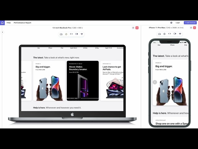
A good example is the official website of Apple. On the cards of the Apple products, you may notice subtle CSS animations when you hover over the product images.

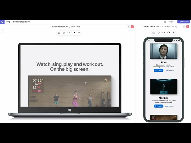
On the Apple TV product page, you’ll notice CSS animations that create a dynamic and engaging user experience.

To create CSS animations that are responsive, we use a keyframe that refers to a specific point in an animation where you can define the styles that an element should have. Keyframes are used in conjunction with the @keyframes rule to define the starting and ending points of an animation, as well as any intermediate steps that should occur.
Check out this blog to learn more about CSS keyframe animation.
Creating Responsive Animations Using CSS Properties
There are many animation properties available in CSS, each with its syntax and options. Here are eight of the most commonly used properties that let you create responsive animations:
- animation-name
- animation-duration
- animation-timing-function
- animation-delay
- animation-iteration-count
- animation-direction
- animation-fill-mode
- animation-play-state
Moreover, CSS animations are supported on popular web browsers like Chrome, Edge, and Safari. However, it’s important to test that your website’s animation appears satisfactory across multiple browsers.
AI-powered test execution platforms such as LambdaTest can help you test CSS animations across real web browsers online, including their latest and legacy browser versions.
animation-name
The animation-name property specifies the name of the animation you want to apply to an element. It allows you to create animations on web pages.
Syntax:
The potential values for animation-name are the names of the keyframe animations that you have defined in your CSS. These keyframe animations are created using the @keyframes rule and consist of a series of CSS rules that define the animation’s behavior at different points in time.
Here is an example of a keyframe animation defined using @keyframes:
This animation gradually increases the opacity of an element from 0% to 100%. You can then apply this animation to an element using the animation-name property like the following code below. It will apply the my-animation animation to any element with the class my-element.
Moreover, you can also use the animation-name property to set multiple animations to an element, separating each animation name with a comma.
For example:
It will apply both the my-animation1 and my-animation2 animations to any element with the my-element class.
animation-duration
The animation-duration property sets the length of time that an animation takes to complete one cycle. It specifies the duration of the animation in seconds (or milliseconds).
Syntax:
The <time> value can be a number followed by a unit, such as 1s (one second) or 500ms (500 milliseconds).
Some potential values that can be used with animation-duration property are 0s (default), 1s, 500ms and 2ms.
In the below example that demonstrates the use of the animation-duration property, we’ve set the animation-duration to 2s, which means the animation will take two seconds to complete one cycle.
The animation-name property specifies the name of the animation, which we’ve defined using @keyframes. The animation-iteration-count property sets the number of times the animation should repeat itself (infinite means it will repeat indefinitely).
animation-timing-function
The animation-timing-function property is used to specify the timing function for an animation. It determines how the animation progresses over time, including its acceleration and deceleration.
Syntax:
Some potential values for the timing-function property are ease (default), linear, ease-in, ease-out, ease-in-out, step-start, and step-end.
The below example shows the demonstration of the animation-timing-function property.
For instance, the animation-timing-function property is set to ease-in-out, which means that the animation starts slowly, accelerates in the middle, and then slows down at the end.
The animation is applied to a div element using the animation-name and animation-duration properties. The @keyframes rule is used to define the animation, which rotates the element 360 degrees.
animation-delay
The animation-delay property specifies a time duration between the start of an animation and when it begins to execute. This property is used to create a delay effect on an animation or to synchronize multiple animations.
The time value is a positive or negative number followed by a time unit, such as s (seconds) or ms (milliseconds).
Some potential values for animation-delay are 0s (default), 1s, 2.5s, and 500ms.
In the below example, the .box element will start animating 3 seconds after the animation is triggered. It will then continue to scale up and down indefinitely. This creates a simple blue box that will animate according to the CSS properties defined above.
animation-iteration-count
The animation-iteration-count property is used to specify the number of times an animation should be repeated.
Syntax:
Some potential values for animation-iteration-count are
In the below example of the animation-iteration-count property, we have a div element with the class my-animation. It is for creating a simple animation effect for three text elements inside a container element. The my-animation class specifies the animation properties that will be applied to the text elements with this class.
In this case, the animation-name property is set to example-animation is defined. The animation-duration property is set to 2 seconds, which means the animation will last for 2 seconds. The animation-iteration-count property is set to 10, which means the animation will repeat 10 times.
The @keyframes rule is used to specify the animation’s keyframes. In this case, the keyframes are named example-animation. The keyframes are defined using percentage values, with 0% being the start of the animation, 50% being the midpoint, and 100% being the end of the animation.
The CSS transform property is used to change the scale of the text elements. At 0% and 100%, the scale is set to 1, which means there is no scaling. At 50%, the scale is set to 1.2, which means the text elements will be scaled up to 1.2 times their original size.
animation-direction
The animation-direction property is used to set the direction in which an animation should play. It determines whether the animation should play forwards (i.e., from the beginning to the end), backwards (i.e., from the end to the beginning), or alternate between forwards and backwards.
Syntax:
Some potential values of the animation-direction property are normal, reverse, alternate, and alternate-reverse.
Here is the example below that shows the use of the animation-direction property. We start by defining the keyframes using the @keyframes rule. In this example, we’re calling the animation myAnimation. We define two keyframes, from and to.
In the from keyframe, we set the transform property to rotate(0deg), which means the element will start at 0 degrees rotation. In the to keyframe, we set the transform property to rotate(360deg), which means the element will end at 360 degrees rotation.
Next, we apply the animation to the my-element div using the animation-name, animation-duration, and animation-direction properties.
The animation-name property specifies the name of the animation (myAnimation). The animation-duration property specifies the duration of the animation (7 seconds). The animation-direction property specifies the direction of the animation (reverse, which means the animation will play in the anti-clockwise direction).
animation-fill-mode
The animation-fill-mode property is used to specify what values should be applied to an element before and after an animation is played. It can help to prevent abrupt changes when an animation starts or ends by setting the initial and final state of the element.
Syntax:
Some potential values of the animation-fill-mode property are none, forwards, backwards, and both.
Let’s look at the below example that shows the use of the animation-fill-mode property. The animation-name property specifies the name of the animation to be applied, in this case, myAnimation. The animation-duration property specifies how long the animation should last, in this case, 7 seconds. The animation-fill-mode property tells the animation to retain its final state after the animation completes.
This code defines the myAnimation animation using the @keyframes rule. The animation gradually changes the background color of the boxes from red to green. The from block specifies the initial state of the animation (the background color is red,) and the to block specifies the final state of the animation (the background color is green).
Now, let’s try switching the value from forwards to backwards. The .box element will start with a red background color, and then when the animation starts, it will change to green for over 7 seconds. After the animation is completed, the element will return to its initial state with a red background color.
animation-play-state
The animation-play-state property determines whether an animation is running or paused. It allows you to control the playback of an animation and can be useful for creating interactive animations on web pages.
Syntax:
Some potential values are running and paused.
The below example shows the use of the animation-play-state property. We defined a new animation using @keyframes. The animation is called my-animation. Inside, we define three keyframes – 0%, 50%, and 100%. At each keyframe, we are applying a different transform property to the element.
At 0%, we are setting the transform property to scale(1), which means there is no scaling applied. At 50%, we are scaling the element up to scale(1.5), making it 50% larger. Finally, at 100%, we are returning the element to its original size with scale(1).
For the .my-element class, we are applying the my-animation animation we defined earlier with a duration of 2s and an easing function of ease-in-out. We also set the animation to run infinitely with infinite. Additionally, we apply some padding, set the background color to orange, and add a border radius of 2rem.
When the .my-element element is hovered over, we pause the animation by setting the animation-play-state to paused. We also changed the background color to red.
 Note
NoteTest your CSS animations across 3000+ real web browsers online. Try LambdaTest Today!
Combining CSS Properties for Responsive Animations
Let’s apply different combinations of animation properties to create responsive animations. Just like what the previous section mentioned, you first need to define a set of keyframes that describe how the animation should change over time to create a CSS animation. This is crucial before we can apply the animation properties.
Here is a demonstration of combining different CSS animations:
The .element div combines four animations that run infinitely using a single animation shorthand. This shorthand lets you define multiple properties at once: animation name, duration, timing function, delay, iteration count, direction, fill mode, and play state.
Here’s how each animation works with its @keyframes:
- Rotate: Spins .element from 0° to 360° over 2 seconds with an ease-in-out timing, using the transform property.
- Blink: Fades .element in and out in 1 second with a linear timing, adjusting opacity.
- Grow-Shrink: Scales .element to 150% and back in 2 seconds with ease-in-out timing, using the transform property.
- Move: Slides .element from left to right in 2 seconds with ease-in-out timing, adjusting left.
Here is another demonstration where we create a background with moving shapes.
To create a background with moving shapes, we use .circle, .square, and .triangle classes with unique animations and positioning:
- Circle: The circle is styled with border-radius: 50% and animates over 10 seconds with ease-in-out timing. At 50%, it shifts 12.5rem before returning to its original position at 100%.
- Square: The square animates over 8 seconds with ease-in-out timing and opacity of 0.8. It rotates 180° and moves 12.5rem at 50%, completing a 360° rotation by 100% to reset.
- Triangle: The triangle animates for 6 seconds with ease-in-out timing. It skews 45° and moves 12.5rem at 50%, then reverts to its original state at 100%.
Each shape runs infinitely, creating a dynamic animated background.
Creating Responsive Animations Using Media Queries
From a user perspective, it is essential to create responsive designs that work across different screen sizes and devices. One of the ways to achieve this is through the use of media queries in CSS.
Let’s look at some examples to see how we can create a responsive animation:
- Moving Animations: To create responsive animations, we use media queries to adjust animations based on screen size. This example demonstrates an animation called move, which runs for 8 seconds, translating the element across the screen.
- Flip Card Animations: In this example, a flip card animation is used, where the card fades in and rotates 180 degrees on hover. The fade-in animation increases opacity from 0 to 1, and transform-style: preserve-3d ensures 3D effects.
For smaller screens (768px, 480px, 320px), the animation duration is increased, the size is decreased, and the movement is adjusted to fit the screen. The @keyframes rule defines the animation’s transformations, such as moving the element horizontally and rotating it.
The smooth flipping of the card is achieved using the rotateY transformation.
Always remember that creating responsive animations with media queries requires careful consideration of relative units to ensure that the animation adapts to different screen sizes. Plus, it’s important to adjust the size and duration of the animation for different devices to ensure optimal user experience.
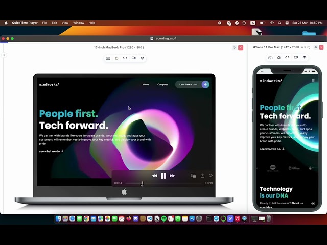
To test responsive animations, tools like LT Browser from LambdaTest help you test and debug websites across multiple device viewports. It allows developers and testers to simulate various screen sizes and resolutions, ensuring that animations are responsive and perform as intended on different screen sizes, such as mobile, tablet, desktop and laptop.
Best Practices for Creating Responsive Animations
Here are some of the best practices for responsive animations:
- Avoid too many animations at once: Excessive use of CSS animations can adversely impact a website’s performance, user experience, and accessibility. Animations may consume significant resources and cause the website to run slowly. Moreover, too many animations can distract users and create an overwhelming experience, while also posing a risk of triggering dizziness for people.
- Take care of the animation duration: It is an important factor as animation duration influences how users perceive and interact with a user interface. If the animation is too short, it may happen too quickly for the user to notice, while a too-long animation can feel sluggish and unresponsive.
- Use screen recording for looping animations: The technique of creating a screen recording is an effective way to evaluate the quality of interface animations. It allows you to replay the animation multiple times and at different speeds. This can be particularly useful when trying to identify areas where the animation may be too slow, too fast, or not fluid enough.
- Avoid infinite animations: Infinite animations can have a negative impact on website performance. Animations require resources to run, and if there are too many running at once, it can slow down the website. It can lead to longer load times, which can be frustrating for users and can also have a negative impact on SEO.
- Avoid animate root elements: While it is possible to animate the html or body tags, it’s not recommended due to reports of triggering strange browser bugs. Additionally, bouncing the entire page would not provide significant value to the user experience. If you require this effect, it’s better to wrap the page in an element and animate it in that way.

Conclusion
To sum it up, responsive animations in CSS are crucial for ensuring that websites are optimized for all devices and can improve usability, engagement, and conversion rates when used effectively. Developers should consider incorporating them into their designs while being mindful not to overuse them.
If you understand the principles of animation, try creating some cool projects with it to strengthen your concept.
Frequently Asked Questions (FAQs)
What are the 4 types of animation?
The 4 types of animation are 2D and 3D animations, stop motion, and motion graphics animation.
How to make a responsive animated website?
To make a responsive animated website, use CSS media queries for layout adjustments, CSS animations for smooth transitions, and JavaScript for interactive effects, ensuring that animations work across various screen sizes and devices.
What is reactive animation?
Reactive animation refers to animations that respond dynamically to user interactions, such as clicks, scrolling, or hover actions, providing real-time visual feedback based on input.
Got Questions? Drop them on LambdaTest Community. Visit now


