How to Position Text Over Images With CSS
Shreya Trivedi
Posted On: November 6, 2024
![]() 188940 Views
188940 Views
![]() 13 Min Read
13 Min Read
Websites usually start with a simple vertical layout, but if you want something more dynamic, CSS techniques like Flexbox and Grid let you organize content in different ways, including horizontally.
Then there’s the CSS position property, which gives you even more control by letting you place elements exactly where you want outside the usual flow of the web page. A popular use case for this is to position text over images with CSS. It is mainly used for hero sections or product showcases. With relative or absolute positioning, you can set text right where it needs to be within an image.
TABLE OF CONTENTS
What Is CSS position Property?
Effectively conveying information often involves placing text directly on images and using them as captions. While HTML structures the content of a web page, it lacks the ability to precisely position elements. This is where the CSS position property comes in.
CSS position property determines how elements are placed within an HTML document. By using properties like top, right, bottom, and left, you can control the exact positioning of elements on the web page. This flexibility allows for creative layouts, whether it’s changing box positions for a unique touch or creating UI elements that stay put even when users scroll.
For example, the McKinsey & Company website specifies that the text should appear at the top-left corner of the div that contains both the image and the text. It means that within the layout structure of their web page, McKinsey has a <div> element that wraps around both the image and text content.

Techniques to Position Text Over Images With CSS
This section discusses various techniques to position text over images with CSS, highlighting different placements like top-left, top-right, center, bottom-left, and bottom-right.
We will look at each technique with code examples along with a breakdown of CSS properties (such as position: absolute, top, left, right, bottom, and transform) to achieve the desired layout on the web page.
top-left
Placing text in the top-left corner ensures it’s noticeable without overwhelming the main image. It strikes a balance between visibility and subtlety, making it ideal for conveying essential information such as titles, brief descriptions, or captions. This positioning allows viewers to easily absorb the text without it detracting from the focal point of the image.
In the above-given example, by applying position: absolute to the nav element, it is taken out of the normal document flow and positioned relative to its first positioned (not static) ancestor, which in this case is the header.
The top property is set to 10px, determining the distance between the top edge of the navigation menu and the top edge of its containing block. Similarly, the left property is set to 20px, defining the distance between the left edge of the navigation menu and the left edge of its containing block.
Through these CSS rules, the navigation menu is precisely positioned 10px from the top and 20px from the left of its containing block, thus achieving the desired top-left placement on the web page.
top-right
Positioned in the top-right corner, the text naturally grabs attention due to the natural reading pattern from left to right. This placement ensures that important messages or announcements are one of the first elements seen by viewers, maximizing their impact. It’s particularly effective for conveying critical information or calls to action that require prompt attention.
To position the text on the images at the top-right corner, the CSS position property is used. Specifically, the position: absolute declaration is applied to the .image-text class, enabling precise placement relative to its containing element. The top: 5px specifies the distance between the top edge of the text and the top edge of the nearest positioned ancestor element, ensuring it’s 5px from the top.
Meanwhile, right: -20px ensures the text is offset by -20px from the right edge of its containing block, allowing it to align flush against the top-right corner of the image. This combination of CSS properties ensures the text appears at the desired location atop the images, achieving the top-right positioning effect.
center
The centered text acts as a bold focal point, drawing the viewer’s attention directly to it. Placing text in the center of the image ensures maximum visibility and impact, making it suitable for headlines, quotes, or any content intended to be the primary focus.
To center the text overlay on each image, the CSS position property is used, particularly focusing on the .text-overlay class. By using position: absolute the text is taken out of the normal document flow, allowing for precise placement within its containing element.
The top: 50% and left: 50% declarations position the text overlay at the center of its parent container. Additionally, the transform: translate(-50%, -50%) rule further refines the positioning by adjusting the text overlay horizontally and vertically, ensuring it’s perfectly centered regardless of its dimensions. This combination of CSS properties effectively centers the text overlay on each image, providing a visually appealing presentation of the content.
bottom-left
Text positioned in the bottom-left corner provides supplementary information without detracting from the main subject of the image. It complements the visual content by offering context or additional details in a non-intrusive manner. This placement is suitable for captions, credits, or any content that enhances the viewer’s understanding of the image without overshadowing it.
To position the text at the bottom-left corner of each image, the CSS position property is used, focusing on the .image-text class. By applying position: absolute the text is removed from the normal document flow and placed precisely within its containing element.
The bottom: 5px and left: 5px declarations position the text 5px from the bottom and 5px from the left edge of the image, respectively. This combination of CSS properties ensures that the text overlay appears at the desired location, flush against the bottom-left corner of each image.
bottom-right
Similar to bottom-left positioning, placing text in the bottom-right corner guides the viewer’s attention toward it after engaging with the main elements of the image. This positioning is effective for providing secondary information or annotations that enrich the viewer’s experience without disrupting the visual flow. It ensures that the text is noticed without competing with the primary focus of the image.
To position the text at the bottom-right corner of the footer, the CSS position property is used, focusing on the .copyright class. By applying position: absolute the text is removed from the normal document flow and positioned precisely within its containing element. The bottom: 10px and right: 10px declarations position the text 10px from the bottom and 10px from the right edge of the footer, respectively.
How to Test Positioning of Text Over an Image?
Modern web browsers, including Chrome, Firefox, Safari, and Edge, widely support the CSS position property. However, checking the specific browser versions you need to support and performing thorough cross browser testing is crucial to ensure consistent behavior across different browsers, devices and operating systems.
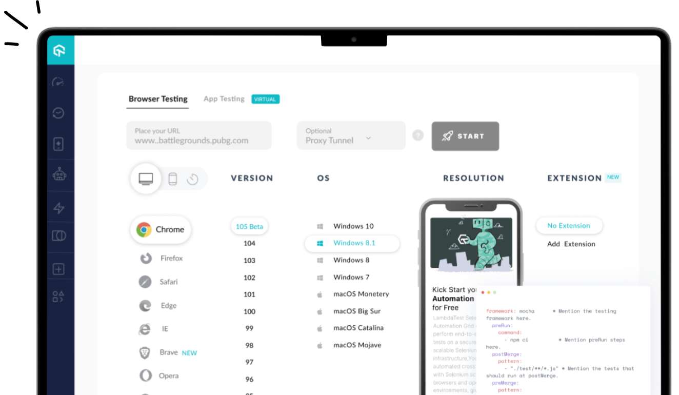
AI-driven cloud testing platforms such as LambdaTest allow you to perform cross browser testing of websites and web apps across real browsers, devices, and operating systems. You can choose to test from a variety of Windows, macOS, Android, and iOS versions running the latest and legacy browsers.

 Note
NoteTest positioning of text over image across 3000+ real environments. Try LambdaTest Today!
When it comes to responsiveness, LambdaTest offers a complimentary tool called LT Browser. It is a Chromium-based desktop browser that lets you run responsive tests online across different mobile, tablet, desktop and custom screen sizes.

When to Use CSS position Property?
While a well-structured HTML document is essential for web design, especially for accessibility, the default layout might not always be optimal. The natural flow of HTML elements follows the order they appear in the code.
However, for a more engaging user experience, elements may sometimes need to be repositioned. This is where the CSS position property comes in. It gives you the flexibility to move elements beyond the constraints of the standard flow, allowing for creative layouts.
Following are the real-world scenarios where CSS position property can be used:
- Fixed Header/Footer: Use the fixed position value to create a header or footer that remains fixed at the top or bottom of the viewport regardless of scrolling. This is commonly seen in websites where navigation menus or important information need to remain accessible to users at all times, providing a seamless browsing experience.
- Absolute Positioning for Tooltips: Use the absolute position value to position tooltips or pop-up messages precisely relative to their parent elements. This is useful for displaying additional information or context when users hover over specific elements, enhancing user interaction and providing clarity within the interface.
- Relative Positioning for Image Galleries: Apply the relative position value to create image galleries where images are positioned relative to their normal position in the document flow. By combining relative positioning with CSS transitions or animations, you can create visually appealing galleries that dynamically adjust to different screen sizes or orientations.
- Static Sidebar With Sticky Navigation: Combine the static and sticky position values to create a sidebar with a sticky navigation menu. The sidebar remains static while scrolling through content, but the navigation menu sticks to the top of the viewport once it reaches a defined scroll position. This ensures easy access to navigation options without obstructing the main content.
- Overlay Menus With Absolute Positioning: Use the absolute position value to create overlay menus or dropdowns that are positioned relative to their nearest positioned ancestor. This allows you to overlay additional content such as navigation menus, pop-up dialogs, or modal windows without affecting the layout of surrounding elements, enhancing user interaction and visual hierarchy.
- Sticky Elements for Call-to-Action Buttons: Use the sticky position value to create call-to-action buttons or banners that remain visible as users scroll through content, prompting them to take desired actions such as signing up for a newsletter or making a purchase. This ensures the placement of important elements, increasing engagement and conversion rates.
You can refer to this blog to learn how to use the CSS position: sticky property.
Best Practices to Position Text Over Images With CSS
To effectively position text over images with CSS, its important to correctly position, style, and responsiveness to ensure an optimal user experience across different devices and screen sizes.
Here are some best practices to position text over images with CSS:
- Responsiveness: Use percentage-based or viewport units (e.g., vw, vh) for text placement to accommodate various screen sizes. Plus, apply appropriate styling (color, font, weight, shadow) to improve text readability and appearance.
- Performance and Accessibility: Use the CSS will-change: transform property for the positioned elements. This property instructs the browser to create a new layer for the specified elements, optimizing performance and enhancing accessibility.
- Structural Considerations: Encapsulate the image and text within a container element for streamlined positioning control. Also use absolute positioning on the text element to independently place it within the container.
- Placement and Visibility: Use the top, right, bottom, and left properties to accurately determine the text’s position within the container. You can also assign a higher z-index value to the text element to ensure it overlays the image.
It’s also best to implement overflow properties (container or text element) to prevent text from extending beyond the image boundaries. Furthermore, optimize image size for fast loading and a seamless user experience.
The will-change: transform property helps specifically for scrolling elements that contain fixed or sticky content, which can lead to performance issues, particularly if the browser struggles to repaint the content smoothly as the user scrolls.
Conclusion
Being able to position text over images with CSS can greatly enhance the visual appeal of your website. This allows you to create engaging designs that effectively convey your message to your audience.
Responsive web design plays a crucial role in ensuring that your text-image compositions adapt seamlessly to different screen sizes and devices. By using responsive techniques, such as fluid layouts and media queries, you can ensure that your text remains legible and visually appealing across a wide range of devices, from large desktops to small-screen devices.
Frequently Asked Questions (FAQs)
How do I keep text over an image in CSS?
You can use position: relative on the image container and position: absolute on the text element to overlay it, adjusting with top and left properties.
How do I overlap text and images in CSS?
For this, you can apply position: absolute to the text and use z-index to control the layering, ensuring the image has position: relative to define a reference.
How do I put text around an image in CSS?
You can use the float property (e.g., float: left) on the image, which allows text to wrap around it, or use the shape-outside property for more advanced text wrapping.
Got Questions? Drop them on LambdaTest Community. Visit now


