Building Accessible Carousels: A Step-By-Step Guide
Alex Anie
Posted On: February 15, 2024
![]() 123721 Views
123721 Views
![]() 27 Min Read
27 Min Read
Carousels are effective in conveying pieces of information in a concise format on the web page. Many organizations find value in using carousels to showcase their product offerings. This feature has proven to be a valuable asset for driving conversions and enhancing user engagement.
Despite being helpful and a great fit for everyday users, carousels come with a lot of accessibility issues, which prevent impaired users from interacting with them. Therefore, it becomes imperative to create accessible carousels that are truly beneficial and inclusive for all users. It’s an investment that pays off in terms of ethics, usability, and overall website performance.
In this article, we will dive deep into accessible carousels, why to use them, the components of carousels, and how to build accessible carousels.
TABLE OF CONTENTS
- What are Carousels?
- Components of Carousels
- Why Are Accessible Carousels Needed?
- Are Carousels Good for Accessibility?
- Role of WAI-ARIA in Creating Accessible Carousels
- Techniques to Build Accessible Carousels
- Demonstration: Building Accessible Carousels
- How to Test the Accessibility of Carousels?
- Best Practices for Accessible Carousels
- Frequently Asked Questions
What are Carousels?
A carousel is a group of individual elements, where each element is called a slide, and each slide is set to overflow horizontally across its containing element.
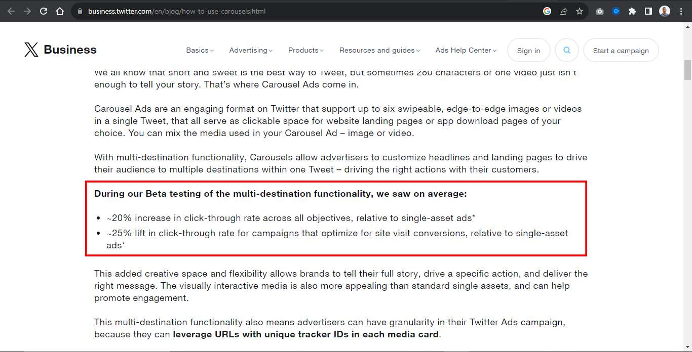
According to beta testing of the multi-destination function on the carousel by X Business, they saw a 20% increase in click-through rate across single posts of carousel assets and a 25% lift in click-through rate for campaigns that optimize for site visit conversion.
For example, the Airbnb website below contains four elements with header images. Each image within the header serves as a slide.
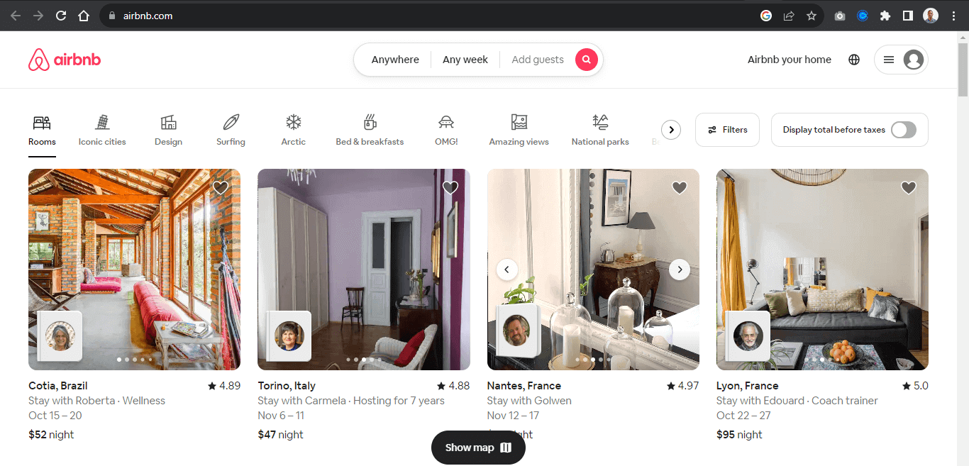
A slide in a carousel moves horizontally in sequential order; each slide rotates one at a time and hides to provide space for the next slide.
Once again, from the Airbnb website, each slide moves horizontally when the slider control is clicked on, revealing the next slide.
Users can directly interact with each slide by using the carousel controls. These controls enable the user to move the slides back and forth. Some carousels enable the keyboard or drag to scroll to move each slide within its slide container.
The carousel typically displays once the page loads, while the “slide picker controls” indicate which slide is displayed.
We can also see the same method replicated on the Motorola website, where each slide showcases the organization’s products as an ad. These types of carousels are banner carousels.
Components of Carousels
Before discussing the importance of accessible carousels, let’s explore different carousel components. Carousel slides are content in the form of a slide. Each slide displays different content and loops one after the other.
To ensure a good user experience, carousels typically have controls that enable users to navigate around the carousel content, known as slides. The controls also indicate which side (content) is currently on display.
The following examples are controls or slide controls that can be implemented when creating a carousel element.
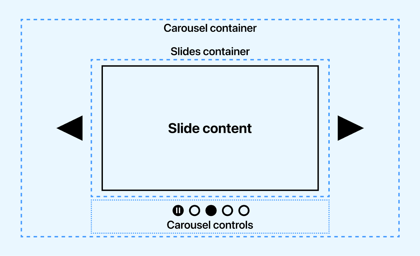
- Previous slide controls: This is a button element with a left arrow icon for navigating the slides back in sequence.
- Next slide controls: This is a button element with a right arrow icon for navigating the slides forward in sequence.
- Slide picker controls: These are small groups of button elements, usually at the base of the carousel. These buttons mainly do two things, one of which is to indicate which slides are currently on display and to navigate to a specific slide without using the slide controls.
- Pause/play controls: This control button controls the play and pause state of the carousel slides. This is mainly seen in the carousel displayed when the page loads.
- Slide: A slide is the individual items that displays in sequence. However, a slide is not a control but can be implemented as a control for drag events, where users can drag a slide to review the next slide.
The Toyota landing page shows how to trigger the animation play state using the play and pause button.
To improve user interaction, keyboards such as spacebars, taps, and arrow keys can be a good control source.
- Spacebar: The space bar control works when the pause/play control is implemented. It serves as an alternative to pause/play control.
- Array keys: The left and right arrow keys on the keyboard can be handy as an alternative to the “previous slide controls” and “next slide control”.
- Tap and Shift keys: The tap or shift + tab key can loop or navigate between slides in sequence.
For example, the MasterClass website shows how to pause and play the slide animation with either the spacebar or the pause/play control.
Tests carousels for accessibility across 3000+ real environments. Try LambdaTest Now!
Why are Accessible Carousels Needed?
Accessible carousels are very much needed to provide instructions to visually impaired users to enable them to navigate carousel elements on the web page. According to WHO, almost 2.2 billion have a visual impairment in some way, making it difficult for people with visual impairment to access the web.
Accessible carousels are needed for multiple reasons:
- They enable visually impaired users to identify components/controls that make up the carousel.
- Assistive technology tools such as screen readers, text-to-speech, and refreshable braille display software reads aria Roles, States, and Properties as audible text to visually impaired users. This helps visually impaired users understand how the carousel works and how to use it.
- Accessible carousels are also necessary for compliance with accessibility standards such as WCAG 2.0 and Section 508.
- With accessible carousels, visually impaired users can navigate carousel components using voice input software and keyboard navigation with the help of accessibility.
- Carousel content can be paused with carousel control by users distracted by frequent movement of the content to enable them to listen to carousel content.
- Visual-impaired users can determine the state of the carousel if it’s pressed, disabled, checked, or hidden.
Accessible carousels generally provide good semantics in the form of audio/speech for visually impaired users. This helps to determine the landmark area the carousel occupies and its role, its content, and how to navigate it on the web page.
Are Carousels Good for Accessibility?
Despite being implemented across multiple sites by web developers, Carousels have numerous associated issues, which we will split into two parts.
Interactivity
Carousels have unpleasant user experiences, as users rarely interact with them. This might be due to a lack of understanding of interacting with carousels.
A study based on Google Analytics Event recorded the number of interactivity. The report states the percentage of visitors who clicked on a carousel feature is 1%, with the first feature getting the highest clicks or interactivity. In contrast, other features have to share the same or no interaction.
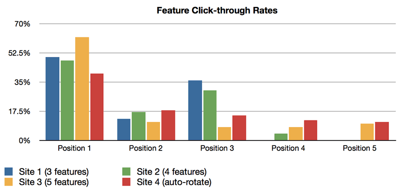
The image above shows click distribution by position. Position 1 is shown to take the highest number, while other positions share the same proposition evenly. This is not good for sites with multiple carousels, as the chances of them being interacted with are low or there is no interaction.
However, to increase the chance of interactivity,
- Consider reducing the number of slides to a maximum of four.
- Captivating headline titles and images can significantly impact click-through rates.
- Content should contain a single idea as it helps users understand what each slide presents.
Since the first slide gets the most attention, the most important slide should be implemented first to encourage user click-through.
Accessibility
Accessible carousels involve ensuring all users can access the content on each slide and navigate each slide via the slider controls.
However, for visually impaired users, screen-readers, and text-to-speech software (assistive technology tools) are relied upon to report the right content or information to the users. For instance, animated slides with pause/play control can display multiple shows within a slide without proper use of WAI-ARIA Roles, States, and Properties. The screen reader can report this as multiple slides instead of showing within a slide or as a plain HTML tag.
Let’s take the Toyota homepage as an example.
From the Toyota homepage, the first slide has two shows that display before the next slide is displayed. At the bottom left corner is a pause /play control for pausing or playing each show within the slide. Without proper WAI-ARIA for labeling, this might not get the right accessible result from screen readers.
Accessibility plays an excellent role for visually impaired users, and assistive technology tools help convey digital content on the web to visually impaired users by speech synthesis (Text-to-Speech) TTS. For example, when a user clicks or interacts with web elements, the screen readers extract the content and report it as an audible speech.
For assistive technology tools to be effective or detect content, several factors have to be implemented, such as the following.
- Alternative text: Mainly referred to as alt text, alternative text is HTML attributes used to write descriptive text to describe the image or content provided within the HTML tag. This attribute is used for content such as images, videos, audio, logos, and web icons. They are helpful for Google search engines and assistive technology tools like screen readers.
- Semantic markup: Semantic markup is HTML tags used to describe the role of the content on the page. This enables web browser format and renders content currently on the web page. Screen readers can also detect semantic markup.
- Captions: Unlike alternative text, captions are displayed directly on the web page. Caption provides a descriptive text that explains what the provided content is about, especially for images. < figcaptions > are used to provide captions in HTML documents. Captions can be very useful for hearing-impaired users.
For example, when a user interacts with a button on a page, screen readers can produce audio feedback indicating the element is a button that can be clicked.
The < h1 > element shows that the content inside the tag should be treated as a level 1 heading, while the < p > tag shows that the content inside it should be treated as a paragraph text. The < button > element shows that this is a clickable button element.
In the next section, we will see the role of WAI-ARIA in building accessible carousels.
Role of WAI-ARIA in Creating Accessible Carousels
The WAI-ARIA, which stands for Web Accessibility Initiative – Accessible Rich Internet Applications, is a specification developed by W3C to provide semantic meaning to assistive technology tools such as screen readers for ensuring content on the web are interpreted the way they function and appear on the web.
For example, visually impaired users cannot see the carousel on the web or interact with the carousel directly, so the WAI-ARIA Roles, States, and Properties are used by developers to provide additional text based information on the HTML tags that describe what the carousel actually means or how the carousel controls functions.
This enables screen readers to read WAI-ARIA Roles, States, and Properties as audible speech back to visually impaired users as it enables them to navigate and use the website the way it was intended by the developer.
When the HTML document is loaded on the DOM by the User Agent, it creates a parallel structure called an accessibility tree, which is made up of accessibility objects. The accessible objects provide information on the HTML markup based on the Roles, States, and Properties of WAI-ARIA.
Following are the WAI-ARIA Roles, States, and Properties that can be implemented to create accessible carousels:
- Roles: The Role defines what the element is meant to do. For example, in a carousel slider, we can add a role=”main” on the carousel-container, indicating that the specified element should be read as the main content of the carousel by screen readers.
- States: The State defines the current condition of the element. For example, we can add a aria-disabled to a disabled button to inform the screen reader to read it as a disabled button.
- Properties: The Properties provide more descriptive information about the element or content on the web page for screen readers. For example, the aria-describedby can be used to describe the content of the carousel slides for screen readers.
Remember that the Roles, States, and Properties are meant to be read as audible speech and do not have or add any functionality to the carousel or web elements.
Techniques to Build Accessible Carousels
Several crucial steps are important when building an accessible carousel. This step ensures that all carousel components are accessible, making it easy for visually impaired users to navigate.
How a carousel is structured, or functions should not prevent it from being accessible. The following techniques illustrate how to create accessible carousels.
Auto-Rotation
Auto-rotation carousels are very common in websites today. This type of carousel can also be called a banner carousel, mainly used to display ads that run as soon as the page loads and continues to auto-rotate.
To improve and make the auto-rotating carousel accessible, a few important steps must be taken.
Auto-rotate may be distracting for people with cognitive impairments. A control button (pause/play button) can be implemented to pause the animation to enable the users to concentrate.
- WAI-ARIA Roles, States, and Properties: These should be implemented to indicate to screen readers that the carousel has an auto-rotation state.
- Pause auto-rotation on hover: Users need time to read content. Implementing pause animation on hover helps visually cognitively impaired users focus on interacting or listening to the carousels.
Visibility
For visually impaired users, visibility means the carousel components are well labeled with the appropriate WAI-ARIA Roles, States, and Properties. This helps to improve the accessibility nature of the carousels.
Here are other aspects that should be considered:
- Hidden elements should have a WAI-ARIA state to indicate the element is hidden or disabled.
- Carousel components should be labeled according to their functions. This makes it easily accessible.
- Buttons with SVGs as content should be labeled and assigned an accessible role to make it accessible to visually impaired users.
- Overflow content should be hidden to make it easy to navigate the carousels.
- All carousel components should be responsive and easy to navigate on mobile, tablet, and desktop.
- Buttons, slides, slider picker controls, play/pause state buttons, and other carousel components should be implemented and labeled accordingly to make them accessible.
Structure, Semantic, and Labeling
Websites require good structure and semantic tags to make websites responsive, SEO friendly, and easy to navigate. This is because browsers can quickly load and render well-structured and semantic websites on the screen.
However, visually impaired users rely heavily on the accessibility of the WAI-ARIA Roles, States, and Properties to determine the structure and semantics of the websites.
In this case, good use of WAI-ARIA should be implemented on semantic tags to let the users know which element holds the main carousel and which element serves as the control.
Landmarks should be implemented to make sections or groups of elements on the page accessible. For example, the main, aside, form, section, article, and div elements can be assigned relevant landmarks that explicitly state their role in the element.
The WAI-ARIA role attribute serves as a way to provide landmarks on the element for accessibility purposes.
Now, let’s see a hands-on demonstration of building accessible carousels.
Demonstration: Building Accessible Carousels
In this blog section on accessible carousels, we will look at various kinds of carousels and how to implement them in your software projects regarding accessibility as specified in the previous examples. To demonstrate the creation of accessible carousels, we will take three popular carousel examples.
Product Carousels
Product carousels are one of the most common carousels and can be seen on major e-commerce platforms such as Amazon, eBay, Walmart, Best Buy, and Apple Store. They are beneficial in cases where collections or groups of products are to be displayed on the website for easy navigation by the users.
Here is a simple use case from the Apple Store. Each product is grouped based on the product’s items.
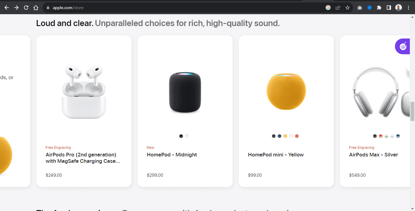
A simple example below shows how to implement a group of product items as carousels.
Example:
From the example above, the carousel contains nine images, each image split into three groups called view. Each view contains similar products.
For example, the first view is a display of Apple HomePod, the next is a display of Apple AirPods, and the last is the Apple 15 display.
This example is most useful when we want to display the same kinds of products or items simultaneously and enable users to navigate around different items from similar types in a roll.
HTML:
From the code above, the entire code is wrapped inside a single div tag of group.
The carousel is split between elements:
- Button: The < buttons > element is placed inside the carousel < main > element. This makes it easy to be positioned side by side with the carousel element
- Section: The < section > element is a wrapper for each “view” of the carousel items. This makes it easy to style and position each view one at a time
- < a >: The < a > element, which is implemented as picker-control , is placed at the bottom of the carousel for easy navigation of each carousel view within its container.
Here are the changes to make the carousel more accessible:
- Button: The < buttons > elements take a role and aria-label attributes. This is useful in cases where the content of the button element is an SVG icon and not an actual text. Providing a role=”button” of aria-label=”backward” makes the buttons more accessible for screen readers.
- Labeling: The < main > element takes a role=”main” and aria-label=”carousel”. The role=”main” indicates where the main content is, while the aria-label=”carousel” indicates that the main element is a carousel.
- Span: The < span > element wraps around each image slide and takes a role, aria-label, and aria-describedby (view 2 of the section element). The role indicates the role of the span as an image. The aria-label provides what type of image is included in the span while the aria-describedby describes what type of image is included in the span.
- < a >: The < a > element takes the role of link, and aria-label is set to slide picker control.
The role, aria-label, and aria-describedby attributes enable screen readers to read the value of these attributes as audible speech for visually impaired users.
CSS:
JavaScript:
From the code example above, the code snippet performs the following functions;
- The carousel variable is attached to an addEventListener method that listens for the mouse scroll wheel. This enables the carousel to scroll when a user scrolls the mouse wheel.
- The forwardBtn variable is attached to an addEventListener method that listens for a click and takes a callback function with a preventDefault() method and scrollLeft property that scrolls the carousel to 900px width when the user clicks the button.
- The backwardBtn variable behaves the same way as the forwardBtn variable, but the scrollLeft property is set to minus 900px. This moves the carousel slides backward.
- The eventHandler methods remove and add active classes.
- The carouselViews is attached to a forEach method that loops through each element (view) of the carouselViews. Then each element of the pickerControls takes an addEventListener of click that returns a callback function of eventHandler.
This enables the slider to add an active class to the pickerControl element to indicate the active element based on the user’s click.
Banner Carousels
Banner carousels are types of carousels found primarily on e-commerce platforms. It helps businesses showcase their product in the form of ads.
Unlike other carousels, banner carousels do not require users to navigate through them as they are set to rotate on page load.
The banner carousel sits typically on top of the page and rotates continuously, one slide at a time. For example, a simple banner carousel from eBay sits on top of the site and displays different types of ads in a slideshow manner.

Here, we can see how products are categorized and displayed as ads.
Now, let’s see how to implement a banner carousel. The below example shows how this is done.
From the code sample above, we have three image carousels, each occupying the browser viewport.
Beside these carousel image slides are the Previous Slide Control and Next Slide Control buttons for navigating the image slides back and forth.
Below the image slide are the Slide Picker Controls for navigating to a specific part of the page. Each picker control is set to a background-color of gold for determining which slide is currently active.
HTML:
The code above includes semantic HTML elements, Roles, and ARIA attributes to provide structure and information for assistive technologies.
Using aria-label, aria-describedby, and alt attributes helps provide meaningful information about the carousel to users who rely on screen readers or other assistive technologies.
- < aside >: The aside elements serve as a wrapper for the sliders in the carousel. It takes a role=”banner” to indicate that the first < aside > element serves as a banner. The aria-label=”carousel” provides a label for assistive technologies to identify this banner as a carousel.
- Image Slides: Each < div > with class image represents a slide in the carousel, and role=”img” indicates that these are images. The aria-describedby provides a description for each image that screen readers can read.
- Slider Control Buttons: The buttons have role=”button” to indicate that they are interactive elements and can be read by screen readers. These buttons include the forward and backward buttons for navigation.
- Slide Picker Controls: They have a class picker, which suggests they are used to select specific slides. The first link has class active, indicating it’s the currently selected slide.
For example, the first image has a description, “A14 Bionic rockets past other smartphone chip iPhone 12 Pro Max.”
CSS:
JavaScript:
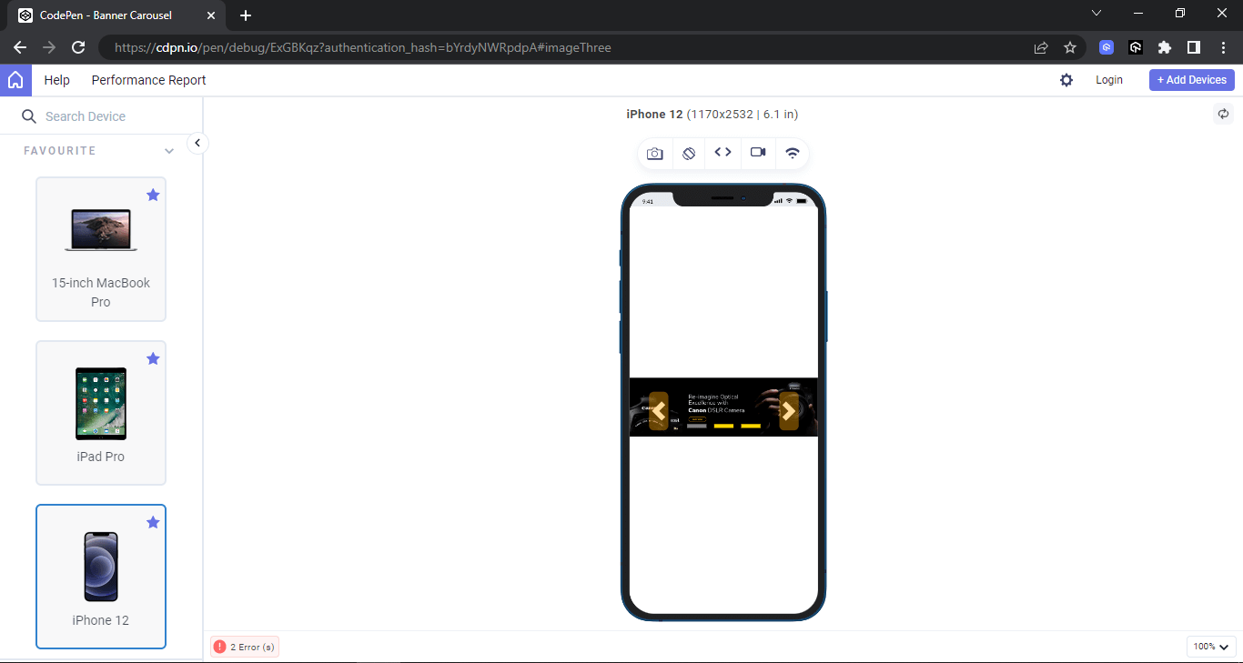
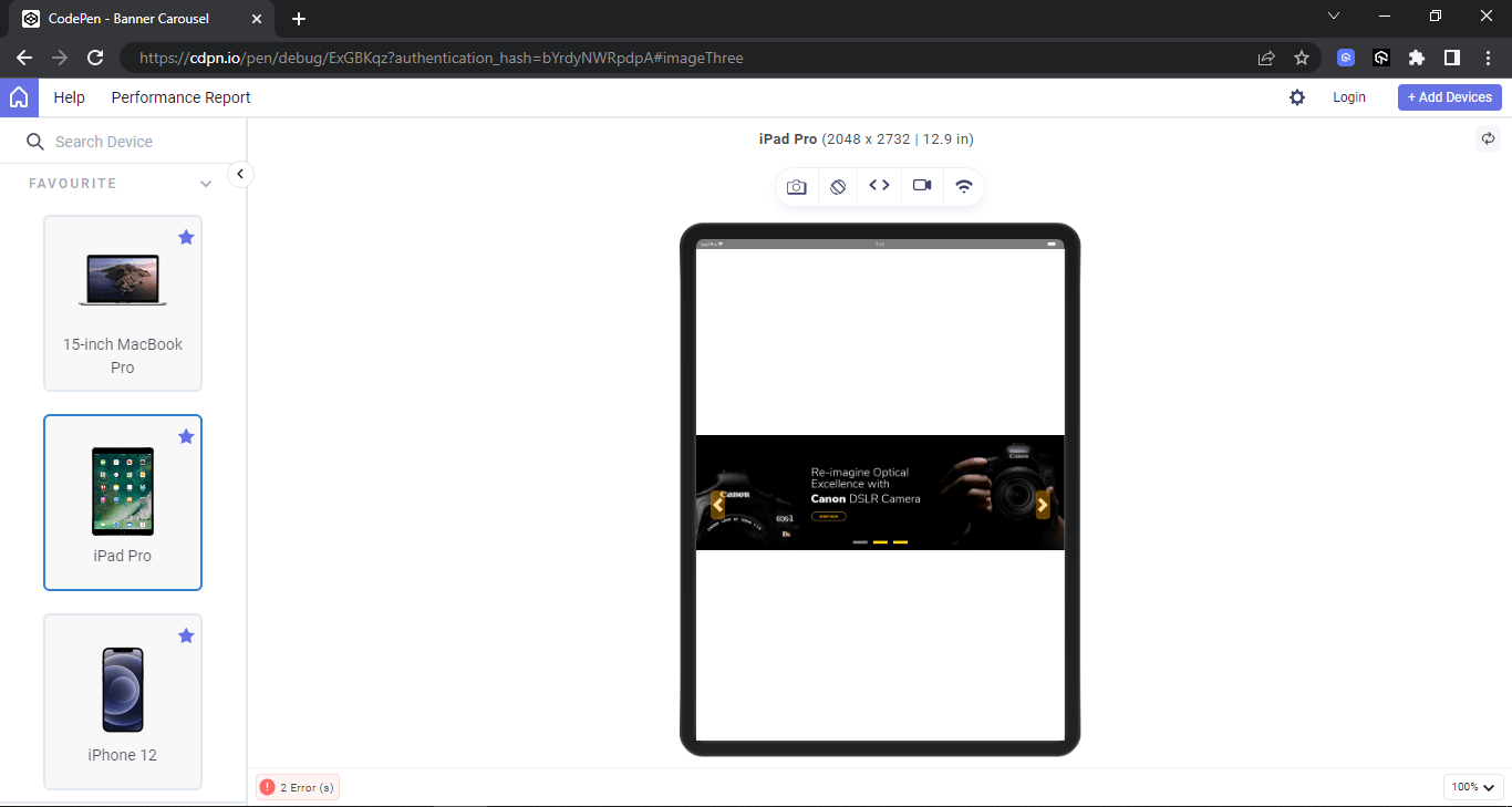
From the browser output above, the carousel is set to 100 viewport width on the desktop and positioned to the middle of the page. Shown below is the output on LT Browser on different screen sizes. This will help to check how banner carousels perform in terms of responsiveness on different device viewports like desktops, mobiles, and tablets.
LT Browser is a free, Chromium-based browser for web developers to help them build, test, and debug their websites and web applications across various pre-installed device viewports. It’s a desktop application that offers a variety of features to make responsive testing easier and more efficient.
Here are some of the key features of LT Browser:
- 50+ pre-installed device viewports: You can test your website on a variety of popular devices, including smartphones, tablets, laptops, and desktops, without having to manually configure each one.
- Live interactive testing: You can interact with your website in real-time as you test it on different devices, making it easy to identify and fix any issues.
- Network throttling: You can simulate different network conditions, such as slow 4G or offline, to see how your website performs under different circumstances.
- Screenshot and bug reporting: You can easily take screenshots of your website on different devices and report bugs directly to your project management tool.
- Integrations with popular tools: LT Browser integrates with various tools, such as Jira, Asana, Trello, GitHub, ClickUp, Slack, and Microsoft Teams.
Desktop Preview:
Mobile Preview:
Tablet Preview:
Testimonial Carousels
Adding testimonials to your web page is a great way to instill confidence in a user about your product. This can quickly be done by creating a simple HTML mockup and CSS styling that displays the testimonials on the page.
However, there are cases where there are many testimonials to display. In this case, the testimonials can be implemented as a carousel that displays several testimonials from a single view. For example, Hashnode uses sample slide animation testimonials to display to the users on the home page.
Similar examples can also be seen on CodeSandbox.
Now, let’s see how to implement the above cases on a web page.
Example:
The example above shows how multiple elements can be implemented as a carousel that animates horizontally across the page.
The element animation-iteration-count is set to infinite to enable the animation sequence to keep repeating itself. In contrast, the animation-play-state is set to run to keep the animation going.
However, each animation is set to pause on hover to stop it from running. This is very useful as it lets users pause the animation and read the testimonials.
HTML:
From the code sample above, the element is broken down into six cards, and each six cards is divided into three groups.
- Cards: Each card contains a paragraph with a role=’’paragraph” indicating that it should be read as a paragraph by screen readers, and aria-label=”testimonials” indicating that this paragraph should be read as a testimonial.
- Card numbers and group: The cards are numbered into six and grouped into three, making it possible for users to interact with each group individually rather than with each card.
CSS:
In the next section of this article, we will look at how to ensure accessible carousels by performing accessibility testing.
How to Test the Accessibility of Carousels?
Ensuring accessible carousels requires screen readers to test different page sections. This is very useful when a carousel element with WAI-ARIA is implemented on each component, such as buttons, slides, slider picker controls, containers, etc.
To test how screen readers read the specified WAI-ARIA Roles, States, and Properties defined on the carousel elements, you can leverage cloud-based accessibility testing platforms to ensure accessible carousels on different combinations of browsers and operating systems.
AI-powered test orchestration and execution platforms like LambdaTest offer accessibility testing of websites and web apps on over 3000+ real browsers and OSes.
We use the LambdaTest screen reader feature on Real Time Browser Testing to run accessibility checks. This will read the WAI-ARIA Roles, States, and Properties specified on the element as audible text, giving the same user experience as a visually impaired user.
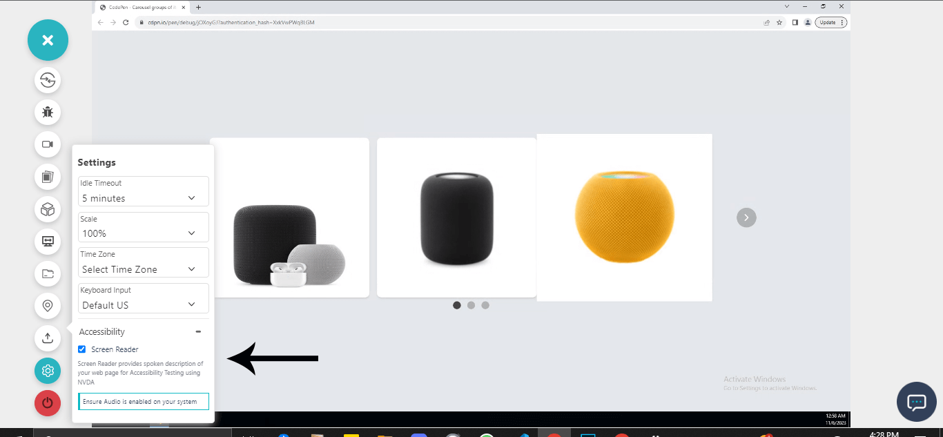
Check out the tutorial below that explains how to test websites in Real Time on the LambdaTest platform.

Subscribe to the LambdaTest YouTube Channel to catch up with the latest videos on Selenium testing, automation testing, and more.
To make sure the carousels are accessible to all users, there are a few best practices that must be followed. Let’s look at some of the best practices to create accessible carousels.
Best Practices for Accessible Carousels
To ensure carousels are well implemented, we can consider the following best practices.
- Easy navigation: Ensure that the carousel slides are easily navigated by implementing navigation controls and control pickers.
- Image quality and bold text: Quality images with bold text should be implemented to encourage users to click through the slides.
- Reduce the number of slides: Avoid multiple carousel slides to maximize engagement.
- Design consistency: Ensure all elements, slides, and navigation controls, maintain consistent style in appearance such as height, width, colors, fonts, etc.
- Avoid autoplay sounds: Ensure sounds are disabled to prevent unpleasant sounds. Users should be given the option to enable sounds for a better experience.
- Semantics: To ensure that carousels are compatible across multiple browsers, developers should write well-semantic mockups and use the appropriate WAI-ARIA Roles, States, and Properties when implementing accessible features on mockups.
- Performance tracking and analytics: Track the performance of the carousel to understand how users interact with each carousel component.
- Fallback options via vendor prefixes: Vendor prefixes such as -webkit-, -moz-, and -ms- just to mention a few, should be used on properties that require vendor prefixes to work well. This will help create a good fallback for legacy browser versions.
Adequate testing should be implemented to ensure the carousel components, such as previous slide control, next slide control, slide picker controls, and pause/play control, are rendered correctly on different browsers for a better user experience.
Conclusion
Carousels help boost users’ engagement and prevent endless scrolling in search of related content or items on the page. However, to create accessible carousels, WAI-ARIA Roles, States, and Properties that enable carousels to be accessible need to be specified within the semantic HTML mockups of the carousel components.
Accessible carousels enable assistive technology tools such as screen readers, text-to-speech, and refreshable braille display software to read WAI-ARIA, Roles, States, and Properties as audible speech for visually impaired users.
Ensure you test each WAI-ARIA Roles, States, and Properties specified on the carousel elements using accessibility testing tools. This will enable you to get real user feedback on how the carousel will be used for visually impaired users.
Frequently Asked Questions (FAQs)
What is the function of the carousel?
Carousels help showcase multiple items in limited space, promote key content, add dynamism, and save space. But remember, accessibility matters: use them wisely and prioritize inclusive design!
Why are carousels not accessible?
While carousels seem visually appealing, they create accessibility issues. Autoplay disrupts impaired users, navigation is often clunky for keyboards and screen readers, and vital information hidden in images is inaccessible. Opt for alternative layouts to ensure everyone can easily access your content.
How do I make an accessible slider?
Make your slider accessible by structuring it clearly with semantic HTML, ensuring keyboard navigation with arrow keys and dedicated shortcuts, offering screen reader compatibility through aria attributes, maintaining good contrast and focus indication, providing text alternatives for non-text content, and avoiding autoplay.
Bonus points for offering keyboard shortcuts, alternative input methods for touchscreens, and thorough testing with assistive technologies! Remember, inclusivity matters.
Got Questions? Drop them on LambdaTest Community. Visit now


 see more >
