Cross Browser Compatibility with CSS: Using Feature Detection for Seamless Web Design
Nikhil
Posted On: January 3, 2019
![]() 41449 Views
41449 Views
![]() 19 Min Read
19 Min Read
The primary goal of every web developer is to build websites with modern and intuitive designs that deliver a smooth and seamless user experience irrespective of which browser they might be using to surf the web. The Internet has witnessed a massive unprecedented boom in recent decades. As of Dec 2018, there are more than 4.1 billion internet users in the world and close to 1.94 billion websites on the web. This consequently implies an expansion in a number of ways websites are being accessed by audiences across the globe. This gives rise to the conundrum of cross browser compatibility which poses a huge challenge to developers. As the number of browsers and their versions are growing at such a rapid pace every year, the task of trying to make a website appear and perform consistently across all browsers is every developer’s nightmare. However, as tedious and time-consuming as cross browser testing may be, it is an imperative phase of every testing cycle. While it is considered nearly impossible to have a website appear and work identical on every browser, there still are a number of ways to deliver consistent user experience and reach a wider target audience. In this article, we’ll explore what cross browser compatibility issues are and why do they occur, how cross browser CSS with feature detection is more favorable to browser detection.
Why Browsers Render Content Inconsistently?
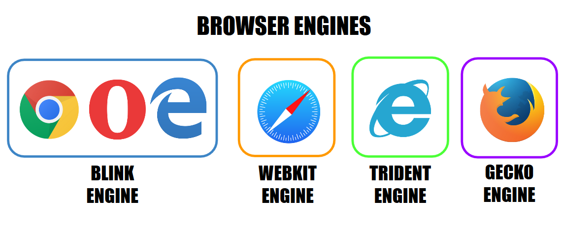
Before delving deeper into cross browser CSS with Feature Detection, it is crucial to have a basic understanding of how internet browsers work and why compatibility issues occur. While browsing the web, whenever you click on a link or type a URL in your browser, you’re guiding your web browser to make a server request for loading the content that you are seeking and to display it on the browser window. This is done by the use of a Rendering Engine that is responsible for parsing the HTML and CSS code and displaying the parsed content on the screen. As every browser has its own rendering engine, content is not displayed identically across all browsers. As a result, there might be glaring differences in the website’s layout and appearance.
Safari uses the ‘Webkit’ rendering engine, Google Chrome uses ‘Blink’(earlier webkit) along with all chromium based browsers like Microsoft Edge and Opera, Firefox uses ‘Gecko’ and finally Internet Explorer uses ‘Trident’. Older versions of Opera used ‘Presto’.

The most dreaded enemy of every front-end developer is the inconsistent feature support among browsers. This means website would appear and work perfectly during development phase on the browser of the developer’s choosing but might end up looking completely haphazard on other browsers during the final testing phase.
Browser Preference Bias
No matter how ardent the denial may be, every developer has a secret ‘browser preference bias’. The browser which the developer relies upon during the website’s development acts as the standard for evaluation of the website’s performance. Majority of the developers naturally have a bias towards Google chrome which has the leading market share worldwide and is packed with the most powerful developer tools suite. This might lead developers to overlook and ignore browsers like Mozilla Firefox, Safari, Opera and the notorious Internet Explorer. Under no circumstances should a developer overlook support for any browser that might be used by even a small fraction of the target audience. Even though Google Chrome and Mozilla Firefox along with Safari have a market share of close to 90-95%, this statistic depending upon the nature of the website and other factors might prove to be deceiving. Browser preference varies greatly with geographical locations and age demographics. For example, Safari is considerably a lot less used outside the US and IE is still the browser of choice for an older generation.
Browser Market Share
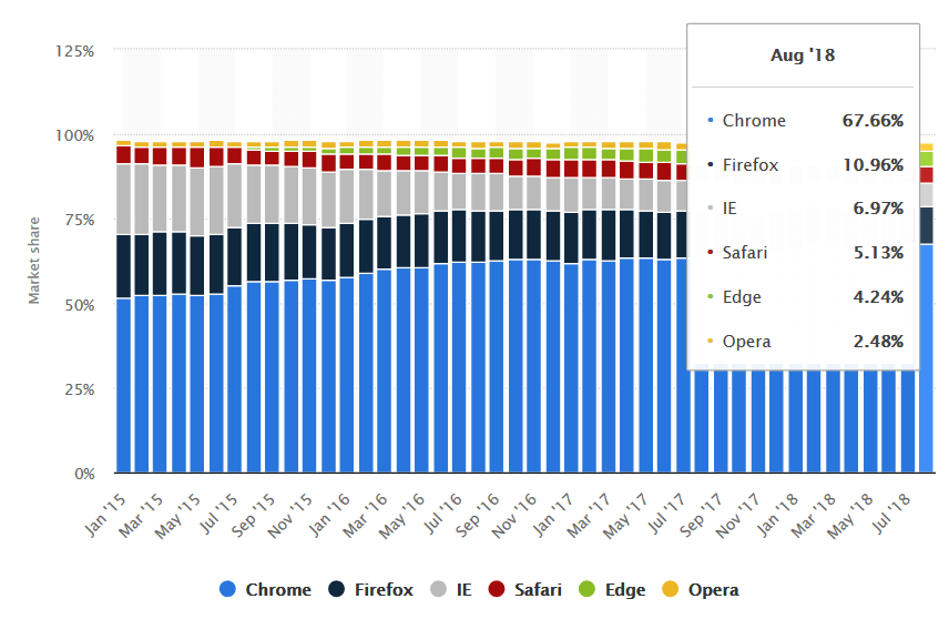
Google Chrome is the clear market leader with at least 67% market share followed by Firefox trailing at 11%. It is interesting to note that the notorious Internet Explorer which is very often ignored by developers still retains market share of almost 7-10% in 2018. This fact further amplifies the indispensable need for developers to pay heed to cross-browser compatibility. You can further use Google analytics or any other web analytics tool to determine which browsers are preferred by the majority of your website visitors. If the share of a browser or browser version is less than 1%, a developer should consider it is a low priority with respect to the ones that are primarily responsible for driving traffic to your website.
Need For Cross Browser Compatible CSS
In recent years, we have witnessed the emergence of new powerful features being rolled out in CSS which has given birth to new modern design trends. However, thanks to cross-browser compatibility issues, a majority of these newly introduced powerful CSS3 properties are not universally supported by all major browsers. In absence of fallbacks, these properties are not interpreted by the browser and ignored completely, which can wreak havoc on your website’s design on older unsupported browsers especially the dreaded IE. New exciting features like CSS Grid, Flexbox, CSS Blend Modes, 3D transforms have pushed the envelope of web design to new heights. However, many developers have been slow to adopt these new rollouts due to their scepticism of cross browser CSS support. Nobody wants to take the risk of building websites for their clients that most browsers won’t render properly.
Here is a brief section to help you understand CSS properties which are not supported by different web browsers. You can use Can I Use platform to realize the supported and unsupported elements for various browsers and browser versions.
- CSS properties not supported by latest version of Internet Explorer (v 11)

- CSS properties not supported by any latest versions of Firefox
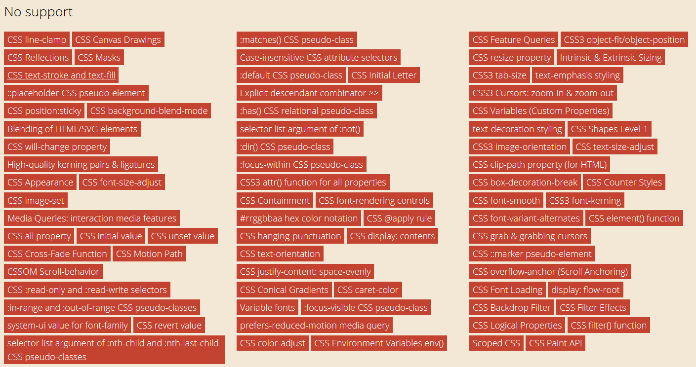
- CSS properties not supported by any latest versions of Google Chrome

- CSS properties not supported by any latest versions of Opera

On top of that even some HTML elements and attributes are also not supported by some browsers. For example form attribute ‘placeholder’ isn’t supported by any version of IE and not even Edge. Although Chrome and Firefox support it.

Approaches to Counter Uneven Browser Support
Graceful Degradation VS Progressive Enhancement
There are two polar opposite development philosophies commonly used by devs for countering uneven browser support and ensuring that users enjoy a degree of consistency across all browsers- Graceful degradation and Progressive Enhancement.
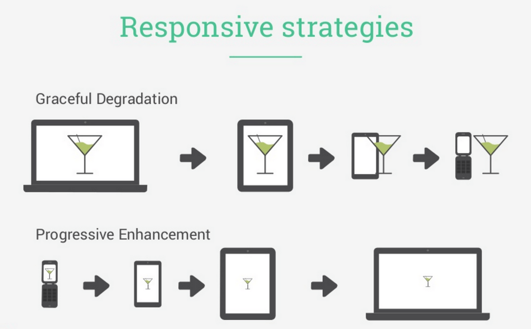
- Graceful degradation approach means building your website with full functionality and design features as supported by the latest modern browser and then gradually coding downwards to provide support of older browser by stripping away layer after layer, downgrading the enhanced version. The lower version of the website is stripped of its enhanced functionality and appearance features but still delivers baseline version to users.
- Progressive enhancement is the reverse or opposite of Graceful Degradation. At first, a basic/baseline version of the website is created and then gradually moving upwards, advanced functionality and appearance features are added for modern browsers and newer versions to deliver feature-rich experience.
Progressive enhancementis generally accepted to be superior to graceful degradation as it starts with the universal base version first and adds further enhancements on top of it later for modern browsers. It guarantees that website would work in any browser new or old, and will render advanced version in all those browsers which support it automatically. Also favourable for testing and crawling by search engine bots/spiders.
What Is CSS Fault Tolerance?
In languages like Javascript Ruby and PHP, the execution is terminated when an error is encountered. On the other hand, CSS is blessed with a feature called “Fault Tolerance”. Whenever the browser comes across a CSS line of code which it cannot interpret or understand, it simply ignores and skips that line of code and jumps to the next. For example, consider the code below example –
We select the element div and changed the colour property to a hex value, “#777”
|
1 2 3 4 5 6 7 8 9 |
div { color: #777; } Now look at the following code: div { color: #777; color: #000; } |
As we have set the color property value to “#000” from “#ccc”, the second value will be used. Now, if we use an invalid property value, CSS will use its fault tolerance feature and will simply ignore the CSS line that it cannot interpret.
|
1 2 3 4 |
div { color: #777; color: foobar(10); } |
Because foobar(10) is not a valid CSS value, browser cannot interpret this line so it simply ignores it. The color value “#777” is retained.
We can leverage this fault tolerance feature of CSS to code fallbacks properties. With this technique, you don’t need to indulge in the hassle of creating two separate files or writing confusing conditional statements. Your website won’t have to send two separate HTTP requests, first for modern CSS file and then for IE fix file like in this case –
|
1 2 3 4 |
<link href="modern.css" rel="stylesheet" /> <!--[if lte IE 8]> <link href="legacy.css" rel="stylesheet"> <![endif]--> |
Now that we have discussed what cross browser compatibility issues are, let us now look at ways to overcome this challenge. The two primary methods that we will discuss are –
- Browser Detection
- Feature Detection
Browser Detection
Browser identification is based on detecting User-Agent String. The NavigatorID.userAgent property returns the user agent string of the current browser. The User Agent request header contains a characteristic string that allows identification of application type, OS, software vendor or software version etc.
Syntax
var ua = window.navigator.userAgent;
Where ua stores the user agent string value of the current browser.
For example, Firefox UA string –
Mozilla/5.0 (Windows NT 6.1; Win64; x64; rv:47.0) Gecko/20100101 Firefox/47.0
Here are the User Agent strings of common web browsers –
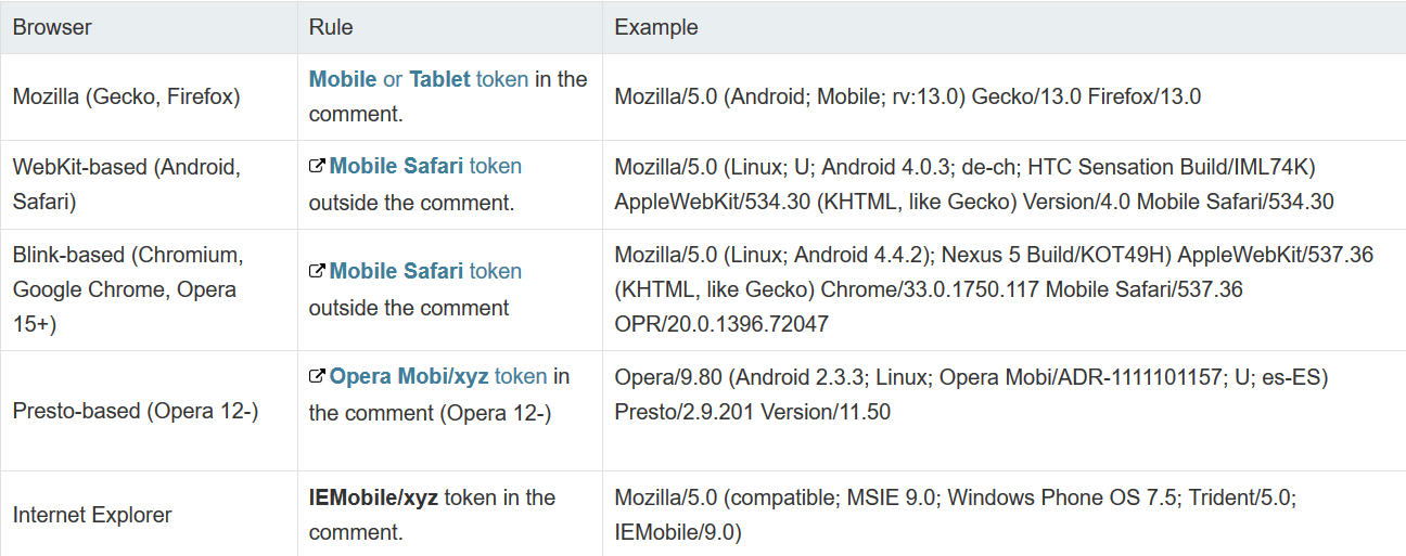
The most common approach is to use JavaScript to query the user-agent header:
|
1 2 3 4 5 6 7 8 9 10 11 12 13 14 15 16 17 18 19 20 21 22 23 24 25 26 27 28 29 30 31 32 33 34 35 36 37 38 |
<!DOCTYPE html> <html> <body> <p>Find the name of your browser using User Agent</p> <button onclick="myFunction()">Try it</button> <p id="demo"></p> <script> function myFunction() { if(navigator.userAgent.indexOf("Chrome") != -1 ) { alert('Your Browser is Google Chrome'); } else if((navigator.userAgent.indexOf("Opera") || navigator.userAgent.indexOf('OPR')) != -1) { alert('Your Browser is Opera'); } else if(navigator.userAgent.indexOf("Safari") != -1) { alert('Your Browser is Safari'); } else if(navigator.userAgent.indexOf("Firefox") != -1 ) { alert('Your Browser is Firefox'); } else if((navigator.userAgent.indexOf("MSIE") != -1 ) || (!!document.documentMode == true )) //IF IE > 10 { alert('Your Browser is Internet Explorer'); } else { alert('Unknown Browser'); } } </script> </body> </html> |
IE Conditional Statements
Another way to detect or identify browser is by using Internet Explorer’s conditional comments. This syntax extends the standard HTML comments and is unique to IE.
Conditional comments are internet explorer specific CSS rules, only recognized by Internet Explorer ignored by all other browsers as they treat them as normal comments. Note that in second case(target other browsers except IE), content is not inside a comment. Therefore it will be recognised by other browsers.
- Target all IE browser versions
123<!--[if IE]>Place content here to target all IE users.<![endif]--> - Target browsers which are not IE
123<![if !IE]>Place content here to target all users not using Internet Explorer.<![endif]> - Target a specific IE version
123<!--[if IE 6]>Place content here to target all users of IE version 6.<![endif]--> - Target IE versions greater than or equal to 7
123<!--[if gte IE 7]>Place content here to target users of IE7 or higher.<![endif]--> - Target IE version less than 7 (i.e. 6 or lower).
123<!--[if lt IE 7]>Place content here to target users of IE6 or lower (less than 7).<![endif]-->
Drawbacks of Browser Detection :
- The biggest drawback of Browser detection by user-agent is that the developer needs to constantly keep a track of browser support. Moreover browser detection doesn’t take into account new browser version updates. New browser versions might support previously unsupported feature making your extra code redundant or new version might remove support for a feature which can wreck your website’s performance.
- Fallback code will be displayed even if there is a possibility that new versions of the browser support that feature
- Some browsers also use a dummy user agent to mask the original.
- Many browsers have also started to spoof their user agent strings. IE has also dropped support for UA detection in browsers beyond version 10 and 11
Feature Detection
A much better alternate approach to browser detection is called “Feature Detection”.
CSS with Feature detection runs a test to determine whether the given feature in question is supported by the current browser, and then conditionally runs different codes depending on whether it does or doesn’t. In simple terms, cross browser CSS with feature detection involves testing whether a browser is capable of running the given lines of code and depending on the outcome of the test, a specific block of code is run which is supported by the browser resulting in near perfect consistency and cross browser CSS compatibility.
This way you can ensure that the browser can deliver a seamless and consistent user experience no matter which browser the user has. A developer doesn’t have to worry about keeping track of cumbersome browser support chart and new version updates. Coupled with the philosophy of Progressive Enhancement, a developer first codes the website to deliver the base version supported in all browsers and proceeds to add on layers depending upon support in new modern browsers. If you do not follow the approach of cross browser CSS with feature detection, browsers that don’t support the features won’t display your site as intended and will deliver a poor user experience. Other than delivering cross browser CSS, it also helps developers to write clean readable CSS by avoiding chaotic multiline fallbacks.
Browser Detection and Feature Detection Comparison
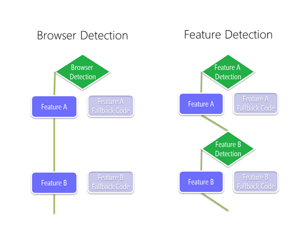
Consider the following test scenario. In both cases, we have a fallback ready for an absence of browser support.
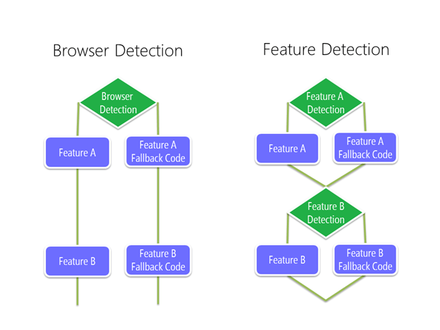
If the browser configuration is known and User-Agent works as intended with successful detection, both methods work.
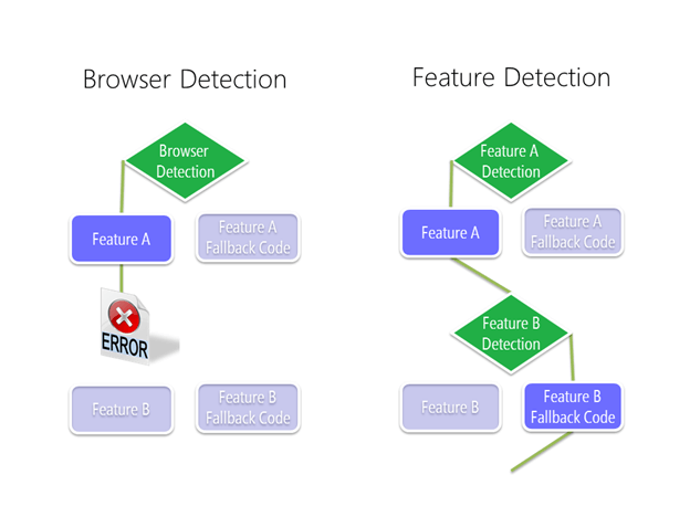
However, when encountered with unknown or incorrect browser configuration, Browser detection method fails completely and is not able to render the page correctly. On the other hand, Feature detection handles this challenge in a much more seamless manner. Cross browser CSS with Feature detection runs a test and determines that the browser is capable of displaying Feature A but when it fails to support feature B, it simply relies on fallback for feature B and successfully renders the page the way developer wanted to.
Cross Browser CSS Feature Detection – @supports Feature Query
There are several tools available in a developers arsenal for achieving cross browser compatibility like modernizr and polyfills. Instead of using third party tools we can achieve the same by using CSS Feature Queries. These are conditional rules which allow us to apply different styles to the same element depending on browser support. Feature queries are similar to @media, @document or @import conditional statements. Unlike @media query which uses conditions based on the screen size, feature query creates conditions based on the cross browser CSS support. If the browser comprehends and supports the property inside the Feature Query, then all the CSS style rules inside the query brackets will be applied. Otherwise, it is ignored and skipped over.
@supports Rule
@supports is a conditional group rule which tests whether the browser supports CSS property: value pairs or not. The browser performs cross browser testing to check whether or not a certain CSS property or value is supported. The result determines whether or not a block of CSS code is applied or not. The syntax is similar to a media query, but instead of a media query, we set a CSS declaration as the test condition for validating cross browser CSS. The browser executes the cross browser CSS styling based on that condition.
Syntax:
|
1 2 3 |
@supports(test condition) { /* apply rules */ } |
Example:
Consider the following example involving vmax width property –
|
1 2 3 4 5 6 7 8 9 |
.container { height: 100%; } @supports (height: 100vmax) { .container { height: 100vmax; } } |
@supports queries tests whether vmax is supported by the user’s browser or not. If it is supported, the height of container will be set to 100vmax otherwise if the feature is unsupported, the height of the container will be set to 100%.
Another example to test whether a browser supports CSS grid or not.
|
1 2 3 4 5 6 7 8 9 |
div { background-color: yellow; } @supports (display:grid) { div { background-color: green; } } |
In browsers that support the grid feature, the background colour of div element will be set to green(because the conditional resolves to true), while for browsers that do not support grid, background of div will be set to yellow.
@supports Operators
We can use multiple logical operators to supercharge @supports feature query to create complex condition tests.
(a). not operator
“not” operator can be used with @supports to check for No Support.
|
1 2 3 |
@supports not (display: flex) { div { display: inline-block; } /* alternative style if display:flex is not supported */ } |
(b). And operator
“And” operator can be used to check multiple test conditions all at once. The result is true only if all conditions are true. If even a single condition is false then the resulting boolean is also false.
|
1 2 3 4 5 6 7 8 9 10 11 12 |
@supports (mix-blend-mode: overlay) and (background: linear-gradient(rgb(45, 145, 245), rgb(20,120,220))) { .wrapper { background: linear-gradient(rgb(45, 145, 245), rgb(20, 120, 220)); } .wrapper img { mix-blend-mode: overlay; } } |
(c). Or operator
“Or” operator can be used to check whether at least 1 condition out of many is true or not. The result is false only if all the conditions are false.
|
1 2 3 4 5 6 7 8 9 10 11 |
@supports (display: -webkit-flex) or (display: -moz-flex) or (display: flex) { section { display: -webkit-flex; display: -moz-flex; display: flex; float: none; } } |
Supports detection using Javascript
Feature queries can also be used with Javascript. Javascript provides the CSS.supports() method which can be implemented in 2 ways –
- CSS.supports(propertyName. value);
Eg : result =CSS.supports("text-decoration-style", "blink"); - CSS.supports(testCondition);
Eg : result =CSS.supports("display: flex");
A bit out of topic, but if you are struggling with memory leaks related to Javascript then I have also written a detailed blog on eradicating memory leaks in Javascript.
Using CSS @supports to create fallback for CSS Grid
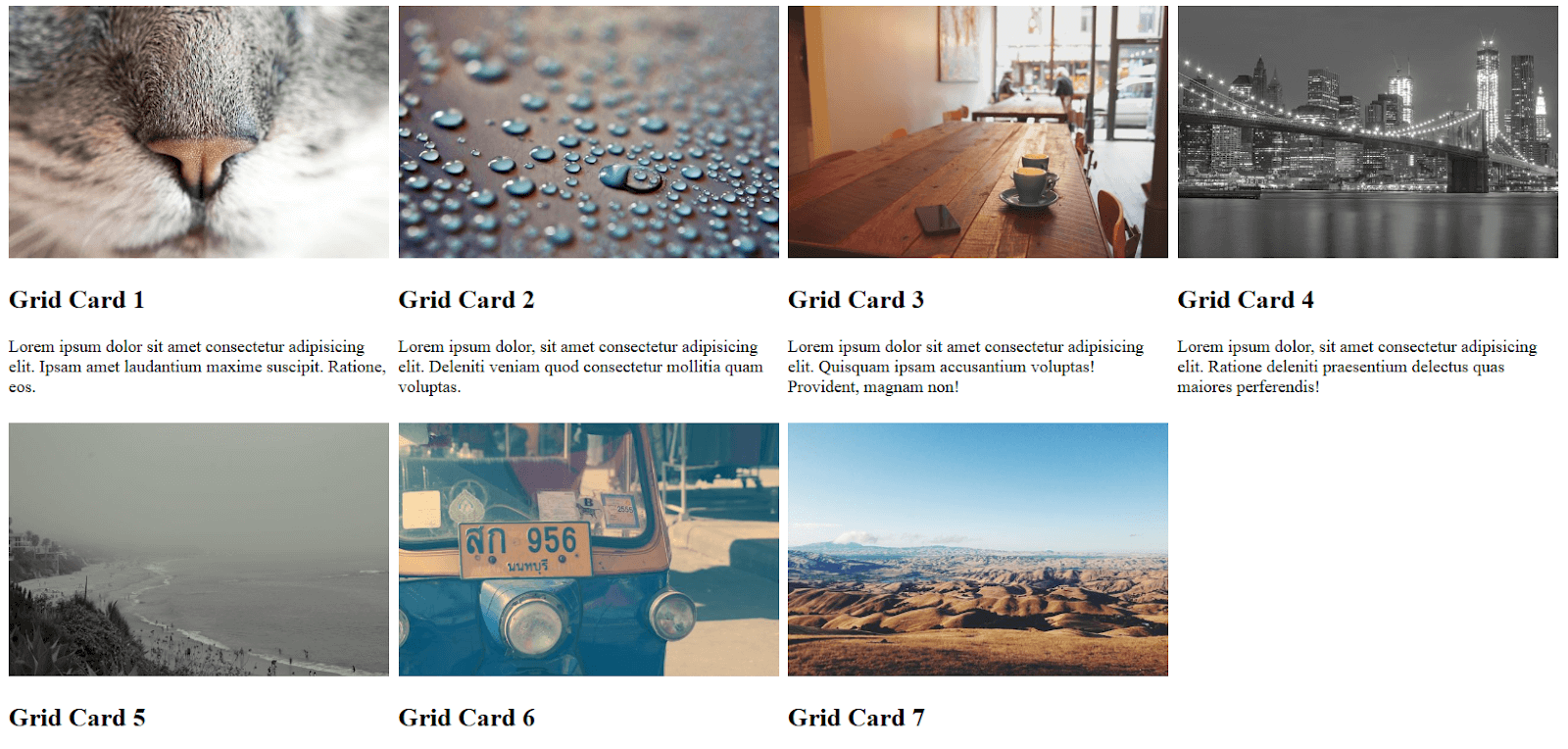
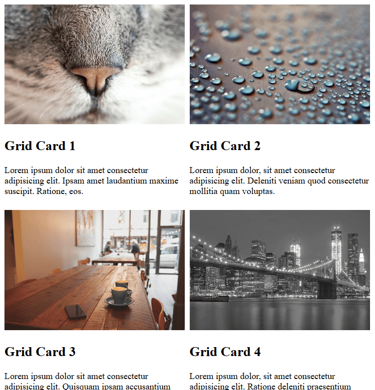
We can now utilise feature queries to create a fully functional mini layout for a gallery or portfolio section. We can do this by progressive enhancement approach by creating a basic layout version first and then adding browser support for flexbox and CSS grid.
|
1 2 3 4 5 6 7 8 9 10 11 12 13 14 15 16 17 18 19 20 21 22 23 24 25 26 27 28 29 30 31 32 33 34 35 36 37 38 39 40 41 42 43 44 45 46 47 48 49 50 51 52 53 54 55 56 57 58 59 60 61 62 63 64 65 66 67 68 69 70 71 72 73 74 75 76 77 78 79 80 81 82 83 84 85 86 87 88 89 90 91 92 93 94 95 96 97 98 99 100 101 |
<!DOCTYPE html> <html> <head> <style> body { text-align: center; } .grid-wrapper { display: inline-block; } .grid-card { width: 18em; display: inline-block; margin: 1.5em 1em; text-align: left; } .grid-card-img { width: 100%; } @supports (display:flex) { .grid-wrapper { display: flex; flex-wrap: wrap; margin: -1.5em 0 1.5em -1em; justify-content: space-around; } .grid-card { padding: 1.5em 0 0 1em; flex: 1 0 18em; max-width: 18em; width: auto; margin: initial; } } @supports (display:grid) { .grid-wrapper { display: grid; grid-template-columns: repeat(auto-fill, minmax(18em, 1fr)); grid-gap: 0.8em; margin: initial; } .grid-card { padding: initial; max-width: none; } } </style> </head> <body> <div class="grid-wrapper"> <div class="grid-card"> <img loading="lazy" class="grid-card-img" src="https://unsplash.it/640/425?image=40"> <h2>Grid Card 1</h2> <p>Lorem ipsum dolor sit amet consectetur adipisicing elit. Ipsam amet laudantium maxime suscipit. Ratione, eos.</p> </div> <div class="grid-card"> <img loading="lazy" class="grid-card-img" src="https://unsplash.it/640/425?image=41"> <h2>Grid Card 2</h2> <p>Lorem ipsum dolor, sit amet consectetur adipisicing elit. Deleniti veniam quod consectetur mollitia quam voluptas.</p> </div> <div class="grid-card"> <img loading="lazy" class="grid-card-img" src="https://unsplash.it/640/425?image=42"> <h2>Grid Card 3</h2> <p>Lorem ipsum dolor sit amet consectetur adipisicing elit. Quisquam ipsam accusantium voluptas! Provident, magnam non!</p> </div> <div class="grid-card"> <img loading="lazy" class="grid-card-img" src="https://unsplash.it/640/425?image=43"> <h2>Grid Card 4</h2> <p>Lorem ipsum dolor, sit amet consectetur adipisicing elit. Ratione deleniti praesentium delectus quas maiores perferendis!</p> </div> <div class="grid-card"> <img loading="lazy" class="grid-card-img" src="https://unsplash.it/640/425?image=44"> <h2>Grid Card 5</h2> <p>Lorem ipsum dolor, sit amet consectetur adipisicing elit. Architecto cum quia tempore totam a! Explicabo?</p> </div> <div class="grid-card"> <img loading="lazy" class="grid-card-img" src="https://unsplash.it/640/425?image=45"> <h2>Grid Card 6</h2> <p>Lorem ipsum dolor sit amet consectetur adipisicing elit. Quae recusandae quidem, nihil maxime dicta suscipit.</p> </div> <div class="grid-card"> <img loading="lazy" class="grid-card-img" src="https://unsplash.it/640/425?image=46"> <h2>Grid Card 7</h2> <p>Lorem ipsum, dolor sit amet consectetur adipisicing elit. Impedit odit saepe, facere iste adipisci aliquam?</p> </div> </div> </body> </html> |
Browser Support For Feature Queries
One sticking point with using @supports feature queries is lack of browser support in some old archaic browsers.

No version of Internet Explorer including version 11 supports feature queries. Safari browser rolled out support for feature queries but only in recent versions. But it must be noted that as CSS degrades gracefully, if a browser does not recognise @supports rule, it will simply ignore the entire block of code without wrecking the web page. The best approach therefore is to first code your your base CSS styles which every browser can handle. Then use @supports feature queries to override those base styling with much more advanced functionality and appearance for modern browsers that can handle those features.
Some developers looking for IE browser support prefer to use tools like Modernizr, Post-CSS and other Polyfills to address their cross browser compatibility needs.
Cross Browser CSS Feature Detection Using Modernizr
Modernizr is an extremely useful JavaScript library that helps to automatically detect availability of next-generation HTML and CSS features in a user’s browsers. Rather than relying upon user-agent sniffing, modernizr depends on cross browser CSS feature detection to allow developers to deliver specific user experiences based on a user’s browser capability. A test is run on the user’s browser to check whether it supports a specific feature or not. If the feature is deemed to be unsupported by the browser, a developer can code all the necessary fallbacks to mirror the unsupported feature. Unlike cross browser CSS with feature detection using @supports feature queries, modernizr also allows to build custom tests for validating cross browser compatibility.
Setting up Modernizr
Older versions of modernizr gave you two options to download the file, Development and Production version. However, in recent version of modernizr a single development version modernizr.js file is no longer available.
- Visit the Download page to custom select only the features you want in your project. This helps reduce file size and boost loading speed of the webpage.
- Insert the file inside the ❬head❭ section.❬script src=”modernizr.js type=”text/javascript❭❬/script❭
- Modernizr adds many CSS classes on the root ❬html❭ tag by default. These classes generated by Modernizr are dependent on the browser’s capabilities. If a feature is supported by the browser, a corresponding class is added to the tag, and if a feature is unsupported, the corresponding class is added with a “no-” prefix(e.g. .feature or .no-feature).
❬html class=” js flexbox flexboxlegacy csstransforms no-csstransforms3d csstransitions”❭ - Add no-js class to the ❬html❭ tag.
❬html class=”no-js”❭This step is necessary in case the user’s browser doesn’t support JS. Necessary fallbacks can be added using this class. However if the browser does support javascript, then Modernizr will replace no-js class with js.
Let’s say we wanted a background image with linear gradient overlay on top of it. We can use Modernizr to detect if the browser supports linear-gradient feature or not and code necessary fallbacks if it doesn’t. Depending on modernizr’s CSS feature detection for the given browser, the result will be either ❬html class=”cssgradients”❭ or ❬html class=”no-cssgradients”❭. We can use progressive enhancement methodology to target both cases easily thanks to modernizr classes.
|
1 2 3 4 5 6 7 |
.no-cssgradients .header { background: url("https://unsplash.it/640/425?image=44"); } .cssgradients .header { background-image: url("https://unsplash.it/640/425?image=44"), linear-gradient(red, yellow); } |
Modernizr Feature Detection Using Javascript
We can also use Modernizr with javascript to test the browser feature with the following syntax:-
|
1 2 3 4 5 6 7 8 |
// Test for flexbox if (Modernizr.flexbox) { console.log('flexbox is available.'); /* Script A */ } else { console.log('flexbox is not available.'); /* Script B */ } |
I will soon be upcoming with another blog to discuss Modernizr in detail.
Modernizr Vs Feature Queries
Modernizr is supported by practically all browsers imaginable unlike feature queries which is not supported by any Internet Explorer version including 11. Excluding IE, feature queries feature queries have already been widely implemented covering 91.68% of global users. Unlike feature queries which are natively supported by browsers, Modernizr needs to be first downloaded and executed in Javascript which increases page load speeds and can affect ranking on SERPs. Moreover @supports feature queries covers a much wider array of CSS properties than modernizr
Cross Browser Testing Being Indispensable
It is inconceivable to achieve cross browser compatibility by using cross browser CSS with feature detection with feature queries or Modernizr alone. If a developer can’t even detect rendering issues across different browsers and browser versions. The wider number of browsers and browser version you validate your website on, the robust your UI gets assured. Not only does this help to deliver a seamless experience to your customers, but it also helps in delivering a sense of accomplishment and relief to the developers. This is why using a cross browser testing tool is vital. Without cross browser testing, developers won’t be able to validate if changes they have made to achieve browser compatibility are working as intended or not. LambdaTest is a cloud-based tool offering 2000+ browsers and browser versions to validate and test your website for cross browser compatibility.
Conclusion
Cross browser compatibility, without doubt, is an indispensable dimension of Web Development which can no longer be ignored. However contrary to popular belief, websites don’t need to look and function exactly the same on each browser. It is crucial to comprehend that full scale 100% compatibility is simply impossible to achieve. Therefore the key goal of every developer should rather be to make their websites accessible across different browsers and providing a pleasant seamless viewing experience to as many users as pragmatically possible. So far, developer community relied on JavaScript especially modernize to resolve their cross browser compatibility issues. But in recent times CSS feature detection has emerged as a viable, lightweight and easy to use an alternative solution that is finding its way into the mainstream and gaining popularity among developers.
Got Questions? Drop them on LambdaTest Community. Visit now


