18 CTA Design Tips To Boost Your Website’s Conversion Rate
Arnab Roy Chowdhury
Posted On: November 20, 2018
![]() 35859 Views
35859 Views
![]() 7 Min Read
7 Min Read
Your website may have millions of visitors, but the question is, how many of them are converted into customers. Conversion rate is a critical factor considered for evaluating any product on the web.
When it comes to marketing, there are 2 important keys
- How to drive traffic to your website
- Convert the incoming traffic into customers
The user experience of a website matters a lot in increasing the conversion rate of a website. And the easiest procedure that can help you in that is optimizing the Call to Action buttons. Here, we shall discuss 19 CTA design tips that will help you in boosting the conversion rate of your website.
1. Name Your Buttons Short & Crisp
Efficient naming is an important part among the UX practices for CTAs. Keep your text short so that the user will be able to understand the purpose of that button. For example – If you are hosting an e-learning website and a user is willing to start a course can do so with the help of a CTA declared at the bottom of the post. Then keep your text short & precise like “Get Started”, “Let’s Begin” or ‘Start’ etc.
2. Choosing the Colors
An important CTA design tip is choosing the appropriate color. You can experiment using different colors until you find the desired result.

3. Figure Out The Right Spot
Proper placement falls among the best UX practices for CTAs. Place the button where they can be easily noticed by the user and gives the user an understanding of what is the website’s main purpose. We can take an example of PayTM. Since their main purpose is mobile recharge and bill payment, take a look at their effective CTA placement.

4. Effectively Design the CTAs
While designing your CTA, follow the best UX practices for CTAs and research other sites for CTA design tips. Design should not be extravagant, rather it should be simple, yet noticeable, loud enough to speak your purpose. Just like the “Submit Your Site” button of awwwards.com.

5. Delaying The Display
You can use an intro video while your website is loaded or a small slideshow, at the end of which the CTA will get displayed. The aim of that intro is to persuade the user in order to convince that they are at the right place. This also helps to increase the user engagement of your website resulting in decreased bounce rate.
6. Creativity Is Key
Another important CTA design tip is creatively placing your CTA. Like embedding it within a video or an animation. If the user likes the video, they will be automatically persuaded to click on the button. This works just like the branding button that people watermark in their YouTube videos.
7. Using Reverse Psychology
Ask a user not to click on a button! Yes, you heard that right. Reverse psychology can be an effective way to persuade users in doing stuff they don’t want to.

8. Adding Animations & Effects
Animated buttons also add an extra effect in improving a website’s aesthetics. Add click and hover effects and animations on your CTAs to make them noticeable.
9. Exit CTA Should Leave a Lasting Impression
Exit CTAs are often important, yet ignored. Displaying a CTA whenever a user is closing a webpage, that offers a discount or something exciting is an important CTA design tip to boost the conversion rate. Let’s take a look at the Exit CTA of Skullcandy.

10. Typography, Mate, Typography!
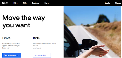
You can make your CTA stand out from the rest with appropriate CTA Typography. Don’t keep your CTAs too close to each other, certainly, don’t make them overlap by anyway. Clear the area around them and efficiently use paddings and margins. Whitespaces actually draw attention to your CTA.
11. Remove the CTAs?
Often, having multiple CTAs at your website makes your customers feel like your aim is only to sell the products. An important CTA design tip is to temporarily remove the CTA. This will have a reverse effect on customers who will want something once they see that they can’t have it.
12. Size of Your CTAs
Make the CTAs large sized and have a varying size at different devices. Make sure they are clickable with the use of thumb or index finger in handheld devices.
13. Want Higher Conversion? Then Be More Persuasive
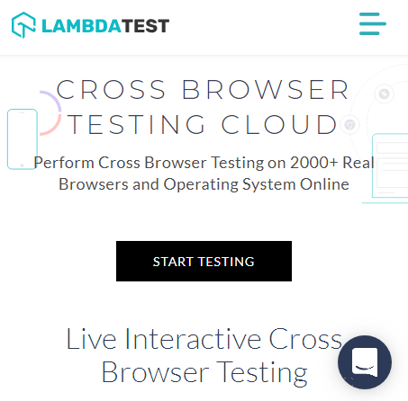
Design and name your CTAs in a way that they mildly follow the persuasive approach, the latest trend in UX followed by multiple websites worldwide. The buttons should be designed in a way that they suggest the user click on them and find out what awaits.

14. Make the CTAs Noticeable
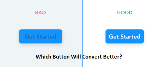
Use bold colors, sharp edges and large and clear fonts. All these falls among the best UX practices for CTA. This makes the button noticeable even in a website that is clustered with contents and media elements.
15. Let Your CTAs Do The Work For You
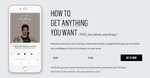
Start the naming with a verb like Sign or Register or Download. This guides the user to perform the necessary action.

16. Check the Variations of the CTAs
Create a few variants of the CTA and check with which variant, your website is getting the highest conversion rate. Use the one that works the most. However, the result may change from time to time. An important CTA design tip is to experiment with different variants frequently.
17. Use fewer Links and More CTAs
Replace important hyperlinks with CTAs, but remember not to overcrowd the page. The user should not feel like you are using only CTA’s to persuade the user to purchase your products.
18. Catchy Hovering
Have a style for your buttons to display more information or attractive animation when the user hovers over them. You can even show additional information on popup or tooltip form to show the user what the CTA is intended for. This is particularly important when the action is complicated and you do not have enough words to name the CTA.

Apart from all the above-mentioned UX practices for CTA, there are many other CTA design tips. You will be able to discover them by experimenting. Remember an important fact, the design technique that works for other websites may not work for you. So, start experimenting and design the perfect CTA that will boost your website’s conversion rate.

Got Questions? Drop them on LambdaTest Community. Visit now


