Guide for Morphing Animation with CSS Clip-Path
Harish Rajora
Posted On: February 9, 2021
![]() 84369 Views
84369 Views
![]() 13 Min Read
13 Min Read
Morphing techniques have been used for animating between two images within films and cartoons for ages. Today, the same process can be seen gradually taking over the website world as animating shapes and floating divs have become a significant part of website designing strategies. While the animation process in web applications began with the fade-in-fade-out kind of animation, it has advanced towards the morphing techniques we see today. Morphing animation has been widely appreciated, gradually seeping its way into the CSS realm sometime later. In this post, we will focus on the CSS clip-path method that helps achieve the same and how browser compatibility testing comes into play here. Assuming some of you might not be familiar with the concepts, let’s lay the groundwork with a basic understanding before implementation.
TABLE OF CONTENT
What is Morphing?
Morphing is a process of transforming one image or shape into another image or form gradually. Since the early 90s, this has become quite common in the animation world due to the incredible computer power and technology improvements. The following image shows the morphing process:

Although the above image is a very advanced morphing done through advanced tools, we will stick to the morphing animations done on the shapes on a web page through code.
In the above image, you can observe that morphing animation is slightly different from old-school animation. Here, one image is not just fading out and another emerging out of it. The process is gradual, and the first image transforms into another point by point, avoiding the sudden appearance of one image which looks abrupt. The image transition in morphing seems as if there is always a single image instead of two at every point in time. There is a point in the image when the image is neither image A nor B. However, the old animation methods portrayed both the images during the transition, with one being in focus and one out of focus.
Morphing with SVG
The technique of morphing, before coming to CSS, was popularly used via SVG. Well, not popularly, but whoever wanted to implement morphing used SVG. SVG works on vector mechanism and point graphics. The idea behind morphing in SVG is to use the same number of points in both the shapes and use them as a vector to perform the animation. Analyzing the vectors in both the source image and the end image requires many manual efforts, though.
Firstly, you have to make an image in SVG format and calculate the points, their location into the canvas. Secondly, you need to repeat the same process with another image and keep in mind that the points need to be the same in number as when they start animating; every point has a new reference into the second image giving rise to perfect morphing. The following GIF is created by morphing through SVG.
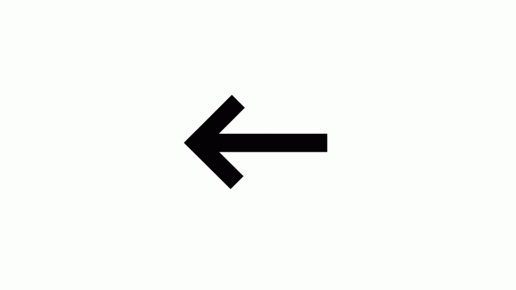
Can you look at the above GIF and recognize how sections are divided so that there are equal points used in both images?

The transition can be seen more clearly below:
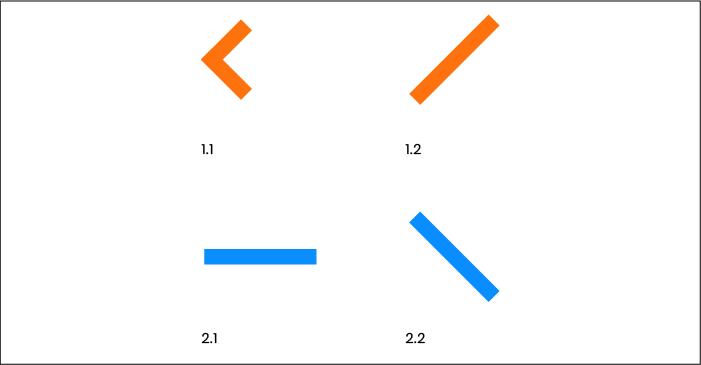
This process of creating the image and defining the points on to the image is called modeling. Once modeling is done, the next process is to animate that image with mathematical calculations or by using a tool or SVG transitions. There are a lot of tools available for these, such as SMIL, MorphSVG, SnapSVG, etc. These come with their set of features and demerits that we will talk about some other day.
But if you ask for my honest opinion, morphing with SVG is a bit of a challenge. A better option to go ahead would be using the new CSS feature called CSS clip-path, which is much easier and faster.
What is a CSS clip-path?
If you have worked with the SVG library, you must be familiar with the <path> tag, which helps create lines, curves, arcs, etc. Saying that this tag is the ”heart” of SVG would not be a wrong thing. The “path” in clip-path refers to the same feature, and this property tries to cut (or clip) the overall shape down. A clip-path creates a clipping region onto a shape that divides the region into two areas. One, which is inside the clipping region, and the second, which is outside. These are called the positive and the negative regions, respectively.
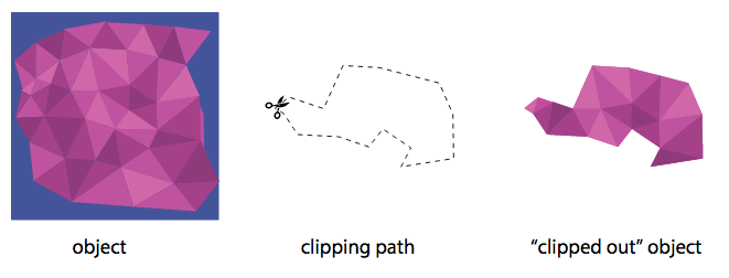
The negative regions are then clipped out and not shown, while the positive regions are shown to the viewer. In the above image, the second part shows the positive region we need to clip out of the first image. The end result is the third image. So, we transit from the positive region to the end image smoothly.
CSS clip-path has a predefined set of shapes, which are used popularly. These are described in the next section.
Make Responsive Images With CSS, HTML, WordPress
Shapes In Clip-Path
Clip-path comes in four in-built shapes. We have considered the same image for all of the arguments below. The syntax of the shapes in the clip-path is as follows:
Circle in Clip-Path
The circle shape is defined by the method circle() that accepts two arguments. The first one is the radius of the circle you want for the positive region. This can be either an absolute number or a percentage number, which will be counted as the percentage of the current radius. This argument is required while creating the circle. The second argument is the position of the center. This is an optional argument, and if not stated, the position of the center of the circle (original/unclipped) is considered.
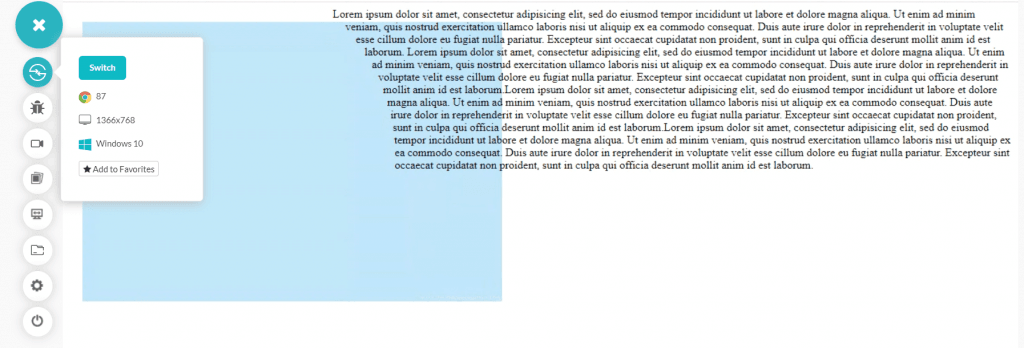
Note: The above image has not used the clip-path but explains how the circle is used in CSS as it will be leveraged while implementing CSS clip-path.
Ellipse in Clip-Path
The next shape provided in the clip-path is the ellipse shape. Ellipse is similar to the circle but with two radii on each axis. Therefore, there will be two values passed as the first argument denoting the values of each axis.
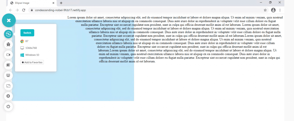
As a quick tip, you can also use the keywords closest-side and farthest side in place of defining the radius values as follows:
The ellipse now created will be based on the size of the floated reference box.
Inset in Clip-Path
The inset property defines the offset in all the four directions. When the absolute or percentage values are described, a rectangle is cut down with the defined offset. The below example uses inset:

To provide a more clear glance towards the object that is cut in the process, we can inspect elements to check the same:
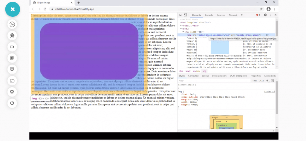
This will come in handy when we use the CSS clip-path property with the same inset.
Polygon in Clip-path
The final shape that is included in CSS clip-path is the polygon shape. The polygon function helps in creation of multi-sided shapes in the CSS. Here, it will help us cut out a polygon shape from the image as an offset so that the text can be adjusted accordingly. The following code helps in the same:
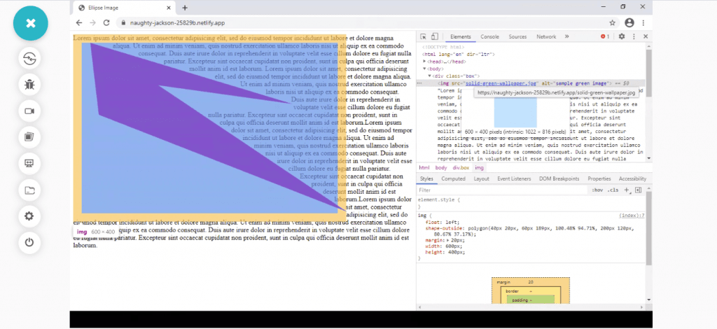
The above image is the inspected image through the Google Chrome browser’s web inspector, which shows the shape of the polygon that got cut with the given coordinates. Polygon is a tricky method to use when you have an image in mind already. The coordinates are hard to predict and as the dimension increases, so does the complexity. The polygon method takes a minimum of three attributes, which means you should at least make a triangle otherwise, the method would not run.
These are the four shapes that come with the CSS clip-path library. As a developer, you are not confined to these images, though. With various online tools, you can upload an image of your choice and cut it out with defined vector points to work upon. The method is similar to using a shape. Now that we have learned the basics, as a next step, we need to replace the shape-outside with the CSS clip-path method and notice the changes.
Browser Support for CSS clip-path
CSS clip-path has been supported by every browser in the market for a long time now, thus passing with flying colors during browser compatibility testing. The below image mentions the first versions of every browser (desktop and mobile) to include CSS clip-path in their feature list.

If you are concerned about browser compatibility testing or cross browser testing for the latest browser versions, here’s a list of all the browsers providing support for CSS clip-path property-
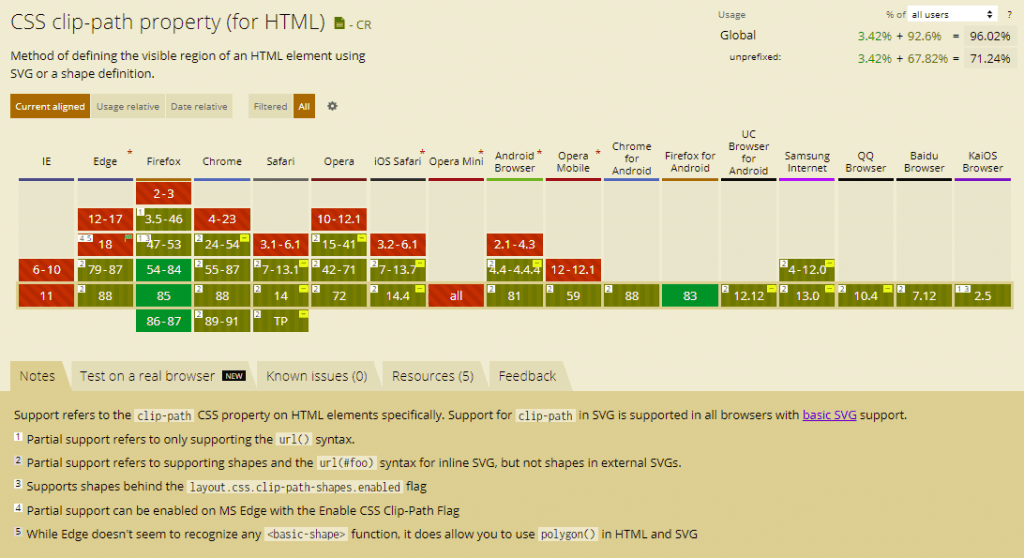
So, start implementing CSS clip-path property right away for all your morphing needs without worrying about browser compatibility testing!
How to Use CSS clip-path?
Using clip-path in CSS is very easy once you have understood how the shape offset works explained in the previous section. To use CSS clip-path, just change the shape-outside property to the clip-path property. Please note that in this section, I am using just the circle to represent the clip-path since other shapes will work similarly as described in the previous section. Also, I have taken out the textual part as the CSS clip-path does not reference the outer offset like shape-outside until done intentionally.
The following code is to use the circle in clip-path:
Save the above code in a .html file and open the same in your Firefox browser to see the following output:
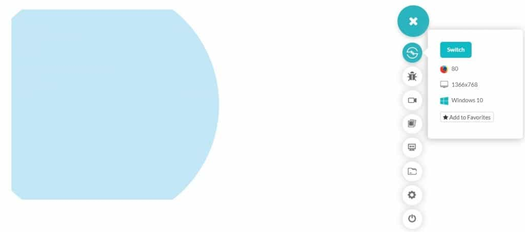
The coordinates passed as the arguments in the circle is considered as the positive region and is visible in the clipped out region. You can scroll up and refer to the “Circle in Clip-Path” section and observe that the negative region clipped in this image was covered with the text.
This was about the CSS clip-path method and how to use it. But we are still one step behind achieving the ultimate goal that we set in this post. We still need some transitions on this image to see how morph animation would work with CSS.
Cross Browser Compatibility Guide To CSS Writing Modes
How to Enable Morph Animations with CSS clip-path
To morph the animation through CSS clip-path, you need to remember two things. The first is to have both the images with the same points as this will act as a reference during the animation. The second is to provide a trigger that will initiate the animation from one image to another.
In the example below, we will convert the right-arrow into the left arrow with the trigger being mouse movement over the image. To satisfy our first condition, the right arrow would have the following points:
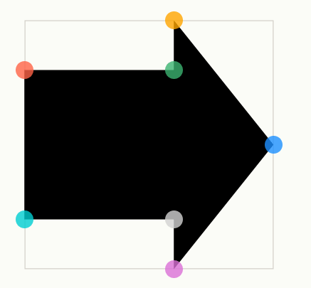
The coordinates for the above points will be (0% 20%, 60% 20%, 60% 0%, 100% 50%, 60% 100%, 60% 80%, 0% 80%).
The second image is a left arrow image that would have the following points:
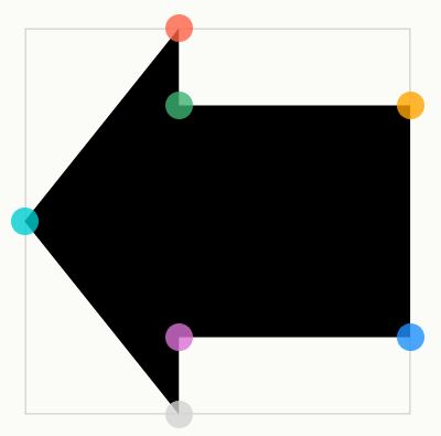
The coordinates for the above image will be (40% 0%, 40% 20%, 100% 20%, 100% 80%, 40% 80%, 40% 100%, 0% 50%).
We are all set now with our images and coordinates. We just need to provide a trigger for the same. The following code will create a morph animation using CSS clip-path:
With the help of CSS clip-path, here’s the morph animation achieved by hovering over the image:
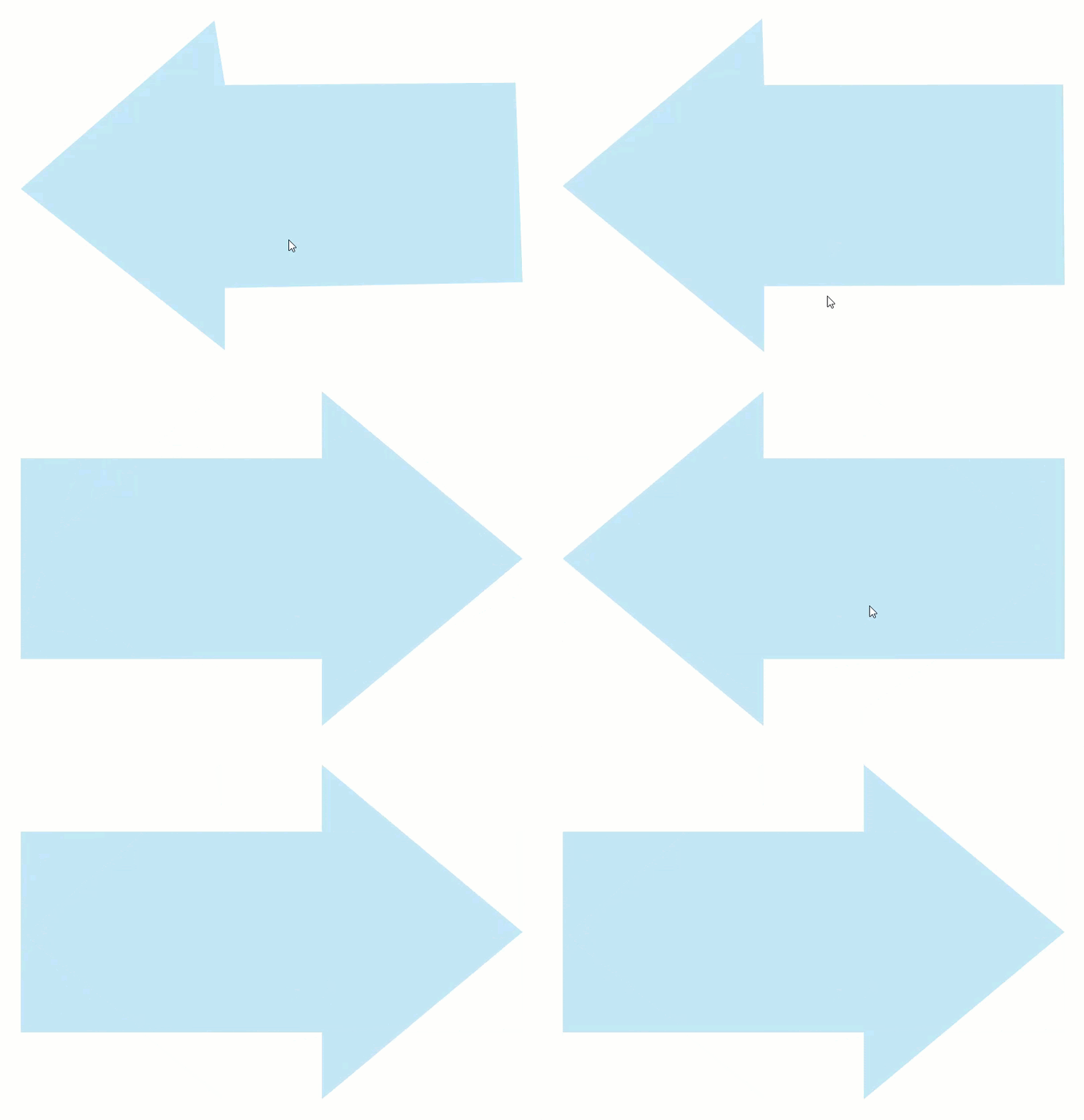
The right-arrow swiftly transforms into the left-arrow with the help of CSS clip-path. It is also worth noting that even though I have clipped the rectangular shape into an arrow, it will not change the overall box size or dimension/shape.
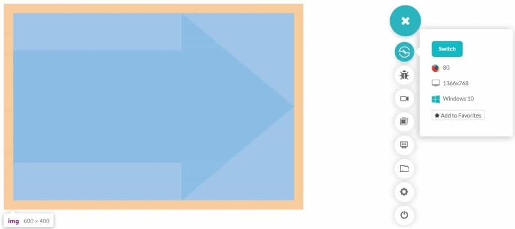
The above image is achieved by inspecting the element through the web inspector. Also, the out-of-box elements may get clipped if the shapes extend out or the outer elements are affected by it. As most of the time working with CSS, this too happens unknowingly and should be regularly observed.
Choosing Between SVG and CSS clip-path
In this post, we highlighted both the techniques for morphing animations. One is old, conventional, and more complex SVG-based, and the other being recent, easier, and simpler CSS-based. While this makes a great argument for using CSS clip-path-based morphing, several vital pieces of evidence favor the same result.
CSS is faster than SVG leveraging the system’s graphic abilities to render a particular shape. Therefore, if you use transmitting various shapes and images onto the server and back, CSS is probably the best choice. In terms of morphing, if you have figured out the points on the image and the coordinates representing those points, clip-path is a much better choice than SVG. CSS is also quick to react and requires minimum code for providing the clip-out function. The user just has to describe the shape and the transition with a trigger, and you are good to go. Although SVG too has its own advantages over CSS, they are probably not relevant when we talk about morphing animations and shape cutting.
Complete Guide To CSS Scroll Snap For Awesome UX
Conclusion
CSS and SVG have been the go-to web development platforms for many years now. Having such a vast collection of techniques and tools to play with makes it difficult to decide which way to approach maintainability issues or browser compatibility testing issues on sites. Hence, to better utilize these powerful technologies, I recommend implementing CSS clip-path property. As you already know, CSS animations are heavily used to build high-quality animated websites that engage viewers and inspire them towards actionable content. CSS clip-path can take your website user experience to the next level without compromising on browser compatibility testing.
With excellent browser support, there is no dilemma in choosing the path for morphing. To ensure your website is rendering ideally across all browser and OS combinations, you can always rely on LambdaTest for cross browser testing on 3000+ browser & OS versions. I hope this post helped gain some insights on CSS clip-path and morphing animations and will help you create some attractive and engaging web pages in the future.
Happy testing!
Got Questions? Drop them on LambdaTest Community. Visit now


