Mobile-Optimized Web Experience Drives 30% More Sales & Conversions
Kritika Murari
Posted On: February 1, 2021
![]() 29339 Views
29339 Views
![]() 13 Min Read
13 Min Read
“The latest data from GWI shows that 77 percent of the world’s internet users buy something online each month, with more people now making purchases via mobile devices than via desktop and laptop computers.” – Data Reportal.
There was a time nearly a generation ago when owning a website was the highest type of technological marvel a business needed. Those days are long gone. The ubiquity of mobile devices, such as smartphones, tablets, and e-readers, has become a double-edged sword for online businesses. They present new opportunities by allowing users to reach a website from anywhere, anytime, and at the same time generating an overhead for the design, development, and testing team.
Mobile optimization is the process of adapting website content for an optimal experience on mobile devices. It involves responsive design, easy navigation, and ensuring site resources are mobile-friendly, to provide a seamless experience on smartphones and tablets.
Nevertheless, mobile continues to be the most preferred way of accessing the internet, period.
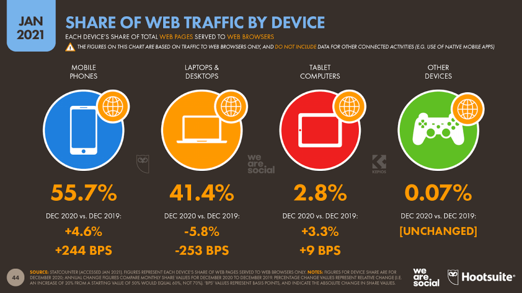
In our previous post, we delved deeper into why mobile is important and why you should focus on mobile-first design as a business owner. In that post as well, we highlighted one main problem with Mobile devices – Limited real estate.
For designers and developers, the space available for placing interactive elements is comparatively significantly less, which limits how they can attract and retain users. And therefore, it became even more critical to work on and optimize the user experience. Thus design and UX of a mobile web page are more critical than you think. Even in the early days, webmasters realized the importance of UX. For example, I remember a 2010 case study where Twitter could boost its sign-ups by 29% by merely redesigning its sign up process. And this was not even targeted at mobile users. Just a redesign of a sign-up process made a significant impact, which holds true for mobile design. Also, not only for conversions, as per Digital WPI’s research, a properly mobile-optimized web page can give 30% more sales, 40% increase in unique page views, 50% decrease in bounce rates, and over 70% increase in overall products sold.
To maintain a competitive edge and get better results out of your online business, it has become increasingly important to deliver an optimal user experience over different mobile devices & network conditions.
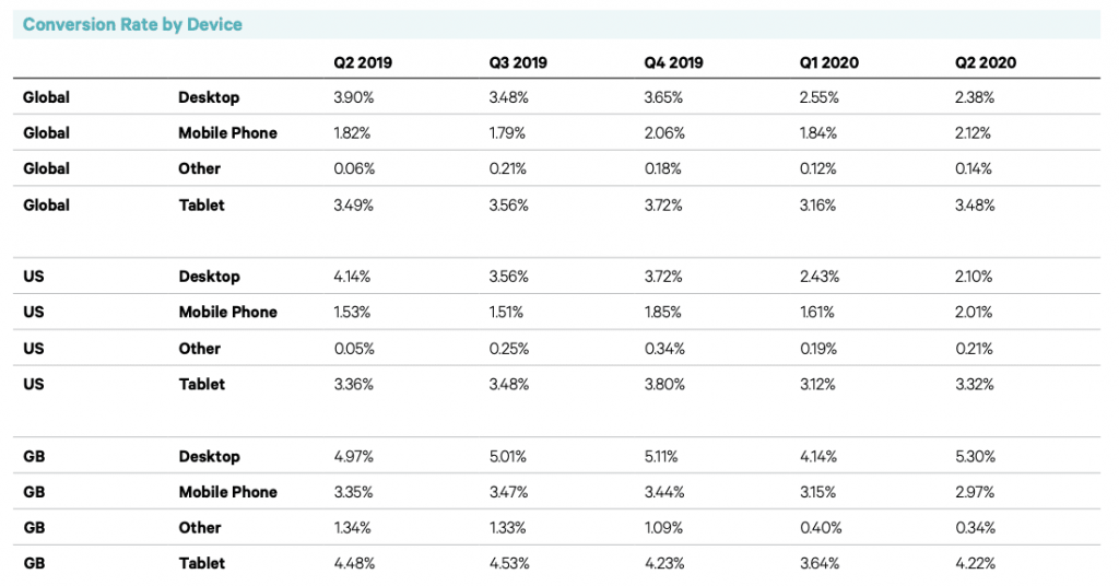
As per Smart Insights, Smartphone’s conversion rates have been gradually catching up since the last four quarters of 2019 and have been neck to neck with Desktop in 2020, especially in the States.
However in a world where high-speed internet and one-day deliveries have become a part of life, users have become incredibly impatient, and most of them will bounce away from your website if it takes longer than 3 seconds to load. If you have not already done so, it is time to reinvent your website with a sole focus on mobile user experience before it’s too late.
Time to make it lean and mean with at least a responsive web design, if not complete mobile-first design!
What is Mobile Optimization?
Mobile optimization is a crucial element of modern web development and SEO strategies. In an age where mobile devices have overtaken desktops as the primary way people access the internet, ensuring a seamless user experience on smartphones and tablets has become essential for website owners and businesses. Mobile optimization involves adapting a website’s design, layout, and functionality to offer an optimal browsing experience across various mobile devices. Beyond enhancing user satisfaction, it also plays a significant role in elevating website rankings on search engine results pages (SERPs). In this article, we’ll delve into the key components of mobile optimization and how it impacts search rankings.
Why is Great Mobile User Experience a Key to Business Success?
According to a report by Data Reportal, on average, internet users aged between 16 to 64 spend about six hours, fifty-four minutes a day online, with a majority of it coming from mobile devices. That’s how short your time frame is. That’s how long you have to get your potential customers’ attention, amongst a sea of competitors fighting the same fight.
Furthermore, 98% of these people use a conventional search engine to find the information or the product they need. Most of them use a mobile device to make the first contact. 61% of customers have a higher opinion of companies offering a memorable mobile experience.
Users are looking for immediate gratification, and Google agrees. Amongst the ever-growing number of mobile users, more than 60% of them accept that they make purchase decisions more quickly now than they did a few years ago. These impatient users go searching for local businesses, researching a product, or looking for instructions in micro-moments. These micro-moments might last a split second, but that’s your moment to shine!
According to the Google research linked above-
- 39% of your user base will stop engaging or coming to your website if the images won’t load or take too long to load.
- 29% of smartphone users will switch to another site or app if they can’t find the information they are looking for, or it’s not fast enough.
- Of those who do switch, 70% switch due to lagging load times.
- 67% will switch if they have to take too many steps to purchase or get the desired information.
Mobile users tend to be very goal-oriented. They expect to be able to find what they need, immediately and on their terms. They won’t stick around if they have to zoom in or out every time they come across something interesting.
How Do You Create a Superior Mobile User Experience?
The first step to making your website look great on mobile is to link design to business health. The better your website looks on mobile, the greater your business success is going to be. You may be surprised to learn that over half of the companies state that they do not set objectives for their design teams’ output. This is based on a report by McKinsey & Company.
Yes, 94% of the first impressions are always design-related. But mobile-optimization is not just limited to a great design. It’s the matter of making your website more personalized for users and making them feel valued. So, let’s get to the bottom of a memorable mobile user experience!
Keep It Simple, Silly
The KISS principle might be an old one, but it applies universally, especially for mobile websites. Your desktop website’s effect might differ on your mobile website with all that color and high-resolution images. You need to ensure that your website has mobile parity– it should offer the same experience on desktop and mobile devices.

To begin with, you can-
- Keep calls to action at the forefront.
- Use responsive navbars like hamburger menus.
- Make it easy for users to return to the home page.
- Make the search function visible and the results relevant.
- Create efficient forms with responsive text fields, visual calendars, and placeholder text-specific input field types.
- Remove any non-essential JavaScript weighing down your page load time.
Implement lazy loading. - Optimize media by using responsive images, small resolution WebP image format.
- Use caching & CDN to enhance page load speed.
- Disable heavy animations and page transitions.
- Disable auto-play for videos and avoid using video-background altogether.
- Don’t miss out on the opportunity to go social – embed social media sharing icons.
- Make sure your chatbot is not obtrusive for mobile screens.
- Add a smooth scroll for a seamless scrolling experience. – On mobile, half of the users start scrolling within 10 seconds and 90% within 14 seconds. (Stats from MOVR)
this means many users are not seeing what is "above the fold" on mobile [2/2]https://t.co/yez2Jw0Aer pic.twitter.com/bZ0lOwT6Qb
— Luke Wroblewski (@LukeW) August 7, 2015
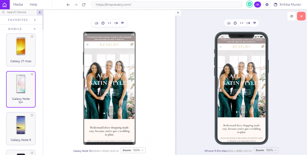
Your website does not have to be black and white, but a bit of rework can go a long way in making it suitable for mobile devices. Recently, Revelry relaunched its eCommerce site with an updated platform and smaller images. Now, the loading time is four times faster, the bounce rate is down by 8% percent, and the conversion rate is up by 30%.
Make It Responsive
- 52% of online shoppers claim that a site’s ability to load quickly influences their loyalty.
- Additionally, 74% of people are likely to return to a website that is optimized for mobile.
- 40% of people will not wait more than three seconds before abandoning your website forever. Your website needs to load fast, and it needs to do it now. That’s simply because 47% of those people expect your website to load in two seconds or less!
Images inspire 53% of online shoppers to make a purchase, but you have to make sure that a picture is not hampering their user experience. Images on your website need to be mobile optimized so that they load quickly. Use a layout capable of adapting to a user’s device, be it the screen size or the capabilities. It becomes essential to perform responsive testing to focus on aesthetics and adaptability based on your consumers’ devices.

Walmart reduced its load time by nearly four seconds by removing several barriers like slow custom fonts and unoptimized image files that hindered the page’s rendering. It experienced a 2% conversion rate increase for every second of improvement.
You must factor in the user’s internet bandwidth and optimize your website for speed. Here’s a guide that will help you test mobile websites on different network conditions.
Let Users Go With The Flow
Your mobile website must allow users to look around and explore before asking them to commit and share their personal information. Users typically get frustrated by sites requiring upfront registration to view the site, mainly when the brand is unfamiliar. If your website does not have a ‘Guest Checkout’ option, you might want to reconsider your decision.
The $300 million button story comes to my mind here, the story of a poorly designed button costing Amazon millions of dollars. Its users were unable to checkout seamlessly; they were prompted to log-in or register to complete their purchase. This entire process was hindering users from checking out faster. Web designers made the mistake of assuming that returning users would have this information at hand, and the new users would not mind signing up as they’d probably come back.
You cannot afford to make assumptions about user behavior. It is essential to understand your customers’ needs, study their behavior and get actionable insights from those observations. The best way to do so is by performing usability testing and visual regression testing daily. See your website through your customers’ eyes, make it a part of your process, use browser for developers like LT Browser, tweak it as and when needed!
Promotions Should Not Be a Distraction
Full-page promotions or ads asking users to perform an action can irk them. Your mobile website needs to be clutter-free. According to a survey conducted by IAB, 54% of users found ad clutter to be the biggest obstacle to a smooth mobile user experience. Your ‘well-placed’ ads might be the very thing putting them off! Interstitial advertisements are particularly off-putting as they make website content less accessible. Interstitials can even impact your search rankings negatively, according to Google.
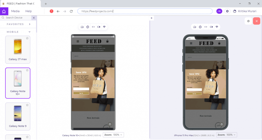
Instead of an intrusive popup, try promoting subtly and consider using mobile phones’ limited viewport most reasonably. Banner promotions should be easily dismissable and should not distract users from the mobile website experience.
There are countless cases of a UX redesign driving up the revenue and ROI. When HubSpot decided to rethink the user experience of their website, they started at the ground level. With the help of focused research, collaboration, and unwavering customer focus, HubSpot doubled its conversion rates. You can do it too!
And That’s A Wrap!
This story’s moral goes beyond the risks of putting extra steps in the way of customers taking actions you want them to take. It is essential to understand that even the tiniest-seeming elements of mobile UX can have a substantial trickle-down impact on your profitability. Empirical research into how people behave and what they expect is the need of the hour. Build user personas, create user stories, factor in the Humans principle, start prototyping and implement rigorous testing.
An investment in mobile website testing can be earned back through a plethora of KPIs, and this theory has been reinforced time and time again. As per a survey by UserZoom, 70% of enterprise CEOs now see UX as a competitive differentiator. That is also why 29% of Enterprises now have a VP of Design or Chief Experience Officer.
With good UX, you will reap the benefits in terms of increased usage, increased productivity, fewer calls to support staff, reduced training time, increased registration rates, and much more. LT Browser can help you do that in the simplest way possible by allowing you to debug your mobile website on 45+ screen sizes, inbuilt debugging tools, and Lighthouse-powered performance reports.
Make it hap’n cap’n!
LT Browser Is Featured On Product Hunt.
Got Questions? Drop them on LambdaTest Community. Visit now


