How To Auto Adjust Your Font Size With CSS font-size-adjust?
Nimritee
Posted On: September 25, 2020
![]() 169053 Views
169053 Views
![]() 7 Min Read
7 Min Read
Many developers use multiple font families and font size to have a better representation of a web page. For example, a developer might use the Bold Comic Sans font for titles and Roboto font for the body. However, this might make your website look cluttered, as many browsers do not support all the fonts. CSS font-size-adjust property can avoid such a situation by making the font size auto-adjust.
CSS font-size-adjust accepts several units of measurement within which font sizes are displayed, including pixels, em, rem, keywords, and viewport units. It may be applied to CSS Classes and IDs, still on elements themselves. Therefore, it may be used as a great hack to stop a significant decrease within the font size just if your first font choice does not load.
However, before understanding the CSS font-size-adjust property, it is important to consider that all your CSS elements should look perfect on all screen sizes. You can use LT Browser free dev-friendly browser for mobile view debugging on which you can see the mobile view of your website on Android and iOS resolutions.
Now let us quickly have a look at the CSS font-size property.
TABLE OF CONTENT
CSS font-size Property
CSS font-size property indicates a glyphs’ desired height based on the font. For the scalable font, the scalable factor is applied to calculate the font-size. However, for a non-scalable font, the absolute unit of the font-size is matched with the set size of the font.
Syntax:
- absolute-number: This value refers to the computed font sizes.
- relative-size: It has the value relative to the font-size computed and font-size table.
- length-percentage: Specifies that the font size is absolute.
CSS font-size-adjust Property
CSS font-size-adjust property provides the developers with honest management of the font size by allowing them to modify the font size of a part when the primarily selected font-type is not available.
In such situations, a font fallback takes place, and the browser uses the second specified font. This might result in a big issue if there is a difference between the aspect ratio of the initial and present font used. In such circumstances, where we need to take care of the look and maintain the text’s readability, the CSS font-size-adjust property can be used.
The font-size-adjust CSS property states that the font size of the element needs to be modified on the basis of the height of lowercase letters instead of the peak of uppercase letters.
Syntax:
| font-size-adjust | none | < number > |
- none: Specifies that the font’s x-height is not preserved
- number: This value refers to the aspect number of the first used font, and then the rest available fonts will be scaled according to the following formula: c = (a/a’) s
where:
| c | adjusted font size to use |
| a | aspect value as specified by the font-size-adjust property |
| a’ | aspect value of the actual font |
| s | font size value |
Example
If 15px Roboto (with an aspect value of 0.50) was unavailable and the next given font had an aspect value of 0.40, the font size of the substitute font used would be, 15*(0.50/0.40) = 18.75px
Interesting Read: 11 CSS Frameworks To Look Forward To In 2020
How CSS font-size-adjust Works?
Here is a demonstration of how the font-size-adjust works, making font size auto-adjust. Below is an example that compares two different font types having different aspect ratios. The x-heights of the lower case letters of the two fonts can be modified to match the x-height of the other font.
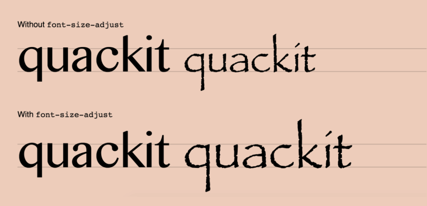
In the above image, the text on the left-hand side has been applied with a font named Comic Sans, which has an aspect value of 0.53. In contrast, the text on the right-hand side has been used with the Calibri font, which has an aspect value of 0.47. This results in an exceedingly small-looking text. On the underside line, a font-size-adjust of 0.53 has been applied because of which the font-size on the underside hand now has its font-size modified according to the aspect ratio specified.
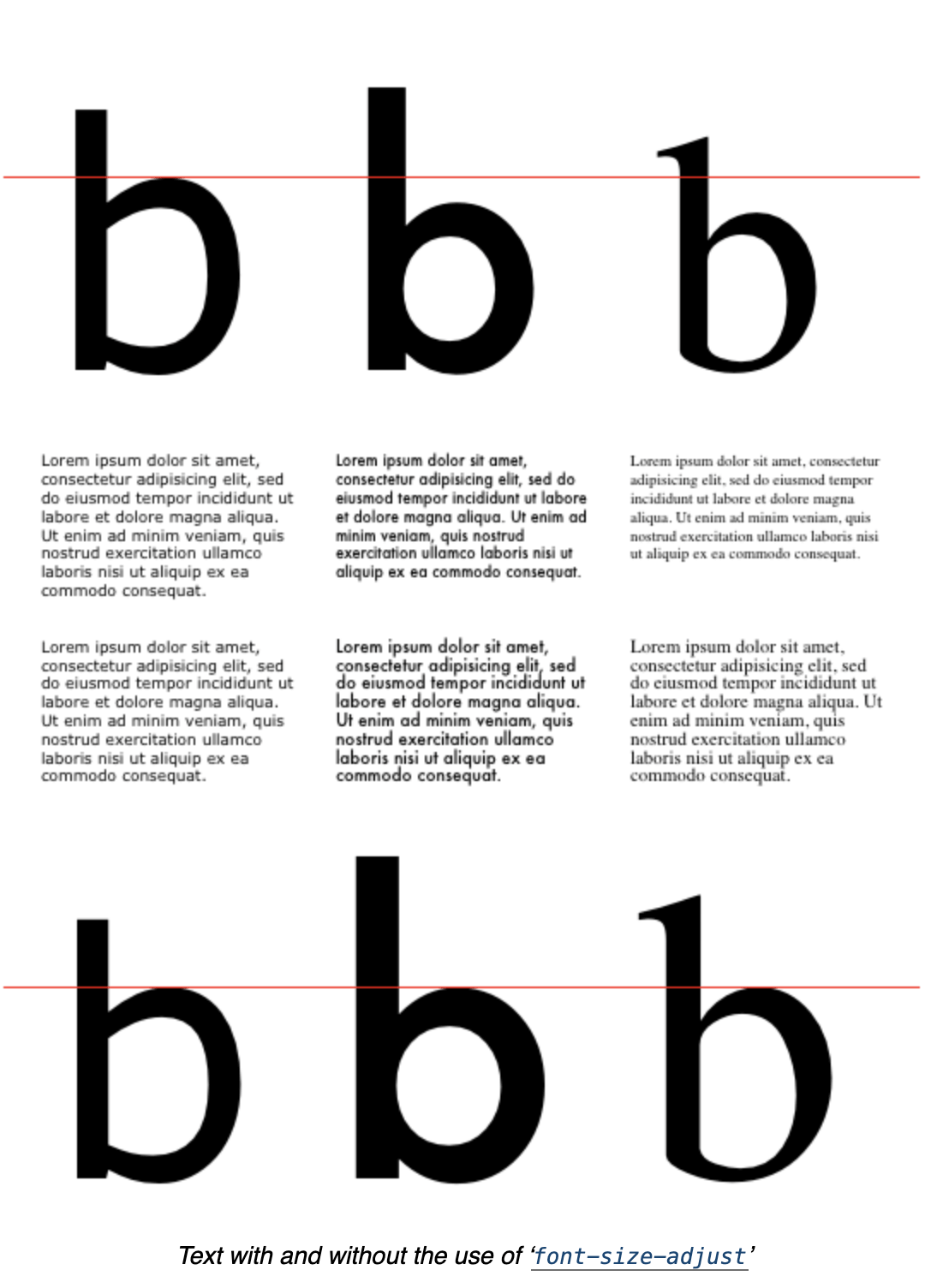
The value of the CSS font-size-adjust property influences the used value of the ‘font-size’ but does not affect it’s enumerated value. It has its effects on the dimensions of relative units supported by font metrics like ex and ch of the fonts available primarily but does not damage the scale of em units.
As the numeric values of line-height check with the calculated size of font-size, the CSS font-size-adjust property does not modify the used value of line-height; rather, it auto-adjusts the font size.
In CSS, authors often specify the ‘line-height’ as a multiple of the font-size. Since the CSS font-size-adjust property affects the used value of font-size, authors should make sure to set the line height when CSS font-size-adjust is used.
Note: Setting the line height too tightly may end up in overlapping lines of text during this situation.
Example
Browser Compatibility
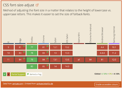
Let’s talk about CSS supports in browsers. Currently, only Firefox supports CSS font-size-adjust property by default. Ranging from version 43 to 30, Chrome and Opera also support this property behind the “Experimental Web Platform Features” flag that can be enabled in chrome://flags. Edge and Safari don’t support the CSS font-size-adjust property at all.
The CSS font-size-adjust property was initially introduced in CSS2, but later removed in CSS2.1, then again re-introduced in CSS3.
Given below is a table that lists major browsers along with the versions that support this feature:
You might also like: Browser Compatibility Guide To CSS Writing Modes
Checking font-size Across Browsers
With LambdaTest, you can check font-size across browsers seamlessly over desktop and mobile by performing cross browser compatibility testing. In the below screenshots, we will implement the font-size-adjust property over the Netlify platform and try to access it on different browsers.
1. Login to LambdaTest dashboard. You can register for free here.
2. Select Real Time Testing and optimize your desired configurations.
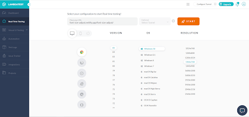
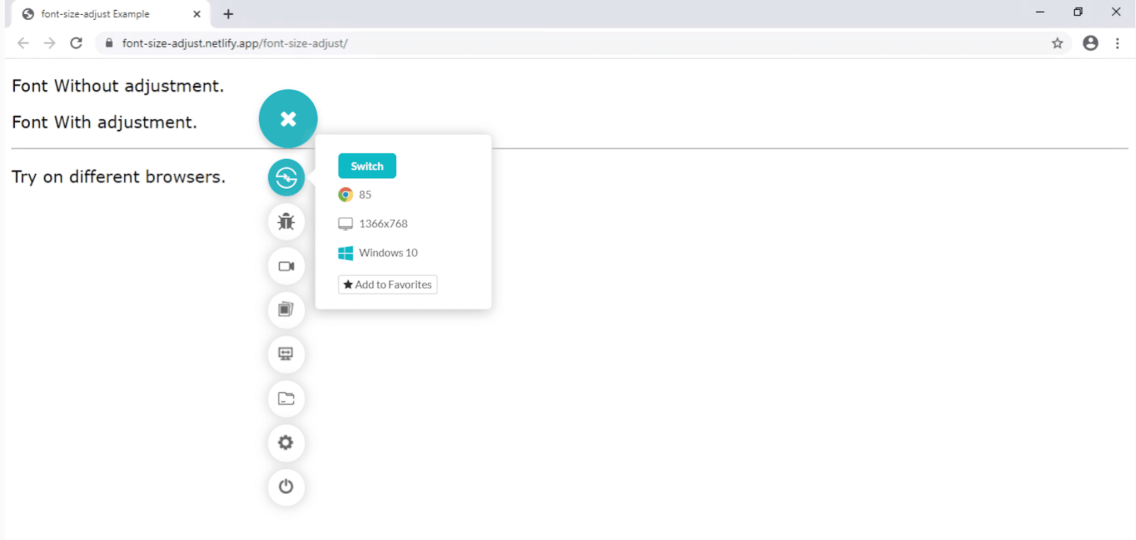
3. Previewing CSS font-size-adjust over a non-compatible and compatible browser.
- Google Chrome (non-compatible)
- Firefox (compatible)
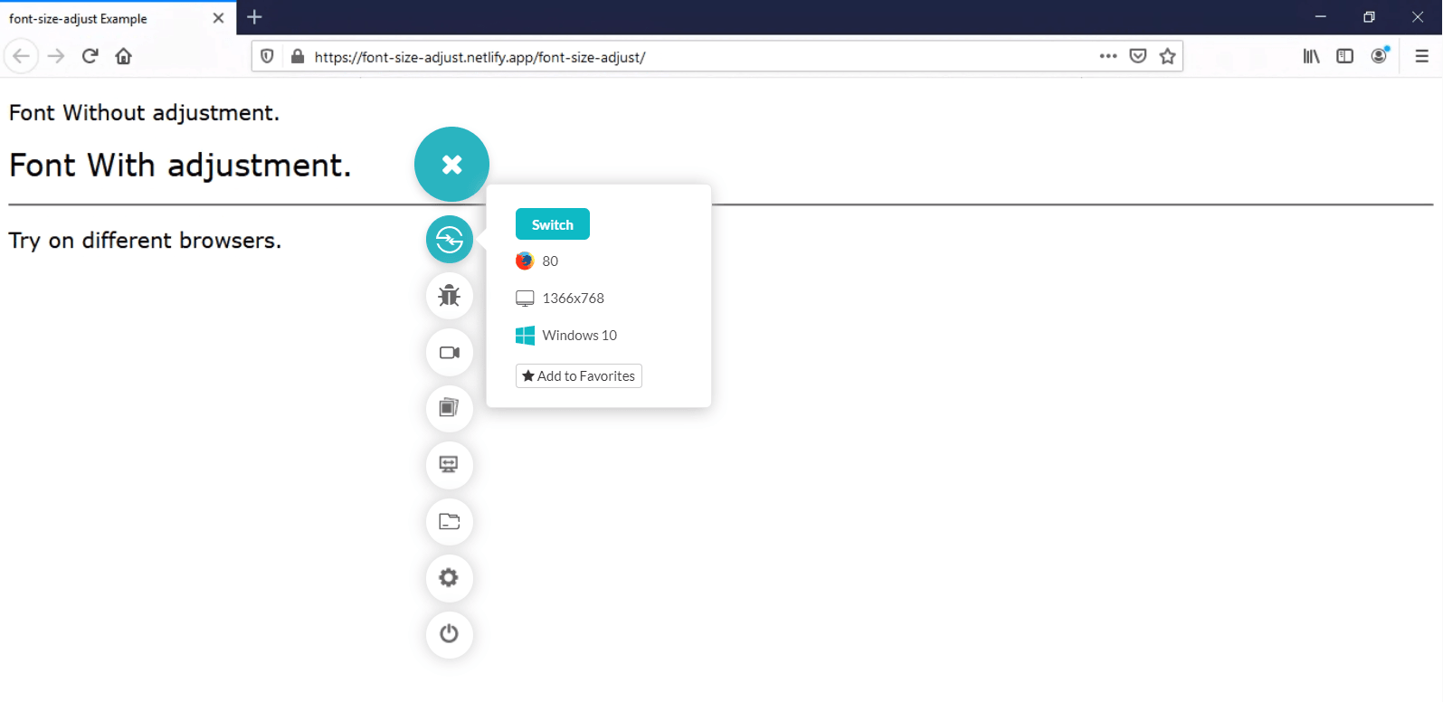
With the help of the real time testing feature available on the LambdaTest platform, this is how you can perform cross browser testing and verify its compatibility with CSS font-size-adjust. There’s a lot more than you can do to ensure CSS compatibility across browsers.
Wrap-up!
Now you would possibly have an idea about what the CSS font-size-adjust property does, why it’s essential, and the way to figure out the aspect value of various fonts.
Because CSS font-size-adjust degrades gracefully in older browsers, you’ll be able to move and begin using it today to boost the legibility of text in production websites. However, it does have severe limitations of being supported by just some browsers, as you have now seen by performing cross-browser compatibility testing. During these situations, you should choose fonts of virtually the identical ratio to forestall size difference. This guide to cross browser testing on older browsers might also help.
We hope you found this article informative. If you have any questions, feel free to chime in the comment section below. If you enjoyed this article, please share it on social channels – to help others find it. That’s all for now.
Happy Testing!!!
Got Questions? Drop them on LambdaTest Community. Visit now


