CSS Scroll Snap Property: Complete Guide with Practical Examples
Harish Rajora
Posted On: June 17, 2020
![]() 201760 Views
201760 Views
![]() 19 Min Read
19 Min Read
Have you ever noticed that, while scrolling on some website on your mobile devices, scrolling ends up abruptly on some, and on other websites it’s perfect? Isn’t it annoying when you scroll down on a page, and it finishes in the middle of a paragraph or image? This is due to the fact that scrolling lacks precision on its own. For a long period of time, developers relied on JavaScript to get better control. Lately, CSS scroll snap has been widely used by developers for a well-controlled scrolling experience.
In this article on CSS scroll snap, I’ll discuss how this property can enhance the user experience & how you can implement it.
TABLE OF CONTENT
- What Is CSS Scroll Snap?
- Properties of CSS Scroll Snap
- [Updated] Practical Use Cases For Scroll Snap
- How To Create CSS Scroll Snap?
- Scroll Snap Through JavaScript and JQuery
- Older Ways To Implement CSS Scroll Snap
- Alternative API For CSS Scroll Snap
- Using Polyfills To Implement Scroll Snap
- Scroll-Snap-Stop
What Is CSS Scroll Snap?
CSS Scroll Snap is a property triggered during the course of normal scrolling but here instead of stopping at the point where the user stopped the scroll event, the webpage snaps to a certain position described by the web developer. For example, if a user scrolls to half of the div box, the div box would automatically snap to the top of its edge (position depends on the developer). This process is similar to locking the viewport to a certain area of the webpage so that whenever the user is not in that area, the webpage automatically snaps to it.
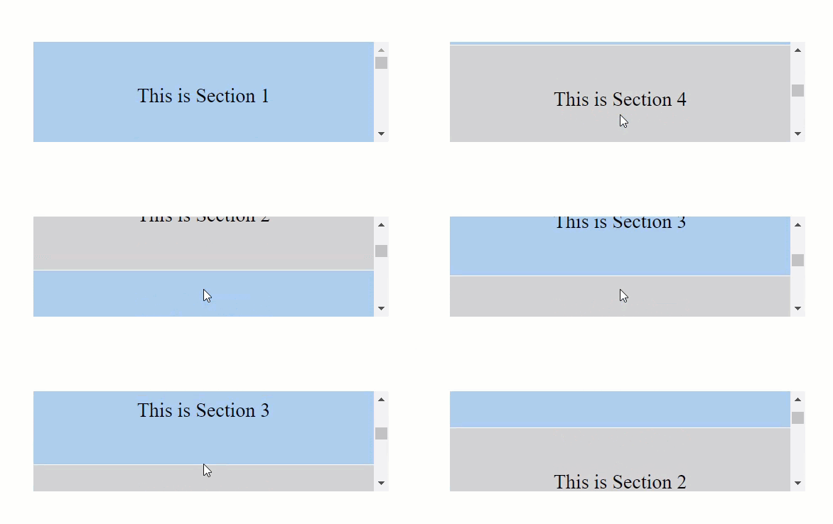
To understand CSS scroll snap, it is better to see the difference first. The following GIF is created while scrolling normally (without applying any scroll-snap property).
The following GIF is created after applying the scroll-snap property.
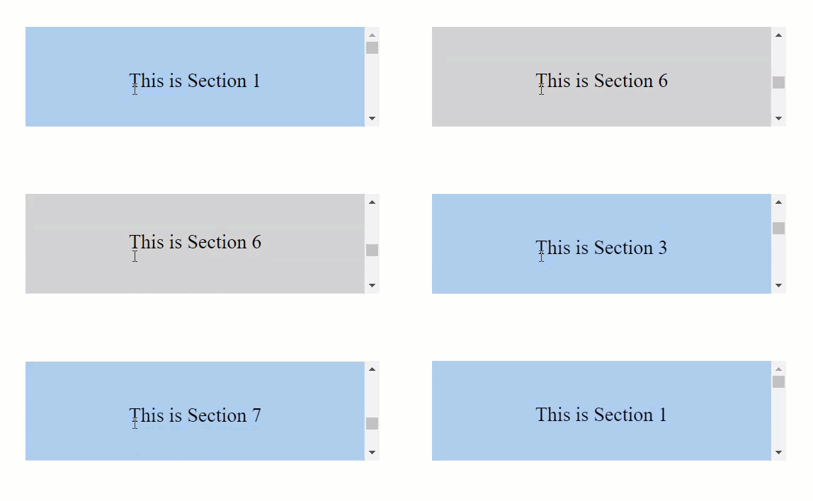
If you missed it, in normal scrolling, I am able to stop in the middle of two different sections but it does not happen while I have the scroll-snap activated. It automatically snaps back.
CSS scroll snap can be applied to any element in the webpage that the developer wants and on different axes too. Unlike the CSS position property, the CSS scroll snap requires the declaration of different properties to work together.
[Updated]Practical Use Cases For Scroll Snap.
This section was not in the original draft, but a few of our readers pointed out that, they’d like to know more about the use cases for scroll snap. So I was more than happy to oblige and include a section on practical use cases of Scroll Snap.
One of the popular use cases of Scroll snap is an image carousel. In this case, a horizontal image carousel is created, whenever you scroll down the next image snaps. You can specify the mandatory scroll-snap-type on the horizontal axis in the scroll container while making sure that you set scroll-snap-align at the center, to make sure the image centres while scrolling.
Another widely used example of scroll snap is the pages with various logical sections being scrolled vertically. These can be your typical product pages, where you want your users to snap through the different feature. You might want to use scroll-snap-type: y proximity for this case, it not only prevents interference when users scrolls down to the middle of a section but also brings the scroll to the new section when you’re close enough.
Properties of CSS Scroll Snap
The CSS scroll snap feature contains two properties that can be broadly categorized into the parent or the container property and the child property.
The Parent or Container Property (Scroll-Snap-Type):
This property needs to be specified to the parent of the element or the container element of the web page. The property that falls under this category is called scroll-snap-type.
Scroll-snap-type property defines the type of behavior the developer wants to give to the scrolling container element. It contains two values that define the direction of the scroll and the behavior of the scroll.
Direction Of Scroll
The direction of the scroll is the direction in which you would like to apply the scroll-snap-type property. It has values of either x (for the horizontal direction) or y (for the vertical direction) or both (for scrolling in both of the directions).
Behaviour Of The Scroll
The behavior of the scroll means the type of scroll-snap you would like to apply. This contains two different values:
Mandatory: Mandatory value always takes the element to the scrolling point decided by the user irrespective of his scroll position.
Proximity: Proximity value takes the element to the scrolling point only when the user is closer to the scrolling point.
The following pen demonstrates the use of a scroll-snap on with both the values with the direction of the scroll being vertical. The code used is as follows:
For scroll-snap-type: y mandatory
Note: Scroll slowly in the result section to view the CSS scroll snap effect.
To see the difference between the proximity value, change the scroll-snap-type line of code to the following:
scroll-snap-type: y proximity
The horizontal direction behaves in a similar way as the vertical one but as a developer, you are also entitled to use both as a value in which the scrolling happens in horizontal as well as the vertical way. Although, as a web developer, I would rather not recommend giving the user liberty to scroll in both the directions because it is really a bad practice on the UX part of the website.
Now that the parent is all set, we need to apply a property to the child element.
The Child Property (Scroll-Snap-align):
CSS Scroll snap requires a property called scroll-snap-align to the child elements. The scroll-snap-align as the name suggests is used for aligning the element when the CSS scroll snap happens. So, if this is set to the value as “centre”, the element will align at the centre of the container/parent element. The scroll-snap-align property takes on three values:
- Start: Refers to the left edge of the element if scrolling horizontally or else the top edge.
- End: Refers to the right edge of the element if scrolling horizontally or else the bottom edge.
- Center: Refers to the centre of the element.
How To Create CSS Scroll Snap?
CSS Scroll Snap is very easy to create using CSS. We just have to remember the parent property and the child’s property and apply them to the appropriate elements. The following code demonstrates the scroll-snap feature with container element scrolling in the vertical direction (with mandatory value) and scroll-snap-align set as “start”.
| <!DOCTYPE html> | |
| <html lang="en" dir="ltr"> | |
| <head> | |
| <meta charset="utf-8"> | |
| <title>Scroll Snap</title> | |
| <style> | |
| .parent { | |
| margin-top: 20%; | |
| width: 400px; | |
| scroll-snap-type: y mandatory; | |
| flex-basis: 50%; | |
| max-height: 15vh; | |
| overflow-y: scroll; | |
| } | |
| li{ | |
| border-bottom: 1px solid white; | |
| padding: 3rem; | |
| font-size: 1.4rem; | |
| color: rgba(white, .5); | |
| background: lightgray; | |
| text-align: center; | |
| scroll-snap-align: start; | |
| display: flex; | |
| flex-flow: column; | |
| justify-content: center; | |
| } | |
| #colorful { | |
| background-color: #abcdef; | |
| } | |
| </style> | |
| </head> | |
| <body> | |
| <center> | |
| <div class="parent"> | |
| <li id="colorful">This is Section 1</li> | |
| <li>This is Section 2</li> | |
| <li id="colorful">This is Section 3</li> | |
| <li>This is Section 4</li> | |
| <li id="colorful">This is Section 5</li> | |
| <li>This is Section 6</li> | |
| <li id="colorful">This is Section 7</li> --> | |
| </div> | |
| </center> | |
| </body> | |
| </html> |
Mandatory Vs Proximity In Scroll-Snap-Type
As I mentioned in the above section, the scroll-snap-type takes on two values: mandatory and proximity. In Proximity scroll-snap-type, browser snaps to the scrolling point only when the user is closer to the scrolling point. Whereas in Mandatory scroll-snap-type, the browser snaps to the scrolling point decided by the user irrespective of his scroll position.
As a web developer, you should know that even though the mandatory value is more consistent, it can raise issues in a couple of situations.
Situation 1: If the content’s length inside the scroll-snap element is greater than the viewport or the container’s length then the content will not be fully visible. In such a case, if the user scrolls down a little to read the content, he will be snapped back to the top edge of the element giving result to poor user experience.
Situation 2: Another situation where the “mandatory” value can mess up is when the scroll element’s length is greater than the length of the viewport/container. In such a situation, again, if the user scrolls down to see the scroll element, he will be snapped back to the top edge of the element.
The following code will help you understand how mandatory value can mess up the scroll-snap.
These two situations should be properly managed not only on the desktops but also on the other devices considering the cross-browser compatibility issues that may arise. But that being said, as a web developer, I assure you that mandatory is actually a more beneficial value to use. If as a developer you are confident about the length of the element and the content residing into it, the mandatory value will provide a more consistent user experience.
Scroll Snap Through JavaScript and JQuery
CSS Scroll snap is very well received in the developer’s community because unlike smooth-scroll which was better off in JavaScript, scroll-snap fulfills the purpose completely in CSS. But, like any other property, scroll-snap was used long before it was introduced as a standard in the CSS list. The developers used JavaScript and JQuery for the same but since its introduction into the CSS, those methods are not adopted anymore.
Using Scroll-Snap With JavaScript
In my previous article on Smooth Scroll, I recommended using JS or JQuery there as it gave the developer more control over the elements he is handling and provided more options to use. It is just opposite in Scroll-Snap. I would rather not recommend taking the JS way and stick to the CSS as it provides more flexibility, more convenience, more precision, and ample features that the need to add any more features will not arise. Moreover, it is hard to find anyone using pure JavaScript for the scroll-snap since the JQuery provided open-source plugins that were smoother and easier to code than JS.
Guide For Fixing Javascript Cross Browser Compatibility
How To Create Scroll Snap with JQuery?
Similar to the JavaScript road, I prefer not to implement scroll-snap in JQuery for the same reasons. Although people do not use JQuery today after CSS scroll snap property, it was the preferred route for the developers before. Developers have developed various plugins for creating the scroll-snap in JQuery. In this section, I have discussed the panelSnap plugin which is open source and easy to implement. By following the given steps, you can create a snapping element on the webpage.
Import the plugin to use in JavaScript:
panelSnap is initialised by creating an object with the following code:
new PanelSnap();
Select the parent container of the scroll-snap, here, I have chosen the body element.
Choose the element to which you would like to scroll.
And you can run the combined JQuery code once done with the necessary things. You can also add more features by calling the inbuilt functions through the instance object.
It is quite vivid that using the < script > tag is leading us to nowhere close to what we get when using the < style > tag.
Browser Support For Scroll Snap
The browser support for scroll-snap is great with even the internet explorer supporting the property.

But, to be assured that the webpage does not mess up on the browsers (or versions) not supporting the property, you need to use the feature queries for the same. Feature queries, in brief, are a check on the web browser. When the developer uses a feature query on a specific property of CSS, he is simply asking the browser to implement the code inside the query only when the browser supports or not supports the property.
The syntax for a support feature query in CSS is as follows:
In contrast, you can also ask the browser to implement the code if it does not support the property by using the not keyword. The syntax then changes to the following:
Similarly here, we can apply the scroll-snap-type and scroll-snap-align under the support rule to take extra precautions. We can write additional code in case the browser does not support the property. Now that we have taken the precaution to implement the code only when the browser allows it, we need to add the code for when the browser will say no to the property.
For this, I would like to introduce the older methods used for the same purpose as scroll-snap.
Additional Parameters With Scroll Snap
Consider making a div box on a webpage. You have the liberty to choose its characteristics like color and size but in addition, we also have the box-shadow to provide shadow effect and border-radius to provide radius in the border. Similar to this, we can also provide additional properties for our CSS scroll snap.
Scroll Padding
When the element connected to the scroll-snap is scrolled, it snaps to the edge of the container element. This is the default behavior and can be changed by using the scroll-padding property of CSS. The syntax used is:
For example, scroll-padding: 20px or scroll-padding: 10%.
By using the scroll-padding with scroll-snap-type, the edges are not snapped but an offset is created which is equal to the scroll-padding value the user gives. So now if the user scrolls with high speed, the point where the scroll element should snap, it still will but leaving an offset from the above element.
The following pen demonstrates the same effect where the scroll-padding length is taken as 10px. Try to scroll on the output box to see the padding effect.
Scroll Margin
The scroll margin in the scroll-snap is used for giving the outset value on the container box. It is applied to the snapping elements and provides a margin between the edges of the container element and the child element. This property is most useful when the developer wants to provide different margin values to the different elements available. If you want to provide the same margins in all the directions, it is better to use scroll-padding instead.
Older Ways To Implement CSS Scroll Snap
The following subsections provide three major properties that were used for implementing the CSS scroll snap before the property became a standard.
Snap-Scroll-Point
Snap-scroll-point implements the directional positioning (horizontal or vertical) on to the child elements located inside the container. If the developer wants horizontal positioning he will use the attribute snap-scroll-point-x and snap-scroll-point-y for the vertical positioning. There is no such property as only snap-scroll-point but we will refer here as general (a combination of both). The snap-scroll-point takes on two values:
none: Snap points are not declared when the value is none but the child element may inherit or take on default value according to the browser.
repeat (length/percentage): Defines the interval at which the snap-points will be defined in the child element. If the developer has put on the value in length (ex 400px), it refers to the length from the edge of the container element. For the percentage value (ex 50%), it refers to the width of the container element.
The syntax for snap-scroll-point-x is as follows:
Scroll-Snap-Destination
The scroll-snap-destination property defines the position at which the element would snap according to the viewport. This property is applied to the parent element. It has a very simple syntax which requires just to define the position.
If the developer is using percentage value instead, it refers with respect to the container element.
Scroll-Snap-Coordinate
The scroll-snap-coordinate property defines the position at which the element will snap according to the parent container element. The scroll-snap-coordinate property is exactly the same as scroll-snap-destination just that the former is used on the child element while the latter is used on the parent element. They both share the same basic syntax:
Important Note On Using The Fallbacks For CSS Scroll Snap
CSS Scroll Snap was introduced keeping in mind that we were required to use multiple properties in the past which neither provided graceful scroll execution nor the perfectness in determining the area. The major problem was the responsiveness on different mobile platforms which flooded the market in recent times. Describing the pixel length as the position for the scroll element would not fit into the viewport of every device. Therefore, CSS scroll snap could take over these anomalies and prove to be a far better alternative. So much better than the browsers not only welcomed it with great support but deprecated the support of the previously used methods. Therefore, if as a web developer you think that you could just write the older properties and expect every browser (the newer ones) to implement it, that would be wrong. The recent browsers will not be able to understand the code. Hence, I would recommend using CSS scroll snap in the normal flow and using the older properties such as scroll-snap-destination and scroll-snap-coordinates under the feature query @support not(scroll-snap: mandatory).
Alternative API For CSS Scroll Snap
Apart from using the CSS scroll snap property directly, developers can also use other APIs which are inbuilt into JavaScript or are open source and readily available on platforms such as GitHub, etc. These interactive APIs would come with different functionalities that the developer can use to enhance the user experience and make the scrolling more native. One such API is scrollTo about which I discussed in the Smooth Scroll CSS article. With scrollTo, the browser will automatically calculate the target element without providing any fixed number. It helps in cross-browser compatibility issues as it is a great choice for screens with different sizes. You can search for other similar APIs on GitHub and other platforms.
Using Polyfills To Implement Scroll Snap
To be confident that your website performs exceptionally well on the cross browser testing area, sometimes, developers use the polyfills to implement the functionalities not supported by the browsers. Polyfills are the small piece of code written in JavaScript used for implementing the features which are not supported by the browser you are aiming at. It does not work the other way though. Polyfill works by applying the feature available in the newer browsers (and versions) to the older browser. But it would not work for applying older browser properties into newer ones like scroll-snap-container or scroll-snap-destination.
It is a good practice to use polyfills for cross browser testing purposes. To run the scroll-snap using polyfills on older browsers, you need to install the package through:
Then import the same using the following code:
Finally, call the function:
scrollSnapPolyfill()
You might find the JS Polyfill files which have been coded to use the older deprecated properties into the new browsers. But, it is not recommended and should not be practiced. Polyfills are available with all the necessary methods that are easily available on the internet.
Scroll-Snap-Stop
Scroll-snap-stop is an additional property in CSS which comes under the umbrella of the scroll-snap module. The scroll-snap creates snap points on the elements but if the user scrolls at a very high speed, he will pass those points and only that snap will happen which comes closer to the position when the scrolling is about to stop (as can be tested on the above live code). With scroll-snap-stop, the developer can force a snap-point to stop no matter how fast the scrolling happens.
Scroll-snap-stop has the following syntax:
The scroll-snap-stop property takes two values:
normal: the snap positions on the elements may snap with this value.
always: the snap positions on the element will strictly “not pass” and viewport will stop at the first occurring scroll-snap-stop point.
This property can be used along with scroll-snap-align property on the child element.
Browser Support For Scroll-Snap-Stop
Unfortunately, the browser manufacturers are still not ready to incorporate scroll-snap-stop into their browsers. There are no defined reasons but as a web developer, I believe that scroll-snap-stop “forces” the user to stop at some point on which may be the user does not want to stop. Applying multiple scroll-snap-stop points on one page would be really irritating for the user and devastating as a user experience. Currently, just Google Chrome, Microsoft Edge and Opera are in this race.

Apart from using caniuse to ensure browser support, you can utilize LambdaTest cross browser testing platform. You can ensure the browser compatibility of your website by performing browser compatibility testing on your browser matrix with LambdaTest. With the support of 3000+ browsers and their support, LambdaTest is an ideal choice to ensure compatibility of the CSS scroll snap feature on different browsers and OS combinations.
Also Read: Browser Compatible Smooth Scrolling with CSS, JS & JQuery
It’s A Wrap!
Scrolling is one thing that is certain to happen on a website and not just once, but a number of times. With the increasing mobile audience and mobile devices, the user searches for the same experience on other devices such as desktops. This has forced the developers to improve their scrolling user experience and give it a more native touch. Keeping this note, CSS introduced a new property called scroll-snap just for the two reasons: It enhances the user experience in the scrolling field and the previously used scroll properties were just not working correctly.
Scroll-snap needs to be applied to the parent or the container element and the child element.
The parent element takes the property scroll-snap-type while the child element takes scroll-snap-align applying their own behavior to their respective elements. Since the scroll-snap is a fairly new property, it does not work on the older versions of the browsers creating cross browser compatibility issues. But, fallbacks are available for the same with older properties in the queue and polyfills providing an environment to run newer properties on the older browsers. Applying this property to your web page will certainly give a boost to the reputation of the website and greater user experience. With millions of websites on the internet, scroll-snap provides a simple yet recognizable user experience which can create a huge difference for standing your website apart.
I hope you liked this article on CSS scroll snap! Feel free to share it with your peers. Any retweet or LinkedIn share is always welcome. Happy Testing!!!?
Got Questions? Drop them on LambdaTest Community. Visit now


 by
by 