20 Elements of Modern Web Design in 2023
Harish Rajora
Posted On: February 10, 2021
![]() 55234 Views
55234 Views
![]() 24 Min Read
24 Min Read
Have you ever wondered why someone likes one website more than the other when they accomplish the same end goal? Website designs have a lot to do when it comes to incline a user and imprint the website in a user’s mind. But website designs have never been the standard textbook theoretical process and will never be. Like everything related to technology, website designs keep evolving as well and are affected by a lot of parameters in between.
In this post, we shall be discussing some of the modern web designs that have either become a favorite of the user or are better as a user experience. Since a browser is now used more than ever as we are being restricted to our homes, a better-designed website will prove to be very efficient for the business and maintaining a loyal user base. In the end, I hope these points will change your reflection on some points and help you improve your web designing.
Minimalistic Design
The first thing to remember while creating a website today is to keep the design minimal and place only necessary elements on the landing page. You can organize the rest of your elements on different pages or concise menus, but the landing page should be minimal in the design.
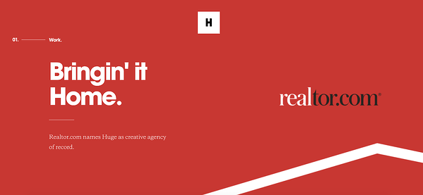
This approach’s only reason is that minimal elements look clean on the web page and a little more organized. Minimum options on the page also help you attract the user to specific actions and leave very little room for distraction. So if you are using minimal designs, there is a good chance that the user will read all that you want him to read, given that color and size are appropriate.
Responsiveness
Being responsive is something that a website cannot compromise on. Since 2017, internet traffic coming from mobile devices has consistently been more than half. In the third quarter of 2020, mobile devices were responsible for 50.8% of all the internet global traffic. We also saw how impatient a user is when it comes to browsing the internet in the above section. This directly indicates that by ignoring the website’s responsive nature, you are jeopardizing more than half of your traffic and users.
If you wish to compare the responsiveness of your website on mobile and tablets, you can use the LT Browser – responsive test onlinedesign checker tool to do so:
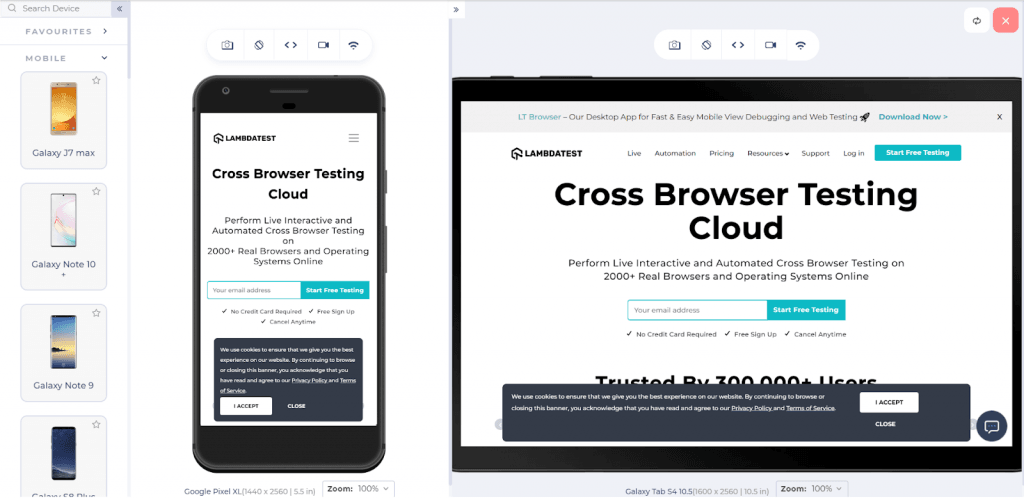
Although not every website is required to be responsive. For example, suppose there is a banking website for different bank related functionalities for the bank users. In that case, it is quite obvious that the users will be using the bank’s systems to operate. But for a general website, responsiveness is extremely important as Google has also started to penalize the websites that are not mobile-friendly in their mobile-first policy. Hence, analyze your users, finalize your domain, and then go for it.
Mobile-Friendly Layout
A lot of the time, people get confused between a responsive website and a mobile-friendly website. But in reality, they are different. A responsive website makes sure that the website responds to the lower or higher resolutions, screen size, etc., and acts accordingly. For example, scaling down the ratio of the elements on a smaller device or using the “picture element” to select the appropriate image for that device, or perhaps setting some media queries and letting them do their job. A mobile-friendly layout is different as while a responsive website design will scale down buttons, the mobile-friendly design will consider that space should be appropriate so that the wrong button is not pressed. A responsive website design will scale down the search results as they were on a desktop, while a mobile-friendly layout might change the column strategy into multi-column results as per the screen size.
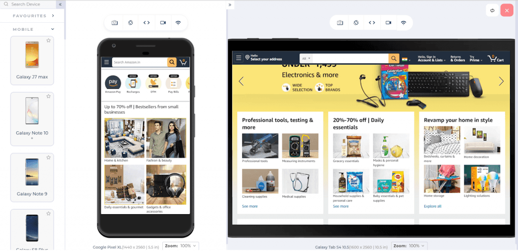
In a nutshell, responsive design does not care about the mobile user’s sentiments but just about the website. A mobile-friendly layout design cares about the user as to how he will see these elements, how he will navigate properly, etc. As a web developer, you need to take care of both of them, and the resulting website should be responsive and mobile-friendly.
Responsive Web Design Testing Checklist: All You Need to Know
Vertical Navigation Menu
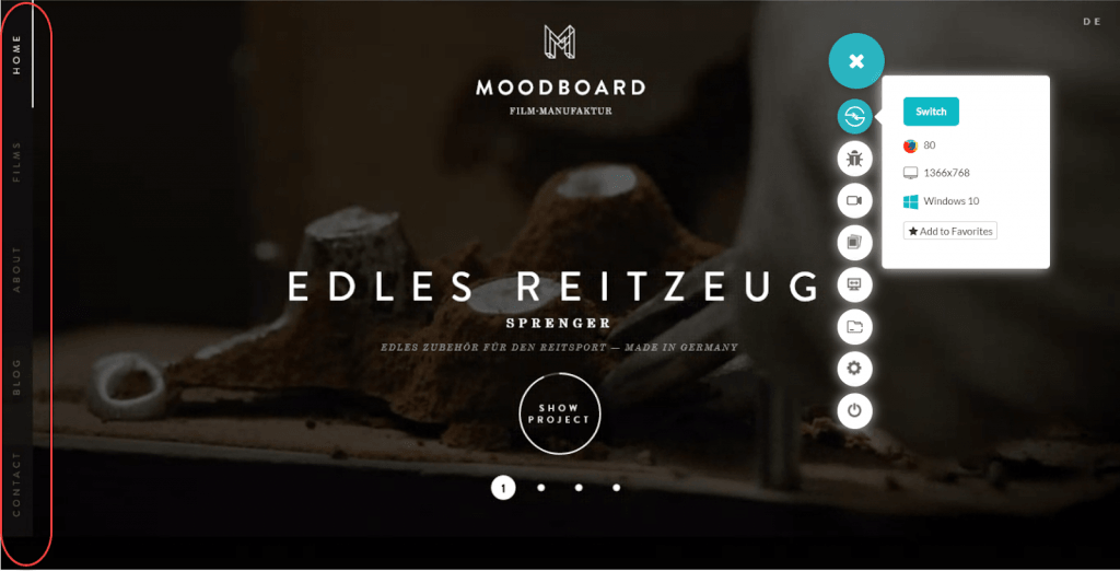
Navigation menus are very important from the point of web designs and need special care for the same. Navigation menus are the sole junction from where your user can explore what more your website has to offer. But navigation menus are a tricky business to maintain. Navigation menus require landscape and portrait adaptability. A vertical navigation menu is one such design paradigm that is used popularly. Moreover, responsiveness is also a factor in designing the menus because the smaller the screen size is, the harder it is to view and click with hands.
The following image demonstrates the vertical menu bar for desktop and tablet devices in landscape mode.
Hamburger Menu
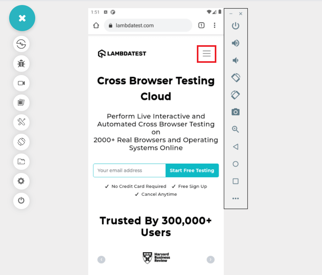
A popular web design method is to go for hamburger menus in mobile devices to attain responsive navigation menus. Hamburger menus have become a standard in website development that they need no introduction to the user and are already aware of its functionality. Although the designs are restricted in mobile devices, they are independent of using unique navigation menu designs.
Removing clustered navigation makes the experience much better. The stack of lines represents the menu in one small space, giving your website more space to display multimedia content and enhancing the site’s aesthetics. Today, almost every popular website uses the Hamburger menu to make navigation easy for the user.
Flat and Semi-Flat Design
Flat designs are the counterpart to the skeuomorphic design techniques used in the past but have been limited these days. Today, we have moved towards the flat design technique, and it has been working great! Skeuomorphism in web design corresponds to representing your function by relating it to some real object so that people can relate without mentioning explicitly. For example, using an envelope for an email to depict the meaning of the application. Skeuomorphic designs contain many details, such as shadows, 3d effects, too much focus on detailing, etc. Skeuomorphic designs give a premium touch mimicking real-world objects. The image below demonstrates the skeuomorphic design:
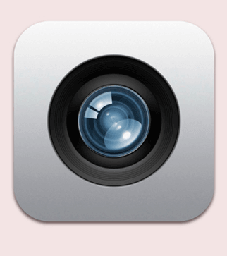
Flat design is just opposite to the skeuomorphic design. In flat designs, we do not focus on the details and the effects. Flat design in a website corresponds to our minimalist design approach. At least the Japanese Animes have told us that flat designs are equally applauded by the audience as long as they can appropriately deliver the meaning. Flat designs can be created easily and can be used from logos to advertising to procedural images. They are so common today that skeuomorphic designs are hard to point out. The below image demonstrates the flat design approach in web design.
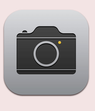
The above image shows a film-roll camera used in the early 2000s to depict the camera application, i.e., relating to the real-world object using flat design.
Semi-flat designs, also called Flat designs 2.0, are somewhere between the skeuomorphic and flat designs. Semi-flat designs look like flat designs and use the same artistic approach but contain a few details to make them more appealing, clear, and clean. Semi-flat designs and flat designs are both equally popular approaches, and if you have anything to represent on your website, flat design is the way to go!
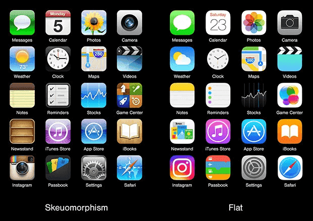
For your understanding, I have also attached iPhone’s application menu screenshots after they moved from skeuomorphic to flat design.
Hero Images
Hero images have become quite a trend today. Honestly, as a web developer, when I saw them initially, I could not find any logical reasons to use hero images on my websites. When you are struggling for speed and efficiency, hero images are like toll booths on your highway hustle. They are big and take more bandwidth as they are always of top quality. But on the other side, the fact is, hero images attract the user and give him a better approach towards your website than other websites. Hero images are also very attractive, and if you have a product to sell, there is nothing better than the hero images for your user. Even if the product, in reality, is darb, it will look a lot shinier and premium in the image. Using hero images in the web design is extremely helpful in such situations, while on the other, it is totally up to the developer and the team to decide.
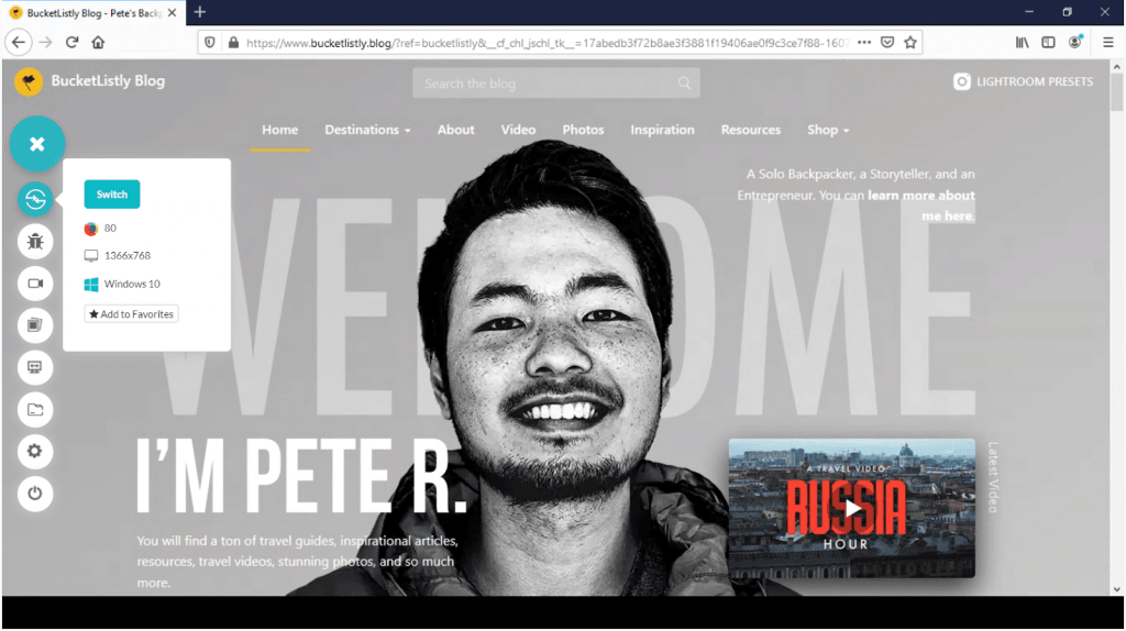
The above hero image showcases the hero image on the bucketlistly website.
Giant Product Images
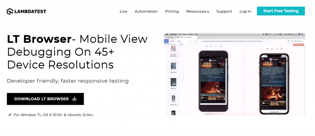
The key to an effective website is to be very distinct in what you are selling. You may have noticed, many B2B websites are beginning to display large product images on their websites, to highlight various features or parts of their product.
When a product is seen in a giant picture, the product’s features are highlighted. The end-user knows exactly what is happening on the page, and the product enjoys the user’s full and undivided attention, which is, by the way, the ultimate objective of a neat website design.
The below image shows how LambdaTest showcases the LT Browser image.
Call-To-Action Buttons
CTA or call-to-action button is a special button used for specific actions set by the developers or clients. CTA buttons are important as they are the primary thing that a client or a developer wants the user to do. Any distraction here would result in lesser goal conversion rates. Therefore, modern web design techniques call for the CTA button placement, which is visible, has no distractions, and attracts users through its surroundings. Maybe a hero picture!!
The following image will clear the concept of a CTA button:
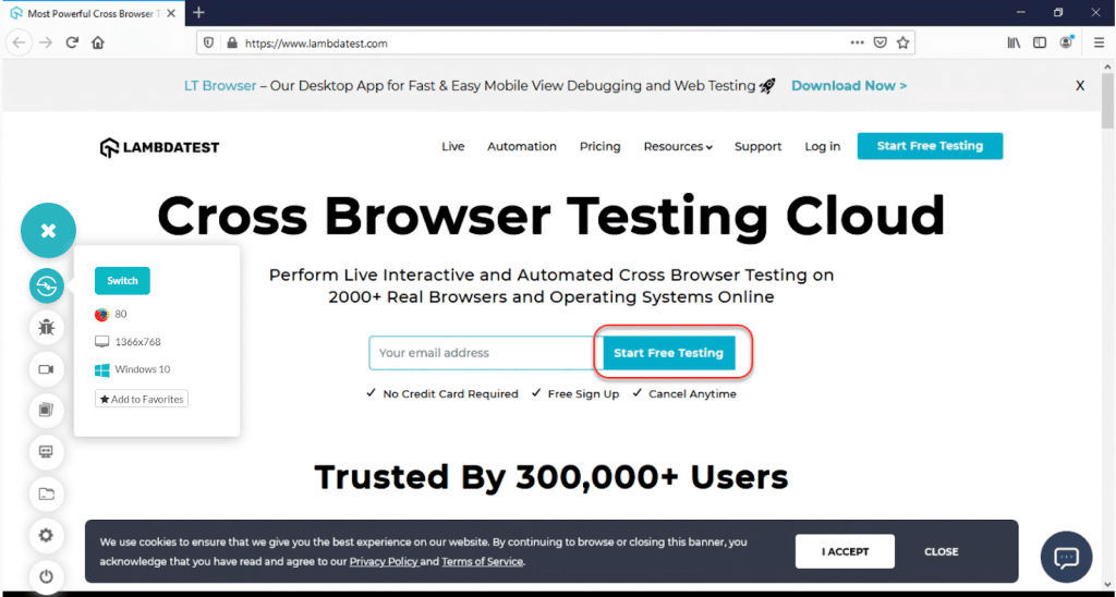
Notice how from the navigation bar to the footer, only one button is visible with a good contrasting color to attract the user to “Start Free Testing.”
Ghost Buttons
Ghost buttons are another popular and primary action button used on a web page. Ghost buttons are transparent (hence the name “Ghost”), have no solid fill color, contain very thin boundaries and dissolve with the background. One such example can be seen in the below image:
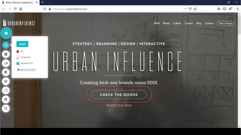
A question to ponder is, what happens when CTA buttons and ghost buttons co-exist on the same page? Or should we use ghost buttons as CTA buttons, perhaps? These are some popular questions, and it is always better to understand their functionalities. It is stated that a user is inclined towards showy and colorful CTA buttons (as indicated by the study). Therefore, CTA and ghost buttons contradict each other, and we cannot use one button for both of them. So, what kind of arrangement do we have to settle for? CTA buttons and ghost buttons can be used together and placed together, but since the user will be attracted towards CTA, you should put your main goal action attached to CTA while keeping the Ghost button acts as the secondary one. This way, neither your goal takes a toll on primary action nor suffers fewer visits to your website.
The following image demonstrates the same:
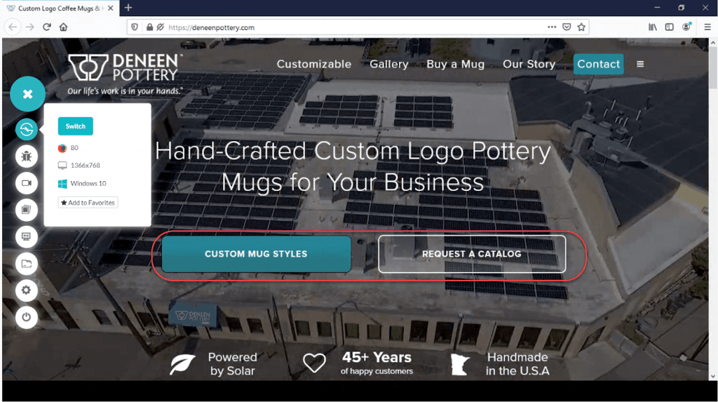
Also, it is very important to note that never go for CTAs as your ghost buttons. This web design blunder will result in the user’s distraction as Ghost buttons cannot be highlighted with colors. The best combination is to put both of them side by side to let the user decide which way he would like to go, as shown in the above image.
Color Palette
Another modern web design element gaining attention is the color palette or color scheme or color combination. As a first thought, the color palette looks like we are talking about our website’s background-color or the main landing page background-color. If these were your thoughts, you are partially right. The color palette in web design does not belong to any one component on the website, but the collective result of all. Maybe your background-color is dark red, which does not look visually appealing but putting the black-colored image with white text will attract the user. The color palette is extremely important for a website developer as it has gone through a lot of research, and fruitful results have been seen.
The color combination you use on your website may symbolize different meanings, such as blue for confidence and trust, yellow for gourmet products, red for reflecting confidence, etc. When such traits are reflected on the user, he perceives the website differently, which creates your stronger brand value and higher sale conversions.
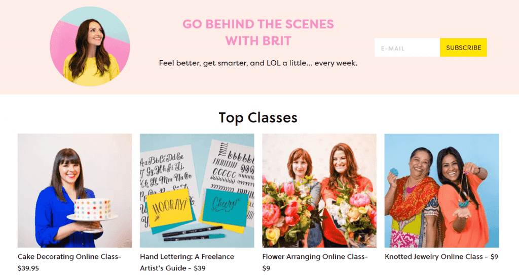
Card Design
The use of cards has grown in common with the more minimalistic website design style beginning to take over. By grouping text and imagery to form one eye-catching feature, cards help visitors absorb your content a little more easily.
Individual cards help to visually distribute data so that visitors can access bite-sized pieces of content quickly without being overwhelmed.
The below image is a great example of card design in action:
Short Videos
Short videos are another great way to engage the user and keep them on your website for a long time. Short videos are of two types on a website (majorly). One is to showcase the product as Amazon does. The second is an introductory video that will introduce your brand or your service or whatever you are offering through the website.
Such videos, when involved in the web design process, generate greater goal conversions. This happens as the videos are more attractive and visually appealing. Also, videos and product demos involve the user with the product or service more intimately than mere images or content. This builds the user’s trust with your brand, after which he does not shy away from investing in you even if your prices are a little high.
SVG Graphics
SVG or Scalable Vector Graphics is a two-dimensional technique to implement vector graphics on the web page using a markup language. SVGs are scalable, very lightweight, and are used heavily for lossless data compression. All these factors make SVG preferable for their usage inside the web page, and they are increasing their usage share by the day. Companies and brands prefer SVG to design their logos, which are just a few KB in size. This helps in a faster loading time, and SVGs are supported by every browser today.
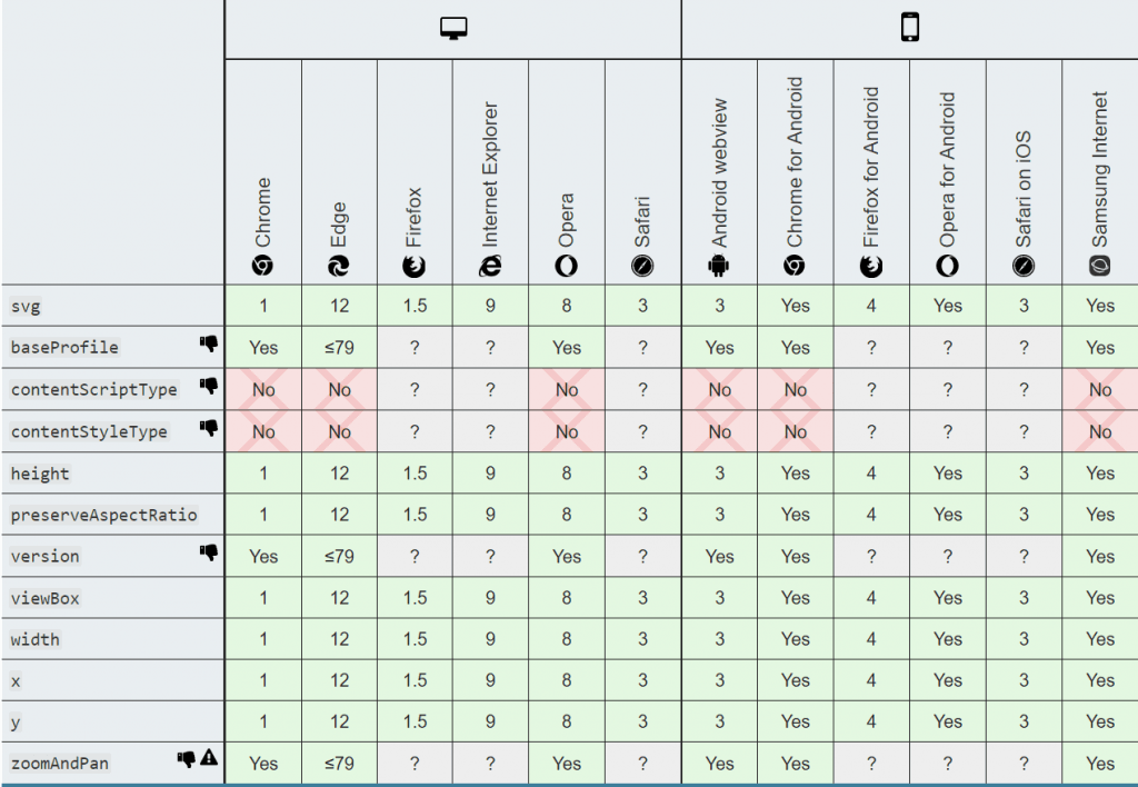
The above table demonstrates the acceptance of SVGs today. To notice the brands using SVG, right-click on their logo and select “save image as” to see the extension as .svg.
White Space
White space is an approach that comes under the minimalistic design and is widely appreciated today. White space means putting very less content and leaving a lot of the space on the page. Such an approach requires larger sized content and is more suited for the home page. The benefit of using the white space web design is that the user cannot skim through the congested content since the content is very less and is more focussed. Writing long contents can distract the user, which can ultimately end up not receiving the required information.
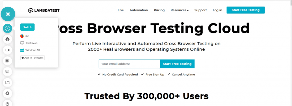
The above image demonstrates the use of white space and describing just the important content on the website.
White space also looks clean and organized, which is appreciated as our human brain has developed. Such appreciation remembers the website, and the user sticks to the website rather than rushing through different things and all the options.
Typography
The typography used in web design revolves around all the written content on the website. Typography includes the font you are using, the font-height you are using, the line spacing, the font’s color, the line length, etc. The ultimate goal of typography is to have no difficulty understanding the written content on your website. Otherwise, the user will hit the back button in no time.
The most important part of the typography is the font the website uses. There are three basic rules always to remember while designing the website. First of all, the font should be readable and very clear. So clear that the user should not even realize and start focussing on the font rather than the content. Secondly, the number of fonts used all over the website should never exceed two, while I recommend that one single font is the best way to go. Thirdly, as a brand, if you have the capital and time and are ready to invest in brand building, it is always recommended to use your font rather than using default ones. Your font is equivalent to your brand. People should relate to the font with your brand even if they are reading promotional content on a third-party website.
As far as the font-size is concerned, the best ranges are the following:
- The mobile devices should exhibit a font size between 12 pts to 16pts.
- The tablet devices should exhibit a font size between 15 points to 19 points.
- A desktop device should exhibit a font size between 16 to 20 points.
Although these should be used with your intuitions such as 20 points for the headlines etc. For hero images and other such font-based attractions, it is up to the designers and client to select the font’s size and color, which should be visually appealing. But you cannot compromise on the font type.
Also Read – Complete Guide To Fluid Typography With CSS Clamp
Cross Browser Compatible
Cross browser compatibility issues arise when the website fails to render properly (as it should) on different browsers or different versions of browsers or different operating systems. Cross-browser compatibility issues are generated due to different base engines on which the browser works. Different browsers also choose what they would like to incorporate and what features they will deprecate from their systems. If a website is still using such features or has not adapted to newer ones, the website fails to render properly, and a lot of business gets a hit due to this.
A simple thumb rule for checking cross-browser compatibility is to go for cross browser testing. Now cross browser testing can be either manual or through online systems. It depends completely on what your user base is and the end-goal of your website. For example, if you are building a website for a particular bank for their employees, they probably would not need responsive websites. Your browser matrix will also depend on such situations as in our example, they would probably be using internet explorer or Mozilla Firefox as most banks do. Therefore, develop, test, and repeatedly iterate until you get a cross-browser compatible website at your end.
Website Accessibility
Website accessibility is the web design element that allows every person to access and explore the website even if they have disabilities. Such options are more readily found in electronic devices such as mobile phones etc. Your website should be able to comply with those options. For example, content reading is one such accessibility feature taking advantage of listening to the written content.
Incorporating website accessibility on the website will help increase your overall audience and gain some praise for including people with disabilities. Website accessibility can also help people without disabilities connect with different gadgets in their account and persons with challenging abilities due to aging.
Optimized For Faster Loading
The customers always appreciate fast service. It is the reason so many people like Amazon prime for its faster delivery. The same goes for the website loading speed. Google research says that 53% of people abandon the website if the website takes more than three seconds to load.
This creates pressure on the developers to build the website with elements that can load faster. This modern web design element is interlinked with many other elements in this list and includes using smart techniques to deliver complete information without delay. One such practice may include rendering the top half of the page quickly or using the very minimalistic design on the page to make it lightweight. On top of it, Google has also started introducing a penalty for slower loading websites in their indexing factor. So a slower website may be put behind others given that all other parameters are the same.
SEO Optimized
Once we are done with the designing part of the website, we want to showcase our product to the whole world. The best way to do that is to be ranked among Google and other search engine’s indexes and let people know we exist! For this, we need to optimize our website according to the search engine’s protocols. A few of those include assigning a meta tag, doctype tag, proper heading tags, etc. There are many more tweaks for optimizing the website and the code that can be searched out on the internet. But before publishing the website, always remember to optimize it for search engines, which is considered an important aspect for modern web design. I mean, what’s the point if no one will ever know what we have created.
12 Common Web Design Mistakes To Avoid in 2021
Conclusion
After many pointers on our plate to digest, we have reached the end of this post. But all these were necessary and vital in your career and development practices as they familiarize you with the recent trends and advancements in web design. By reading this complete post, you must have got hold of an important thing around which many things revolve today: minimalist design. Minimalistic designs are the modern web design techniques, and as a thumb rule, if you have something that you wish your user should see, use minimal design. A white canvas with a 30-40 point black self-derived font sentence and a flat image symbolizing the text cannot be ignored. The same goes for other design techniques. Therefore, if you have a website or are thinking of starting development, analyze the points, and define your website’s clear structure. Also, keep in mind that the website should be young or old, abled or disabled, mobile or tablet, etc. Once you have the design in your hand, optimize the website with reference to the search engine, publish the website, and at last, sit back and relax!!
Frequently Asked Questions (FAQs)
What is modern web design?
Modern website design combines different elements that work together to create an effective and user-friendly experience. These elements include typography, layout, color choices, grid systems, motion graphics, and responsive designs.
What is the importance of modern website design?
Having a well-crafted website is crucial for making a positive impact on potential customers. It aids in lead generation, driving conversions, and most importantly, delivering a seamless user experience. It ensures easy accessibility and smooth navigation for website visitors.
What are the 5 areas of web design?
Your webpage serves as a platform for showcasing your products, and there are five key areas that facilitate your customers in discovering your business: user interface design (UI Design), graphic design, user experience design (UX design), and search engine optimization (SEO).
What is the main purpose of web design?
Web design plays a crucial role in ensuring websites are mobile-friendly, allowing easy viewing and navigation on mobile devices. A well-designed and responsive website enables customers to access the business effortlessly. Moreover, consistent branding, which involves promoting a product with a distinct design, further enhances the overall impact.
What are the advantages of web design?
Website design plays a vital role in making a lasting first impression. It significantly contributes to your search engine optimization (SEO) efforts. It establishes the initial perception of customer service. Moreover, it fosters trust and credibility with your audience.
What makes a website unique?
Creating a unique website begins by understanding your own identity and the audience you serve. The process of self-discovery is crucial in developing a distinct website. Without this foundation, it is impossible to achieve uniqueness in your online presence.
What is HTML web design?
HTML, serves as the coding language utilized to organize the structure and content of a webpage. It enables the arrangement of content in various formats, such as paragraphs, bulleted lists, images, and data tables.
How are modern websites built?
Mobile testing encompasses the evaluation of applications on mobile devices to ensure their functionality, usability, and performance. This includes testing various types of mobile apps, including native, web, and hybrid applications.
Got Questions? Drop them on LambdaTest Community. Visit now


