Top 20+ SaaS Website Design Inspirations [2024]
Saniya Gazala
Posted On: November 27, 2023
![]() 50208 Views
50208 Views
![]() 25 Min Read
25 Min Read
In today’s rapidly advancing technological world, Software-as-a-Service (SaaS) companies play a pivotal role in connecting people and businesses by offering solutions through their software. These companies address real-time challenges faced by individuals and businesses.
For example, consider a scenario where a sales professional manages inbound and outbound calls using separate Excel sheets, manually updating call statuses. This manual process of updating Excel sheets is challenging. However, with the help of Customer Relationship Management (CRM) software, managing customer data becomes efficient. CRM streamlines customer information and offers additional services like generating invoices, creating proposals, converting leads into customers, managing products and orders, and more.
Per the SaaS company’s total revenue report, in September 2023, Zoho emerged as the top-performing company in the SaaS sector for CRM and related software, generating revenue exceeding 500 million U.S. dollars. Following closely were Talkdesk with 229.5 million U.S. dollars and Odoo with 178 million U.S. dollars in revenue.
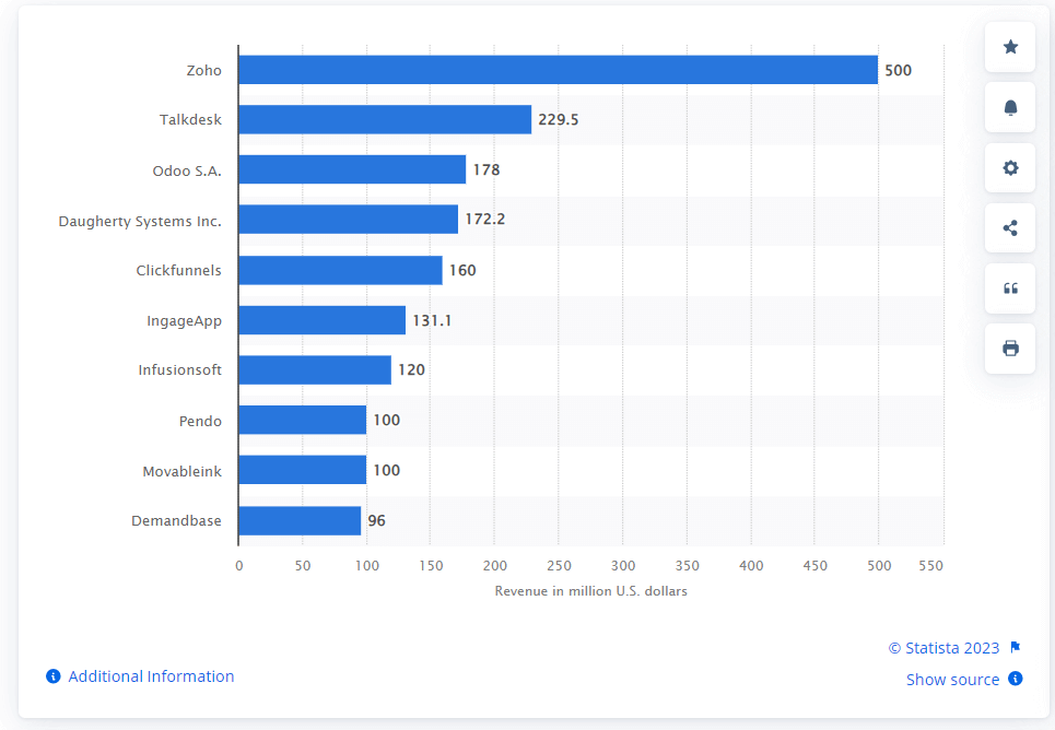
SaaS companies provide software solutions that resolve practical issues, making tasks like sales management more organized and effective.
SaaS companies focus on providing smooth functionality with an easy user interface.
No matter how complicated the software functionality may be, SaaS companies focus on delivering a software solution with an appealing and easy-to-use UI so that technical and non-technical users can use it. They also conduct demos on their how-to-use software and provide complete customer support.
This blog will explore inspiring SaaS website designs, highlighting their user-friendly features. By the end, you’ll gain insights into the UI aspects and functionalities of both B2B and B2C SaaS companies. The goal is to showcase their website designs and provide information on the functionality you can potentially incorporate into your projects.
So let’s get started.
TABLE OF CONTENTS
Why Consider a Great Design?
The success of any SaaS business can heavily depend on the quality of its user interface. A good interface connects users and enhances their efficiency, improving user retention. Recognizing that a visitor’s evaluation of a SaaS company often begins with its website is crucial. The first impressions formed by any user can significantly impact their perception.
To learn more about making user-friendly web apps, explore this blog on 10 top web design trends that can help develop an effective web app.
Below, let us look at some SaaS website design inspiration companies that will help consider using and implementing it. However, before looking into the SaaS website design, let us understand what SaaS company is and why they are so popular.
SaaS Website Design Inspirations
The importance of a well-created and visually appealing SaaS website design cannot be overstated. Whether you are a seasoned designer looking for fresh inspiration or an entrepreneur launching a new SaaS product, you can always take inspiration from some of the great SaaS website designs available.
In this section, we will showcase some of the most inspiring SaaS website designs and products shaping the future of online software solutions. From user interfaces to captivating visuals, let this collection be your muse in creating SaaS websites that not only impress but also deliver a smooth and enjoyable experience for your users.
LambdaTest
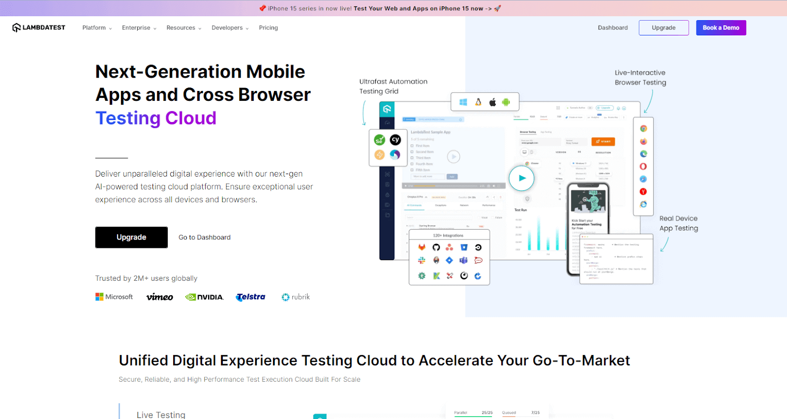
LambdaTest is a cloud-based testing platform that lets you check how your website or app looks and works on different devices and browsers. It’s user-friendly, making navigating easy for beginners and experienced users. LambdaTest is an AI-powered test orchestration and execution platform that lets you run manual and automated tests at scale with over 3000+ real devices, browsers, and OS combinations.
LambdaTest Website Design
The SaaS website design of this platform is straightforward for users to interact with. You can use this for inspiration to build a website around a testing platform. Each service has its dedicated page with detailed content and images.
- LambdaTest organizes its website to quickly access features like cross-browser testing, automation, pricing, and resources.
- Expect a professional, tech-friendly color scheme aligned with LambdaTest’s branding for a visually appealing experience.
- Look for strategically placed CTAs guiding users to sign up, start a free trial, or explore specific features for better engagement.
- LambdaTest’s website is designed to be responsive, ensuring a seamless experience across devices and screen sizes.
- High-quality images and graphics likely explain complex concepts or showcase platform features for a visually appealing and informative site.
- LambdaTest’s website follows a clear hierarchy, presenting essential information about services, features, and benefits.
- Look for a dedicated section with documentation, blog posts, webinars, and tutorials to help users stay informed and maximize the platform’s benefits.
- Positive user feedback is likely showcased through testimonials or case studies, adding credibility to LambdaTest’s real-world impact.
Salesforce
Salesforce is a B2B American cloud-based software company offering customer relationship management (CRM) services and software. In addition to customer service, analytics, marketing automation, and application development, Salesforce provides a range of enterprise applications.
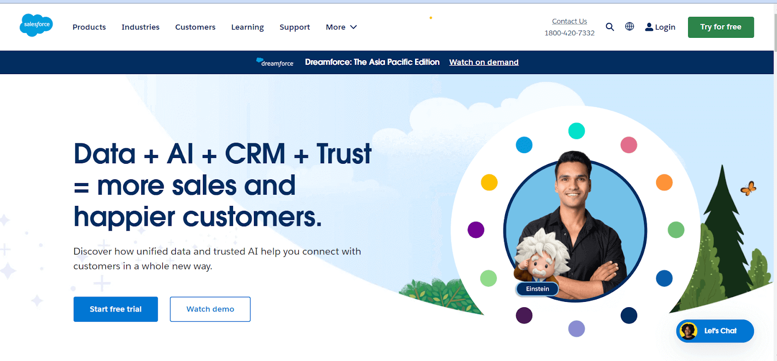
Salesforce Website Design
This SaaS product has an appealing UI, which makes it the best SaaS website design inspiration for anyone planning to develop a CRM. You can take Salesforce UI as inspiration. This platform also allows users to customize their UI based on their convenience.
- Embrace a professional and contemporary look and feel with a clean layout focusing on user experience.
- Maintain consistent branding elements such as colors, fonts, and logos.
- Designed a clear and easy navigation structure with menus that guide visitors to essential sections.
- Ensure the website is responsive across various devices. It mainly prioritized mobile-friendly design for a seamless experience.
- With high-quality visuals, including relevant images and graphics, make visuals to convey the value and capabilities of Salesforce products.
- Interactive elements like sliders or animations to engage visitors.
- Place clear and compelling CTAs strategically using language encouraging visitors to take specific actions.
- Showcase customer testimonials or success stories that build trust by highlighting positive experiences with Salesforce.
- A logical hierarchy for presenting information prioritizing key messages and features.
- Provides educational resources such as whitepapers or guides that help users understand the benefits of Salesforce products.
- Integrate social media links for easy sharing and engagement that helps showcase Salesforce’s presence and activity on social platforms.
Drift
This solution in the buyer engagement domain leverages artificial intelligence to enhance customer interactions and adapt experiences based on individual preferences.
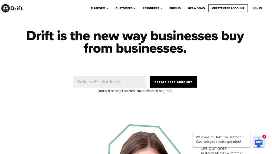
Drift Website Design
Focuses on user-friendly SaaS website design. Drift ensures an easy navigation system built with a white and black theme, with an easy-to-read font allowing users to interact with the buttons with fewer clicks.
- Focus on a clean, straightforward layout with enough white space, and use a minimal color palette to enhance readability and highlight key elements.
- Choose bold and easy-to-read fonts for headings and a complementary font for body text to maintain a professional look.
- Incorporate high-resolution images and graphics that align with Drift’s branding. Visuals that convey a sense of innovation and technology.
- Maintain a consistent color scheme and typography throughout the website.
- Ensure the website is responsive to various devices for a seamless user experience.
- There are clear and compelling CTAs that guide visitors to take desired actions and action-oriented language to prompt engagement.
- Design an intuitive navigation structure with clear menus.
- Develop informative and engaging content about Drift’s products or services, with multimedia elements like videos or interactive features.
- Showcase customer testimonials and success stories to build trust and highlight any awards or recognition from Drift.
Slack
It is a leading example of SaaS application development and is a robust business communication platform with comprehensive features.
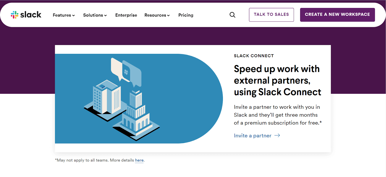
As a versatile communication and collaboration medium, Slack finds its niche between formal emails and informal messaging apps. Many companies consider it their virtual headquarters due to its straightforward interface and seamless integration with various apps.
Slack Website Design
If you’re considering building separate websites for various business departments such as IT, Engineering, and Project Management, you can draw inspiration from Slack’s website design.
- Notably, Slack’s color combination is beautiful with purple and grey; along with this, their homepage stands out, especially for those involved in an organization or community using Slack, as it noticeably displays relevant details.
- Each solution offered by Slack to different businesses has its dedicated page. These comprehensive pages feature related guides, blog sections, GIFs, and stories specific to that solution. For instance, the Engineering solution page showcases engineering stories at the bottom, while the IT solution page includes IT-related stories.
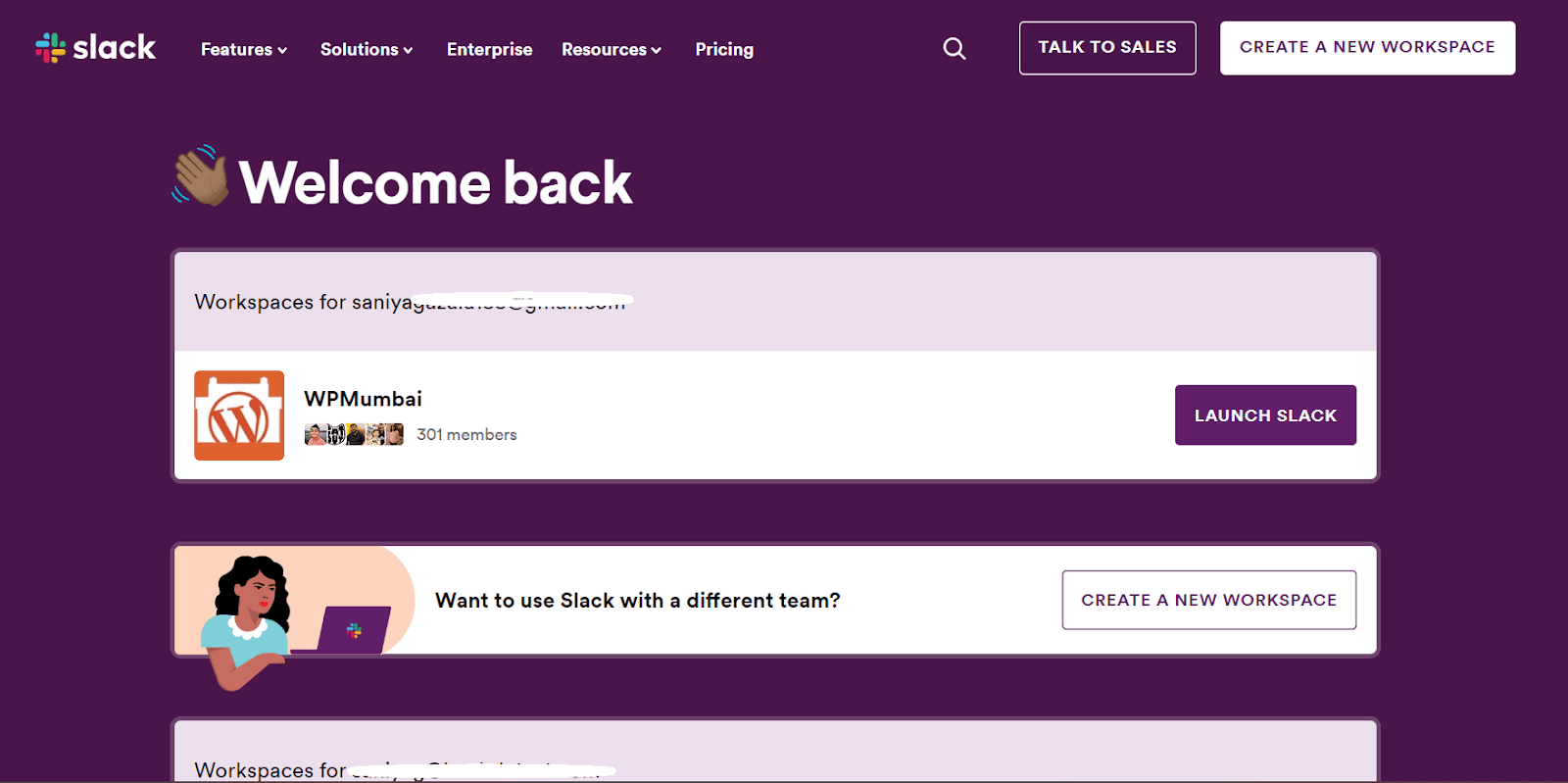
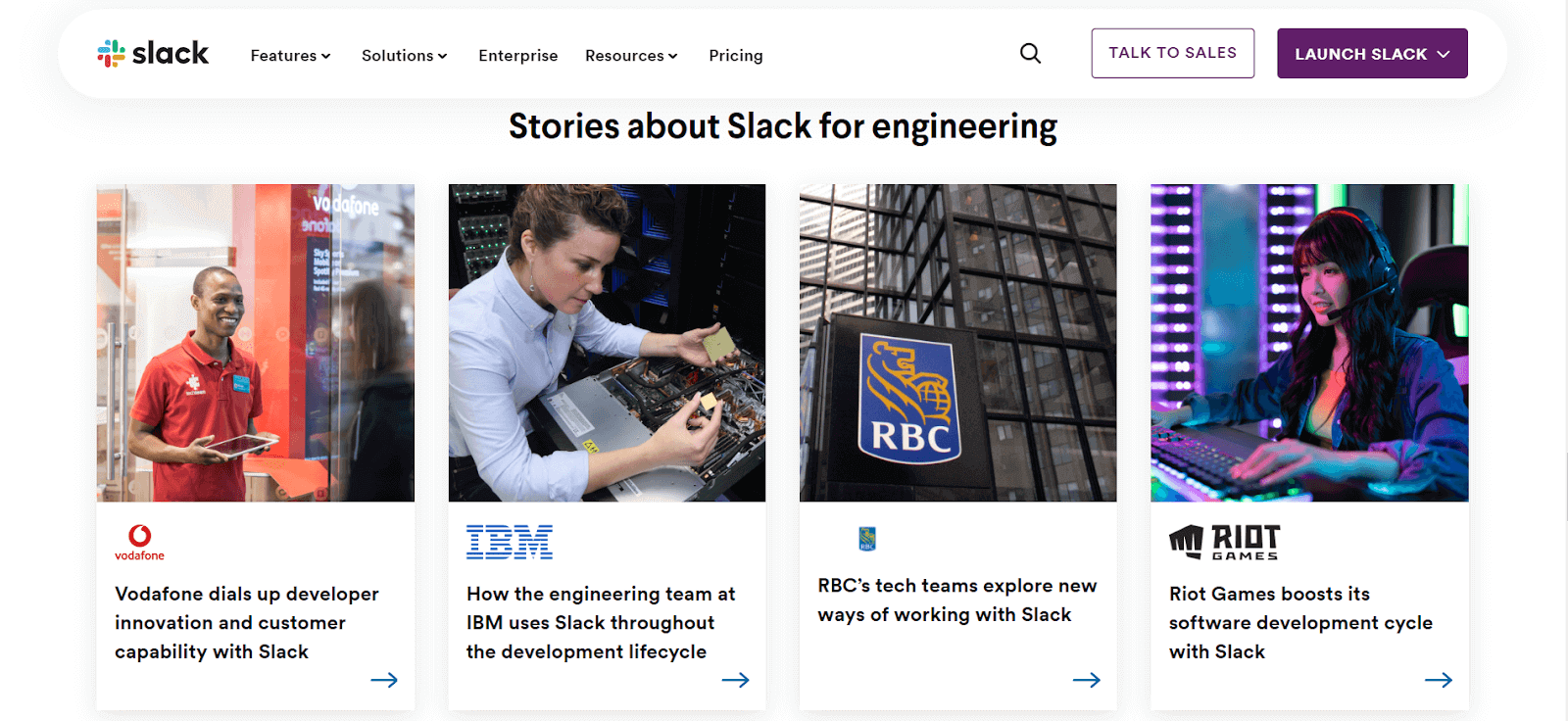
This strategic organization encourages visitors to explore and stay longer on the website. Additionally, interactive buttons facilitate user engagement, providing a user-friendly experience.
Slack’s SaaS website design prioritizes user-friendly interfaces, enabling efficient team communication. Launched in 2013, its unique selling proposition (USP) lies in delivering faster, more organized, and secure transmission, surpassing traditional email methods.
 Note
NotePerform testing across various devices to validate SaaS product functionality and UI. Try LambdaTest Today!
Zendesk
Zendesk, a cloud-based SaaS platform launched in 2007, revolutionizes customer service by offering various solutions for handling customer requests across multiple channels like email, web, social media, phone, and chat.

It sets itself apart by prioritizing customer service as a core component of its CRM offerings. Their software is designed to improve support, sales, and customer engagement, aiming to build lasting relationships.
Zendesk Website Design
When creating a SaaS website design, remember Zendesk’s user-friendly interface, a crucial factor in delivering a smooth and satisfying customer service journey.
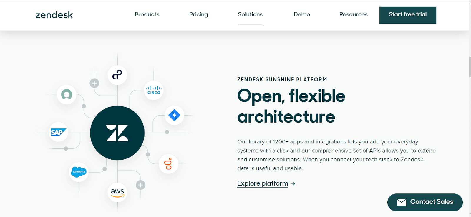
- Each of their website section and pages has a different UI. Zendesk has used green and off-while/white as their website color.
- Interactive Pop-ups are used when clicking on the Demo page.
- Their website’s “Solution” page is simple yet elegant. This past section, where they display which companies they are connected with and provide solutions, can be considered.
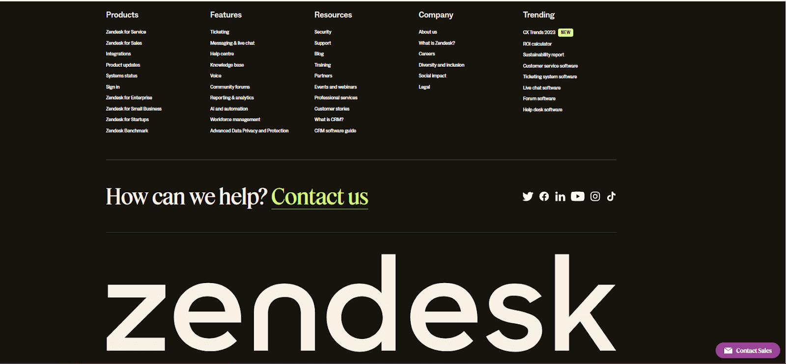
- The footer of this website differs from the standard one that most websites have, as you can see below. This footer design is different when visited from page to page.
Mailchimp
This SaaS platform is for email marketing and automation solutions. Launched in 2001, it is a leading tool for businesses looking to organize email campaigns and engage with their audience effectively.
Mailchimp Website Design
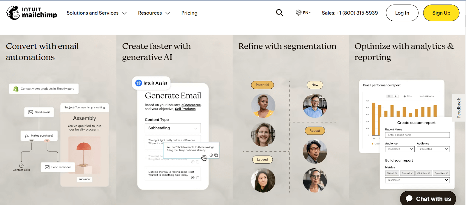
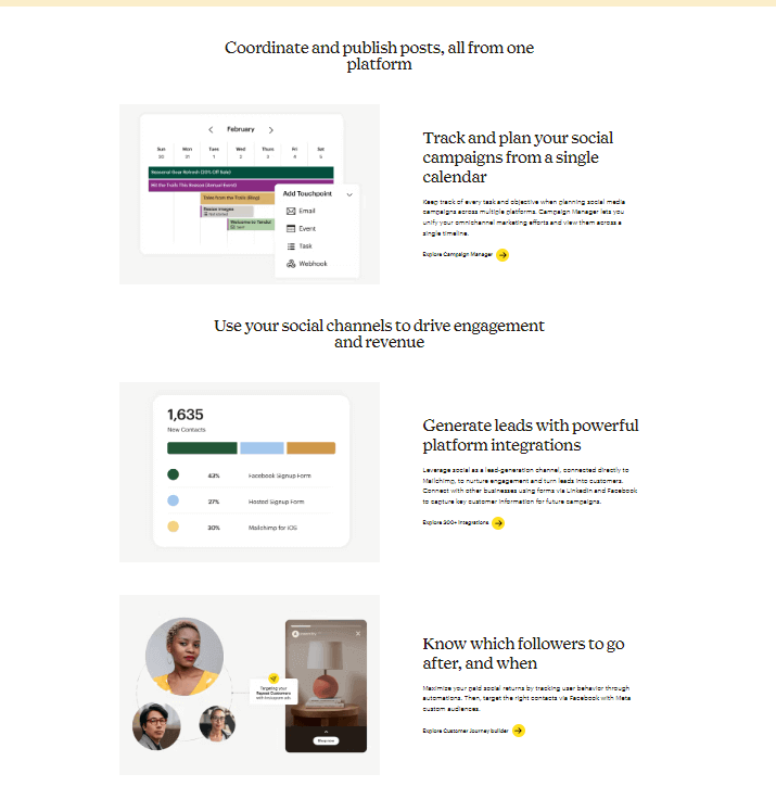
- It is known for its user-friendly interface and innovative features. From this SaaS website design, you can take inspiration from how they have made each section unique to represent their features and services not only to get inspired from their website but also because this platform has very simple to use UI so that any technical or non-technical users can use their product.
- Each of the services offered by Mailchimp has dedicated pages that highlight what this service does and how to use it, with small gifs around each container to explain what it consists of and what you can do if you are looking for SaaS website design around Marketing and automation email campaigns.
Intercom
This software makes creating personalized communicators and sending targeted, behavior-driven emails and in-app messages easy.
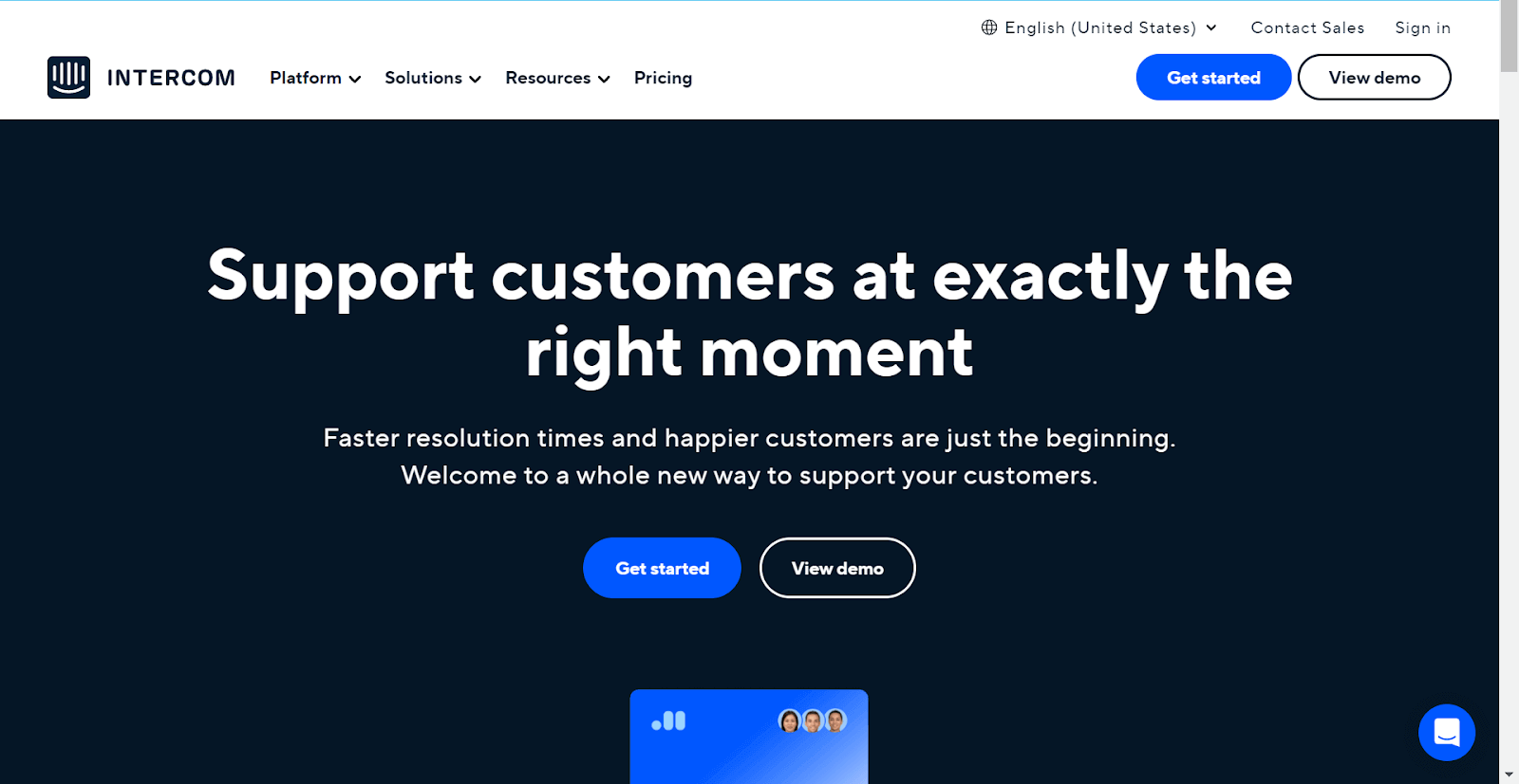
By utilizing the power of Intercom, businesses can acquire, engage, and retain customers effortlessly. With its streamlined communication capabilities designed for sales, marketing, and support teams, Intercom is vital in driving exponential business growth.
Intercom’s SaaS website design ensures a thoughtfully crafted, user-friendly interface. Launched in 2011, its unique selling proposition lies in delivering personalized conversations and automated support to over 25,000 global organizations.
Intercom Website Design
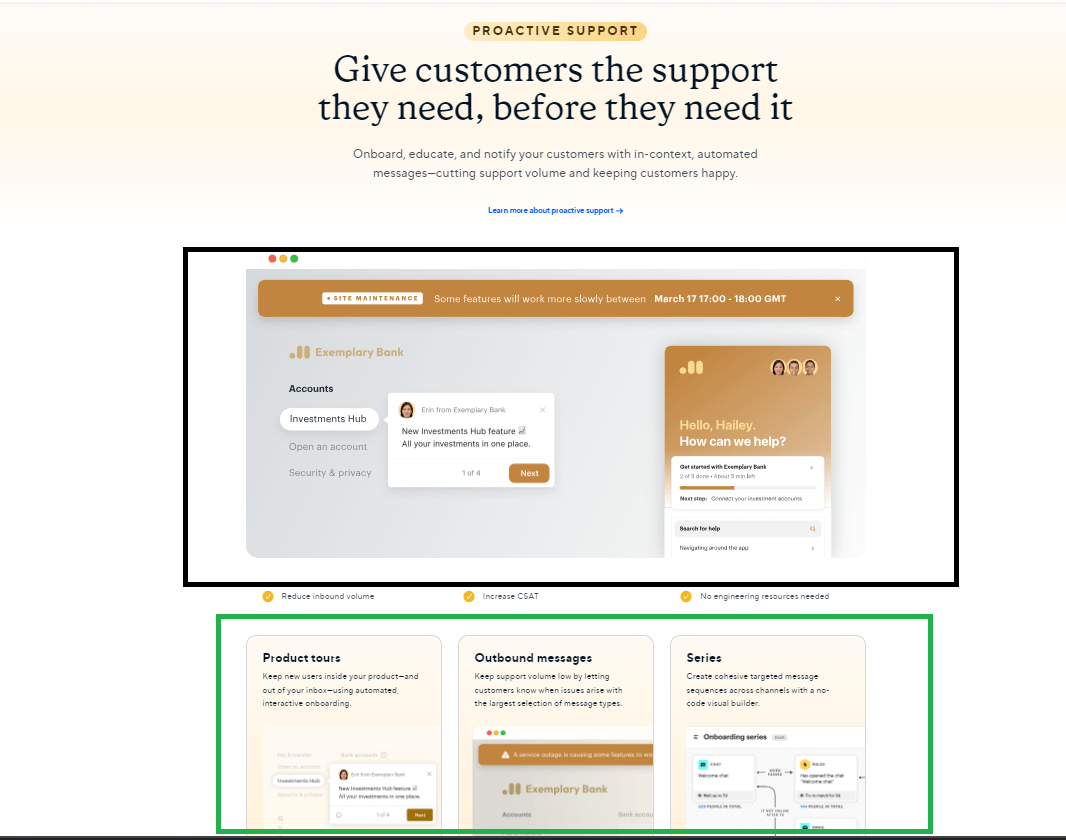
The intercom website is something that I get inspired by; they have creatively showcased their services on the homepage. Each section is dedicated to a specific service and includes a short video and additional details in a card view. This approach is beneficial if you have numerous benefits to showcase on your website.
Asana
With a user-friendly SaaS website design, Asana facilitates seamless navigation. Launched as a solution in the project management realm, it empowers teams to streamline project workflows, fostering effective communication and task tracking.
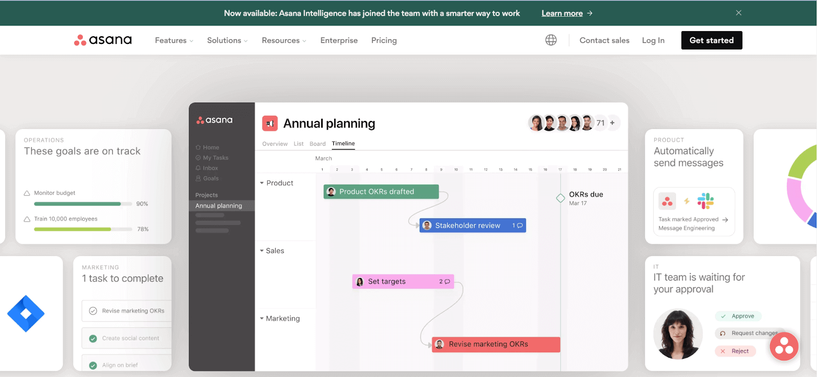
Asana’s SaaS website design is created for simplicity and ease of use, contributing to its widespread popularity among users.
Asana Website Design
If you want to build a project management tool, take your team activity, enhance the team’s productivity, and track your progress on a project. Then, you can take inspiration from the Asana website design, which can be taken into consideration.
The most interactive feature on this website is scrolling via services under sections; the gif shown for each service is very interesting. It also has a carousel section for displaying all the products that Asana provides integration.
Zoom
Zoom stands out as a cloud-based platform for video and audio conferencing, chat, and webinars, known for its user-friendly, reliable, and cost-effective nature.
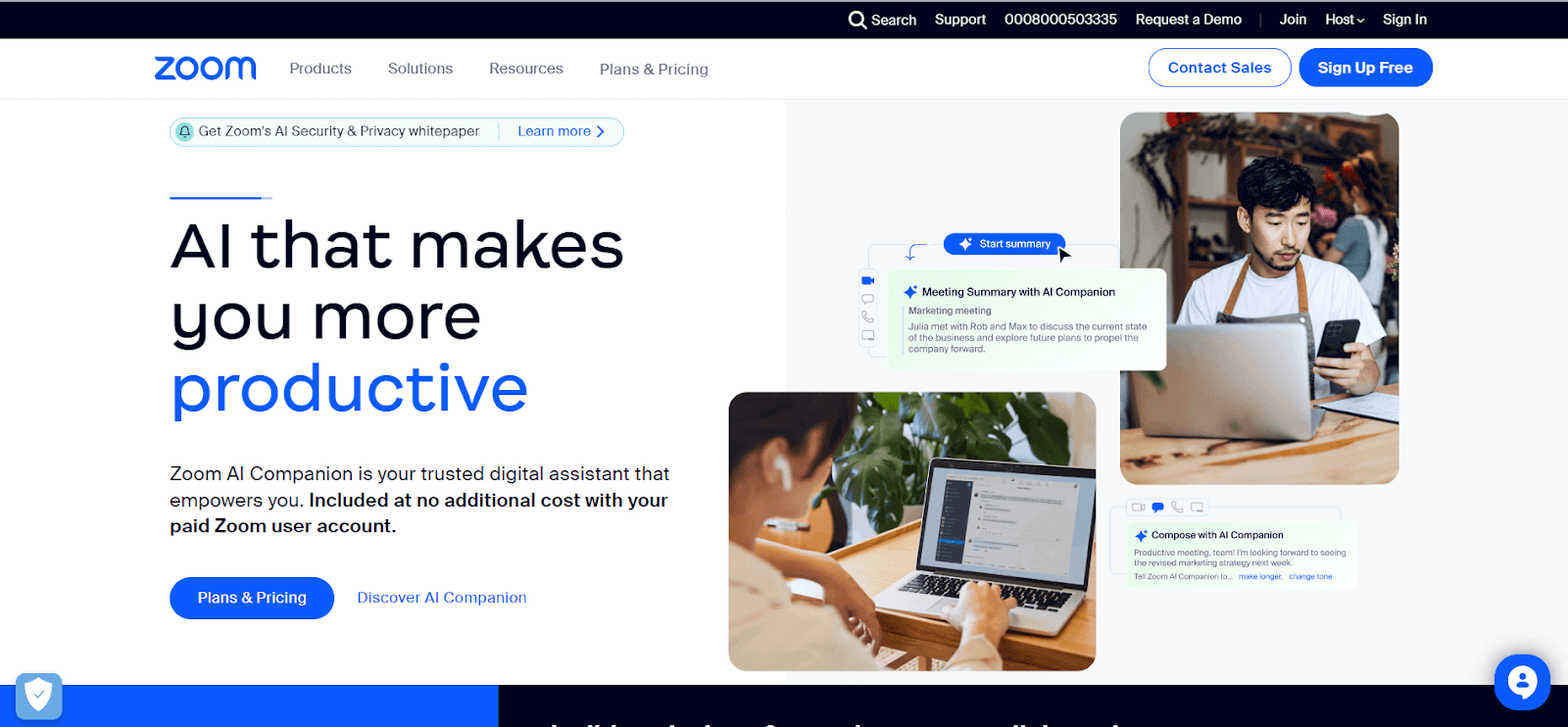
This SaaS product is utilized by freelancers, teams, and businesses of all sizes; Zoom serves personal and professional communication needs. It enables users to share screens easily and conduct distance education and webinars.
With a primary focus on video calls and online chat, Zoom has become an essential product for users looking to collaborate from anywhere.
Zoom Website Design
Zoom’s SaaS website design inspires those who are considering developing a customized replica. With a user-friendly interface, it effortlessly guides users through various features, making it a model for creating solutions tailored to user needs.
This website has a dark blue and black theme, and with some animation and smooth transition, this design can be considered if you want to make the website interactive.
G Suite
SaaS applications from Google have significantly improved the lives of businesses and individuals across diverse polls or statistics.
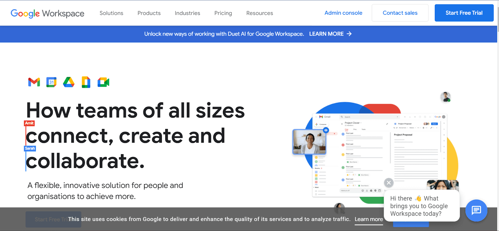
The well-known Google Suite includes essential applications like Gmail, Google Docs, Google Sheets, and Google Drive. What sets it apart is its compatibility with all devices.
G Suite Website Design
G Suite’s SaaS website design prioritizes user-friendly interaction, enhancing accessibility and popularity. Launched in 2006, its unique selling proposition enables real-time collaboration on the same document among team members.
This website has a simple white and a little bit of a blue color theme, along with some animation on the home page, a short video information, and learning more about the section where each card will redirect you to the more detailed page.
Quixy
Quixy, a no-code platform, empowers citizen developers to address unique challenges and bring ideas to fruition without coding. It stands out in the realm of SaaS applications, enabling users to create applications swiftly through a user-friendly visual interface.
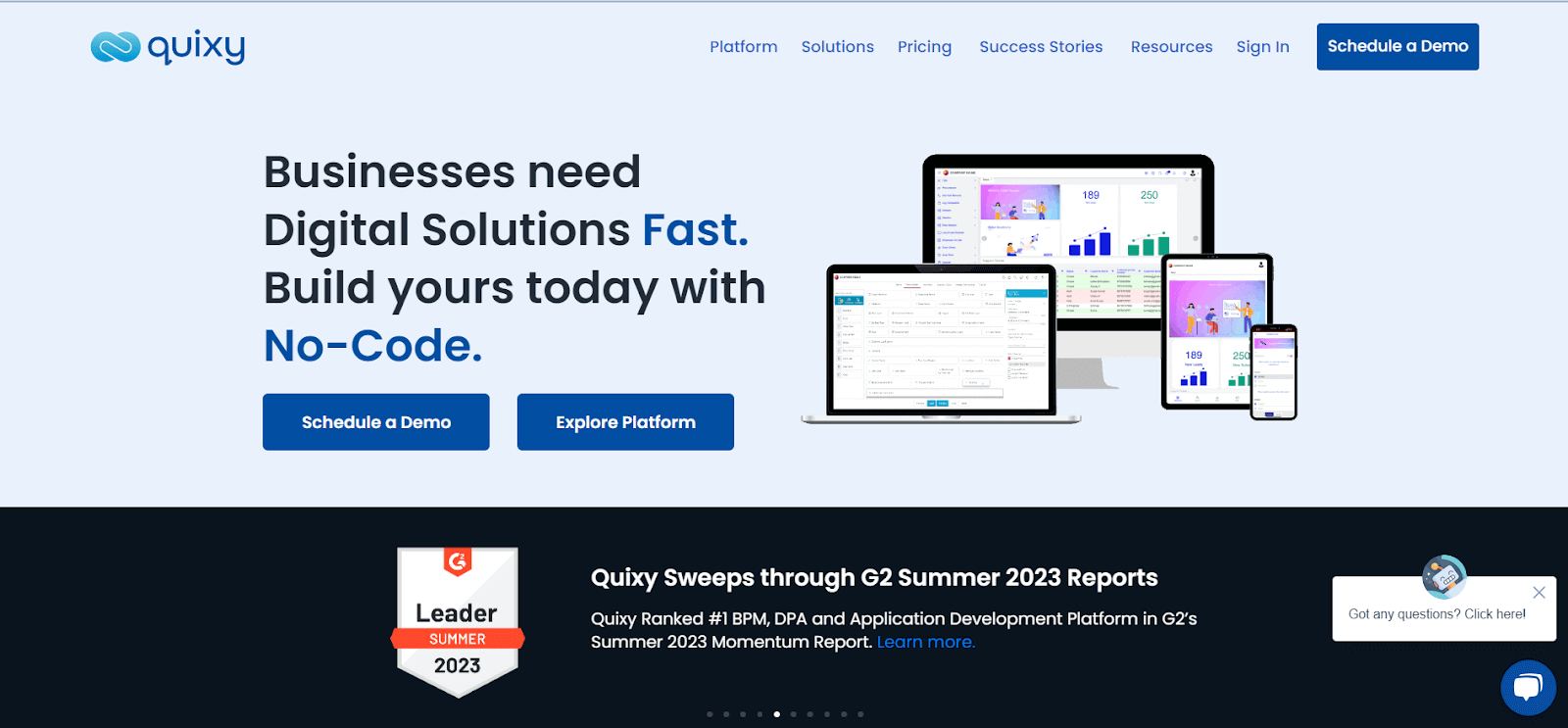
The platform’s ready-to-use apps cater to various organizational processes, from applicant tracking to project management. These apps can be used as-is or customized to suit specific organizational needs.
Quixy Website Design
Quixy’s SaaS website design prioritizes simplicity, ensuring an easy app development process. Launched in October 2019, its unique selling proposition revolves around automating business processes and workflows, allowing the creation of enterprise applications 10X faster with No-Code Digital Transformation software.
The website looks very basic yet elegant. The feature we can take inspiration from is the transitions when scrolling on the website. The presentation of their work with a smaller card view is obvious and aligned.
Atlassian
With a wide range of business tools, such as Jira and Confluence, Atlassian serves the various needs of organizations by providing a comprehensive suite of solutions. Their reputation for versatility is well-deserved, as they offer team collaboration and project management software and multiple solutions for agile development, IT service management, and DevOps.
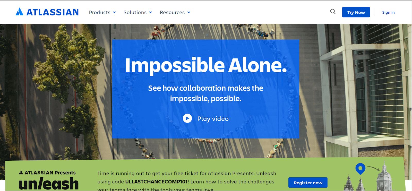
Atlassian’s ecosystem is robust, enabling businesses to streamline workflows, improve communication, and foster department collaboration. It is no wonder that Atlassian is the top choice for organizations looking for integrated and scalable solutions to enhance productivity and efficiency.
Atlassian Website Design
With a commitment to user-friendly SaaS website design, Atlassian’s products feature interfaces that simplify navigation and improve user experience.
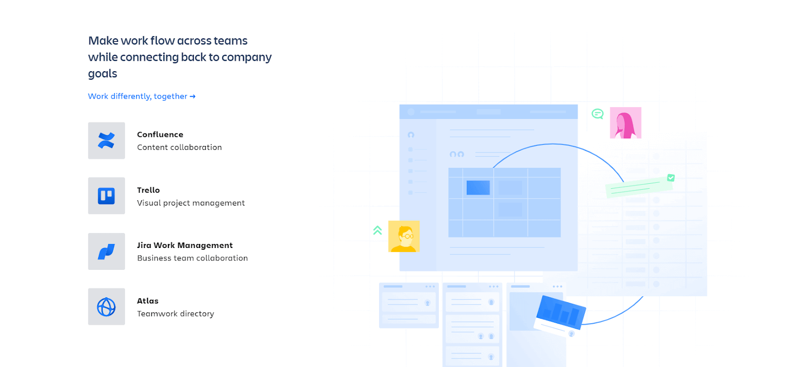
They have used infographics, texts, and some transitions to make it look unique when scrolling the website. Otherwise, the site is functionality and content-centric.
Workday
Human resources teams utilize Workday as a comprehensive financial and human capital management tool. Integrating multiple functions efficiently streamlines HR and financial processes within organizations.
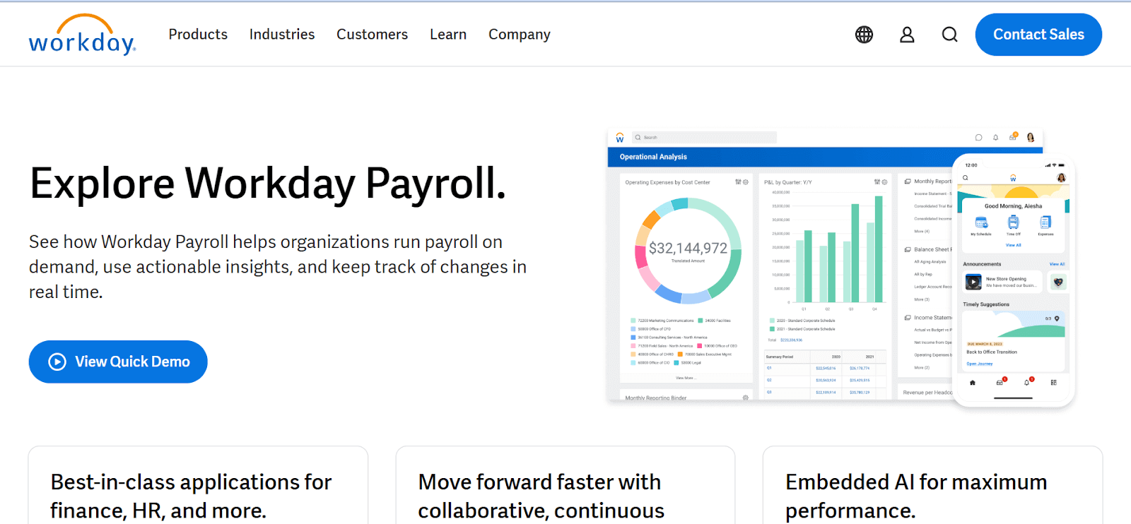
Workday prioritizes a user-friendly interface, ensuring a smooth experience for its users. The SaaS website design inspiration behind Workday’s interface is creating a visually appealing and easy-to-navigate platform, enhancing user engagement and productivity.
Workday Website Design
Workday’s interface makes a visually appealing and easy-to-navigate platform, improving user engagement and productivity. They have used a white and blue color scheme, with easy navigation and easy click of a button for users.
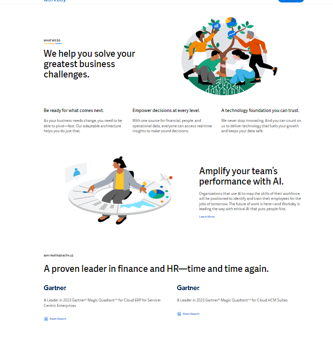
It is a fundamental and static website with no such transitions, gifs, or any added creative sections. Still, if anyone wants to showcase their content-centric and functionality-centric, they can use this SaaS website design for inspiration.
Lightrun
Lightrun’s Developer Observability Platform, where adding logs, metrics, and snapshots to live applications is now a seamless process. No more waiting for new releases or stopping running processes – with Lightrun, you can effortlessly enhance your applications with additional telemetry on demand, all while staying within your IDE. You can easily monitor real-time application output without ever leaving your development environment. This capability applies to cloud-native applications, Kubernetes, bare metal, and serverless setups.
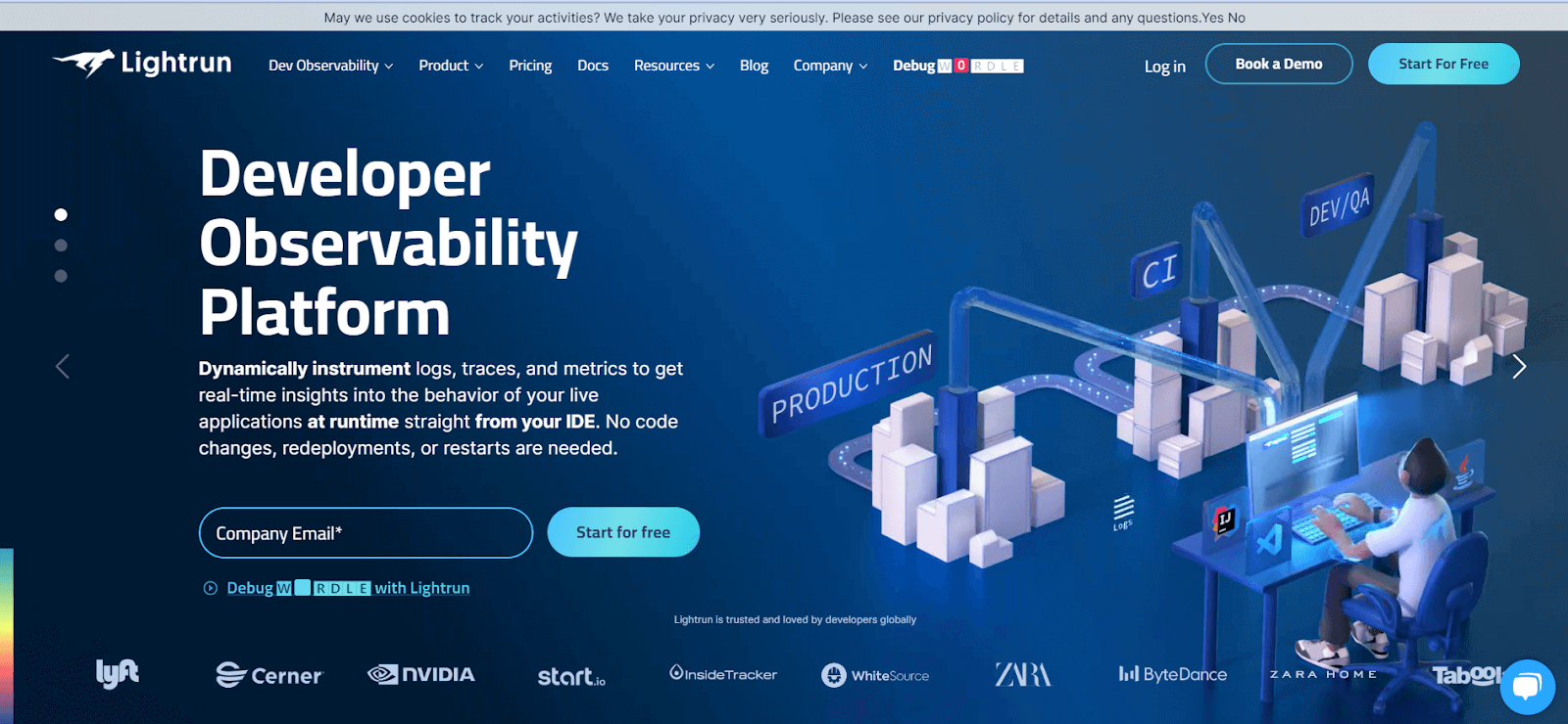
Its read-only instrumentation ensures your code remains protected. Easy integration into your existing development workflows allows you to incorporate Lightrun’s power into your processes smoothly.
Lightrun Website Design
This SaaS website design incorporates neon effects, utilizing a color palette of blue and black. The layout of each section is designed for easy navigation.
It inspires anyone seeking to build a website with an attractive effect with some gifs and transitions that can be considered.
Bentogrids
This is a versatile SaaS solution with an extensive array of designs for web and graphics. It caters to the needs of website developers, UI/UX designers, and graphic designers, offering diverse options for creative inspiration.
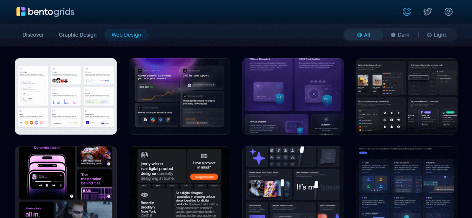
This SaaS product is designed to enhance the design process and streamline the creation of visually appealing websites and graphics. It was released in the year 2022.
Bentogrids Website Design
This SaaS website design takes inspiration from various web and graphic design templates.
You can select any template present in both dark mode and light mode.
New Relic
It is a leading SaaS solution for businesses looking for complete details on the performance of their software applications. It is famous for its robust features and analytics capabilities.
It serves as a signal of SaaS website design inspiration for those looking to develop an application monitoring and observability website.
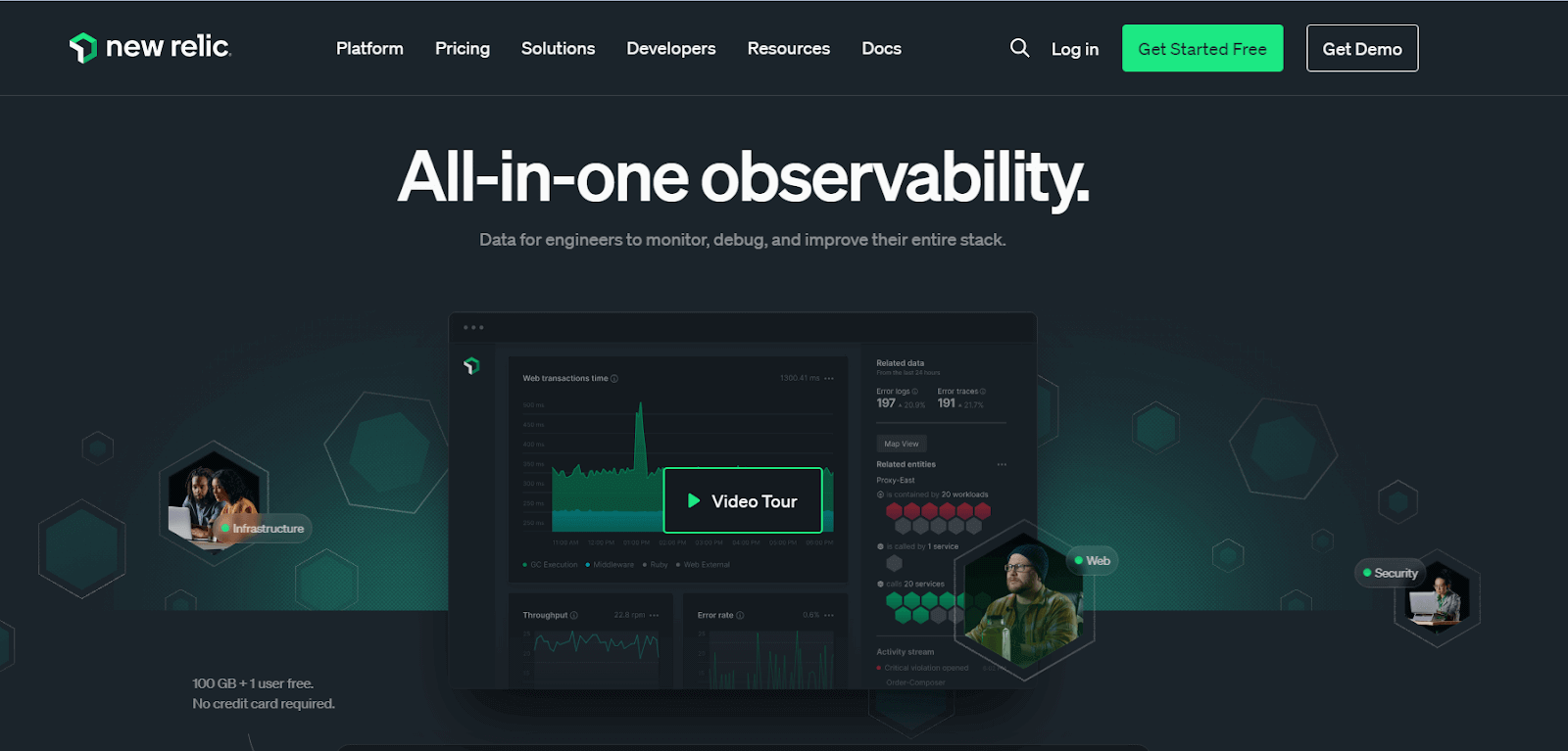
There are many sections on the New Relic website that you can get inspired by and use not only the website design but also inspiration from their platform to see how users interact when checking their website performance.
New Relic Website Design
The SaaS website design stands out with its unique color scheme of green and black, creating a futuristic and hi-tech vibe. In the homepage section, they’ve uniquely utilized hexagon shapes to represent the various services offered by their product visually.
To assess the performance of your software application across various browsers and operating systems, consider integrating New Relic with LambdaTest. This integration allows you to gain comprehensive insights into performance issues, enabling you to take corrective actions based on the test logs provided by LambdaTest.
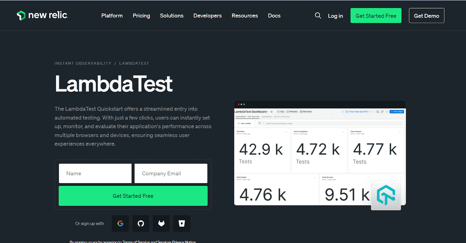
Refer to the step-by-step documentation for detailed instructions on integrating New Relic with LambdaTest.
SaaS Landing Pages
Designed with precision, the SaaS Landing Pages by Cruip serve the unique needs of SaaS businesses, offering templates beyond creativity to capture the essence of data representation. The templates are created to smoothly display item purchases via charts, presenting an interactive dashboard that transforms data into actionable insights.
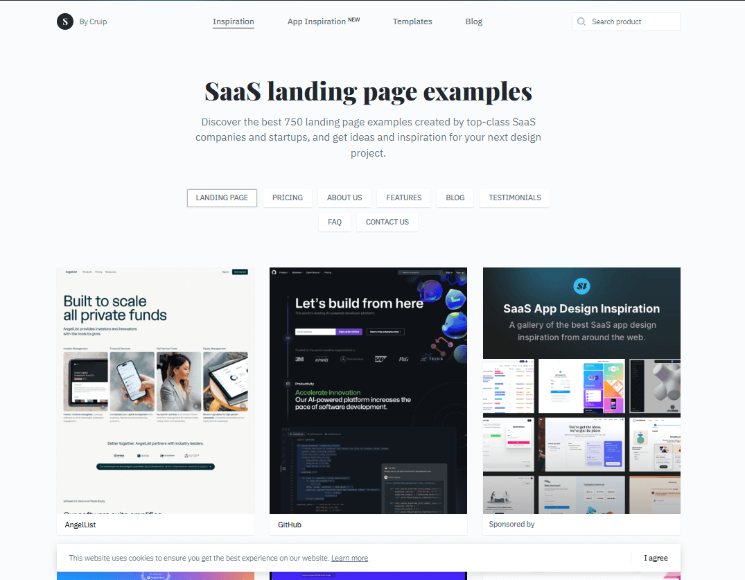
SaaS Landing Pages Website Design
This platform is a perfect source of inspiration for SaaS website design. It enables users to leverage elegance and functionality to create an interactive SaaS dashboard.
Whether you prefer different card views or an attractive list display for customer data, the options are widely available and can be customized.
Cruip
Cruip is revolutionizing the web design process with its innovative platform that provides many professionally designed templates. As a notable player in the SaaS industry, Cruip’s main goal is to empower businesses to create visually appealing and high-performing landing pages effortlessly.
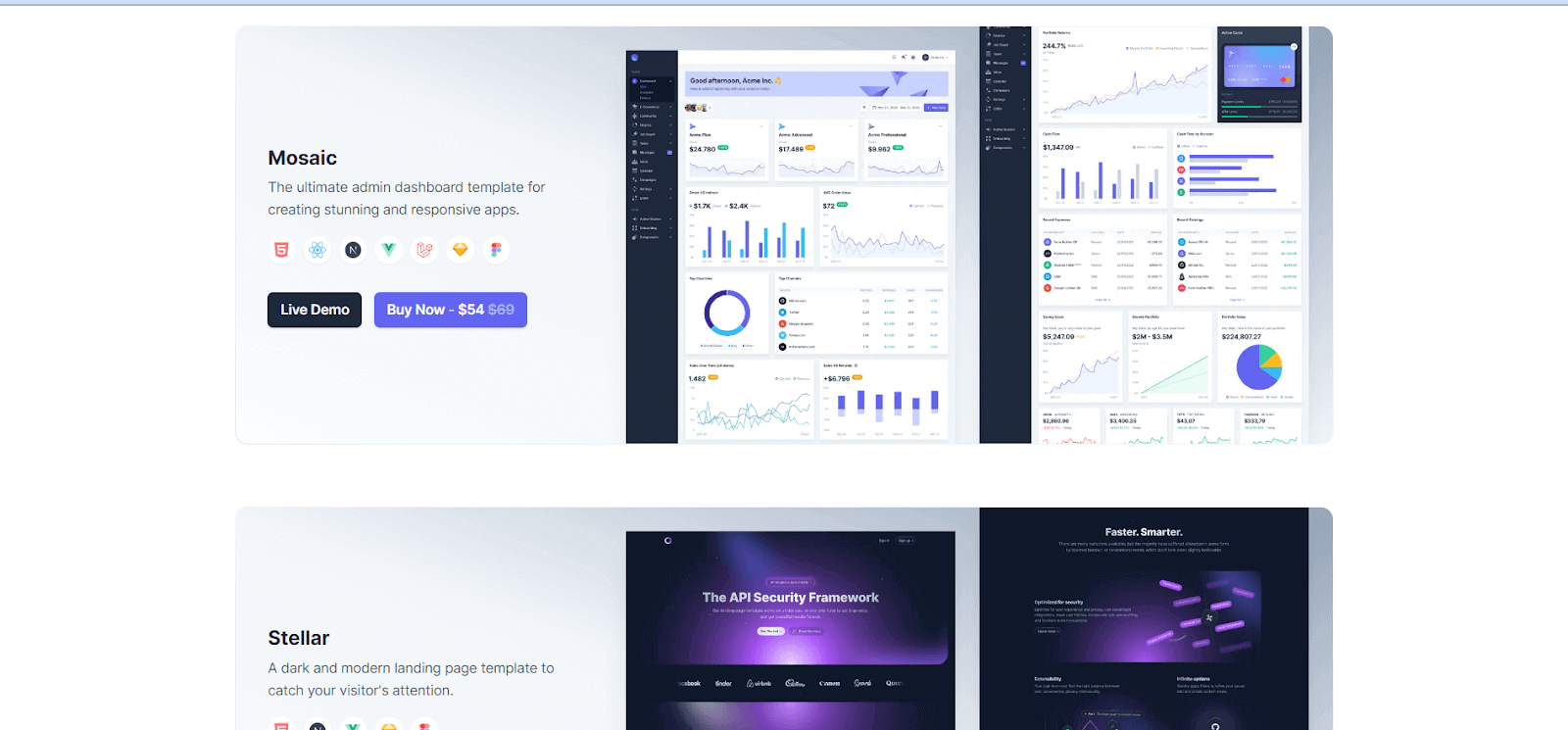
This product was launched in 2019 and has gained immense attention in the SaaS world for its user-friendly interface and modern design creativity, making it an excellent source of inspiration for a website.
Cruip Website Design
This can be difficult to integrate into your project for anyone who needs programming knowledge; these libraries must be imported or installed in your HTML and CSS project.
With the help of Tailwind CSS templates, you can create a unique, smooth UI website; using programming language makes customizing the website easy.
Landingfolio
Landingfolio provides the finest landing page inspiration and templates for businesses seeking to optimize their online presence.
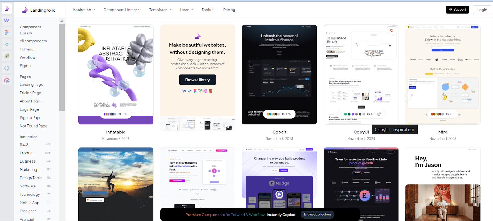
Launched in 2017, this platform offers extensive SaaS website design inspiration templates suitable for any company. You can customize them with various design development tools like Figma, seamlessly integrating with platforms like Webflow, Tailwind CSS, and more.
Landingfolio Website Design
The platform provides a diverse collection of landing page examples and templates, serving as an invaluable resource for designers, marketers, and entrepreneurs eager to enhance their online presence.
This platform has sections and templates for mobile apps, SaaS products dashboard pages, landing pages, pricing sections, and more. You can integrate the design with Figma and other tools, and it also allows you to create logos for free, build mockups, and more.
Mobbin
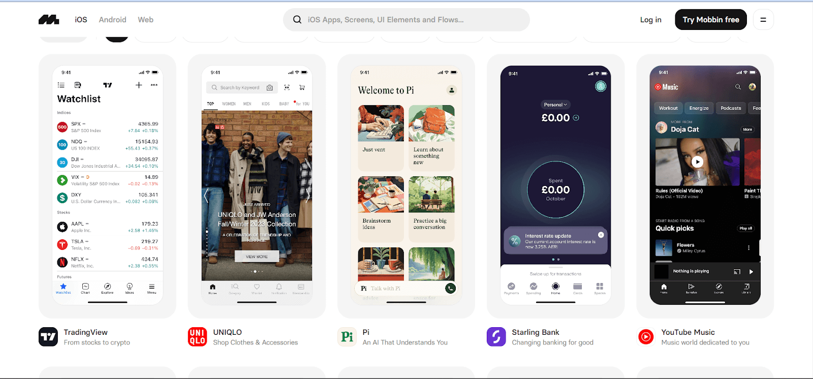
Mobbin is an American-based company launched in 2018 that provides a comprehensive solution for designing and optimizing mobile applications. This platform offers various tools and features to organize the mobile app design process.
Mobbin Website Design
Mobbin is a leading SaaS website design inspiration for mobile app development. If you are a UI/UX developer looking for some mobile app design inspiration, it is a collection of mobile app design patterns and inspirations; this platform offers design templates for iOS and Android and web app designs.
There are different UI elements, screen views, and more from which you can take inspiration to help you build a good UI/UX for your mobile and web app.
Testing a mobile app can be challenging due to its many pages and views, such as settings, profiles, preferences, home, and card views for displaying data. Each view individually poses difficulties, and ensuring consistency across various devices adds another layer of complexity. To align the design and functionality of your mobile app seamlessly, consider leveraging a cloud-based platform like LambdaTest.
This platform allows you to perform mobile app testing by offering a mobile device lab. Alternatively, you can opt for emulators and simulators, ensuring your app performs optimally and maintains a uniform user experience across various mobile devices.
To know more about how you can perform real-device testing, watch this video on how to perform real-time testing on a real-device cloud.
To stay updated, subscribe to the LambdaTest YouTube channel for more videos on Appium testing, mobile device testing lab, and XCUITest app testing to enhance your testing experience!
Typeform
Typeform, launched in 2013, has become a go-to solution for creating dynamic and engaging online forms. It provides unique ways to collect and interact with data, whether you need a contact or registration form. This platform goes beyond traditional forms, offering the flexibility to design interactive survey forms and quizzes.
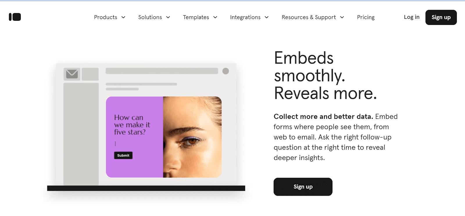
Typeform stands out as a SaaS website design inspiration where you can enhance user engagement and gather more interactive and user-friendly information. Its features make it a versatile tool for various website data collection needs.
Typeform Website Design
Typeform stands out as a SaaS website design inspiration where you can enhance user engagement and gather information more effectively and user-friendly. Its features make it a versatile tool for various website data collection needs.
On their website, you can find some inspiring sections to try to implement in your project. When scrolling through their website, you can see that each section is self-explanatory on what Typeform provides.
They have used transition, informative short videos, and black and off-cream color combinations. They offer custom templates to build the form or survey with the help of the drag-and-drop option.
You can perform usability testing on forms to validate whether the online form, survey, and quizzes function properly over various devices, browsers, and operating systems.
Kobiton
Kobiton is a cloud-based mobile testing solution launched in 2016 that allows developer and tester teams to ensure the functionality and performance of their mobile applications across various devices and operating systems.
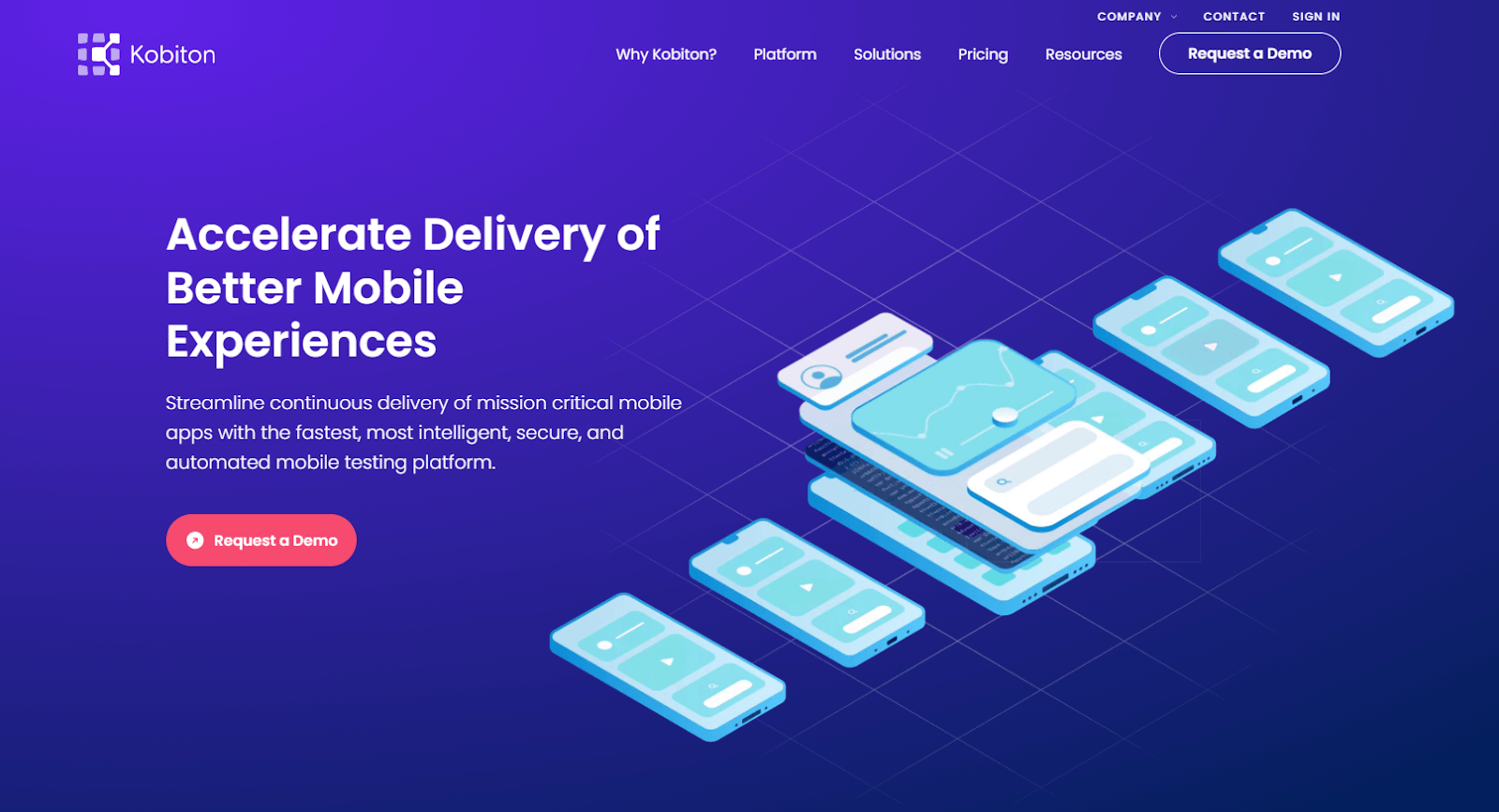
For software testing companies aiming to create a comprehensive cloud-based mobile testing application, Kobiton is a perfect source of inspiration for SaaS website design. The website design is elegant and exceptionally user-friendly, offering an intuitive experience for seamless navigation.
Kobiton Website Design
This SaaS website design is very effective and creative as the home page’s hero section or the home page’s banner is informative. With the animation effect, they are trying to convey what their product is about. Their UI is appealing and creative, so they have listed their services when scrolling through, as shown below.
Freshdesk
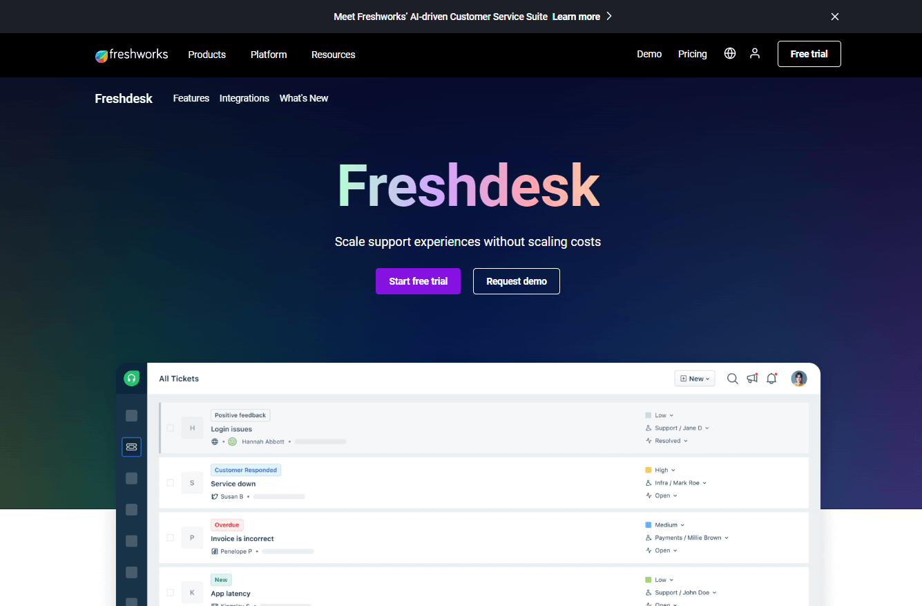
Freshdesk stands out with its SaaS website design, featuring an informative and visually appealing isometric illustration on the homepage banner.
Freshdesk Website Design
Focusing on user-friendly UI, Freshdesk provides an engaging and informative website layout.
The SaaS website design of this product is mainly focused on displaying the content, it has a very basic design, but you can use these sections if you have more content to showcase for your users. It has no animation but consists of a carousel, and each solution service page is filled with details, images, and icons.
ClickUp
ClickUp stands out in this list as a project management tool first and a CRM second, similar to SmartTask and Monday.
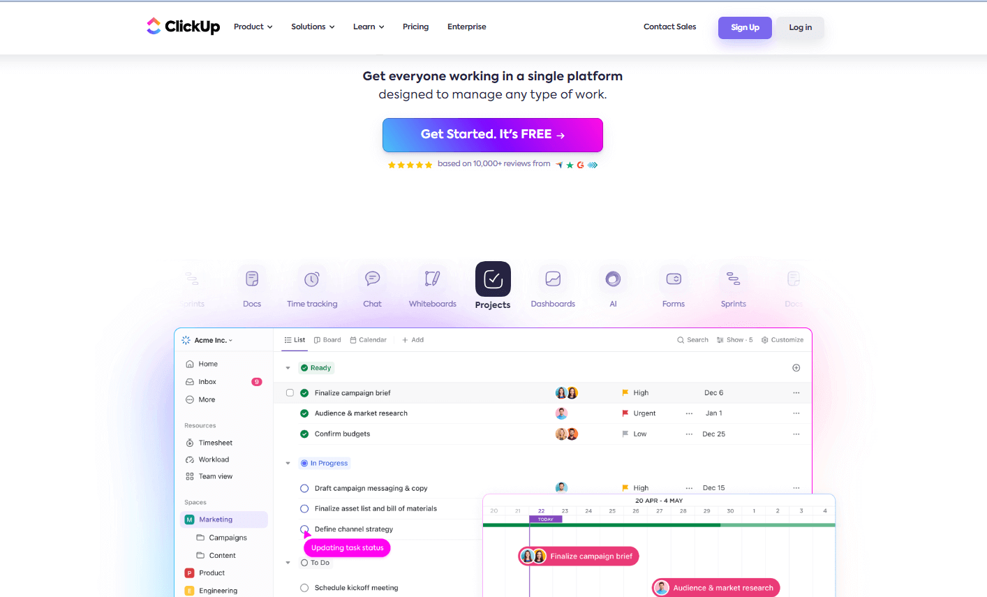
What sets ClickUp apart is that its CRM capabilities are not pre-set; users must configure them based on a template. Despite this setup effort, the results are rewarding.
ClickUp Website Design
ClickUp’s SaaS website design ensures a smooth user experience with intuitive navigation and functionality, contributing to its user-friendly interface.
Their website design is very static with no animation, consists of gifs, and each card of a particular service is identified with different colors, making it easy for users to read and interact. It is colorful and looks beautiful, allowing you to use the provided website templates to create your web page or website.
Now that we have reached the end of this list of SaaS products, I hope these SaaS website designs were helpful in terms of getting inspiration from each of them.
Conclusion
The essential role of SaaS in facilitating business operations includes rapid deployment, user-friendly interfaces, cost-effectiveness, accessibility, and reduced infrastructure expenses.
In creating your own SaaS product, drawing inspiration and ideas from established examples like those mentioned above can be invaluable in creating your own SaaS product. Given the diversity among SaaS offerings, it is crucial to carefully study the paths these companies take and understand how to adapt their successful business models.
In the world of software development, adding a SaaS component is not just beneficial but often essential. The collaboration between software and SaaS is integral to efficient development practices. Explore the possibilities within the examples or look for a SaaS solution adapted to your company’s needs.
Frequently Asked Questions (FAQs)
How does SaaS differ from traditional software?
Unlike regular software, SaaS works online instead of being installed on each device. With SaaS, you use the software over the internet without installing it locally. It comes with subscription pricing, automatic updates, and easy scalability, while traditional software usually needs upfront fees and manual updates.
How are data collection forms designed to maximize user completion rates?
Creating forms with a neat format and limited fields is key to minimizing obstacles. By incorporating inline validation and offering contextual assistance, users are guided seamlessly, promoting confidence and boosting the form completion rate.
How does the design adapt to different screen sizes and resolutions?
Add responsive design strategies, such as flexible grids and media queries, to guarantee a seamless website adaptation to multiple screen dimensions and resolutions. Give priority to the visual organization of content for an unvarying user journey across all devices.
Got Questions? Drop them on LambdaTest Community. Visit now


